

Job:03171 Title:Typography Referenced (Rockport)
Page: 83
068-121 03171.indd 83 9/22/11 4:54 PM
Type Designers
Text
Job:03171 Title:Typography Referenced (Rockport)
Page: 83
Charles Bigelow
American, –
Typefaces: Leviathan (1979), Lucida (1984),
Chicago, Geneva (1991), Wingdings (1993)
Charles Bigelow is a type historian, educator, and
type designer. He was born in Detroit, Michigan
in and attended Cranbrook Academy of Art ()
from to . In , Bigelow became one of
the few graphic designers to receive a MacArthur
Foundation Prize Fellowship. He also received the
Frederic W. Goudy Award in Typography from
Rochester Institute of Technology ().
Bigelow’s accomplishments are extensive, including
establishing Stanford University’s digital typography
master’s program. He and Kris Holmes cofounded the
Bigelow & Holmes foundry and designed the Wingdings
and Lucida type families, the latter of which is one
of the fi rst fonts to optimize typography for output on
the lower resolution printers of personal computers.
This duo also created some of the fi rst TrueType
fonts, including Apple’s city fonts—Chicago, Geneva,
Monaco, New York—Apple Chancery, and the
ubiquitous Microsoft Wingdings font.
Bigelow taught type design, typography, and the
history and theory of writing at Stanford University
from until . In , ’s School of Print Media
named him the Melbert B. Cary Distinguished Professor.
Peter Bilak
Czechoslovokian, –
Typefaces: Craft (1994),
Atlanta, Champollion, Holy Cow (1995),
Masterpiece (1996), Orbital (1997),
Eureka (1998), Fedra Sans (2001),
Fedra Serif (2003), Greta Text (2007),
History (2008), Fedra Mono, Irma (2009)
Peter Bilak was born in in what was then
Czechoslovakia. Today, he is a graphic and typeface
designer based in The Hague, The Netherlands.
He started the type foundry Typotheque () in
and the Indian Type Foundry in . Bilak teaches
postgraduate typeface design at the Royal Academy
of Art () in The Hague and lectures widely about
graphic design and typography. He also contributes
regularly to international publications including Print,
Eye, Items, tipoGrafi ca, and Idea.
In , Bilak and Stuart Bailey cofounded Dot Dot
Dot magazine, which they coedited until .
Greta Grande,
068-121 03171.indd 83 9/22/11 4:54 PM
Job:03171 Title:Typography Referenced (Rockport)
Page: 84
068-121 03171 C2.indd 84 10/12/11 9:28 AM
Typography, Referenced
Text
Job:03171 Title:Typography Referenced (Rockport)
Page: 84
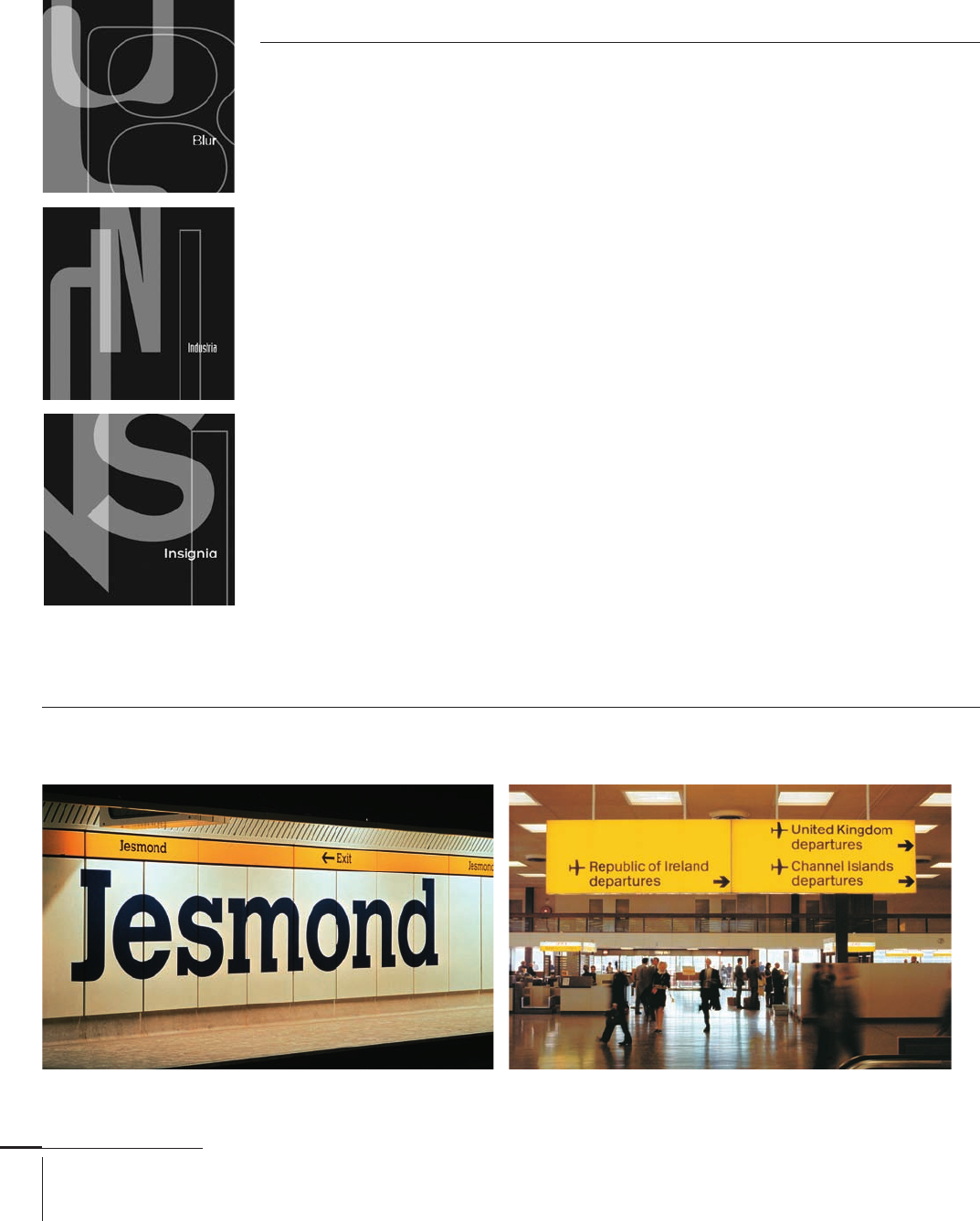
Jesmond Station sign, 1981
Neville Brody
British, –
Typefaces: Industria, Insignia (1989), Arcadia (1990), Blur, Typeface 6 & 7, (1991),
Gothic, Pop, Typeface 4 (1992), Dome, Harlem, Tokyo, World (1993),
Autotrace, Dirty (1994), Meta Subnormal (1995, with Erik Spiekermann)
Renowned British graphic designer, art director, and typographer Neville
Brody gained public acclaim in the early 1980s (26) with his highly inno-
vative approach to typography.
Brody was born in London in and attended the London College
of Printing and Hornsey College of Art. His early work included
experimental and revolutionary combinations of typographic expression
for magazines such as the Face and Arena, as well as for independent
music labels and artists such as Cabaret Voltaire and Depeche Mode.
In , two volumes about his work became the world’s best-selling
graphic design book, and an accompanying exhibition of his designs at
the Victoria and Albert Museum drew more than , visitors before
it moved around Europe and Japan. In , Brody started the design
consultancy Research Studios, the type foundry Fontworks, and Fuse,
a regularly published collection of experimental typefaces continually
challenging the boundaries between editorial, graphic, and type design.
In , Brody was named the new head of the communication art and
design department at London’s Royal College of Art.
Margaret Calvert
South African, –
Typefaces: Transport (1963), Calvert (1980), A 26 (1994), New Rail (2009, with Henrik Kubel)
BAA Signs, 1964
068-121 03171.indd 84 9/22/11 4:54 PM
Job:03171 Title:Typography Referenced (Rockport)
Page: 85
068-121 03171.indd 85 9/22/11 4:54 PM
Type Designers
Text
Job:03171 Title:Typography Referenced (Rockport)
Page: 85
Margaret Calvert was born in South Africa in . In ,
she and her family immigrated to the United Kingdom,
where she studied illustration at Chelsea School of Art
and typography at the Central School of Arts and Crafts.
Her former tutor, Jock Kinneir, then asked her to assist
him in designing the sign system for Gatwick Airport.
During the s (), Calvert again collaborated with
Kinneir on the typography and design of Great Britain’s
comprehensive road-sign system, which included
creating the typeface Transport and several pictograms.
In addition, Calvert has designed integrated lettering
and sign systems for British rail, British airports, and
the Tyne and Wear Metro. In , Monotype ()
released Calvert, an Egyptian typeface originally
designed for the Tyne and Wear Metro and later adapted
for the Royal College of Art.
Previously, Calvert was the chairperson of the
communication art and design department at London’s
Royal College of Art, as well as a fellow of the University
of the Arts (), London, and an honorary doctor of the
University of Brighton.
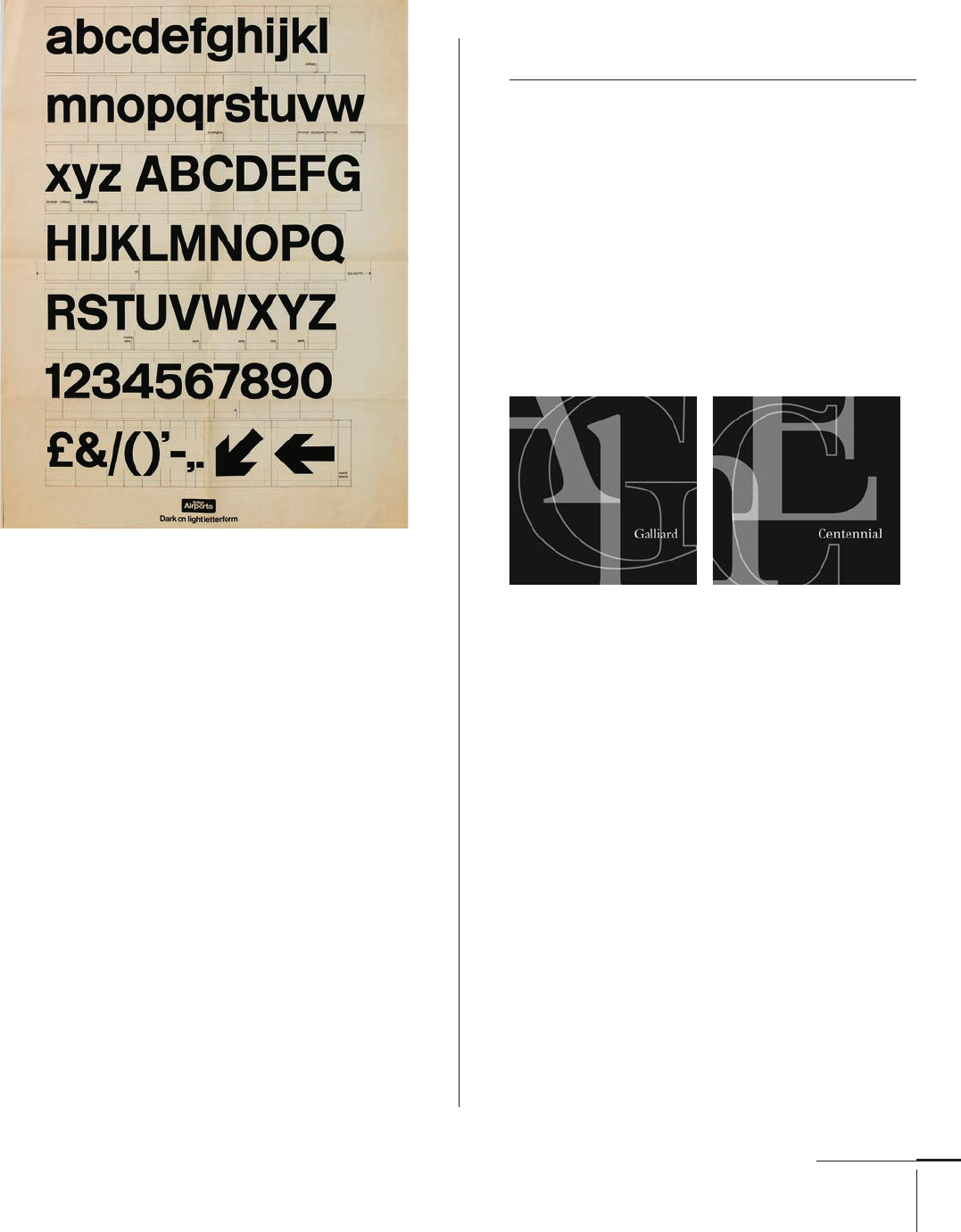
Matthew Carter
British, –
Typefaces: Auriga, Cascade Script (1965),
Freehand 471, Snell Roundhand (1966), Dutch 811 (1970),
Gando Ronde (1970, with Hans Jorg Hunziker),
Olympian (1970), Shelley Script (1972),
CRT Gothic (1974), Video (1977),
Bell Centennial, Galliard (1978), V&A Titling (1979),
Charter (1987), Elephant (1992),
Mantinia, Sophia (1993), Big Caslon, Skia (1994),
Alisal, Tahoma, Walker, Wilson Greek (1995),
Georgia, Verdana (1996), Miller, Big Figgins (1997),
Manutius, Rocky (1998),
Monticello (2002), Carter Sans (2010)
Matthew Carter is an English-born American type
designer, punchcutter, and scholar based in Cambridge,
Massachusetts.
He is the son of Harry Carter, a printing historian
and the archivist for Oxford University Press. In ,
Carter spent a year studying the traditional crafts of
type design and type founding with Jan van Krimpen’s
assistant, the punchcutter P. H. Raidische at the
Enschedé Font Foundry () in Holland.
For the past fi fty years, Carter has designed and
made type in every possible medium, from metal to
fi lm and digital. Prior to starting his own digital type
foundry, Carter & Cone Type, Inc., with Cherie Cone
in , he worked for Mergenthaler Linotype and Bit-
stream ().
He received the Chrysler Award for Innovation in
Design, the Type Directors Club () Medal and the
American Institute of Graphic Arts () Medal. In
, London’s Royal Society of Arts elected him a Royal
Designer for Industry. Carter was named a MacArthur
Foundation Fellow in .
Type,
068-121 03171.indd 85 9/22/11 4:54 PM

Job:03171 Title:Typography Referenced (Rockport)
Page: 86
068-121 03171.indd 86 9/22/11 4:54 PM
Typography, Referenced
Text
Job:03171 Title:Typography Referenced (Rockport)
Page: 86
Willem Hendrik Crouwel
Dutch, –
Typefaces: Vormgevers (1962), Edgar Fernhout (1964),
New Alphabet (1967), Gridnik (1974), Fodor (1977)
Willem Hendrik Crouwel (also known as Wim) is a
Dutch graphic designer, type designer, and educator.
He was born in Groningen, The Netherlands, in ,
and studied fi ne arts at the Academie Minerva there
from until . He also studied typography at
Amsterdam’s Gerrit Rietveld Academie.
In , he cofounded the design studio Total
Design (currently known as Total Identity) with
graphic designers Benno Wissing, Friso Kramer, and
the Schwarz brothers. In , Crouwel designed
the typeface New Alphabet, a font that embraces
the limitations of cathode ray tube technology and
therefore only uses horizontal and vertical strokes.
Throughout his career, Crouwel has also been
dedicated to design education. He taught design at
the Royal Academy of Art (Akademie Voor Kunst
en Vormgeving St. Joost or AKV|St. Joost), at the
Gerrit Rietveld Academie, in Delft University of
Technology’s department of industrial design, and at
Erasmus University Rotterdam.
From to , he was director of the Museum
Boijmans Van Beuningen in Rotterdam. In ,
Crouwel received the Gerrit Noordzij Prize from
the Royal Academy of Art (), The Hague, for
extraordinary contributions to the fi elds of type
design, typography, and type education.
Oswald Bruce Cooper
American, –
Typefaces: Oz Poster, Packard (1913),
Cooper Old Style (1919), Cooper Black (1920),
Maiandra (circa 1924), Pompeian Cursive (1927),
Cooper Fullface, Ozwald (1928),
Highlander (circa 1930), Oz Brush (1930)
Oswald Bruce Cooper was born in in Mount Gilead,
Ohio. He left his hometown at a young age to become
a printer’s apprentice and to study illustration at the
Frank Holme School of Illustration in Chicago.
It was at the Holme School that Cooper befriended
his lettering instructor, Frederic Goudy (). He
soon became part of Goudy’s circle of artists and
designers, including Will Ransom and William
Addison Dwiggins (). The same year, Cooper formed
a creative partnership with Fred Bertsch—aptly named
Bertsch & Cooper—designing general typography,
newspaper advertisements, and layouts for books
and magazines, with Cooper specializing as a hand-
lettering artist. In , he achieved his fi rst notable
success with lettering he designed for the Packard
Motor Company. He subsequently received a design
patent and released the lettering as the typeface
Packard by American Type Founders.
To supplement lettering and layout services, Bertsch
& Cooper added typesetting in . Shortly after that,
Cooper designed Cooper Black, the fi rst typeface with
rounded serifs that started the twentieth-century ()
trend for ultra bold typefaces. It was an immediate
success and became one of the most popular typefaces
in the United States during the s () and s
(). He created a companion italic in .
068-121 03171.indd 86 9/22/11 4:54 PM
Job:03171 Title:Typography Referenced (Rockport)
Page: 87
068-121 03171.indd 87 9/22/11 4:54 PM
Type Designers
Text
Job:03171 Title:Typography Referenced (Rockport)
Page: 87
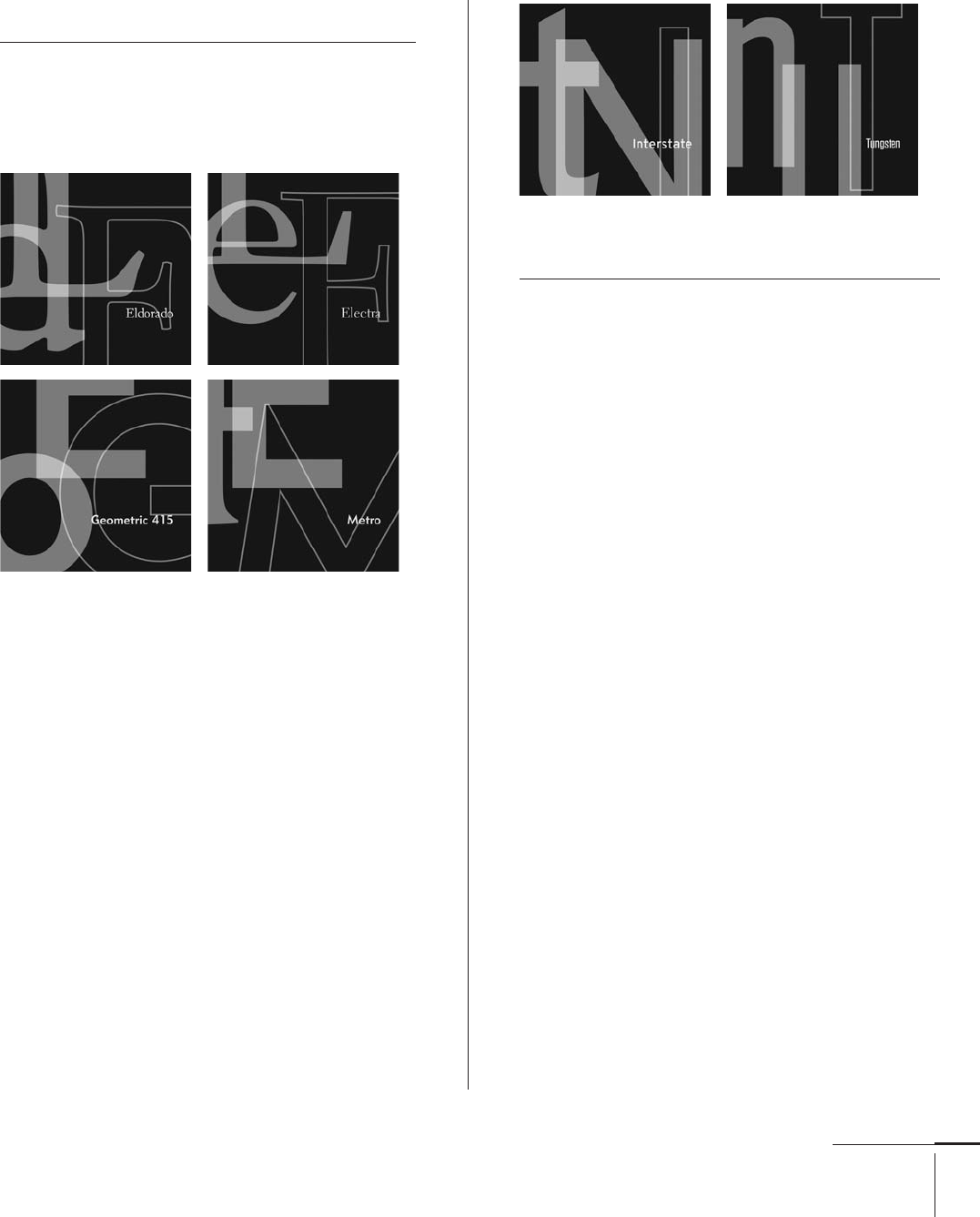
William Addison Dwiggins
American, –
Typefaces: Metro, Geometric 415 (1929),
Elante, Electra, Transitional 521 (1935), Caledonia (1938),
Winchester (1944), Eldorado (1953), Falcon (1961)
William Addison Dwiggins was born in in
Cambridge, Ohio. At nineteen, he studied lettering
with Frederic Goudy () at the Frank Holme School
of Illustration in Chicago.
Dwiggins pursued a diverse career that included
illustration, calligraphy, printing, advertising, and
book design. After working as a freelance designer,
he was appointed acting director of Harvard University
Press in , and in , founded the Society of
Calligraphers in Boston.
At age forty-four, he began designing typefaces
exclusively for the Linotype () machine and at the
invitation of Mergenthaler Linotype. His fi rst typeface
was a sans serif, Metro. His best-known typeface, Cale-
donia, combines characteristics of the Scotch Romans
and the typeface Bulmer designed by William Martin.
In the s () and s (), Dwiggins created the
typographic house style for publisher Alfred Knopf
in New York City. In , the American Institute of
Graphic Arts () awarded Dwiggins his profession’s
highest honor, the AIGA medal.
Tobias Frere-Jones
American, –
Typefaces: Dolores, Nobel (1991),
Archipelago, Garage Gothic (1992),
Cafeteria, Epitaph, Interstate, Reactor,
Reiner Script, Stereo (1993),
Armada, Fibonacci, Hightower, Niagara (1994),
Asphalt, Citadel, Microphone, Pilsner (1995),
Whitney (1996), Griffi th Gothic, Phemister (1997),
Grand Central, Welo Script (1998), Gotham, Retina (2000),
Nitro, Surveyor (2001), Exchange, Idlewild (2002),
Dulcet, Monarch (2003), Argosy, Tungsten (2004)
Tobias Frere-Jones is a prolifi c type designer and teacher,
and the director of typography at Hoefl er & Frere-Jones
(), a prominent type foundry in New York City.
After completing his studies at the Rhode Island
School of Design () in , he joined The Font
Bureau, Inc. () in Boston as a senior designer. During
his seven-year tenure there, he created some of the
foundry’s best-known typefaces, including Interstate.
Frere-Jones left The Font Bureau in to return to
New York City, where he began working with Jonathan
Hoefl er (). In the past decade-plus, he has designed
more than typefaces for publications, institutions,
and corporate clients including the Wall Street Journal,
Martha Stewart Living, GQ, Esquire, the New York Times,
and the Boston Globe.
He joined the faculty of the Yale School of Art ()
in , where he continues to teach graduate-level
typeface design courses. In , Frere-Jones became
the fi rst American to receive the Gerrit Noordzij Prize,
presented by the Royal Academy of Art (), The Hague
in honor of his unique contribution to type design,
typography, and type education.
068-121 03171.indd 87 9/22/11 4:54 PM
..................Content has been hidden....................
You can't read the all page of ebook, please click here login for view all page.