

Job:03171 Title:Typography Referenced (Rockport)
Page: 93
068-121 03171.indd 93 9/22/11 4:55 PM
Type Designers
Text
Job:03171 Title:Typography Referenced (Rockport)
Page: 93
Rudolf Koch
German, –
Typefaces: Deutsche Schrift, Neu Deutsch (1909),
Fruhling (1913), Maximillian Antiqua (1914),
Zierfraktur (1919), Koch Antiqua, Locarno, Xmas (1922),
Neuland, Schmale Anzeigenfraktur (1923), Banco,
Klingspor Schrift, Wilhelm Klingspor Gotisch (1925),
Jessen (1926), Geometric 231, Kabel (1927),
Off enbach (1928), Zeppelin (1929), Wallau (1930),
Marathon, Prisma (1931), Holla (1932), Neufraktur (1933),
Claudius (1937), Steel (1939)
Born in Nuremberg, Germany, Rudolf
Koch was the son of a sculptor. He
apprenticed in a metal foundry, attended
evening classes at the Art School,
and left the foundry before completing
his apprenticeship. Returning to
Nuremberg, he trained as a teacher
and then in , found work as a
designer in Leipzig.
At the age of thirty, Koch began a long,
fruitful position as a type designer in a
small type founders fi rm at Off enbach.
The company was Rudhardsche Giesserei,
later internationally known as the
Klingspor type foundry. Shortly after
joining Klingspor, Koch designed his
fi rst typeface, Deutsche Schrift, a bold
blackletter ().
As with all his typefaces, he experi-
mented with hand-drawn letters using a
broad pen. He drew the same letters again
and again until every letter was perfect,
the type ready to cut.
First came Neuland in , a family
of convex-shaped capitals reminiscent
of German Expressionist woodcut letter-
ing. He then designed Wilhelm, Klingspor
Schrift, and Jesson, which he cut himself,
a simplifi ed blackletter with Romanized
capitals, created originally for the Four
Gospels printed by Klingspor, one of the
seminal publications that refl ects this
approach to typography.
One of the most respected designers
and teachers of his day, Koch was fi rst
and foremost a calligrapher; all types he
designed but one developed from his cal-
ligraphic forms. “Lettering,” he once said,
“gives me the purest and greatest pleasure,
and on countless occasions, it has been to
me what a song is to a singer.”
Koch, Koch,
068-121 03171.indd 93 9/22/11 4:55 PM
Job:03171 Title:Typography Referenced (Rockport)
Page: 94
068-121 03171.indd 94 9/22/11 4:55 PM
Typography, Referenced
Text
Job:03171 Title:Typography Referenced (Rockport)
Page: 94
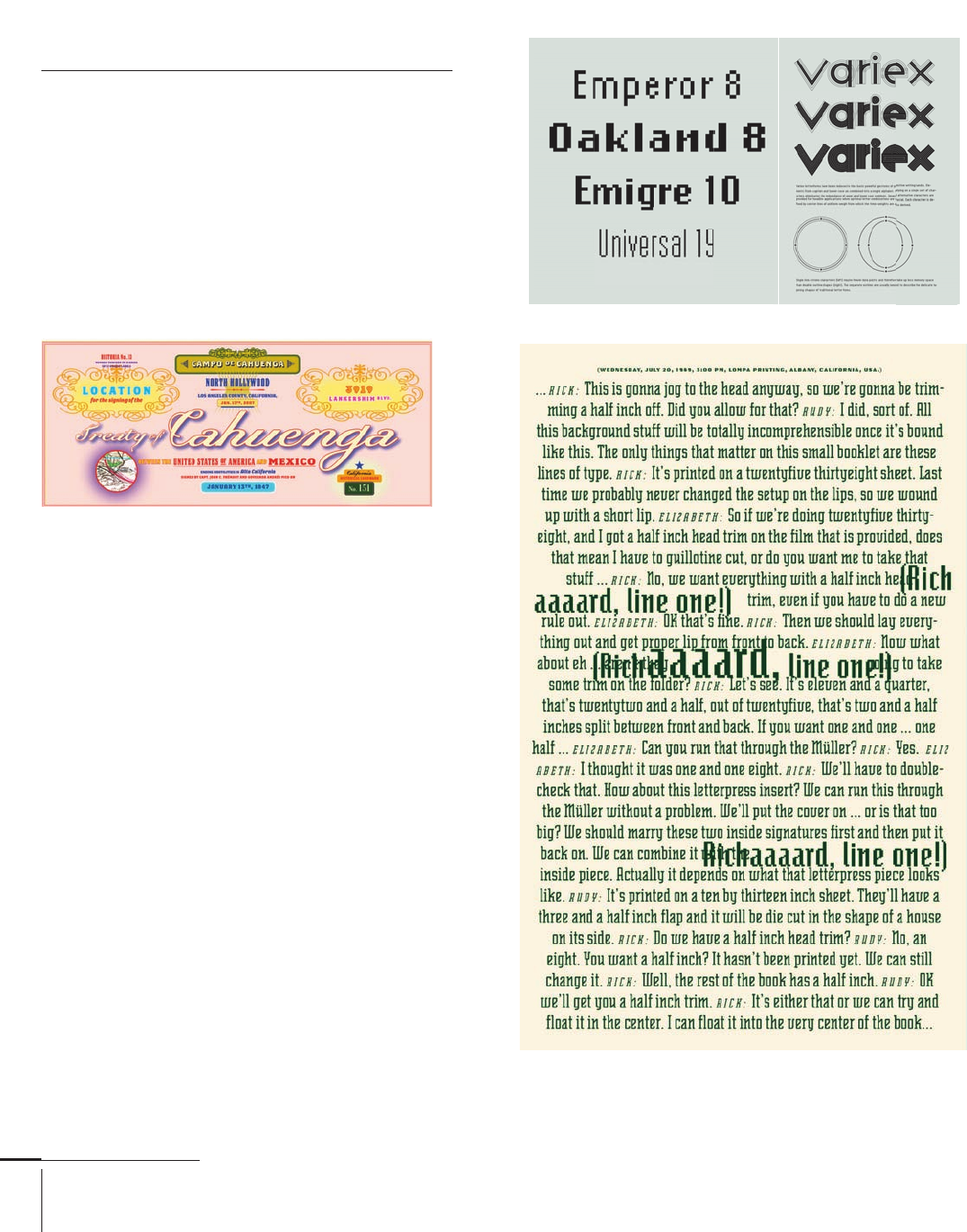
Zuzana Licko
Czechoslovakian, –
Typefaces: Low-Res (1985),
Emigre, Emperor, Matrix, Modula Sans,
Oakland, Universal (1986), Modula Serif (1988),
Lunatix, Oblong, Senator, Variex (1989), Citizen,
Elektrix, Totally Glyphic, Totally Gothic, Triplex (1990),
Journal (1991), Quartet (1992), Narly (1993),
Dogma, Whirligig (1994), Base, Soda Script (1995),
Mrs. Eaves (1996), Filosophia, Hypnopaedia (1997),
Tarzana (1998), Solex (2000), Fairplex (2002),
Puzzler (2005), Mr. Eaves (2009)
Zuzana Licko is the cofounder of the Emigre, Inc. ()
foundry and infl uential journal Emigre magazine,
together with her husband Rudy VanderLans. She was
born in in what was Bratislava, Czechoslovakia, and
immigrated to the United States in . She graduated
with a degree in graphic communications from the
University of California, Berkeley, in .
In the mid-s (), personal computers and low-
resolution printers put the tools of typography in the
hands of a broader public. In , Licko began designing
typefaces that exploited the rough grain of early desktop
systems. While other digital fonts imposed the coarse grid
of screen displays and dot-matrix printers onto traditional
typographic forms, Licko’s embraced the language of
digital equipment. At the time, she and VanderLans
called themselves “new primitives” and pioneers of a new
technological dawn.
She also produced historical revivals alongside her
experimental digital display faces. Licko’s typeface Mrs.
Eaves, inspired by the eighteenth-century typefaces of
John Baskerville () (and named after his mistress and
housekeeper Sarah Eaves) became one of the most popular
typefaces during the s ().
Cahuenga
Senator et al,
068-121 03171.indd 94 9/22/11 4:55 PM
Job:03171 Title:Typography Referenced (Rockport)
Page: 95
068-121 03171.indd 95 9/22/11 4:55 PM
Type Designers
Text
Job:03171 Title:Typography Referenced (Rockport)
Page: 95
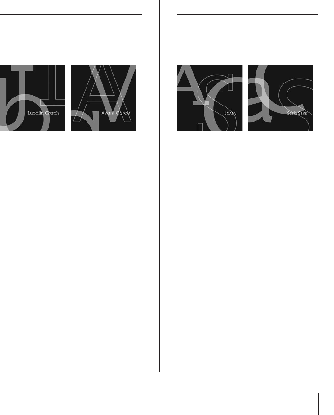
Herb Lubalin
American, –
Typefaces: Avant Garde Gothic (1970, with Tom Carnase),
Ronda (1970), Lubalin Graph (1974),
Serif Gothic (1974, with Tony DiSpigna)
In post–World War II United States, few designers or
typographers were more charismatic and infl uential than
Herb Lubalin. Born in New York City, Lubalin attended
Cooper Union (), graduating in .
As a young art director, he worked at Sudler &
Hennessey for more than ten years before starting his own
design fi rm, Herb Lubalin Inc., in . His partnership
with Aaron Burns and Edward Rondthaler created
International Typeface Corporation () (), which in
its heyday became the world’s largest typeface supplier.
Today it is Monotype Imaging Company ().
Lubalin also founded and designed the magazine
U&lc for , which was distributed worldwide. As an
editorial designer, he was in charge of the Saturday
Evening Post, Eros (), Fact (), and Avant Garde
(), which led him to design a type family with the
same name. In , Lubalin was inducted into the
New York Art Directors Hall of Fame and in , earned
his profession’s highest honor, the American Institute
of Graphic Arts () Medal.
Martin Majoor
Dutch, –
Typefaces: Scala (1990), Scala Sans (1993),
Seria (2000), Nexus (2004)
Martin Majoor is a Dutch graphic designer and
type designer trained at the School of Fine Art in
Arnhem, Denmark. He has been designing type
since the mid-s ().
In , he started working as a typographic
designer in the research and development
department at Océ-Netherlands, where he did
research on screen fonts and worked on the
production of digital typefaces for laser printers.
After working at the Vredenburg Music Centre
in Utrecht (for which he designed the typeface
Scala), Majoor became an independent type
designer and book typographer in Arnhem in .
Since then, he has designed several type families
and numerous books and covers.
Majoor now works as a type designer and
graphic designer in Arnhem and Warsaw.
068-121 03171.indd 95 9/22/11 4:55 PM

Job:03171 Title:Typography Referenced (Rockport)
Page: 96
068-121 03171.indd 96 9/22/11 4:55 PM
96
Typography, Referenced
Text
Job:03171 Title:Typography Referenced (Rockport)
Page: 96
Max Miedinger
Swiss, –
Typefaces: Pro Arte (1954), Helvetica (1956),
Monospace 821, Neue Haas Grotesk (1957),
Horizontal (1964)
James Montalbano
American, –
Typefaces: Orbon (1995), Freddo (1996), Nora (1997),
Clearview (2004), Moraine (2010), Trilon (2011)
James Montalbano’s professional career began as a
public school graphic arts teacher in New York City.
Following graduate studies in technology education,
he studied lettering with Ed Benguiat (80), and began
working as a graphic designer and art director at
various type foundries and trade publications.
In , he formed Terminal Design, Inc., and began
to concentrate on lettering and typeface design. He
has created custom typeface designs for editorial,
corporate, government, and publishing clients including
International Typeface Corporation (128), Warner Music,
The American Medical Association, Vanity Fair, Vogue,
Men’s Vogue, Gourmet, Mademoiselle, Details, Glamour,
Fortune, Scribner, J. C. Penney, , and MillerCoors.
In , he completed a new family of typefaces for
the U. S. National Park Service, and for the past few years
he has been involved with Meeker & Associates in the
development of the Clearview type system for text, display,
roadway, and an interior guide sign program.
Montalbano has taught typography and type design
at the Pratt Institute (349), Parsons The New School
for Design (349), and the School of Visual Arts (349)
in New York City.
Living Social, 2010
Max Miedinger was born in in Zurich, Switzerland.
Between and , Miedinger trained as a typesetter
and attended evening classes at the Kunstgewerbeschule.
In the early 1950s (22), he became an in-house type
designer with Haas Type Foundry in Münchenstein,
Switzerland. He designed his most famous typeface,
Helvetica (176), in ; it is still the most widely used
sans serif in the world.
It was at the Haas where Edouard Hoff mann asked
Miedinger to adapt the foundry’s existing Haas Grotesk to
accommodate current taste. Haas Grotesk had its origins
in nineteenth-century German work such as Berthold’s
Akzidenz Grotesk. The new typeface, created from
Miedinger’s china-ink drawings, was a new design in its
own right rather than one with minor modifi cations, as
had been the original plan. Neue Haas Grotesk, as it was
then called, proved extremely popular. When D. Stempel
AG in Germany released the typeface in , the foundry
called it Helvetica—the traditional Latin name for
“Switzerland,” to capitalize on the increasing popularity of
Swiss typography. Although Helvetica was not planned as
a diverse family of weights like that of Adrian Frutiger’s
(88) Univers (181), several designers have added to it
during the past thirty years. These additional weights are
available on most typesetting systems.
Two of Miedinger’s other typefaces, Pro Arte, a revival
of a nineteenth-century poster typeface, and Horizontal,
a heavy, square, titling face, were atypical in terms of his
style and approach.
068-121 03171 C2.indd 96 10/12/11 9:31 AM

Job:03171 Title:Typography Referenced (Rockport)
Page: 97
068-121 03171.indd 97 9/22/11 4:55 PM
Type Designers
Text
Job:03171 Title:Typography Referenced (Rockport)
Page: 97
Stanley Morison
British, –
Typefaces: Blado (1923), Gill Sans (1928), Bembo (1929),
Perpetua (1932), Times New Roman (1932)
Stanley Morison was a
British graphic designer,
printing historian, and
major infl uence on the
reform of typographic
standards used in the
printing industry during
the ea rly t went iet h
century (16).
Born in in
Wanstead, Essex, England,
Morrison was self-taught,
having left school at a
young age after his father
abandoned the family. In
, he became design
supervisor at Pelican Press
and then held a similar
position at Cloister Press
before becoming an edi-
torial assistant at The
Imprint magazine in .
In , he was appointed
Cambridge University
Press typographic adviser,
and he published a book,
First Principles of Typogra-
phy, in .
From to ,
Morison was typographic
advisor to the Monotype
Corporation (125), where
he commissioned Eric Gill
(89) to design Gill Sans
(175) () and Perpetua
(). He was a founding
member of the Fleuron
Society dedicated to
typographical matters (a
fl euron is a typographical
fl ower or ornament) and
also functioned as the
Society’s editor for its
journal, The Fleuron, from
to . Morison was
also typographic advisor
to the Times of London
newspaper from to
. In , the paper
commissioned him to
produce an easy-to-read
typeface. Times New
Roman (165), developed
with graphic artist Victor
Lardent, was introduced
in and subsequently
issued commercially by
Monotype in .
In , Morison was
elected a Royal Designer
for Industry by the
British Royal Society of
Arts honoring individuals
who have achieved
“sustained excellence in
aesthetic and effi cient
design for industry.”
Morison, 1932
068-121 03171.indd 97 9/22/11 4:55 PM
..................Content has been hidden....................
You can't read the all page of ebook, please click here login for view all page.