
Job:03171 Title:Typography Referenced (Rockport)
Page: 98
068-121 03171.indd 98 9/22/11 4:55 PM
Typography, Referenced
Text
Job:03171 Title:Typography Referenced (Rockport)
Page: 98
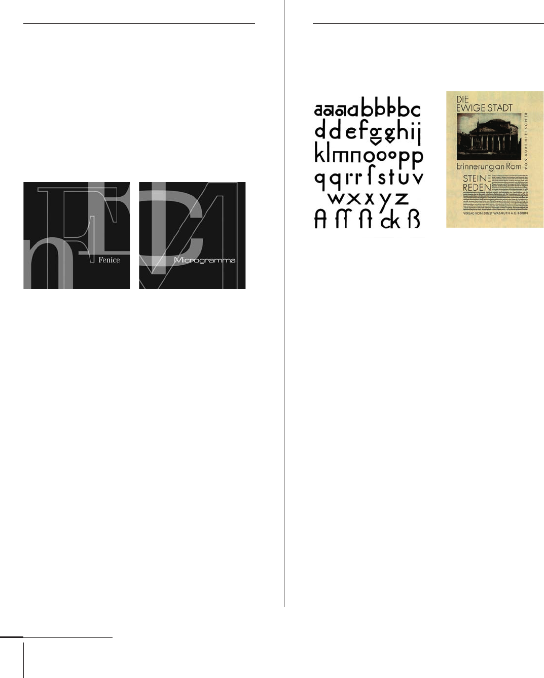
Aldo Novarese
Italian, –
Typefaces: Athenaeum (1945), Patrizia (1950),
Augustea, Fluidum (1951), Microgramma (1952),
Fontanesi (1954), Egizio, Juliet, Ritmo (1955),
Garaldus (1956), Slogan (1957), Belizio, Recta (1958),
Estro (1961), Eurostile, Square 721 (1962),
Formal 436 (1966), Metropol (1967), Stop (1971),
Sprint (1974), Geometric 885 (1976), Lapidar (1977),
Fenice, Justus Fraktur, Novarese (1980),
Colossalis, Symbol (1984), Mixage (1985), Arbiter (1989),
Central, Nadianne (1998), Press Gothic (2007)
Aldo Novarese was one of the modern era’s most prolifi c
type designers. Born in Italy in , he attended the
Turin School of Printing, where he studied woodcarving,
etching, and lithography. Following a brief period working
as a graphic arts teacher, he joined the Nebiolo type
foundry, where he ultimately became the foundry’s art
director in .
He collaborated with Alessandro Butti on many
of his early typeface designs. These include Augustea
and Microgramma, which, with the addition of its
lowercase (332), became Eurostile in . The Garamond-
based (162) Garaldus takes its name from a category
in the Vox system of type classifi cation. In , Novarese
designed the type that bears his name, Novarese, for
the Haas foundry. Novarese is also well known as the
author of Alfabeta, a book about the origins and evolution
of typefaces in history.
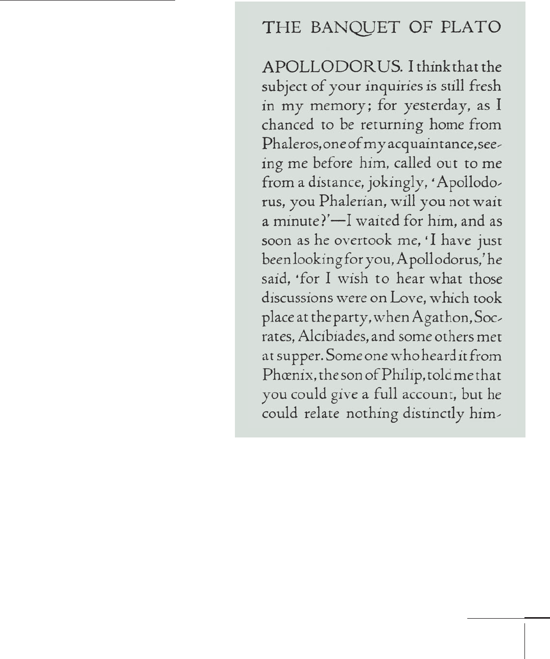
Paul Renner
German, –
Typefaces: Futura (1927), Plak (1928),
Renner Grotesk (1936), Ballade (1937),
Renner Antiqua (1939)
Paul Renner was a German typographer, graphic designer,
and teacher best known as the designer of Futura (174), a
groundbreaking typographic landmark of modernist form
still popular today.
During the 1920s (20) and 1930s (21), he was a
prominent member of the Deutscher Werkbund (German
Work Federation) while creating his fi rst book designs
for various Munich-based publishers. As an author,
he fashioned a new set of guidelines for balanced book
design in his books Typografi e als Kunst (translated
“Typography as Art”) and Die Kunst der Typographie
(translated as “The Art of Typography”).
Renner established the Meisterschule fur Deutchlands
Buchdrucher (Advanced School of German Bookprinting)
in Munich and recruited fellow type designers Georg
Trump and Jan Tschichold (105) to teach there. In ,
Tschichold was removed from his post and interned by
the Nazis for “subversive typography,” and four years later,
in , Renner himself was forced to resign.
Futura, 1927 Advertisement, 1927
068-121 03171.indd 98 9/22/11 4:55 PM
Job:03171 Title:Typography Referenced (Rockport)
Page: 99
068-121 03171.indd 99 9/22/11 4:55 PM
Type Designers
Text
Job:03171 Title:Typography Referenced (Rockport)
Page: 99
Bruce Rogers
American, –
Typefaces: Brimmer (),
Montaigne (), Riverside Modern (),
Centaur (), Metropolitan ()
Born in Linnwood, Indiana, in ,
Bruce Rogers was an American graphic
and type designer considered by some the
greatest book designer of the twentieth
century (). He was known for a classical
approach to typography and page layout
and for dismissing modernism.
After completing his studies at Purdue
University, Rogers worked as an artist for
the Indianapolis News. During this same
time period, he became interested in
publishing and producing fi ne books,
so he moved to Boston, where he worked
as a freelance designer for Louis Prang
& Co. It was here that he cut one of his fi rst
typefaces, Montaigne, a Venetian-style
design named for the earliest book in
which it appeared, a limited edition
of The Essays of Montaigne.
In , Rogers moved to New York
City where he worked both as a freelance
designer and as house designer for the
Metropolitan Museum of Art. During his
tenure at the museum, he designed his
most famous typeface, Centaur (), for
the limited edition of Maurice de
Guérin’s The Centaur. In subsequent years,
Rogers worked extensively as a typographic
advisor and book designer for Mount
Vernon Press, Harvard University Press,
Monotype Corporation (), and Oxford
University Press.
Rogers,
068-121 03171.indd 99 9/22/11 4:55 PM
Job:03171 Title:Typography Referenced (Rockport)
Page: 100
068-121 03171.indd 100 9/22/11 4:55 PM
Typography, Referenced
Text
Job:03171 Title:Typography Referenced (Rockport)
Page: 100
Christian Schwartz
American, –
Typefaces: Flywheel (), Atlas, Elroy (), Hairspray (), Morticia, Zombie (), Fritz (),
Casa Latino (), Pennsylvania (), Loz Feliz, Simian (), Bau, Harrison, Neutra (),
Amplitude, Eero, Houston (), Symantec (, with Conor Mangat), Unit (, with Erik Spiekermann),
Bosch (, with Spiekermann), Farnham (), Guardian Egyptian (, with Paul Barnes),
Popular (), Deutsche Bahn (, with Spiekermann), Oxide, Stag (), Local Gothic (),
Luxury (, with Dino Sanchez), Giorgio (), Neutra Slab ()
Christian Schwartz was born in and grew up in a
small town in New Hampshire. He graduated from Carnegie
Mellon University in with a degree in communica-
tion design and spent three months as the in-house type
designer at MetaDesign Berlin. He then joined The
Font Bureau, Inc. () in , as a member of its full-time
design staff .
In , Schwartz formed orange italic (with product
designer Dino Sanchez) and Schwartzco, Inc. He is also
a partner in the type foundry Commercial Type with the
London-based designer, Paul Barnes. In addition to his work
for The Font Bureau, Inc., he has designed fonts for Emigre
(), FontShop (), and House Industries () (including
the popular Neutra family, based on the work of modernist
architect Richard Neutra), as well as proprietary designs
for corporations and publications including Bosch, Deutsche
Bank, Esquire, the New York Times, the Houston Chronicle,
and the Guardian.
The New York Type Directors Club (), the Smithson-
ian’s Cooper Hewitt, National Design Museum in New York
City, and the International Society of Typographic Design-
ers () have all honored his typographic work. Schwartz
also received the prestigious Prix Charles Peignot in
from the Association Typographique Internationale ().
068-121 03171.indd 100 9/22/11 4:55 PM
Job:03171 Title:Typography Referenced (Rockport)
Page: 101
068-121 03171.indd 101 9/22/11 4:55 PM
Type Designers
Text
Job:03171 Title:Typography Referenced (Rockport)
Page: 101
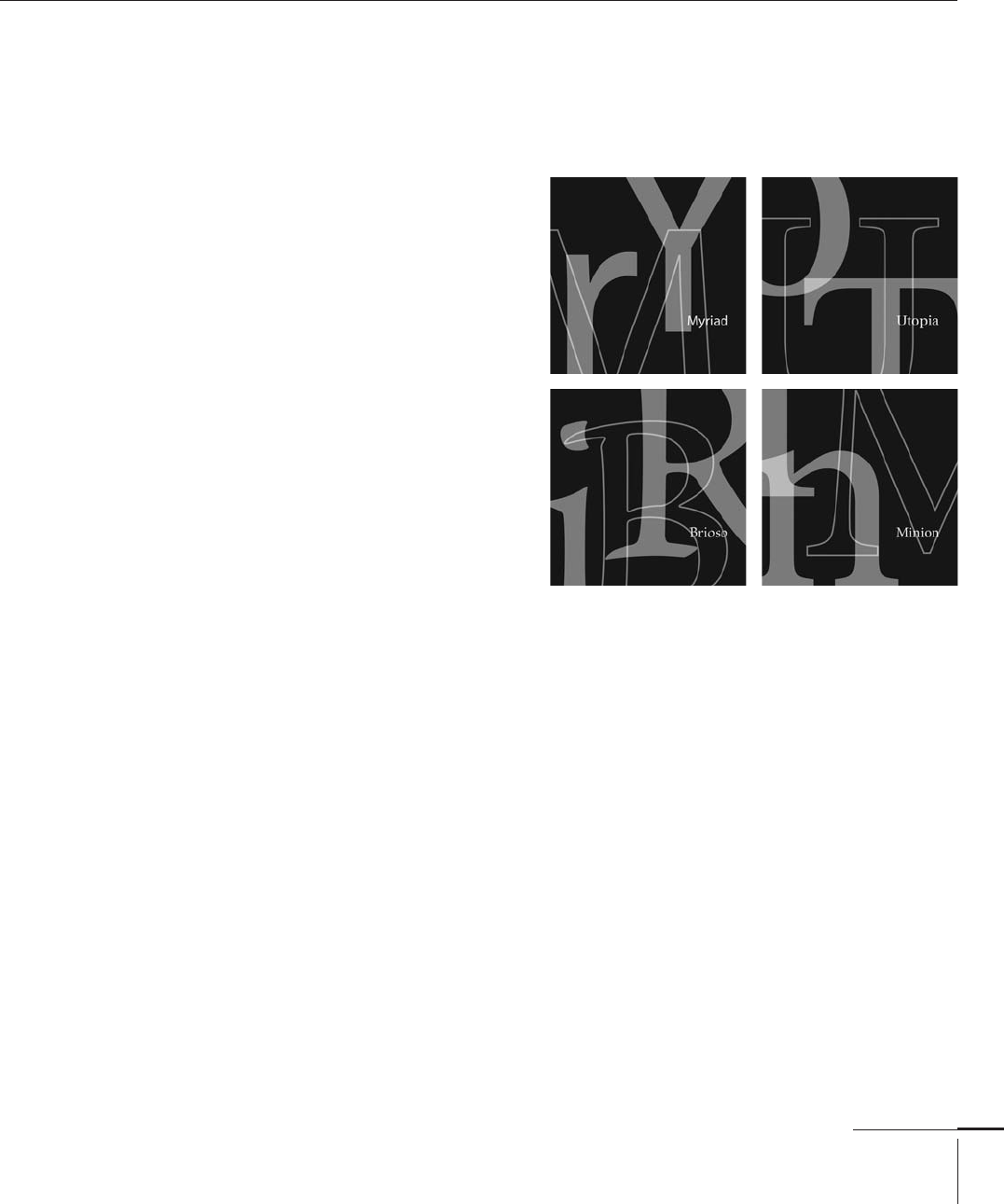
Robert Slimbach
American, –
Typefaces: Slimbach (), Adobe Garamond, Giovanni, Utopia (), Minion (),
Myriad (, with Carol Twombly), Poetica (), Calfi sch, Sanvito (),
Adobe Jenson (), Cronos, Kepler (), Warnock (), Brioso (), Arno ()
Robert Slimbach is a prolifi c
type designer who has worked
at Adobe Systems () since
. His digital typefaces have
been recognized for design
excellence worldwide, most
notably the rarely awarded
Prix Charles Peignot from the
Association Typographique
Internationale ().
Slimbach was born in
Evanston, Illinois, in and
spent the majority of his child-
hood in southern California.
After completing college,
he quickly developed an inter-
est in graphic design and
typography while running a
small silkscreen printing
business producing posters
and greeting cards.
Following a two-year stint
at Autologic Incorporated, he
developed and designed the
fonts ITC Slimbach and ITC
Giovanni for International
Typeface Corporation () in
New York City.
In , Slimbach joined
Adobe Systems, where he has
concentrated primarily on
designing typefaces for digital
technology and drawing
inspiration from classical
sources. During his tenure
there, Slimbach has designed
many new fonts for the Adobe
Originals Program. His own
roman script calligraphy
formed the basis for his
typeface Brioso. Though
Slimbach has not produced
as many typefaces recently,
he has taken full advantage
of the new linguistic and
typographic capabilities
off ered by the OpenType
format, which now provides
the post- type designer
with a much broader range of
glyphs and optical sizes within
any given typeface.
068-121 03171.indd 101 9/22/11 4:55 PM
Job:03171 Title:Typography Referenced (Rockport)
Page: 102
068-121 03171.indd 102 9/22/11 4:55 PM
Typography, Referenced
Text
Job:03171 Title:Typography Referenced (Rockport)
Page: 102
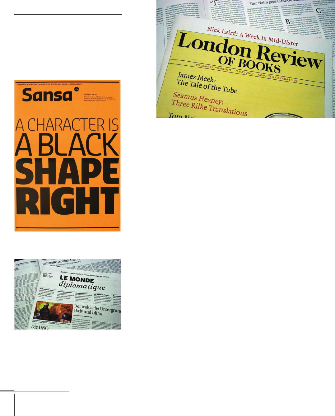
Fred Smeijers
Dutch, –
Typefaces: Renard (),
Quadraat (), Quadraat Sans (),
Fresco, Sansa (),
Arnhem, Custodia (), Monitor (),
Eva (), Ludwig ()
Born in Eindhoven in ,
Fred Smeijers is a Dutch type
designer, graphic designer,
author, and educator.
He studied at the Academie
voor Beeldende Kunsten in
Arnhem from to . From
to , he worked at Océ
Nederland (a Dutch manufacturer
of printing and photocopying
equipment) as the company’s
typographic advisor, designing
digital typefaces for early laser
printers. In , he started the
digital type foundry, OurType,
with Rudy Geeraerts. As the
foundry’s creative director, he
has designed numerous typefaces
including FF Quadraat and
Renard. He also has designed
wordmarks and custom typefaces
for clients such as Philips, Canon,
and TomTom.
Smeijers is a professor of digital
typography at the Hochschule
fur Grafi k und Buchkunst ()
in Leipzig, Germany and at the
Royal Academy of Art () in The
Hague, The Netherlands. He also
authored Counterpunch () and
Type Now (), both published
by Hyphen Press in London. In
, Smeijers received the Gerrit
Noordzij Prize, the highest honor
awarded by The Royal Academy
of Art, for his innovations in
type design and his outstanding
contributions to type education.
Quadraat,
Arnhem,
Sansa,
068-121 03171.indd 102 9/22/11 4:55 PM
..................Content has been hidden....................
You can't read the all page of ebook, please click here login for view all page.