

Job:03171 Title:Typography Referenced (Rockport)
Page: 13
008-029 03171.indd 13 9/22/11 4:17 PM
13
Type History and Timeline
Text
Job:03171 Title:Typography Referenced (Rockport)
Page: 13
Mid to Late
Nineteenth Century
Frederic Goudy (90) (–) was one of
America’s most prolifi c and well-known type
designers, displaying originality and techni-
cal skill. He created more diverse typefaces
than any designer before him. (Morris Fuller
Benton [81] [–] may have created a
larger and more divergent library, but also
had a staff of designers to help him with
his task.) Goudy was self-taught and didn’t
begin designing until age thirty.
As a designer and printer, Goudy devel-
oped a distinctive personal style. Early on he
learned that even the most beautiful type-
faces were doomed to failure unless they had
a good marketing program. As a result, this
man used his typefaces in specimen books
and promotional material that were both
exceptional graphic designs and compelling
marketing vehicles. In addition, Goudy was
his own best spokesperson. It is a testament
to his ability that so many of his designs are
still in active use.
Benton, on the other hand, is the
unknown father of U.S. type design. He was
the person behind American Type Founders’
() type development program for more
than thirty-fi ve years. Benton is responsible
for novelty designs such as Broadway, Tower,
and Wedding, sans serifs such as Alternate
Gothic, Franklin Gothic (172), and News
Gothic (179), and mainstay advertising faces
such as Century Oldstyle, Stymie, and the
Cheltenham (186) family. He also created
the fi rst modern revival of Bodoni’s (71) work
and developed the quintessential legibility
(330) face in Century Schoolbook—and this
is only a sampling of his prodigious work.
For many years, had the
greatest off ering of typefaces in the world—
an off ering that Benton essentially built.
Outside the United States during this
period, Emil Rudolf Weiss (–),
Rudolf Koch (93) (–), Lucian
Bernhard (82) (–), and Paul Renner
(98) (–) began designing type.
A leading German typographer,
designer, and calligrapher, Weiss was
associated with the Bauer foundry
in the 1930s (21) and 1940s (22).
Koch was primarily a calligrapher
and teacher, but his association with
the Klingspor type foundry in Germany
provided the opportunity for a number of
his designs to become type fonts. Most
famous for his sans serif design, Kabel
(177), he is also responsible for several other
typefaces that have been made into digital
type fonts. His calligraphic Locarno has
been enlarged into a much bigger family
than he anticipated, and Neuland is
available from several sources. Other faces
by Koch include Holla, Jessen, Marathon,
Off enbach, Steel, and Wallau.
Bernhard was a character. He never owned
an automobile, radio, television, or virtually
Rudolf Koch,
1924
Kabel
008-029 03171.indd 13 9/22/11 4:17 PM
Job:03171 Title:Typography Referenced (Rockport)
Page: 14
008-029 03171.indd 14 9/21/11 5:02 PM
Text
Job:03171 Title:Typography Referenced (Rockport)
Page: 14
14
Typography, Referenced
any other electrical appliance. He was an
avid tango dancer and world-class admirer
(an enlightened society might use harsher
words) of women. He also was fond of telling
tales about himself—such as how he ran
away from home because he was hopelessly
in love with the bareback rider—charming
stories that likely stretched the truth more
than a little.
He began designing typefaces as a young
man in Germany, with his fi rst cut in .
From then on, he designed a typeface a year
until he came to the United States in
to work with , for which he produced
thirteen types. Many of his typefaces are
still available, among them Bernhard
Cursive, Bernhard Gothic, Bernhard Tango,
and Bernhard Fashion. Unfortunately, a
few such as Bernhard Booklet, Bernhard
Brushscript, and Lucian are not.
Renner created the fi rst modern,
geometric () sans serif face: Futura ().
Although not a member of the Bauhaus,
Renner shared its ideals and believed that
a modern typeface should express modern
models, rather than revivals of previous
designs. His original renderings for Futura’s
lowercase () were much more experiential
and geometric in character than those
fi nally released by the Bauer foundry.
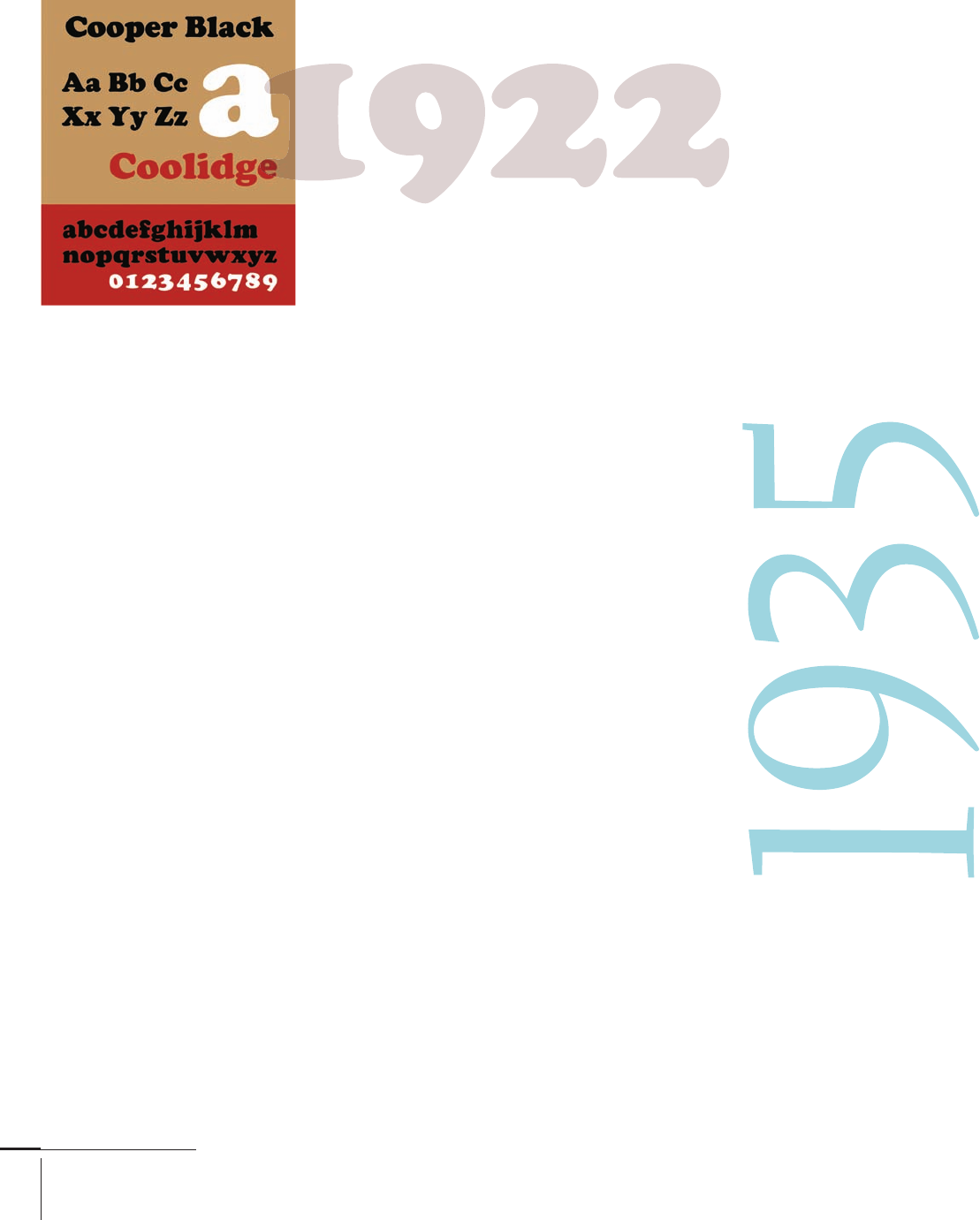
Primarily a lettering artist and graphic
designer, American Oswald Bruce Cooper
() (–) is also responsible for
designing a number of advertising display
typefaces (). He patterned all his type
designs after his hand lettering. A student
of Goudy (), Cooper shunned the lime-
light, becoming famous in his time
almost in spite of himself. As his fame in
graphic arts, copy writing, and advertis-
ing spread, Barnhart Brothers & Spindler
foundry approached him to produce type
designs. Creating more than a dozen fam-
ilies of type, Cooper persisted in thinking
of himself as a “just” a lettering artist.
His best-known typeface, Cooper Black,
has been called a design for farsighted
printers and nearsighted readers. Recently
there has been a revival of several of his
designs, the more important of which are Oz
Handicraft from Bitstream (), as well as
Ozwald and Highlander from International
Typeface Corporation ().
Another U.S. graphic, typographic, and
book designer, William Addison Dwiggins
() (–) came about during this
period. Dwiggins’s self-imposed challenge
in all his type designs was to create beautiful
and utilitarian typefaces for machine
composition. In fact, this challenge became
the catalyst for Dwiggins to begin his career
in type design. He once wrote an article in
the trade press complaining about a lack of
acceptable Gothic typefaces available for
Linotype () composition. Upon seeing
the article, Chauncey Griffi th, the director
of typography at Mergenthaler Linotype,
wrote Dwiggins a letter that said, in essence,
“If you think you’re so good, let’s see you
draw a Gothic.” Dwiggins accepted the
challenge, which began a twenty-seven-
year association between Mergenthaler
Linotype and the designer. For Mergenthaler
Linotype, Dwiggins designed Caledonia,
Eldorado, Electra, Falcon, and Metro.
Elektra
008-029 03171.indd 14 9/21/11 5:02 PM

Job:03171 Title:Typography Referenced (Rockport)
Page: 15
008-029 03171.indd 15 9/21/11 5:02 PM
Text
Job:03171 Title:Typography Referenced (Rockport)
Page: 15
Nineteenth-century Birthdays
Tolbert Lanston (–)
American inventor of the Monotype
hot-metal composition system
Ottmar Mergenthaler (–)
German inventor of the Linotype machine
Frederic Goudy (–)
American typeface designer
Morris Fuller Benton (–)
American typeface designer who headed
American Type Founders’ (A) type
development program for thirty-fi ve years
Emil Rudolf Weiss (–)
German type designer
Rudolf Koch (–)
German type designer most famous for his
sans serif design Kabel
Paul Renner (–)
German type designer who created Futura,
the fi rst modern, geometric sans serif face
Oswald Bruce Cooper (–)
American lettering artist and graphic
designer
William Addison Dwiggins (–)
American graphic, typographic,
and book designer
Eric Gill (–)
English sculptor, stonecutter, artist, and
type designer who created Gill Sans
Victor Hammer (–)
Australian designer who created
American Uncial
Lucian Bernhard (–)
German type designer who came to the
United States in to work with
Stanley Morison (–)
English typographical advisor to the
Monotype Corporation for more than
twenty-fi ve years
Jan van Krimpen (–)
Dutch type designer and book typographer
Georg Trump (–)
German teacher of graphic design and type
designer primarily associated with the
Weber foundry
Charles Peignot (–)
French director of Deberny & Peignot for
fi fty years
Robert Hunter Middleton (–),
American type director for Ludlow Company
type foundry for fi fty years
William A.
Dwiggins,
008-029 03171.indd 15 9/21/11 5:02 PM
Job:03171 Title:Typography Referenced (Rockport)
Page: 16
008-029 03171.indd 16 9/21/11 5:02 PM
16
Typography, Referenced
Text
Job:03171 Title:Typography Referenced (Rockport)
Page: 16
Eric Gill
Eric Gill (–) was an English sculp-
tor, stonecutter, artist, and type designer.
His most important work—and his only
sans—is Gill Sans (). His other designs
include Joanna, Perpetua, and Pilgrim.
A true iconoclast, Gill was well known
for his radical political beliefs and sexual
adventures. Through his friendship with
Stanley Morison () and Beatrice Warde,
often called the First Lady of Typography,
Gill fi rst began to design type. Morison
felt Gill’s background would give the
stonecutter an understanding of the con-
struction and purpose of serifs, and so he
commissioned Gill’s fi rst face, Perpetua.
Gill also designed Gill Sans at the request
of Morison. The goal for Gill Sans was to
provide Monotype () an alternative
design to the many geometric () sans
serif faces being released in Europe at the
time. While not a geometric design like
its competition, Gill’s sans became the
most popular serifl ess type in the United
Kingdom.
Late Nineteenth and
Early Twentieth Centuries
In , American Type Founders was founded as a consortium of twenty-three
individual type foundries. The late s saw an intense demand for type, but the type
business was in turmoil, with too many competing type foundries each designing, man-
ufacturing, marketing, and distributing their own fonts. Out of this atmosphere grew
, founded as a venture to improve business margins and restore stability to the type
industry. Not only did the consortium meet its commercial goals, but the design com-
munity benefi ted from the monumental outpouring of exceptional type designs it
produced. In its most prolifi c years between and , built the foundation of
U.S. type design.
Also during this time period, Lanston Monotype Machine Company was founded
in Washington, D.C. It released its fi rst typeface, Modern Condensed, in . Ottmar
Mergenthaler designed the Blower Linotype, fi rst installed at the New York Herald
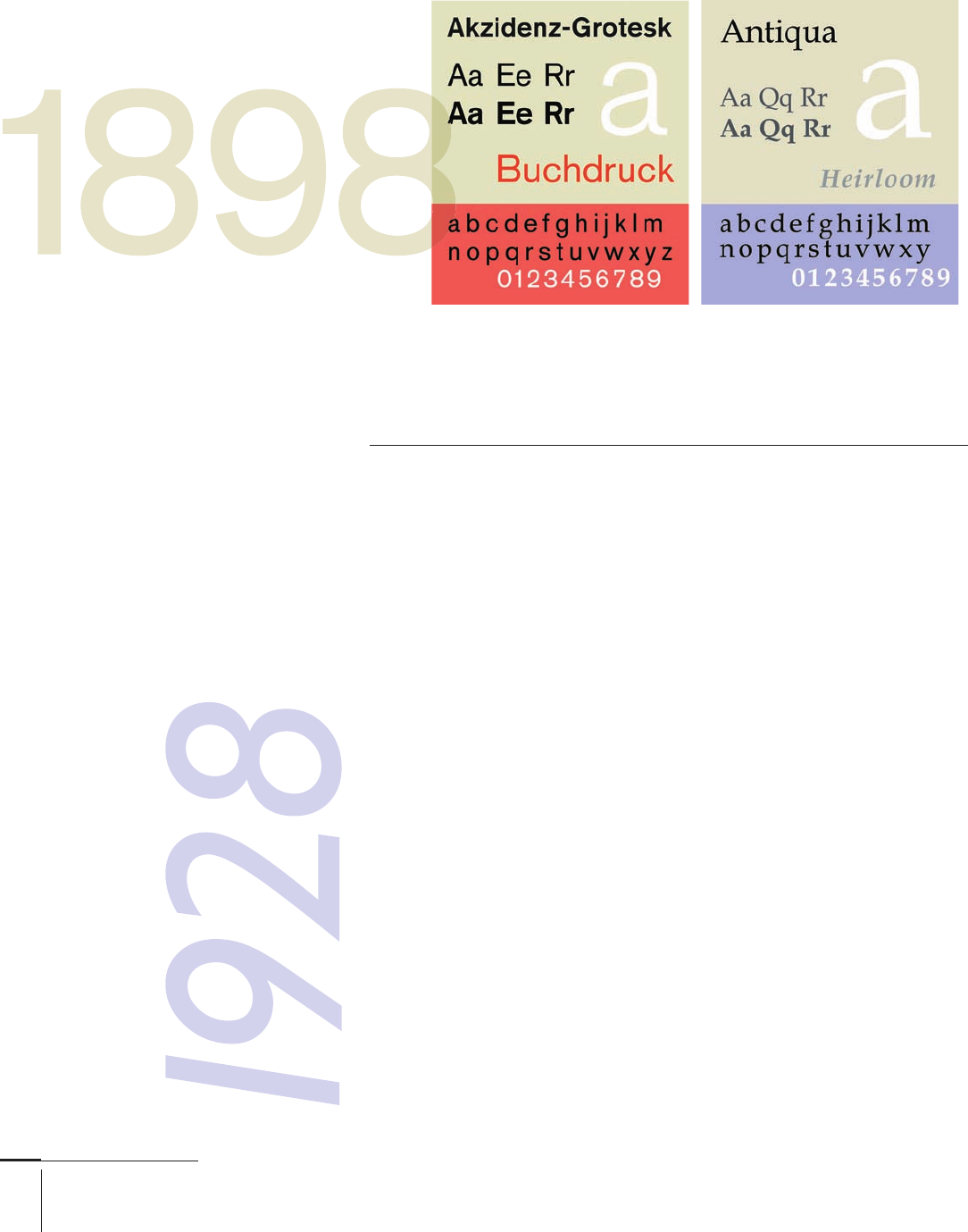
Tribune. And in , H. Berthold AG () released Akzidenz Grotesk (), the great-
grandparent of Helvetica (). It did yeoman’s duty as what was then called a “jobbing
face” until the late s (), when the geometric () sans serif designs took over.
Revival of Akzidenz Grotesk came at the hands of Max Miedinger () in .
Several type infl uencers—some designers, some not—came onto the scene
during this time as well:
Gill Sans Italic
008-029 03171.indd 16 9/21/11 5:02 PM

Job:03171 Title:Typography Referenced (Rockport)
Page: 17
008-029 03171.indd 17 9/21/11 5:02 PM
17
Type History and Timeline
Text
Job:03171 Title:Typography Referenced (Rockport)
Page: 17
Stanley Morison
Though not a type designer, lettering
artist, or calligrapher, Stanley Morison
(–) was one of the most infl uen-
tial fi gures in modern British typography.
As typographical advisor to the Monotype
Corporation () for several decades, he
was responsible for the release of such
classic designs as Rockwell (), Gill Sans
(), Perpetua, Albertus, and perhaps his
most successful face, Times New Roman
(). In addition to new type styles,
Morison also sponsored a series of type-
face revivals—Bembo (), Baskerville
(), Ehrhardt, Fournier, and Walbaum—
unequaled in Britain or Europe.
Although rarely referenced in books on
typographic history, another of Morison’s
contributions was his avid support of
Beatrice Warde. Morison was Warde’s
friend, lover, and, perhaps most impor-
tantly, mentor. He provided her the
opportunity and guidance to excel as a
typographic historian, publicist, and pas-
sionate advocate for the printing arts.
Victor Hammer
Type designer Victor Hammer (–)
created American Uncial, his most famous
design, in . Born in Australia, Hammer
acquired a reputation for craftsmanship
as a designer, punchcutter, and printer in
Italy. He immigrated to the United States
where he became a fi ne arts professor at
Wells College in Aurora, New York. This is
where he cut the punches for Uncial.
Jan van Krimpen
Jan van Krimpen (–) was a good
type designer and one of the greatest book
typographers of the twentieth century ().
His fi rst and most successful type
design was Lutetia, which he drew for
the prestigious Netherlands printing
house of Enschedé en Zonen. Other faces
by Van Krimpen include Cancelleresca
Bastarda, Romanée, Romulus, Spectrum,
and Van Dijck.
Georg Trump
Georg Trump (–) was a teacher
of graphic design and type designer pri-
marily associated with Germany’s Weber
foundry. He released his most important
design, Trump Mediaeval, in . He also
drew the typefaces City, Delphin, Schadow
Antiqua, and Codex ().
Charles Peignot
Director of Deberny & Peignot for nearly
fi fty years, Charles Peignot (–)
stayed closely involved in the creation
of all new faces emanating from his
foundry. He commissioned the poster
artist A. M. Cassandre to create the type-
face that bears his name, Peignot. He also
led the cause for typeface copyright pro-
tection and helped found the Association
Typographique Internationale ().
Robert Hunter Middleton
Type director for Ludlow Company type
foundry for almost fi fty years, Robert
Hunter Middleton (–) devoted
almost his entire professional life to
that company. By the time he retired,
Middleton had created almost type-
faces, among them Radiant, Stellar,
Karnak, and Record Gothic.
Beatrice Warde
Although she never drew a typeface,
Beatrice Warde (–) was vital
to modern typographic history. As
Monotype’s () director of publicity,
she was the passion behind Monotype’s
typographical eff orts during its most
important years from into the s
(). She’s often dubbed the First Lady of
Typography: In addition to creating mar-
keting programs, she was an educator,
historian, typographer, and the moving
force behind Eric Gill’s () designs of Gill
Sans () and Perpetua.
Jan Tschichold
In the early part of this century, Jan
Tschichold (–) revolutionized
typography by almost single-handedly
making asymmetric () typographic
arrangement the style of choice for young
designers. For many years, Tschichold
created posters, book covers, adver-
tisements, and even letterheads that
showcased quintessential examples of
asymmetric design. His work not only
created a new typographic genre, but it
also served as the benchmark for those
who followed in his footsteps.
In addition to being a teacher, typogra-
pher, book designer, and rebel, Tschichold
also designed typeface. Sabon (), a
typographic tour de force, is the face that
established Tschichold’s reputation as a
type designer.
008-029 03171.indd 17 9/21/11 5:02 PM
..................Content has been hidden....................
You can't read the all page of ebook, please click here login for view all page.