

Job:03171 Title:Typography Referenced (Rockport)
Page: 18
008-029 03171.indd 18 9/23/11 11:35 AM
Text
Job:03171 Title:Typography Referenced (Rockport)
Page: 18
Twentieth Century
In the beginning part of the century:
•
Benton created Century Expanded () based
on Century, the typeface cut by his father, Linn
Boyd Benton, in collaboration with Theodore
Low DeVinne for Century Magazine. The objec-
tive for Century was a darker, more readable
typeface than the type being used and one
that could accommodate the magazine’s two-
column format. Century Expanded is a wider
version of the magazine typeface.
•
released Franklin Gothic (). Named
after Benjamin Franklin and originally issued
in just one weight, the Franklin Gothic family
eventually expanded to include several designs.
•
Benton added Century Oldstyle to the Century
family (), considered an exceptionally suc-
cessful melding of Century typeface and Old
Style design traits. Although almost ninety
years old, it is still one of the most frequently
used serif designs for advertising typography.
•
The year brought the release of Century
Schoolbook, a design the result of Benton’s
research into vision and reading comprehension.
It was conceived and widely used for setting
children’s schoolbooks. The face also served
as the foundation for the many legibility types
that followed.
•
Goudy released Goudy Oldstyle (), his most
consistently popular typeface, but a design with
which he was not completely satisfi ed.
•
released its fi rst modern revival of
Garamond ().
18
Typography, Referenced
Early Twentieth-
Century Birthdays
Beatrice Warde (–)
American, known as the
First Lady of Typography
Jan Tschichold (–)
German teacher, typographer,
book designer, and typeface
designer
Warren Chappell (–)
American type designer and
typographic scholar
Roger Excoff on (–)
French graphic and
type designer
Max Miedinger (–)
Swiss designer
Freeman (Jerry) Craw (–)
American graphic and
type designer
Tony Stan (–)
American who designed,
among others, Berkeley
Old Style, Garamond,
Century, and Cheltenham
Herb Lubalin (–)
American designer whose
creative graphic design and
typographic handling broke
new ground
Hermann Zapf (–)
German typeface designer
Aldo Novarese (–)
Italian type designer
Aaron Burns (–)
American, cofounder of
International Typeface
Corporation
Ed Benguiat (–)
American designer who
has drawn more than
typefaces
Adrian Frutiger (–)
Swiss graphic designer and
typographer
008-029 03171 C2.indd 18 10/12/11 9:03 AM
Job:03171 Title:Typography Referenced (Rockport)
Page: 19
008-029 03171.indd 19 9/21/11 5:02 PM
19
Type History and Timeline
Text
Job:03171 Title:Typography Referenced (Rockport)
Page: 19
Warren Chappell
American type designer and typographic
scholar Warren Chappell (–)
studied under Rudolf Koch () in
Germany and created typefaces for both
American and European foundries. His
works include Trajanus, Lydian, and
Lydian Cursive.
Roger Excoff on
French graphic and type designer
Roger Excoff on (–) created,
among other faces, Mistral in and
Antique Olive in the s (). The
latter was always popular in its country
of origin, but did not enjoy success
outside of France until Compugraphic
Corporation released and heavily pro-
moted the face in the late s ().
Tony Stan
A prolifi c New York letter and type
designer affi liated with Photo-Lettering,
Inc. and International Typeface
Corporation (), Tony Stan (–)
created or adapted a number of typefaces.
His designs include, among others,
Berkeley Old Style, Garamond,
Century, and Cheltenham.
Freeman (Jerry) Craw
American graphic and type designer
Freeman (Jerry) Craw (–) created both
metal and phototype faces, among them
Craw Clarendon, Craw Modern, and Ad Lib.
For several years, he was vice president
and art director of Tri-Arts Press during
which he was responsible for some of the
United States’ most eloquent printed
material.
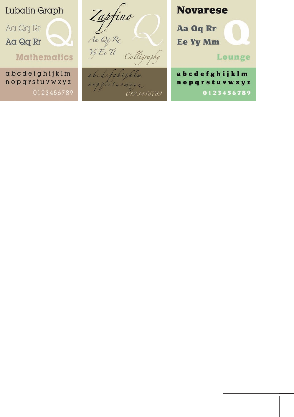
Herb Lubalin
In the s () and s (), the
creative graphic design and typographic
handling of American designer Herb
Lubalin (–) broke new ground.
At the same time, it set the standard
for graphic communication that much
of the graphic design community
emulated. He designed logotypes, posters,
magazines, advertising, packaging,
books, stationery, and collateral
promotional materials. In addition,
Lubalin cofounded and created more
than alphabets. He was responsible
for such typefaces as Lubalin Graph
and Ronda, and codesigned
Avant Garde Gothic with Tom Carnese.
Hermann Zapf
One of the twentieth century’s () most
important and prolifi c typeface designers,
Hermann Zapf (–) has created
such universally acclaimed typefaces
as Optima, Palatino, Melior, Zapf
Chancery, Zapfi no, and Zapf Dingbats.
He began his career with the D. Stempel
AG foundry in West Germany after World
War II. After leaving Stempel in , Zapf
created typefaces for foundries such as
H. Berthold AG (), Linotype (), and
, in addition to many exclusive designs
for private and corporate use. Zapf is also
probably the world’s most famous and
successful calligrapher.
Aldo Novarese
Italian type designer Aldo Novarese (–
) created a variety of text and display
designs. Early in his career, he was asso-
ciated with Turin’s Nebiolo type foundry
and created faces primarily in conjunc-
tion with Alessandro Butti, among them
Augustea and Microgramma (which later
became Eurostile when he added lower-
case []). Later in his career, Novarese
developed several faces that became
designs, including Novarese (his most
successful), Symbol, and Mixage.
Aaron Burns
Although Aaron Burns (–) was
not a type designer, his contribution to
the typographic world is as signifi cant
as many of the most important and well-
known typeface creators. Burns founded
International Typeface Corporation (),
which released more than original and
revival typeface designs and gave many
type designers a fi rst opportunity to create
a commercial typeface design.
008-029 03171.indd 19 9/21/11 5:02 PM

Job:03171 Title:Typography Referenced (Rockport)
Page: 20
008-029 03171.indd 20 9/21/11 5:02 PM
20
Typography, Referenced
Text
Job:03171 Title:Typography Referenced (Rockport)
Page: 20
1920s
•
In , Klingspor type foundry released the geometric (62)
sans Kabel (177), named for the Transatlantic Cable and
designed by Rudolf Koch (93).
•
Monotype (125) released Gill Sans (175) in .
Commissioned by Stanley Morison (97) for Monotype,
this Eric Gill (89) design aimed to recover sales being
lost to the new German geometric (62) sans. Gill Sans
is not, however, a true geometric face; most of its
character designs and proportions derive from classical
serif designs.
•
A year later saw the release of Futura (174). Drawn by
Paul Renner (98), this was the fi rst modern geometric (62)
sans infl uenced by the Herbert Bayer’s Universal typeface
and the Bauhaus design philosophy. Futura became the
benchmark design for modern sans, forcing virtually every
type foundry to create its own version.
•
In , Monotype (125) release Bembo (155), the
twentieth-century (18) version of a typeface designed by
Francesco Griff o (76) for Aldus Manutius (78). Monotype
released the design as part of Stanley Morison’s (97)
typeface revival program.
•
That same year, D. Stempel AG foundry put out
Memphis (188), the fi rst twentieth-century slab serif (59)
design. The similarities between this and Futura (174)
are obvious. Almost every type supplier now has its
slab serif version of Memphis, plus many completely
original designs, as a result of this font’s success.
Ed Benguiat
Ed Benguiat (–) has drawn more than typefaces,
possibly more than any other type designer. He has
designed faces for , Photo-Lettering, Inc., and a variety
of corporate clients. He has revived old metal faces such
as Souvenir, Bookman, and Sara Bernhardt, and
has drawn new and original designs such as Charisma,
Panache, and Spectra.
Adrian Frutiger
Contemporary Swiss graphic designer and typographer
Adrian Frutiger (–) is one of the most important type
designers of the post–World War period. He began his
work as an apprentice to a printer and studied woodcut-
ting and calligraphy before launching his type design
career. Deberny & Peignot asked him to adapt Futura (174),
but he found it too geometric. Instead, he chose to create
a large type family with matching weights; thus, Univers
(181) was born. He also created a number of other popular
typefaces: Egyptienne, Serifa (191), OCR-B, and the face
used at the Charles De Gaulle Airport in France, now
known as Frutiger (173).
008-029 03171 C2.indd 20 10/12/11 9:06 AM
Job:03171 Title:Typography Referenced (Rockport)
Page: 21
008-029 03171.indd 21 9/23/11 11:35 AM
Text
Job:03171 Title:Typography Referenced (Rockport)
Page: 21
1930s
The fi rst year of this decade saw the release of Metro, the
only sans serif type William Addison Dwiggins (87)
designed. Although originally intended for newspaper
headline copy, this face became popular for a variety of
advertising display applications. A face with more human-
ity than Helvetica (176) or Univers (181), less obvious
overtones than Gill Sans (175), and just a hint of art deco
(66) panache, Metro is unlike most other sans.
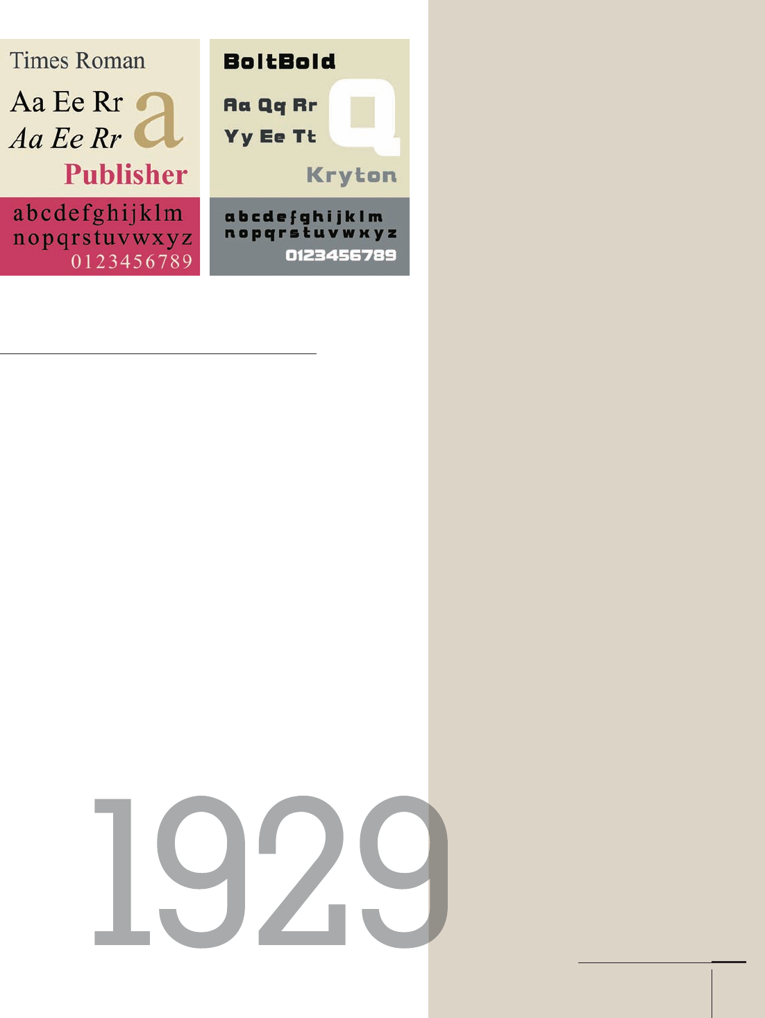
Two years later, Times Roman (165) arrived, commis-
sioned by the Times (London) newspaper. Stanley Morison
(97) supervised the design and provided the original Plantin
specimens used to draw the face. He also appointed the
designer, Victor Lardent, an artist on the Times staff .
During the second half of the s, was
released. It was a realist sans serif typeface widely used for
traffi c, administration, and business applications, estab-
lished by the German standards body Deutsches Institut
für Normung as a standard typeface for German signage.
Ludlow Company foundry released its stressed sans
Radiant in . It was intended to express the modern
spirit of the s while breaking away from previous sans
serifs’ geometric proportions and monotone weight. And
Mergenthaler Linotype released Caledonia.
Birthdays of the 1930s
Friedrich Poppl (–)
German type designer who worked
primarily for the H. Berthold
AG foundry
Leslie Usherwood (–)
Canadian who founded Typsettra,
Ltd. in Toronto and created Caxton,
Usherwood, and Flange
Matthew Carter (–)
American who cofounded Bitstream
Tom Carnese, (–)
American best known for his col-
laborations with Herb Lubalin at
who created or helped create a
number of popular fonts, including
Avant Garde Gothic, Bolt
Bold, and Pioneer
Memphis
21
Type History and Timeline
008-029 03171.indd 21 9/23/11 11:35 AM

Job:03171 Title:Typography Referenced (Rockport)
Page: 22
008-029 03171.indd 22 9/23/11 12:18 PM
Text
Job:03171 Title:Typography Referenced (Rockport)
Page: 22
Birthdays of the 1940s
Gerard Unger (–)
Dutch type designer who has drawn
several faces for the Enschedé type
foundry in The Netherlands and Dr-Inf
Rudolf Hell in Germany
Colin Brignall (–)
British type designer and director of
type development at Letraset who
designed Corinthian, Edwardian,
Italia, Revue, Romic, and Retro
Sumner Stone (–)
American type designer and former
director of typographic development
for Adobe Systems
David Quay (–)
British type designer who drew
Quay Sans, and more recently Coptek,
La Bamba, and Lambada for Letraset
Erik Spiekermann (–)
German type and graphic designer
who designed faces such as
Offi cina, FF Meta, FF Info, Lo Type,
and Berliner Grotesk
1950s
In the s, under the direction of Edouard Hoff mann, the Haas foundry
asked Max Miedinger (96) of Zurich, Switzerland, to update Haas Grotesk,
a version of Berthold’s Akzidenz Grotesk (170). His creation, New Haas
Grotesque—rechristened Helvetica (176) in honor of its country of origin—
was released in . The typeface has supplanted Futura (174) as the
world’s most widely used typeface. Miedinger released only three variants;
several designers have added other styles and weights. Also in the early
part of the s, Mergenthaler Linotype released Palatino.
By the middle of the decade, the fi rst phototypesetting machine was
placed in a commercial business, Trump Mediaeval was released, and the
Courier Monospaced typeface debuted. Howard “Bud” Kettler designed the
monospaced (fi xed-width or nonproportional) slab serif (59) typeface to
resemble the output from a strike-on typewriter.
In , Optima—Hermann Zapf’s (107) favorite typeface—was released.
(He used it to set his own wedding invitation.) While not the fi rst, Optima
has become the benchmark for all stressed, or calligraphic (64), sans serif
typefaces. Optima italic also was one of the fi rst typefaces created using
the aid of mechanical distortion system. The roman was photographically
obliqued as a starting point for the design by the New York typography
studio of Photo-Lettering, Inc.
1940s
In , IBM announced its Electromatic Model electric typewriter,
featuring proportional spacing. Seven years later, Mergenthaler Linotype
released Trade Gothic (180), and then René Higonnet and Louis Moyroud
invented the Lithomat in France.
The Lithomat was the fi rst successful phototypesetting machine. Later
models called Lumitype could print more than , characters per hour.
22
Typography, Referenced
008-029 03171.indd 22 9/23/11 12:18 PM
..................Content has been hidden....................
You can't read the all page of ebook, please click here login for view all page.