Size Classes and the iPhone 6
So it’s great that the split view gives us one behavior for the iPad and another for the iPhone.
Except, well, that the iPhone 6-series devices are really big. Maybe not iPad big, but it at least makes you wonder whether it’s really appropriate to lump all iPhones together. After all, iOS 9 runs on everything from the 4s (with its 320×480, 3.5-inch screen) to the iPhone 6s Plus (414×736, 5.5-inch screen). Even within the iPhone range, there may be times we want to go to a side-by-side mode with our split view.
To do so, we need to understand how iOS represents screen sizes and their contents.
Size Classes
In iOS, screens, view controllers, and views all have a collection of sizing information called a trait collection. These traits are collected by the UITraitCollection class, and include things like the points-to-pixels scaling factor (2.0 for Retina devices, 3.0 for the iPhone 6s Plus, 1.0 for the old iPad 2), the device idiom (phone or pad), whether it supports 3D touch, and a very general way to represent the available space in each dimension.
The available space is represented as a size class, and has two values: compact and regular. Those should sound familiar, because they’re the values of the sizing bar at the bottom of the storyboard pane, which we saw way back in Managing an Object’s Properties. Let’s think back to the grid that appeared in the pop-up, and the descriptions it provided: regular width and height were described as an iPad, whereas compact width and regular height represented an iPhone in portrait orientation.
Traits are inherited from the screen, to the one window that’s always on the screen, through view controllers, and views, down to each individual view, like a button or table. Along the way, they can be changed. So an iPad screen will have regular width size class in either orientation, but the left side of a split view will have compact width, since the layout of the split view constrains how much space it can use.
The split view’s decision about whether to use a side-by-side or a two-screen layout is based on the width size class it inherits. If it thinks it’s in a compact space, it will use the navigation-style two-screen approach; if it inherits regular width, it will use a side-by-side presentation.
The size classes are also used to support the new multitasking features in iOS 9. To try it out, run the app in the Simulator for an iPad Air, Air 2, or Pro, the devices that support iOS multitasking. Use the home button (⇧⌘H) to go back to the home screen. Launch another app in the Simulator, like Safari, and rotate to landscape. Drag a little bit from the right side of the screen to enter multitasking mode. From here, you’ll see a list of apps and their icons. Choose PragmaticTweets to open it in the right side of the multitasking interface, running side-by-side with Safari, as seen in the figure.

Notice that as long as our side of the split uses only part of the screen, it is considered to be in a horizontally compact size class, and so we get the iPhone-style behavior of navigating from the list of tweets to their details. Only by dragging out to consume the rest of the screen (and thus becoming the sole foreground app) can we achieve our regular-width, two-pane split view.
Now let’s use size classes for our own purposes. When an iPhone 6-series device is in landscape, there’s surely enough room to do the two-pane split view, rather than just have table rows stretch across the screen. So let’s do that. The trick to do this is simple: we have to convince the split view that it has regular width to work with, not compact. Let’s do that.
Container Controllers
We can’t just tell the split view controller that it has regular width: it has to inherit this from a parent view or view controller. We can do that by creating a container controller, a view controller that contains other view controllers. This parent will own the split view controller and will be in a position to give it a trait collection that says it has regular width, if we decide we want to go side by side.
To get started, go to the storyboard, look through the Object library (⌃⌥⌘3), and find the plain View Controller icon, a yellow ball with a dashed box inside it. Drag this icon to the left of the split view controller.
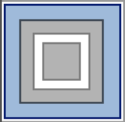
The way we get this view controller to “own” the split view controller is pretty weird. We need to use a container view, instead of the usual UIView that comes with a view controller. So, in the scene list, find the view that’s a child of this new view controller and delete it. This will also delete the top and bottom layout guide objects from the scene. Now, in the Object library, find the Container View icon, shown in the figure as a gray box inside a white box inside a gray box. Drag it onto the new view controller icon or its box in the storyboard; it will become the sole child of the view controller.
This also adds a new view controller scene to the storyboard, connected by a segue. What’s interesting is that this isn’t a segue that transitions between scenes; it’s an embed segue that tells the container scene which view controller to show first. So it’s great that Xcode gave us a default view controller to embed, except we don’t want that one; we want to embed the split view controller.
So, Control-click on the container view to show its connections HUD. The first one will show that viewDidLoad has an embed segue connected to that blank view controller. Drag from the circle in this connection to the split view controller. This will allow us to make a segue connection. At the end of the drag, choose Embed as the segue type. We should always name our segues, so click the segue icon between the two scenes, bring up its Attributes Inspector (⌥⌘4), and give it the storyboard identifier embedSplitViewSegue.
Now the empty view controller that the container view supplied for us has no connections at all, so we can delete it.
Control-click on the container view to show its updated connections. For Triggered Segues, it will show viewDidLoad via an embed segue to the Split View Controller. This is the weird part: this segue isn’t performed as part of a navigation like in the last chapter; it happens when the view loads, at which point the container view controller will get its one and only look at the child view controller that it’s going to contain.
This scene is going to be the beginning of our app, so choose the view controller, go to the Attributes Inspector (⌥⌘4), and select the Is Initial View Controller box. This won’t visually change anything, since control will flow immediately to the split view controller child. But it will ensure that this view controller loads first, which we need. The beginning of the storyboard should now look like the figure.

Now we’re at the point where we need to write some code, to grab the reference to the split view controller and be able to change its trait collection. In the File Navigator, select the Pragmatic Tweets group and use New Group to create the group Size Class Override. Within this group, choose New File to create a new Cocoa Touch Class, with the name SizeClassOverrideViewController, a subclass of UIViewController written in Swift. Finally, in the storyboard, select the view controller with the container view, bring up its Identity Inspector (⌥⌘3), and change the class to SizeClassOverrideViewController. Now the container view controller will be our custom class.
What we need to do with this code is grab a reference to the split view controller, and send it our preferred size class traits. In SizeClassOverrideViewController.swift, start by creating a property to refer to the UISplitViewController.
| | var embeddedSplitVC: UISplitViewController! |
As implied by the name of the embed segue, our one look at the split view controller happens when the view loads. This will make a call to prepareForSegue—just like when we’re navigating between scenes—so we override that method to grab the reference to the destinationViewController.
| | override func prepareForSegue(segue: UIStoryboardSegue, sender: AnyObject?) { |
| | if segue.identifier == "embedSplitViewSegue" { |
| | embeddedSplitVC = segue.destinationViewController |
| | as! UISplitViewController |
| | } |
| | } |
Now we’re in a position to start changing the split view’s sense of how much room it has to work with!
Overriding Trait Collections
Now let’s think about what we want to tell the split view controller, and when. It will use a side-by-side view when it thinks its width size class is regular and not compact. We could probably swing the side-by-side view on an iPhone 6s, but not a 4s. Let’s look at our sizes.
| Model | Dimensions (points) | Scale factor |
|---|---|---|
| iPhone 4s | 320×480 | 2.0 |
| iPhone 5/5s | 320×568 | 2.0 |
| iPhone 6/6s | 375×667 | 2.0 |
| iPhone 6 Plus/6s Plus | 414×736 | 3.0 |
| iPad 2 | 768×1024 | 1.0 |
| iPad Retina/iPad Air | 768×1024 | 2.0 |
| iPad Pro | 1024×1366 | 2.0 |
So, assuming that we don’t want to try to go side by side on the 4s, and we definitely want to do so on the big iPhone 6 models, let’s pick a value in the middle. We’ll just say that any width bigger than 480 is enough for us to try side by side.
When the device is rotated, view controllers get a callback to the method viewWillTransitionToSize. That’s the perfect place to pull our trickery. We’ll override that method, check the size we’re transitioning to, and if it’s wide enough for us, we’ll override the split view controller’s trait collection. Here’s how we do that.
| 1: | override func viewWillTransitionToSize(size: CGSize, |
| - | withTransitionCoordinator coordinator: |
| - | UIViewControllerTransitionCoordinator) { |
| - | if size.width > 480.0 { |
| 5: | let overrideTraits = UITraitCollection ( |
| - | horizontalSizeClass: .Regular) |
| - | setOverrideTraitCollection(overrideTraits, |
| - | forChildViewController: embeddedSplitVC!) |
| - | } else { |
| 10: | setOverrideTraitCollection(nil, |
| - | forChildViewController: embeddedSplitVC!) |
| - | } |
| - | } |
We look at the incoming width on line 4. If it’s greater than 480.0, lines 5--6 create a new UITraitCollection. The initializers for this class take either one of the four traits—horizontalSizeClass, verticalSizeClass, userInterfaceIdiom, or scaleFactor—or an array of already initialized trait collections to merge together. All we care about is setting the horizontalSizeClass to the enum value UIUserInterfaceSizeClass.Regular.
Then all we have to do is pass this to our embeddedSplitVC. A parent view controller can override a child’s trait collection with setOverrideTraitCollection, which is what we do on lines 7--8. This is only possible from a parent view controller—other VCs can’t go changing each other’s trait collections willy-nilly—which is why we had to go through the whole rigmarole of setting up our custom container controller.
Finally, if our width isn’t big enough for the split view controller to go into side-by-side mode, we use setOverrideTraitCollection with nil, on lines 10--11, which lets it inherit its traits as before.
With our sneaky override of the size class now complete, run the app again on different models in the Simulator (keeping in mind you’ll have to sign into Twitter on each one if you haven’t already, as they store their system settings separately from each other). On a sufficiently large device, the split view controller will now go into side-by-side mode when rotated to landscape, as seen in the following figure.
