Building Our User Interface
That white box in the Simulator is our app. It’s not much, but then again, we haven’t done anything yet, so let’s start building it. Press Stop in Xcode to stop the simulated app, and then take a look at the project in Xcode.

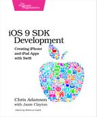
If the File Navigator isn’t already showing on the left side of the project window, bring it up with ⌘1. The File Navigator uses a tree-style hierarchy with a blue Xcode document at the top, representing the project itself as the root. Under this are files and folders. The folder icons are groups that collect related files, such as the views and logic classes for one part of the app; groups don’t usually represent actual directories on the filesystem. We can expand all the groups to see the contents of the project, like this:
Different project templates will set us up with different files. For the view-based app, we get two source code files in the PragmaticTweets group, along with a Main.storyboard, a LaunchScreen.storyboard, and an Assets.xcassets. These are the files we’ll be editing. There are also a few helper files like Info.plist, but we won’t need to edit them directly. The PragmaticTweetsTests and group is where we will write unit tests to validate our code, something we’ll do in Chapter 6, Testing the App. Ditto for PragmaticTweetsUITests, which can test the purely UI parts of our app. Finally, the Products group shows the files our build will create: in this case, PragmaticTweets.app for the app, plus PragmaticTweetsTests.xctest and PragmaticTweetsUITests.xctest for the runnable unit tests. Files shown in red indicate they haven’t been built yet; PragmaticTweets.app is red in the figure because, although we’ve run it in the Simulator, we haven’t built it for the actual device yet.
We said at the outset that iOS development starts with the user interface. By focusing on what the user sees and how they interact with it, we keep our focus on the user experience and not on the data models and logic behind the scenes. We typically build our user interfaces visually and store them in storyboards. The project has one such file, Main.storyboard, so let’s click it.
Storyboards
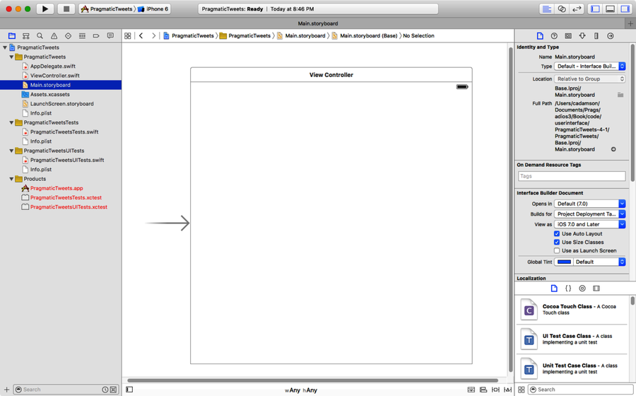
When we click on Main.storyboard, the Editor area switches to a graphical view called Interface Builder, or IB for short. In iOS, IB works with user interface documents called storyboards. Just like in movie-making, where a storyboard is a process used to plan out a sequence of shots in a movie or TV show, the storyboard of an iOS app shows the progression through the different views the app will present. The initial storyboard looks like the following figure.
Our app uses a single view, so we follow the right-pointing arrow (which indicates where the app starts) into a square that represents the visible area of the screen. This is our app’s one view; if we were building a navigation-style app, there would be one view rectangle for each screen of the navigation. Click the view to show a header box with three icons. These are proxy objects that represent objects that will work with the view at runtime: a view controller that contains logic to respond to events and update the view; a first responder that represents the ability to handle events; and an exit segue, used for when we back out of views in navigation apps (something we’ll visit in a later chapter).

At the bottom left of the Editor area, IB shows a little view disclosure button. Click this to show and hide the scene list (shown here), which shows each “scene” of the storyboard and its contents as a tree structure. Currently, our one scene has the proxy objects discussed earlier, and inside the view controller, we find two layout objects and a “view.” This view is the big square in the UI; as we add UI elements like buttons and labels, the scene’s tree list will show them as children of this view.

But wait a minute!, you might say, iPhones aren’t square, and neither are iPads! Quite right. What we’re seeing in our startup view is Apple pushing developers to “think different” about device sizes. At the bottom of the IB pane, a label indicates our current layout as “w: Any h: Any.” This is actually a button that allows us to try our user interface layouts in different sizes and orientations. Click the label to show the sizing popover, which looks like the one in the figure.
As we mouse over the grid of boxes in this popover, we can switch the height and width previews between Compact, Any, and Regular, and the popover titles will give us a hint of the class of sizes we’re previewing, like “iPhone in landscape orientation.” Click on the box to change the preview to see the main view change to this size and shape. Once we start laying out some contents for the view, this is how we will preview how they’ll be laid out on different device sizes, and when we rotate from portrait to landscape, or vice versa. However, when we’re not previewing and actually building the UI, this should be set to Any:Any.
Adding Buttons
So let’s start adding some UI elements to our view. We’ll begin by adding a button to send a tweet telling the world that our first app is running. To add components to our storyboard, use the toolbar to show the Utility area on the right (if it’s not already showing), and find the Library pane at the bottom right. There’s a mini-toolbar here that should default to showing user interface objects; if not, click the little icon of a square in a circle (or press ⌃⌥⌘3). The bottom of the pane has a button to toggle between list and icon views for the objects, and a search filter to find objects by name. Scroll down through this pane to find the icon that just says Button; we can tap once on any of the objects to get its name, class, and description to appear in a popover. Drag the button from the Object library into the iPhone-sized view in IB. This will create a plain button.

It leaves a lot to the imagination, huh? Without the edge and background decorations of earlier versions of iOS, it doesn’t necessarily look like a button at all. It could easily be mistaken for a text label.
The recent look of iOS, introduced back in iOS 7, has three stated themes: deference, clarity, and depth. The first of these, deference, means that the UI appearance focuses attention on our content rather than competing with a bunch of pseudo-realistic effects.
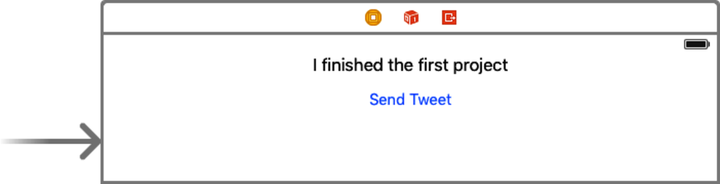
So maybe our problem is a lack of content. iOS expects us to tell the user what’s going on in our app, and we’re not holding up our end of the deal yet. Let’s fix that. First, we’ll say what the button does. Double-click on the button to change its name to Send Tweet. Now it says what it does, but it still doesn’t exactly feel button-y.
Maybe we can fix that by contrasting the blue text of the button with a plain label. Back in the Object library at the lower right, find the Label object, and drag one above the button. Change its text to “I finished the first project.” Drag both objects so that they’re centered in the view; a dashed blue line will appear when we’re centered, and the drag will snap to this position. The view should now look like the figure.
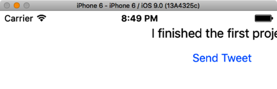
Go ahead and click the Run button to run this app again in the iOS Simulator. We should just see the label and the button, right? Sure, but there’s a problem.
When we run the app in the Simulator, we typically start in portrait orientation. And right now, that’s going to be a problem, because our label and button are not centered in portrait; in fact, they’re cut off on the right edge, as seen in the following figure. Rotate to landscape with Rotate Left and Rotate Right items in the Hardware menu (⌘← and ⌘→, respectively), and it looks a little better, but it’s still clearly not centered on tall models like the iPhone 5. What happened?
The problem is that we’ve been designing against a hypothetical square shape, and we never explicitly said these labels were supposed to be centered. What’s happened instead is that they’ve kept a constant distance from the top and left sides of their parent view. In a way, it makes sense: iOS doesn’t know what matters to us: a constant distance from the top or bottom, or being centered, or some other relationship entirely.
Stop the Simulator, go back to Xcode, and select the label. On the right side of the workspace, show the Size Inspector, by clicking the little ruler icon (or pressing ⌥⌘5). This inspector tells us about the size and location of elements in our UI. There’s a section called Constraints, which currently reads:
The selected views have no constraints. At build time explicit left, top, width, and height constraints will be generated for the view.