Customizing Table Appearance
While it’s great to have the Twitter data in our table cells, only having access to a single, one-line text label makes it impossible to show the various fields of the ParsedTweet; at this point, we don’t even know who sent which tweet! We need to change what these table cells look like, to provide more room to show our data.
Table Cell Styles
When we create the UITableViewCell in tableView(cellForRowAtIndexPath:), our initializer takes a style argument. As it turns out, this can allay our problems somewhat.
The available styles are collected in an enumeration. Four cell styles are defined in the UITableViewCellStyle enumeration, of which we’ve been using UITableViewCellStyle.Default. Fortunately for our fingers, we don’t have to write the whole type when we refer to an enumeration’s value; we can just write the value itself, like .Default.
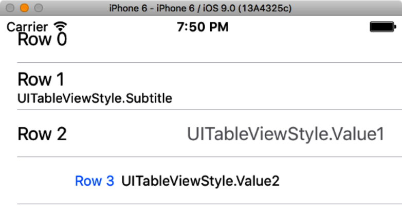
The UITableViewCell class itself defines certain subviews—textLabel, detailTextLabel, imageView, and accessoryView—and this style determines if and where those subviews are laid out. The figure shows a four-row table with the row number in the textLabel, and the name of the style in the detailTextLabel. Notice that for the .Default style in row 0, the detailTextLabel is not shown at all.
This figure doesn’t show the cell’s other possible subviews; if an imageView is set, it appears on the left side of the cell, and an accessoryView (usually a Show Details button) appears on the right. Clearly, if all of those subviews are present, the cell is going to get pretty crowded, and that’s something we’ll have to deal with soon.
For now, we’ll try out the two-line presentation of the UITableViewCellStyle.Subtitle, and along the way we’re going to fix a problem we’ve created for ourselves.

Grouped Tables
Another appearance option is to use grouped tables, which is just an attribute we can set on the table view in the storyboard. This sets the table’s style to UITableViewStyleGrouped, which in turn makes the table look like this figure.
The major differences with a grouped table are that header and footer views do not “stick” to the top or bottom of the screen when scrolling, and on iOS 6 and earlier, the cells have rounded edges that make them look more like buttons. The grouped table is what the Settings app uses, and users will be familiar with its appearance from that.