
Chapter 16
Running Descriptive Statistics in Access
IN THIS CHAPTER
- Determining rank, mode, and median
- Pulling a random sampling from your dataset
- Calculating percentile ranking
- Determining the quartile standing of a record
- Creating a frequency distribution
Descriptive statistics allow you to present large amounts of data in quantitative summaries that are simple to understand. When you sum data, count data, and average data, you're producing descriptive statistics. It's important to note that descriptive statistics are used only to profile a dataset and enable comparisons that can be used in other analyses. This is different from inferential statistics, in which you infer conclusions that extend beyond the scope of the data. To help solidify the difference between descriptive and inferential statistics, consider a customer survey. Descriptive statistics summarize the survey results for all customers and describe the data in understandable metrics, while inferential statistics infer conclusions such as customer loyalty based on the observed differences between groups of customers.
When it comes to inferential statistics, tools like Excel are better suited to handle these types of analyses than Access. Why? First, Excel comes with a plethora of built-in functions and tools that make it easy to perform inferential statistics—tools that Access simply does not have. Second, inferential statistics is usually performed on small subsets of data that can flexibly be analyzed and presented by Excel.
Running descriptive statistics, on the other hand, is quite practical in Access. In fact, running descriptive statistics in Access versus Excel is often the smartest option due to the structure and volume of the dataset.
Basic Descriptive Statistics
This section discusses some of the basic tasks you can perform using descriptive statistics.
Running descriptive statistics with aggregate queries
At this point in the book, you have run many Access queries, some of which have been aggregate queries. Little did you know that when you ran those aggregate queries, you were actually creating descriptive statistics. It's true. The simplest descriptive statistics can be generated using an aggregate query. To demonstrate this point, build the query shown in Figure 16.1.

Figure 16.1 Running this aggregate query will provide a useful set of descriptive statistics.
Similar to the descriptive statistics functionality found in Excel, the result of this query, shown in Figure 16.2, provides key statistical metrics for the entire dataset.

Figure 16.2 Key statistical metrics for the entire dataset.
You can easily add layers to your descriptive statistics. In Figure 16.3, you're adding the Branch_Number field to your query. This will give you key statistical metrics for each branch.

Figure 16.3 Add the Branch_Number field to your query to add another dimension to your analysis.
As you can see in Figure 16.4, you can now compare the descriptive statistics across branches to measure how they perform against each other.

Figure 16.4 You have a one-shot view of the descriptive statistics for each branch.
Determining rank, mode, and median
Ranking the records in your dataset, getting the mode of a dataset, and getting the median of a dataset are all tasks a data analyst will need to perform from time to time. Unfortunately, Access doesn't provide built-in functionality to perform these tasks easily. This means you'll have to come up with a way to carry out these descriptive statistics. In this section, you'll learn some of the techniques you can use to determine rank, mode, and median.
Ranking the records in your dataset
You'll undoubtedly encounter scenarios in which you'll have to rank the records in your dataset based on a specific metric such as revenue. Not only is a record's rank useful in presenting data, but it's also a key variable when calculating advanced descriptive statistics such as median, percentile, and quartile.
The easiest way to determine a record's ranking within a dataset is by using a correlated subquery. The query shown in Figure 16.5 demonstrates how a rank is created using a subquery.

Figure 16.5 This query ranks employees by revenue.
Take a moment to examine the subquery that generates the rank:
(SELECT Count(*)FROM RepSummary AS M1 WHERE [Rev]>[RepSummary].[Rev])+1This correlated subquery returns the total count of records from the M1 table (this is the RepSummary table with an alias of M1), where the Rev field in the M1 table is greater than the Rev field in the RepSummary table. The value returned by the subquery is then increased by one. Why increase the value by one? If you don't, the record with the highest value will return 0 because zero records are greater than the record with the highest value. The result would be that your ranking starts with zero instead of one. Adding one effectively ensures that your ranking starts with one.
Figure 16.6 shows the result.

Figure 16.6 You've created a Rank column for your dataset.
Getting the mode of a dataset
The mode of a dataset is the number that appears the most often in a set of numbers. For instance, the mode for {4, 5, 5, 6, 7, 5, 3, 4} is 5.
Unlike Excel, Access doesn't have a built-in Mode function, so you have to create your own method of determining the mode of a dataset. Although there are various ways to get the mode of a dataset, one of the easiest is to use a query to count the occurrences of a certain data item, and then filter for the highest count. To demonstrate this method, follow these steps:
- Build the query shown in Figure 16.7. The results, shown in Figure 16.8, don't seem very helpful, but if you turn this into a top values query, returning only the top record, you would effectively get the mode.
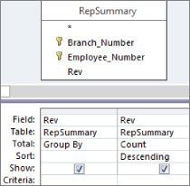
Figure 16.7 This query groups by the Rev field and then counts the occurrences of each number in the Rev field. The query is sorted in descending order by Rev.

Figure 16.8 Almost there. Turn this into a top values query and you'll have your mode.
- Select the Query Tools Design tab and click the Property Sheet command. The Property Sheet dialog box for the query appears.
- Change the Top Values property to 1, as shown in Figure 16.9. You get one record with the highest count.
Figure 16.9 Set the Top Values property to 1.
As you can see in Figure 16.10, you now have only one Rev figure—the one that occurs the most often. This is your mode.
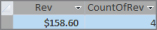
Figure 16.10 This is your mode.
Getting the median of a dataset
The median of a dataset is the number that is the middle number in the dataset. In other words, half the numbers have values that are greater than the median, and half have values that are less than the median. For instance, the median number in {3, 4, 5, 6, 7, 8, 9} is 6 because 6 is the middle number of the dataset.
Access doesn't have a built-in Median function, so you have to create your own method of determining the median of a dataset. An easy way to get the median is to build a query in two steps:
- Create a query that sorts and ranks your records. The query shown in Figure 16.11 sorts and ranks the records in the RepSummary table.

Figure 16.11 The first step in finding the median of a dataset is to assign a rank to each record.
- Identify the middlemost record in your dataset by counting the total number of records in the dataset and then dividing that number by two. This will give you a middle value. The idea is that because the records are now sorted and ranked, the record that has the same rank as the middle value will be the median. Figure 16.12 shows the subquery that will return a middle value for the dataset. Note that the value is wrapped in an
Intfunction to strip out the fractional portion of the number.As you can see in Figure 16.13, the middle value is 336. You can go to record 336 to see the median.
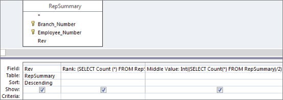
Figure 16.12 The Middle Value subquery counts all the records in the dataset and then divides that number by 2.
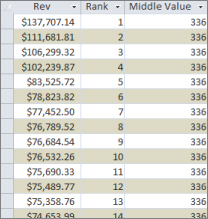
Figure 16.13 Go to record 336 to get the median value of the dataset.
If you want to return only the median value, simply use the subquery as a criterion for the Rank field, as shown in Figure 16.14.

Figure 16.14 Using the subquery as a criterion for the Rank field ensures that only the median value is returned.
Pulling a random sampling from your dataset
Although the creation of a random sample of data doesn't necessarily fall into the category of descriptive statistics, a random sampling is often the basis for statistical analysis.
There are many ways to create a random sampling of data in Access, but one of the easiest is to use the Rnd function within a top values query. The Rnd function returns a random number based on an initial value. The idea is to build an expression that applies the Rnd function to a field that contains numbers, and then limit the records returned by setting the Top Values property of the query.
To demonstrate this method, follow these steps:
- Start a query in Design view on the Dim_Transactions.
- Create a Random ID field, as shown in Figure 16.15, and then sort the field (either ascending or descending will work).

Figure 16.15 Start by creating a Random ID field using the
Rndfunction with the Customer_Number field. - Select the Query Tools Design tab and click the Property Sheet command. The Property Sheet dialog box for the query appears.
- Change the Top Values property to 1000, as shown in Figure 16.16.
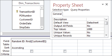
Figure 16.16 Limit the number of records returned by setting the Top Values property of the query.
- Set the Show row for the Random ID field to false, and add the fields you will want to see in your dataset.
- Run the query. You will have a completely random sampling of data, as shown in Figure 16.17.
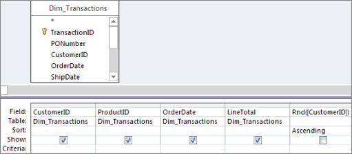
Figure 16.17 Running this query produces a sample of 1,000 random records.
Advanced Descriptive Statistics
When working with descriptive statistics, a little knowledge goes a long way. Indeed, basic statistical analyses often lead to more advanced statistical analyses. In this section, you build on the fundamentals you've just learned to create advanced descriptive statistics.
Calculating percentile ranking
A percentile rank indicates the standing of a particular score relative to the normal group standard. Percentiles are most notably used in determining performance on standardized tests. If a child scores in the 90th percentile on a standardized test, her score is higher than 90 percent of the other children taking the test. Another way to look at it is to say that her score is in the top 10 percent of all the children taking the test. Percentiles often are used in data analysis as a method of measuring a subject's performance in relation to the group as a whole—for instance, determining the percentile ranking for each employee based on annual revenue.
Calculating a percentile ranking for a dataset is simply a mathematical operation. The formula for a percentile rank is (Record Count–Rank)/Record Count. The trick is getting all the variables needed for this mathematical operation.
Follow these steps:
- Build the query you see in Figure 16.18. This query will start by ranking each employee by annual revenue. Be sure to give your new field an alias of “Rank.”

Figure 16.18 Start with a query that ranks employees by revenue.
- Add a field that counts all the records in your dataset. As you can see in Figure 16.19, you're using a subquery to do this. Be sure to give your new field an alias of “RCount.”

Figure 16.19 Add a field that returns a total dataset count.
- Create a calculated field with the expression
(RCount–Rank)/RCount. At this point, your query should look like the one shown in Figure 16.20.![A query in Design view with RepSummary table and a query grid with added field Percentile: ([RCount]-[Rank])/[RCount] in between Rev and RCount fields.](http://images-20200215.ebookreading.net/22/4/4/9781119086543/9781119086543__access-2016-bible__9781119086543__images__c16f020.jpg)
Figure 16.20 The final step is to create a calculated field that will give you the percentile rank for each record.
- Run the query. Sorting on the Rev field will produce the results shown in Figure 16.21.
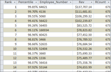
Figure 16.21 You've successfully calculated the percentile rank for each employee.
Again, the resulting dataset enables you to measure each employee's performance in relation to the group as a whole. For example, the employee who is ranked 6th in the dataset is the 99th percentile, meaning that this employee earned more revenue than 99 percent of the other employees.
Determining the quartile standing of a record
A quartile is a statistical division of a dataset into four equal groups, with each group making up 25 percent of the dataset. The top 25 percent of a collection is considered to be the first quartile, whereas the bottom 25 percent is considered to be the fourth quartile. Quartile standings typically are used for the purposes of separating data into logical groupings that can be compared and analyzed individually. For example, if you want to establish a minimum performance standard around monthly revenue, you could set the minimum to equal the average revenue for employees in the second quartile. This ensures that you have a minimum performance standard that at least 50 percent of your employees have historically achieved or exceeded.
Establishing the quartile for each record in a dataset doesn't involve a mathematical operation; instead, it's a question of comparison. The idea is to compare each record's rank value to the quartile benchmarks for the dataset. What are quartile benchmarks? Imagine that your dataset contains 100 records. Dividing 100 by 4 would give you the first quartile benchmark (25). This means that any record with a rank of 25 or less is in the first quartile. To get the second quartile benchmark, you would calculate 100/4*2. To get the third, you would calculate 100/4*3, and so on.
Given that information, you know right away that you'll need to rank the records in your dataset and count the records in your dataset. Start by building the query shown in Figure 16.22. Build the Rank field the same way you did in Figure 16.18. Build the RCount field the same way you did in Figure 16.19.

Figure 16.22 Start by creating a field named Rank that ranks each employee by revenue and a field named RCount that counts the total records in the dataset.
Once you've created the Rank and RCount fields in your query, you can use these fields in a Switch function that will tag each record with the appropriate quartile standing. Take a moment and look at the Switch function you'll be using:
Switch([Rank]<=[RCount]/4*1,"1st",[Rank]<=[RCount]/4*2,"2nd",
[Rank]<= [RCount]/4*3,"3rd",True,"4th")
This Switch function is going through four conditions, comparing each record's rank value to the quartile benchmarks for the dataset.
Figure 16.23 demonstrates how this Switch function fits into the query. Note that you're using an alias of Quartile here.

Figure 16.23 Create the quartile tags using the Switch function.
As you can see in Figure 16.24, you can sort the resulting dataset on any field without compromising your quartile standing tags.

Figure 16.24 Your final dataset can be sorted any way without the danger of losing your quartile tags.
Creating a frequency distribution
A frequency distribution is a special kind of analysis that categorizes data based on the count of occurrences where a variable assumes a specified value attribute. Figure 16.25 illustrates a frequency distribution created by using the Partition function.
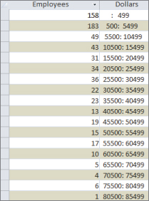
Figure 16.25 This frequency distribution was created using the Partition function.
With this frequency distribution, you're clustering employees by the range of revenue dollars they fall in. For instance, 183 employees fall into the 500: 5999 grouping, meaning that 183 employees earn between 500 and 5,999 revenue dollars per employee. Although there are several ways to get the results you see here, the easiest way to build a frequency distribution is to use the Partition function:
Partition(Number, Range Start, Range Stop, Interval)The Partition function identifies the range that a specific number falls into, indicating where the number occurs in a calculated series of ranges. The Partition function requires the following four arguments:
Number(required): The number you're evaluating. In a query environment, you typically use the name of a field to specify that you're evaluating all the row values of that field.Range Start(required): A whole number that is to be the start of the overall range of numbers. Note that this number cannot be less than zero.Range Stop(required): A whole number that is to be the end of the overall range of numbers. Note that this number cannot be equal to or less than theRange Start.Interval(required): A whole number that is to be the span of each range in the series fromRange StarttoRange Stop. Note that this number cannot be less than one.
To create the frequency distribution you saw in Figure 16.25, build the query shown in Figure 16.26. As you can see in this query, you're using a Partition function to specify that you want to evaluate the Revenue field, start the series range at 500, end the series range at 100,000, and set the range intervals to 5,000.
![A query in Design view with MainSummary table and a grid listing Field inputs Employees: Employee_Number and Dollars: Partition([Revenue],500,100000,5000) with Total inputs Count and Group By, respectively.](http://images-20200215.ebookreading.net/22/4/4/9781119086543/9781119086543__access-2016-bible__9781119086543__images__c16f026.jpg)
Figure 16.26 This simple query creates the frequency distribution shown in Figure 16.25.
You can also create a frequency distribution by group by adding a Group By field to your query. Figure 16.27 demonstrates this by adding the Branch_Number field.
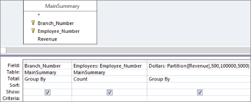
Figure 16.27 This query will create a separate frequency distribution for each branch number in your dataset.
The result is a dataset (shown in Figure 16.28) that contains a separate frequency distribution for each branch, detailing the count of employees in each revenue distribution range.

Figure 16.28 You've successfully created multiple frequency distributions with one query.