
Chapter 30
Customizing the Ribbon
IN THIS CHAPTER
- Working with the default Ribbon
- Examining Ribbon architecture
- Studying Ribbon controls
- Learning the XML necessary to construct Ribbons
- Adding VBA callbacks
Unless you're upgrading from Access 2003, the Ribbon will already be familiar to you. The Ribbon was introduced in Office 2007 and replaced the toolbar and menu system that ruled the computing world for decades. The toolbars and menus were an effective user interface for working with a variety of tasks and operations, but the CommandBars model used in versions of Access prior to 2007 was quite complex, and sometimes difficult to program. The Ribbon introduced an entirely new way of working with user-interface components.
The Ribbon is quite unlike traditional toolbars or menus and supports features not possible with toolbars and menus. As you'll soon see, customizing the Ribbon is a very different process from using CommandBars to compose toolbars and menus in previous versions of Access.
The Ribbon Hierarchy
The Ribbon is a fairly complex structure and is hierarchical in nature. At the top level are the tabs you see along the top of the Ribbon. Each tab contains one or more groups, each containing one or more controls. The Ribbon is highly adaptable to your current tasks, so the description that follows may not be exactly the same as you see on your screen:
- Tabs: The top object in the Ribbon hierarchy. You use tabs to separate the most fundamental operations into logical groups. For instance, the default Ribbon contains four tabs: Home, Create, External Data, and Database Tools. The File tab acts differently from the other tabs. It opens a backstage area with typical file operations.
- Groups: The second highest object in the Ribbon hierarchy. Groups contain any of the number of different types of controls and are used to logically separate operations supported by a Ribbon tab. In Figure 30.1, the Home tab contains seven groups: Views, Clipboard, Sort & Filter, Records, Find, Window, and Text Formatting.
- Controls: In Figure 30.1, notice the variety of controls within each group on the Home tab. The Views group contains a single control, while the Text Formatting group contains 18 different controls. Normally, the controls within a group are related to one another, but this is not a hard-and-fast rule.
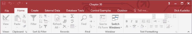
Figure 30.1 The default Ribbon.
As you design your custom Ribbons, you should keep the basic Ribbon hierarchy in mind. Microsoft has spent a great deal of time experimenting with and testing the Ribbon paradigm, and it works well for a wide variety of applications.
You can add a maximum of 100 tabs to a custom Ribbon—a very high limit. The other objects have similarly high limits. Obviously, too many tabs or too many groups can become a real problem for your users. Generally speaking, you should design your Ribbons in a conservative manner, including only the items at each level that your users actually need. Microsoft recommends four or five tabs and never more than seven.
Controls for Access Ribbons
The Ribbon supports many more types of controls than the older command bars. In previous versions of Access, the type and variety of controls you could add to menus and toolbars were severely limited. Most toolbars included buttons, and a few other types of controls like drop-down lists, but there were very few options for adding complex or sophisticated controls to command bars.
Ribbons can contain buttons, text boxes, labels, separators, check boxes, toggle buttons, edit boxes, and even controls nested within other controls. This chapter explores a few of these controls, but you can find examples showing how to use every type of Ribbon control in Access on the Microsoft Office website (http://office.microsoft.com).
Access features some very interesting controls to use on your custom Ribbons. These controls are used in the default Ribbon and are accessible to the custom Ribbons you add to your applications. These controls have no analogues in older versions of Access and are completely new to Access.
SplitButton
The SplitButton is similar to a traditional button in an Access interface. What makes the SplitButton different is that it is split vertically or horizontally into two different controls. The left (or top side) of the control works as any other button and responds to a single click. The right (or bottom side) of the button includes an arrow that, when clicked, reveals a selection list of single-select options.
An example of a SplitButton (shown in Figure 30.2) is the View button on the Home tab.
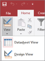
Figure 30.2 The SplitButton is a powerful Ribbon control.
The top portion of the View button can be clicked to switch to Design view. Or the arrow on the View button can be clicked to reveal a list of other options. Only one option in the SplitButton list can be selected. As soon as an item in the list is selected, the SplitButton closes, and the action selected by the user is performed.
The button portion of the SplitButton control is independently programmable.
Menu
The Menu control is shown in Figure 30.3. Although the Menu looks very much like a ComboBox or DropDown, they are not the same type of object. Notice that the items in the drop-down list in Figure 30.3 include not only text (Clear All Filters, Filter By Form, and so on) but also an image and tooltip help (not shown in Figure 30.3) associated with each item.
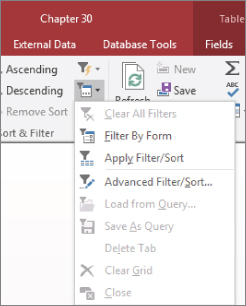
Figure 30.3 The Menu control simplifies a user's selections.
Only one item in the list can be selected at a time, providing an easy-to-understand interface for your users, when a limited number of options exist.
The SplitButton and Menu are similar in many ways. They both expose a list when clicked and present a list of single-select items. The main difference is that a SplitButton is split into two portions (the button portion that executes the default action and the menu portion), whereas the Menu simply drops down the list when clicked.
Gallery
The Gallery presents the user with an abbreviated view of different options for formatting and other tasks. Figure 30.4 shows the Themes Gallery for reports.
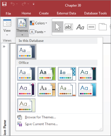
Figure 30.4 The Gallery provides the user with a preview of the options.
Gallery controls are used extensively in Access for displaying options such as to format controls and select fonts.
Button
The Button is a familiar control from the CommandBar user-interface in older versions. A button can be clicked to perform an action. It does not provide options like a Menu or Gallery, but it can open a dialog box that contains additional options. The Copy button in the Clipboard group of the Home tab is an example of a button. Clicking Copy copies the current selection onto the Clipboard, but it doesn't provide any other options or perform any other actions.
ToggleButton
A special type of button control, the ToggleButton is used to set a state or condition of the application. ToggleButtons have two states: on and off. When a ToggleButton is in the off state, it appears like a normal button on the Ribbon. When a ToggleButton is clicked to set the on state, its background color changes to indicate its state, and its tooltip caption may change. Figure 30.5 shows the Apply Filter ToggleButton in its on state. The change in appearance is an indicator that a filter has been applied. Its tooltip changed from Apply Filter to Remove Filter.
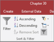
Figure 30.5 A ToggleButton changes appearance to indicate state.
ComboBox
A ComboBox on the Ribbon is very similar to the Combo Box control on a form. It is a combination of a text box and a list box in that you can type directly into a ComboBox or click the down arrow portion of the control to display a list of options. The Font control on the Text Formatting group of the Home tab is an example of a ComboBox control.
CheckBox
A CheckBox control is another control that may seem familiar. It looks and acts just like a check box you put on a form. When a CheckBox has been clicked, a check mark appears in the box; otherwise, the box appears empty. The Required control on the Field Validation group of the Table Tools tab is an example of a CheckBox control.
Special Ribbon features
The Ribbon contains two other special features that are worth noting. Some controls have SuperTips that can expand the amount of information shown in a tooltip. Also, the Ribbon can be hidden to increase the screen space available.
SuperTips
The SuperTip is similar to the tooltip used in previous versions of Access. A SuperTip is relatively large and contains text that you specify, helping the user understand the purpose of a control. The SuperTip, shown in Figure 30.6, appears as the user hovers the mouse over a control on the Ribbon.
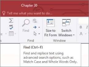
Figure 30.6 The SuperTip provides helpful information to the user.
The SuperTip example in Figure 30.6 is displayed when you hover the mouse pointer over the Find button on the Home tab. It's larger than a tooltip and shows more information, such as the shortcut key and a longer explanation of its function.
Collapsing the Ribbon
By default, the Ribbon is always open on the screen. However, the Ribbon, with all its controls and tabs, is quite large and may be in the way while users work with an application. There are several ways to collapse the Ribbon. The easiest methods are to press Ctrl+F1 or to double-click any tab. Pressing Ctrl+F1 again expands the Ribbon and keeps it visible. Single-clicking any tab brings the Ribbon back again, but only temporarily; the Ribbon will “auto-collapse” until you double-click a tab to restore the Ribbon to its pinned state.
The Ribbon contains a Collapse/Pin button in the lower-right corner. When the Ribbon is pinned (expanded) the button is a small up arrow. When the Ribbon is collapsed, the button shows a push pin. Figure 30.7 shows the Collapse/Pin button in both states.
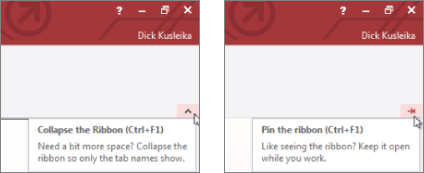
Figure 30.7 The Ribbon can be collapsed or pinned.
Any forms or reports that are open as the Ribbon is collapsed and expanded are moved up or down so that their positions (relative to the Ribbon) remain the same. For example, a form that is open right below the Ribbon moves upward to occupy the same distance between the top of the form and the bottom of the Ribbon area.
Editing the Default Ribbon
Access 2010 added the ability to edit the default Ribbon. Changes made to the Ribbon stay with Access on the machine where the changes were made, but an option to export modifications is available in the Ribbon Designer.
Right-click anywhere on the Ribbon and choose Customize the Ribbon from the menu to launch the Ribbon Designer. The Customize the Ribbon window (see Figure 30.8) uses the “two list” paradigm in which one list contains available commands and the other contains selected commands. You select the category of Ribbon you want to modify (File Tabs, Main Tabs, Macros, All Commands, Popular Commands, and so on) from the drop-down above the list on the left side, and then you use the Add and Remove buttons between the lists to add or remove items from the Ribbon.
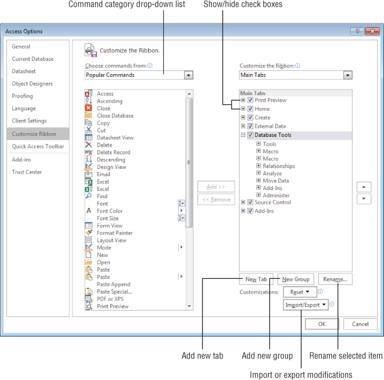
Figure 30.8 The Ribbon Designer allows you to customize the Ribbon.
From the perspective of Access, there is just one Ribbon, but it has a number of Main tabs on it: Print Preview, Home, Create, External Data, Database Tools, Source Control, and Add-Ins. Within a Main tab are a number of groups, such as Views, Clipboard, and Sort & Filter. You cannot add or remove tabs or commands from the default Ribbon, but you can remove individual groups.
You can take away entire built-in groups, but you can't remove individual commands within a group. You can use the buttons below the right list to add new custom tabs or to add new groups within existing Ribbon tabs, and then add commands to the custom group. Using a new custom tab or group is the only way to add commands from the left list to the Ribbon definition on the right side.
You can't add commands directly to tabs. Commands must reside within groups on a tab. It's easy to add a command to a group: Select the command from the list on the left, select the custom group to receive the command in the list on the right, and click the right-pointing arrow between the lists.
If you want to remove certain commands from a built-in group, you have to remove the built-in group containing the bad command, add a custom group, move it to the appropriate tab, and then add only the commands you want in the group. Right-click the new group and select Rename from the shortcut menu, or select the new group and click the Rename button under the Customize the Ribbon list. The Rename dialog box appears (see Figure 30.9). Use this dialog box to assign a new name to the group and select the group's icon.
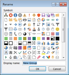
Figure 30.9 Renaming a custom group and setting the group's icon.
You can hide built-in Ribbon tabs if you prefer. Notice the check boxes next to the items in the list on the right side of Figure 30.8. Deselecting a box next to a tab hides the tab from the user. If the tab contains commands the user must have, you can add a custom tab (with the New Tab button under the Customize the Ribbon list on the right side of Figure 30.8), and then add custom groups as needed. Finally, add the necessary commands to the custom groups.
In many cases, simply hiding tabs is probably easier than removing them from the Ribbon. If they're hidden, you can easily restore their visibility later on, if you need to.
The Ribbon Designer includes up and down arrows at the far right side for repositioning tabs and groups within tabs. You could, for instance, add a custom group (or use an existing group) and move the most commonly used commands into it with the up- and down-arrow keys.
If the changes you've made don't work out as expected, click the Reset button below the Customize the Ribbon list to return the built-in Ribbon to its original state. The Reset button (notice its drop-down arrow in Figure 30.8) lets you reset the entire Ribbon or just the selected tab.
Click the Import/Export button below the Customize the Ribbon list to export the customizations you've made to the Ribbon as an external file. Alternatively, the list that appears when you click the Import/Export button includes a command to import a customization file and apply it to your Ribbon. Not surprisingly, the customization file is in XML format and is shared by all of the Office 2016 applications.
Using a customization file makes it easy to apply custom Ribbon changes to all users working with an Access 2016 application. It's also a great way to back up the changes you've made if you need to reapply the changes later on. You could, for instance, set up the Ribbon exactly as you want your users to see it, export the customization, and then reset the Ribbon to its original state so that you have access to all Ribbon features during your development cycle.
Working with the Quick Access Toolbar
The Quick Access toolbar is in the upper-left corner of the main Access screen (see Figure 30.10) just above the File tab. The Quick Access toolbar remains visible at all times in Access and provides a handy way to give your users quick access to commonly performed tasks such as opening a database file or sending an object to a printer.
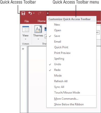
Figure 30.10 The Quick Access toolbar remains on the screen at all times.
The Quick Access toolbar is fully customizable. It comes with a list of default controls, some of which are hidden, that you can hide or unhide with the Quick Access Toolbar menu (see Figure 30.10). You can quickly and easily add any of a large number of operations to the Quick Access toolbar. Also, the controls you add are applicable either to the current database or to all Access databases.
The easiest way to add a command to the Quick Access toolbar is to locate the command on the Ribbon, right-click it, and then select Add to Quick Access Toolbar from the shortcut menu that appears. Access adds the selected item to the rightmost position in the Quick Access toolbar.
A more flexible approach to modifying the Quick Access toolbar is to open the Quick Access Toolbar customization screen by selecting the File tab in the upper-left corner of the main Access screen and clicking the Options button near the bottom of the Backstage. Then select the Quick Access Toolbar item from the Access Options list to open the Customize the Quick Access Toolbar screen (see Figure 30.11).
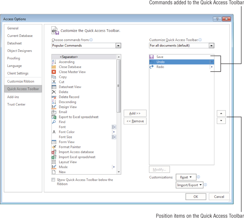
Figure 30.11 You can easily add new commands to the Quick Access toolbar.
Like the Ribbon Designer, the Quick Access Toolbar Designer uses a list of available commands and a list of selected commands. The list on the left side of the screen contains items representing every command available in Access, categorized as Popular Commands, Commands Not in the Ribbon, All Commands, and Macros. You select the command category from the drop-down control above the list. The category list also contains entries for all the Ribbon tabs in Access (File, Home, External Data, and so on). Selecting an item from this drop-down list reveals the commands within that category.
The Quick Access toolbar provides a handy way for you to control which commands the users access as they work with your Access applications. The tasks available to the Quick Access toolbar include operations such as backing up the current database, converting the current database to another Access data format, viewing database properties, and linking tables.
Because the Quick Access toolbar is visible to all users, be sure not to include commands (such as Design View) that may be confusing to users or harmful to your applications. Because the Quick Access toolbar is easy to customize, it's not difficult to add the commands you need at the time you need them, instead of leaving them visible to all users all the time.
Use the Add and Remove buttons in the Quick Access Toolbar Designer to move an item from the list on the left to the list on the right. The Quick Access Toolbar Designer is quite smart. After a command has been added to the Quick Access toolbar, the command is no longer available to be added again, so you can't add the same command more than once.
The Quick Access Toolbar Designer also contains up and down arrows to the right of the selected list that enable you to reorder the left-to-right appearance of the Quick Access toolbar commands.
Be warned that you can add any number of commands to the Quick Access toolbar. When more commands are contained than the Quick Access toolbar can display, a double-right-arrow button appears at the far right side that expands to show the hidden commands. However, because the whole idea of the Quick Access toolbar is to make commands quickly available to users, there is no point in loading up the Quick Access toolbar with dozens of commands that only make it more difficult for the user.
Developing Custom Ribbons
The Ribbon Designer and Quick Access Toolbar Designer provide convenient ways to customize the Access user interface. However, as you've seen, these methods limit the customizations you can make. Using Extensible Markup Language (XML), you have a lot of flexibility in customizing the Ribbon.
Ribbons are not represented by a programmable object model in Access. Ribbon customizations are defined by XML statements contained in a special table named USysRibbons. Access uses the information it finds in the XML to compose and render the Ribbon on the screen.
The Ribbon creation process
Briefly, creating custom Ribbons is a five-step process:
- Design the Ribbon and compose the XML that defines the Ribbon.
- Write VBA callback routines (described in the following section) that support the Ribbon's operations.
- Create the
USysRibbonstable. - Provide a Ribbon name and add the custom Ribbon's XML to the
USysRibbonstable. - Specify the custom Ribbon's name in the Access options screen.
None of these steps is particularly intuitive, especially when it comes to composing the XML and writing callback routines. Your best bet is to find an example that is reasonably close to what you want and customize its XML to suit your purposes.
Using VBA callbacks
A callback is code that is passed to another entity for processing. Each procedure you write to support operations on a Ribbon is passed to the “Ribbon processor” in Access that actually performs the Ribbon's actions. This is very unlike the event-driven code you've been working with in Access. Clicking a button on a form directly triggers the code in the button's Click event procedure. A Ribbon's callback procedure is linked to the Ribbon but is internally processed by Access and does not directly run in response to the click on the Ribbon.
To fully understand this process, imagine that Access contains a process that constantly monitors activity on the Ribbon. As soon as the user clicks a Ribbon control, the Ribbon processor springs into action, retrieving the callback procedure associated with the control and performing the actions specified in the callback.
This means that there are no Click, DblClick, or GotFocus events associated with the Ribbon in Access. Instead, you bind a callback to a Ribbon control through the XML that defines the Ribbon. Each Ribbon control includes a number of action attributes that can be attached to callbacks, and the Ribbon processor takes over when the user invokes a control's action.
Here is an example. The following XML statements define a button control on a Ribbon:
<button id="ViewProducts"
    label="All Products"
    size="large"
    imageMso="FindDialog"
    onAction="OpenProductsForm"
tag="frmProductsDisplay"/>Notice the onAction attribute in this XML code. Notice also that the onAction attribute is set to OpenProductsForm. The onAction attribute is similar to the events associated with a form's controls. Each interactive Ribbon control (buttons, SplitButtons, and so on) includes the onAction attribute. The callback procedure (OpenProductsForm, in this example) assigned to the onAction attribute is passed to the Ribbon processor when the control's action occurs.
A control's attributes may appear in any order within the control's XML, but they must be spelled correctly. XML is case sensitive, so attributes must be entered exactly as you see in the examples in this chapter and in the Chapter30.accdb example database. And, attribute values (like "FindDialog") must be surrounded by double or single quote characters. Both types of quotes are legal in XML, but it's a good practice to choose one and stick with it.
Notice that the button control does not contain a Click event. Instead, each interactive control's onAction attribute handles whatever action is expected by the control. In the case of a button, the action is a user clicking the button, whereas for a text box, the action is the user typing into the text box. Both of these controls include the onAction attribute, but onAction means something different for each control.
Ribbon controls have several other important attributes, such as imageMso, screentip, and supertip. These attributes are described in the “Adding Ribbon Controls” section, later in this chapter.
Figure 30.12 Set the Show add-in user interface errors property to see Ribbon errors.
Creating a Custom Ribbon
As mentioned previously, creating and customizing Ribbons is very different from working with CommandBars in earlier versions of Access. Creating Access Ribbons is, at minimum, a five-step process. Each of these steps is described in detail in the following sections. Later you'll see more examples of these steps.
Step 1: Design the Ribbon and build the XML
As with most database objects, the first step to creating a new Access Ribbon is to design it carefully on paper. If you're converting an existing toolbar or menu to an Access Ribbon, you have a pretty good idea of the controls and other items to add to the Ribbon.
The XML document you create for your Ribbon mirrors the design you've laid out. Perhaps the most challenging aspect of composing the Ribbons XML is visualizing how the Ribbon will look, based on the XML behind it. There are no visual cues in a Ribbon XML document that hint at the Ribbon's appearance when rendered in Access. Experience will be your best guide as you work with Ribbon customization, and sometimes trial and error is the only way to achieve a desired objective.
As a final point, Access is extremely fussy about the XML used to compose Ribbons. There is no “parser” in Access that validates the XML as a Ribbon is rendered. If an error exists in the XML document, Access refuses to render the Ribbon, or the Ribbon will be missing elements defined in the XML. This is one reason that using a good XML editor to compose your XML is important. Most often, the only way you know that an error exists in your Ribbon XML code is that Access loads the default Ribbon instead of your custom Ribbon.
Inevitably, Ribbon development in Access requires a number of back-and-forth cycles in which you modify the XML, transfer it to Access, and view the results. You have no real way of really knowing how well your XML will work as a Ribbon specification until Access renders the Ribbon on the screen.
The “Basic Ribbon XML” section later in this chapter describes the fundamental XML statements required by Access Ribbons.
For this example, we'll create a new tab on the default Ribbon. The new tab will be named “Messages” and will contain one control that opens a form. First, design a form with one Label control on it containing a message to be displayed. Figure 30.13 shows the form frmMessage, which can be found in the Chapter30.accdb database.
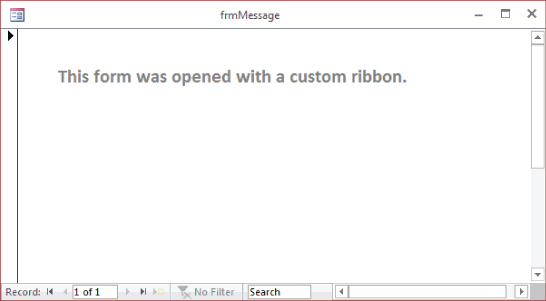
Figure 30.13 A simple form that displays a message.
To create the XML that will define the new Ribbon elements, open your favorite XML editor. The examples in this chapter use the XML Notepad application, available for free from Microsoft.com (www.microsoft.com/en-us/download/details.aspx?id=7973). Figure 30.14 shows the XML in XML Notepad.
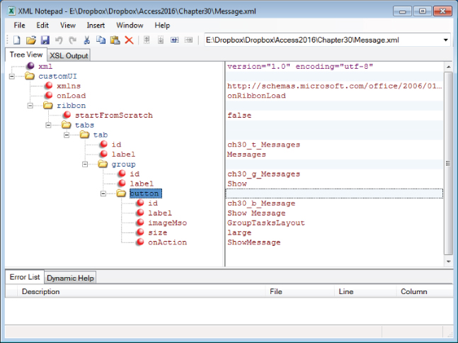
Figure 30.14 XML Notepad can be used to write XML.
In XML Notepad, you can choose Source from the View file to see the XML that is generated. Here's the XML for Message.xml:
<?xml version="1.0" encoding="utf-8"?>
<customUI xmlns="http://schemas.microsoft.com/office/2009/07
     /customui" onLoad="onRibbonLoad">
  <ribbon startFromScratch="false">
    <tabs>
      <tab id="ch30_t_Messages" label="Messages">
        <group id="ch30_g_Messages" label="Show">
          <button id="ch30_b_Message" label="Show Message"
           imageMso="GroupTasksLayout" size="large"
             onAction="ShowMessage" />
        </group>
      </tab>
    </tabs>
  </ribbon>
</customUI>
We'll discuss each of the parts of this XML file later in the chapter. For now, note that this XML creates a button labeled Show Messages on a Group labeled Show on a tab labeled Messages. The onAction attribute, which we'll need for the next step, is named ShowMessage.
Step 2: Write the callback routines
Before writing any callback code for Ribbon controls, you must reference the Microsoft Office 16.0 Object Library in the References dialog box (choose Tools  References, and select the check box next to Microsoft Office 16.0 Object Library). Otherwise, the VBA interpreter will have no idea how to handle references to Ribbon controls.
As we described earlier in this chapter, callback routines are similar to event procedures, but they don't directly respond to control events. Each type of callback routine has a specific “signature” that must be followed in order for the Ribbon processor to locate and use the callback. For instance, the prototype onAction callback signature for a button control is:
Public Sub OnAction(control as IRibbonControl)The prototype onAction callback for a check box is:
Public Sub OnAction(control As IRibbonControl, _
    pressed As Boolean)
Even though these callbacks support the same onAction control attribute, because the controls are different, the signatures are different. Clicking a button is just that—click once, and the action is done. In the case of a check box, a click either selects (pressed = True) or deselects (pressed = False) the control. Therefore, an additional parameter is required for check boxes.
These procedures are just prototypes and do not apply to any particular control on a Ribbon. In practice, the callback procedure for a control is usually named after the control to distinguish it from callback procedures for other controls. For this example, write the following code in a standard module:
Public Sub ShowMessage(control As IRibbonControl)

  'Called from Messages > Show > Show Message
  DoCmd.OpenForm "frmMessage"

End Sub
Notice that this procedure's declaration matches the prototype for a button control's onAction callback procedure. Although not required, this procedure even contains a comment that identifies the Ribbon control that calls the routine.
Callback routines must be declared with the Public attribute in a standard module, or they can't be seen by the Ribbon process.
The name you apply to callback routines is entirely your choice, as long as the procedure's declaration matches the control's onAction signature. Obviously, the procedure's name must match the value you assign to the control's onAction attribute, and documenting the procedure's relationship to a Ribbon control is very helpful when it comes time to modify the Ribbon or the callback.
Notice that the preceding callback procedure doesn't reference the control by name. This means that you have to write a uniquely named callback for each control or use a single callback for multiple similar controls.
Step 3: Create the USysRibbons table
Access looks for a table named USysRibbons to see whether any custom Ribbons are in the current database application. This table does not exist by default; if present, it contains the XML that defines the custom Ribbons in the application.
USysRibbons is very simple, containing only three fields (shown in Table 30.1).
Table 30.1 The USysRibbons Table Design
| Field | Data Type |
ID |
AutoNumber |
RibbonName |
Short Text 255 |
RibbonXML |
Long Text |
The ID field just keeps track of the Ribbons in the table. The RibbonName field is used to specify which Ribbon Access should load at startup (described in Step 5, later in this chapter), whereas RibbonXML is a Long Text field containing the XML that defines the Ribbon.
Because USysRibbons is a table, your Access database may actually include the definitions of many different custom Ribbons. However, only one custom Ribbon can be active at a time. Later in this chapter, we cover how to invalidate an existing Ribbon and load a new Ribbon in its place.
You might find good reasons to add additional fields to USysRibbons, if necessary. For instance, you could add a Notes or Comments field that helps another developer understand how the Ribbon should be used. You could also add a modification date and other fields that help track changes to your custom Ribbons. If you modify USysRibbons, be sure not to remove or rename the three required fields (ID, RibbonName, and RibbonXML). These three fields must exist in USysRibbons and must be named correctly for your custom Ribbons to work.
Step 4: Add XML to USysRibbons
Now you're ready to store your XML in the USysRibbons table. Open the USysRibbons table in Datasheet view. In the RibbonName field, enter rbnMessages and move the cursor to the RibbonXml field.
Copy the XML that you created in Step 1 and paste it into the RibbonXml field of USysRibbons. If you're using XML Notepad, open the XML file in XML Notepad and choose View Source to output the XML to Windows Notepad. Then copy the XML from there to paste into USysRibbons. Figure 30.15 show USysRibbons with the fields completed.
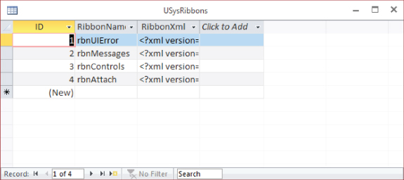
Figure 30.15 The USysRibbons table stores the XML for custom Ribbons.
The XML that was pasted into the RibbonXml field contains a lot of white space. Don't worry about the tabs and line breaks in the XML. However, if you replace existing data in the RibbonXml field, be sure to replace all the existing data. With tabs and line breaks, it can be difficult to know if you've left any remnants from the previous data.
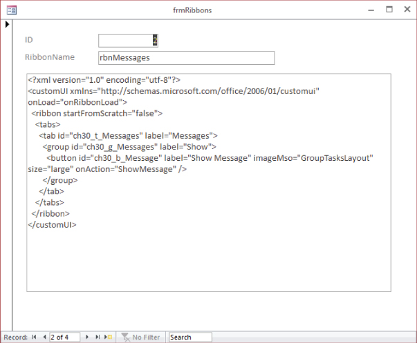
Figure 30.16 frmRibbons displays the information stored in the USysRibbons table.
Step 5: Specify the custom Ribbon property
The last step, before restarting the application, is to open the Current Database properties (choose File Options Current Database), scroll to the Ribbons and Toolbar Options section, and select the name of the new Ribbon from the Ribbon Name combo box (see Figure 30.17). The combo box's list contains only the names of custom Ribbons in USysRibbons that were in the table as Access started, so it does not contain the name of the new Ribbon. (Apparently Access reads USysRibbons only one time as Access opens a database.) You have to type the Ribbon's name into the combo box, or restart the application and let Access find the new Ribbon in USysRibbons.
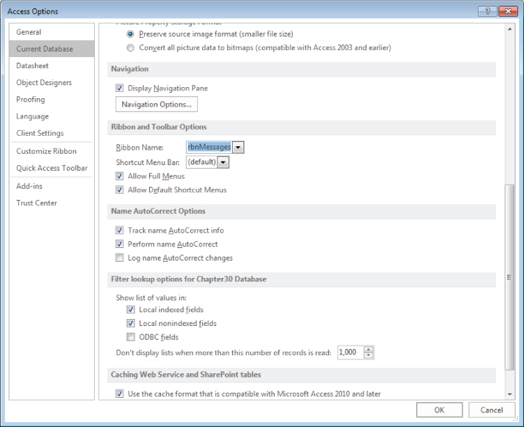
Figure 30.17 Specifying the new custom Ribbon in the Current Database options dialog box.
When you close the Options dialog box after selecting a new Ribbon Name, Access displays a message that you must close and reopen the database for the changes to take effect. Figure 30.18 shows the message displayed.
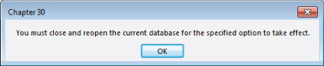
Figure 30.18 Changes to the Ribbon Name property require a restart of the application.
Once Access is restarted, the new tab shows on the default Ribbon. Figure 30.19 shows the new tab, the Show group on that tab, the lone Show Message button, and the form that is opened when the button is pushed.
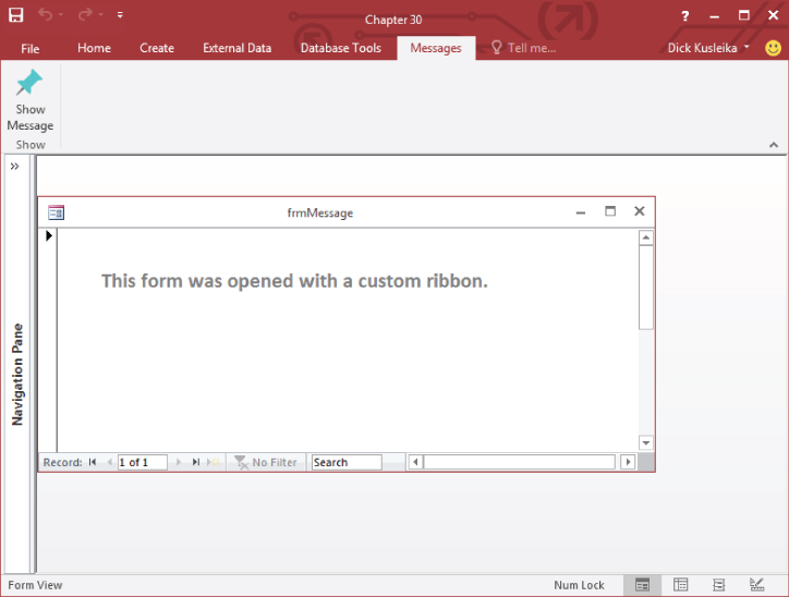
Figure 30.19 The XML produces new Ribbon elements that open a form.
The Basic Ribbon XML
Take a closer look at the basic XML required by Ribbons. The following XML represents a prototype Ribbon. (Line numbers have been added to make the discussion following this XML easier to understand.)
 1 <?xml version="1.0" encoding="utf-8"?>
 2 <!-- This is a comment in the ribbon's XML -->
 3 <customUI xmlns="http://schemas.microsoft.com/office
     /2009/07/customui" onLoad="onRibbonLoad">
 4   <ribbon startFromScratch="true">
 5     <tabs>
 6       <tab id="tab1" ...
 7         <group id="group1" ... >
 8          ... Controls go here ...
 9         </group>
10       </tab>
11       <tab id="tab2" ...
12         <group id="group2" ... >
13          ... Controls go here ...
14         </group>
15         ... Repeat Groups ...
16       </tab>
17       ... Repeat Tabs ...
18     </tabs>
19   </ribbon>
20 </customUI>
The first statement (<?xml version="1.0" encoding="utf-8"?>) is not required by and does not affect Access Ribbons. It's completely your choice whether to keep this line or not in the USysRibbons table. Well-formed XML includes the version line, and it helps other programs to render the file, so it's a good practice to include it. Line 2 shows how to add a comment to a Ribbon's XML code. The <!-- and --> are standard commenting tags for XML documents.
Line 3 (beginning with <customUI…) specifies an XML namespace (xmlns), an XML document that predefines acceptable tags for the XML statements that follow. The Office namespace defines the Office Ribbon constructs, such as tabs, groups, controls, and so on. Every Ribbon defined in the RibbonXML field in USysRibbons must start with this statement, so be sure it's included.
The statement in line 4 is rather important. The startFromScratch directive determines whether you're building an entire Ribbon from scratch or modifying the default Ribbon by adding or taking things away. Depending on your situation, the majority of your custom Ribbons may be built from scratch because the default Ribbon knows nothing about the forms, reports, and other objects and operations in your database. Also, the default Ribbon contains commands that may be dangerous to your application's integrity. For instance, a user could open a form, report, or table in Design view and make changes without your being aware of it. Removing these commands from the user interface is a first line of defense for your applications.
When startFromScratch is set to false, your custom Ribbon definition is added to the default Ribbon to the right of the built-in tabs. Because Access includes only four tabs by default, you may have enough room for your additional tabs without overcrowding the Ribbon. When startFromScratch is set to true, none of the default tabs, groups, or controls is shown on the Ribbon. Only what you include in the XML will be displayed.
Most of the tags in an XML file have a corresponding closing tag that defines the end of the section that relates to that tag. All the statements between the opening and closing tags are children of that tag. Lines 19 and 20 are the closing tags for the Ribbon and CustomUI elements, respectively.
The <tabs> (line 5) and </tabs> (line 18) tags indicate the beginning and end of the tabs on the Ribbon. Ribbons are hierarchical, with tabs containing groups, which contain controls. The tabs, therefore, are the highest-level objects within a Ribbon and enclose all other Ribbon objects.
Line 6 defines the leftmost tab on the Ribbon. In this example, the tab's name is tab1. The other attributes for this tab are not shown but are implied by the ellipsis (…). The ending tag for tab1 is located on line 10.
Line 7 begins the definition of the first group on tab1 and line 9 ends this group. Within the group are the controls displayed by the group.
The rest of this prototype Ribbon is simple repetition of the first few items.
Adding Ribbon Controls
The previous section presented a simple prototype Ribbon. In this example, the controls were indicated by … Controls go here …. on lines 8 and 13. In this section, you'll see the XML and the callback procedures for several controls. Many XML attributes are common to more than one control. We won't discuss every attribute for every control; rather, we'll look at the most-used attributes.
Specifying imageMso
Most, but not all, Ribbon controls include an imageMso attribute that specifies the picture attached to the control. You can't provide simple references to image files; instead, you must use an imageMso identifier for this purpose. Every Ribbon control in the Office 2016 applications has an associated imageMso value. You use these values on your custom Access Ribbon controls and provide a label that tells your users the exact purpose of the control.
To find the imageMso for a particular Ribbon control, use the Customize the Ribbon window to open a particular Ribbon. Then use the drop-down in the upper left of the designer to select the Ribbon category containing the Ribbon command and hover the mouse over the command's entry in the list (see Figure 30.20).
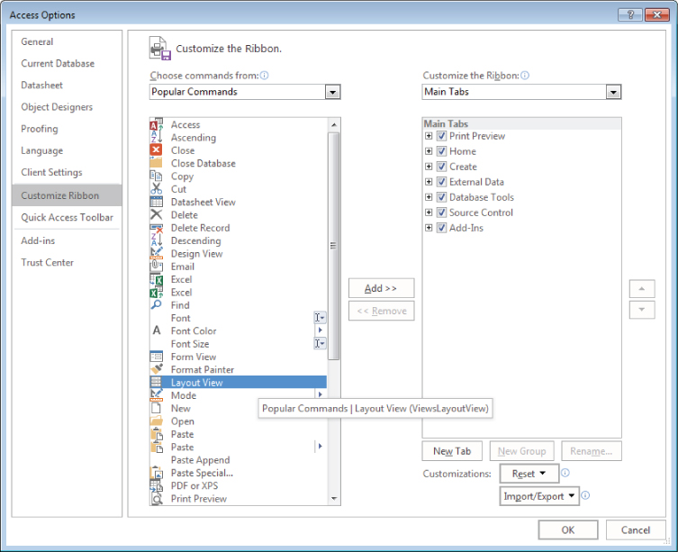
Figure 30.20 Using the Ribbon Designer to obtain a Ribbon command's imageMso attribute.
The imageMso for the Layout View command (ViewsLayoutView) is shown in parentheses in the tooltip that appears near the selected command.
The Label control
The Label control is, by far, the simplest and easiest to add to a Ribbon. A Ribbon label is completely analogous to a label you add to an Access form. It contains either hard-coded text or text that is generated by a callback procedure.
Here is a sample label definition:
<group id="ch30_g_Settings" label="Settings">
  <labelControl id="lbl1" label="Font Things" />
  <separator id="s1"/>
  <labelControl id="lbl2" label="Choose Font Settings" />
  <checkBox id="chk1" label="Bold" onAction="SetBold"/>
  <checkBox id="chk2" label="Italics" onAction="SetItalics"/>
</group>
This XML contains two labels, a separator, and two check boxes. The text in each of these labels is hard coded, rather than returned by a callback procedure. You can set the label's caption at run time using a callback procedure and the getLabel attribute:
<group id="ch30_g_Label" label="Labels">
  <labelControl id="lbl3" getLabel="lbl3_getLabel" />
</group>
The preceding XML code uses getLabel to identify the callback procedure that will determine what the label displays. In a standard module, the following procedure will show the current date in the label:
Public Sub lbl3_getLabel(control As IRibbonControl, ByRef label)

  label = FormatDateTime(Date, vbLongDate)

End Sub
The label argument is passed ByRef, and whichever string is assigned to that argument is displayed in the labelControl. In this example, the FormatDateTime function is used to create a string with the current date.
You can also use one callback procedure to control several labels. In this example, three labels use the same getLabel attribute:
<group id="ch30_g_Label" label="Labels">
  <labelControl id="lbl3" getLabel="lbl3_getLabel" />
  <labelControl id="lbl4" getLabel="lbl456_getLabel" />
  <labelControl id="lbl5" getLabel="lbl456_getLabel" />
  <labelControl id="lbl6" getLabel="lbl456_getLabel" />
</group>
The lbl456_getLabel callback procedure uses the control's id property to determine which control is calling the procedure:
Public Sub lbl456_getLabel(control As IRibbonControl, ByRef label)

  Select Case control.Id
    Case "lbl4"
      label = "This is Label 4"
    Case "lbl5"
      label = "This is Label 5"
    Case "lbl6"
      label = "This is Label 6"
  End Select

End SubThe Button control
The Button control is perhaps the most useful and fundamental of all of the Ribbon controls. A button is very simple; it has a label, an imageMso attribute for setting the button's image, and an onAction attribute that names the callback routine. An example of a button XML is:
<button id="btn1" size="large"
  label="Browse"
  imageMso="OutlookGlobe"
  onAction="btn1_onAction" />
The btn1_onAction callback procedure, shown below, uses the FollowHyperlink method of the Application object to launch a web browser. The Button Ribbon control does not support double-click actions, so tying a button to a callback procedure is very simple.
Public Sub btn1_onAction(control As IRibbonControl)

  Application.FollowHyperlink "http://www.wiley.com"

End Sub
Another attribute that you can use with the Button control is the keytip attribute. Access assigns key tips to most controls that you add to the Ribbon. Key tips are shown when the Alt key is pressed; they allow you to navigate the Ribbon from the keyboard. You can specify your own key tip with the keytip attribute. The XML for the preceding button with a keytip attribute look like this:
<button id="btn1" size="large"
label="Browse" keytip="B"
imageMso="OutlookGlobe"
onAction="btn1_onAction" />
Figure 30.21 shows the new button with a B for the key tip, allowing the user to access the button with an easy-to-remember keyboard shortcut.
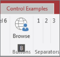
Figure 30.21 You can specify a custom key tip for controls.
Separators
A separator is a graphical element that divides items in a group, as shown in Figure 30.22. Separators contain no text and appear as a vertical line within a group. By themselves, they're not very interesting, but they graphically separate controls that would otherwise be too close within a group.
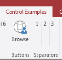
Figure 30.22 Separators provide a way to divide controls within a group.
Here's the XML code for the separators in Figure 30.22:
<group id="ch30_g_Separator" label="Separators">
  <labelControl id="lbl7" label="1" />
  <separator id="s2" />
  <labelControl id="lbl8" label="2" />
  <separator id="s3" />
  <labelControl id="lbl9" label="3" />
</group>
The only requirement for separators is that each be assigned a unique ID value.
The CheckBox control
The CheckBox control is effective for allowing the user to select any of a number of different options. CheckBox controls are not mutually exclusive, so the user can choose any of the check boxes within a group without affecting other selections.
CheckBox controls are established much like any other Ribbon control:
<tab id="ch30_t_Outdoor" label="Outdoor">
  <group id="ch30_g_Sports" label="Sports">
    <checkBox id="chkBaseball" label="Baseball" ...
    <checkBox id="chkBasketball" label="Basketball" ...
    <separator id="outdoor_Sep1"/>
    <checkBox id="chkTennis" label="Tennis" ...
    <checkBox id="chkWaterPolo" label="Water Polo" ...
  </group>
  <group id="ch30_g_Camping" label="Camping Supplies">
    <checkBox id="chkTent" label="Tent" ...
    <checkBox id="chkGranola" label="Granola" ...
    <checkBox id="chkLantern" label="Lantern" ...
    <separator id="camping_Sep1"/>
    <button id="btnCamping" imageMso="StartTimer"
      size="large" label="A Big Button" />
  </group>
</tab>The tab produced by this XML code is shown in Figure 30.23 (and included in the ControlExamples.xml example Ribbon in the Chapter30.accdb database).
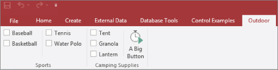
Figure 30.23 CheckBox controls are a good choice when the user needs to be able to select among a number of options.
The Ribbon CheckBox controls shown in Figure 30.23 work exactly as you would expect. The check boxes may be selected individually or in any combination. CheckBox controls are not mutually exclusive, and each control can have its own onAction attribute, or multiple controls can share a callback procedure.
The DropDown control
The DropDown control is more complex than the label, button, and check box examples we've covered. It includes a list of items for the user to choose from. Therefore, a DropDown has a number of attributes that define its appearance, as well as callbacks that populate its list:
<dropDown
  id="ddLogin"
  label="Login" supertip="Select your employee name...
  screentip="Login Name"
  getItemCount="ddLogin_getItemCount"
  getItemLabel="ddLogin_getItemLabel"
  onAction="ddLogin_onAction" />
The id, label, screentip, and supertip attributes define the DropDown control's appearance. The getItemCount and getItemLabel populate the DropDown's list. onAction specifies the callback that handles the control's action. Figure 30.24 shows the DropDown created in this section.
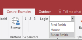
Figure 30.24 A DropDown control lists users' names.
The VBA callbacks for a typical DropDown are shown in the following code. Two primary callbacks are required for a DropDown. The first sets the count of items to appear in the list, and the second actually populates the list.
Public Sub ddLogin_GetItemCount( _
    control As IRibbonControl, ByRef count)

    count = Nz(DCount("*", "tblSalesPerson"), 0)

End Sub

Public Sub ddLogin_getItemLabel( _
    control As IRibbonControl, index As Integer, ByRef label)

    Dim sName As String

    sName = Nz(DLookup("SalespersonName", _
        "tblSalesPerson", "SalesPersonID = " & index + 1), _
        vbNullString)

    label = sName

End Sub
The first callback (ddLogin_getItemCount) gets the count of items to be placed on the DropDown's list. Notice the ByRef count parameter. This parameter tells the DropDown how many items to accommodate on its list.
The second procedure (ddLogin_getItemLabel) actually retrieves the items for the list. In this case, the procedure pulls the SalesPerson name field from tblSalesPerson using DLookup. ddLogin_getItemLabel is called by the DropDown multiple times; the exact number of calls is determined by the count value established by ddLogin_getItemCount.
An accurate count of values to add to the DropDown is important. The DropDown has no way, other than the count parameter, to know how many items to expect. Setting a count too low means that not all items will be added, whereas setting the count too high means that list contains blank spaces. For instance, if you set the count to ten items but only five are available, then the DropDown's list contains the five items but also five blank spaces.
The ddLogin_getItemLabel routine cheats a little bit to supply this information. Notice the index parameter passed to this routine, which tells the procedure which slot on the drop-down list is being filled when the procedure is called. The DLookup adds 1 to this value and extracts the name of the salesperson whose ID matches this value. This means that the SalesPersonID values have to be sequential, starting with 1, or this procedure will fail.
Extracting data with nonsequential ID values, or where the ID value is non-numeric, requires a bit more work. In the following code, ddLogin_getItemLabel has been rewritten to use an ADO recordset rather than the DLookup function. The ddLogin_onAction procedure uses a recordset in the same way.
Private Const msSQLSALESPERSON As String = _
  "SELECT SalespersonName FROM tblSalesPerson ORDER BY
   SalesPersonName;"

Public Sub ddLogin_getItemLabel( _
  control As IRibbonControl, index As Integer, ByRef label)

  Dim adRs As ADODB.Recordset

  Set adRs = CurrentProject.Connection.Execute(msSQLSALESPERSON)
  adRs.Move index

  label = adRs.Fields(0).Value

End Sub

Public Sub ddLogin_onAction( _
  control As IRibbonControl, id As String, index As Integer)

  Dim adRs As ADODB.Recordset

  Set adRs = CurrentProject.Connection.Execute(msSQLSALESPERSON)
  adRs.Move index

  MsgBox "You are logged in as " & _
    adRs.Fields(0).Value & ".", _
    vbOKOnly, "Logged In"

End Sub
Both procedures use the same module-level constant, msSQLSALESPERSON. This ensures that the records are sorted in exactly the same order. The Move method moves to the record specified by index, and if the records were in a different order from one procedure to the next, the wrong name would be returned. The name of the salesperson is retrieved using the adRs.Fields(0).Value statement. By controlling the SQL statement in a module-level constant, you can be sure that the first field (.Fields(0)) will contain the proper information.
The SplitButton Control
The SplitButton control is very useful in situations where the user may select from a number of different options, but one option is used more frequently than the others. An example might be a number of reports, one of which is commonly printed while the others are printed less often. The View SplitButton that's on the Home tab when you're designing a table is a good example (refer to Figure 30.2). The button portion of the View SplitButton changes, depending on the context. If the user is already in Datasheet view, the button changes to Design view and vice versa.
The items on a SplitButton's list are contained within <menu> and </menu> tags. Whichever controls (within reason, of course) that appear within these tags show up in the SplitButton's list. The definition of the default button portion of a SplitButton lies outside the <menu> and </menu> tags. In the following code fragment, spbtn1_btn1 is the default button, whereas the other buttons (spbtn1_btn2, spbtn1_btn3, and so on) occupy the SplitButton's list:
<group id="ch30_g_Splits" label="Split Button">
  <splitButton id="spbtn1" size="large">
    <button id="spbtn1_btn1"
      imageMso="ModuleInsert"
      label="Button1"
      onAction="spbtn1_onAction" />
    <menu id="spbtn1_menu" itemSize="large">
      <button id="spbtn1_btn2"
        imageMso="OutlookGlobe"
        label="Button2"
        onAction="spbtn1_onAction" />
      <button id="spbtn1_btn3"
        imageMso="OutlookGears"
        label="Button3"
        onAction="spbtn1_onAction" />
      <button id="spbtn1_btn4"
        imageMso="Organizer"
        label="Button4"
        onAction="spbtn1_onAction" />
    </menu>
  </splitButton>
</group>
This Ribbon XML example produces the SplitButton shown in Figure 30.25. This example is contained in the rbnControls example in the Chapter30.accdb database.
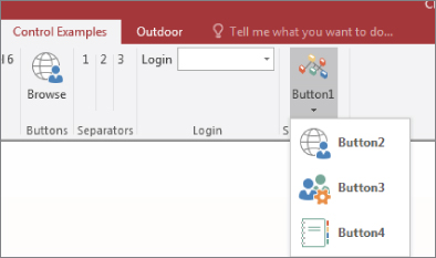
Figure 30.25 A SplitButton is a very useful Ribbon control.
Attaching Ribbons to Forms and Reports
The Ribbon elements we've created so far are always visible. Often, you'll want the Buttons, DropDowns, and Menus that you place on the Ribbon to be available all the time. However, you may have certain Ribbon elements that you want to display only in certain situations. Fortunately, Access provides a simple way to display Ribbons when a form or report is active.
Forms and reports have a RibbonName property that you can set in the Property Sheet or with VBA. The Ribbon Name property in the Property Sheet provides a drop-down for all the Ribbons in the USysRibbons table. Figure 30.26 shows a Ribbon being attached to a form.
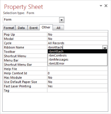
Figure 30.26 Setting a form's Ribbon Name property.
The rbnAttach XML code is in the FormAttach.xml file included with the sample files for this chapter and is in the USysRibbons table in the Chapter30.accdb example database. Here's the XML:
<?xml version="1.0" encoding="utf-8"?>
<customUI xmlns="http://schemas.microsoft.com/office/2009/07
     /customui" onLoad="onRibbonLoad">
  <ribbon startFromScratch="false">
    <tabs>
      <tab id="ch30_t_Attach" label="My Form">
        <group id="ch30_g_Attach" label="My Form">
          <button id="ch30_b_Attach" label="My Form"
           imageMso="GroupTasksLayout" size="large" />
        </group>
      </tab>
    </tabs>
  </ribbon>
</customUI>
The button doesn't have an onAction attribute, so the Ribbon doesn't actually do anything. It's just an example to show how the Ribbon changes when attached to the form. The startFromScratch attribute is set to false so that the tab is added to the default Ribbon instead of replacing it. Figure 30.27 shows the new tab that is displayed when the form is opened.
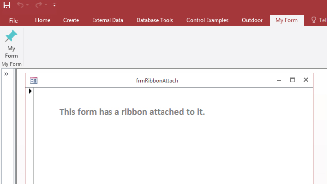
Figure 30.27 Opening a form opens its Ribbon.
The My Form tab, with its associated controls, is available while the form is open. Closing the form causes the new tab to disappear. The list of Ribbons in the Property Sheet acts like the list in the Options sheet. That is, it doesn't update whenever you add a new Ribbon to USysRibbons. You have to close and reopen your application to update the list.
Removing the Ribbon Completely
Assume, for a moment, that there are perfectly legitimate reasons why you don't want to use the Ribbon in your applications. Perhaps you've developed a set of effective switchboard forms, or you've mimicked the old-style toolbars and menus with borderless forms. Or, your applications are entirely forms-driven and don't need the flexibility provided by toolbars and Ribbons.
Here's how you can completely remove the Ribbon from the Access interface:
- Create a new table called
USysRibbons, if you haven't already done so. - If creating the
USysRibbonstable for the first time, add three fields:ID(AutoNumber),RibbonName(Text) andRibbonXML(Memo). - Create a new record with the
RibbonNameset to Blank. It doesn't really matter what you call it. - Add the following XML to the RibbonXML column:
<CustomUI xmlns="http://schemas.microsoft.com/office/2009 /07/CustomUI"> <Ribbon startFromScratch="true"/> </CustomUI> - Restart the database.
- Select the File tab and then the Options button in the Backstage.
- Click the Current Database tab and scroll to the Ribbon and Toolbars area.
- In the Ribbon and Toolbars area, set the Ribbon Name to Blank (the same name you specified for the
RibbonNamecolumn in Step 3). - Close and reopen the database.
This process sets up a dummy Ribbon named Blank that contains no tabs, no groups, and no controls. In effect, you're telling Access to put up an empty Ribbon, which simply removes the Ribbon from the Access user interface.