
Dream in Color
Color theory haunts my dreams. I am often caught off guard because I am thinking of color. Colors appear one way alone and can become magically transformed when placed next to another color. The colors in my dreams can’t be seen with the waking eye. Perhaps in a distant future we will discover ways to see those dream colors.
In the meantime, grab a handful of color chips from the paint store and try mixing and matching to see what happens visually. Make your own color chips using iridescent and interference paints. To spice up your color options even more, make color chips using different kinds of metal leaf. You’ll be able to see, for example, how a certain color would look against a coppery leaf. Experimenting this way will save you a lot of time later and you will find some very cool combinations.
TECHNIQUE ONE: Impact
It is definitely worth having a color wheel in your studio for easy reference. Three easy ways to get color drama are:
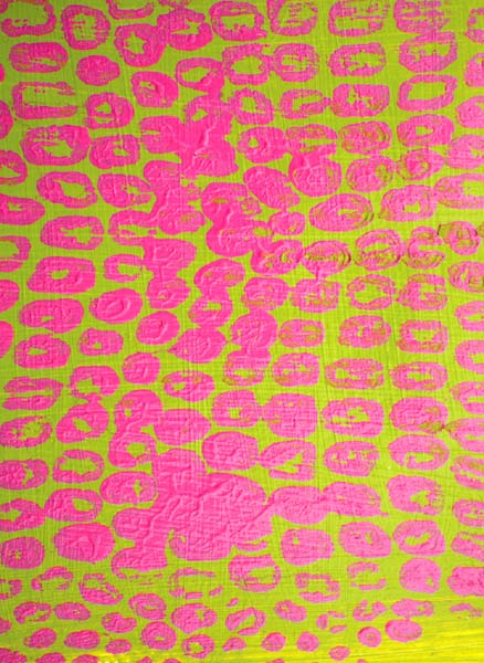
Complementary Color: Opposites attract, right? Placing an fuchsia color next to a green has major punch.
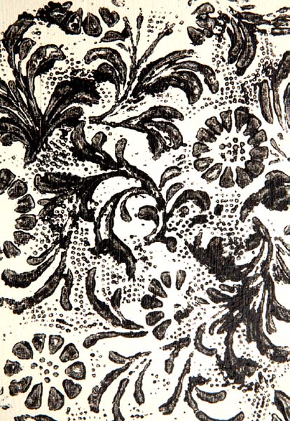
High-Contrast Colors: The extreme would be black against white. Your eye will gravitate to the place where your darkest darks and lightest lights come together.
Cool Against Hot Color: If you have a painting that is warm, use some cool color accents to give it pop. Do the reverse if the painting is too cool.
TECHNIQUE TWO: Brighten It Up, Gray It Down
Color theory can improve your art by giving it more impact and balance. Many books and websites address this subject. Learning about high and low key colors and how they can have varying levels of color saturation will get you started.
TECHNIQUE THREE: COLOR KEY
Color key is the overall brightness and chroma (color saturation) of a painting. High and low key paintings can have varying levels of color saturation. It’s the use of lights and darks, saturated and desaturated color, that makes a piece of art pop, not unlike the use of sweet and sour or salt and sugar in a recipe.
High Key paintings are on the light end of the value scale and can be achieved with the addition of white to your color. In all three of these samples you can see at least a hint of color in the lighter values. Combine high key color with darker images to give your piece focus, like in the piece above.
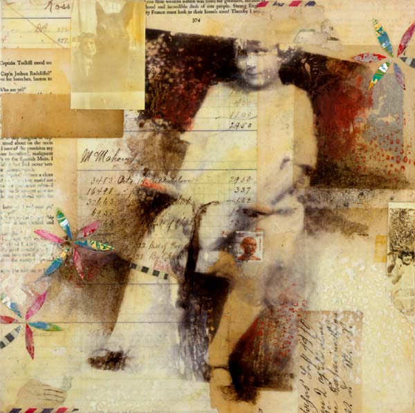
FADED MEMORIES
Darlene Olivia McElroy

The varying saturation of one color in a piece can give you both quiet and loud areas.
PINK CRUSH
Darlene Olivia McElroy

CALM IN THE EYE OF THE STORM
Darlene Olivia McElroy
Low key paintings tend toward the darker end of the value scale. Think of the sea or a cityscape at night—one in which you can barely see color in the darkness. Add a glow of a lighter color and now you have a focal point.