
According to Psychophysics of Vision by Michael Kalloniatis and Charles Luu, about 8 percent of men and 0.5 percent of women have some form of color blindness. This is a significant number of people (most of them are males because of gene mechanics), many of them can become your customers. You should take care of this category of players, which is much easier than you can assume. The following figure shows the players with different types of vision:
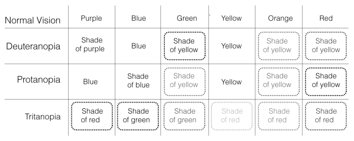
I think it is more correct to use the term color vision deficiency instead of color blindness, because people with different forms of color vision deficiencies basically do see colors, they have no black and white vision, based on shades of grey (except for a very rare disorder called achromatopsia). But they have difficulties with some of the colors and relative shades; for them there is a shift in the spectrum for specific colors. Color receptors give a response closer in hues to other colors, which creates trouble in perceiving differences between shades. Usually, such people have their own characteristics for each specific color, based on its saturation and brightness; however, sometimes such parameters are not powerful enough to spot the difference between specific colors. The following are the most common forms of color vision deficiencies (according to Colorblind Vision application):
- Deuteranopia: This is one of the common forms resulting in people having problems with the perception of the color green, because there is a shift towards the red color. Hues such as orange and yellow are affected as well. People have trouble in perceiving differences between shades of red and green; in some cases they can look the same or very close. A total of 5 percent of males and 0.38 percent of females have this deficiency.
- Protanopia: People have difficulties with the red color, the shift is directed towards the green color. It is similar to deuteranopia, with people having the same problems with the red-green pair and its derivatives as yellow and orange. 2.5 percent of males and 0.002 percent of females have protapia.
- Tritanopia: The perception of blue-pair is affected. This type of color deficiency causes a very strong distortion of the perceived palette of colors, red being dominated. For instance, yellow shades are replaced with pink ones. Its occurrence is rarer, less than 1 percent of population.
- Achromatopsia (monochromacy): Total color blindness is an extremely rare color vision disorder. The world looks like a monochromic image. Only 0.005 percent of the population is diagnosed with it.
It is important to note that people with any of the common forms of color vision deficiencies are full-fledged members of society (in many countries, it is not an official disability, and does not affect people's career), they are fully adapted to the world around them, even having some advantages; for instance, people with red-green blindness sometimes have a better talent of distinguishing patterns, they can see camouflaged objects better. Unbelievable, but Jon Hicks—the designer who is behind the drawing of the Firefox logo (he has been mentioned in this book earlier)—is colorblind. The following is the quote from his website:
"You see, I'm colourblind, and more specifically, I have problems distinguishing between blue and purple, and green and brown. This is called 'red/green colourblind'. I can see tones, but hold up a blue square and purple square, and I'll probably just see 2 blue squares (handy that you had some coloured squares lying around though) "
Neil Harbisson, an amazing man, was born with achromatopsia; he couldn't see any colors, other than black and white. That did not prevent him from studying fine arts; he used a monochromic pallet for his work. Then he met a student from Plymouth University, interested in cybernetics. Together they started a project, which later became popular as eyeborg, the device that helped him to catch colors, not by vision but by hearing special sounds. The eyeborg is a sensor that converts colors into sounds of specific tones. He can "hear the colors" around him, he even sees (or it is better to say, listens to) colors in his dreams when he sleeps. The artist even began to work on sound portraits; a person or an object is converted into a number of tones, which the eyeborg generates by scanning their surfaces. Vice versa, a melody or a speech can be converted into a color chart, so he also has some paintings of famous sounds.
The red-green blindness is the most common type of color vision deficiency, which is a problem if we try to recall the most popular color codes modern games are using. The green color is positive, friendly, and safe, but red symbolizes danger and hostility. Friends usually are marked in greens and enemies in reds. A character's calm mood is identified by green signals, but his fury by red ones. Another good example is of the trajectory lines; the correct ones can be painted green and the wrong ones red:
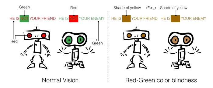
The player with red-green blindness does not see (or barely sees) the difference between such code and signals. Is the character an enemy or a friend? Is the progress bar now in a red or green zone? The player has no clue. For him/her, such color code looks very alike, as though he is looking at some military equipment painted in various forms of olive drab or tan, and should spot the difference between shades. This can make some of the aspects of the game unrecognizable and even make the game impossible to play. This is especially true for various puzzle games, displaying a lot of color balls or bricks. Imagine you have a Match-three game, where the player does not know the exact color of each element. So he can only play randomly; sounds weird, but it is a very realistic scenario for players with some color vision deficiencies.
What do you have to do to prevent such a situation? First of all, try to look at your game screen via the eyes of a person with color recognition problems. There are several ways to simulate color vision deficiency. Many modern graphic editors have some options for that; for instance, look at Adobe Illustrator's or Adobe Photoshop's special menus. When you go to View | Proof Setup, there are two useful options Color Blindness—Protanopia-type and Color Blindness—Deuteranopia-type. For older editions of Adobe products, there is a plugin Vischeck, which is a project by two scientists at Stanford University: Bob Dougherty, PhD and Alex Wade, PhD. The plugin can be found at http://www.vischeck.com/downloads/.
Another way to see the world as the people with color vision deficiencies do is to use special applications for the iPhone or iPad. One of the popular ones is Colorblind Vision, developed by opcoders.com. It is very simple to use, you have to choose the form of color vision weakness and a camera with the specific color filter will start immediately. The main advantage of this way of simulation is the opportunity to test not static images, but the dynamic gameplay itself.
There are a lot of online tools that let you upload images and look at their color transformation. For instance, look at the inclusive design toolkit, which was developed by the University of Cambridge, Engineering Design Center and sponsored by BT. Its goal is to let designers produce solutions for a wide range of customers, which include those with a number of abilities and also those with some special needs. The online simulator can be found at http://www.inclusivedesigntoolkit.com/betterdesign2/simsoftware/simsoftware.html. It shows examples of vision affected not only by color blindness, but also by cataracts, glaucoma, diabetic retinopathy, and so on.
Look at your game screen through the simulator and try to determine all the weak points you've got. Don't think much about the background artwork or other elements of decoration, they will not confuse a player with a color vision weakness; try to fix all game items that have visual coding based on colors (primarily all the red/green pairs, then blue/violet, and so on). If the game element uses only a few color signals to demonstrate its state, the solution is simple: contradictory colors may be replaced with more secure ones. For example, a red signal can be replaced with a yellow, and a green with a blue. It is useful to use special color palettes full of reliable color swatches.
You can find some of the palettes on the website of Christine Rigden at http://www.rigdenage.co.uk/safecolours/palettefiles.html. She was the author of the interesting article The Eye of the Beholder—Designing for Colour-Blind Users published in British Telecommunications Engineering, Vol. 17, in January 1999. One of the ideas described in the article was the creation of special safe palettes for color blind people, based on the web-safe color palette. The result is presented in the form of color tables suitable for Adobe Photoshop.
In case the game has game triggers with a lot of color states (for instance, it is a puzzle with a dozen color balls), another approach can be used. Each trigger can feature a special graphic icon, which helps to differentiate it from others. There are a lot of familiar examples from real life using such a method to distinguish objects. For example, playing cards, which have both colors and symbols; traffic lights for pedestrians, where special pictograms (or words) are used (the green light usually displays the symbol of a walking person, but the red light shows a person standing still). So try to equip game triggers with some unique graphic icons, also try to combine them with some safe colors to increase attractiveness.
You can also play with patterns, a good inspiration would be various maps and schemes from old books; many great books were published in black and white. So graphic illustrators of that time had to distinguish elements by using patterns based on dots of different densities, diagonal lines, grids, parallel lines, and so on.
Bear in mind that you need not try to create a universal system that would be good both for people with normal color vision and those with some problems, because a majority of players with normal vision can be confused by a new logic of color coding (such players expect that the angry enemy would feature red eyes, not blue ones). It is better to add an optional mode oriented to players with special color needs. The game has to be created normally, using any color scheme you like, but all the important trigger elements should have the option of being switched from the normal look to the special from the menu options. A practical example can be found in the puzzle game Peggle, designed by PopCap Games; it can be switched to the color-blind-friendly mode via the Options menu:
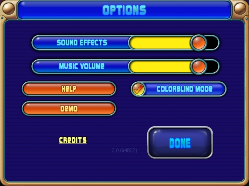
A puzzle game Peggle from PopCap features special mode for color-blind players
Then you have to check the entire color adaption with some real-time simulators. If the game is playable in such a mode, you can be calm. Of course, the most reliable way is to invite a person with color vision deficiency to be your beta tester; such a person can give the most precious advice. Remember that you may not resolve all the problems associated with the colors for color-blind players, but you should at least try, because of the love and respect you have for all of your players.
Sometimes a human eye can have extra abilities. There is an interesting story about the famous French painter Claude Monet. Because he had cataracts diagnosed at a pretty advanced age, the lens in his eye began to lose their ability to transmit light correctly. The painter began to experience difficulties with the perception of colors; all objects were in a fog. So when he was 82 years old, he was successfully operated on his left eye and the faulty lens was removed. The result was a bit unexpected; the painter got the ability to see ultraviolet light. Usually, the lenses in the human eyes work as filters blocking ultraviolet light, but he had no lens in his left eye, so the UV rays could reach his color sensors and affect them. He began to see the world differently, his color vision range changed. It is interesting that as he used his new abilities in his work, all the paintings drawn after the surgery had a unique color palette, for example, he added more blue pigment to images of water lilies.