
To design a product that is comfortable to use, some general guidelines should be followed. They are not complicated and in most cases, they are very obvious and familiar; they can be easily formulated by your own gaming experience. You may recall any solutions you liked from other projects (and not necessarily game products). Additionally, some reverse thinking is required; situations when you felt uncomfortable using a mobile application should be noticed to try avoiding them in your own project. Good ergonomics is pretty transparent and natural for its users. It is pretty inconspicuous and hard to remember actual details about problems rather than overall pleasant experiences. That is why it would be efficient to learn from bad examples by trying to solve ergonomic problems.
Even if you planned a complex gameplay with a lot of shades, always try to start with simple rules. The first levels are the training ones. People usually dislike tutorials, because such game levels look too synthetic and boring. Games are entertainment, so the training should be engrossing too. This is why it is better to embed the tutorials inside the game process instead of keeping them separate. The first levels should be simple, have only one goal, and teach a specific principle of the game. Special pop-up messages with clarifications can be displayed. But try not to overdo it, the levels should not be too easy to complete, the complexity must rise gradually. Otherwise, the player may decide that the game is ridiculously simple.
Literally, in each software application including games, there is a "distance to a destination"; it is measured in the number of clicks (taps) a user has made to get some output. Apparently, the intervals should be reasonably minimum; to attain such values, all trajectories of the movements inside the application from a screen to another screen should be well thought out. The general objective is to help a player to activate the game process as fast as possible. This is pretty trivial for simple games with only one game mode; in such cases, the distance is equal to one, and only a tap on the Start button of the game is needed. But games with more complex structures need some smart decisions. For instance, a racing game by default requires vehicles and tracks to be chosen before a race, so the distance is longer. But it can be shorter if some stages are optional; the player can choose the vehicle once at the beginning of a game session, but the track can be set automatically. In which case the game can have, for example, a Quick race button. So a player gets two possible paths: a long one with the freedom to choose some elements, and a short one with some predefined components. Of course, the second one is not sufficient to express all game possibilities, because some options can be out of the scope of a player's attention. But that can be resolved as well. The game should push the player to choose something new; for example, before a specific race, by tapping the Quick race button, the player gets a message that he has to choose another type of vehicle.
It is always better to avoid any type of pop-up messages asking the player to push an Ok button to close it; people sincerely hate them, especially when such elements are used inside the gameplay process. The info message should be displayed parallel to the action and disappear automatically (after a period of time or after the player achieves a specific objective).
It is one of the most desirable buttons. The gameplay of a mobile game is often interrupted; a game session usually consists of many short periods of playing. The common causes of interruption are external factors; for example, communication with other people, arriving at a destination, and so on. Thus, it is necessary for the player to be able to pause the game at any time. Generally, the pause command is assigned to a button that activates the game menu; when it is tapped, all the game processes freeze. At one point it is reasonable to place such a type of control in the top-left corner, the way many iOS applications do. That provides a habitual pattern of behavior for the player. At some other point, it is more common to place such a button at the right-hand side corner of the screen, because it is more comfortable for right-handed persons; many modern games use these types of layouts. Some titles also place the menu/pause buttons at the center of the screen; the most comfortable setup in such a case is a centered button placed at the bottom when a device is used in portrait mode so that thumbs can easily reach it. The most uncomfortable scenario is a centered pause button displayed at the top, as players need to shift their hands to press it. There can be little excuse for such layouts; it is hard to press the button accidentally, but this reason sounds a little unconvincing.
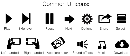
An ideal variant of the text label for the button is menu/pause, but it occupies too much space; hence, only Pause can be used. The words can be replaced with graphic symbols, which is very handy. For instance, an arrow pointed to the left can mark the menu button. But now it is very popular (most of the modern game titles use this approach) to implement a pause symbol (two parallel bars). Because the symbol has been taken from media controls, some other icons from there can be used as well. For example, the Play symbol can mean start (or continue) a game session, the Skip level can switch to the next level skipping the current one, and so forth.
A modern game of any genre must autosave the game progress. That is an indisputable rule! The player can pause or unload the game, but it should save the current game setup. In an ideal case, positions and states of each element can be recorded to a saved file. The iCloud functionality is always good practice, but the system should be reliable enough; there should be locally saved files as well to work in situations when the cloud-based storage is unavailable. Action games can utilize checkpoints to save the player's progress. In this case, they play the role of an element which motivates the player to move forward. Try not to spare too many checkpoints, it is good to use as many as you could in any level, especially before you get to a tricky scene. A good way to change the game's difficulty level is to vary the number of checkpoints. Never, I say never, place the checkpoints just before a cut scene! Players hate situations when a hard game scene—a fight with a boss—is preceded by an animated sequence, portion of text, or some other narrative element. They hate them even if a skip function exists. The only artistic excuse is the attempt to induce a specific player's emotion, for instance, make him/her angry, so he begins to hate the enemies immensely (and the author of the game as well).
Remember that there is an experience issue that a standard autosave feature is incapable of resolving. While playing some game with a very picturesque game design (especially those with a strong adventure component), users may need the opportunity to save their progress in a specific location. For example, users might want to share their experience with somebody else, showing a particular game scene or how to replay an interesting moment. For such games it is good to have some form of manual saving as a niche feature. There are no hot keys on mobile devices, so saving should be activated via the menu. Saves should be graphically presented as slots with some small screenshots. The game should be made a little rigorous by limiting the overall number of such slots. If the number is big or unlimited, a player can create a mess; there will be dozens of saves he would never clean up.
Alternatively, a game can automatically create special saves on locations that are considered beautiful or important. So a player can use a special menu (it may be titled as Memories) to give access to those saves. For example, such options can appear after a successful completion of the main story line.
An element of the game's comfort is associated with the Continue button. The player has started the game for the second time and he wants to continue his journey; the destination should be only one tap long. He would be annoyed if the game asked him to perform some selection procedures such as choosing the type of mode he played before and picking out the appropriate saves of the game. Therefore, the game must give prominence to the Continue button. Hence, it is the first button on the list of the main menu.
Each interactive element the game has must be expressed well. First of all, the buttons should look and operate like buttons; the player's eye should be able to distinguish them out from the background and other elements easily. It is a mistake when a person taps a still image thinking that it is a button. The game elements should express their nature too. Each game trigger must say, "You can push me".
In most cases, you should develop a control system, where the direct manipulation of game elements is used, because it looks more natural for touchscreens. Try not to create control buttons to move the character, but let the player tap the screen and mark the destination the character will walk to. Various increment and decrement buttons are bad. Unless they are needed for specific game mechanics or mood, for instance, some games that imitate retro arcades do use onscreen controls.
It is better to introduce the components of the gameplay step by step. This makes it not too overwhelming for the player. His attention should be focused on one event per moment. To express all the features of the element, you need to pay special attention to the level design. The whole level should be about the element you want to show to the audience—you need water to test a boat. The element's purpose should be clear and univocal as well. Remember that it is more efficient to give the player few, but good gaming tools, rather than surprise him with a bunch of possibilities he will never use. This does not mean that you should not introduce something new during the game progress, but you must stimulate him to drop the tools he has used before in favor of the new ones.
The game level design should follow the same rule; if you are going to surprise somebody with some element (for example, a beautiful waterfall), it should be alone in its brilliance, and other components should not interfere. Moreover, it can guide a player's sight in the proper direction, so the player can enjoy the complete view.
Old school games used the metaphor of a medicine chest to cover up for the loss of a character's health. A player's hard efforts were very often rewarded with some medicine chests, so he could fight some extra enemies to get better health. I like that approach very much; however, nowadays more and more games have dropped the medicine chests, thinking that the player's being would be more comfortable with a health regeneration function. How does it work? The character loses his health when he is in a stressful situation; for example, he is in a fight, he has fallen down from somewhere, and so forth. And he restores his health conditions when the situation is calm. Also, when medicine chests are scattered on a game level, the autoregeneration function should be balanced very accurately to ensure the game works well.
Game levels should be planned correctly. They must have both peaks (sequences of very dynamic actions), and valleys (zones of comfort and relaxation, some sort of digression), so that the player can regain his breath. This is especially important for games with health regeneration, because the player needs some shelters to restore his condition. Remember that the valleys shouldn't be boring, show the player something beautiful (such parts of levels can feature the most interesting examples of visual design), or give him a simple and leisurely task.
The main components of the game; for example, a plot, objectives, characters, weapons, protagonist abilities, mechanics, and so on, should come in portion. The lesser the better. A player can concentrate his attention on a pretty limited amount of new things at one moment; in cases where the sight is blurred, he does not notice some details and is less surprised by new content. Moreover, a person can be tired of a huge wave of new experiences, so it is important to be courteous and show new things in a delicate manner.
In an ideal scenario, the game features an automatic difficulty level. It looks at the player's behavior and makes the conditions harder if his attempts are successful very often; vice versa, it tries to make the game less difficult if there are a lot of failures. It is not easy to implement such a system because of the calculation of the right balance. But the game should at least go along with the player; if he is stuck somewhere for a long period of time, the process must be inconspicuous enough, so the player won't feel ashamed. The change in difficulty levels should be available in the options menu all the time. It is pretty obligatory to include the Restart and Undo buttons into your puzzle games.
Contradictory to desktop and console games, mobile games are not much about audio content. Very often the players are playing in public spaces; if they can't use headphones, they prefer to switch the music and sound off, or reduce the volume level significantly. Some players may also have some degree of hearing loss (there is also a condition called tinnitus, when people perceive some additional noise in their ears; for example, ringing, buzzing, whistling, clicking, and so on), since they may have some trouble in perceiving sounds.
Therefore, you should first think about your game without any audio (I'm not talking about audio games). Don't use stimulus based only on sound. Game situations should use visual methods, but the sound can be a pleasant supplement to them. Music should be less important than sound effects if we are talking about game mechanics; however, it plays a significant role in enhancing the mood of the game, especially when it is interactive; in action sequences, melodies are more effective, in disquieting scenes they give some sense of suspense, and so forth. Even silence, when the music suddenly stops, can be used as the element of a story. But the music should be pretty unobtrusive to be comfortable for the ears; players can simply get tired of it, as music accompaniment can sound very monotonous and importunate (this is why a contextual melody suitable in real time is a good solution). So there should be an option to turn the music off and that option should not be a part of the sound effects control.