
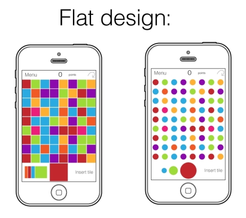
The prototype in this chapter already has some decoration, such as the in-fashion flat and minimalistic approach to graphics for mobile application. This decoration also includes pure colors, simple shapes, and large and light typefaces. The only final preparations are some tunes on colors. Alternatively, the square tiles might be replaced by color circles as you can see in the following figure. They look very funky, recalling some pop-art work, especially when there is some empty white space around, which emphasizes the power of colors:
You can get inspired by some sources of fine and professional design. Look at such games as already mentioned Hundreds with a clean, modernist visual style and Puzzlejuice (http://puzzlejuicegame.com) from Colaboratory with flat and very attractive design, based on the contrast between color squares and a dark gray background (its UI is gorgeous as well). Don't miss Radballs (http://radballsthegame.com) from glow play, a magnificent tile-matching game with graphics, which can be used as cover art for electronic musicians; to the credit of its author, the attention to detail is pretty incredible. Another magnificent example is a game called Flipcase (https://twitter.com/flipcaseapp) which has an ingenious visual concept. The graphics are clean and minimalistic, but most importantly, the game turns the iPhone 5C Case into a game accessory.
Players have to put silicone cases contrariwise so they cover the screen, and then the game displays all virtual items in positions aligned with the circular holes the cases have. Such a setup does not give extra game features, but looks funny and gives the audience a bit of a pleasant surprise. The idea is small and simple, but it is original and this helps to draw strong attention to the application. The following figure shows the design for a game called Skeuomorphic:
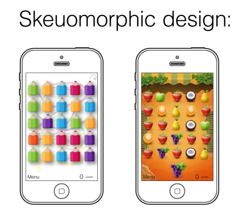
For the Skeuomorphic game artwork, first of all you need to find some attractive plot ideas to define the theme and style of the game. It is better to choose something elementary but very appealing. It is advisable to choose things without small details and complicated shapes otherwise, they can confuse the player. Especially in small screen resolutions, the tiles should not be dazzled. The color of elements has to be extremely uniform. It is always better to use images of something familiar; a good example is a match-three game called Candy Crush Saga (http://www.candycrushsaga.com/) from King.com Limited, which uses tasty images of candies as the main game pieces. Here are some ideas for tiles you can manage: colored light bulbs, flowers, planets, autumn leaves, fruits, monster eyes, and many others. Before you draw the final images, it is always better to create a bunch of drafts and to check them by playtest; sometimes, things that sound great on paper are practically impossible to use.