
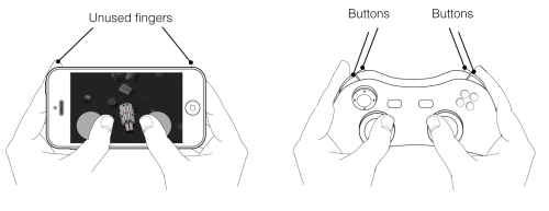
It must be confessed that controlling complex objects in a 3D space is not very natural for touchscreens. They were created for pointing, scrolling, and gestures, but not for dual control of motion (that was not thought of when such devices where planned). There are several factors that make such a job less comfortable and precise. First of all, when people play on a mobile device (either iPhone or iPad), they use their fingers in a very specific way. In most cases, only thumbs are available for input. The other fingers can be used as well, but that is not as comfortable and natural as holding a game controller, where special buttons are ergonomically placed on top of or under the device so that the fingers can naturally reach them. There cannot be a direct analogy with keyboard-and -computer mouse tandem. You cannot recreate the gaming keyboard mechanics simply by placing virtual WASD, Shift, and Space keys on the screen because to interact with them, players need to use five fingers at the same time; but that is practically impossible on mobile devices, especially on phones where the screen is smaller.
Difference between a touch-screen device and a gaming controller
That is a problem because the familiar paradigm should be changed. From the very beginning, video games were designed for machines with fixed physical controls since many habits and principles are attached to such architecture. Look at popular handheld gaming consoles such as PlayStation Vita from Sony or the Nintendo 3DS. Despite the fact that they feature touchscreens, they have familiar physical buttons as well.
In the worst scenario, a 3D action game on a touchscreen-only device may not become a story about fighting enemies, but about fighting with the game's controls since game designers need to invent their own effective solutions and some new logics by bringing up some new habits for the players. The obvious approach is onscreen controls that imitate the behavior of physical buttons. As a rule, they are placed at the bottom corners of the screen so that the thumbs can easily reach them. Additional controls are displayed nearby (a little above). A user may simply shift his thumb to press them, or try to use index fingers. It is better to avoid using any controls situated very far. Since the player needs to stretch to reach them, taking his finger from the surface of the screen, it is always a little bit frustrating.
Note
iOS 7 introduced a native support for external gaming controllers, almost giving the gaming console experience to the player. Contrary to the previous editions of the operating system, developers don't need a special third-party API to provide support for joysticks; everything works via standard libraries.
The game may utilize either virtual buttons or so-called virtual control pads or virtual joysticks that are sometimes more comfortable for complex accurate actions. They have more degrees of freedom because the directions are not fixed to the horizontal and vertical axes. An object on the screen can move in a diagonal direction by a single tap. Their logics imitate the behavior of a laptop's touchpads which were invented to replace the computer mouse. Touchpads can be pretty precise; no wonder Valve Corporation, a company that is an excellent specialist in the 3D action genre, is going to use such technology rather than traditional analog sticks in their upcoming steam controller. Their virtual analogs may be precise and delicate as well, but here, we meet one overall disadvantage of onscreen controls: tactile perception cannot be used by players. They cannot feel the boundaries of the input zone by touch. The screen is equally smooth since a finger can unexpectedly shift its position touching other controls.
As a result, some spontaneous mistakes in the controlling may occur. Thus, onscreen virtual pads should be pretty large, and not adjoined too close to each other.
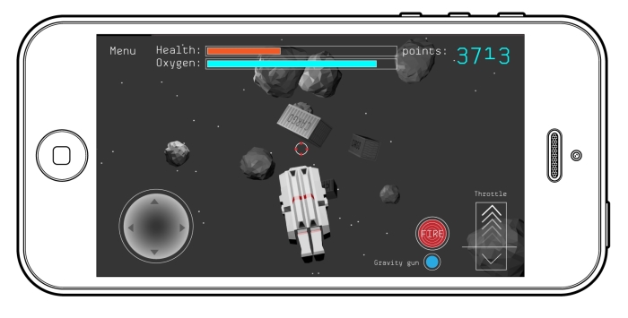
A screen layout with virtual controls on it
Another important point is that the zones where virtual controls are situated are overlapped with fingers. Therefore, there should not be any important graphic elements of a game scene in those zones. If the UI displays some useful information, the player simply will not see it.
However, virtual controls have one great advantage. The system is very flexible. Any displayed button can be added or removed from the screen in a moment. The captions may be changed, and even their size can depend on context. Such functionality offers a challenge for better clearness of some aspects of the gameplay. For example, if the player is out of ammo, the FIRE button turns into a disable state, and there is text, Find some ammo, above it. Or if some function is not available by now, the game does not display a corresponding control on the screen.
It is important to mention that onscreen controls must be adjustable. People may use their fingers differently; so, sometimes they wish to move virtual buttons a little bit (don't forget to include the option to turn the layout into the default state). Another vital point is a layout for left-handed persons. It can be created very easily. You simply need to mirror the positions of control elements on the screen.
Because of the tricky nature of the onscreen virtual controls, you have to spend a lot of time testing it on a device and asking other people about their experience with your game, figuring out the important nuances of comfort controlling.
Remember that the positions of the fingers are not always obvious for players; so, it is a good practice to show a clarifying scheme at the very beginning of the game. It is worth noting that in most cases, virtual controls are perceived as uncomfortable only at the very beginning, but later, the players may successfully adapt to them. So, your goal is to alleviate that phase, for example, through level design. The first game scenes should not include any episodes that required an accurate maneuvering in space. That should be a room upholstered with soft featherbed where the player can learn how to walk without fear of being harmed. The room can have large spaces, large gates, and simple objectives. For example, if you would put a narrow bridge at the very beginning, many players would fall down from it over and over again, thus hating your game more and more. Another good practice is stage-based learning of controls; they are introduced one by one. For example, there are two control pads in a game, one for moving a character on the ground and the second one for free-looking, and there may be several additional buttons such as FIRE or JUMP. You can give them all to the player at once, hoping that he might figure out how to use them properly, or you can do it in a more smart way. At the very beginning, the player only has to use the first control pad; the other one is disabled. After a period of time, when the player is already familiar with the basic controls, the objective may become a little harder. He is asked to start using the second control pad. To use such tactics correctly, the plot of the game should express these stages in a creative manner. If the player has only one button for a period of time, that should be the best one-button-game experience ever!
Astronaut is Gone uses onscreen controls in a full manner. The normal layout is made up of a virtual joystick to the left, which controls the AMU's directions on the screen, and a throttle slider to the right, letting the player accelerate the unit or break it. There is also a FIRE button near the slider. The plot helps to organize a step-by-step learning of controls. It is intended that the computer system of the AMU is broken, but it tries to repair itself on its own by making various self-tests, which is not a fast procedure; so, systems of the Unit come back to life one by one. At the very beginning, only the direction joystick is available; the throttle control is considered out of order. The AMU is moving forward slowly, and the speed cannot be increased or decreased. The player learns how to maneuver in space, avoiding collisions with rocks and space junk. There are also several objectives such as catching some spare parts that are floating in space. The player needs them to fix the Unit. Then, the computer system declares that the throttle is in order. The environment around the protagonist becomes a little more hazardous; so, the player is forced to use the main engine. One of the ideas is to show a space part that is running away from the protagonist because he should increase the speed to catch it. Finally, after a period of time, the FIRE button is activated. To present a new feature, the game asks to shoot some rocks that block the way. As you can see, only the tutorial plays a role of the integral part of the game rather than the boring appendage.