
The power of templating in Silverlight means we rarely have to create custom panels and controls. More often than not, an existing element provides the behavior we need and a custom template will provide the appearance. But there are times when you really need something that behaves differently than any of the stock panels or controls. For those cases, Silverlight provides a way for you to create your own fully featured panels and controls, supporting all the same things that the built-in ones support.
Custom panels enable you to create your own specialized layout algorithms. For example, you may want a panel that lays out its children using concentric circles rather than a box model. Implementing custom panels also has a nice educational benefit: they help you visualize and understand the layout process. Once you've created a few panels of your own, you'll find you better understand how the built-in ones work, and can better debug issues.
Due to the power of templating and the use of UserControls, custom controls are more rare than custom panels. But there will be times when a custom control is exactly what you need to differentiate your application or support a critical bit of functionality. Silverlight supports the creation of custom controls, including full templating and visual state management, making it a cinch to create your own.
In this chapter, we'll start by creating a custom panel. As you may have guessed, it'll be a panel that lays out its children in concentric circles or orbits. We'll use that panel to learn how to manage measuring and arranging, and how to bend the layout cycle to our will. With the custom panel completed, we'll turn our attention to creating a custom control. This will be an expander control, with support for a header and content, all of which can be fully styled and templated.
In chapter 6, I covered the layout system. In that system, the primary responsibility for positioning and sizing controls falls to the panel the controls reside in. Some panels, such as the Canvas, position using simple Left and Top coordinates. Others, such as the StackPanel, lay out children based on a series of measurements and a placement algorithm.
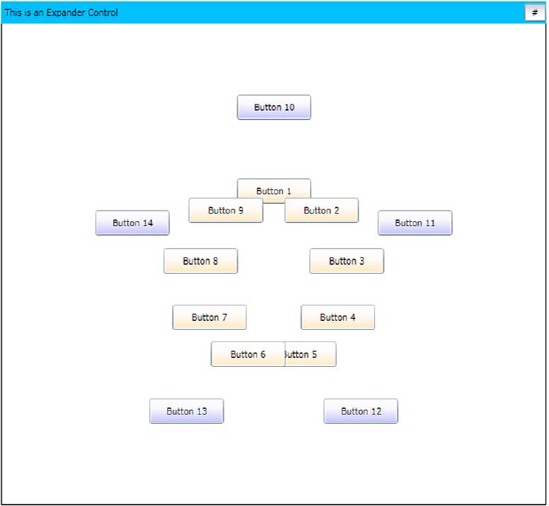
In this section, we're going to build a panel that doesn't currently exist in Silverlight: the OrbitPanel. This Panel will lay out elements in a circle rather than the horizontal and vertical options available with the stock StackPanel or the box layout of a Grid. The new panel in action can be seen in figure 24.1.
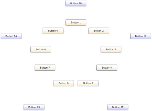
Figure 24.1. The OrbitPanel in action. The inner (first) orbit has nine buttons. The outer (second) orbit has five buttons.
The OrbitPanel control supports an arbitrary number (greater than zero) of orbits. Each orbit is a concentric circle starting at the center point. The amount of space allocated to an orbit is a function of the number of orbits and the size of the panel itself. If there are many orbits, the space will be narrower.
The layout is done starting at angle 0 and equally dividing the remaining degrees by the number of items in the specific orbit. Items added to the panel may specify an orbit via the use of an attached property.
In this section, we'll build this panel, starting with project creation, including the addition of a library project specifically made for this panel and for the custom control we'll build later in the chapter. We'll create a dependency property as well as an attached property, both because they're useful and because creating them is a necessary skill for panel and control builders. From there, we'll spend most of the time looking at how to perform the measure and arrange steps described in chapter 6 to layout the control. We'll wrap up this section with a guide for some potential enhancements should you desire to take the panel further on your own.
For this example, create a new Silverlight project. I called mine Chapter 24 Controls. Once the solution is up with the Silverlight application and test website, add another project; this second project will be a Silverlight class library named ControlsLib. Though I could've put the custom panel into the same project as the Silverlight application, that's almost never done in real-world scenarios.
From the Silverlight application, add a project reference to the ControlsLib project. Do this by right-clicking the Silverlight application, selecting Add Reference, navigating to the Projects tab, and selecting the project. While you're in the project, remove the default class1.cs file that came with the template.
With the project structure in place, let's work on the OrbitPanel class.
The implementation of our panel will be in a single class named OrbitPanel. Inside the ControlsLib project, add a new class named OrbitPanel. This class will contain all the code for the custom panel. Derive the class from the Panel base type as shown here:
namespace ControlsLib
{
  public class OrbitPanel : Panel
  {
  }
}
Panel is the base type for all layout panels in Silverlight, including the Canvas, Grid, and StackPanel. The class itself derives directly from FrameworkElement, so it's a pretty low-level class, lacking the extras you'd find in something like Control. What it does include is important to Panels: the Children property.
The Children property is a UIElementCollection—it's a specialized collection of child elements placed inside this panel. This is the key property that makes a Panel a Panel.
In addition to the Children property, the Panel class provides a Background brush property and a boolean IsItemsHost, which is used in concert with the ItemsControl class. Deriving from Panel allows you to substitute your panel for the StackPanel in a ListBox, for example.
The OrbitPanel class will have two dependency properties used to control how it functions.
The OrbitPanel class will need to have two properties. The first, Orbits, will control the number of concentric circles, or orbits, available for placing items. The second is an attached property, Orbit, to be used on items placed into the panel; it controls which circle the item is to be placed in.
In general, controls and panels should expose properties as dependency properties. If there's any possibility that they'll be used in binding or animation, a dependency property is the way to go. In fact, when the Silverlight team exposes properties as straight CLR properties, more often than not, they get feedback that it should've been a dependency property because a customer or someone in the community tried to use it in binding or animation.
Dependency properties are specified at the class level using a static property and DependencyProperty.Register call. For use in code and XAML, they're also wrapped with a standard CLR property wrapper that internally uses the dependency property as the backing store. Optionally, the dependency property may specify a callback function to be used when the property changes.
Listing 24.1 shows the complete definition for the Orbits property, with all three of these items in place.
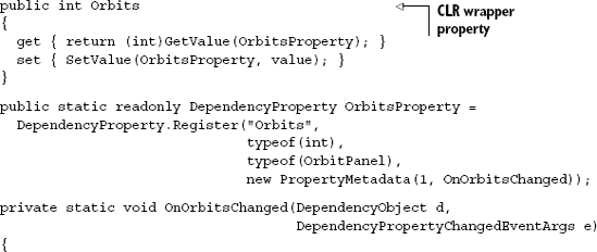
The first thing you'll notice in this code is the Orbits CLR property. This is a standard CLR wrapper, used for simple property access in code and required for property access in XAML. The property code uses the GetValue and SetValue methods, provided by DependencyObject, to access the backing dependency property. Though not required at a compiler or framework level (unless you want to use the property in XAML), providing the CLR wrapper is a standard practice when defining dependency properties.
Tip
Visual Studio 2010 includes a snippet for declaring dependency properties for WPF. With a slight change to rename UIPropertyMetadata to PropertyMetadata in the last parameter, this works well for Silverlight applications and saves you from remembering the exact syntax.
The next chunk of code in this listing defines and registers the dependency property. The single line both defines the property and registers it with the property system. The first parameter is the string name of the property. By convention, the name of the dependency property variable is this string plus the word Property. The second parameter is the type of the property itself—in this case, an int. The third parameter is the type you're registering the property on. The fourth and final parameter is a PropertyMetadata object.
The PropertyMetadata object can be used to specify a default value, a property changed callback, or as seen here, both. When providing the default property value, be very specific with the type. For example, a property value of 1 won't work with a double type; you must specify 1.0 or face the wrath of an obscure runtime error.
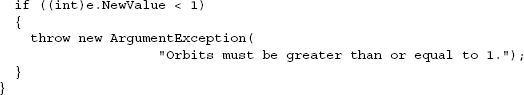
The property changed callback function enables you to hook into the process to perform actions when the dependency property changes. Note that you'd never want to do this inside the CLR wrapper, as that would only catch a few of the scenarios under which the property could change. The callback function takes in an instance of the object that owns the property, as well as an EventArgs-derived class that has both the new and old values available for inspection.
All three pieces—the CLR wrapper, the dependency property definition and registration, and the callback function—make up the implementation of a single dependency property in Silverlight. Though verbose, the benefits provided by dependency properties are great, as seen throughout this book. When creating your own properties for panels and controls, err on the side of implementing them as dependency properties.
A specialized type of DependencyProperty, the attached property is used when you want to provide a way to enhance the properties of another object. That's exactly what we need to do with the Orbit property.
Each item added to the OrbitPanel needs to be assigned to a specific circle or orbit. This is similar in concept to how a Grid needs items to specify rows and columns, or how the Canvas needs Left and Top for each element. The way those properties are specified is to use the type name (Grid or Canvas) and the property name together in the element, like this:
<TextBox Grid.Row="0" Grid.Column="1" />
<TextBox Canvas.Left="100" Canvas.Top="150" />
In these examples, the TextBox doesn't contain a Row, Column, Left, or Top property; instead it relies on another type (the Grid or Canvas) to attach them. We'll do the same with the Orbit property of the OrbitPanel. Listing 24.2 shows the implementation of the Orbit attached property in the OrbitPanel class.
Example 24.2. The Orbit attached property in the OrbitPanel class
public static int GetOrbit(DependencyObject obj)
{
  return (int)obj.GetValue(OrbitProperty);
}
public static void SetOrbit(DependencyObject obj, int value)
{
  obj.SetValue(OrbitProperty, value);
}

public static readonly DependencyProperty OrbitProperty =
    DependencyProperty.RegisterAttached("Orbit",
                                        typeof(int),
                                        typeof(OrbitPanel),
                                        new PropertyMetadata(0));
Note that attached properties don't use a CLR wrapper. Instead, you provide Get and Set methods to allow the properties to be used in code and XAML.
The RegisterAttached method is similar to the Register method seen in listing 24.1, with the parameters being identical. In this case, I didn't use a callback method, but instead provided a default value of zero.
With this property in place, we'll now be able to write markup like this:
<TextBox x:Name="FirstNameField" clib:OrbitPanel.Orbit="1" />
(The namespace declaration clib is assumed to be valid in the XAML file in which this bit of markup lives.) To inspect the value of the attached property from code, use the Get function defined in listing 24.2:
if (OrbitPanel.GetOrbit(FirstNameField) > 0) ...
In this way, we can now set and retrieve properties associated with objects, without those objects having any provision for the properties in the first place. This is a powerful way to augment types to track additional data.
Dependency properties—and the special type of dependency property, the attached property—are essential and often use parts of the property system in Silverlight. When creating your own panels and controls, you'll almost certainly rely on them as the primary means of providing "knobs" your users can use to control the behavior of your custom classes.
In the case of the OrbitPanel, both of these properties will come into play when performing our custom layout.
The primary responsibility of a panel is the layout of its child controls. In truth, this is what makes a panel a panel; a panel that performed no custom layout wouldn't be particularly useful.
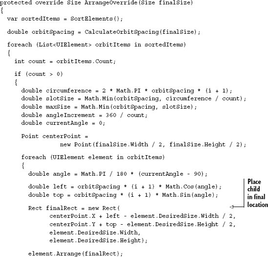
As we learned in chapter 6, the layout pass involves two primary steps: measure and arrange. The measure step measures all the children of the panel, as well as the overall panel itself. The arrange step performs final placement of the children and sizing of the panel. As the authors of a custom panel, it's our responsibility to provide this critical functionality. Listing 24.3 shows the measure step, implemented in the MeasureOverride method of the OrbitPanel class.
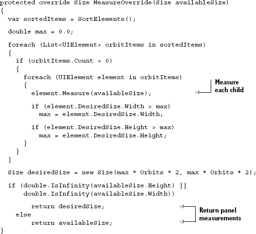
The measure pass starts by getting a list of all items, grouped by their orbit. The code for this function, SortElements, is included in listing 24.5. I loop through each orbit, then through each item in the orbit, and measure that item. I get the largest dimension (either width or height) from that element and compare it to the current max. This is admittedly a bit of a hack, as the size allotted to each item is, in theory, a pie slice, not a rectangle. In addition, due to the simplified nature of the orbit sizing, I didn't need to group the children by orbit. Nevertheless, it'll work for this example.
Once I've looped through every child item, I then calculate the desired size for this panel. That is calculated by taking the number of orbits, multiplying by two to account for the circular nature, then multiplying by the maximum item size. If the original size passed in was unlimited, I return the desired size; otherwise, I return the sized provided to the control.
The most important step in this function is the step that measures each child. That's what sets the desired size for each child in preparation for the arrange step shown in listing 24.4.
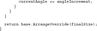
The arrange step is where the real layout happens. It's in this function that the individual children are placed in their final locations. This is the function that requires digging way back to 10th or 11th grade to remember that trigonometry.
This function, like the previous one, starts by sorting the children into their respective orbits. This is done via the SortElements function, the body of which is shown in listing 24.5. I then run through each orbit, calculating the size of the circle and the angular offset of each item. The angle chosen is based on the number of items in that orbit; it's 360 degrees evenly divided by the item count.
Then, I calculate the left and top position given the angle. This left and top will actually be used for the center point of the element being placed. With that calculated, I call Arrange on the element to move it to its final location.
Listings 24.3 and 24.4 relied on common functions. The code for both, CalculateOrbitSpacing and SortElements, is included in listing 24.5, wrapping up the code for the OrbitPanel class.
Example 24.5. Supporting functions
private double CalculateOrbitSpacing(Size availableSize)
{
  double constrainingSize = Math.Min(
              availableSize.Width, availableSize.Height);

  double space = constrainingSize / 2;

  return space / Orbits;
}

private List<UIElement>[] SortElements()
{
  var list = new List<UIElement>[Orbits];

  for (int i = 0; i < Orbits; i++)
  {
    if (i == Orbits - 1)
      list[i] = (from UIElement child in Children
                 where GetOrbit(child) >= i
                 select child).ToList<UIElement>();
    else
      list[i] = (from UIElement child in Children
                 where GetOrbit(child) == i
                 select child).ToList<UIElement>();
  }

  return list;
}
CalculateOrbitSpacing uses the size of the panel to figure out the spacing of the individual concentric circles. This is done by evenly dividing up the total space. The SortElements function takes each of the children and puts it into a list by orbit.
Note that the SortElements function has special logic to group any elements in an invalid orbit into the highest orbit. It doesn't handle any cases where a negative (invalid) orbit number was specified, but that's easy enough to add.
These three listings make up the full implementation of the OrbitPanel class. With the code in place, the last thing to do is to test the panel on a page.
To test the new panel, we'll use a simple bit of markup that creates a number of button controls and places them into two different orbits. A third orbit is defined but not used. Listing 24.6 shows the markup to be placed in MainPage.xaml. Before adding this code, build the project to get the ControlsLib namespace to resolve and the OrbitPanel IntelliSense to show.
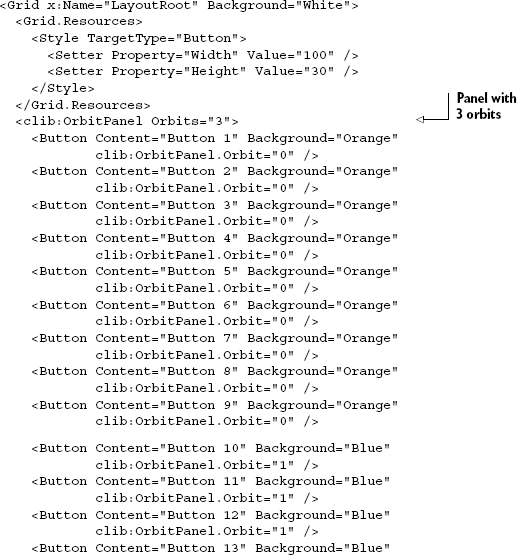
This listing produces the image from the opening of this section (figure 24.1), with two orbits of buttons. In order for this listing to work, you must define the following namespace:
xmlns:clib="clr-namespace:ControlsLib;assembly=ControlsLib"
Panels are all about measuring and arranging their children. Measuring is used to ask each child what size it wants to be, and to provide the overall size for the panel. Arranging is used to calculate the final location of each of the child elements.
This panel has been a pretty simple implementation both for space reasons and to keep to the essentials of what we need to learn. If you want to take it further, there are some enhancements I'd recommend.
The panel we created in this section is a good starting point for your own panel design. There are a number of places you could take this panel. Three enhancements I'd recommend are using start and stop angles, defining orbits using a grid-like approach, and item clipping.
Currently the panel starts calculating layout at zero degrees and completes at 360 degrees. A simple change would be to provide dependency properties for StartAngle and StopAngle, and use those in the layout calculation. This would allow arcs of controls rather than full orbits.
Another potential change would be to make the orbit definitions more flexible. Rather than only providing a number of orbits, you could use orbit definitions in the same way the Grid panel uses RowDefinitions. An example of the markup might look like this:
<clib:OrbitPanel>
  <clib:OrbitPanel.OrbitDefinitions>
    <clib:OrbitDefinition StartAngle="25" StopAngle="40" Width="100" />
    <clib:OrbitDefinition StartAngle="340" StopAngle="270" Width="Auto" />
    <clib:OrbitDefinition StartAngle="90" StopAngle="180" Width="*" />
  </clib:OrbitPanel.OrbitDefinitions>
  ...
</clib:OrbitPanel>
This would enable you to support different arcs for each orbit, as well as set widths (optionally using grid units) for each orbit.
You would accomplish this by creating a custom collection type to hold the orbit definitions, then creating an OrbitDefinition class. The collection would be exposed by the panel. The measure and layout calculations would change to use the provided sizes rather than calculating sizes.
The third enhancement is item clipping. I didn't implement this in the OrbitPanel because, frankly, it doesn't make a lot of sense to do so. But clipping the individual child elements is often essential to the functioning of a panel.
When an item is clipped, the portion of the element that would normally lie outside the allotted space isn't shown. This is accomplished by setting the size of the rectangle in the arrange step to be smaller than the size of the element. For example, to modify listing 24.4 to clip all elements to 30 × 30 pixel rectangles, change the finalRect to be calculated like this:
double maxWidth = 30;
double maxHeight = 30;
Rect finalRect = new Rect(centerPoint.X + left - maxWidth / 2,
                          centerPoint.Y + top - maxHeight / 2,
                          maxWidth, maxHeight);
In a real panel, you'd calculate the maxWidth and maxHeight based upon available space in the layout slot. In addition to this calculation change, be sure to apply the same measurement to the call to the measure step, so the child has the ability to resize itself if possible.
Creating a custom panel in Silverlight is a straightforward process once you decide on a layout algorithm. The majority of the work is performed inside the measure and arrange steps. The measure step is where the panel calculates the size of each element and the size of the panel itself. The arrange step is where the panel performs the actual positioning (and optional clipping) of the child elements.
Creating a custom control is similar to creating a panel; many of the same steps apply. In the next section, we'll create a control that supports styling and visual states.
In the previous section, we built a custom panel. Panels differ from controls in that they typically participate in the opposite side of layout: panels are responsible for laying out controls; controls are responsible for measuring themselves.
When creating controls in Silverlight, you have two main choices: you can write a UserControl or create a custom control. User controls, covered in chapter 10, are more about composing other controls, whereas custom controls are about defining new behavior to make available to developers.
Custom controls differ from user controls in that they're lookless by default— they're expected to work with a completely different control template as long as certain contracts are adhered to. User controls bring their templates along with them in the form of the .xaml file; they support limited templating and styling capabilities.
In this section, we're going to build a custom control that can show grouped content with a header which, when clicked, shows or hides the content. There are already controls that can do this, but building it will show you how to inherit from a base class and support templating and visual states.
In chapter 10 we learned about the different types of controls available in Silverlight. Many of the controls had common base types. When creating your own control, the choice of base type will greatly impact how the control can be used and how other developers will expect it to work. Table 24.1 shows the common base types you can derive from.
Table 24.1. Common control base types
Type | Description |
|---|---|
| This is a generic base control. If none of the specialized variants have what you need, derive from this class. |
| A control that contains a single child item for display. The |
| A control that contains multiple child items for display. The control supports adding individual items or binding to a list to obtain items. The items are displayed using a supplied panel. |
| An |
| A control that supports minimum, maximum, and current values. One example is the |
| A control that can be clicked to fire an event. |
| A button-type control that supports keeping its state when clicked. Examples include the |
When choosing a control, try to pick the richest one possible. If you're building something that naturally fits the Selector model, that's a better choice than picking ItemsControl or Control. The more you use built-in functionality, the more your control will behave like others in Silverlight without extra effort on your part.
For the control we're building, we'll start with ContentControl and build from there. In the ControlsLib project, add a new class named Expander:
namespace ControlsLib
{
  public class Expander : ContentControl
  {
  }
}
The ContentControl base class provides the ability to use properties such as Content and ContentTemplate. We'll definitely make use of those, but we also need to augment with our own properties for the header.
When supporting arbitrary content, the pattern is to have a content property of type object and a template property of type DataTemplate. That way, the developer can customize the presentation of the content without having to retemplate the entire control.
The ContentControl base type supplies the Content and ContentTemplate properties that perform this function for the primary content. We'll add Header and HeaderTemplate to support the same for the top header. Both properties will be defined as dependency properties, as shown in listing 24.7.
Example 24.7. The Header and HeaderTemplate properties
public object Header
{
  get { return (object)GetValue(HeaderProperty); }
  set { SetValue(HeaderProperty, value); }
}

public static readonly DependencyProperty HeaderProperty =
    DependencyProperty.Register("Header",
                                typeof(object),
                                typeof(Expander),
                                new PropertyMetadata(null));

public DataTemplate HeaderTemplate
{
  get { return (DataTemplate)GetValue(HeaderTemplateProperty); }
  set { SetValue(HeaderTemplateProperty, value); }
}

public static readonly DependencyProperty HeaderTemplateProperty =
    DependencyProperty.Register("HeaderTemplate",
                                typeof(DataTemplate),
                                typeof(Expander),
                                new PropertyMetadata(null));
Using object as the type for the header enables us to use anything from a string to a Grid full of controls as the header. If a template is supplied, Silverlight will render using that. If no template is supplied, Silverlight will render it natively if it's a UIElement, or using ToString if it's any other type (such as an integer, string, or your custom class).
In addition to the simplicity of class inheritance, one of the main differentiators for a custom control over a user control is the control template.
When creating a custom control, it's important to define the contract with the control template. The contract consists of the things that must be in the control template in order for your control to work.
In general, you want this contract to be as small as possible. Think long and hard about what things you must have in the contract, as opposed to what could be accomplished with binding.
In our control, the contract can be kept small: just a single toggle button. We need the toggle button, in this case, because we're going to use it to expand and collapse the bottom section of the expander control. Listing 24.8 shows the class with the contract in place.
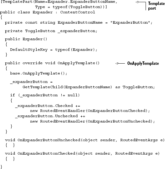
The contract is defined both explicitly and implicitly. The explicit contract definition is the TemplatePart attribute on the class. Though not enforced in code, this is used by Expression Blend to enforce the contract in the tool. The attribute specifies both the name of the required element as well as its type. A best practice is to use a constant for the name, as it'll also be used elsewhere in the code.
The implicit contract is enforced by the OnApplyTemplate function. In this function, you're going to look for the various template parts and attempt to resolve them into variables you can use elsewhere in the class. OnApplyTemplate is called when the control template is loaded for this instance of the control.
In OnApplyTemplate, you'll typically find the control instances by name using GetTemplateChild (which does a FindName equivalent on the template) and wire up any events or other hooks.
Note also the constructor. The constructor specifies the default style key to be used. This looks a little odd because it's setting the key to the type of this class. As we'll see next, that's exactly what we want.
Custom controls are designed to support templating by the designers and developers using them. But every control should provide a default template to be used when no other template has been applied.
The default template is kept in a resource dictionary file named generic.xaml in the themes folder of the assembly containing the control. In our project, that's the ControlsLib assembly. Add the themes folder and the generic.xaml file. Listing 24.9 shows the style to be included inside the ResourceDictionary tags.
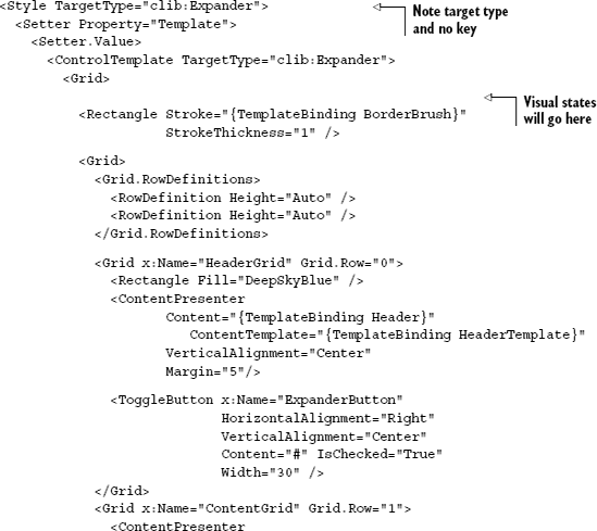
Note that this style doesn't have a key. The key is the type it targets; that's why the constructor in listing 24.8 specifies the class type as the default style key.
This listing shows the default style and template for the Expander control. The template is defined just like the control templates we saw in chapter 23. In this case, I use a grid to hold both the header and the content. The header and content are both implemented using ContentPresenter elements. The ContentPresenter, when bound to appropriate content and content template properties, takes care of all the dirty work associated with presenting arbitrary content. Without it, there'd need to be some way to use a TextBlock when it's text, and other specialized types otherwise.
For this listing to work, the ResourceDictionary tag will need the following namespace added:
xmlns:clib="clr-namespace:ControlsLib"
In listing 24.9, I left room for the spot where the visual states will go. The final piece of a custom control is the support and definition of VisualStateManager controlled state management.
Visual states describe the UI modes or states a control can be in. One visual state may be when the mouse is over the control; another when the mouse button is clicked. A third visual state may be when something is considered selected.
In our control, the visual states will be Expanded and Collapsed. Using visual states rather than hard-coding expand and collapse logic allows the designer or developer to completely customize what it means for the control to be expanded or collapsed. Remember, controls are lookless—they define behavior, not appearance.
Listing 24.10 shows the parts of the Expander class required for supporting visual states.

Just as was the case with template parts, template visual states have both an explicit and implicit contract. The explicit contract is handled by the TemplateVisualState attribute. This allows Blend and other design tools to know what visual states are supported by this control.
The implicit contract is handled by calls to VisualStateManager.GoToState. This call works under the assumption that a particular visual state exists. If it exists, the control is put into that state. In this example, when the expander button (a template part) is checked, we enter the Expanded state. When it's unchecked, we enter the Collapsed state.
Using states like this allows you to define the appearance of each state completely in XAML. Of course, we'll need to provide a default implementation in the control template in generic.xaml.
Visual states are designed for XAML. They're based around storyboards and references within the same XAML file. For more in-depth information on creating states, check out chapter 23.
Listing 24.11 shows the visual states definition for the Expander control. Place this markup into the spot called out in listing 24.9.
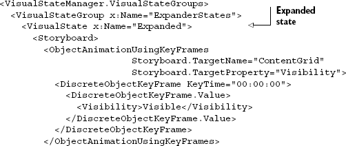
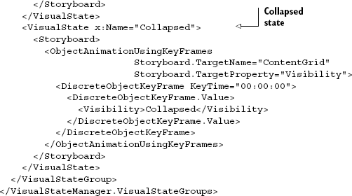
Listing 24.11 provides the markup for two different visual states: Expanded and Collapsed. Both refer by name to elements defined in listing 24.9. Using visual states like this allows us to have a control that has no real dependency on elements inside XAML. Instead, the control's behavior specifies which state to enter, and the markup (which can be changed by a developer or designer without access to the control's source) can completely define what it means to be in that state.
The final step is to test the control. I used it to wrap the OrbitPanel we wrote in the first section, but you could use it with any type of content. Here's the MainPage.xaml markup with the new control in place:
<Grid x:Name="LayoutRoot" Background="White">
  ...
  <clib:Expander Header="This is an Expander Control"
                 Margin="20" BorderBrush="Black">
    <clib:OrbitPanel Orbits="3">
    ...
    </clib:OrbitPanel>
  </clib:Expander>
</Grid>
The result of the combination of both controls is shown in figure 24.2. The expander encloses the OrbitPanel and its contents.
Writing custom controls in Silverlight can be a rewarding experience. The templating approach means you don't have to consider every possible way someone may want to present your control; instead, you can focus on the required behavior.
Controls in Silverlight are lookless. The code you write shouldn't make assumptions, other than what's in the explicit contract, about what the UI contains or how it'll behave. The use of template binding, template parts, and template visual states helps keep this separation clean and understandable.
In general, before you create a custom control, consider whether templating an existing control will provide what you're looking for. I've seen menu systems created entirely from ListBox controls, for example (I'm even responsible for one of them). Once you're sure that the behavior of existing controls doesn't provide what you're looking for, you can embark upon creating your own control.
Silverlight has a highly extensible layout system. Imagine if other technologies allowed you to easily create your own elements with completely custom layout algorithms. HTML, for one, would be much more creative if you could encapsulate all that div manipulation into something that works as a first-class citizen on any page.
Custom panels and custom controls provide the ability to augment Silverlight with your own requirements and your own ideas of how things should work. They provide a way to extend the system, building upon the same foundations used in all of the other built-in elements. They let you do things the designers and developers of Silverlight may not have considered when building the platform.
Creating a custom panel is easy once you learn to express the layout algorithm as a pair of measure and arrange steps. Silverlight handles calling these steps when needed, so all you need to concern yourself with is the functionality directly related to your own custom layout algorithm. The sky's the limit!
Custom controls are equally powerful. If you've searched through the built-in controls, the SDK, and the toolkit, and haven't found a control with the behavior you want, you can build your own from scratch. Silverlight provides strong building blocks in the form of specialized base classes and the templating and state management patterns you leverage in the creation of your controls. You don't even need to worry about how it looks, as once you define the behavior and the contracts, a designer can make the control look any way she wants. That's the power of the lookless control model.
In the next chapter, we'll wrap up the book with a discussion around customizing the install experience for all the awesome applications you'll soon be creating.