
Chapter 22 described the powerful animation features available in Silverlight. These features are useful for creating entertaining illustrations and for adding a degree of richness to your application. This richness can also be applied to controls, as you'll see in this chapter.
Throughout this chapter, you'll see how to apply rich styles to your application. These styles are similar to the CSS features you may have seen in the HTML world. In general, a Style declaration will be part of a resource, so we'll cover resources first. From there, you'll learn how to manage resources in dictionaries before moving on to creating rich visual Styles themselves. We'll cover both explicit and implicit styles. Then you'll see how to expand on the definition of a Style to define a ControlTemplate, enabling you to redefine the visual structure of a Control. Once we've covered that subject, you'll learn how to use the VisualStateManager to deliver engaging visual states and transition animations within your Control elements.
In general, it's a good idea to create reusable items whenever possible. This practice makes your application more maintainable. In fact, creating reusable components is a common idea within object-oriented languages such as C#. But, sometimes, you may have items that represent nonexecutable pieces of data—for instance, an image, a media file, or some XAML. These types of content generally fall into one of three categories: declarative resources, loose resources, and bundled resources. We'll cover all three of these categories in this section, beginning with declarative resources, which are fairly different compared to the other two.
Declarative resources are items intended to be shared across multiple elements in your project. They can be any object you want to share. For instance, a resource can be used to define a DataTemplate or Storyboard, as hinted at earlier in this book. Resources are also a vital part of the styling and templating features discussed later in this chapter. Before you see those features, let's examine the basic syntax and usage of a declarative resource (see listing 23.1).
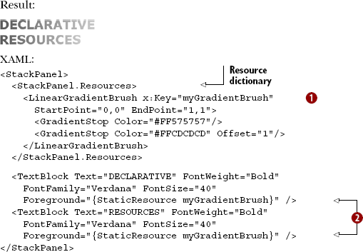
This listing shows a basic declarative resource scoped to a StackPanel in the form of a LinearGradientBrush  . This
 GradientBrush is used by both TextBlock elements defined in this listing  . This shared approach is possible because the resource is within the same scope as the two
 TextBlock elements. Within this section, you'll learn about resource scoping in further detail. In addition, you'll see how to use declarative resources at design time. This task will demonstrate to the meaning behind the x:Key attribute and StaticResource items shown in listing 23.1. Finally, this section will end with a discussion of using declarative resources at runtime.
Resources must be defined within an appropriately named collection called Resources. This collection is a ResourceDictionary, a specialized dictionary containing resources identified by implicit or explicit keys. These resources and their associated keys can be defined at both design time and runtime. Both approaches are shown in listing 23.2.
Example 23.2. SolidColorBrush defined as a resource at design time and runtime
XAML:
<StackPanel x:Name="myStackPanel">
  <StackPanel.Resources>
    <SolidColorBrush x:Key="theSolidColorBrush" Color="Green" />
  </StackPanel.Resources>
</StackPanel>
C#:
SolidColorBrush brush = new SolidColorBrush();
brush.Color = Colors.Green;
myStackPanel.Resources.Add("theSolidColorBrush", brush);
This example shows how to define a resource at design time and runtime. Both approaches require you to specify two items. The first item is the key, which in this case is theSolidColorBrush. The other is the resource itself, which in this case is a SolidColorBrush.
The key of a resource is a string that uniquely identifies it. At runtime, this identifier is set when you add a resource to a ResourceDictionary. Because the ResourceDictionary class implements the IDictionary interface, you can add a resource using the Add method. The first parameter of this method represents a key. The ResourceDictionary implements the IDictionary interface, so you should use the x:Key attribute to identify a resource at design time. Keys are only necessary when you want to explicitly use a resource, as shown in the examples so far. When we get into styles, you'll see how an implicit key can be useful as well. Once you've selected a key, you may move on to the details of the resource.
The resource itself is the reason for this section. This item can be virtually any object that Silverlight allows to be shared. For example, controls and visuals can't be shared. In general, you'll most likely use Storyboard, Style, and Template items as resources with the occasional low-level int or double type and maybe even instances of your own classes for data. Regardless of the type of resource, the item can only be used within its respective scope.
So far, we've seen resources placed into various on-page elements. That's great for nonstyle resources such as references to data objects and whatnot. When used with styles, though, it's similar to placing CSS styles directly into your HTML page—it works, but it's not really a best practice. In most cases, your resources are going to be placed in a central location, such as in App.xaml.
Resources defined in App.xaml are available to the entire application. The syntax is the same as defining resources locally. After a resource has been defined, either locally or through App.xaml, it can be referenced at design time through the StaticResource markup extension:
<TextBlock x:Name="myTextBlock" Text="Hello, World"
  Foreground="{StaticResource theSolidColorBrush}" />
The StaticResource extension expects a single value that must match a key from an in-scope ResourceDictionary. The resource must also be defined syntactically before it's referenced. Because of this requirement, listing 23.3 won't work.
Example 23.3. How not to be seen
XAML:
<StackPanel x:Name="myStackPanel">
  <TextBlock x:Name="myTextBlock" Text="Hello, World"
    Foreground="{StaticResource theSolidColorBrush}" />
  <StackPanel.Resources>
    <SolidColorBrush x:Key="theSolidColorBrush" Color="Green" />
  </StackPanel.Resources>
</StackPanel>
This listing shows an invalid use of a resource; the resource is used before it's defined. If you attempt to run this example, it'll throw an XamlParseException. The order in which entries appear is especially important once you start working with independent resource dictionaries and have to merge them in the correct order.
Though App.xaml may ultimately be the aggregation point for your resources, a common strategy is to place resources into individual resource dictionary files. The files are typically groups of related resources or entire application themes. Those resource dictionary files are then compiled into the application (build action of Page, Custom Tool set to MSBuild:Compile) and merged in from App.xaml or into the dictionaries of individual pages.
For example, listings 23.4 through 23.7 show how to merge two different resource files into your application using App.xaml as the aggregation point but also referencing from within the dictionaries. Listing 23.4 shows the first resource file, StandardColors.xaml.
Example 23.4. Merging resource dictionaries—colors dictionary
StandardColors.xaml:
<ResourceDictionary
  xmlns="http://schemas.microsoft.com/winfx/2006/xaml/presentation"
  xmlns:x="http://schemas.microsoft.com/winfx/2006/xaml">

  <SolidColorBrush x:Key="TextColor" Color="#FF303030" />

  <SolidColorBrush x:Key="HeadlineTextColor" Color="Black" />

  <LinearGradientBrush x:Key="PageBackgroundColor"
                       StartPoint="0,0"
                       EndPoint="0,1">
     <GradientStop Offset="0" Color="#FFFFFFFF" />
     <GradientStop Offset="1" Color="#FFD0D0D0" />
  </LinearGradientBrush>
</ResourceDictionary>
The StandardColors.xaml resource dictionary is our base dictionary. It has no dependencies on others, but is used in several other places. This dictionary defines three Brush resources, two of which are simple SolidColorBrush instances; the third is a LinearGradientBrush.
The StandardColors.xaml resource dictionary is used by the ControlStyles.xaml resource dictionary shown in listing 23.5.
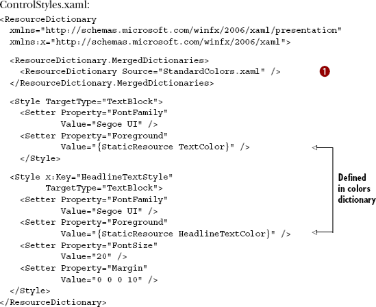
The standard colors dictionary is merged into the control styles dictionary . This is required because the control styles dictionary uses resources defined in the color dictionary. As you'll see in the next listing, dependencies can't be chained; they don't ripple "upward" and must be explicitly defined in each XAML file. Listing 23.6 shows App.xaml where the dictionaries are made available to the whole application.
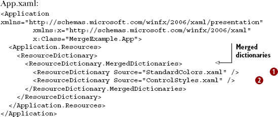
Listing 23.6 shows App.xaml. Both StandardColors.xaml and ControlStyles.xaml are merged into App.xaml to make their included resources available to the rest of the application. As I mentioned earlier, you can't merge resources and expect the dependencies to flow through. For example, StandardColors.xaml is merged into ControlStyles.xaml. That's not sufficient to make the resources in StandardColors. xaml available outside on the control styles; they're in a private dictionary. To expose them to the rest of the application, they're all merged into the applicationwide dictionary in the Application object (see listing 23.7).
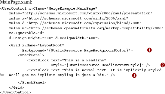
Finally, we get to our main page. MainPage.xaml is using a resource defined in StandardColors.xaml. It's also using a control style defined in ControlStyles.xaml. Finally, the TextBlock  is using an implicit style defined in ControlStyles.xaml.
If you're coming from a CSS background, the way the resources are nested may seem odd to you because each goes into a discrete dictionary instead of a global sheet. In the next section, we'll cover how to access those discrete dictionaries, whether they're at an element level or application level.
Referencing resources at design time is useful for setting up the initial state of an application. As an application runs, you may need to work with those resources dynamically. To help you accomplish this feat, Silverlight enables you to search for, insert, edit, and remove resources at runtime.
Searching for a resource at runtime involves referencing the Resources property, which is a ResourceDictionary available on every FrameworkElement and Application. Because of this, you can readily search for a declarative resource by using its key. If the resource isn't found, null will be returned; if the resource is found, its object representation will be returned. Because the return value may be an object, you may need to cast the value to another type, as shown in this example:
var brush =
   myStackPanel.Resources["theSolidColorBrush"] as SolidColorBrush;
if (brush != null)
   brush.Color = Colors.Blue;
This code retrieves the SolidColorBrush defined as a resource in listing 23.2. Once it's retrieved, this Brush is changed from Green to Blue. This small but interesting change occurs at runtime. When this code is executed, the TextBlock in listing 23.2 changes to Blue without any additional code because the Silverlight system automatically listens for those changes. But, it doesn't necessarily listen for when resources are removed.
Accessing resources in elements uses the same syntax for any given element. To access resources defined in the application, it's slightly different:
var brush =
   Application.Current.Resources["theSolidColorBrush"] as SolidColorBrush;
if (brush != null)
   brush.Color = Colors.Blue;
Rather than specifying an element, you need to specify Application.Current. Once you move beyond that, the syntax is the same. This will also pick up any merged-in resources, so there's no special step required to navigate down into any other dictionaries. (Note that in XAML, the difference is abstracted away by the StaticResource extension.)
Resources may be removed at runtime through the Remove method. This method takes a string that represents the key of the resource to delete. Once it's deleted, this resource can't be used. If the resource was applied to any items in your Silverlight application, the Resources attributes will still be in use; if you remove a resource, you may want to manually update any elements using the declarative resource.
Declarative resources are those defined within your Silverlight application. These resources can be created at either design time or runtime. In addition, declarative resources can be added, edited, and removed at runtime through the readily available Resources property. In addition to declarative resources, Silverlight has another type of resource known as loose resources.
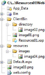
In addition to using resources defined within your XAML, Silverlight enables you to access loose resources. A loose resource is an external entity, which may represent something such as an image hosted on some server on the Internet or some publicly visible JSON data. Regardless of the type of content, Silverlight provides the ability to access loose resources. To demonstrate accessing a loose resource, imagine an ASP.NET web application with the structure shown in figure 23.1.
Figure 23.1 shows the structure of a basic ASP.NET web application. This web application has one web page named Default.aspx. Assume that this web page hosts the Silverlight application defined within the MySilverlightApplication. xap file, which is nestled within the ClientBin directory. This will become important in a moment. Also note the four image files that are part of this web application structure: image01.png, image02.png, image03.png, and image04.png. These images represent the loose resources that we'll use throughout this section.
You'll learn two different ways to access loose resources. The first approach involves referencing loose resources whose location is relative to the Silverlight application. The second approach involves using an absolute Uri.
Silverlight allows you to access loose resources relative to the site of origin—the location where the requesting Silverlight application resides. In many cases, your Silverlight application will be stored within a subdirectory. For instance, in figure 23.1, the Silverlight application (MySilverlightApplication.xap) is stored within the ClientBin directory, so this directory can be considered the site of origin. If you want to access image01.png in figure 23.1, you could use the Source shown here:
<Image x:Name="myImage" Source="image01.png" />
This accesses a resource in the same directory as MySilverlightApplication.xap. This directory represents the site of origin. If you change the Source property to reference /image01.png, you'd get the same result because the site of origin represents the root directory when a relative URI is used. This syntax will still allow you to reference loose resources in subdirectories. For instance, you could reference image02.png in figure 23.1 using the Source in this example:
<Image x:Name="myImage" Source="directory/image02.png" />
This markup shows how to reference a loose resource in a subdirectory, demonstrating that you can use subdirectories with relative references. If you reference a .xap file on a remote server, all your references will be relative to that remote reference. This is important because you can't use a relative URI to access loose resources in directories that are ancestors to the site of origin. This restriction is a security measure to help ensure that preexisting loose resources can't be used unless you explicitly allow it. To allow this use, you must expose them through the cross-domain policy file mentioned in chapter 14 and use an absolute Uri.
Silverlight gives you the flexibility to access loose resources via an absolute Uri. This gives you the flexibility to access resources from anywhere across the Internet as long as the target server allows it in its cross-domain policy file. This requirement is also necessary if you want to access a resource located up the directory tree from your .xap file. For instance, if the Silverlight web site structure in figure 23.1 is hosted at http://www.silverlightinaction.com, you could access image03.png by using the Source shown here:
<Image x:Name=
   "myImage" Source="http://www.silverlightinaction.com/image03.png" />
This example shows how to access a loose resource via an absolute Uri. This Uri points at the location of the resource, and this location will be loaded as a loose resource. There's also a way to bundle resources along with your Silverlight application.
The third kind of resource used in Silverlight is referred to as a bundled resource. A bundled resource is an item included in the .xap file of a Silverlight application. The term "bundled resource" is a made-up expression used solely for the sake of communication. Bundled resources give you a way to include resources specific to a Silverlight application.
Throughout this section, you'll learn about the two types of bundled resources that can be used in Silverlight. The first is known as a content file—a file that's added to the .xap file and deployed alongside a Silverlight application. The other type of resource is known as an embedded file, which represents an item that gets embedded into a Silverlight assembly. This kind of resource can be useful for helping to hide your valuable resources.
A content file is one that's added to a .xap file and deployed alongside a Silverlight application within the .xap. If you define an image as a content file, that image will be included within the resulting .xap file when the Silverlight application is built. In fact, any file with a build action of Content will be bundled into the resulting .xap file. Figure 23.2 shows a .png and .xml file being bundled into a .xap file as content files.
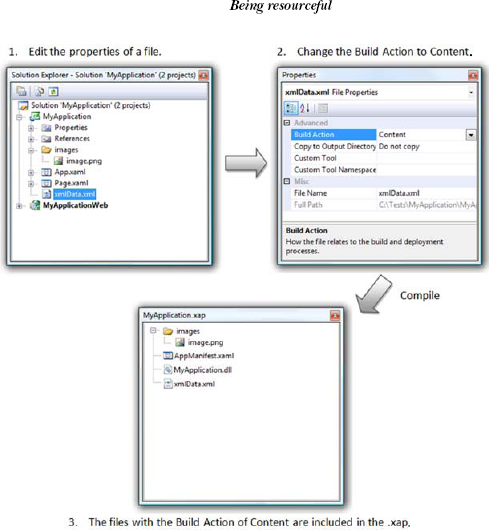
Figure 23.2. Defining a file as a content file. When it's compiled, the content file is added to a .xap file.
Figure 23.2 shows two files that have been added and marked as content files. The first, xmlData.xml, is a basic XML file. Once the project is built, this file ends up in the root of the .xap file structure. The second, image.png, belongs to a nested directory called images. When the project is built, this relative directory structure is carried over to the final .xap file, which can be accessed using a relative path reference. All content files can be referenced by providing a path relative to the application assembly. This approach can be used at design time, as shown in this markup:
<Image x:Name="myImage" Source="/images/image.png" />
This example shows the syntax used to reference a content file at design time. The leading forward slash (/) informs Silverlight to begin looking at the same level as the application assembly. This approach is the recommended way to include content with a Silverlight application because it makes things more easily accessible. Sometimes, you may come across somebody who does things the old-school way—the content files will be embedded within the Silverlight assembly. You'll now see how to access these embedded files.
An embedded file is a file embedded within a Silverlight assembly, which may be either an application or a library. Either way, an embedded file becomes a part of an assembly by changing the build action to Resource. This file can be retrieved at design time or runtime by providing a special URL structure.
Embedded resources are accessible through a URL that has three parts. The first part names the assembly to which the resource belongs. The second piece is a special keyword called Component that declares a resource as being retrieved. The final part is a relative URL that maps to the location of the resource within the assembly. These three items come together to form a URL template that looks like the following:
[AssemblyName];component/[RelativePath]
This template can be used at design time or runtime. The design-time implementation relies on the element type to convert the resource. At runtime, you must manually convert the resource. First, you retrieve the embedded resource from the assembly through the Application class, as shown in this line of code:
StreamResourceInfo resource = Application.GetResourceStream(
  new Uri("SilverlightApp1;component/embedded.png", UriKind.Relative));
This example shows how to retrieve the resource from the assembly. This resource is represented as a StreamResourceInfo, which is part of the System.Windows. Resources namespace. This class instance must be converted to the type appropriate for your situation. As we mentioned earlier, you shouldn't come across this scenario very often. When it comes to content files, you'll probably come across a loose resource. In XAML, you'll most likely use declarative resources. This approach is especially true if you're giving your elements Style.
As you saw in section 23.1, resources are the nonexecutable parts of your application. These parts are useful for creating items that can be reused multiple times. In addition to being reused, resources can also be shared by multiple elements. These two characteristics make resources a natural fit for styling.
Styling is a way to consistently share the same property values across multiple elements. To see why this is a good idea, imagine needing to create a typical forms-based application. This application must use TextBox elements that have a bold 9 pt Verdana font for input. In addition, you want to give the TextBox elements a subtle gradient background to make them more appealing. Without styles, you may decide to implement these visual enhancements as shown in listing 23.8.

Listing 23.8 shows the brute-force approach to defining the visual properties of multiple elements. It defines two TextBox elements with the same values for the Height, Width, FontFamily, FontSize, and FontWeight properties. In addition, the same complex LinearGradientBrush definition is used for the Background of both TextBox elements. Unfortunately, this approach isn't scalable. For instance, if you need to change the font of the TextBox items, you'd have to make the change to each item, but you can overcome this minor inconvenience using a Style.
A Style is a way to share the same property values across multiple elements. Throughout this section, you'll learn how to create and use a Style. This approach will help you avoid the maintenance nightmare shown in that last listing. You'll first see how to define the visual properties of a control through a Style. From there, you'll learn how to share a Style definition across multiple elements.
To define the look of an element using a Style, you simply set the Style property. This instruction may sound redundant, but the property name is the same as the type name. The Style property is available on every FrameworkElement, so virtually every control in the Silverlight framework can be styled. You can do this by taking advantage of the Style class's Setters collection.
The Setters collection stores the entire definition of a Style. This definition is made up of individual property/value pairs similar to those seen in CSS within the HTML world. In Silverlight, each combination is defined within a Setter element, which lets you assign a value to a single visual property. Interestingly, this approach can be used to set both simple and complex property values.
A simple property is a property that can be set at design time with a primitively typed value. A primitively typed value is something like an int or string value. These kinds of values can be used at design time to set the values for properties such as FontSize and FontFamily. Listing 23.9 shows how to use five simple properties as part of a Style.
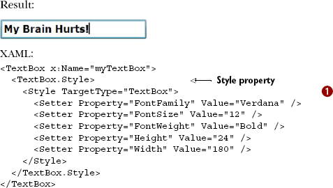
This example shows how to define a Style that uses five simple properties, each of which is defined within a Setter element. These elements are automatically added to the Style object's Setters collection. More importantly, each of the items in this collection is defined by two publicly visible attributes.
The two attributes that define a Setter are called Property and Value. The Property attribute determines which property the Value will be used with. The Property must be a DependencyProperty, but the Value property can be set to any object. Because of this fact, the Setter element is flexible, making it a natural fit for simple properties. In addition, it's also a natural fit for complex properties.
A complex property is a property whose value is a general-purpose object. In general, these kinds of properties have nested properties that must be set. For example, a LinearGradientBrush could be considered a complex property value because it has the additional stops broken out using property element syntax. Now, imagine trying to use this LinearGradientBrush as part of a Style. You must use an approach similar to that shown in listing 23.10.
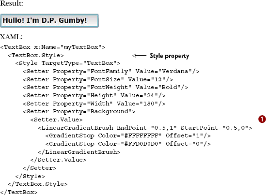
Listing 23.10 shows how to define a more complex property as part of a Style . There aren't any new elements shown here, but it does show you how to break out the Setter.Value into a nested property itself. This approach gives you the flexibility to use something as complex as a LinearGradientBrush.
The approaches shown in both of these examples haven't solved the problem of scalability; they've just shown the syntax of a Style used inside of an element instead of explicit properties. To solve to problem of scalability, you must understand how to target your Style definitions so they may be reused.
In CSS, one way to define styles is to include two parts. One part represents the name of the style; the other part is the name of the HTML tag the style is applicable to. An explicit Style in Silverlight also uses these two parts.
The first part of a Style uniquely identifies a Style definition. As shown in the previous two examples, this part is optional. It becomes a requirement only if you create a Style as a resource and want to refer to it explicitly. If you choose this approach, you must specify the x:Key attribute to uniquely identify the Style, and you must specify the other part—the TargetType.
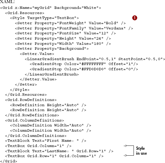
The TargetType property signals which System.Type a Style is applicable to. This property doesn't need to be set if you define a Style within an element, as shown in the previous examples. If you define a Style as a resource, you must set this property as shown in listing 23.11.

Listing 23.11 shows a Style defined as a resource. The Style in this case is configured to be used with TextBox elements as set through the TargetType property . If you were to attempt to use this Style with an element of another type, an error would occur. It can be used with any types that might derive from TextBox.
CSS supports implicit styles, where you simply specify the type (a DIV, for example) and CSS applies it to all DIV elements within a certain scope. Silverlight supports a similar type of implicit styling.
In the previous example, we saw how a style may be reused by applying it to each control. In a large application with many controls, this procedure can be both tedious and error prone. Silverlight 4 introduced implicit styles.
Implicit styles look exactly like their explicit cousins, except they omit the key. That's it. If you define a style with a TargetType and omit the key, the TargetType becomes the key and the style becomes implicit.
Listing 23.12 shows the previous example but converted to an implicit style.
Just as we saw in the previous example, this listing defines a style that targets the TextBox type. But we've omitted the x:Key, so this is an implicit style. Note the TextBox controls at the bottom of the listing: they now pick up the style without requiring any StaticResource setting. This is a huge timesaver for applications of any real complexity.
Styling, both explicit and implicit, is a powerful way to define the user interface standards for your application. Design professionals (or integrators, depending on how your team is set up) spend a good bit of their time defining styles, just as they would with HTML/CSS. They can work with them directly in XAML as we have here or use Expression Blend to make the process easier.
Once you've mastered styling, you're ready to take a step beyond setting simple properties and into working with the control templates themselves.
The styling features shown in section 23.2 are a welcome addition to the Silverlight world. These items allow you to quickly create a consistent look throughout an application. This look can be shared across the application by defining the styles as resources. But, occasionally, the styling options can be somewhat limiting. To overcome these limitations, you can use a template.
A template empowers you to redefine the entire visual representation of an element, giving you the flexibility to make any Control look the way you want it to look. When doing this, you don't sacrifice the behavior of the Control. You could create a Button that looks and feels like an octagon and still reacts to the Click event. Over the course of this section, you'll experience the full power of a template by building a control template. You'll also see how to elegantly create a reusable template.
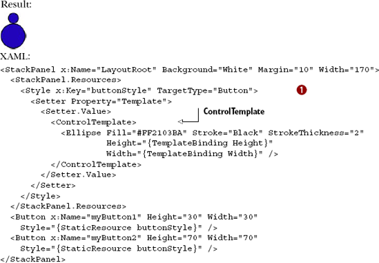
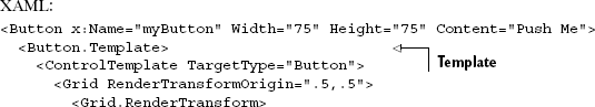
When you build a control template, it'll ultimately be used with a Control. Every Control in Silverlight exposes a property called Template. This property is a ControlTemplate that lets you take complete control over what a Control looks like. In a sense, when you set this property, you're resetting the control's appearance, giving you a clean slate to work with. From there, you can make a Control look like whatever you want it to look like. For instance, listing 23.13 changes the look of a Button to make it look more like a sphere.
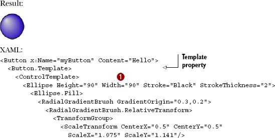
This example shows a basic ControlTemplate . This ControlTemplate is associated with a Button through its Template property. Notably, if you were to define a ControlTemplate as a resource, you'd associate the template with a specific type through the TargetType property. This property behaves the same way as it did with the Style class. Interestingly, when a template is used with a ContentControl, the Content property doesn't behave the same way.
Over the course of this section, you'll learn how to display content within a ControlTemplate. This content will generally be placed inside a Panel or Border because a ControlTemplate can have only one root element. This root element can then be used to house the contents of a ContentControl or an ItemsControl. You'll also see how to customize the way in which the Items of an ItemsControl are arranged. But first, you'll see how to use properties that are part of the target control in your templates.
Ultimately, the purpose of a ControlTemplate is to define the appearance of a Control. This Control may have properties set that should be used within your template. For instance, you may want to use the Background or FontFamily property values of a Control in your ControlTemplate. In these types of situations, you should use a TemplateBinding.
A TemplateBinding is a special type of data binding used within a ControlTemplate. This data binding uses the Control to which the ControlTemplate is applied as its data source. The data source is identified as a specific property within that Control. This property is referenced by name when you create a TemplateBinding. An example of such a reference is shown in listing 23.14.
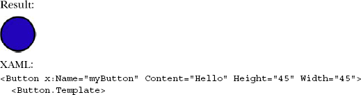
This example shows the basic syntax of a TemplateBinding . This syntax mimics the data-binding syntax explained in chapter 11. In this case, the binding causes the Height and Width property values of the Button to be used by the Ellipse in the ControlTemplate. These property values are simple in comparison to what the value of the Content property could be, though. If you're going to display the Content of a ContentControl in a ControlTemplate, you may want to consider using another approach.
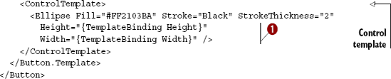
You may have noticed that the Content of the Button elements in the past two listings hasn't been shown because, when you define a ControlTemplate, you must tell Silverlight where to place that Content. To help you do this task, Silverlight provides two FrameworkElement instances: ContentPresenter and ItemsPresenter.
The ContentPresenter class empowers you to specify where the Content of a ContentControl should be shown. It may be easiest to think of this element as a placeholder for some piece of Content. Beyond that, the syntax of a ContentPresenter is the element itself, as shown in listing 23.15.
This example shows the general usage of a ContentPresenter. As you can see, this object is a placeholder designed to be used inside a ControlTemplate. This element is generally limited to ContentControl scenarios and isn't usually used in ItemsControl situations. For these scenarios, you may want to consider an ItemsPresenter such as the one shown in listing 23.16.
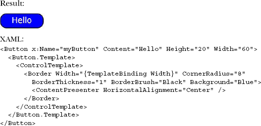
This example shows a ListBox with a ControlTemplate applied to it. The Items of that ListBox are positioned according to the ItemsPresenter . This element is important because it determines where the Items will be positioned in a ControlTemplate, but the ItemsPresenter doesn't determine how the Items will be arranged. That's the role of the ItemsPanel.
The Items of an ItemsControl control are arranged according to the ItemsPanel property. This property is a special kind of template that defines the Panel that will be used to lay out the Items. By default, this property is set to use a StackPanel with a Vertical Orientation. In reality, you're free to use any of the Panel elements discussed in chapter 3. You could use a Horizontal StackPanel, as shown in listing 23.17.
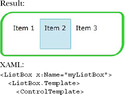
This example uses a Horizontal StackPanel as the ItemsPanel to arrange the Items in the ListBox horizontally. It's highly likely that you'll only use a StackPanel as an ItemsPanel. Although you can technically use another Panel element, the other options require actual code. This code will be based entirely on your particular situation, so we won't cover that topic in this section.
The ControlTemplate class enables you to redefine the way a Control looks. This new definition can use the target Control property values through a TemplateBinding. When it comes to displaying the Content of a ContentControl, you should use a ContentPresenter within a ControlTemplate. If this ControlTemplate is associated with an ItemsControl, you may need to use an ItemsPresenter to show the Items. These Items can be rendered in new ways thanks to the ItemsPanel property.
Once you've settled on a ControlTemplate, you may want to use it across multiple controls. Thankfully, Silverlight makes it easy to create reusable templates.
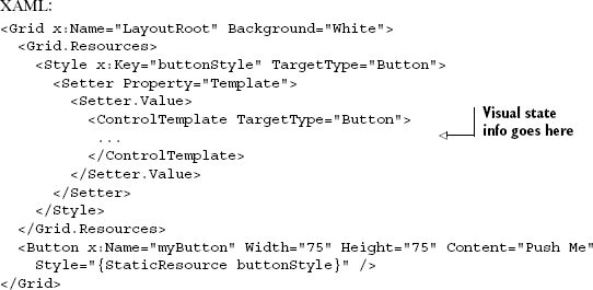
Creating individual templates can be useful when you want to give individualized attention to your controls; templates can also be useful for creating a truly unique yet consistent user experience. To help make it easier to deliver a consistent user experience, Silverlight allows you to define a ControlTemplate as part of a Style (see listing 23.18).
This example shows a ControlTemplate defined within a Style . Though this is a simple template, you can also define a ControlTemplate as complex as you need it to be. You can even go as far as defining a ControlTemplate that considers visual states.
Templates give you the flexibility to completely dictate what a Control looks like, but the template explanation given in section 23.3 is only useful for defining the default look of a Control. This default look represents the Control's normal state. In reality, most controls have multiple states. For instance, a Button can be in a pressed or disabled state. To enable you to manage what a Control looks like in such a state, Silverlight provides something known as the VisualStateManager.
The VisualStateManager is an element that manages the states and the transitioning between states. This element belongs to the System.Windows namespace. Because the VisualStateManager is in this namespace, it's ready to be utilized in your Control definitions. Before you can fully utilize the VisualStateManager, you must gain an understanding of components involved in state and transition management. Once you understand these components, you can leverage the power of the VisualStateManager itself. As you'll see in the conclusion of this section, this power can be wielded across multiple elements with the help of a Style.
The VisualStateManager relies on a variety of components to do its job. These components make up something referred to as the parts and states model. This model is designed to separate a Control element's appearance from its behavior, ensuring that you can customize the visual pieces of a Control without having to change its underlying logic. To enable this feat, the parts and states model relies on three components: states, transitions, and parts.
A state is used to reflect a particular aspect of a control. For instance, the Button has one state that defines what it looks like by default. If a user moves the mouse over this Button, it'll enter another state. If the Button is pressed, it'll change to yet another state. These three states are shown in table 23.1.
Table 23.1. Several states of a Button. Each state has a slightly different visual appearance.
Normal | MouseOver | Pressed |
|---|---|---|
|
|
|
This figure shows three of the states exposed by the Button class. In reality, the Button class has many more states. These states are exposed to the VisualStateManager with the help of the TemplateVisualStateAttribute. This attribute can be used by a Control to identify the states a Control can be in. In addition, because a Control can simultaneously be in multiple states, the TemplateVisualStateAttribute exposes the group that a state belongs to. The states and groups available on the Button class are listed in table 23.2.
Table 23.2. The states and groups of the Button class
State | GroupName |
|---|---|
|
|
|
|
|
|
|
|
|
|
|
|
Each state is identified by a Name property, which is part of the TemplateVisualStateAttribute. This property is complemented by another called GroupName, which determines the grouping for the state. The reason for this property is to logically group together visual states. This is necessary because a Control can be in multiple states at the same time. For instance, a Button can simultaneously be in a Focused state as well as a Pressed state because the Pressed state is in a different group than the Focused state. Perhaps a better example is a CheckBox being in a Checked state while also being in a Disabled state. Either way, the main thing to understand is that groups are exclusive— a Control can be in multiple states as long as those states belong to different groups. States that are part of the same group have the ability to transition between one another.
A transition defines the way a Control looks as it changes from one state to another. This change is represented as a Storyboard, so you're free to implement a smooth shift between two states. You can even do this at a fine granular level because of the inclusion of parts.
A part represents a specific element within a ControlTemplate. A part is generally used when some underlying logic may need to change an area of a ControlTemplate. For instance, the thumb on a Slider will change any time a user clicks the track. This event will cause some underlying logic to move the position of the thumb. Both the thumb and track are defined as parts, as shown in figure 23.3.
Figure 23.3. The required parts of a Slider are the thumb and the track. The actual appearance of the slider isn't important as long as it has the parts that form the UI contract.
This figure shows the two main parts of a Slider, which has more parts. These parts are defined by the TemplatePartAttribute, which enables you to specify the name and type of a UIElement that represents a part within a Control. This attribute is used to transmit data about the element that represents the part within the parts and states model. Now that this model has been explained, let's look at how to leverage it with the VisualStateManager.
The VisualStateManager is used by a ControlTemplate to manage the change between states. This change can be used to generate two different kinds of effects. The first is known as a state-based effect, which can be useful for doing something such as creating an enlarged Button if a user moves the mouse over it. The other type is known as a transitioning effect, which is useful for creating a fluid interface for controls that may change between states of the same group. Both kinds of effects will be covered in this section.
A state-based effect is a transition that occurs at the moment a Control enters a VisualState. When a Control enters this state, the Storyboard associated with the VisualState begins. This Storyboard is defined as part of a ControlTemplate. The Storyboard can be useful for creating a glowing effect or a ballooning effect (see listing 23.19).
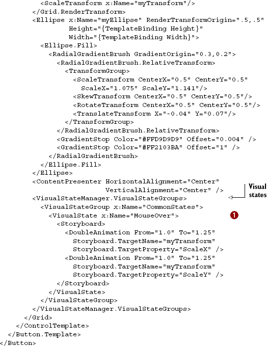
This listing defines an effect that occurs when a user triggers the MouseOver VisualState for the Button . All of the items in this example have been described in the previous chapters. You should note three main things. First, the VisualStateGroups element tells the ControlTemplate that some custom Storyboard is going to be used for a state. Second, this state belongs to a predefined group, which is described by the VisualStateGroup element. Third, the VisualState items associated with this group are detailed inside the element. This approach is useful for creating effects when a Control enters a state. But the effect created in listing 23.19 would be better defined as a VisualStateTransition.
In addition to state-based transitions, the VisualStateManager enables you to define a transition between states. You can trigger this transition in code by calling the GoToState method or by using a DataStateBehavior or GoToStateAction behavior. We'll use GoToState here because it's the most useful to control authors.
To define a transition in XAML, you must use an element called VisualStateTransition, which allows you to associate a Storyboard with a change between two states. The beginning state is identified by a string property named From. The state being transitioned to is specified by a string property called To. Listing 23.20 defines a transition that changes the Button in the previous listing back to a Normal state.
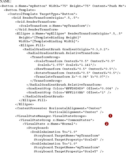
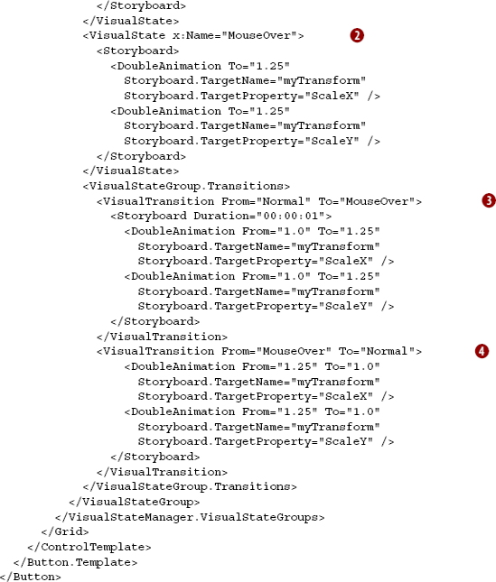
This listing shows the definitions of two VisualTransition elements. The first VisualTransition scales the Button up as it changes from the Normal VisualState to the MouseOver VisualState . The second VisualTransition scales the Button down as it goes from the MouseOver VisualState back to the Normal VisualState  . These two transitions are necessary because, otherwise, the
 Button would be stuck looking like it did in a MouseOver state. There are two other interesting tidbits in this example.
First, you'll also notice the addition of the two VisualState definitions . These are necessary to keep the transition animations in place. Without these definitions, the transition animations would be lost. The other interesting piece in this example is the use of the VisualStateGroup element . You can only create transitions between states that belong to the same group because, as we stated earlier, a Control can be in multiple states as long as those states belong to different groups. Creating transitions between states empowers you to create deeper and richer controls, so it's only natural to want to share these effects with multiple Control instances.
Because the visual states you create with the VisualTransition and VisualState elements are part of a ControlTemplate, you can define them as part of a Style. For the sake of completeness, listing 23.21 shows the transitions from the previous example defined as part of a Style.
This listing shows how the previously defined Button ControlTemplate can be included in a Style. This ControlTemplate uses the VisualState and VisualTransition elements from listing 23.20. This example puts everything from this chapter together. The main thing to note is that you can leverage the VisualStateManager within a Style declaration. This is an exciting news because there can be a lot of XAML involved in creating effects for the various states and transitions of a Control. These states and transitions are part of something known as the parts and states model, which is supported by Microsoft Expression Blend. Because of this convenience, you're empowered to create some of the richest controls available on the Internet.
Resources in Silverlight come in many flavors. The ones most associated with the word resource are those we put in XAML, inside resource dictionaries. Those dictionaries can be parts of controls in app.xaml or in separate files merged into existing resource dictionaries. Resources defined this way can be just about anything from data source or view model classes, to styles, to brush and color definitions.
The most common uses of XAML resources are styles and control templates. Styles provide a way to factor out the common property settings for controls and store them in a location where they can be shared among many instances. Building upon styles are control templates. Control templates go a step beyond what you can do with the public properties affected with styles; they let you completely change the visual representation of a control including its visual states and transitions.
Another common type of resource is a file resource, accessed as a loose file, embedded into the compiled DLL or copied into the zipped-up .xap. You'll use these whenever you want a file to be delivered with the application itself.
Understanding resources, styles, templates, and visual states are all prerequisites to building your own controls. We've covered user controls previously. In chapter 24 we'll take on building truly lookless controls using everything we've learned so far.