
The Amplitude library provides you with two separate CSS classes so that you can convert your HTML elements into volume controls. You can use the following code to create the Volume Up control:
<span class="amplitude-volume-up"></span>
Similar to the preceding code, you can turn any element into the Volume Down control by attaching the following class to it:
<span class="amplitude-volume-down"></span>
Let's get two more images for our buttons. Follow these steps to do so:
- Get the following icons from the Google Material Icons website:
- volume_down (https://material.io/tools/icons/?icon=volume_down&style=baseline)
- volume_up (https://material.io/tools/icons/?icon=volume_up&style=baseline)
- Update the content of the controls element file according to the following code:
<div class="controls">
  <div class="amplitude-play-pause"></div>
  <div class="amplitude-stop"></div>
  <div class="amplitude-mute"></div>
  <div class="amplitude-volume-down"></div>
  <div class="amplitude-volume-up"></div>
</div>
Similar to the Play and Mute buttons, we have to define separate CSS styles for each state.
- Update the player.css file and add the corresponding code:
.controls .amplitude-volume-up {
  background: url('./images/baseline-volume_up-24px.svg');
  background-size: cover;
}

.controls .amplitude-volume-down {
  background: url('./images/baseline-volume_down-24px.svg');
  background-size: cover;
}
These style classes are pretty similar. They receive most of the settings from the parent element rules and only provide the path to the background image.
- Check out the application. This time, you are going to see five buttons in a row:
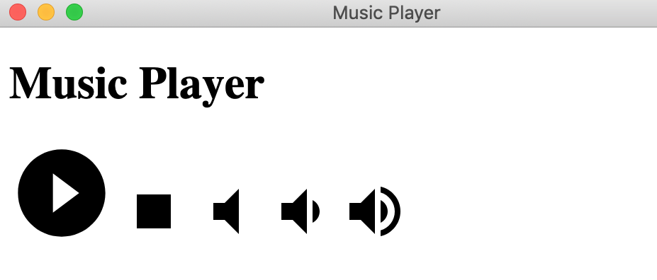
Note that clicking on the Volume Down button multiple times triggers the Mute button. It changes its state as soon as you reach a volume level of zero. By default, each click of the button increases or decreases the volume by 5%. You can change this step value when initializing the Amplitude object, but the end user's experience may become overwhelmed.
Instead of two buttons, let's have a range slider so that our end users can change the desired level of volume much faster than when they were using separate buttons:
- Luckily, AmplitudeJS already provides support for ranges in the following format:
<input type="range" class="amplitude-volume-slider"/>
- For the sake of simplicity, let's comment out the Volume Up and Volume Down buttons and append the input range element, as follows:
<div class="controls">
      <div class="amplitude-play-pause"></div>
      <div class="amplitude-stop"></div>
      <div class="amplitude-mute"></div>
      <!-- <div class="amplitude-volume-down"></div> -->
      <!-- <div class="amplitude-volume-up"></div> -->
      <input type="range" class="amplitude-volume-slider" />
</div>
- Restart the application or reload the main window. You should see a range element next to the Mute button. By default, the slider is in the middle, that is, at the 50% level, as shown in the following screenshot:

- Another useful feature is that other elements react to the player state too. This happens because Amplitude updates all the corresponding CSS classes, and the browser immediately reacts to that. For example, as soon as the range slider reaches zero, the mute button changes its state:

So far, we can start and stop the music, reset its progress, and even control its volume. Now it's time to display the progress of the song to our users. In the next section, you will learn how to declare and use the Progress Bar element, which comes with HTML and is supported by the Amplitude library.