
For the digital wallet application, we are going to use Ant Design components for React.
Ant Design is a design system that uses the values of nature and determinacy to enhance the user experience of enterprise applications. Using Ant Design, you can gain access to an extensive collection of fantastic components so that you can build your applications quickly. Make sure you visit https://ant.design/ to find out more, as well as examples and documentation.
The first thing we are going to do is install the Ant Design library. We are also going to implement a traditional application layout that contains a header, footer, sidebar, and main content area. Let's take a look at the steps for installation:
- Run the following command to install the antd library into your project:
npm install antd
- Open index.css and append the following style to it:
html,
body,
#root {
  height: 100%;
  width: 100%;
}
In the preceding code, we are making the application take up the full page size. You should also update App.css with a couple of new style rules to make the layout look neat and tidy.
- Replace the content of the App.css file with the following content:
.App {
  height: 100%;
}

.App > .ant-layout {
  height: 100%;
}
Besides this, we are going to take some styling from the Ant examples for the Layout component.
- Append a few additional rules to make the layout look good:
.ant-layout-header,
.ant-layout-footer {
  background: #7dbcea;
  color: #fff;
}
.ant-layout-footer {
  line-height: 1.5;
}
.ant-layout-sider {
  background: #3ba0e9;
  color: #fff;
  line-height: 120px;
}
.ant-layout-content {
  background: rgba(16, 142, 233, 1);
  color: #fff;
  min-height: 120px;
  line-height: 120px;
}
All of the styles we need for the initial setup are now in place. Switch to the App.js component code to build the component tree.
- Update the imports section by adding the antd styles and components:
import React from 'react';

import 'antd/dist/antd.css';
import './App.css';

import { Layout } from 'antd';
const { Header, Footer, Sider, Content } = Layout;
- Replace the component function with the updated template according to the following code:
function App() {
  return (
    <div className="App">
      <Layout>
        <Header>Header</Header>
        <Layout>
          <Sider>Sider</Sider>
          <Content>Content</Content>
        </Layout>
        <Footer>Footer</Footer>
      </Layout>
    </div>
  );
}
- Run the application to see what the main page looks like:
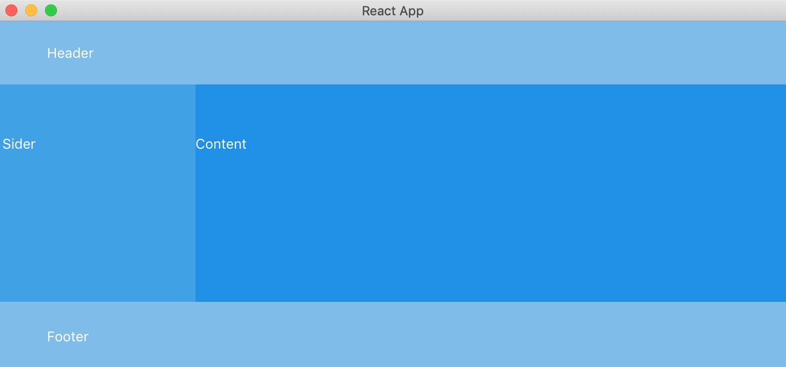
This is the initial layout for our digital wallet application. It has header and footer blocks, along with a sidebar and main content area.
Now, it's time to set up a personal Ethereum blockchain so that we can test the application on demo data and accounts without spending real money.