SINGLE COLUMN
11. Give the Subject Matter a Face

When choosing an appropriate typeface for a page or spread of a single-column grid, consider the subject matter. Some faces are classic and neutral and work with most material, while other faces give a point of view and nearly mimic the topic. A typeface can help set an attitude or it can recede discreetly. The type area of the page, type size, and leading (interlinear space) affect the overall fit of the text. No matter how the material fills the given or desired space, proportions are important.
Project
For the Love of Animals
Client
Henry Holt and Company
Design
Fritz Metsch
A simple and elegant page with neutral typography displays restraint and concentrates on readability.

With a simple text design, typographic details are crucial. Letter-spacing and relationships between type sizes contribute to the overall success of a design.
Basic type size is a crucial factor for readability. A successful page incorporates a type size that sits comfortably in the width of the text column. If the type is justified, a type size that is too large in proportion to a small text width will result in gappy word spacing.

A classical page design generally calls for a small head margin and a large foot margin. Gutter margins are traditionally smaller than the outside margins. Even simple, single-column pages normally take a marker, such as a running head or running foot, and a page number.
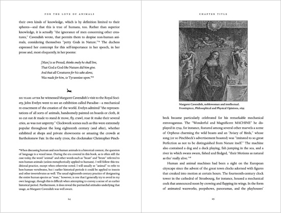
Carefully consider the leading, or interlinear space. Allow enough space to avoid typesetting that looks like a dense, gray mass. Conversely, setting too much space can result in type that looks more like texture than readable text.
12. Design with Ample Margins

If a project contains many pages, a good practice is to leave a gutter margin large enough to keep the text from getting lost in the binding. When the project is a book, a spread that looks proportionate on screen or in laser printouts can change radically once the book is printed and bound. The amount of spatial loss in the gutter depends on the length of the book or brochure as well as the binding method. Whether the piece is perfect bound, sewn, or saddle stitched, it’s a good idea to make certain that nothing goes missing.
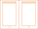
BINDING METHODS AND MARGINS
Depending on the number of pages in a project, some binding methods cause type to get lost in the gutters more than others. A project with a sewn or notch binding can be opened flatter than a perfect-bound (glued) project. Type may get lost in the gutter of a perfect-bound project and readers may be reluctant to crack the binding when pulling the book open. If the project is spiral bound, leave enough space in the gutter for the spiral holes.
Project
Sauces
Client
John Wiley and Sons
Design
BTDNYC
Eight hundred–plus pages of hard-core cooking information begs for—and receives—healthy portions of gutter space.
Images are from Sauces, published by John Wiley & Sons, © 2008 by James Peterson. Reprinted with permission of John Wiley & Sons, Inc.
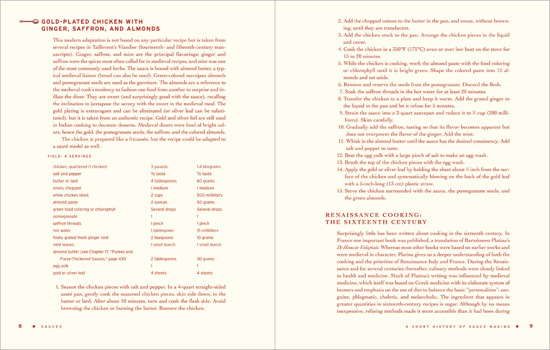
Wide gutter margins ensure that important recipe instructions remain easy to read, without text slipping into the gutter.
Generous margins take into account elements such as charts and sidebars, which are set to wider measures than text. Wide margins also act as buffers for images.

13. Work in Proportion
Keep proportions in mind, even for the page foot, and leave plenty of space for your page number.
THE GOLDEN RATIO
Designers often work by eye and instinct to determine the most handsome proportions. They then find that other people working in the realm of space and planning have similar approaches, using similar proportions and ratios. The golden ratio has been used in art and architecture for thousands of years. Also called the golden section, the golden ratio describes a ratio of elements, such as height to width. The ratio is approximately 0.618. In other words, the smaller segment (for example, the width) is to the larger segment (the height) as the larger segment is to the sum of both segments. So, a designer could have a measure that is 22 picas wide with a height of 35 picas 6 points. Most designers don’t consciously use or even talk about the golden ratio, but it’s discussed in many design books, so it’s worth learning for your first cocktail party.
Project
The Plague of Doves
Client
HarperCollins
Design
Fritz Metsch
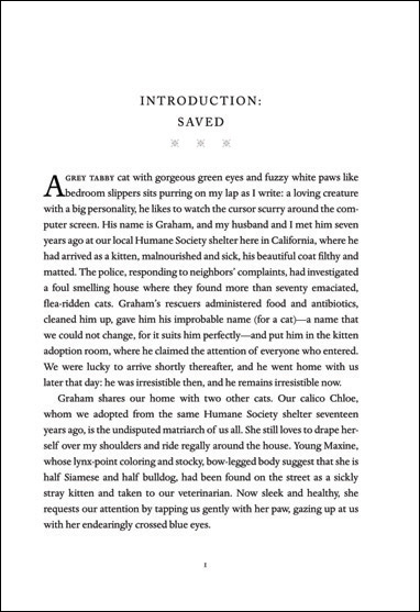
An example of crystal goblet design, this simple text page allows the work of a major literary talent to shine. In her book, The Crystal Goblet: Sixteen Essays on Typography, typographer and scholar Beatrice Warde wrote that “printing should be invisible,” and noted that quiet design is like a crystal goblet: “Everything about it is calculated to reveal rather than the hide the beautiful thing which it was meant to contain.”

The foot margin (the margin at the bottom of the page) is slightly larger than the head margin. The screened, patterned art delicately presents the title type, set in bold for a strong texture but in a small size for an understated look.
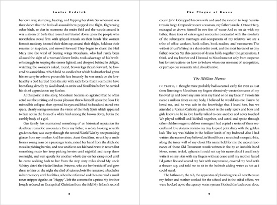
Bold, letterspaced running heads (headers) and folios (page numbers) give texture to a full page of type. Reading is easier with generous margins and ample leading.
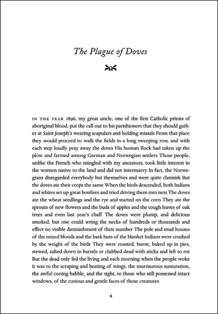
A centered page number, or folio, is a signal of a classical design.