WHEN TYPE FORMS THE GRID
56. Get Noisy

Sometimes the message doesn’t need to be absolutely clear. Various sizes, orientations, rotations, widths, and weights of type can make a message shout. In such cases, the viewer doesn’t need to read carefully as much as feel engaged.
Project
Identity and packaging
Client
Smokehead
Design
Navy Blue
Design Director
Marc Jenks
Designer
Ross Shaw
A rollicking package evokes wood type, which is perfect for a masculine, smoky libation.

OPPOSITE PAGE, BOTH PHOTOS: Whether for a poster or a package, this typography creates the grid in a joyous, boisterous way. Along with the colors, the negative and positive spaces created by the type make some words recede and others seize center stage.

RIGHT: The type is wittily laid out on the bottle with a peek-a-boo label. The typography on the stamped tin echoes the three-dimensional feeling of hot metal typesetting.
57. Turn It on Its Side


Type can work simultaneously on horizontal and vertical axes. Large type functions as a container to hold the rest of the information in the piece. The width of each name can be manipulated by clever use of tracking and varied type sizes, widths, and weights.
Project
Theater ad for Cyrano de Bergerac
Client
Susan Bristow, Lead Producer
Design
SpotCo
Creative Director
Gail Anderson
Designer
Frank Gargiulo
Illustrator
Edel Rodriguez
This ad emphasizes the most memorable part of a title, avoiding a lot of text that might easily be ignored in favor of one punchy name with the surname in a smaller size.
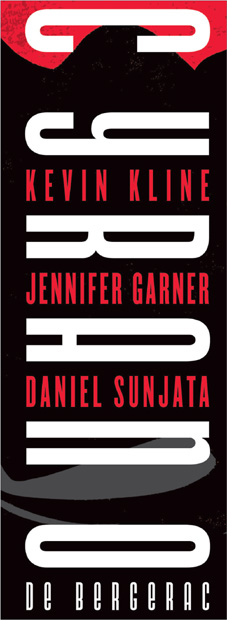
THIS PAGE AND OPPOSITE PAGE: A tidy arrangement and a limited palette doesn’t necessarily result in a static piece. Arresting, bold type forms a central column of information. The designers featured the star of the performance by marrying a brilliant illustrated profile with showstopping typography.

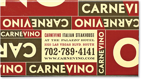
58. Pack It In

Packing a lot of letters into a piece, whether it’s a poster, shopping bag, or matchbook—or a matchbook that looks like a poster—can help form a grid. An ingenious logo and type design using a number of type families both sleek and faux rustic, can act as a holding pen for key information such as the name and address of a business.
Project
Restaurant identity
Client
Carnevino, Las Vegas
Design
Memo Productions, NY
Designers
Douglas Riccardi, Franz Heuber
Strong alignments and gridded areas give punch to the identity of a steakhouse in Las Vegas. Strip steak on the Strip, anyone?
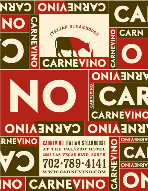
Varied type sizes provide drama and movement. Adjusting letter spacing and typefaces to justify lines creates a pecking order of information. Playing light against dark, sans serifs against serifs, and subdued against bold creates holding areas for shapes, forms, and contact information.

The matchbox is larger—one could say meatier—than most restaurant matchboxes.
59. Play with the Grid
As with jazz, typography can be syncopated. Even within a tight and well-considered grid, it’s possible to have a typographic jam session by varying widths, weights, and positions. The next step is to see what happens when you turn everything on its side.
Project
Ads and promos
Client
Jazz at Lincoln Center
Design
JALC Design Department
Designer
Bobby C. Martin Jr.
The look of Jazz at Lincoln Center is bright, disciplined, and full of energy. The design is clean, Swiss, but syncopated—and very cool.


Thanks to the dynamics of small sans serif type against a larger line, the type has a strong sense of movement. On its side and surprinting two layered silhouettes, the type really swings.
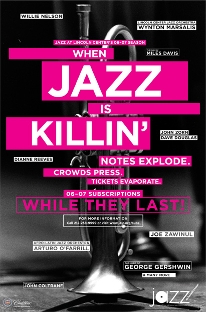
White dropout type in boxes of different sizes and depth makes a sharp and rhythmic counterpoint against smartly cropped images.
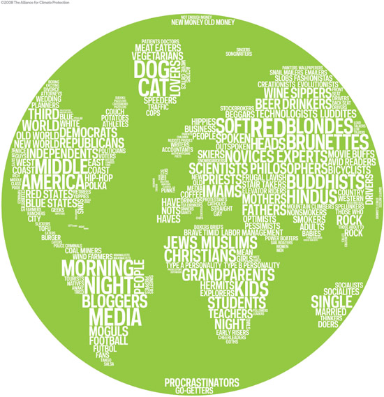
60. Involve the Viewer

Sometimes a grid has to go off the grid. Type sizes, shapes, and weights can convey message about a culture, either locally or globally, intriguing the reader and acting as a call to action.
Project
Alliance for Climate Protection advertisement
Client
WeCanDoSolveIt.org
Design
The Martin Agency; Collins
Designers
The Martin Agency: Mike Hughes, Sean Riley, Raymond McKinney, Ty Harper; Collins: Brian Collins, John Moon, Michael Pangilinan
This ad for an environmental initiative takes advantage of bold typography to make a point.

The choice of words and type sizes might (or might not) be specifically statistically chosen. Larger type sizes shout for attention, while smaller sizes and weights act as visual glue. The bright green color is the obvious and perfect choice for an ad calling for climate protection.