HORIZONTAL HIERARCHY
51. Break Signage into Sections
Designing signs is a specific design challenge that requires logic, organization, and consistency. A grid system for the graphics applied to a sign system—especially designs that wrap around kiosks—can accommodate
• levels of information that are searched in sequence—choice 1, choice 2, and so on
• secondary choices that are still important, such as which language to read
• tertiary information that answers basic questions and needs, such as gate information at an airport, restroom designations, and where to get something to eat
• a host of complex options that arise in the course of following signs: for example, a user realizing he has to retrace steps.
Because the user must also be able to see the signs and read them easily, even while walking or driving, the type should be readable, with a clear hierarchy, and the colors should flag attention without obscuring the message.
Project
Identity and Signage
Client
The Peter and Paul Fortress, St. Petersburg, Russia
Art DIrection
Anton Ginzburg
Design
Studio RADIA
A presentation for the identity of the Peter and Paul Fortress in St. Petersburg, Russia, shows how people can find their way in both English and Russian. Parts of the project have been completed.

Shown for use on pylons, the main signs and graphic plates form bands of information.

Details of the graphic plates show the many kinds of information the designers had to present and specify.
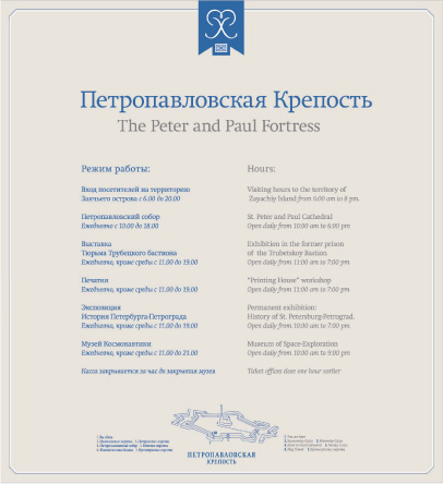
The text for a sign mounted on a pylon is set in clear, classic typography with a nod to the history of the city.
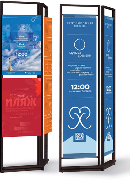
The blue panels are temporary banners, printed digitally and mounted on pylons, to announce changeable events. The photo panel shows the format of posters for such events.
52. Put Like with Like
A clear way to segregate information is to use a horizontal hierarchy. On a website, bands of information can be parts of a navigation system. Information can also be organized in bands.
To have each category follow a linear path, set up the information to open to a list of options, which, when clicked, further opens to a page that contains yet another kind of horizontal hierarchy.
Project
artgallery.yale.edu
Client
Yale University Art Gallery
Site Design, Development, and Programming
The Yale Center for Media Initiatives
The website for the Yale University Art Gallery is elegant and clear with well-defined horizontal zones.

Horizontal bands forming a navigation column are positioned above another horizontal band.

Clicking on the blue navigation column opens a drop-down menu, horizontally arranged.

A clickable menu on the home page opens to show more information.

Clicking on the main navigation bar opens yet another horizontally organized menu.

Submenus use two columns, with an image on the left. Each entry is set off by horizontal rules.

Although it is two columns, the screen adheres to a well-planned horizontal hierarchy.
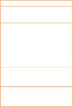
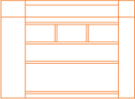
53. Let Space Define Your Horizons


Adequate space on a text page provides order and a sense of balance. By using a larger amount of space, it’s possible to separate introductory materials, such as headings and text, from more explanatory copy, such as captions or step-by-step information. The discrete areas help the reader navigate the page.
Project
Kurashi no techo (Everyday Notebook) magazine
Client
Kurashi no techo (Everyday Notebook) magazine
Designers
Shuzo Hayashi, Masaaki Kuroyanagi
In pages or spreads with a bounty of images and information, a horizontal hierarchy can demarcate headings and then levels of steps, giving a sense of order and calm and making it easy to parse the information.

Space clearly sets off text from images and defines pockets of information.

A well-considered horizontal organization breaks introductory material into zones. Images and captions marching across the spread create a horizontal flow, while enabling each image-and-caption combination to be a clear and easy-to-read step in the article’s instructions.
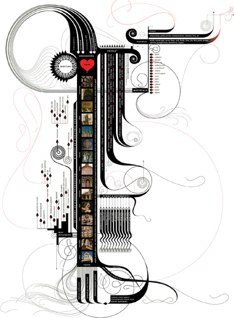
54. Illustrate Timelines
It’s wise to think of a timeline as more than a functional piece of information. A timeline can also represent a person’s life or an era, so the design needs to reflect the content.
Project
Influence map
Client
Marian Bantjes
Designer and Illustrator:
Marian Bantjes
In Marian Bantjes’s illustration of influences and artistic vocabulary, craft and detail are paramount. Lessons learned from influences, such as movement, flow, and ornamentation are all in evidence. Bantjes’s ten years as a book designer have informed her considerable typographical talent.

Lyricism stems not only from the curved lines of the illustrations but also from the weights of the rules. The letterspacing of the small caps creates texture and lightness. The ampersand is beautiful, and, although the piece is a knockout of movement, carefully controlled alignments play off the curves.
55. Work above and below the (Scrolled) Fold
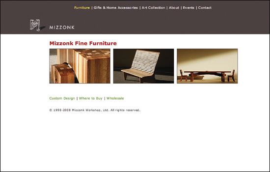
The strongest way to segregate items is to simply divide the available space. A clear horizontal bar can function as a flag, a way of calling attention to the top story or information. Furthermore, using a color at the top of the bar offers the option of dropping the information out of the headline, creating a happy tension of negative versus positive, light versus dark, and dominant versus subservient.
Project
www.mizzonk.com
Client
Mizzonk Workshop
Design
Punyapol “Noom” Kittayarak
Lean, low lines characterize a site for a custom furniture business based in Vancouver, British Columbia.

Within a horizontal organization, the home page can be skimmed from top to bottom.
On subscreens, the navigation bar remains as a strong horizontal guide.

Not all elements are sized or set to the same depth. When text dips below the base of the image, it creates a lyrical flow.