GRID, RECONSTRUCTED
87. Observe Masters

Making a close study of the work of graphic pathfinders can result in layouts that are similar to the work of the masters and yet offer fresh interpretations of grid systems.
Layouts designed as an homage, with echoes of original Swiss masters, can have a fresh feeling thanks to a deep and basic understanding of the overall precepts rather than a slavish copying of specific elements.
Project
étapes: magazine
Client
Pyramyd/étapes: magazine
Design
Anna Tunick
A spread from a magazine article about the designer Josef Müller-Brockmann is a trove of grid basics, from the chronology of his life to book jackets and seminal images.

Astute observation of Müller-Brockmann’s work results in a rich design that is an intelligent homage as well as an independent study.
88. Blow It Up
Grids can overwhelm a project and become an overriding force, or they can be subtle underpinnings that, in the words of one author, contribute “a layout that is elegant, logical, and never intrusive.”
Project
Chuck Close|Work
Client
Prestel Publishing
Design
Mark Melnick
An unobtrusive design elegantly presents big-personality paintings.

The strength of the cover lies in its simplicity and its focus on the artist and his work. Note the overall layout of a book jacket, prior to folding and wrapping around the bound book.
THIS PAGE TOP LEFT: For the title page spread, an enlargement of the eye captures the artist, while the title is, again, simple.
THIS PAGE TOP RIGHT: Here, the obvious grid is in the subject matter and its title.
THIS PAGE TWO MIDDLE IMAGES: Again, the grid of the subject matter reigns supreme.

Images on the endpapers move from the artist at work to the artist in profile.
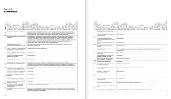
89. Change Boundaries

Auxiliary material can be as beautiful as the main text—and can change the boundaries between primary and supporting material. Back matter, that is the material at the end of a book or catalog such as appendixes, timelines, notes, bibliography, and index, can be complex. Details throughout a project define a thorough design, including a clear and handsome design for pages that are sometimes less noticed.
Project
Exhibition Catalog Show Me Thai
Client
Office of Contemporary Art and Culture, Ministry of Culture, Thailand
Design
Practical Studio/Thailand
Design Director
Santi Lawrachawee
Graphic Designers
Ekaluck Peanpanawate Montchai Suntives
An exhibition catalog contains a number of useful grids, with an especially interesting treatment of the list of participants.


OPPOSITE PAGE TOP: A spare photo contrasts with a highly gridded page.
OPPOSITE PAGE BOTTOM: On the left page, the text measure, or width of the set type, is the same as the width of two images combined. Wide measures are generally not encouraged, but the layout works.
A three-column grid and a chart artfully provide a sense of order.

The tabular material on the spread is clear, handsome, and interesting, with an ornamental motif that lends texture.