TWO COLUMN
14. Give Columns Equality

A grid with two even columns can control a large amount of material on a page. Symmetrical columns give a sense of great order and can support variations in image sizes and amouns of space. Perfect for publications with international audiences, two even columns can present the same information in two different languages, coexisting equally.
Project
Return to the Abstract
Client
Palace Editions, for the Russian State Museums
Design
Anton Ginzburg, Studio RADIA
Two columns present information in two languages, Russian and English.

Traditional justified columns provide a sense of order and comfort for conservative editors and readers.


If the column width is wide enough and the text small enough, each of the two columns will present a uniform and readable texture. A tidy text setup can support all sorts of other information, such as boxes, charts, or images.
15. Design for Function

Project
Extreme Textiles
Client
Smithsonian, Cooper-Hewitt, National Design Museum: Extreme Textiles Exhibition Catalog
Design
Tsang Seymour Design
Design Director
Patrick Seymour
Designer
Susan Brzozowski
An exhibition catalog weaves different formats together, depending on the needs of the material.
Although a typical approach to a two-column grid employs columns of equal widths, a two-column grid can consist of two unequal columns. When the purpose of an information-rich piece is to be open, readable, and accessible, an option is to construct a grid containing a narrow column and a wider column. The wider column works well for running text and enables the author(s) to deliver a coherent running narrative, while the narrow column can hold material such as captions, images, or tables.

Used for captions, a narrow column can work readably, whether the caption appears on a chapter opener or a text page. Note that chapter openers often have more space before the text starts (also known as a sink, or drop) than a normal text page.

Successful and balanced grid construction employs a wide column that is double the width of the narrow column. The type in the narrower column is set in the same typeface as the running text but in a lighter-weight font. Using varying font weights adds rich texture.

When there are few or no images, the structure of two uneven columns can support a page with nothing in the smaller text column.

Rules can function as devices to either divide the space or connect columns within the space. Here, the blue rules become part of the weave of the page without overwhelming the material; they also denote new paragraphs.
16. Rules Rule!

Sometimes, instructional material includes so many discrete chunks of information that a page needs more than mere space between the columns for readability. In such cases, a vertical rule can function as a dividing line between columns. Horizontal rules can separate information within columns by dividing running text from boxed material, or by separating the overall text area from the running feet and folios by means of another horizontal rule. Caution: Too many rules can dull a page.
Project
America’s Test Kitchen Family Cookbook
Client
America’s Test Kitchen
Art Direction
Amy Klee
Design
BTDNYC
Horizontal rules at the head and foot can set off information or frame an entire box.

This vertical rule keeps chunks of different information, sometimes with different type attributes—such as bolds, all capitals, italics, fractions—in their respective columns.

The space between units of information separates horizontal elements and gives a page clarity.

Horizontal rules can also help control components. When there’s a lot of informational action going on, a horizontal rule can separate a page number or a running foot from the rest of the hard-core information.
17. Use the Entire Area

A two-column grid is a pronounced framework that makes a piece easy to follow. Images can fit comfortably within a column, with captions above or below. But why stop there? Once the basic framework is determined, there is room to vary the spreads. Wider images, sized to two columns, or captions set out into the margin, can enliven the overall project, adding rhythm as well as order.
Project
Annual report
Client
Cathedral Church of St. John the Divine
Design
Carapellucci Design
An easy-to-follow report varies image widths.

Variations include making the images wider and using various type widths.

The look of the piece depends on the material; an annual report, for example, will often have a straightforward look, depending on the business. This report plays it straight, as befits the client, a nonprofit organization.
18. Use Typography to Define Zones in the Grid

Good design reflects and relates to the material and, therefore, to the reader. Successful typography defines clear and understandable zones, no matter the publication’s purpose. Zones can work both horizontally and vertically within a spread or story and still maintain orderly integrity. The key is to make certain that material corresponds. Specifically, make sure the reader understands the basic material at a glance. Make certain the headline or headlines stand apart. Ensure that captions are positioned so they correspond with their images and help the reader—especially when the piece is instructional.
Project
Croissant magazine
Client
Croissant magazine
Art Direction and Design
Seiko Baba
Croissant, a Japanese magazine geared to women over thirty, makes instructions handsome and clear. This particular magazine is a MOOK, a special edition published by Croissant editors. The title is Mukashi nagara no kurashi no chie, which roughly means “time-honored wisdom of living.”
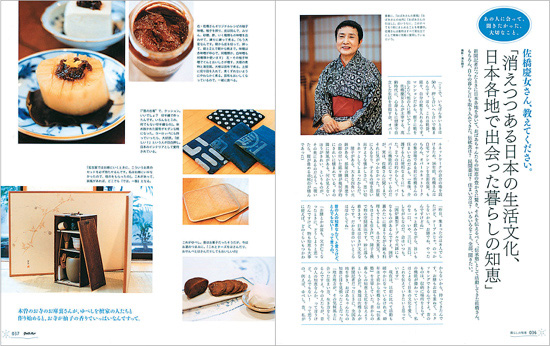
Headlines are set in an area separate from the text—in some cases on the right edges of the page. In other cases, headlines are set in the center of the page. Sections of text are set off by space or rules, with a distinct area for captions.

Type in different zones can distinguish various kinds of information. Here, running text and step-by-step directions are in separate areas.
19. Mix Quirks with Consistency

The most successful grids have consistency, order, clarity, and a strong structure—then they shake things up. A two-column grid can be set with columns of different widths, which add visual tension and movement to a project. Even when quirky variations are used to enliven a design, a stable basic structure provides a clear framework while allowing drama.
Consistent elements in many projects are
• a heading area at the top of the page
• a consistent text box in the same location on both left and right pages that acts as an effective signpost for the reader
• running feet and folios at the foot of the page to help the reader navigate through the piece
Project
Brochure for the Performing Arts Center, Purchase College
Client
SUNY Purchase
Design
Heavy Meta
Art Director
Barbara Glauber
Designer
Hilary Greenbaum
A sound organizational structure allows quirky variation to enliven a design.

This project has a master format to support key information used throughout the brochure. Key descriptive text with auxiliary information is easy to find. The clear structure holds its own against an energetic ornamental device.


ABOVE: Along with a strong structure, this project has a clear typographic hierarchy. The first use of the heading is larger; subsequent headings are repeated in a box of the same size but with smaller type. Dates and locations are found in a color bar with the same color code but a more straightforward treatment. Consider all relationships and keep the hierarchy clear.
OPPOSITE PAGE: Most images are used as full-page horizontals, but text boxes and color bars cutting into some images add movement and drama. Names of performers, positioned in clear but different areas of the image add texture and a sense of play.

Colors harmonize with the information.

RIGHT: Silhouettes and white space vary the pace.
20. Alternate Formats

Within one piece, it’s legitimate to combine a number of grid and typographic systems. When there are different kinds of information, even a clear two-column grid needs to be altered a little so that there’s clarity and balance.
Project
2007-2008 HD Program Guide
Client
The Metropolitan Opera
Design
AdamsMorioka, Inc.
Creative Directors
Sean Adams, Noreen Morioka
Art Director
Monica Schlaug
Designers
Monica Schlaug, Chris Taillon
A controlled and classical yet lively design brings youthful energy to the collateral graphics for a timeless art form.

Running text, such as a continuous story or synopsis, is set in two even columns.
Sections devoted to each performance open with large, dramatic photos.

Typography, adjusted to distinguish information, shows a counterpoint between serif and sans serif information.

Presenting different kinds of information, such as a question-and-answer format, calls for a two-column grid, with a narrower column for the questions and the wider column for the answers.