LAYERED GRID
90. Make It Complex
The near-impossible can be designed if you break down the steps. Color can create shapes and spaces. A receding color is, essentially, a negative space. A dominant color becomes part of the foreground. Plot out how various overlaps can create another dimension for the entire piece. Allow yourself to experiment with layers and shapes.
As for solving the puzzles, you’re on your own.
Project
Cover for the Puzzle Special of The Guardian’s G2
Client
The Guardian Media Group
Design
Marian Bantjes
This cover for the puzzle issue of G2, uses layers of lines and squares.

The ultimate grid, a puzzle, gets depth via the skilled hands of Marian Bantjes, who likes “to push those rules that I know and try and make something that is making me uncomfortable, but in a good way.”

91. Think of More Than One Dimension
Although most layouts using grids are flat, whether on a printed page or a computer screen, they need to capture the dimensions of the work they illuminate. A brochure can be produced in a format other than a book or booklet or flat page. Conceived three-dimensionally but designed as a flat piece, brochures with accordion or barrel folds can give additional depth to a piece.
Project
Exhibit Catalog for Stuck, an art exhibit featuring collages
Client
Molloy College
Gallery Director
Dr. Yolande Trincere
Curator
Suzanne Dell’Orto
Designer
Suzanne Dell’Orto
Cleverly conceived as a fold-out piece, this brochure for an exhibit of collages evokes some of the playful art in the gallery show.

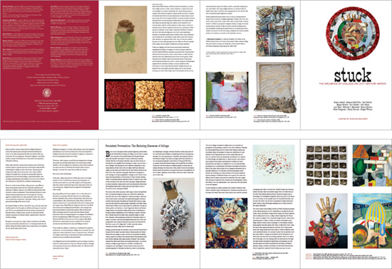
OPPOSITE PAGE: One of the four panels on the interior side of the brochure shows a deconstructed art history book, situated tidily in one of the columns. The type combination of the stately Gill Sans and the jocular P. T. Barnum calls to mind the juxtaposition of elements found in collages.
A traditional grid provides a spine for the varous quirky collages in an exhibit. The straight-faced (literally) treatment of the type and well-planned space work together to frame the lively art. The top image shows the exterior of the piece; the bottom image is the interior. Printed on two sides, the accordion-folded brochure takes on a three-dimensional air.
92. Think Globally
The framework of the grid can support many superimposed elements. Keep in mind that
• informational typography needs to be readable
• open space is crucial to the success of a composition
• it is not necessary to fill every pixel or pica
On the most literal level, layers can intrigue the reader. On a deeper level, they are an invitation to mull over combinations of elements.
Project
Branding posters
Client
Earth Institute at Columbia University
Creative Director
Mark Inglis
Designer
John Stislow
Illustrator
Mark Inglis
Layered photos, line illustrations, and icons add depth and imply levels of meaning, as well as interest, in this project.
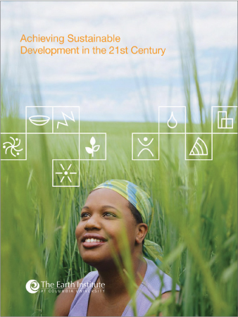

THIS PAGE BOTH IMAGES: Layering adds dimension but keeps the message clear in this cover and inside spread of a brochure.

Elements superimposed over a photo and the use of transparent areas of color enhance the three columns of typography.

Typography is only the top layer on a poster for a talk about complex health issues.