COLOR AS ORGANIZING PRINCIPLE
45. Control It with Colors
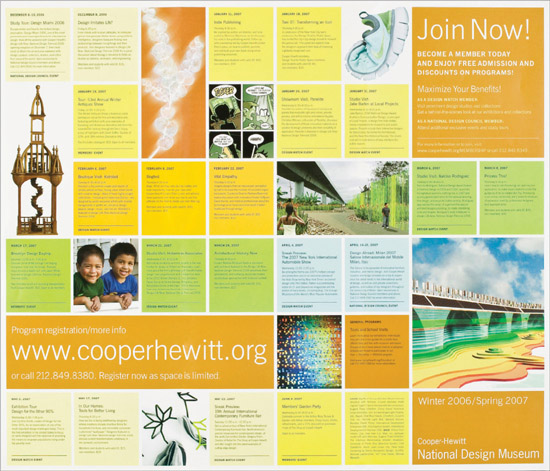
Consistent in size and within an overall grid, tightly plotted yet flexible color modules can support playful variations of both text and images, as shown in this program calendar. Boxes and color can provide an overall system and structure and can also control information clearly. When listing a lot of specific details, a grid that combines color modules can set off dates and information from other kinds of text, such as URLs, calls to action, or banners with the main title of the piece.
Project
Program calendar
Client
Smithsonian, Cooper-Hewitt, National Design Museum
Design
Tsang Seymour Design, Inc.
Design Director
Patrick Seymour
Art Director
Laura Howell
This system for seasonal program calendars supports a uniform message. It also allows dynamic variations of colors and images.
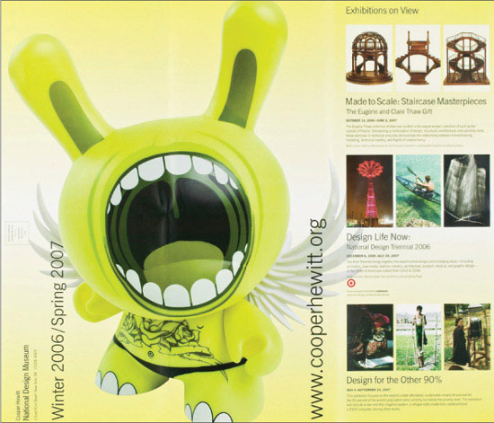

Synopses of the lead exhibits and their dates complement exuberantly large and unfettered images on the reverse side of the program calendar, setting up visual tension and compression.

Varied image sizes and the occasional silhouette adhere to, but also pop out of, the framework of the color boxes.
OPPOSITE: Months are color coded to clearly chart the passage of time. Each event has a module to itself.
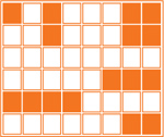
First, define the size of your overall area, breaking it into equal squares. Then take into account an overall outside margin. Use squares as single boxes, doubled (or even tripled) horizontally or vertically, or stacked. Paying attention to the information to be contained, the modules can be color-coded by date, month, price, event, or whatever is appropriate for the project. When designing with hardworking information, the color should communicate and enlighten the message.
Modules also support photos and illustrations. As with text, an image can fit into one module, two vertical modules, two or four horizontal modules, or four stacked modules. In short, the color boxes allow a range of variation, while maintaining control and integrity. To add further interest, play against the grid of the boxes by silhouetting the occasional image, giving further rhythm and visual space to a lively program.
Within the structural support from a cavalcade of colors, information can exist in its own space. Color modules can support a readable hierarchy of information with small type sizes, as well as larger headlines and bolder information. Varied type sizes and weights along with upper- and lowercase type make it easy for the reader to scan dates, events, times, and descriptions. Large headlines in the multimodule boxes add rhythm and surprise, as well as a consistency among similar kinds of copy, such as marketing lines, the client or museum, calls to action, and contact information.
A double-sided project, or a project on a spread, can also take advantage of the modular format, by following, but also interrupting, clearly defined areas.
46. Use Color in Typography for Emphasis


Too much color can be busy and confusing. However, the right amount of color provides a guide to help the reader recognize priorities. A pronounced hierarchy of headings can be easy to follow if aided by accents in color.
Project
Croissant magazine
Client
Croissant magazine
Designer
Seiko Baba
Illustration
Yohimi Obata
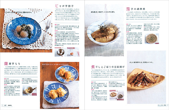
Color subtly sets off type, adding clarity and zest to magazine spreads. This particular magazine is a MOOK, a special edition published by Croissant editors. The title is Mukashi nagara no kurashi no chie, which roughly means “time-honored wisdom of living.”

Setting one character larger and in color calls attention to a particular heading.
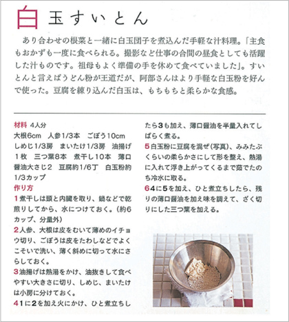
Here, color sets off one piece of information from another. Clear differentiation is especially useful and important for instructions. In this cookbook spread, subheads are in color. The numbers in the recipe instructions are also in red to set them apart from the text.

The weight, size, or shade of a different color for the Q Questions provides texture and visual interest.
47. Put the Information in the Color

Using color in a calendar makes it easier to separate specific elements, such as days of the week. The information both stands out and works with the overall spread. Colors can also complement the palette of the photo.
For situations where it’s important that the dates are featured but not obscured, chose colors or shades that are muted and and do not upstage the material. Desaturated colors (colors with more gray) work best if type is surprinting, that is printed on top of the color.
Project
Calendar of events
Client
New York City Center
Design
Andrew Jerabek
Photos and palettes work together to determine shades for calendar boxes.

A rich background and astounding movement play against the controlled calendar in complementary colors.
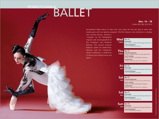
Box colors present such a delicate and distinctive palette that they complement instead of compete with a beautifully art-directed photo.

Autumnal colors support a spread containing a dramatic photo with accents of saffron.
48. Code with Color

Coding information by color can help viewers quickly find the information they need. A scan of a color key, in conjunction with icons, quickly communicates far more information than words or colors alone.
Depending on the client or material, the colors can be muted or bright. Saturated colors—colors with less gray—immediately command attention.
Project
Identity program
Client
Earth Institute at Columbia University
Design
Mark Inglis
Creative Director
Mark Inglis
Color codes differentiate a suite of six scientific disciplines for the Earth Institute at Columbia University.

By design, each discipline includes a number of research centers and associated degree programs. Each discipline has an assigned color system.


Icons also tie into the color system.

The colors work with icons, color bands, or type.
49. Separate Content with Color

Color is sometimes all that’s needed to divide segments of material. Depending on the color chosen, a big bold hit can create an unexpected, welcome pause in a lengthy text or create a feeling of excitement about what’s to follow.
Color and dropout type, or type that is white reversed out of the background color, can work in tandem to create arresting section openers. The contrast of white type against a color works as successfully as that international icon, the stop sign.
Project
No Reservations
Client
Bloomsbury USA
Design
Elizabeth van Itallie
Sections of a book are separated by colors as cheeky as Anthony Bourdain, the author of the book

THIS PAGE AND OPPOSITE PAGE: Each color arrests attention and supports a bold heading.

50. Use Shades to Achieve Color

Sometimes, there isn’t a budget for full color. Although most posters and advertisements are designed for a number of venues, such as print, websites, and television, there are still cases where a particular budget doesn’t allow for anything other than black-and-white printing. Such color restrictions can occur in books, newspapers, and flyers.
Even with black only, it’s possible to achieve color and texture by using different shades. Texture springs from type that prints black on white, drops out of the black as white, or surprints on different screens. Graphics and images can provide additional variety.
HOW SCREENS WORK
Depending on the paper, a background of 70 percent black can provide color and still support readable type. Ten percent black allows typography to stand out and be clear. Further, photos with grayscale values add texture and a variety of shades to a piece. The darker the screen, the more readable the dropout type. Light shades enable type to surprint.
Although printing quality is such that it’s less crucial to worry about very small type dropping out of a black background, it is still a good idea to pay attention to the size of small type.
Project
Movie ad for Before the Devil Knows You’re Dead
Client
ThinkFilm
An ad withstands color restrictions and presents a bold attitude.

OPPOSITE PAGE: Screens of black provide a range of color and texture. The screens are dark enough to support dropout type, so that headlines or copy can stand out readably. Black boxes contain dropout white headlines, thereby providing clarity as well as color and texture.