GRID, INTERRUPTED
83. Build in a Surprise


A tidy, almost-Swiss approach perfectly and clearly sets forth information for the reader. Tidiness is good. Clarity is good. Going beyond the solution is great. A well-ordered grid, with vertical columns and a readable system, can be modified simply by varying the type sizes. Large and small key words provide depth, as well as an unexpected burst of energy, in a highly organized spread.
In a project that includes a range of informational problems, a grid adds variation, clarity, and authority. A well-planned grid allows a designer to diversify page layouts and keep a coherent structure. Three columns can contain either a little information, such as headings only, or a lot, such as lists with heads and subheads.
Project
Masters of Graphic Design Catalog Covers of UCLA Extension 2
Client
University of California, Los Angeles
Design
AdamsMorioka, Inc.
Creative Director
Sean Adams
Designers
Sean Adams, Monica Schlaug
Strong grid underpinnings support numerous layout variations in this catalog featuring catalog covers.

Subtle but consistent, the three-column vertical grid recurs throughout the catalog, starting with the cover.

The three-column structure, which is clear in the heading for the spread, is a visual foil for the large, playful type that interrupts the Swiss serenity. The range of type sizes and emphases adds a surprising counterpoint and a touch of playful fresh air to the controlled columns.

This spread shows the heart of the catalog. On the left page, three columns cleanly contain the name of the designer, the time frame, and the designer’s photo and bio, while the right page features only the designer’s catalog cover.

A strong system can support an additional method of organization. Here, the vertical columns become headings for the strong horizontal bands in the index of designers. Each horizontal band contains the name of a designer, thumbnails of the designer’s work, and the name of the edition containing the work.
84. Vary Sizes
Once an overall grid is determined, there is room to play with scale, space, size, and typography. Springing from the intent and importance of the text, the sizes of images and text can be dynamic or dull, depending on the amount of space the material needs.
Project
What Is Green?
Client
Design within Reach
Design
Design within Reach Design
Creative Director
Jennifer Morla
Art Director
Michael Sainato
Designers
Jennifer Morla, Tim Yuan
Copywriter
Gwendolyn Horton
“Green-ness” and sustainability are hot (globally warmed) topics, addressed by many companies, including DWR, which has been ecologically conscious for years. The first thirteen pages of this project provide a sense of flow for a story with one related issue and a variety of layouts.

The image on this cover makes such an unmistakable statement that the typography can be minimized.
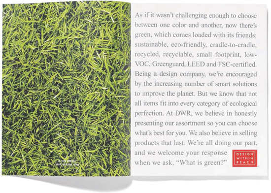
On the first page, the typography makes a statement—and a lengthy proclamation—filling the entire area of the grid.

In a dramatic shift of scale, the contents page employs a horizontal setup for easy flow. Leaders—rules, for example—direct the eye to the contents. Thumbnails act as quick signals for the content.
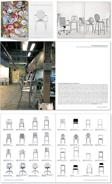
These layouts show the shifts in text sizes. Note that one spread has a very wide text measure, which is generally undesirable in text setting. In this case, however, style and message trump normal design precepts. If you want to read about the recycled aluminum chairs, you will. The payoff is that the description of the chairs is very pithy.
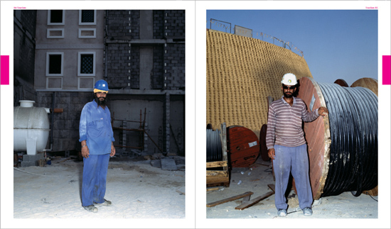
85. Let the Photo Do the Talking

When you have a fabulous photo, don’t wreck it. Sometimes the best solution is to make a photo as large as possible, crop very little or avoid cropping altogether, and leave the image free of surprinted type or graphic gimmicks. In other words, relate it to your grid, but, otherwise, let it have its day.
Project
Magazine
Client
Bidoun
Creative Director
Ketuta-Alexi Meskhishvili
Designer
Cindy Heller
Photographers
Gilbert Hage (portraits) and Celia Peterson (laborers)


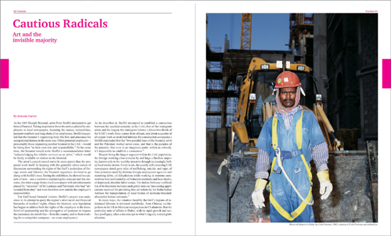
THIS PAGE AND OPPOSITE PAGE: There is no need to do anything to these photos, which speak volumes on their own without graphic devices.
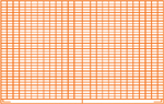
86. Set It Off with Sidebars

A sidebar, a box that contains a subset story expanding on the main feature, is a common way to set off information that relates to, but needs to be separate from, the main text. Boxes can work within the grid; they function as adjunct information as opposed to interruptions.
Project
Nikkei Architecture
Client
Nikkei Architecture magazine
Design
ar
Boxes and charts control technical information in an architectural trade magazine.

A well-organized grid can generally accommodate sidebars, or boxes, in varying sizes: all columns, two columns, or one column.

Often, the boxes or sidebars function as discrete designs, but they always relate graphically to the main story by using common colors, typefaces, or rules.