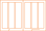
THREE COLUMN
21. Make It Look Simple
The most successful design looks simple but is subtly versatile. A design that seems open and spare can support a lot of material, especially in a book or catalog.
If the project contains both text and images, look at the proportion between the two and determine how much space is needed for each. When captions are long and contain a lot of additional information, such as credits and supplemental descriptions, distinguish the captions from the text by using different typefaces, by setting the type smaller, or by varying the amount of space between elements.
One structural solution is a three-column grid that scans like a one- or two-column design. Use two of the columns for a single text width and position the text on the right side of the page. The result is a clean look for the running text and a generous left margin for a long caption.
If the material dictates, two columns of captions can replace the single text column, allowing captions and images to sit readably on the same page. With a three-column grid, it’s possible to size images to be one, two, or three columns wide or a full-page bleed.
Project
Beatific Soul
Client
New York Public Library/Scala Publishers
Design
Katy Homans
This book, a companion to an exhibition exploring the life, career, art, journals, and manuscripts of Jack Kerouac, features his landmark novel, On the Road. The three column grid allows many variations and extreme flexibility, resulting in a page that looks spacious, calm, and beatifically simple.

This simple but versatile multicolumn grid accommodates all kinds of information. The generous leading of the serif running text makes it easy to read. Captions sit in the left column and are set in a sans serif face for ultimate clarity. The page structure can easily accommodate variations in the text.

Three columns provide a strong framework for narrow art and multiple captions. On the left page of the spread, captions take the place of the running text, and a narrow image sits in the left column; the right page of the spread is reserved for text alone.

For pacing and clarity, large images occasionally have a page to themselves. Here, an image of Jack Kerouac’s typewritten manuscript holds its own against the calm column of text on the left page.

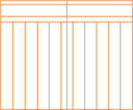
For reference material, such as the notes and index sections, the grid becomes three columns.
22. Define Columns Typographically

Typography can help define columns. The use of different weights and sizes can help to determine the order of information, creating a hierarchy that can be either horizontal (title, description, yield) or vertical (columns, left to right). Different type, such as a sans serif, can set off lists or information that differs from running text or instructions. Bold weights for titles or the numbers in instructions can function as alerts as well as add zest to the page. Lighter weights, possibly in a different face, can work for headnotes or subservient copy. The clearly-defined spaces can keep the range of typefaces from becoming a visual mash.
Project
Martha Stewart’s Cookies
Client
MSL Clarkson Potter
Design
Barbara deWilde
Sophisticated photography and typography accurately reflect the elegance and taste of a domestic authority.
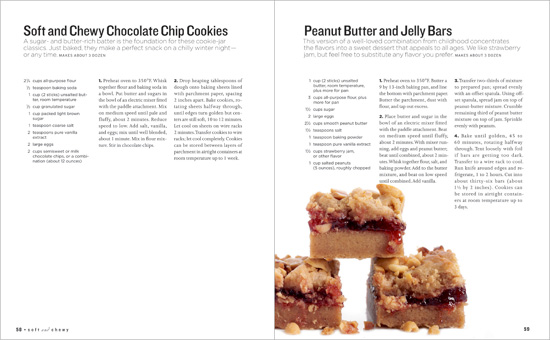
Ingredients are in sans serif, and instructions are in a serif typeface. A bolder version of the sans serif is used for emphasis.
Elements are wittily stacked to create a sense of play. Using different faces for accents enlivens the format, so it can be fun and instructive.
23. Avoid Overcrowding

When designing multiple columns, it’s not necessary to fill absolutely every inch of space. It’s good to leave certain columns open. White space directs the reader’s eye around the page, making it easy to pick and choose certain stories, images, or logos. Rules of varying weights help control and give punch to the information.
Project
Good magazine issue 008
Client
Good Magazine, LLC
Design Direction
Scott Stowell
Design
Open
White space and witty, edgy design help readers cruise through a lively combination of hard-core big ideas that make the globe a better place.

Preliminary sketches show a sense of space.

Contents pages are often difficult to parse. This one gets rid of the clutter and makes it easy for readers to find their way around the magazine’s offerings. The various sizes and weights of the typography give the page interest and balance. Icons at the upper right determine a format used throughout the magazine.

The page contains five levels of information, which are clear and easy to read due to tidy typography and generous space.

Rules and cleverly controlled typography set off a range of information types.

Muscular typography cascades through a spacious page opposite an equally muscular illustration.

Big ideas? Big letters! Large drop caps playfully signal starts of stories and play on the words of the heading. Icons introduced in the contents page appear in a consistent position, at the upper right of the page, with only the appropriate icons in use.
24. Lower the Columns

A full page of three-column text can become dense. A good way to keep the reader engaged and undaunted is to lower the columns on the page, which creates clean spreads and a feeling of movement. Lowered text columns also enable the designer to create a clear area for lead information such as the running head and page number, spread title, headnote, and photos.
Project
Pew Prospectus 2008
Client
The Pew Charitable Trusts
Design
IridiumGroup
Editor
Marshall A. Ledger
Associate Editor/Project Manager
Sandra Salmans
A nonprofit’s works are presented seriously, yet elegantly.

Variation is the spice of design, so it’s also good to add contrast by designing the introductory material to a wider measure. For additional texture, set the headnote in a typeface altogether different from the typeface used for rest of the material.


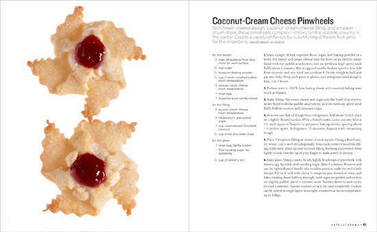
25. Shift Shapes

Changing the shapes of photos and drawings can enliven and enlighten a how-to story. If everything is the same size and width, the piece will be clear but dull. Instead, it’s possible—and better—to vary the mix.
Project
Martha Stewart Living
Client
Martha Stewart Omnimedia
Design
Martha Stewart Living
Chief Creative Officer
Gael Towey
Clear how-to images and finished photos sit in a strong yet flexible format.

One way to clarify text or instructions is to include how-to illustrations and a photo of the finished recipe or craft object. The images will be useful, and their varying shapes keep the page from being static.

OPPOSITE PAGE: The typography in this piece is functional and detailed; it’s also exquisite without being precious. The boxed-in sidebar signals the reader to important information that’s separate from the recipes.