SWISS GRID
78. Set Up a System

A versatile system allows different sizes, shapes, and information to work in numerous configurations.
PIONEERS
Ellen Lupton notes that the Swiss grid pioneers Josef Müller-Brockmann and Karl Gerstner defined a design “programme” as a set of rules for constructing a range of visual solutions. Lupton nails the crucial aspects of Swiss design. “The Swiss designers used the confines of a repeated structure to generate variation and surprise. A system allows for both dense and spacious pages within the same project.
Project
étapes: magazine
Client
Pyramyd/étapes: magazine
Design
Anna Tunick
This magazine article employs a flexible system in its visual review the work of the great gridmeister Josef Müller-Brockmann.
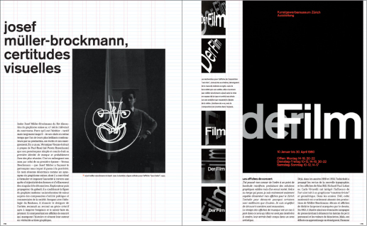
This systematic grid allows the page to be broken into halves, thirds, and quarters; it can also be subdivided horizontally.

The strong grid controls image sizes and supports variations.

Strict grids do not preclude excitement. Arresting images and rhythmic placement create variation and surprise.

This spread shows how the grid can easily accommodate a sidebar and illustrates how the grid can also support a page with ample white space.
79. Use Weights and Measures

A gridded piece with Swiss design foundations can make a lot of text a delight to read. This system visually broadcasts information so that it reads loud and clear. Multicolumn grids can contain copious amounts of information and accommodate images and color boxes for sectional information. The system also allows for variation; what is left out enhances the material that is put in.
Project
Subscription brochure
Client
Jazz at Lincoln Center
Design
Bobby C. Martin Jr.
Typography readably wrangles a rich offering of programs.
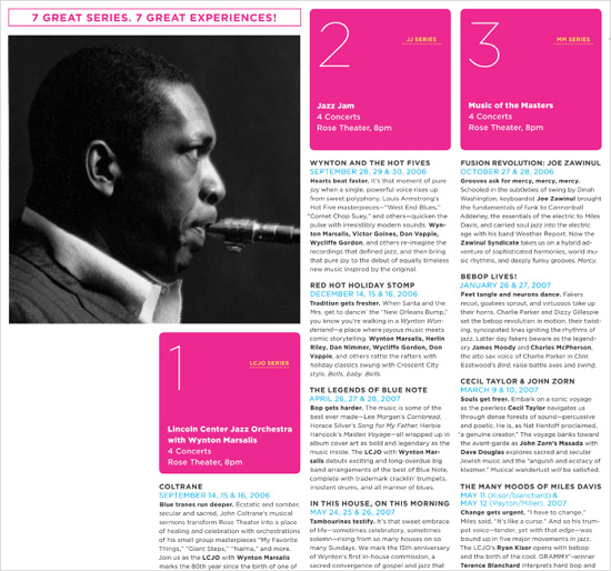
DETAIL (ABOVE) AND OPPOSITE PAGE: This brochure shows a controlled variation of weights, leading, labels, heads, and deks. Hierarchy is clean and clear. Color modules signal the seven different series. The typography within each color module is clear and well balanced, with sizes and weights that clearly denote the series information. The color modules are successful subset layouts within the overall layout of the brochure. Within the modules, an elegant choice of typefaces and alignments act as minibanners.

80. Use Helvetica
In 2007, Helvetica’s fiftieth anniversary helped make this classic and clean sans serif typeface a star. Why is Helvetica so clearly associated with the Swiss grid? Aside from its name, tweaked from Helvetia, the Latin name for Switzerland, the functional lines of the face originally christened as Neue Haas Grotesk, worked in tandem with the orderly grids that defined modernism in the 1950s.
Various showings of Helvetica
Client
• Designcards.nu by Veenman Drukkers
• Kunstvlaai/Katja van Stiphout
Photos
Beth Tondreau
Helvetica can be used in a range of weights and sizes. The medium and bold weights often signal a no-nonsense, nonfrivolous approach.
The thinner weights nod to simplicity, luxury, and a Zen quietness. When you choose a typeface for your project, keep in mind its weights and sizes and what they say.

A thin, elegant weight of Helvetica can look quiet yet sophisticated.

Varying weights function as both emphatic and matter of fact.

Clear letterforms made Helvetica the everyman of typography, but every man and woman will want to watch alignment and spacing!

Helvetica’s no-nonsense features make it as typographically elemental as air and water.
81. Use Rules
Rules are versatile. They can function as
• navigation bars
• containers for headlines
• grounding baselines for images
• separation devices
• mastheads
Project
www.vignelli.com
Client
Vignelli Associates
Design
Dani Piderman
Design Director
Massimo Vignelli
A master of grids and rules, Massimo Vignelli shows his stripes on the Web.
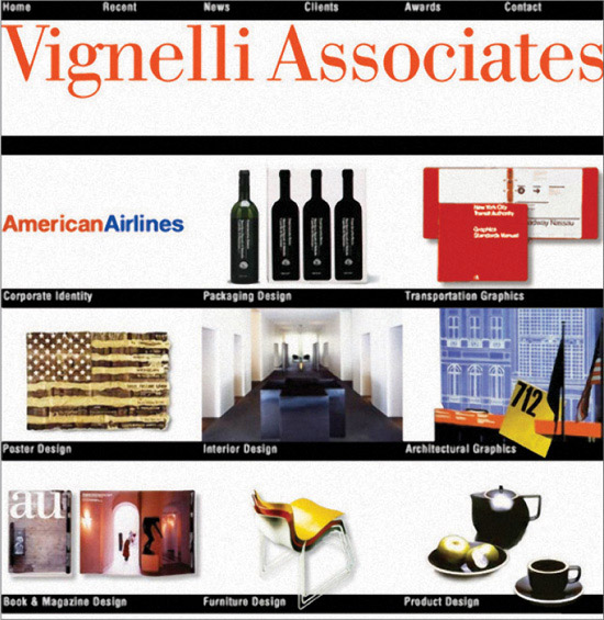
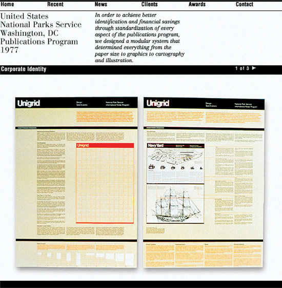
OPPOSITE PAGE TOP: Always consistent, Vignelli Associates’ well-ordered work translates to the Web.

Rules of varying weights both separate and contain information.
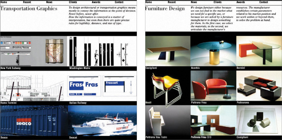
OPPOSITE PAGE BOTTOM: Headings set in Franklin Gothic Bold contrast with and complement Bodoni and Bodoni Italic, providing Swiss design with an Italian accent.
82. Employ Vertical and Horizontal Hierarchies

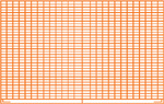
Dividing a page into clearly delineated areas can make stationery, forms, and receipts beautiful as well as utilitarian. Horizontal and vertical grids can coexist successfully, ordering units of information in a way that differs from a more expected approach but contains all of the necessary elements.
Project
Stationery receipt
Client
INDUSTRIES Stationery
Design
Drew Souza
The design of this receipt takes to heart Herbert Bayer’s method of treating an entire page as a surface to be divided.


OPPOSITE PAGE AND THIS PAGE: Employing horizontal and vertical hierarchies in one piece, the stationery system and receipt creates a clearly divided container for many chunks of data. Without the sales information, the receipt is a beautiful abstract composition. With the nuts-and-bolts info, the receipt is a functional system.