TABLES AND CHARTS
36. Think of the Chart as a Whole
Creating charts, tables, and timetables is an intimidating feat dictated by numerical information. In her book, Thinking with Type, Ellen Lupton advises designers to avoid the type crime of creating what she calls a data prison, with too many rules and boxes. Following Lupton’s advice, think of the chart, grid, or timetable as a whole and consider how each column, row, or field relates to the entire scheme.
Use shades of a color to help the user navigate through dense information. Shades work whether the job is black and white only or whether there’s a budget for color. Shaded horizontal bands can be used to set off rows of numbers, enabling users to find information. As organizational devices, frames and rules aren’t completely verboten. Rules can distinguish particular sections and, in the case of timetables, define specific zones of content. For more complex projects, such as a train schedule, where a complete system is necessary, color coding can distinguish one rail or commuter line from another.
A grid is nothing without the information it displays, and in multiple columns, clean typography is crucial. For directions at an airport or train station, the way the data is typeset can make the difference between easy travel and missed connections. Be certain to leave adequate space above and below each line, even when there’s an abundance of information. Space will aid readability, which is the first principle of a timetable.
Project
Timetables for New Jersey Transit
Client
New Jersey Transit
Design
Two Twelve Associates
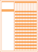
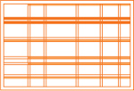
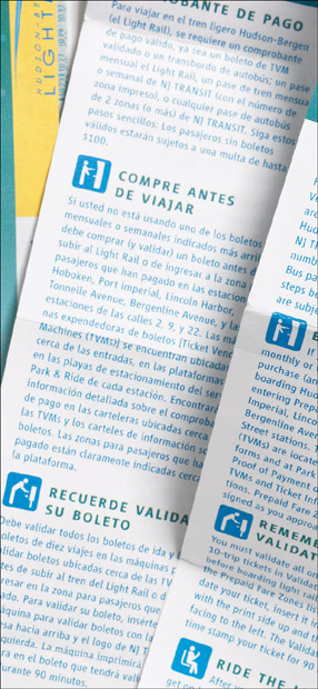
These timetables for New Jersey Transit show that, by simplifying and streamlining, a designer can set off material without the separation anxiety of too many ruled boxes. Devices such as icons or arrows also help the traveler navigate through copious information. Arrows and icons may be clichés, but, sometimes, using a common denominator is the best way to get the message to a mass of readers.

Alternating bands of color set off each stop in this timetable. Rules are used sparingly and clearly define sets and subsets of information. Vertical rules distinguish stations from their destinations, while horizontal rules separate major geographical zones.

The same system that works for timetables also works for tables of fees. Again, alternating bands of color define stations, with horizontal and vertical rules setting off headings, such as One Way and Off-peak Roundtrip, from the stations and fees.
Pictograms support headings in sections detailing purchasing requirements.
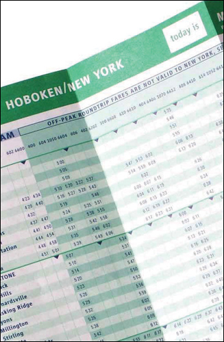
Arrows define express stations.

Typography is clean and no nonsense. The designers have surrounded each row and column with ample space, giving a lightness to dense information and making it easy to read. Dashes and wavy rules are used sparingly but to helpful effect. White arrows contain directionals, and black boxes with additional dropout type further clarify the day’s schedule.
37. Illustrate the Charts

Charts and tables can be simple columns of figures, or they can be illustrated and much easier to read. A designer or illustrator can chart the statistics accurately but use graphic line, shape, color, texture, repetition of icons and wit to illustrate the material at hand. Depending on the information presented, the chart will be more memorable with graphics.
Project
Good magazine issue 008: Transparency
Client
Good Magazine, LLC
Design Direction
Scott Stowell
Design
Open
Charts
Nigel Holmes
Wit and craft serve up statistics with style.
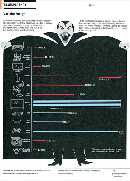
There’s no better visual to get across the idea of a vampire economy than, well, a vampire.
Assigning color codes to issues gives a quick visual read on a situation.
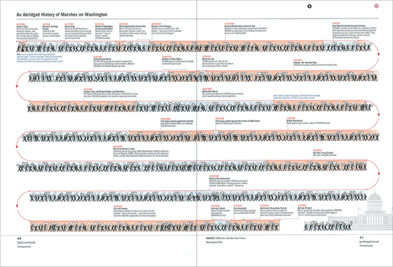
Wit works. Charting a history of marches using icons as part of the march of time cleverly moves the eye forward.
38. Design beyond the Expected
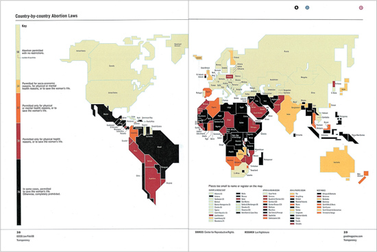
Statistical information can be shown on a number of levels, not simply with numbers. Alternatives to traditional lists are colors, icons, and whimsy. The clever approach does not obscure the crucial comparisons.
Project
Good magazine
Design
Open
Design Direction
Scott Stowell
Charts
Nigel Holmes
Charts can be fun, as shown by these additional stylish stats.

Repeating icons are more memorable than mere lists of numbers.
39. Frame Boxes with Discretion

Ideally, tabular information can be set up to avoid a boggling array of framed fields, or boxes. However, sometimes a communication involves so many discrete elements that the clearest approach to controlling data is to frame each unit.
Although it’s possible to devise subscription cards that work without rules and frames and borders, different fields, as well as weights of rules and frames, cannot only impose order, but also create a layout that is reassuring in its sense of order.
Project
Kurashi no techo (Everyday Notebook) magazine
Client
Kurashi no techo (Everyday Notebook) magazine
Designers
Shuzo Hayashi, Masaaki Kuroyanagi
A subscription card is beautiful, as well as functional.
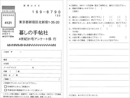
THIS PAGE AND OPPOSITE PAGE: These subscription cards pay attention to the weight of the rules. Heavier weights set off certain kinds of material and call attention to the most important text or headline. Varying weights provide balance and emphasis and offset supplementary material.

40. Go beyond Boundaries
Grids can be set up to organize unconventional shapes, breaking space into discreet areas. A circle can be bisected horizontally and vertically to create quadrants, or cut radially to make pie shapes.
Project
Circle Book education tool, New York Transit Museum
Client
New York Transit Museum
Project Developers
Lynette Morse and Virgil Talaid, Education Department
Design
Carapellucci Design
Designer
Janice Carapellucci
This educational volvelle combines education, information, and activity—and, like its subject, it moves!

On one side, images bleed off and create a contrast between facts and illustrations. Typography is simple, with bold headlines echoing the logo and calling attention to the headline and URL. The horizontal lines on the subway car echo the lines in the text area.
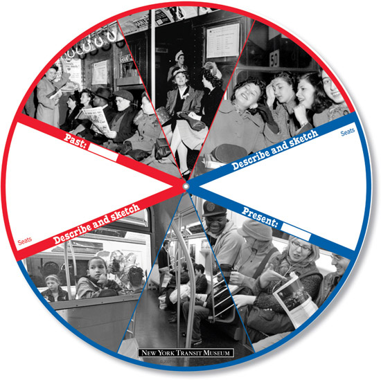
On the other side, heavy rules cleverly contain instructions and areas for notations. The blue and red colors are the actual colors used for the A, C, E, and 1, 2, 3 trains in New York City.