
To illustrate the different steps and methodologies described in Chapter 1, Machine Learning Review, from data analysis to model evaluation, a representative dataset that has real-world characteristics is essential.
We have chosen "Horse Colic Dataset" from the UCI Repository available at the following link: https://archive.ics.uci.edu/ml/datasets/Horse+Colic
The dataset has 23 features and has a good mix of categorical and continuous features. It has a large number of features and instances with missing values, hence understanding how to replace these missing values and using it in modeling is made more practical in this treatment. The large number of missing data (30%) is in fact a notable feature of this dataset. The data consists of attributes that are continuous, as well as nominal in type. Also, the presence of self-predictors makes working with this dataset instructive from a practical standpoint.
The goal of the exercise is to apply the techniques of supervised learning that we have assimilated so far. We will do this using a real dataset and by working with two open source toolkits—WEKA and RapidMiner. With the help of these tools, we will construct the pipeline that will allow us to start with the ingestion of the data file through data cleansing, the learning process, and model evaluation.
Weka is a Java framework for machine learning—we will see how to use this framework to solve a classification problem from beginning to end in a few lines of code. In addition to a Java API, Weka also has a GUI.
RapidMiner is a graphical environment with drag and drop capability and a large suite of algorithms and visualization tools that makes it extremely easy to quickly run experiments with data and different modeling techniques.
The business problem is to determine given values for the well-known variables of the dataset—if the lesion of the horse was surgical. We will use the test set as the unseen data that must be classified.
Based on the data and labels, this is a binary classification problem. The data is already split into training and testing data. This makes the evaluation technique simpler as all methodologies from feature selection to models can be evaluated on the same test data.
The dataset contains 300 training and 68 test examples. There are 28 attributes and the target corresponds to whether or not a lesion is surgical.
After looking at the distribution of the label categories over the training and test samples, we combine the 300 training samples and the 68 test samples prior to feature analyzes.
The ratio of the No Class to Yes Class is 109/191 = 0.57 in the Training set and 0.66 in the Test set:
|
Training dataset | ||
|---|---|---|
|
Surgical Lesion? |
1 (Yes) |
2 (No) |
|
Number of examples |
191 |
109 |
|
Testing dataset | ||
|
Surgical Lesion? |
1 (Yes) |
2 (No) |
|
Number of examples |
41 |
27 |
Table 2: Label analysis
The following is a screenshot of top features with characteristics of types, missing values, basic statistics of minimum, maximum, modes, and standard deviations sorted by missing values. Observations are as follows:
- There are no categorical or continuous features with non-missing values; the least is the feature "pulse" with 74 out of 368 missing, that is, 20% values missing, which is higher than general noise threshold!
- Most numeric features have missing values, for example, "nasogastric reflux PH" has 247 out of 368 values missing, that is, 67% values are missing!
- Many categorical features have missing values, for example, "abidominocentesis appearance" have 165 out of 368 missing, that is, 45% values are missing!
- Missing values have to be handled in some way to overcome the noise created by such large numbers!

Figure 12: Basic statistics of features from datasets.
In this section, we will cover supervised learning experiments using two different tools—highlighting coding and analysis in one tool and the GUI framework in the other. This gives the developers the opportunity to explore whichever route they are most comfortable with.
In this section, we have given the entire code and will walk through the process from loading data, transforming the data, selecting features, building sample models, evaluating them on test data, and even comparing the algorithms for statistical significance.
In each algorithm, the same training/testing data is used and evaluation is performed for all the metrics as follows. The training and testing file is loaded in memory as follows:
DataSource source = new DataSource(trainingFile);
Instances data = source.getDataSet();
if (data.classIndex() == -1)
  data.setClassIndex(data.numAttributes() - 1);
The generic code, using WEKA, is shown here, where each classifier is wrapped by a filtered classifier for replacing missing values:
//replacing the nominal and numeric with modes and means
Filter missingValuesFilter= new ReplaceMissingValues();
//create a filtered classifier to use filter and classifier
FilteredClassifier filteredClassifier = new FilteredClassifier();
filteredClassifier.setFilter(f);
// create a bayesian classifier
NaiveBayes naiveBayes = new NaiveBayes();
// use supervised discretization
naiveBayes.setUseSupervisedDiscretization(true);
//set the base classifier e.g naïvebayes, linear //regression etc.
fc.setClassifier(filteredClassifier)
When the classifier needs to perform Feature Selection, in Weka, AttributeSelectedClassifier further wraps the FilteredClassifier as shown in the following listing:
AttributeSelectedClassifier attributeSelectionClassifier = new AttributeSelectedClassifier();
//wrap the classifier
attributeSelectionClassifier.setClassifier(filteredClassifier);
//univariate information gain based feature evaluation
    InfoGainAttributeEval evaluator = new InfoGainAttributeEval();
//rank the features
Ranker ranker = new Ranker();
//set the threshold to be 0, less than that is rejected
ranker.setThreshold(0.0);
attributeSelectionClassifier.setEvaluator(evaluator);
attributeSelectionClassifier.setSearch(ranker);
//build on training data
attributeSelectionClassifier.buildClassifier(trainingData);
// evaluate classifier giving same training data
Evaluation eval = new Evaluation(trainingData);
//evaluate the model on test data
eval.evaluateModel(attributeSelectionClassifier,testingData);
The sample output of evaluation is given here:
=== Summary ===

Correctly Classified Instances     53       77.9412 %
Incorrectly Classified Instances    15       22.0588 %
Kappa statistic             0.5115
Mean absolute error           0.3422
Root mean squared error         0.413
Relative absolute error        72.4875 %
Root relative squared error      84.2167 %
Total Number of Instances       68

=== Detailed Accuracy By Class ===

        TP Rate FP Rate Precision Recall F-Measure MCC   ROC Area PRC Area Class
        0.927  0.444  0.760   0.927  0.835   0.535  0.823  0.875  1
        0.556  0.073  0.833   0.556  0.667   0.535  0.823  0.714  2
Weighted Avg.  0.779  0.297  0.789   0.779  0.768   0.535  0.823  0.812

=== Confusion Matrix ===

 a b <-- classified as
 38 3 | a = 1
 12 15 | b = 2
As explained in the Model evaluation metrics section, to select models, we need to validate which one will work well on unseen datasets. Cross-validation must be done on the training set and the performance metric of choice needs to be analyzed using standard statistical testing metrics. Here we show an example using the same training data, 10-fold cross validation, performing 30 experiments on two models, and comparison of results using paired-t tests.
One uses Naïve Bayes with preprocessing that includes replacing missing values and performing feature selection by removing any features with a score below 0.0.
Another uses the same preprocessing and AdaBoostM1 with Naïve Bayes.

Figure 13: WEKA experimenter showing the process of using cross-validation runs with 30 repetitions with two algorithms.

Figure 14: WEKA Experimenter results showing two algorithms compared on metric of percent correct or accuracy using paired-t test.
Let's now run some experiments using the Horse-colic dataset in RapidMiner. We will again follow the methodology presented in the first part of the chapter.
Note
This section is not intended as a tutorial on the RapidMiner tool. The experimenter is expected to read the excellent documentation and user guide to familiarize themselves with the use of the tool. There is a tutorial dedicated to every operator in the software—we recommend you make use of these tutorials whenever you want to learn how a particular operator is to be used.
Once we have imported the test and training data files using the data access tools, we will want to visually explore the dataset to familiarize ourselves with the lay of the land. Of particular importance is to recognize whether each of the 28 attributes are continuous (numeric, integer, or real in RapidMiner) or categorical (nominal, binominal, or polynominal in RapidMiner).
From the Results panel of the tool, we perform univariate, bivariate, and multivariate analyses of the data. The Statistics tool gives a short summary for each feature—min, max, mean, and standard deviation for continuous types and least, most, and frequency by category for nominal types.
Interesting characteristics of the data begin to show themselves as we get into bivariate analysis. In the Quartile Color Matrix, the color represents the two possible target values. As seen in the box plots, we immediately notice some attributes discriminate between the two target values more clearly than others. Let's examine a few:

Figure 15: Quartile Color Matrix
Peristalsis: This feature shows a marked difference in distribution when separated by target value. There is almost no overlap in the inter-quartile regions between the two. This points to the discriminating power of this feature with respect to the target.
The plot for Rectal Temperature, on the other hand, shows no perceptible difference in the distributions. This suggests that this feature has low correlation with the target. A similar inference may be drawn from the feature Pulse. We expect these features to rank fairly low when we evaluate the features for their discriminating power with respect to the target.
Lastly, the plot for Pain has a very different characteristic. It is also discriminating of the target, but in a very different way than Peristalsis. In the case of Pain, the variance in data for Class 2 is much larger than Class 1. Abdominal Distension also has markedly dissimilar variance across the classes, except with the larger variance in Class 2 compared to Class 1.

Figure 16: Scatter plot matrix
An important part of exploring the data is understanding how different attributes correlate with each other and with the target. Here we consider pairs of features and see if the occurrence of values in combination tells us something about the target. In these plots, the color of the data points is the target.

Figure 17: Bubble chart
In the bubble chart we can visualize four features at once by using the graphing tools to specify the x and y axes as well as a third dimension expressed as the size of bubble representing the feature. The target class is denoted by the color.
At the low end of total protein, we see higher pH values in the mid-range of rectal temperature values. In this cluster, high pH values appear to show a stronger correlation to lesions that were surgical. Another cluster with wider variance in total protein is also found for values of total protein greater than 50. The variance in pH is also low in this cluster.
Having gained some insight into the data, we are ready to use some of the techniques presented in the theory that evaluate feature relevance.
Here we use two techniques: one that calculates the weights for features based on Chi-squared statistics with respect to the target attribute and the other based on the Gini Impurity Index. The results are shown in the table. Note that as we inferred while doing analysis of the features via visualization, both Pulse and Rectal Temperature prove to have low relevance as shown by both techniques.
|
Chi-squared |
Gini index | ||
|---|---|---|---|
|
Attribute |
Weight |
Attribute |
Weight |
|
Pain |
54.20626 |
Pain |
0.083594 |
|
Abdomen |
53.93882 |
Abdomen |
0.083182 |
|
Peristalsis |
38.73474 |
Peristalsis |
0.059735 |
|
AbdominalDistension |
35.11441 |
AbdominalDistension |
0.054152 |
|
PeripheralPulse |
23.65301 |
PeripheralPulse |
0.036476 |
|
AbdominocentesisAppearance |
20.00392 |
AbdominocentesisAppearance |
0.030849 |
|
TemperatureOfExtremeties |
17.07852 |
TemperatureOfExtremeties |
0.026338 |
|
MucousMembranes |
15.0938 |
MucousMembranes |
0.023277 |
|
NasogastricReflux |
14.95926 |
NasogastricReflux |
0.023069 |
|
PackedCellVolume |
13.5733 |
PackedCellVolume |
0.020932 |
|
RectalExamination-Feces |
11.88078 |
RectalExamination-Feces |
0.018322 |
|
CapillaryRefillTime |
8.078319 |
CapillaryRefillTime |
0.012458 |
|
RespiratoryRate |
7.616813 |
RespiratoryRate |
0.011746 |
|
TotalProtein |
5.616841 |
TotalProtein |
0.008662 |
|
NasogastricRefluxPH |
2.047565 |
NasogastricRefluxPH |
0.003158 |
|
Pulse |
1.931511 |
Pulse |
0.002979 |
|
Age |
0.579216 |
Age |
8.93E-04 |
|
NasogastricTube |
0.237519 | ||
|
AbdomcentecisTotalProtein |
0.181868 | ||
|
RectalTemperature |
0.139387 | ||
Table 3: Relevant features determined by two different techniques, Chi-squared and Gini index.
In RapidMiner you can define a pipeline of computations using operators with inputs and outputs that can be chained together. The following process represents the flow used to perform the entire set of operations starting with loading the training and test data, handling missing values, weighting features by relevance, filtering out low scoring features, training an ensemble model that uses Bagging with Random Forest as the algorithm, and finally applying the learned model to the test data and outputting the performance metrics. Note that all the preprocessing steps that are applied to the training dataset must also be applied, in the same order, to the test set by means of the Group Models operator:
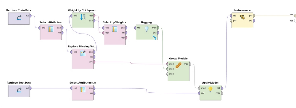
Figure 18: RapidMiner process diagram
Following the top of the process, the training set is ingested in the left-most operator, followed by the exclusion of non-predictors (Hospital Number, CP data) and self-predictors (Lesion 1). This is followed by the operator that replaces missing values with the mean and mode for continuous and categorical attributes, respectively. Next, the Feature Weights operator evaluates weights for each feature based on the Chi-squared statistic, which is followed by a filter that ignores low-weighted features. This pre-processed dataset is then used to train a model using Bagging with a Random Forest classifier.
The preprocessing steps used on the training data are grouped together in the appropriate order via the Group Models operator and applied to the test data in the penultimate step. Finally, the predictions of the target variable on the test examples accompanied by the confusion matrix and other performance metrics are made evaluated and presented in the last step.
We are now ready to compare the results from the various models. If you have followed along you may find that your results vary from what's presented here—that may be due to the stochastic nature of some learning algorithms, or differences in the values of some hyper-parameters used in the models.
We have considered three different training datasets:
- Original training data with missing values
- Training data transformed with missing values handled
- Training data transformed with missing values handled and with feature selection (Chi-Square) applied to select features that are highly discriminatory.
We have considered three different sets of algorithms on each of the datasets:
- Linear algorithms (Naïve Bayes and Logistic Regression)
- Non-linear algorithms (Decision Tree and KNN)
- Ensemble algorithms (Bagging, Ada Boost, and Random Forest).
|
Models |
TPR |
FPR |
Precision |
Specificity |
Accuracy |
AUC |
|---|---|---|---|---|---|---|
|
Naïve Bayes |
68.29% |
14.81% |
87.50% |
85.19% |
75.00% |
0.836 |
|
78.05% |
14.81% |
88.89% |
85.19% |
80.88% |
0.856 | |
|
Decision Tree |
68.29% |
33.33% |
75.68% |
66.67% |
67.65% |
0.696 |
|
k-NN |
90.24% |
85.19% |
61.67% |
14.81% |
60.29% |
0.556 |
|
Bagging (GBT) |
90.24% |
74.07% |
64.91% |
25.93% |
64.71% |
0.737 |
|
Ada Boost (Naïve Bayes) |
63.41% |
48.15% |
66.67% |
51.85% |
58.82% |
0.613 |
Table 4: Results on unseen (Test) data for models trained on Horse-colic data with missing values
|
Models |
TPR |
FPR |
Precision |
Specificity |
Accuracy |
AUC |
|---|---|---|---|---|---|---|
|
Naïve Bayes |
68.29% |
66.67% |
60.87% |
33.33% |
54.41% |
0.559 |
|
Logistic Regression |
78.05% |
62.96% |
65.31% |
37.04% |
61.76% |
0.689 |
|
Decision Tree |
97.56% |
96.30% |
60.61% |
3.70% |
60.29% |
0.812 |
|
k-NN |
75.61% |
48.15% |
70.45% |
51.85% |
66.18% |
0.648 |
|
Bagging (Random Forest) |
97.56% |
74.07% |
66.67% |
25.93% |
69.12% |
0.892 |
|
Bagging (GBT) |
82.93% |
18.52% |
87.18% |
81.48% |
82.35% |
0.870 |
|
Ada Boost (Naïve Bayes) |
68.29% |
7.41% |
93.33% |
92.59% |
77.94% |
0.895 |
Table 5: Results on unseen (Test) data for models trained on Horse-colic data with missing values replaced
|
Models |
TPR |
FPR |
Precision |
Specificity |
Accuracy |
AUC |
|---|---|---|---|---|---|---|
|
Naïve Bayes |
75.61% |
77.78% |
59.62% |
29.63% |
54.41% |
0.551 |
|
Logistic Regression |
82.93% |
62.96% |
66.67% |
37.04% |
64.71% |
0.692 |
|
Decision Tree |
95.12% |
92.59% |
60.94% |
7.41% |
60.29% |
0.824 |
|
k-NN |
75.61% |
48.15% |
70.45% |
51.85% |
66.18% |
0.669 |
|
Bagging (Random Forest) |
92.68% |
33.33% |
80.85% |
66.67% |
82.35% |
0.915 |
|
Bagging (GBT) |
78.05% |
22.22% |
84.21% |
77.78% |
77.94% |
0.872 |
|
Ada Boost (Naïve Bayes) |
68.29% |
18.52% |
84.85% |
81.48% |
73.53% |
0.848 |
Table 6: Results on unseen (Test) data for models trained on Horse-colic data using features selected by Chi-squared statistic technique
The performance plots enable us to visually assess the models used in two of the three experiments—without any replacement of missing data, and with using features from Chi-squared weighting after replacing missing data—and to compare them against each other. Pairs of plots display the performance curves of each Linear (Logistic Regression), Non-linear (Decision Tree), and Ensemble (Bagging, using Gradient Boosted Tree) technique we learned about earlier in the chapter, drawn from results of the two experiments.

Figure 19: ROC Performance curves for experiment using Missing Data

Figure 20: Cumulative Gains performance curves for experiment using Missing Data

Figure 21: Lift performance curves for experiment using Missing Data
The impact of handling missing values is significant. Of the seven classifiers, with the exception of Naïve Bayes and Logistic Regression, all show remarkable improvement when missing values are handled as indicated by various metrics, including AUC, precision, accuracy, and specificity. This tells us that handling missing values that can be "noisy" is an important aspect of data transformation. Naive Bayes has its own internal way of managing missing values and the results from our experiments show that it does a better job of null-handling than our external transformations. But in general, the idea of transforming missing values seems beneficial when you consider all of the classifiers.
As discussed in the section on modeling, some of the algorithms require the right handling of missing values and feature selection to get optimum performance. From the results, we can see that the performance of Decision Trees, for example, improved incrementally from 0.696 with missing data, 0.812 with managed missing data, and for the best performance of 0.824 with missing data handled together with feature selection. Six out of seven classifiers improve the performance in AUC (and in others metrics) when both the steps are performed; comparing Table 5 and Table 6 for AUC gives us these quick insights. This demonstrates the importance of doing preprocessing such as missing value handling along with feature selection before performing modeling.
A major conclusion from the results is that the problem is highly non-linear and therefore most non-linear classifiers from the simplest Decision Trees to ensemble Random Forest perform very well. The best performance comes from the meta-learning algorithm Random Forest, with missing values properly handled and the most relevant features used in training. The best linear model performance measured by AUC was 0.856 for Logistic Regression with data as-is (that is, with missing values), whereas Random Forest achieved AUC performance of 0.915 with proper handling of missing data accompanied by feature selection. Generally, as evident from Table 3, the non-linear classifiers or meta-learners performed better than linear classifiers by most performance measures.
Handling missing values, which can be thought as "noise", in the appropriate manner improves the performance of AdaBoost by a significant amount. The AUC improves from 0.613 to 0.895 and FPR reduces from 48.15 to 7.41%. This indeed conforms to the expected theoretical behavior for this technique.
Meta-learning techniques, which use concepts of boosting and bagging, are relatively more effective when dealing with real-world data, when compared to other common techniques. This seems to be justified by the results since AdaBoost with Naïve Bayes as base learner trained on data that has undergone proper handling of noise outperforms Naive Bayes in most of the metrics, as shown in Table 5 and Table 6. Random Forest and GBTs also show the best performance along with AdaBoost as compared to base classifiers in Table 6, again confirming that the right process and ensemble learning can produce the most optimum results in real-world noisy datasets.
Note
All data, models, and results for both WEKA and RapidMiner process files from this chapter are available at: https://github.com/mjmlbook/mastering-java-machine-learning/tree/master/Chapter2.