Learning a new program can seem overwhelming. Many programs offer multiple ways to accomplish the same task. Designer is no exception. Why are there three ways to do exactly the same thing? Wouldn't it be easier if you had just one way to complete the task? Then you would have only one way to learn and remember. Fortunately, you don't have to remember every technique you learn, just the ones that work best for you.
If we polled a group of computer users for their favorite copy and paste method, we would receive different answers. Everyone has their own preferences, and no two users work exactly the same way.
In this chapter we explore many of the techniques available for adding, copying, moving, and aligning objects in Designer. By exploring them you can find the methods that work best for you. Even if you are not new to Designer, we hope to show you a new technique or two. After we cover the techniques for working with objects we'll examine the powerful features of the Object Library, form fragments, and master pages.
Placing objects on the design page may seem like a straightforward task. A variety of techniques exist offering more efficient workflows depending on the task at hand. In this section we discuss the methods available for adding objects and some time-saving tips on when to use them.
When we place an object on the design page, Designer creates a new instance of that object. A new instance means that the object is an independent copy of the original. This instance has its own set of properties that you can set without affecting any other object on the form or in the Object Library.
Many computer applications, including operating systems, use drag and drop. When you want to delete something, you drag it to the deleted items folder or the trash bin. You move files to new locations by dragging them from one folder to another. In LiveCycle Designer we frequently drag and drop objects to and from the design page and the palettes.
STEPS: Drag and Drop an Object to a New Location
Open Designer and create a blank new page. When you open the program, bypass the options for opening a file and choose File

Position you mouse over the object you want to move. This can be an object on the page, an object in the library, or an object in the Hierarchy palette. In our example we use the Object Library palette. By Default the palette should be open. If you do not see the Library palette, choose Window
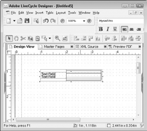
Click and hold the mouse button on the desired object. This selects the object and begins the drag-and-drop process. Click the Button object as shown in Figure 24.1.
With the mouse button held down, move the object to the new location. This is the drag portion of the process. Dragging can occur within the same area of the workspace or between different areas of the workspace. Drag the Text Field object from the Object Library palette to the blank new page as shown in Figure 24.2.
Release the mouse button. This is the drop action that releases the object in the new location. If you attempt to drag an object to a location that is not allowed, the mouse pointer changes to a no symbol.


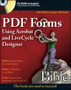
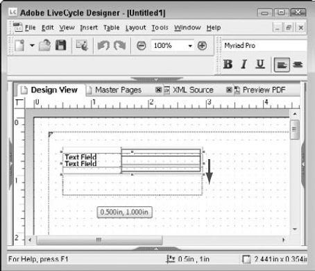
In Designer we can use the drag-and-drop technique to drag objects from the Object Library onto the design page to create a new object. While you drag the object onto the design page, a dotted line appears showing the object's size and tentative location along with a screen tip listing the object's current X/Y coordinates as shown in Figure 24.3. When you release the mouse pointer the object is dropped on the design page and your mouse pointer returns to the regular selection arrow.

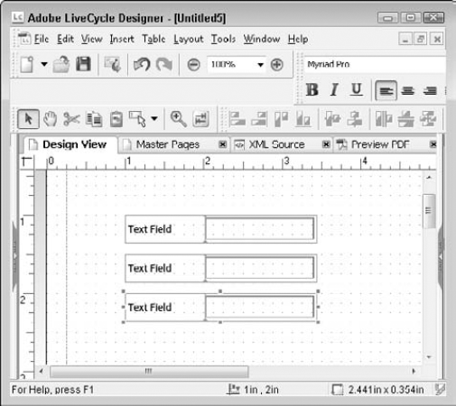
When you use the drag-and-drop method, Designer creates a new instance of the object with a predetermined size. It also names the object according to the object type. If you create a standard object (non-customized), then Designer appends an incremental number to the end of the object name. For example, the first text field you drag onto the design page becomes TextField1, followed by TextField2, and so on, as shown in Figure 24.4. Each type of object has its own numbering sequence. The first numeric field is named NumericField1, regardless of how many other fields are already on the page.

Acrobat and Designer both offer a stamping technique. When you stamp objects on the design page they are created using predetermined sizes. By selecting an object from the Object Library with a single click, you are now ready to stamp in the design page. Move your mouse pointer anywhere in the design page. The pointer is the same shape as the icon you selected in the Object Library, with a screen tip displaying the current X/Y coordinates. A single click stamps the object on the design page and returns your mouse pointer to the regular selection arrow.
Stamping fields can seem tricky the first couple of times. Unlike the drag-and-drop method, stamping provides no outline to show you where the object is going to be placed on the page, as shown in Figure 24.5. This method takes some practice. Remember, when you have a tool selected, the mouse pointer changes to that object's icon shape. Regardless of the shape, the coordinates are measured from the upper-left corner of the icon.
It may seem as if the object is dropped up and to the left of where you click. This is caused by the snap to grid setting, as shown in Figure 24.6. When you stamp the field on the page, the coordinates move up and left to the nearest dot on the grid if snap to grid is active. Test this by zooming in and dropping an object between the dots. You can drop them anywhere you'd like if you turn off the snap to grid feature.
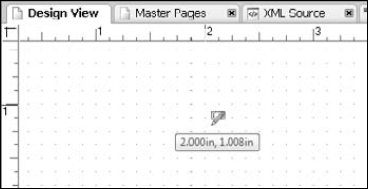
Figure 24.5. Stamping a Text Field shows the screen tip measured from the top left of the mouse pointer, but no object outline.
STEPS: Stamping Fields on the Design Page
Use the blank page opened in Designer from the preceding series of steps or create a new blank page.
Click once on an object in the Object Library. This selects the object and changes your mouse pointer into the object icon.
Move your mouse over the design page. Notice where the top-left corner of the mouse pointer is. This is where the top-left handle of the new object is placed.
Click once to stamp the object. A single click places one instance of the object on the design page. The first instance created is the object's default height and width. The mouse pointer returns to the normal selection arrow.
If you do not want your fields created based on a predetermined size, you can draw a field. Drawing allows you to create any size objects you need. Rather than clicking and dragging an object from the Object Library, click the object one time in the Object Library to activate the tool. You can now move to anywhere in the design page to draw the object. Click and drag your mouse to determine the new object's location and size. As soon as you let go of the mouse, the regular mouse pointer returns to edit existing fields.
STEPS: Drawing Objects
Click once on an object in the Object Library. This selects the object and changes the mouse pointer into the object's icon.
Move the mouse over the design page. Notice where the top-left corner of the mouse pointer is. This is where the top-left handle of the new object is placed.
Click and drag the mouse to draw the object until you reach the size desired. By drawing the object you determine its height and width, as shown in Figure 24.7.
Release the mouse pointer to finish drawing the object. The mouse pointer icon changes back to the regular selection arrow.

You may find that when you begin adding fields to your form design, you want the tool to remain active to create multiples without having to reselect the tool each time from the Object Library. As we discussed in the stamping fields section previously, this feature is available in both Acrobat and Designer. In Acrobat this feature is called Keep Tool Selected. In Designer it is called Keep Drawing. The feature can be activated when a tool is active by selecting View
Tip
To stamp a field in a custom size, turn on the Keep Drawing feature. Draw one field on the design page with the desired dimensions. Now the stamping feature will create objects with the same dimensions as the last drawn object. Every time you choose a tool from the library it resets to the default dimensions.
Copying objects in Designer is just like copying items in other programs, with a variety of methods available. You may have already formatted the appearance of the object, set a calculation, or written a script that is simply easier to copy than to recreate. If you have a form with fields and layout that are similar to what you are building, copying fields can save significant design time.
You can make a copy of any object on the design page using your favorite copy technique. One of the more common methods to copy and paste, toolbar buttons, is missing in the Designer interface. Of course you can customize toolbars to add the cut, copy, and paste buttons if desired.

When you begin pasting in Designer, objects may not react the way you are accustomed to in other applications. In many applications such as word processors and e-mail programs we establish where the copy is to be located by placing the cursor in the desired location. In many graphics programs the copy is offset a small distance from the original. In Designer the copied location is determined by where the tip of the mouse pointer is located when you execute the paste command. This can work to your advantage when you become familiar with it. The first few times you paste in Designer it may seem a little odd. Try copying and pasting with various techniques to see if one method or another works better for you.
The copy and paste techniques available in Designer include:
The Edit menu: Select the object you want to make a copy of. Select Edit
Right-click: Right-click the object you want to make a copy of. This opens the context menu. Select Copy from the context menu, right-click the design page approximately where you want the copy placed, and select Paste from the context menu.
Drag and drop: Drag and drop normally moves an object. To make a copy (a duplicate) you need to hold down the Ctrl key when the mouse is released. Select the object you want to copy. Click and drag the object to the desired location then hold down the Ctrl key while you release the mouse.
Keyboard shortcuts. The standard keyboard shortcuts for Cut (Ctrl + X), Copy (Ctrl + C), and Paste (Ctrl + V) work in Designer. Select the object you want to copy. Press Ctrl + C to copy it. Place your mouse pointer approximately where you want the copy placed, and then press Ctrl + V to paste it.
Duplicate: You can find Duplicate in the Edit Menu. Select Edit
Note
For more details on the duplicate feature, see Duplicate Fields and Objects later in this chapter.
Copy and Paste buttons. These buttons are not on the visible Designer toolbars unless you customize a toolbar and add them. Select the object you want to copy. Click the Copy button and then click the Paste button.
Note
For more information on customizing toolbars, see Chapter 22.
We have found that the right-click, paste method is the least efficient when placing objects. Using the right-click method requires you to move your mouse pointer to select the Paste command from the context menu. This also changes where the object is pasted accordingly.
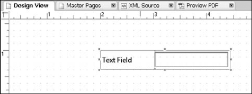
The Insert menu contains a choice for each of the library object groups with a cascading menu for each object contained in that group as shown in Figure 24.9. When you use the Insert menu, items are placed in the center of the design page. Inserting more than one object in a row stacks them on top of one another.
Adding objects with the menus can be useful when the palettes have been collapsed. However, we feel the other methods offer better workflows. Having the objects stacked in the center of the design page does not offer the most effective use of time.
If you plan to create a large number of fields with standard settings and you need the design space more than the library palette, the Tools toolbar may be your best choice. The toolbar contains a button called the Field Edit tool. The drop-down Field Edit Tool allows you to choose one of the most common field types with default settings from the Standard Library. When you use the Field Edit tool you can stamp or draw fields. As shown in Figure 24.10, as soon as the field type is selected a checkmark is placed in the drop-down list and Keep Drawing is turned on.

The Keep Drawing feature is automatically activated when you use the Field Edit tool in Designer 8.2. However, not all versions of Designer act this same way. In earlier Designer versions you may need to turn on the Keep Drawing feature. We like using the Field Edit tool when design space is limited to avoid having to open the right palette well. Unfortunately the Field Edit tool does not offer objects from other library groups.
Duplicating fields is similar to copying a field. It makes a copy and then places the copy offset relative to the original object. The first time you duplicate an object, it is offset one point down from the original as shown in Figure 24.11. You can adjust the distance and direction of the offset placement by dragging the duplicated object. The next duplicate is offset in the same direction and the same relative distance as the one you dragged, as shown in Figure 24.12.
Tip
You can easily make duplicates by using the keyboard shortcut of Ctrl+D.
STEPS: Duplicating an Object
Choose File
New. Create a new blank document.Drag a Text Field onto the upper-left corner of the design page. This adds a text field object to the form. We dragged the text field from the Standard Group of the Object Library palette.
With the text field selected, go to Edit
Duplicate (Ctrl + D). This makes a copy of the text field one point down on the design grid.Drag the duplicate text field down on the page, making sure they do not overlap. This sets the direction and distance for the next Duplicate command. The Duplicate dialog box is shown in Figure 24.13.
With the second text field selected, go to Edit
Duplicate (Ctrl + D). The third field is placed below the second, with equal spacing between the objects. Your screen should appear similar to Figure 24.12.
Creating duplicates of multiple objects is also possible. This works best if all the objects are offset the same distance and direction.
If you know in advance that you need to create more than one copy of an object or set of objects, Copy Multiple is another option. Acrobat has a similar feature called Place Multiple Fields, with some minor differences in terms and dialog box layout. One setting varies greatly between the two programs. When Acrobat asks for the number of times to copy the selected fields down or across, it wants a total number of fields desired, including the original. Designer requests the number of copies you want to create, not including the original.
When you use Copy Multiple the dialog box prompts you for the desired number of copies, the offset direction, and the offset distance. It works just like duplicate, with a dialog box to control the settings as shown in Figure 24.14. Using Copy Multiple is recommended when the copied objects need to be equally spaced, or when they should have no spacing between them. They dialog box has a setting for touching that precisely aligns the objects without the need to measure the height and width of the objects.
In the Vertical Placement group you can place the copies above, below, or with no vertical movement relative to the original. Setting the Vertical Spacing to touching or offset by a measurement controls the distance between the objects. Keep in mind if you do not want the objects touching, then the offset measurement must be greater than the original object's height.
The Horizontal Placement group works in a similar way; you can place copies to the left, to the right, or with no horizontal movement relative to the original. Setting the Horizontal Spacing to touching or offset by a measurement controls the distance between the objects. If you do not want the objects touching, then the offset measurement must be greater than the original object's width.
Unless you are trying to achieve a stair step look to your fields, you probably shouldn't set the vertical and horizontal placement at the same time. The Copy Multiple dialog box retains your last setting.
The results of Copy Multiple and Duplicate can be identical; it is only a matter of preference in your workflow.

How many hours have you spent trying to get things in exactly the right place? Have you ever thought there has to be an easier way? Many form designers use the "eyeball" technique. They rely on what they see on the page to determine object positions. For some users that means zooming in, placing a few objects, zooming back out, and checking to see if the position looks okay. For other users it means jotting down an object's coordinates and using them when placing other objects in the layout palette. These methods work, but they are not the most efficient workflows.
When placing objects in your form design, having things aligned makes a form neat and professional looking. It is worth the time required to align objects for a better overall form appearance. In this chapter we explore the many methods for aligning objects. Before we do, we need to discuss how to select more than one object.
To align two or more fields using Designer's built-in techniques, you must first select the objects. Clicking an object selects that object. Clicking a second object deselects the first object. The methods available while working on the design page include:
Ctrl + Click: To select multiple objects, hold down the Ctrl key while clicking additional objects. Using Ctrl allows you to be selective in which objects you grab. Ctrl key selects only the objects you click.
Tip
Use caution when holding down the Ctrl key and clicking objects. If you hold the mouse pointer down too long, you may move the object(s) on the page, accidentally making copies of the selected objects. As we discussed previously, dragging and dropping an object with the Ctrl key down makes a copy.
Shift + Click: The Shift key works just like Ctrl when selecting on the design page. The only difference is that although holding down the mouse too long moves the object(s) on the page, it does not create copies when using Shift.
Click and drag a selection marquee (lasso): Use your mouse to click and drag a box around the desired objects to select them. You must fully enclose the object's handles inside your marquee for it to be included in the selection. Partially enclosing an object does not select it. Start with your mouse in a blank area of the design page, not over an object. Click and drag your mouse to draw a box around the objects. When you release the mouse button all objects fully enclosed by the marquee become selected.
Ctrl + A: This keyboard shortcut selects all objects on the active page.
Tip
Acrobat and Designer differ when using the marquee method to select objects. In Acrobat you only need to touch the object to select it. In Designer, you must fully enclose the object's handles to select it.
When you have more than one object selected, the appearance of the object's handles becomes very important. When you select on the Design Page, the last object selected is the active object. The active object becomes the reference point that the other objects align to. The active object's handles are solid blue, as opposed to the other selected objects which have handles with a blue outline but no fill color, as shown in Figure 24.15. You can change the active object to any of the other selected objects by clicking the desired object. The solid blue handles move to the last selected object. Clicking an object outside of the selected objects selects the new object only and deselects the previous group.

If you have a tendency to hold the mouse pointer down too long when selecting multiple objects on the page, using the Hierarchy palette for selecting, as shown in Figure 24.16, may be a better choice for you.

Using the Hierarchy palette also can be beneficial if objects are positioned very close to one another. The top object in the Hierarchy list is always the active object, regardless of the order selected. The selection methods in the Hierarchy palette include:
Ctrl + Click: This works the same way in the Hierarchy palette as on the design page. Hold down the Ctrl key while clicking additional objects. Dragging and dropping with Ctrl does not make a copy in the Hierarchy palette.
Shift + Click: The Shift key works differently in the Hierarchy palette than on the design page. Shift selects everything between the first object and the second object you click. Select the first object you want by clicking it, and then hold down Shift while you click the last object you want. All of the objects in between are also selected.
Shift + Arrow Key: Holding down the Shift key while using either the up-arrow or down-arrow key selects the additional objects.
Ctrl + Arrow Key: The Ctrl key takes a little more effort to use with the arrow keys. Holding down Ctrl while pressing the up-arrow or down-arrow key moves the focus to the next object. The object is not selected unless you press the spacebar.
Ctrl + A: This keyboard shortcut selects all objects on the active page and works the same in the Hierarchy palette as on the design page.
No matter which method you use to select multiple objects, sometimes you get an extra object in the selection. You can remove an object from the selection as well, using the Ctrl key.
Now that we have the selection techniques covered we can continue our discussion of alignment. As we discussed in Chapter 22, aligning objects does more than affect their appearance on the page. Alignment also affects the tab order the form recipient encounters when entering data in the form.
Remember that when multiple objects are selected the active object (noted by the solid blue handles) becomes the reference point for all other objects. Alignment choices affected by the active object include:
Edges: Alignment can be to any of the four edges: left, right, top, and bottom.
Vertical Center: The active object's vertical center becomes the alignment position.
Horizontal Center: The active object's horizontal center becomes the alignment position.
The remaining alignment options are not affected by the active object:
To the Grid: The objects are aligned to the dot on the grid nearest the upper-left selection handle. Each object is aligned to the grid independent of the other objects.
Center in Page Horizontally: With a single object selected, this option places it centered between the left and right margins. If two or more objects are selected, the selected object's collective handles become the reference point. Selecting this option does not align the objects with each other. This method moves them as a set to the horizontal center of the page.
Center in Page Vertically: With a single object selected, this option places it centered between the top and bottom margins. If two or more objects are selected, the selected object's collective handles become the reference point. Selecting this option does not align the objects with each other. This method moves them as a set to the vertical center of the page.
Methods for aligning objects include:
Layout Menu: With the objects selected, use the Layout menu to choose an alignment from the available list:
Layout
Align: This submenu contains seven options: the four edges, vertical and horizontal centers, and to the grid as shown in Figure 24.17.Layout
Center in Page: This submenu contains the two page-related options: Center in Page Vertically and Center in Page Horizontally, as shown in Figure 24.18.
Layout Toolbar: The Layout toolbar contains six alignment choices: the four edges, vertical center, and horizontal center, as shown in Figure 24.19.
Keyboard: Shortcuts exist for many of the alignment choices including:
Ctrl + Right Arrow: This shortcut aligns the selected objects on the right edge of the active object.
Ctrl + Left Arrow: This shortcut aligns the selected objects on the left edge of the active object.
Ctrl + Up Arrow: This shortcut aligns the selected objects on the top edge of the active object.
Ctrl + Down Arrow: This shortcut aligns the selected objects on the bottom edge of the active object.
Alt + Ctrl + Up Arrow: This shortcut aligns the selected objects on the vertical center of the page.
Alt + Ctrl + Right Arrow: This shortcut aligns the selected objects on the horizontal center of the page.
Alt + Ctrl + Left Arrow: This shortcut aligns the selected objects to the grid.
Unfortunately, the alignment options are not available in the right-click context menus from either the design page or the Hierarchy palette.


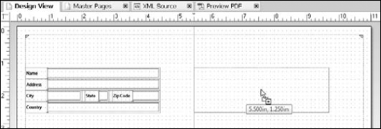
Creating a few guidelines before beginning your form design can significantly reduce the need to align objects. If we create a form with billing and mailing address blocks laid out left to right in a columnar style, adding the vertical guideline for the second column's position allows us to snap our objects to the line when adding them to the form, as shown in Figure 24.20. Adding a horizontal guideline for a row of various object types can save a significant amount of time.
Note
For details on using guidelines, see Chapter 22.
In many form designs the fields may not have to be placed at a specific measurement; the intent is to space them out equally in the available design space. You don't need to do these calculations manually. Place the first and last objects in the desired position. Then use the Distribute feature to adjust the spacing between the objects equally. Distribution can be adjusted in either a vertical (down) or horizontal (across) direction.
Another distributing option called Rows and Columns aligns and distributes objects in both directions. Distribute Rows and Columns is recommended only when you have the same number of objects in each row and each column. Doing otherwise produces unexpected results.
STEPS: Distributing Objects
Place the top or left-most object at the desired location. Assuring this object is in the correct location alleviates the need to move the objects after distribution.
Place the bottom or right-most object at the desired location. The distributed distance is calculated by the total distance between the first and last object. Moving either of these objects closer or farther from the other objects changes the total calculated distance between objects.
Select all objects to be distributed.
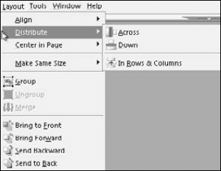
From the menu select Layout
Distribute. Figure 24.21 shows the Distribute submenu that appears. The submenu includes the following options:Across: Choosing this option distributes the selected objects equally between the left-most object and the right-most object.
Down: Choosing this option distributes the selected objects equally between the top-most object and the bottom-most object.
In Rows & Columns: If the selected objects have equal quantities in each vertical area and equal quantities in each horizontal area, this option creates a table-like layout with the selected objects.
Select the desired direction to distribute. Objects are now equally spaced between the first and last selected object.
When objects are being moved and aligned frequently, sets of objects can become useful. Groups are used for formatting, aligning, and moving objects. Generally when we align objects in our form design we choose two objects we want to align on the same edge.
Sometimes you need to align a set of objects with another set that vary in type, size, and quantity of objects, as shown in Figure 24.22. For example, you may have an address block on the left for billing information and another block on the right for shipping. The billing and shipping blocks of data do not always contain the same fields. You may have a contact phone number in the billing address and section for special notes in the shipping address. These fields may vary in size as well. Aligning the left and the right set can easily be done using a group.
To create a group, select the objects desired. Select Layout

One more note about groups: They do not affect the objects' tab order. If your intent is to have the tab order go through a set of objects before moving on to any other area on the design page regardless of their position, you need to wrap the objects in a subform.
Note
For information on how to create subforms and control tab order using subforms, see Chapter 27.
All the tools you need to create a form are contained in the Object Library. The Object Library is organized into groups that open and close in an accordion style with a triangle/arrow on the left side of the group name to indicate open or closed. The group is closed if the triangle is pointing toward the name. The group is open if the triangle is pointing down. By default the Object Library appears in the right palette well of the workspace.
The Object Library stores each of the objects with all their properties configured. The properties include font type, font size, object size, colors, borders, appearance, margins, and more. Placing an object on the design page creates a new instance of that object. This instance is a copy of the original object in the library. Any property settings you change in this instance do not affect the original.
The Object Library groups can be set to one of three views: Small Icons, Large Icons, and Sorted List. To change a group's view, you can right-click in the group, and select View from the context menu. It is also possible to change the group view by using the menu button on the Group tab and then selecting view from the menu.
Working with Designer Objects becomes easier as you become more familiar with the program interface. Many of the objects share default settings, while a few others have unique settings. To help with the alignment of captions between the object types we compiled the settings for each object in the standard library, as shown in Table 24.1.
Table 24.1. Standard Library Objects Default Properties
Type | Font | Size | Width | Height | Left/Right Margins | Top/Bottom Margins | Reserve | Caption | |
|---|---|---|---|---|---|---|---|---|---|
Button | Interactive | Myriad Pro | 10 | 1.125in | 0.2362in | 0 | 0 | NA | NA |
Check Box | Interactive | Myriad Pro | 10 | 1.1024in | 0.2362in | 0.0394in | 0 | 0.8268in | Right |
Circle | Static | NA | NA | 1in | 1in | 0 | 0 | NA | NA |
Content Area | Static | NA | NA | 6.6929in | 6.6929in | NA | NA | NA | NA |
Date/Time Field | Interactive | Myriad Pro | 10 | 2.4409in | 0.3543in | 0.0394in | 0.0394in | 0.9843in | Left |
Decimal Field | Interactive | Myriad Pro | 10 | 2.4409in | 0.3543in | 0.0394in | 0.0394in | 0.9843in | Left |
Drop Down List | Interactive | Myriad Pro | 10 | 2.4409in | 0.3543in | 0.0394in | 0.0394in | 0.9843in | Left |
Email Submit | Interactive | Myriad Pro | 10 | 1.375in | 0.2362in | 0 | 0 | NA | NA |
HTTP Submit Button | Interactive | Myriad Pro | 10 | 1.125in | 0.2362in | 0 | 0 | NA | NA |
Image | Static | NA | NA | 1in | 1in | 0 | 0 | NA | NA |
Image Field | Interactive | Myriad Pro | 10 | 1in | 1in | 0 | 0 | 0.1969in | Bottom |
Line | Static | NA | NA | 1.5748in | 0 | 0 | 0 | NA | NA |
List Box | Interactive | Myriad Pro | 10 | 2.4409in | 1.2205in | 0.0394in | 0.0394in | 0.1969in | Top |
Numeric Field | Interactive | Myriad Pro | 10 | 2.4409in | 0.3543in | 0.0394in | 0.0394in | 0.9843in | Left |
Paper Forms Barcode | Interactive | NA | NA | 3.25in | 1.75in | 0 | 0 | NA | NA |
Interactive | Myriad Pro | 10 | 2.4409in | 0.3543in | 0.0394in | 0.0394in | 0.9843in | Left | |
Print Button | Interactive | Myriad Pro | 10 | 1.125in | 0.2362in | 0 | 0 | NA | NA |
Radio Button | Interactive | Myriad Pro | 10 | 1.1024in | 0.2362in | 0.0394in | 0 | 0.8661in | Right |
Rectangle | Static | NA | NA | 2in | 1in | 0 | 0 | NA | NA |
Reset Button | Interactive | Myriad Pro | 10 | 1.125in | 0.2362in | 0 | 0 | NA | NA |
Signature Field | Interactive | Myriad Pro | 10 | 2.4409in | 0.3543in | 0.0394in | 0.0394in | 0.9843in | Left |
Subform | Static | NA | NA | 3.937in | 1.9685in | 0 | 0 | NA | NA |
Table (one cell) | Static | Myriad Pro | 10 | 1.1811in | 0.3937in | 0.0197in | 0.0197in | NA | NA |
Text | Static | Myriad Pro | 10 | 1.153in | 0.206in | 0.0197in | 0.0197in | NA | NA |
Text Field | Interactive | Myriad Pro | 10 | 2.4409in | 0.3543in | 0.0394in | 0.0394in | 0.9843in | Left |
If you are wondering why the default objects have such strange measurements for their defaults, they were converted from metric measurements. For example 3.937 in is equal to 10 cm.
The Standard Group of the Object Library contains one of each of the basic object types available in Designer. Because we discussed the basic object types in Chapter 22, we'll discuss more specifics here. All of the objects in the Standard group that have a font setting were created with Myriad Pro, 10 point font. Myriad Pro is one of the fonts that are always available in Acrobat and Adobe Reader. This eliminates the need to embed the fonts and reduces the overall file size.
Other settings such as height, width, caption, and margins vary by object type. Understanding these variations in settings makes aligning and spacing the objects consistently less daunting. The property variations cause objects to not align exactly, even when using the alignment features. The object boundaries are aligned, but the differences in margins or caption reserve cause the text within the object to not align as expected. The caption reserve is the amount of space in the composite object that is dedicated as the caption.
Note
For a list of specific objects available, see Chapter 22.
For example, in a form with only a text field and a check box placed side by side, the captions of these fields do not appear at the same height even if the objects are aligned on the top edge as shown in Figure 24.23. Because the text in the caption is set to center vertically, the height of the objects causes them to not align. Altering the height of one object to match the other fixes this. Alignment issues caused by margins or caption reserve settings are not as obvious as height settings.
The default appearance of the field objects is set to sunken box. The sunken box appearance adds a shadowed border to the field area only, not the caption. This makes the fields stand out from the rest of the document text. Figure 24.24 shows the sunken box appearance of a text field compared to some other common appearances when opened in a viewer application.

The My Favorites group of the library was set up for you to customize. Alter the existing objects or add custom library objects to the group as needed. It contains a few items to give you some ideas of what you might like to store. As shown in Figure 24.25, the objects in the My Favorites group are the most frequently used objects in the Standard group. They have exactly the same property settings as those in the Standard object group. This is one area we recommend changing to suit your needs because Myriad Pro fonts and sunken appearances do not work for everyone. Of course, you can create more groups in the Library as needed to store your custom objects.
Note
For more information on creating library groups, see "Creating Custom Library Objects" later in this chapter.

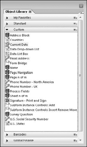
The Custom Group of the Object Library contains specialized fields for your use. These specialized fields are one of the object types mentioned previously, with unique properties, and sometimes they include scripting. A custom object can be multiple fields stored together as a set. When stored in the library, all of the objects settings including their relative positions to one another are maintained. As shown in Figure 24.26, some of the custom objects included are:
Address Block: This object set contains name and address fields organized as expected for addressing a letter or displaying billing information.
Countries: This drop-down box is pre-populated with country names. You can customize the country choices if necessary.
Current Date: A date field designed with script to populate the field with the current date.
Email Address: This text field is designed to collect e-mail addresses. The script it contains validates against standard e-mail formats before allowing the user to continue.
U.S. States: The 50 United States plus the District of Columbia are stored in this drop-down list. The list provides the form recipient a spelled-out state name, while the data being captured is the two-letter abbreviation.
Phone Number: Formatted for either North America or the UK, these text fields allow numeric entries only in the appropriate format of the region selected.
U.S. Social Security Number: This text field is formatted to require a nine-digit numeric entry that is formatted to include the dashes when the user exits the field.
Data Drop-down List: A drop-down list with script attached that populates two columns of data from the data source connected to the form.
Signature – Print and Sign: This object is a static text box with the words Signed By and a line for a wet signature.
Many additional custom objects are available including page numbers, a data list box, and additional fields that are placed in the form when used with the additional LiveCycle ES components. We recommend you explore the custom objects so you are aware of these additional features. Don't spend the time creating one that already exists!
Designer's Barcode Group contains an extensive set of supported barcodes as shown in Figure 24.27. Many businesses use barcodes on inventory. Forms that are scanned usually have a barcode to indicate which form is being processed. The data in a barcode is usually just a reference number and does not contain any identifying information. For example, the Universal Product Code (UPC) found on the items you purchase at the store does not contain the brand name, product name, price, or expiration date. It contains only a unique product number. When someone at the store scans the code, the store's central computer looks up the UPC number and returns the product information including the price. Most barcodes have two parts: the machine readable bars and the human readable text.

Barcodes use check digits to ensure the proper information was received when scanned. What happens if you take a black marker and add to the barcode? What if the barcode is torn, wrinkled, or wet? The scanner may not read the bar code correctly. Barcodes utilize error correction and check digits to minimize problems caused by minor flaws that otherwise render the barcode unusable. Check digits also prevent barcode tampering. The check digit is calculated by the scanning device each time a barcode is scanned. If the calculated check digit value does not match the printed check digit value the barcode is rejected and must be rescanned.
In Designer, barcode fields have data binding properties just like other field objects. Static barcodes usually contain the associated number stored in the barcode fields as the default value. Dynamic barcodes can be calculated values, such as a Make and Model when concatenated have a unique value that the barcode represents. All of the barcodes, except the Paper Forms Barcode, are generated only at specific points in the form rendering process. Those special processing events include when the form is initially rendered on the screen, just before it is printed, and just before it is saved.
Paper forms barcodes are unique in the way they work in Acrobat and Reader. They are the only barcode capable of changing as the form recipient completes a field and advances to the next field. You can watch the barcode adjust its contents as you fill in the form. Paper forms barcodes include the field names as well as the values those fields contain. To store both sets of data, they use a special two-dimension (2D) format that supports three encoding symbologies: PDF417, QR Code, and Data Matrix.
PDF417 is the default encoding, an open barcode standard developed by Symbol Technologies. The barcode data is stacked in two dimensions and is comprised of modules forming code words that are arranged in rows and columns. Because paper forms barcodes include multiple fields, you can set the barcode to accept all the form data, or only a collection of fields on the form.
Tip
Paper forms barcodes require an additional license for Adobe LiveCycle Barcoded Forms ES if the form is to be completed in Adobe Reader.
Whichever barcode you decide to use on your form, careful testing is recommended to verify the barcode is readable by the intended scanning system.
Custom library objects are one of our favorite reasons for using Designer to create forms. Although not every company has a set of guidelines relating to creating forms, most large companies do. Think about generic documents that are presented to the public by your company. Do they have a consistent appearance in font, color, or layout? Documents produced by different departments may have different guidelines. Creating a number of forms that require a consistent appearance can be difficult without some documentation. If your company does not already have a set of guidelines or policies regarding form design, perhaps it is time to consider creating some.
The Standard and My Favorites groups of the Object Library are based on Myriad Pro fonts. What if the company requires Arial for all forms? What if the field's appearance must be underlined? Imagine if the company has policies regarding font size, color, alignment, logo use, and more. Constantly changing these properties each time you add a field to the form can be tedious, not to mention the potential for missing property settings, and having objects that do not comply with company guidelines.
Setting up a Custom Library Group with objects containing the desired settings helps improve form development and decrease design time. Working with Custom Objects also encourages compliance with company design policies.
Organizing your Object Library is like organizing your desk or file cabinet. If you throw everything on top of the desk, or just toss stuff in a drawer, you waste time trying to locate items the next time you want to use them. How you organize your custom groups is a personal choice. You can create the library groups to organize your custom objects before saving any objects. Or, you can add custom objects to the existing groups until you've had a chance to decide how you want to organize your custom objects. You can always reorganize the custom objects later if needed, moving or copying the object from one group to another when necessary.
If you have only a handful of customized objects, you probably can create a single group to store them all. If you can think of three or four different types of field formats you need in your forms then create a group for each style of document.
We strongly recommend that when storing custom objects you don't cut the object descriptions short. As you add more custom objects to the library, their variations become harder to detect. Using good descriptions helps you choose the desired object more quickly and helps when you reorganize.
STEPS: Creating a New Object Library group
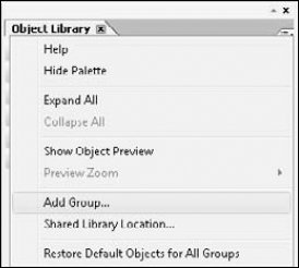
Open the Object Library palette, if necessary. Select Window
Click the Palette menu button in the upper-right corner. This opens the Library palette menu as shown in Figure 24.28.
Select Add Group. The Add Library Group dialog box opens as shown in Figure 24.29.
Type a group name. Enter a descriptive name for your group.
Click OK. This closes the Add Library Group dialog box and places the new group in the Object Library palette.

When you create a new group, it is immediately added to the Object Library. Because the newly created group is empty, the space dedicated to it is small. It is hard to see that the group is closed as indicated by the arrow to the left of the group name. When the group is opened a very small, white area becomes visible. When the group is active in the Object Library, a thin dotted border surrounds the group to indicate the groups' boundaries as shown in Figure 24.30. When adding a custom object to the group, drop the object within this dotted boundary. You should create the library group before adding custom objects to the library. You can't create a group during the Add process. You can move objects from one group to another, but this creates additional steps in the workflow.

One of the best ways to create a collective set of custom library objects is to create a form from scratch. After you have added all of the objects to the form design and completed the formatting and design, look it over. How many of these objects would you recreate with the same settings for the next form you build?
Do you have a Designer form someone else created with the formatting you need? It doesn't matter who built the object or how long ago it was created. You can take any object on the design page or master pages and add it to the Object Library at any time.
STEPS: Adding a Custom Object to an Object Library Group
Select the object(s) on the design page you want to add to the Object Library. The object should already have its formatting and properties set.
Place your mouse over the selected objects. The mouse pointer shape changes to a black four-headed arrow.
Drag and drop the object(s) on the desired group in the Object Library. Don't worry if you dropped the object on the wrong group. This opens the Add Library Object dialog box, as shown in Figure 24.31, where you can change the storage group if necessary.
Type a name for the custom object. Object names should be short but descriptive.
Enter a description for the custom object. We recommend the object's purpose, the object type(s), and any specific formatting or scripting you may have applied.
Change the Tab Group, if necessary. The tab group list contains all of the groups available in your Object Library.
Click OK. This closes the Add library Object dialog box and places the custom object in the group chosen in Step 7.

Your custom object has now been stored in the object library for future use. You can add, remove, and edit custom objects at any time. You also can set up a shared Object Library group.
As you use custom objects over time you may need to adjust the objects you've created. You may need to change the object's fonts, appearances, or colors, for example. In a custom object made of multiple objects, you may need to add items or remove items from the set. You can modify, delete, or move objects to another library group after they are created. Perhaps a few objects were stored in an existing library group before the custom group was created. Managing custom objects includes:
Delete: To delete an object from the library group, right-click the object and select Remove Object from Library in the context menu. The Delete key also deletes the selected object from the library group.
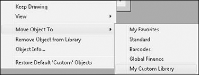
Move: To Change the group where the custom object is stored, right-click the custom object. From the Context menu that appears select Move Object To. This displays a list of available library groups, as shown in Figure 24.32. Select the group desired from the list. Or, you can drag a library object from one group to another to move them.
Edit Object Description or Name: To change the object's name or description, right-click and select Object Info from the context menu. The Edit Library Object Information dialog box opens for editing as shown in Figure 24.33.
Edit Objects or Object Properties: To change the contents of the custom library object, drag an instance to the design page. Make the necessary changes to the object on the design page. Drag the objects back to the custom library. If you give the object the same name, Designer prompts you to replace the existing object as shown in Figure 24.34.


Now that we have a custom library built, we want to share it with some coworkers. We want everyone to have the exact same set to use in their form designs. If we ask our coworkers to create the custom library from an existing form design, they may omit some objects or alter them before placing them in the library group. There is no sense in making everyone add the objects to their custom library groups and retype the descriptions since we can share our library groups.
STEPS: Setting up a Shared Library Group
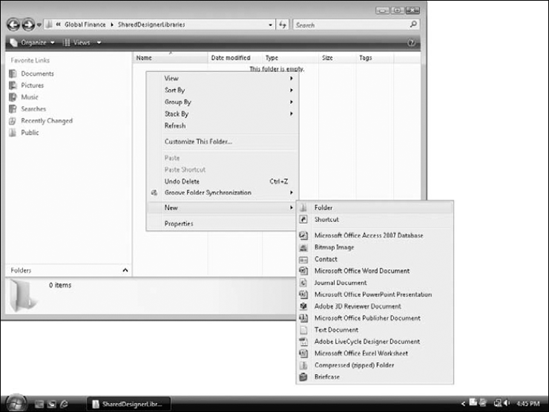
Create a folder in a network location all users have access to. If necessary, ask someone in your IT department for assistance in locating or creating a shared folder with the proper permissions for each user. The name of this folder can be anything you choose. We recommend a generic name such as Designer Shared Libraries.
Create a subfolder in this shared network location. The name of this folder does not affect the Designer Library Name. However, naming it the same as the shared library group name in Designer simplifies maintenance and sharing. We right-clicked in the shared directory to create a new folder, as shown in Figure 24.35.
Copy the custom library objects from their current location to the newly created folder. It is best to open the library directly from the file system for this step. If you are unsure where the library objects are currently stored, you can check by opening the library group's properties from the library group menu. Figure 24.36 shows the library group properties where you can locate the path of the stored objects. Don't worry if you cannot read the entire path. We can copy it from the location box. Tab into the location box; this highlights the entire path. Right-click the path and choose Copy from the context menu. Now open an Explorer window and paste the copied address into the address bar.
In Designer, if necessary create a new Library Group. Name this group the same name as the shared folder you are connecting to. If you already have the custom group built, skip to Step 5.
Note
For more information on how to create a new Object Library Group see the section "Creating a New Object Library Group" earlier in this chapter.
Using the shared Library Group menu, open the Group Properties dialog box.
In the properties window, click the Browse button, as shown in Figure 24.37. This opens the Browse For folder window.
Navigate to the location of the shared folder on the network and click OK. This sets the shared folder on the network as the new storage location for the library group.
Click OK in the Group Properties dialog box to finish the process. This stores the selected network folder as a new library group in designer.
Repeat Steps 2 through 9 for any additional shared libraries. Consider creating additional libraries for projects that have unique design requirements, departments that have special formatting requests, or any other specialized design needs.


When setting up shared library objects, you should have a select group of people manage the library. Without some restrictions placed on the library, anyone who has access to the shared library can add, edit, or remove objects from the shared library.
You can change these settings in the Group Properties in Designer, or in the shared network file. The settings available in Designer are there so that you don't accidentally remove or edit something. They can be turned on or off at any time. To truly secure the library from unwanted changes, talk with your IT department about configuring permissions on the shared network folder.
Form fragments are similar to custom library objects. Form fragments are customized objects stored in the Fragment Library. Form fragments can be single or multiple objects with custom properties and scripts. You can create multiple fragment library groups to store your form fragments.
Some differences exist between form fragments and custom objects. While both a custom object and a form fragment create a new instance of an object on the form, the form fragment remains linked to the original object. When changes are made to the original form fragment, the changes can be updated anywhere the fragment was used. Updating happens automatically if the form was saved as an XDP file. If you saved your designer document as a PDF form, then you need to update the fragment.
Creating a form fragment is as easy as creating a custom object. What happens when you create the form fragment is a little different, however. Custom library objects can be single or multiple objects and are stored in the library the same way you created them on the design page. With a form fragment, you need to wrap the objects in a subform. If you already have the objects in a subform, you can use the existing subform. If you do not have a subform around your objects, then one is created before it is saved in the Fragment Library.
Note
For information on subforms, see Chapter 27.
STEPS: Creating a Form Fragment from Objects on the Design Page
Select the object(s) on the design page you want to create the form fragment. The objects should already have their formatting and properties set.
Place your mouse over the selected objects. The mouse pointer shape changes to a black four-headed arrow.
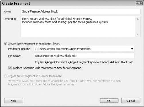
Drag and drop the object(s) on the My Fragments group in the Fragment Library. This opens the Create Fragment dialog box as shown in Figure 24.38.
Or, right-click the selected objects and choose Fragments
Enter the Fragment Name. This is the object name shown in the Fragment Library for future use.
Enter a description for the fragment. Enter information to describe the intended purpose of the fragment. You can find this information later by right-clicking a form fragment in the library and choosing Fragment Info.
Click Create New Fragment in Fragment Library. This is the default method for storing fragments that stores the fragments in your local file system. This makes using the fragment easy to find. We recommend this option. Any available Fragment Library appears in the drop-down list. You can create a new fragment library if necessary during this process.
Note
For more information on creating a new fragment library group, see the section "Creating Fragment Library groups" later in this chapter.
Verify that the Replace selection with a reference to new form fragment check box is selected. This creates the fragment and links the original in the form design file to the new fragment. This option is selected by default.
Click OK to finish creating the fragment. This saves the fragment in the library for future use as shown in Figure 24.39. Notice the objects are now in a purple shaded area. You can still see the individual objects in the Hierarchy palette and on the design page, but changing them is now restricted to altering the form fragment.
Save the form. Save the form as an XDP if you are going to continue design work, or if it is used with other LiveCycle products. This ensures that any changes to the form fragment automatically update in the XDP file. When the form is saved as a PDF the fragment becomes embedded in the document at the time the file is saved. You need to complete updates manually.

Note
See the section "Updating form fragments" later in this chapter details on how to update form fragments.
Create New Fragment in Current Document is another option available in the Create Fragment dialog box. We do not recommend this choice. Designer files can be stored anywhere and have a tendency to be modified, renamed, and deleted over time. Not realizing the original fragment is stored inside a document causes links to be broken when the file is renamed or deleted. Accidental updates to other files can happen as well. The fragment objects appear and act like other objects in the document. Only a fragment indicator on the Hierarchy palette reminds you this is an original. When saving a fragment in the current document you must save as an XDP file or a Designer Template (TDS). A document already saved as a PDF disables the Create New Fragment in Current Document option.
The Fragment Library contains groups just like the Object Library. However, creating additional groups is different with fragments. Fragments are stored in a folder of your choice in the file system. Using the operating system, you can create as many folders in the file system you need to store fragments in. Adding them to the Fragment Library requires only that you open them through the Fragment palette menu.
Because Fragment Library groups can be made outside of the Designer interface, Designer allows you to quickly create multiple folders to organize the Fragment storage. When creating a new fragment Designer also allows the normal Browse dialog box to create a new folder during the save process if one does not already exist as shown in Figure 24.40.
Once the form fragment is stored in the fragment library it is ready for use. Fragments are treated differently than other objects because they need to create a link to the original file. You can add form fragments to the design page using the following methods:
Drag and Drop: This is the most common method and works the same as it does with any other object dragged from the library palette.
Insert Menu: By selecting Insert
Cut, Copy, and Paste: Any existing instance of a fragment can be copied to another location and retain its fragment properties. The new copy is an instance of the fragment linked to the original in the fragment library.
Duplicate: An existing fragment can be successfully duplicated if more than one copy is desired.
Copy Multiple: The copy multiple dialog box can be used when many instances of a fragment are needed.
Note
For details on how to add an object using the above methods, refer to the section "Adding Fields and Objects to a Form" earlier in this chapter.
Two of the other methods are not available with fragments: stamping and drawing. Drawing fragments does not make much sense. The idea behind the fragment is that a single copy controls how objects look in any form design where they are placed. Drawing allows the creator to choose the object size. Unfortunately, stamping a fragment is also not available. We hope to see this feature in the future.
Once a form fragment is added to the design page the object has a purple dashed border as shown in Figure 24.41. When the mouse rolls over the fragment, or if the fragment is selected, a purple fill color appears over the objects with a fragment icon in the upper-left corner, as shown in Figure 24.42. The Hierarchy palette shows a fragment icon on top of the subform, as shown in Figure 24.43.
You can't select an individual object inside the fragment on the design page. This prevents changes to the fragment's contents. The individual objects can be seen in the Hierarchy palette, but they are a light gray color indicating they are disabled, as shown in Figure 24.44. You cannot select the disabled objects or resize the fragments. When you place the mouse pointer on a selection handle the icon changes to a NO symbol. Again, this is because the fragment controls the object's appearance. The fragment can be moved to another area on the design page, updated, removed, and placed inside other subforms or groups, but not altered.

Independent changes are one of the benefits to using custom objects, because they allow each instance to have different settings. Fragments do not offer this customization ability, and customizing defies the purpose of the fragment. If you find that a form that contains a fragment needs to be controlled independently, you can break the link and embed the objects into the current form design, as shown in Figure 24.45. This process disables all of the fragment's updating capabilities and cannot be undone. If you need the fragment object in the future, delete the existing objects and re-add the fragment object to the form design.
Are you still unsure where you can use a fragment? May we suggest an address block as a suitable place to start? How many forms do you have with an address block on them? You may have even stored the address block in your custom library with your formatting changes already. Any minor change to the layout position or font settings requires opening each of those forms and repeating the changes. Give fragments a try; when you start using them you'll wonder how you ever got along without them.


Fragments are great when multiple form designers need to use the same object on many form designs. The object is stored in a safe location, allowing the designers to place it on the form as needed. When a change occurs to the original fragment content, little work is required to update all of the forms that use the fragment.
Fragments placed in an XDP file receive the updates automatically. The updates are visible in the XDP files as soon as the altered fragment is saved. XDP files are used extensively with the LiveCycle servers and do not require the form to be edited by anyone for the fragment to be updated.
Fragments placed in a PDF file do not receive the update automatically. A form fragment contained in a PDF, when opened in Acrobat or Reader, appears exactly the same way as when it was last saved in Designer. In order for the PDF to get an updated fragment, it must be opened in Designer and resaved. This of course requires someone to resave every PDF form which contains fragments, and is not the most effective workflow.
Master pages are the foundation for the design pages. The master pages control where in the form objects can be placed, what page size is used, the orientation, and more. A form design can have multiple master pages, allowing for various pages sizes, layouts, and orientations within the same form. Objects placed on the master pages appear on all body pages based on that master page.
If you have worked with a page layout program, then you are already familiar with how master pages work. If not, you might compare the master page to the header and footer of a word processing document. Page numbers, logos, and disclaimers are some common examples of items place on master pages. Master pages are much more than headers and footers though.
Note
For more details on configuring master pages, see Chapter 25.
Imagine a corporate stationary set. If the graphics, repeating text, fonts, and formats had to be recreated every time a page was added to the document, consistency would become a problem. In many stationary sets the first page is formal and the remaining pages have less content. When we lay out a letter with those properties we need the following:
Page 1 Master: The company logo, name, address, phone numbers, and additional contact information are included on this page. This page is based on an 8½ × 11 inch page with a larger top margin for the company logo.
Page 2 Master: Only selected contact information is provided on this page. This page is based on an 8½ × 11 inch page with reduced margins because the logo is not needed.
Page 3 Master: The last page contains a business envelope with logo and address information. A standard number 10 business envelope is 4⅛ × 9½ inches. The third master page is based on these dimensions.
Creating three separate documents is unnecessary. One designer file can contain all three master pages. Even if the form results in a five-page letter, we restrict the master pages according to our needs. The page 1 master will only be used one time regardless of the total number of pages in the letter. The page 2 master will be used for all remaining pages in the letter. The envelope is an optional page that appears only if the user requests an envelope. As you can see, Designer offers extensive flexibility in laying out master pages in form designs.
By default the only object on the master page is a content area. The content area determines the boundaries of your body page and in many cases is equivalent to the page margins. Content areas can also be set up in other configurations such as columnar style or sections for newsletters. In this case they still control where the field objects can be placed but no longer reflect the page margins.
Every form has at least one content area. When the master pages are active, the content area has a pink dashed border as shown in Figure 24.46. Objects placed on the master page can be outside the content area. This is a recommend practice because by placing the objects outside of the content area, you ensure that objects added to the design pages do not overlap or run over the master page items. Page numbers and logos belong outside the content area. However, if you want to place a watermark style image behind the form contents, you can center it across the content area.
How you add objects to the master pages is no different from adding them to body pages. You can add interactive field objects that you want to have appear on multiple pages. A customer name may be repeated at the top of each page of an order form. If you place the field in the master page you don't need to put another copy on each additional body page.
When activated, the Object Editor appears as a blue frame around the selected object on the design page. You can turn on the Object Editor by selecting View
As shown in Figure 24.47, the selected field's name appears at the top of the Object Editor, where it can be renamed. Below the field on the left side of the Object Editor is a drop-down list to change the selected field to another field type. On the bottom right side of the field editor is a button to open the context menu. The context menu normally appears after right-clicking an object. Each of these items can be accessed other ways in designer. The Object Editor simply puts them in a single area for easy use. Using the Object Editor is a matter of personal preference.
New users should remember to rename objects as they are added to the design page. The blue frame can make moving and aligning objects difficult, so you may choose to turn this feature on and off while working.

Although changing objects from one field type to another is possible, it is not generally recommended. Objects have different properties depending on the object type. Changing from a simple object type to a more complex object type is okay. However, when changing to a field type that doesn't utilize the same properties this additional information can stick to the new field and create unexpected results. Deleting undesired objects and recreating the correct object is safer if you are unsure what properties the two objects have in common.
Tip
The amount of random access memory (RAM) available on the computer plays a large part in object properties not being completely removed or added. Using an underpowered computer or attempting to run too many applications at the same time can intensify this problem. Verify the computer has met the minimum requirements for running LiveCycle Designer.
Drag-and-drop is a common technique for moving items on the design page, changing palette configurations, and adding objects to the form design.
When adding objects, using the stamping technique creates objects at their default size.
Drawing objects allows you to determine the dimensions of the objects when they are created.
You can continue to draw or stamp objects without going back to the Object Library palette for the tool by turning on the Keep Drawing feature. Using this feature in combination with stamping and drawing allows you to customize the stamped object's dimensions.
Save formatting time by copying objects on the design page that already have the formatting desired.
You can quickly make organized copies of an object that are offset the desired distance and direction by using the Duplicate feature.
Copy Multiple is much like Duplicate but allows you to supply the total number of objects in a dialog box. Copy Multiple is extremely useful when you want the copied objects to touch with no space between them.
Saving time when formatting and aligning requires selecting more than one object at a time. Many selection techniques are available.
Aligning objects would be tedious if it required you to remember measurements or use visual cues only. Use the Alignment tools to increase productivity.
Aligning sets of objects may require them to be grouped to produce the desired results.
You can use subforms in place of groups to align objects. We recommend them when the objects can be logically organized into sections to clean up the form design. Subforms also allow you to control tab order.
You can add objects from the Library palette in many ways. If the objects in the Standard palette do not contain settings optimal for your form design, create your own custom library objects.
Form objects have extensive properties that you can set. To increase efficiency, create custom library objects with the properties you most frequently use. Use custom library groups to organize the custom objects created.
Designer supports a variety of barcode formats including 2D barcodes. The paper forms barcode included with Designer requires an additional license if the form is completed in Adobe Reader.
Objects that are used on multiple form designs that must be updated frequently should be stored as form fragments. Fragments can be updated easily and reduce editing time.
Sharing custom objects and fragments with coworkers ensures consistency between form designers. When you supply the objects to be placed on the form, less time is required to set properties.
Master pages are the basis of all forms. Every Designer document has at least one master page. Design pages can be restricted to a specified master page, including how many times that master page is used.
The Object Editor offers editing of field names on the design page.