Adobe LiveCycle Designer is a powerful form design program, which becomes very apparent when you open the workspace. Designer makes extensive use of palettes that are loaded with all the tools and properties you need to create your forms.
As we have mentioned in previous chapters, when you create a form in LiveCycle Designer, you cannot edit the form in Acrobat. Now that we have covered the differences between Acrobat and Designer Forms, we are ready to start designing. Remember that unlike Acrobat, Designer allows you to do all the form design within the application. You don't need to use another authoring program to create your form background and labels. Just open Designer, and we'll discuss all the tools you'll need to build a new form.
In this chapter, we cover exploring the basic Designer workspace and descriptions for using tools, menus, and palettes.
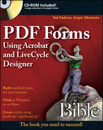
The first thing you see when you launch LiveCycle Designer is the Welcome to Adobe LiveCycle Designer window, as shown in Figure 22.1. The window is designed to help you get started using the program. It contains important links to sample files, new documents, existing documents, and the help files. Take a few moments to explore the options in the welcome window.
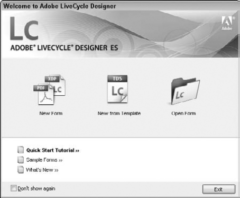
Figure 22.1. The Welcome to Adobe LiveCycle Designer window opens when you first launch LiveCycle Designer.
The welcome window contains three task buttons and three additional text links. The task buttons offer a quick way to work with your forms. They allow you to create new forms or open existing forms. The text links are provided for you to explore the sample forms installed with LiveCycle Designer, learn about new features, and create forms following a step-by-step tutorial.
The first task button in the welcome window is the New Form button. The icon contains two images: a PDF document and an XDP document. These are not your only options, but an indicator of the types that are available. Upon selecting this option, you are initially greeted by the New Form Assistant, as shown in Figure 22.2. The New Form Assistant can walk you through the process of creating your forms using a variety of methods.
Tip
After you become more comfortable with the program, you may wish to bypass the welcome window when you open LiveCycle Designer. To bypass the window once, use the Exit button in the lower-right corner or the Esc key on your keyboard. The welcome window continues to appear each time you launch the program or begin a new form.
To stop the screen from opening on startup and each time you create a new form, check the Don't show again box in the lower-left corner. The next time you launch LiveCycle Designer, the welcome window doesn't open. If you want to reopen the welcome window, select Help
You have these options for creating new forms using the New Form Assistant:
Use a Blank Form: With this option, you can select the desired paper size, orientation, and number of blank pages to start your form. You then create the design of the document by adding the necessary text, graphics, and form fields using the tools in Designer.
Based on a Template: There is no need to start from scratch, if one of these prebuilt templates has what you are looking for. This option allows you to create a new form from a variety of templates such as invoices, order forms, and purchase orders.
Using the New Form Assistant, you can create a PDF form with interactive text fields based on the column headers in the Excel spreadsheet. The New Form Assistant creates one text field object for each column in the spreadsheet. Text field objects are positioned in the form from left to right and wrapped onto additional lines if needed. The caption and binding name of each text field object corresponds to the column header text in the spreadsheet.
Import a PDF Document: You may already have forms built in another program. By converting them into PDF documents, you can then import them into Designer for further development. Or if you've already built a form in Acrobat, you'll want to use this method. When you import Acrobat forms with fields, Designer recognizes the fields and converts them to the equivalent Designer fields. You may use the PDF document as a static background image in the new LiveCycle Designer Form or convert it to a flowable layout as if it were created in LiveCycle Designer.
Import a Word Document: If you have forms created in Word, select this option to convert them. If the original Word document contains form fields, they are converted to form fields in LiveCycle Designer. The Word form field names and calculations are not maintained when converted to LiveCycle Designer. If the file contains only the labels on the form, then you need to add the form fields after the document has been converted.
Note
For more information on how to use the New Form Assistant, see Chapter 23.
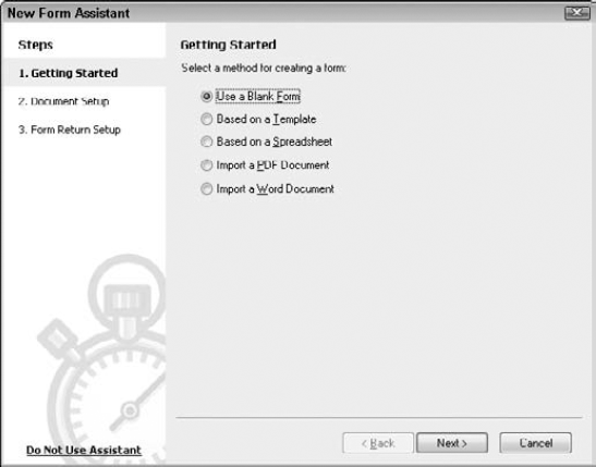
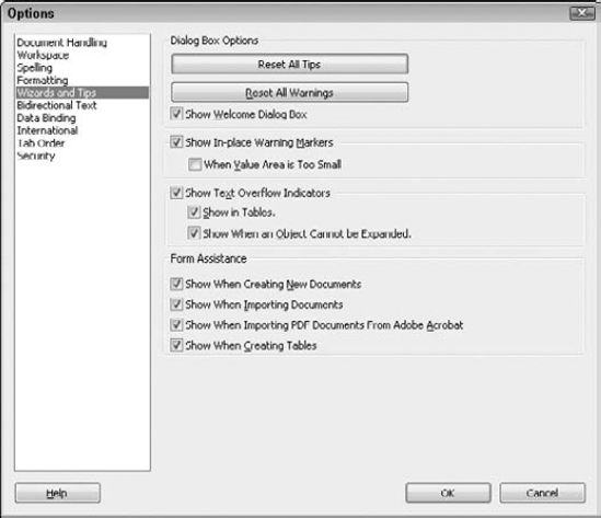
Each time you create a new document, import a document, or import a PDF from Acrobat, the New Form Assistant is launched. You can customize this behavior to suit your needs. Click the Do Not Use Assistant link in the lower-left corner. The Assistant Options dialog box appears.
These items appear in the Assistant Options, as shown in Figure 22.3:
Skip the Assistant this one time: This closes the Assistant and takes you to the New Dialog box to select a common paper size or one of the templates available.
Skip the Assistant when creating new documents: If you don't want help creating forms in LiveCycle Designer but want help importing other documents, use this setting.
Don't show the New Form Assistant again: If you don't want the New Form Assistant to help with new documents or imported ones, use this setting.
Figure 22.3. The Assistant Options dialog box allows you to control when you want the New Form Assistant to help.
To change your New Form Assistant settings, open the options window by choosing Tools
When you choose not to use the Form Assistant, a different window appears when you select New Form. The New dialog box allows you to select a paper size to start a blank document or choose from one of the templates available, as shown in Figure 22.5.
Tip
If you want to bypass both the Form Assistant and the New dialog box, you can do so by turning off the welcome window and turning off the Form Assistant. Each time you launch Designer after that, you have a blank gray interface screen. Clicking the New button on the toolbar starts a blank document based on your default template without needing to complete a dialog box.
The second task button in the welcome window is the New from Template button, which shows a LiveCycle TDS icon. Using this option starts the New Form Assistant described above (refer to Figure 22.2). It preselects the first step of the wizard and moves you to the second step to select the template. Open Form is the third task button in the welcome window, which launches a standard Open dialog box.
Quick Start Tutorial is the top link. This opens the LiveCycle Designer Help files and navigates to the Tutorial section. The Tutorial contains sample forms you can try, such as an office function survey and purchase order. These are step-by-step directions on how to create a form.
The Sample Forms option contains a variety of forms to explore and learn from. Click the link to open the Help window, where descriptions of each form are listed as well as the location of the document.
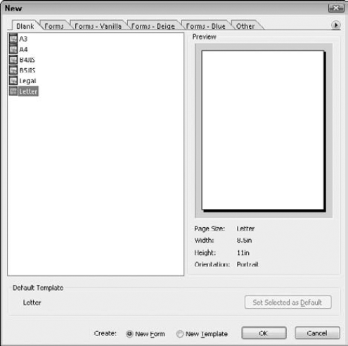
Figure 22.5. The New dialog box, where you can choose paper size for a blank document or start from a template
The last link in the welcome window is What's New. In each release of the program, new features are added and existing features enhanced. Trying to explore the program on your own and hoping to stumble upon each of these new features would be a difficult task. The Help file describes each of these new features or enhancements, so that you may start utilizing them. These are a few of our favorite new features in Designer:
Hyperlinks (Version 8.2): You have the ability to change text into an interactive hyperlink. It's a long-awaited and much-welcomed feature.
Typography enhancements (Version 8.2): Kerning, spacing, and tab leaders are available, to name a few. Check out the Font palette for more.
Tab order (Version 8.2): With this enhancement, setting tab order can now be done in a list format via the new tab order palette. It is no longer necessary to click the objects on the page when changing to a custom order; you simply drag the items up or down in the list.
Form fragments (Version 8.1): Form fragments are pieces of a form design that are used on multiple documents. They are stored in the fragment library as XDP files. Take a privacy disclaimer, for example; you may need to include it on many of the forms you design. By creating the disclaimer as a form fragment, you can store that text one time in the fragment library, reusing it as many times as needed and confident it contains the correct information. Then when that disclaimer has wording or formatting changes, you open the fragment library object to adjust it. Forms need to be stored in the native designer XDP format to take advantage of the fragments updating abilities.
One of the hardest things to adjust to in a new program is locating the tools you need. You may know what needs to be done to get your form ready; now you need to locate the appropriate tools to create it.
The Designer workspace offers menu commands, toolbars, palettes, and editors to help you accomplish your task. When you launch the program, you see many of these features already in the workspace, but others need to be turned on. As you grow more comfortable working in Designer, you'll notice that your own preferences affect how the workspace is arranged. As we explore the program in more depth, we discuss many of these items again in later chapters. Take some time to familiarize yourself with the terms used to describe the various areas of the Designer interface, as shown in Figure 22.6.
The title bar is located at the top of the program window. It contains the name of the program and the name of the document you are currently working on. The menu bar is just below the title bar and contains all the available commands.
Smart forms require mathematical calculations or validation logic in order to collect the correct data. We don't want to depend on the form recipient having a calculator handy to complete complicated forms. The script editor allows you to write the code to make your form easier for the form recipient to complete. Scripting is permitted in JavaScript and FormCalc languages.
Note
Scripting is covered in Chapter 29. Exploring the script editor is covered later in this chapter in the section "Opening the script editor."
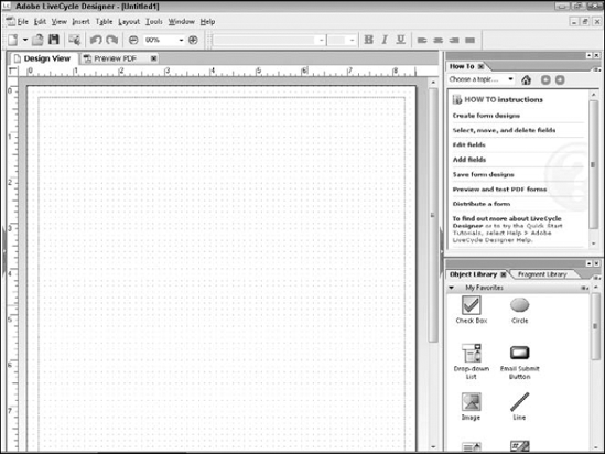
Three palette wells are docked to the workspace when you launch Designer. Two are open and visible on the right side of workspace: the How To palette and the Library palette. The third palette well, the Hierarchy palette, is hidden on the left side of the workspace. Hidden palettes can be turned on in the Window menu.
Palette wells have a palette bar, an expand button, a close button, and menus, and can hold more than one palette tab, as shown in Figure 22.7. Palettes contain the tools, settings, and properties available to work with. To hide or show all the palettes on one side of the layout editor, click the expand button on the palette border.
While working in Designer and switching palettes, some items in the palette may not be visible. Because the palette well can be resized, information can get cut off the edges. When that occurs, a light gray bar with a double black arrow appears on the edge where information is not visible. To show the missing information, click the gray bar and the palette automatically resizes in that direction. Resizing the palette manually is also an option.
Many tools and settings are located within the palettes, and finding what you need may be challenging at first. Rest assured that this gets easier as you become more comfortable with Designer. You can create additional palette wells, reorganize the tabs within the palette wells, and even remove some palette wells if desired.
Note
For more information on changing palettes, see "Customizing the Workspace" later in this chapter.
The Hierarchy palette, shown in Figure 22.8, appears on the left side of the workspace. It is a structured view of each object in the form and is used for many purposes. We all know that objects can be very difficult to select sometimes. The Hierarchy tab makes selection easy; whatever you select in the Hierarchy palette is also selected in the active editor: Design View, Master Pages, or the XML source. The keyboard shortcut for the Hierarchy is Shift+F11.
Tip
Keyboard shortcuts can be used to show or hide each of the palettes. If the palette is open, but not the active tab in the palette well, the shortcut activates it. When the palette is closed or when the palette well in which the tab appears is minimized, the shortcut opens it. When the palette is already open and is the active tab in the palette well, the shortcut closes the palette. Note that it does not close the palette well, only the palette tab, unless that palette tab is the only tab contained in the palette well.
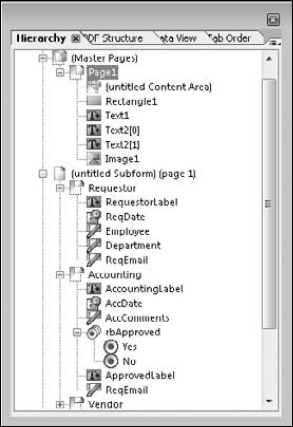
The hierarchy shows the objects placed on the form, in the order you placed them. It can be used to organize objects into logical groups of related items. The stacking order of objects displayed on the form can be altered in the hierarchy. Moving an item in the hierarchy does not affect its placement on the design page when the form is positioned content, as shown in Figure 22.9. The following methods work to select objects using the Hierarchy palette:
Single object: Click the object.
Multiple adjacent objects: Click the first object and then hold down the Shift key while clicking the last object. This selects all objects in between.
Multiple non-adjacent objects: Click the first object and then hold down the Ctrl key while clicking each additional object.
Select a group: If groups were created, you can select a group by clicking the group node in the hierarchy.
A clear understanding of the hierarchy is critical when we build dynamic forms with flowing layouts. The object's position in the hierarchy determines its layout on the design page when rendered. In a dynamic flowing layout, changing an object's position in the hierarchy changes the object's position in the design page, as shown in Figure 22.10.
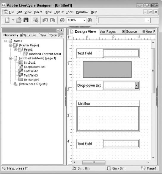
Figure 22.9. The Hierarchy and Layout view of a positioned form. Notice that the order of objects in the hierarchy does not affect the position of objects on the design page.
Note
Designing dynamic forms is covered in Chapter 26.
We recommend that you rename your objects and organize the hierarchy each time you design a form. It takes only a few minutes to complete, and you become more efficient when locating objects later. Objects can be renamed at any time during the design process. The object name can be edited in the Hierarchy palette, the Object palette, or the field editor.
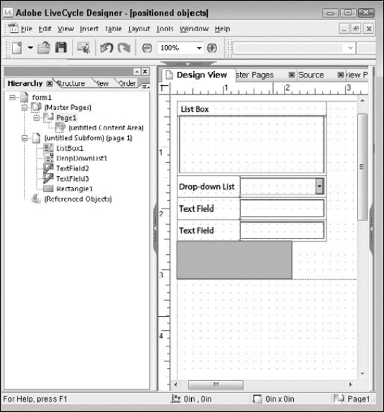
Figure 22.10. The Hierarchy and Layout view of a flowed form. The objects' positions in the hierarchy caused them to move on the design page to match the order in the form template hierarchy.
STEPS: Renaming an Object in the Hierarchy
Right-click the object. This displays the context menu.
Choose Rename from the context menu. The field name is highlighted in blue for you to replace.
The keyboard shortcut to rename a field in the hierarchy is F2. Select the field, and press F2 on the keyboard to rename the field.
Type the new field name.
Press Enter to save the new name.
To organize the hierarchy, you simply drag the fields to the preferred locations. Dragging groups of fields is beneficial when portions of the form have already been organized.
PDF forms are used to gather electronic data. What happens to that data after the form recipient completes the requested information? Does this data belong to an existing electronic file? Will someone rekey the data into that file?
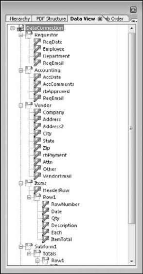
A Designer form can have data bindings that allow you to exchange data between the form and another data source. If your form has a data connection established, the Data View palette displays the connection name and hierarchy of the data nodes, as shown in Figure 22.11. If no data connection is set up, this palette appears empty.
Note
See Chapter 31 for more information on data connections.
The Data View palette appears in the palette well docked on the left side of the workspace. Although no shortcut is designated for this palette, you can switch between palette tabs using the keyboard by pressing Ctrl+Tab. Keyboard shortcuts also can be assigned if desired.
Note
See "Customizing keyboard shortcuts" later in this chapter for details.
The PDF Structure palette is available only if the form was imported from a PDF file and set as a fixed background. If you import a structured PDF document as artwork, the PDF Structure tab displays tags and structural information about the background PDF. This information is used by assistive technologies to define the reading order and tabbing order in the document. If you import a PDF that is not tagged, or not structured, the PDF Structure palette allows you to add structure to the document. The palette gives a nice reminder on forms where the palette is unnecessary: "PDF Structure can only be used in PDF forms that contain artwork."
Form recipients tabbing through a form when entering data is common practice. Although a few users still click the fields with the mouse, more users navigate using the keyboard. Tab Order is also very important when an assistive device is in use. The tab order determines which field is selected next in the navigation.
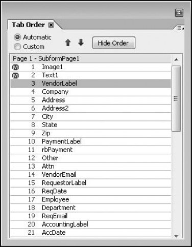
The Tab Order palette is new in Designer 8.2 and is used if the default tab order does not suit your needs. Tab order can be set in previous versions of Designer. However, no palette was available with which to alter the sequence. In any previous version of Designer, changing the tab order meant clicking each field in the order desired. This was a very tedious process for many users who were unaware of the shortcuts available to modify tab order in the middle of the sequence. Imagine the frustration of clicking the wrong field on a form with hundreds of fields. Using the palette to change tab order by dragging and dropping fields into the desired sequence is a great improvement over the previous method.
A number is displayed beside each object's name as shown in Figure 22.12. The number indicates the sequence of the objects within the tab order. To alter the current field's tab position, drag it to a new location in the Tab Order palette.
Metadata for the selected object can be found in the Info palette. If there is a <desc> tag included in the XML source for an object the Info palette displays the tag information. The form's metadata can be seen when the top level in the hierarchy is selected. This information is being populated by the form properties dialog box. To add or change information, go to File
In Acrobat the field tools fit on a single toolbar. Designer offers many interactive field objects for you to use when creating forms. All those tools require more space to store them. The Library palette houses all of the form design objects.
Being able to store and reuse form field objects is one of best time-saving features when building forms in Designer. Unlike Acrobat where field object properties must be set or copied from an existing field each time, Designer stores your custom field preferences.
The Object Library palette is different than the other palettes in Designer, as shown in Figure 22.13. It has an accordion style appearance to the groups, with a triangle/arrow on the left side of the group name to indicate open or closed. The group is closed if the triangle is pointing toward the name. The group is open if the triangle is pointing down.
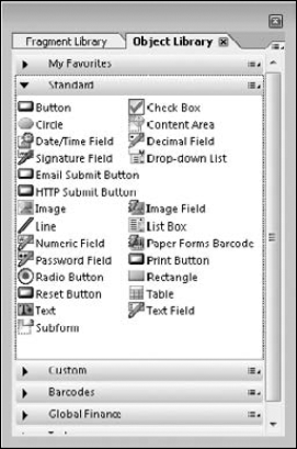
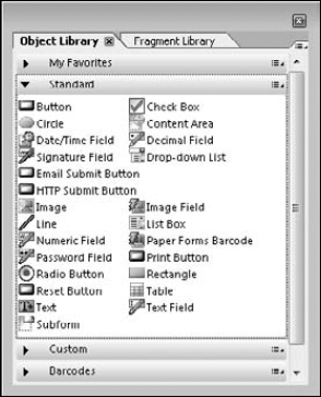
The Object Library palette contains all the different objects needed to create your forms. The Object Library is divided into four standard groups: My Favorites, Standard, Custom, and Barcodes. The Standard group contains each of the basic form field objects:
Button: Use this when you want the form recipient to initiate an event such as submitting data, adding sections to a form, printing, and resetting form data.
Date/Time Field: This is a specialized field with a data type set to date and/or time. The form recipient gets a pop-up calendar control to select the date. Customize the date format as needed for display as well as data collection.
Signature Field: Digital signatures are used to authenticate users or attest to document contents. You can specify whether a signature covers the entire form or selected objects on the form. To use selected objects, you must create a collection and the signing party must use Acrobat or Adobe Reader version 8.0 or later.
Image Field: An image field is used when the form recipient needs to attach an image to the form, or when the data being merged with the document contains record-specific images. For example, if the form is an employee emergency contact record, we may want to print the employee picture with the data.
Print Button: Add a print button to your form as a reminder to the form recipient when a printed copy is needed. The print button opens the print dialog box to choose the print settings needed.
Reset Button: A reset button can be used to clear data from all of the form fields back to their default values.
Submit Button: When you want to submit the data via e-mail or the Internet, a submit button sends the data.
Email Submit Button: Clicking an e-mail submit button attaches either the form data or the entire form to an e-mail message for submission to the specified e-mail address. Be aware that this is not a secure process, which means the document can be opened by anyone who has access to that e-mail.
HTTP Submit Button: A Web site with a standard URL, which is able to process the incoming data, is required in order to use an HTTP submit button. When the form recipient clicks the button, the Acrobat viewer program sends the data using the Internet to the specified URL.
Understanding the Default Tab Order
Tab order in form fields can make your form user friendly or extremely frustrating to the form recipient. Making sure you take time to test this before distributing your form is imperative. Adobe realizes tab order is important and sets it up for you by default. Understanding how Designer sets the default tab order saves time and frustration when designing forms.
When building a form in Designer, the default tab order is determined by the position of the object in the form. Tabbing is set from top to bottom and left to right based on object position. In other words, the object with the smallest Y coordinate (vertical position) is first in the tab order. If multiple objects are aligned at the same Y coordinate, with different X coordinates (horizontal position), the leftmost object is first in the sequence.
Let's explore a form's tab order that is problematic and discuss what is causing the issues. Notice in the form below that the fields are organized into the applicant block on the left and the joint-applicant block on the right. The form with the incorrect tab order has trouble tabbing through the titles in the correct sequence. It also takes us to the co-applicant title before finishing the applicant block of data.
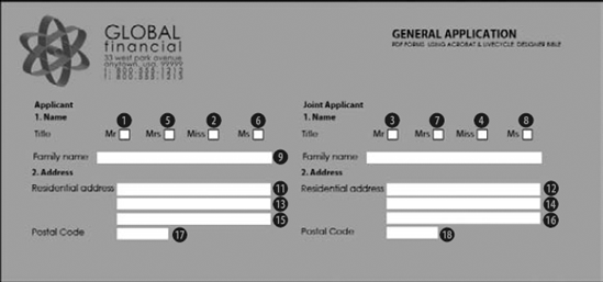
Form with wrong tab order
The problem with the titles tabbing out of sequence is caused by their Y coordinates not being identical. The author manually aligned the title fields. You can avoid this by using the alignment features.
Field Name | Y Coordinate Measurement | Incorrect Tab Position |
|---|---|---|
Applicant Mr | 1.7898 in | 1 |
Applicant Mrs | 1.795 in | 5 |
Applicant Miss | 1.7898 in | 2 |
Applicant Ms | 1.795 in | 6 |
Joint Mr | 1.7898 in | 3 |
Joint Mrs | 1.795 in | 7 |
Joint Miss | 1.7898 in | 4 |
Joint Ms | 1.795 in | 8 |
To fix the titles, the fields must have the same Y coordinate. Once changed, the tab order of the title fields is fixed. However, the problem remains with the tab order jumping left to right through the fields. We want the applicant information filled in first and then the joint-applicant.
This can be achieved by wrapping the sections in a subform. A subform tells Designer that the fields are related and should be treated as a set. The tab order looks at the top-left handle of the subform for determining tab position. When the tab order reaches the first item in the subform, it tabs through all the subform items before going back to the main form. Below you'll find a form with the tab order set after the changes have been made.
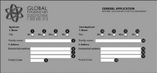
Form with correct tab order
Note
Distributing forms is covered in more detail in Chapter 30.
Numeric Field: Use this when you need to collect floating decimal or integer data, including currency, use a Numeric field. Numeric fields are limited to two decimal places, so any additional data is rounded.
Password Field: Placing a Password field on the form allows you to mask the entered characters displayed in the document.
Radio Button: When you need to allow a single choice in a set of related options, use radio buttons. For example, if you ask form recipients for their gender, they should not be able to select both male and female.
Check Box: When multiple choices are allowed in response to a question, use check boxes. For example, if you offer multiple services, form recipients should be able to select as many items as they are interested in.
Decimal Field: A decimal field is very similar to a numeric field. Use a decimal field when you need to control the number of leading digits, or the number of decimal places.
Drop-down List: When you want to provides the user with a list of choices for data entry, you can use a drop-down list. Only one choice is visible on the form until the button is clicked by the form recipient, and only one selection is allowed. You also can choose to allow a form recipient to enter custom text if the choice he needs is not included in the drop-down choices.
List Box: A list box is similar to a drop-down list. A list box can show multiple lines on the form. The list box may accept multiple choices; however, custom entries are not allowed.
Table: A table can be either a field or a static object. The standard table features are allowed, including header rows, body rows, and footer rows. If the table spans a page break, it is possible to define an overflow header and footer if desired. Tables also can be static in layout or dynamically adjusting based on user interaction or data merged with the form.
Text Field: The text field is the most common form object and can accept multiple lines and formatting of the text if desired.
The Standard group of the Object Library also contains some static objects. Static objects do not allow user interaction:
Circle: The circle object can be used for an ellipse, circle, or arc appearance and may include gradient fill effects.
Content Area: Content areas reside on the master pages of the form. They control the layout of all other objects placed in the form design including subforms. Changing the content area size on the master page alters where objects can be placed on the design page.
Image: This image object does not change based on user input or data merging. We use image fields to display company logos and graphics that remain consistent.
Line: Drawn lines can be used for enhancing form design. Lines are available in a variety of dashed and dotted styles with custom sizes and colors.
Rectangle: Drawn rectangles can include gradient fill effects, and you have four corner styles to choose from.
Subform: A subform is a container used to organize objects in the form design. The subform also controls the objects positioning in the document.
Text: Static text objects are used as labels, titles, and repeating header/footer information. Remember that these text objects do not allow user interaction in the form.
Adjacent to the Object Library palette, you will find the Fragment Library palette as shown in Figure 22.14. Many custom objects are used in multiple form designs, which of course is why we choose to store them as custom objects. We simply don't want to take the time to recreate the object each time it is used. Now consider that the custom object was something like a disclaimer, which every year gets reviewed by a committee. Worse yet, it gets reviewed every quarter. Now we need to locate every form that uses the custom object and replace it with the new one. Having the custom object certainly is better than having to copy and paste; however, this is exactly the type of thing that form fragments are good for.
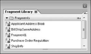
Form fragments are custom objects that are stored in the file system as XDP files. When you place a form fragment in your design, a link to the fragment is created. When you make changes to that disclaimer, you only have one place that needs updated—the form fragment!
You also can create script fragments, if you have a script that is completely independent of an object, such as loop routine. Object-related scripts, such as validate and calculate, cannot be turned into script fragments.
Note
For information on how to create and use form fragments, see Chapter 24.
Warning
A Designer form saved as an XDP automatically receives fragment updates. Any time the XDP is opened, or used in LiveCycle ES the fragment retrieves the current information available. A Designer form saved as a PDF file embeds the fragment at the time the document is saved. In order to update the fragment in the PDF file it must be opened in Designer and saved again.
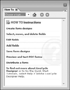
This small palette usually docks on the right side of the design page. The How To palette contains a list of help topics for commonly used features. This feature does not open the complete help file; it provides you with the how-to steps directly in the palette.
There are seven main categories listed in the How To palette, as shown in Figure 22.15. Clicking a topic brings up additional choices to select from. Navigating the How To palette is very intuitive. A home link at the top takes you back to the main seven options. A drop-down menu lets you jump to another topic.
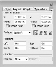
The Layout palette contains the following settings regarding the selected object: size and position information, margins, and caption position as shown in Figure 22.16. The X/Y coordinates indicate where on the design page the object is currently placed. This measurement is usually based on the object's top-left handle, known as the anchor point. Changing the anchor point to any other handle or the center is possible. These additional options are located in the Anchor drop-down list. This is useful when selecting the Expand to fit option.
Objects in Designer forms can adjust in size based on content the form recipient provides or data that is merged to the form. Selecting the Expand to fit option is part of what allows that to occur. When the object size adjusts, it increases in height and width away from the anchor point. For a standard object with the top-left anchor, the object grows to the right and down.
Note
For more information on dynamically expanding fields or forms, see Chapter 26.
Limited object rotation is also allowed. Buttons are available for the following settings: No Rotation/Remove Rotation, Rotate 90°, Rotate 180°, and Rotate 270°. Unfortunately, custom rotation is not supported in Designer.
Many field objects contain a caption. The caption can reside on any of the four sides of the field. Some form authors prefer captions on the left, while others prefer them below the object. An ongoing debate involves whether check boxes should have captions on the left or the right of the box. Changing the position is a simple click of the drop-down choices.
Note
For customizing captions and layout tips, see Chapter 25.
The Object palette contains sub-tabs. Which tabs are available depends on the selected object type. Static objects such as text or rectangles have only a sub-tab called Draw. You can set properties such as visible and locale as shown in Figure 22.17.
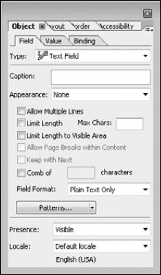
For fields, the Object palette contains three sub-tabs: Field, Value, and Binding. Some properties, such as name and data binding, are available for all object types. Many additional properties available here are specific to the currently selected field type:
Field: The object tab properties change based on the object type. For example, a drop-down list is populated by the list items entered here, or you can change the style of a check mark.
Value: If you want to have a preselected value when the form recipient opens your form, you can provide a default value on this tab. Validation rules also are set here.
Binding: If you establish a data connection to your form, this tab stores the binding to the data.
Note
See Chapter 25 for details on using the Object palette to set properties.
The Border palette stores the settings for the border color, line weight, and fill effects as shown in Figure 22.18. Most objects have properties that can be set in the Border palette. However, four Library Objects do not have any properties in the Border palette: Line, Rectangle, Circle, and Content Area. The first three objects have borders available, but they are stored in the Object palette.
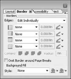
Currently, nine border styles, adjustable line weights, custom border colors, four corner styles with a customizable radius, solid colors, and gradient fills are available to choose from.
Note
Applying border properties is covered in Chapter 25.
Accessibility ensures that form recipients with disabilities can access electronic content and resources using assistive devices. LiveCycle Designer can create forms that comply with the U.S. federal code regulating accessibility for vision and mobility challenged persons. This code is generally referred to as Section 508. For more information, see www.section508.gov. Be aware that accessibility policies vary from country to country. Check your local policy as needed.
Just creating the form in Designer does not make it accessible. Some additional properties must be set to make it compliant. Because Designer forms are generally viewed as PDF files, many items discussed in Chapter 11 on making forms accessible apply to Designer created forms as well.
Note
See Chapter 11 for more details on accessibility.
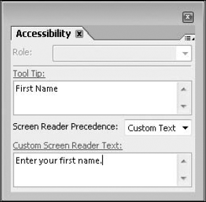
In the Accessibility palette, you can provide custom text for a screen reader as shown in Figure 22.19. A screen reader uses the following order when reading Designer created objects: custom text, tool tip, caption, and name. You can alter this order if necessary.
The main portion of the program window is divided into four tabs. This area is known as the Layout Editor as shown in Figure 22.20. It is located between the palette wells in the center of the screen. When Designer is first launched, only the Design View and Preview PDF tabs are visible. To open the Master Pages tab in the editor, select View
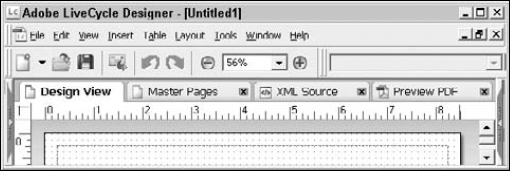
Figure 22.20. The Layout Editor contains tabs for Design View, Master Pages, XML Source, and Preview PDF.
Tip
Notice that the Master Pages, XML Source, and Preview PDF tabs have an X on the tab name to close them. You also can right-click the three editor tab names (Design View, Master Pages, and XML Source) at the top of the Layout Editor for a shortcut to turn the tabs on or off. When you right-click the PDF Preview tab it indicates whether the preview is static or dynamic as set in the form properties.
When working on a form design, much time is spent planning object placement and sequence of fields, colors, and other formats. You will spend most of your working time in LiveCycle Designer positioning and formatting fields on the Design View tab. Design View is the main layout area in LiveCycle Designer and is sometimes referred to as the Body Pages, as it was named in earlier versions.
Design View shows each page of your form as you continue to build it. Forms can be multiple page sizes and orientations. As you add objects to the design page, many visual properties can be set without using a palette. You can type captions, align objects with other objects, and more. The visible grid assists you with object placement and can be fine-tuned to suit your needs. Additional guides and drawing aid tools are available to make working in Design View easier.
Note
Working in Design View is covered in more depth in Chapters 24, 25, and 26.
Master pages control the layout and background of your form, including page size, orientation, and content areas. Every form has at least one master page. The Master Pages tab is hidden by default. To turn it on go to View
Although you could build a form without adding anything to the master pages, we don't recommend it. Does your form have elements that need to be consistent from page to page? Think of master pages in terms of headers and footers or page templates for your form design. A form can be designed with multiple page orientations, sizes, and layouts including columns. Subforms and flowed layout allow you to accomplish a column style form layout and just about any other you can conjure up.
Note
Master pages are explored in Chapter 25.
Designer forms are based on XML. Designer is a graphical user interface (GUI) for writing XML. Every object you add to the design page adds a new block of code to the source code. The XML can be edited directly on this tab if you are comfortable doing so. Most of us are not programmers and do not choose to work in the XML source view, but it has some very useful applications.
Suppose we have a form designed following all the corporate guidelines, except we forgot to change the font. All the objects on the form are the wrong font. Now we realize that selecting a field and changing the font is not a difficult task, but when a form has hundreds of fields on multiple pages, it gets very tedious. Using the hierarchy may be an option; you can select all the objects in the document and change the font. However, selecting any drawn objects and graphics causes the formatting toolbar to be disabled. Opening the XML source and running through Find and Replace can be much easier.
Warning
Be careful when editing the XML directly. Any flaw in the XML structure causes the document to not load or function properly.
Note
Working with XML is covered in more depth in Chapter 31.
Clicking the Preview PDF tab opens your form in Reader or Acrobat to test form functionality or simply to preview formats and layout. Previewing your form is required to test calculations and scripts, because scripts are not executed in Design View. Using the Preview PDF tab inside Designer prevents you from having to open an Acrobat viewer and open your file manually. After you're in the Preview PDF tab, the Acrobat viewer shortcuts become active.
Note
The Preview PDF tab has a minimum requirement of Acrobat or Reader version 6.02 or higher to display. If you have loaded only LiveCycle Designer without loading Acrobat or Reader, the tab is not available. To preview a form in the Preview PDF tab, the Display PDF In Browser option must be selected in Acrobat or Reader. In the viewer program, verify that this is turned on by going to Edit
The more we work in Designer, the more we open and close palettes, the more our preference for their location becomes apparent. In this section, we discuss how to move palette tabs into different palette wells. We explore how to adjust the design grid to suit our needs and insert guidelines for additional control when placing objects.
Customizing settings in the workspace can take a significant amount of time. We believe this to be time well spent, with the payoff showing in your day-to-day efficiency. Unfortunately, Designer does not have a setting to save customized workspace layouts. Designer retains the current workspace settings as long as it is properly shut down. If desired, you can easily reset the workspace to the default settings.
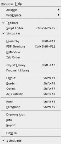
Controlling which palettes are currently visible and resetting them can all be found in the Window menu as shown in Figure 22.21. Turning palettes on and off is a simple click of the palette name in the Window menu. Any currently open Designer forms are located at the bottom of the menu. Various document arrangements become available when multiple files are open.
If no documents are currently open, Designer opens and creates new files maximized within the program window. If you choose to restore the document window to a smaller size, then Designer opens and creates documents arranged in the reduced area. To change this setting, select Window
Tip
Sometimes options located in the Window menu are confused with the options in the View menu. Palettes are in the Window menu. Editor tabs are in the View menu.
Many of the font and paragraph settings can be found on the text formatting toolbar. However, every option is not available on the toolbar. To see the complete set of font and paragraph options, you need to open the palettes. To turn on the Font palette, select Window
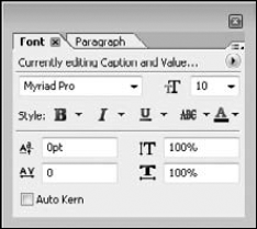
The Font palette contains settings for changing font styles, sizes, and colors. Some enhancements in version 8.2 are kerning, line spacing, and scaling, as shown in Figure 22.22.
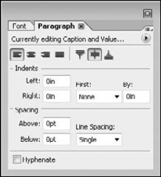
The Paragraph palette contains options for both vertical and horizontal alignment. You also can set indents, complete with first line and hanging styles as shown in Figure 22.23. The new feature on this tab is Hyphenate.
Notice at the top of both the font and paragraph palettes that a message appears: "Currently editing Caption and Value." This is an indicator of how much of the selected object is going to be formatted. You can set different fonts, sizes, colors, alignments, and margins for the caption and the field.
Note
Formatting the field and caption independently is covered in Chapter 25.
A grid is visible when working in Design View and Master Pages. The grid is designed to help you align objects when placing them on the page. Objects are designed to snap to the dots of the grid. We recommend using the grid whenever possible. Adjusting the grid may be necessary to work efficiently with your own form designs. You also may want to insert some guidelines to simplify aligning multiple objects.
Any setting that affects the grid can be found in the Drawing Aids palette, as shown in Figure 22.24. Turn on the drawing aids by selecting Window
The rules and grid measurement units can be set to one of the following options: inches, centimeters, millimeters, and points.
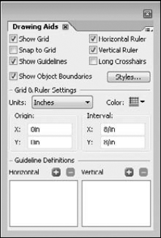
An often overlooked feature in Designer is the object border color and style when working in Design View and Master Pages View. Static objects have a solid blue border indicating they are non-interactive, whereas field objects have a solid orange border to indicate they are interactive. Subforms appear in the design page with a pink dashed border. Object border colors are a very helpful feature, which you can customize in the Drawing Aids palette. Each object type has a border color and style you can set by clicking the Styles button. We encourage you to try adjusting these settings; if you find that you prefer the defaults, a reset button is available.
Tip
An easy way to tell if an object on the design page is static or interactive is to check the object's border color. Objects with solid blue borders are static, and objects with solid orange borders are interactive.
You may find you need to turn the Snap to Grid feature and the grid itself on and off at various stages of your form development. You can find those options and more in the View menu or use keyboard shortcuts if you prefer not to open the Drawing Aid palette. Use these Drawing Aid shortcuts:
Show/Hide Grid: Ctrl+'
Snap to Grid: Shift+Ctrl+'
Object Boundaries: Ctrl+;
Note
See "Using the View menu" later in this chapter for more details.
Adding guidelines while you work can be extremely helpful and can be done from within the Drawing Aids palette or directly on the design pages. To set guidelines using the Drawing Aids palette, click the green plus sign (+) in either the vertical or horizontal area of the Guidelines Definitions section.
To set a guideline in the design page, locate the corner between the rulers. You'll see a small white area with cross hairs, as shown in Figure 22.25. Place your mouse in this area, and drag down and/or over into the design area. If you release your mouse while still in the vertical ruler, you set a horizontal guideline at that point on the vertical ruler. Likewise, you set a vertical guideline by releasing the mouse pointer while in the horizontal ruler. By releasing the mouse on the actual page, you are setting both a vertical and horizontal guide.
You can move a guide by dragging the blue triangle in the ruler to a new position. You also may make adjustments to the guidelines in the Drawing Aids palette.
The script editor is hidden by default in this version of Designer; select Window
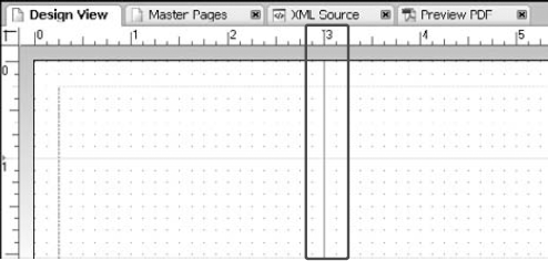
Figure 22.25. The design page after a 3-inch vertical guideline and a 1-inch horizontal guideline has been set
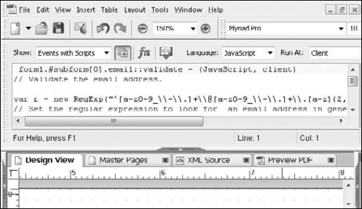
The Show box in the script editor is set to events with scripts by default. This allows you to see the selected object's code, regardless of the event the script is attached to. A numeric field may have a script written for both a calculate event and a validate event. The script editor shows both pieces of script separated by the events. Filtering the event list is certainly possible; just select the event you'd like from the drop-down list.
To the right of the Show box is a button called Show Events for Child Objects. The button is selected by default and allows you to see scripts for any child objects. Having this on allows you to select the top-level node in the hierarchy, and then the script editor shows all scripts contained in the form. It may contain more than you wish to see at times, so change the setting as needed.
The green FN button contains a list of functions available to the currently selected scripting language. The syntax checker looks at the all the scripts in the form for errors. Any errors found are reported in the Log tab of the Report palette.
The status bar is an invaluable tool when designing forms. It's a shame the status bar is not visible by default, as it was in previous releases. To turn on the status bar, select Window
The status bar contains information regarding the currently selected object's position, size, and object name. These properties also can be found in various palettes, but this gives you a single, always visible, area to check settings. If you drag an object, the status bar updates the position information while dragging.
The form's current page number and total page count is indicated in the status bar. To the right of the page count indicator on the status bar are four editing icons. These are interactive buttons that you can turn on or off by clicking the icon.
The first three of these icons can be found in Edit
On the far right end of the status bar are three gray boxes that light up to indicate that one of the following keys on the keyboard is active:
CAP is for the Caps Lock key.
NUM is for the Number Lock key.
SCRL is for the Scroll Lock key.
The status bar is full of valuable information that can be seen at all times while editing. We recommend you turn the status bar on.
As we've discussed many times before, the palette options in Designer are extensive. Turning them on and off as needed to set properties, access features, and maximize screen real estate seems to never end. The palette wells and tabs do not have to remain where they currently are located.
To move an entire palette well, including any tabs currently docked in that well, drag the palette bar. As you approach the center of the screen the palette begins to float and is not docked to the workspace side. To dock a palette well, drag the title bar toward the desired side of the workspace. The palette outline snaps to the side of the screen when you get close to the edge. Sometimes you don't want the palette well to dock to the sides, yet each time you try to drag the palette, it attempts to snap to an edge. You can prevent a palette well from docking by holding down the Ctrl key while you drag.
When dragging a palette away from a well, the palette outline changes shape. If the outline shows the tab with a palette well border, when dropped it creates a new palette well with only that tab inside. Dragging to the center of the design page is the easiest way to create a new floating palette well. If the outline shows only the tab name, then you are near an existing well, and a black frame surrounds that well. The black frame indicates that when you drop the palette it becomes docked in the surrounded palette well.
Enjoy customizing the workspace to your own liking. Experiment with different combinations of layouts, and see what works best for you.
Another time-saving technique is to use keyboard shortcuts. Many items have keyboard shortcuts already assigned to them, but others you need to assign yourself. The pull-down menus contain many commands. If the commands already have a keyboard shortcut assigned to them, the shortcut is shown to the right of the menu choice. If a command you use frequently does not have a shortcut, you can assign a custom keyboard shortcut. As shown in Figure 22.28, the keyboard shortcut window allows you to work with all the commands in the program, or you can filter the available list by selecting a product area from the drop-down list.
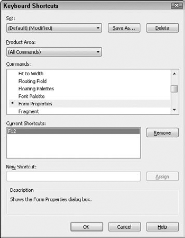
STEPS: Assigning a Keyboard Shortcut
Select Tools
Keyboard Shortcuts. This command opens the Keyboard Shortcuts dialog box.Select the desired command in the Commands list.
Click in the New Shortcut area.
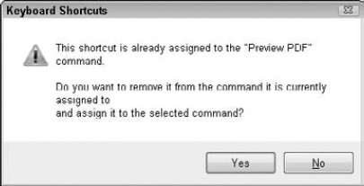
Type the keys you want to assign as the shortcut. If the shortcut is already assigned to another command, you receive a prompt regarding replacing the shortcut, as shown in Figure 22.29. If this happens, try to think of another shortcut. If you are sure the existing shortcut is one you do not use, then replace it.
Click the assign button. After you have found a shortcut, click the Assign button. Clicking this button adds the shortcut to the dialog box.
Save the shortcut. You can save your custom shortcuts with a descriptive name for easy identification.
Resetting the keyboard shortcuts is as simple as choosing the default option from the top of the Keyboard Shortcut dialog box.
Most of the toolbars are located below the menu bar and above the editors in the toolbar well. Toolbars can be docked to any of the four sides of your screen or allowed to float in the design space. For example, you may prefer to work with the layout tools near the selected objects on the page. Dragging a toolbar handle allows you to move a toolbar easily. The outline of the toolbar changes as you drag it. The outline appears as a thick, dotted border to indicate it's a floating position. As you approach an edge of the program window, the toolbar outline changes to a thin, black line indicating it can dock there. Follow these steps to move a toolbar.
STEPS: Moving a Toolbar to an Alternate Position
Position the mouse cursor. Place your mouse on the two dotted gray separator bars on the left edge of the toolbar. These gray bars are known as the toolbar handle.
Click and drag the toolbar to an alternate location.
Drag the toolbar until it snaps back to the edge of the workspace. If a toolbar is already floating and you want to move it or dock it, you may click and drag anywhere inside the title area of the toolbar.
Tip
If a toolbar is floating and you want to put it back in its previously docked location, double-click anywhere in the title bar area of the toolbar.
These toolbars are available by default in Designer:
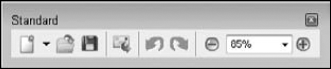
Standard: The first toolbar in the interface, shown in Figure 22.30, contains options for New Document, Open File, Save, Distribute, Undo, Redo, Zoom Out, Zoom Percentage, and Zoom In.
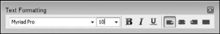
Text Formatting: The text formatting tools, shown in Figure 22.31, offer limited formatting choices, including Font, Size, Bold, Italic, Underline, and horizontal alignment options.
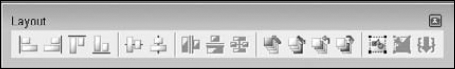
Layout: This toolbar, shown in Figure 22.32, is for working with multiple objects. It contains tools for aligning, distributing, stacking, grouping, and merging.
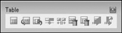
Table: The Table toolbar, shown in Figure 22.33, offers buttons for creating tables, inserting and deleting columns and rows, splitting and merging cells, and converting to and from tables.
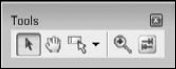
Tools: This toolbar, shown in Figure 22.34, offers additional basic tools for these tools: select object, hand, field edit, zoom, and tab order.
You can now create your own custom toolbars and add more tools to the existing toolbars in Designer. For example, if you frequently need to use the vertical alignment tools, you could add them to the existing Text Formatting toolbar or create a new toolbar. Customizing your toolbars begins by selecting Tools
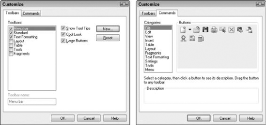
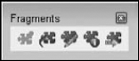
To create a new toolbar, select the Toolbars tab and click New. Type a new name for your toolbar. To add additional tools to the toolbars, in the Customize window, select the Commands tab. Locate the desired tool, and drag it to an existing toolbar. We decided to make a new toolbar with all the buttons related to form fragments, as shown in Figure 22.36.
If you are trying to maximize your design space, you can close all the toolbars (floating and docked) by selecting Window
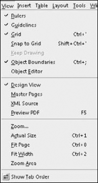
The View menu, shown in Figure 22.37, contains commands for adjusting how you look at the design space and gives you access to the tab order. As mentioned previously, many Drawing Aids settings can be turned on and off from the View menu.
When you first open Designer, the zoom level is set to maximize the available workspace. This setting is known as Fit Width, and it works the same way in the Acrobat viewers. The keyboard shortcut also is the same: Ctrl+2. You'll notice that if you expand or collapse a palette well on the left or right side of the screen, the design page adjusts automatically. However, if you need all the palettes open for settings, this leaves little room for working.
Many options are available for changing the zoom settings. Keyboard shortcuts are available for many common zoom settings, as shown in the View menu in Figure 22.36.
The Standard toolbar has zoom in, zoom out, and the zoom percentage options. The Tools toolbar has a zoom tool similar to Acrobat for clicking the design page in the desired location. No matter which method you choose for adjusting the zoom levels while working, make sure your zoom level is set appropriately for the task at hand.
The design grid is the dotted background on the Design View and Master Pages tabs. The spacing between the dots is controlled by the settings of the Drawing Aids palette. As you add objects to the design page, they snap to the grid dots to assist in layout and alignment. This is very helpful when your objects are consistent in size. However, when the objects vary in size, setting the spacing between objects can be difficult.
With the Snap to Grid setting on, we tried to place three objects with different sizes below one another. We wanted the spacing between the objects to be equal. Notice in Figure 22.38 that this was not possible; the gap between the top two objects is smaller than the gap between the bottom two objects.
The Snap to Grid feature can be turned off temporarily to help you place, size, and align objects. Select View
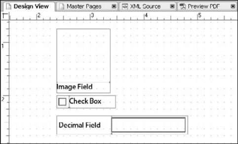
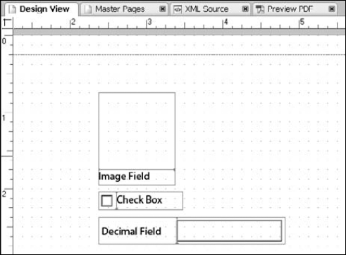
Figure 22.39. The Snap to Grid feature has been turned off, allowing more control over object placement.
Perhaps you prefer ten dots per inch as opposed to the standard eight dots per inch. To customize the spacing of the dots on the grid, select Window
Adobe LiveCycle Designer is a powerful form design program that creates forms based on XML.
The main program window is divided into four areas: Design View, Master Pages, XML Source, and Preview PDF.
Designer forms place a dependency on which specific versions of the Acrobat viewers can be used to interact with your form.
Tasks are preformed through the use of menus, tools, and palettes.
Palettes can be customized to your preferences. This includes showing or hiding palettes and rearranging palette positions.
A limited set of tools is available on the default toolbars. Additional buttons can be added to the existing toolbars. You also can create new toolbars.
Using keyboard shortcuts is another method of accessing tools and settings. If a keyboard shortcut is not assigned to a frequently used feature, you can add one.
The design page has a dotted background. This design grid is used to snap objects into place. It can be customized to suit your needs.
A New Form Assistant can help walk you through creating a new form.
Forms can be imported from Microsoft Word, existing PDF files, and spreadsheets.
The default tab order is based on the objects' positions on the design page. It starts at the top of the form and works top to bottom, left to right. The tab order can be adjusted easily by dragging fields up and down in a new palette, if the default tab order doesn't suit your needs.
Form fragments are design pieces that are used in multiple form designs. Fragments are stored in the file system and can be updated easily.
The Library palette contains all the basic form design objects necessary to create your forms. You can add custom objects to the library.
The Hierarchy palette provides a structured view of your form design elements.
Scripting is supported in both JavaScript and FormCalc.