Text formatting is formatting that you can apply to individual characters of text. It includes font (typeface), size, attributes such as bold and underline, fill color, and border color. (Formatting that affects entire paragraphs only, such as indentation or bullet style, is called paragraph formatting, not text formatting, and is covered in Chapter 7.)
As you learned in Chapter 5, PowerPoint automates text formatting by applying themes to slide masters. The slide masters then dictate the default text size, font, color, and attributes that should be used on slides. By applying text formatting through the slide masters, rather than to individual slides, you ensure consistency and make it much easier to make global font changes later on.
However, you may need to change the formatting of some text. For example, the font size for titles on the slide master may be a bit too large; in this case, you can decrease the font size for the Title placeholder, and this change will apply to all of the layouts for that master. You can even save the changes to a new theme file so that you can reuse the theme with the smaller title text later on.
In some cases, you might need to manually change the text formatting for an individual text box, or even an individual paragraph or word. For example, you may create text boxes manually that label the parts of a diagram; in this case, you would probably want to use a fixed font and size for those labels, so that they do not change if you switch themes later on.
There are several ways to change the font that is used in a presentation. Whenever possible, in order to maintain consistency, you should use the method that affects an entire slide master. However, in some cases, you may need to change the font in an individual text box, or even individual characters within the text box. Office 2007 comes with a lot of different fonts, and you may also have acquired some additional fonts by installing other programs. A font is a typeface, or a style of lettering. To see an example of two different font styles, compare the lettering of the above heading to the lettering in this paragraph.
Note
In the past, when most fonts were not scalable, a distinction was sometimes drawn between the term "typeface" — referring to a certain style of lettering — and the term "font" — which referred to a specific typeface used at a certain size, with a certain combination of attributes, such as bold and italic. Nowadays, however, the terms font and typeface are synonymous for all practical purposes.
Windows fonts are generic — that is, they work with any program. For example, a font that came with WordPerfect also works with Microsoft Word and with PowerPoint. Within PowerPoint, you have access to all of the installed Windows fonts on your system.
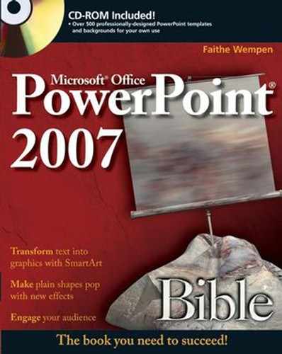
The majority of the fonts that come with Windows and Office are scalable, OpenType or TrueType fonts. These are outline fonts, which means that they consist of unfilled mathematically created outlines of each character. When you assign a size, you are sizing the outline; each outline is then filled in with black (or whatever color you choose) to form each character. As a result, these fonts look good at any size. PowerPoint's Font list does not differentiate between OpenType and TrueType fonts, and both are marked with TT icons to their left, as shown in figure 6.1.
Depending on the default printer, PowerPoint's Font list may also contain fonts that have printer icons to their left. These are printer-resident fonts, and they are built into the default printer that you have set up in Windows. figure 6.1 shows one such font, AvantGarde. You should not use these fonts in a presentation that you plan to show on another computer, or to distribute to others electronically, because not everyone will have these fonts available.
In terms of appearance, there are two basic groups of fonts: serif (those with little tails on each letter, such as the small horizontal lines at the bases of the letters i and t) and sans-serif (those without the tails). The headings and regular paragraph text in this book are a serif font. If you flip back to the first page of this chapter and look for the words "IN THIS CHAPTER," this is an example of a sans-serif font.
A font can make a tremendous difference in the readability and appeal of your presentation, so selecting the right ones is very important. But how do you choose from among all of the fonts that are installed on your system? Here are some general rules:
Strive for consistency. (Yes, I keep harping on that, but it's important.) You should avoid changing the font on an individual slide, and instead, make font changes to the slide master, or, in some cases, to a master layout.
Whenever possible, rather than choosing a fixed font, use the (Headings) or (Body) placeholders at the top of the Font menu (figure 6.1). You can then redefine those placeholders using a font theme. This makes it much easier to change the fonts for the entire presentation later on.
Note
For more on font themes, see Chapter 5.
Try to use a sans-serif font for the "Headings" font, because sans-serif is easier to read at large sizes.
Use serif fonts for the body if the presentation is very text-heavy, because serif fonts are easier to read in long paragraphs (such as in this book).
Avoid script fonts in presentations, because they are hard to read.
Avoid novelty fonts, because they take the focus away from your message.
Another consideration when choosing fonts is whether the PC on which you present the show is likely to have the same fonts installed. If you stick with Windows-supplied fonts such as Arial and Times New Roman, which are available in both Windows XP and Windows Vista, this is a non-issue. However, if you use a font that came with Office 2007, such as Calibri, but you plan on presenting on a PC that uses an earlier version of Office, then you might want to embed the fonts in the presentation when you are saving it. If you present or edit the show on a PC that does not have the right fonts, and the fonts are not embedded, then PowerPoint will use fonts that are as close as possible to a match. Although this is helpful, it can also cause strange and unexpected line breaks in your text.
Tip
To embed fonts when saving the presentation, choose Tools
Tip
If you end up on the other side of that equation, and are stuck with a presentation that uses fonts that your system doesn't have, use Replace Fonts to replace all instances of the missing font with one that is available on your PC. It's easier, of course, if all fonts are specified from slide masters, rather than on individual slides because then you have to make the change only on the master, not on each slide.
Choosing a different font theme was covered in Chapter 5 because of the connection between themes and fonts, but let's have another look at it here in the context of font formatting. A font theme is a specification that names two fonts: one for headings (titles) and one for body text (everything else). Font themes apply to all text that uses the font placeholders rather than a fixed font. To switch to a different font theme, follow these steps:
On the Design tab, click Fonts. The Fonts menu opens to display samples of the available themes. These include both built-in font themes and any custom themes that you've created.
Hover the mouse pointer over a theme to see it previewed on the slide.
Click the font theme that you want.
Note
To create your own custom font themes, see Chapter 5.
Tip
You apply the font theme to the slide master that the current slide uses. If you have other slides in the presentation that use different slide masters, the change does not affect them. To apply the change to all slide masters, instead of clicking the font theme in step 3, right-click it and choose Apply to All Slides from the menu that appears.
If you apply a specific font to some text, that text will no longer use the font that is specified by the font theme. That font will not change when you change the presentations overall font theme.
If this is what you want, then you have two ways to apply a specific font: from the Home tab or from the mini toolbar.
To apply a font from the Home tab, follow these steps:
Select the text to be formatted. It can be on a slide master (most preferable), on a layout master, or on an individual slide.
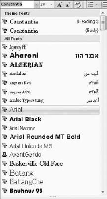
On the Home tab, in the Font group, open the Font drop-down list.
Point to a font other than the ones designated (Headings) and (Body). The selected text is previewed in that font, as shown in figure 6.2.
Click the font that you want. PowerPoint applies the font to the text.
If you want to return to using the theme fonts, select the "Headings" or the "Body" font from the top of the menu.
The mini toolbar is just what it sounds like — a small toolbar. It appears above and to the right of selected text. When the mouse pointer is directly on top of the selected text, the mini-toolbar appears dimmed, but if you move your mouse up to the mini-toolbar, it becomes fully visible.
To apply a font from the mini toolbar, follow these steps:
Select the text to be formatted. It can be on a slide master (most preferable), on a layout master, or on an individual slide.
Hover the mouse pointer over the selection so that the mini toolbar appears, as shown in figure 6.3. If it does not appear, right-click the selection.
On the mini toolbar, open the Font drop-down list.
Point to a font other than the ones marked (Headings) or (Body). The selected text is previewed in that font.
Click the font that you want. PowerPoint applies the font to the text.

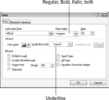
The Font dialog box (shown in figure 6.4) provides a third way of changing the font. It also gives you access to the controls for setting font size, color, and attributes, all of which you will learn about later in this chapter. To open the Font dialog box, click the dialog box launcher in the Font group on the Home tab. Then make your selections in the dialog box, just as you would from the Home tab's Font group. Notice in figure 6.4 that the Font drop-down list is labeled Latin Text Font. In this case, "Latin" just means regular text characters.
If you restrain yourself from using a lot of manual text formatting, and rely on the theme to handle it, you should not have a problem with inconsistent font usage. Whenever you need to make a change, you can do it once on the slide master and be done with it.
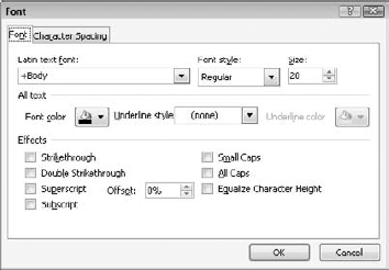
Figure 6.4. The Font dialog box provides access to many different text-formatting controls, as well as the font list.
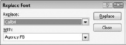
However, not everyone can be counted on to show such discipline and good design sense as you. Suppose your coworker created a long presentation in which he sporadically applied a certain font for some special elements. Now you need to work on that presentation, but you don't have that font. You will need to go through and hunt for all instances of that font and change them to some other font. Fortunately, PowerPoint has a Replace Fonts feature that can help you to find all of these instances. Follow these steps:
On the Home tab, in the Editing group, click the down arrow for the Replace button and choose Replace Fonts. The Replace Font dialog box appears, as shown in figure 6.5.
In the Replace drop-down list, select the font that you want to replace. Only the fonts that are currently in use in the presentation appear on this list, and so it's easy to navigate.
In the With drop-down list, select the desired replacement font. All of the available fonts on your system appear here.
Click Replace. All of the instances of that font are replaced.
Repeat steps 2 to 4 to replace another font, or click Close when you're finished.
Each theme has a specified font size that it uses for titles and for body text, with different sizes typically used for different levels of bulleted lists. You can use the default settings, or you can edit the placeholders on the slide master to change them. In some cases, you might also need to change the size of an individual block of text on an individual slide.
Note
As you learned at the end of Chapter 4, PowerPoint has an AutoFit feature that you can turn on or off for each text box. When enabled, AutoFit permits the text size to shrink so that the text fits into the text box, or it permits the text box to grow so that the text fits at its current size. However, AutoFit does not change the text's font size as applied by the Font Size setting; if you enlarge the text box, the text goes back to its regular size.
The size of the text is just as important as the font. If the text is too large, it looks unattractive and amateurish, but if it's too small, the people in the back row won't be able to follow along.
Font size is measured in points, and each point measures 1/72 of an inch when printed. However, PowerPoint slides are usually shown on a screen rather than printed, and so the appropriate font size depends mainly upon the presentation medium. For example, a 72-point letter on a 15" monitor is very different than a 72-point letter on a 12-foot projection screen.
The default sizes that are specified in the built-in themes provide you with a good starting point. You can increase or decrease the sizes on the slide masters as necessary. Here are some things to consider when choosing font size:
The farther away the audience will be sitting from the slides, and the smaller the display screen, the larger the text should be.
Very thick and very thin letters are harder to read at small sizes. A font of moderate thickness is most readable.
Very tight spacing can make thick letters difficult to read; on the other hand, very loose spacing can emphasize the individual letters to the point where the words they comprise are not as obvious. (Character spacing adjustment is a new feature in PowerPoint 2007, and is controlled through the Character Spacing button on the Home tab.)
If any of your slide titles are so long that they wrap to an additional line within the title placeholder box, consider slightly decreasing the font size for the title placeholder on the slide master so that the wrapping doesn't occur. Make your changes to the slide master — not the individual slide on which the problem occurs. This is because audiences find it jarring when the slide title is not in the same place or not the same size on every slide.
The Font Size drop-down list, shown in figure 6.6, is on the Home tab and is actually also an input box. You can click it and type a font size directly into the text box, or you can open the dropdown list and select a value. Typing your own value is useful if the size that you want doesn't appear on the list. At the smaller sizes, the list increments by one point, but at the larger sizes, it makes bigger jumps, and so not all values are available.
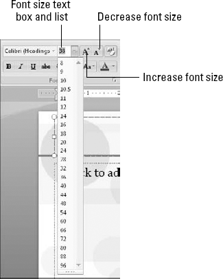
Figure 6.6. Select a font size from the drop-down list, or click in the Font Size text box and type a value.
Note
The same Font Size drop-down list is also available in the mini toolbar and in the Font dialog box.
As a shortcut, you can also use the Increase Font and Decrease Font buttons, which are available both on the Home ribbon and on the mini toolbar. They are shown in figure 6.6, and they increase or decrease the font size by one position on the Font Size list. (As noted earlier, for the smaller sizes, the increment occurs at one point at a time, but for larger sizes there is more of a jump between sizes.) You can also use the following keyboard shortcuts:
Increase Font: Ctrl+Shift+>
Decrease Font: Ctrl+Shift+<
Character spacing is the amount of blank space between individual letters. You can adjust this spacing to make more or less text fill a text box. Character spacing can affect the appearance and readability of both titles and body text, and figure 6.7 shows examples of the various character spacing presets that are available with examples of how it affects your text.

Figure 6.7. Character spacing, which you set from the Home tab, affects the appearance and readability of your text.
To adjust character spacing, select the text and then choose a setting from the Character Spacing drop-down menu on the Home tab.
To set custom spacing, choose More Spacing from the drop-down menu. This opens the Font dialog box to the Character Spacing tab, as shown in figure 6.8.
To set custom spacing, choose either Expanded or Condensed from the Spacing list, and then enter a number of points by which to expand or condense. As a point of reference, Table 6.1 lists the presets from figure 6.7 and their expand/condense values; use these as a basis for fine-tuning.

Table 6.1. Equivalent Expanded/Condensed Settings for Character Spacing Presets
Preset | Custom Spacing Equivalent |
|---|---|
Very Tight | Condense by 3 points |
Tight | Condense by 1.5 points |
Normal | Normal |
Loose | Expand by 3 points |
Very Loose | Expand by 6 points |
You can also adjust kerning in the Font dialog box. Kerning decreases the amount of space between two letters, based upon their shapes. For example, when capital letters A and V appear next to each other, you can reduce the space between them without them overlapping because of their shapes. Kerning takes the shapes of the letters into account as it selectively tightens the spacing. Kerning looks best when you apply it to large text, and so the Kerning for Fonts setting enables you to specify a minimum font size, as shown in figure 6.8, below which text is not kerned.
To set the font color for individually selected text, use the Font Color button on the Home tab, or use the Text Fill button on the Drawing Tools Format tab in the WordArt Styles group. Why are there two buttons that do the same thing? Well, they don't do exactly the same thing. The Font Color button on the Home tab applies only simple, solid-color formatting, and is available even in legacy presentations. The Text Fill button has a wider array of fill options, including gradients, textures, and even picture fills. It is available only in a PowerPoint 2007 presentation. figure 6.9 shows these two buttons and their menus.
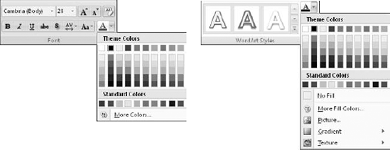
Figure 6.9. The Font Color button (left) and the Text Fill button (right) are both located on the Home tab. They can both apply solid-color formatting, but only the Text Fill button can apply special fill effects.
For text color and fill, as with the colors of all objects, it is usually best to stick with the theme color placeholders rather than using fixed colors. This way, if you want to change the color theme or the overall theme later on, the colors will automatically update. This doesn't necessarily mean that you have to forego special fill effects; you just have to base them on theme colors. For example, if you're creating a gradient effect, you should use two theme colors for the gradient.
Note
For more on color placeholders, see Chapter 5. For more on special fill effects, see Chapter 10.
One of the major improvements in PowerPoint 2007 is the ability to apply graphics-like formatting to any text. For example, you can apply outlines to text, just as you can apply borders to drawn shapes, text boxes, or other objects. In PowerPoint 2003 and earlier, this was possible only with WordArt text (that is, text treated as an internal graphic) and not as regular text. figure 6.10 shows some text with an outline.

By default, text has no outline. To apply an outline, select the text and then choose a color from the Text Outline button in the WordArt Styles group on the Home tab. You can choose either a theme color or a standard (fixed) color. You can also choose an outline weight from the Weight submenu, as shown in figure 6.11. Chapter 10 covers object outlines (borders) in more detail.

Note
You can also apply dashes to the text outline, although this is usually not a good idea for text. Dashes are more suitable for the borders of larger objects.
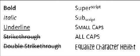
Text attributes are modifiers that you apply to the text, such as bold, italics, underline, strike-through, shadow, and so on. PowerPoint offers several attributes, as shown in figure 6.12.
There are actually several types of text attributes, and they can be divided into the following major groups:
Bold and italic are actually considered font styles. You can apply one of these four styles to your text: Regular, Bold, Italic, or Bold Italic. In some fonts, each of these styles is formed with a separate character set that is embedded in the font file, and the letters are actually different shapes. However, in other fonts, bold is simulated by making each character a little thicker, and italics is simulated by tilting each character to the right. figure 6.13 shows the difference between these font types.
Some attributes apply an effect on top of— or in addition to — the text. These include underlining, strikethrough, and double strikethrough.
Superscript and Subscript attributes are used for setting off symbols and numbers for footnotes, chemical notations, exponents, and so on. They raise or lower the affected text and also shrink it by about 30 percent (this is the default setting, although you can also customize the percentage).
Shadow formatting takes two forms. If you apply it with the button in the Font group, then it is available in all presentations, even legacy ones, and it simply places a slightly offset gray copy behind the characters. You can also apply shadow formatting from the WordArt Styles group to create different types of shadows.
All Caps formatting appears to change lowercase letters to their uppercase equivalents. However, they are not really uppercase; they're just formatted this way. Removing the All Caps attribute returns the text to their normal appearance.
Small Caps formatting is similar to All Caps except that letters that are normally lowercase appear slightly smaller than letters that were already uppercase to begin with.

Note
Small Caps formatting was not available in earlier versions of PowerPoint, and if you save the presentation in PowerPoint 97-2003 format and open it in an earlier version, the Small Caps attribute is removed.
Equalize character height formatting forces each letter to be the full height that is allotted for capital letters. This distorts the letters and is most useful when working with shaped WordArt text (which is covered later in this chapter).
As shown in figure 6.14, the five most popular text attributes appear as toggle buttons in the Font group on the Home tab. They are Bold, Italic, Underline, Shadow, and Strikethrough.

The other attributes are available in the Font dialog box. You can access them by following these steps:
On the Home tab, click the dialog box launcher in the Font group. The Font dialog box opens, as shown in figure 6.15.
In the Font Style drop-down list, choose the combination of bold and italic that you want: Regular, Bold, Italic, or Bold and Italic.
Choose a text color from the Font Color drop-down list. (We'll look at font color as a separate topic later in this chapter.)
If you want underlined text, choose an Underline Style from the drop-down list. The default color for an underline is the same as the color of the text; if you want a different color, you can choose it from the Underline Color drop-down list.
In the Effects section, select or deselect the check boxes for any attributes that you want. Some of these attributes are mutually exclusive, and so one is deselected when you select the other:
Strikethrough and Double-strikethrough
Superscript and Subscript
All Caps and Small Caps
Click OK to apply your choices.
Each character has a numeric value stored in the presentation file, and uppercase character numbers are completely different from their lowercase counterparts. For example, a capital B is not just formatted differently from a lowercase b — it is a different character.
As you learned in the preceding section, you can apply the All Caps attribute to some text to force it to appear in all uppercase format, but this is just an illusion. The identifying numbers for the characters have not changed; they're just wearing a mask. When you remove the attribute, the characters go back to the way they normally look.
If you want to really change the case of some text, including changing the numeric identifiers for the characters behind the scenes, then you must either retype the text or use the Change Case feature. You can access the Change Case attribute in the Font group on the Home tab, as shown in figure 6.16. Change Case enables you to set a block of text to any of the following settings:
Sentence case: Capitalizes the first letter of the first word in the sentence, and the first letter of the first word after a sentence-ending punctuation mark such as a period.
Lowercase: Converts all characters to lowercase that are not already so. (It does not do anything to numbers or symbols.)
Uppercase: Converts all characters to uppercase that are not already so. (It does not do anything to numbers or symbols.)
Capitalize each word: Capitalizes the first letter of each word.
Toggle case: Reverses the case of every letter. For example, it would change "Smith" to "sMITH."
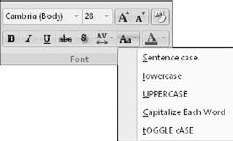
When you use the Change Case attribute, the text retains no memory of its previous capitalization state. For example, if you used the Capitalize Each Word option on the word "PowerPoint," it would convert to "Powerpoint." If you wanted to re-capitalize the middle P, then you would have to manually retype it (or select only that P and choose Change Case
Tip
Most style guides dictate that you should capitalize all important words in titles, but not every word. For example, in the title "The Best of the Best," you do not capitalize the words "of" and "the." Unfortunately, the Capitalize Each Word option in Word cannot make that distinction for you, and so you must make those changes manually. However, Word's grammar checker does identify and fix these capitalization errors. If you have a long, text-heavy presentation, you might find it worthwhile to export the text to Word, perform a grammar check, and then re-import it.
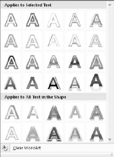
WordArt enables you to apply formatting features to text that would normally be used only with graphics, such as special fills, outlines, glows, reflections, and other special effects. It's pretty amazing stuff, as you'll see in the following sections, especially with the all-new effects that PowerPoint 2007 provides.
Up until PowerPoint 2007, WordArt has always been a rather compartmentalized specialty feature. However, in PowerPoint 2007, you can apply WordArt Styles to all text. There is no distinction between WordArt and regular text, and so you do not have to choose between cool special effects and including text in the outline and spell checks.
A WordArt Style is a preset combination of fill color, outline color, and text effects. WordArt Styles are built into PowerPoint — you can't customize them or add to them. However, you can apply one and then make changes to it.
Note
For more on text effects, see the section, "Applying WordArt Styles."
To apply a WordArt Style, follow these steps:
(Optional) To make the style apply to certain text, select that text.
On the Drawing Tools Format tab, in the WordArt Styles group, open the WordArt Styles gallery. Notice in figure 6.17 that there are two categories of styles. Some apply only to selected text, and others apply to the entire text box (object).
Hover the mouse pointer over the styles to preview them on the text on the slide.
Click the desired style to apply it. To remove a previous WordArt effect, click Clear Wordart.
If you choose a WordArt style that is supposed to apply only to the selected text, but you have not selected any text, then PowerPoint applies it to the word at the insertion point's location. The insertion point can be at the beginning of the word or anywhere within it, but not following the word. If the insertion point follows a word, PowerPoint tries to apply the style to text that is to the right of the word. If this is a blank space, the style applies to the blank space and the change is not apparent.
Warning
When you save a presentation in PowerPoint 97-2003 format, any text box that contains text with WordArt formatting applied is converted to a graphic that you cannot edit. If you need to edit the text in PowerPoint 2003 or earlier, make sure that you remove the WordArt effects before saving in that format.
The text effects that you apply using the Text Effects button in the WordArt Styles group — Shadow, Reflection, Glow, Bevel, 3-D Rotation, and Transform — are similar to regular attributes such as bold, italic, and underline, in that they apply modifiers to the basic text to produce some special appearance. However, this chapter looks at these effects separately because they are part of the new WordArt functionality in Office 2007, and apply only to text in PowerPoint 2007 presentations (as opposed to legacy presentations).
Note
When working with text for backward-compatible presentations, stick with the effects that you can access from the Font group.
All of these effects, except for Transform, are also available for formatting graphics objects such as drawn shapes, SmartArt, and charts.
Note
To customize and fine-tune each of these effects, see Chapter 10.
There are two ways of applying a shadow — one is available in all cases and the other is available only with PowerPoint 2007 presentations. The Shadow button in the Font group applies a default shadow to any text, and you can use it even in a backward-compatible presentation. Its shadow appears slightly below and to the right of the text, and the shadow color is automatically based on the background color.
For more flexibility, in the WordArt Styles group, click Text Effects and then select Shadow to open a gallery of shadow presets. These presets are divided into categories, including Outer (the default type), Inner, and Perspective, as shown in figure 6.18. You can scroll down in the gallery to access more presets.
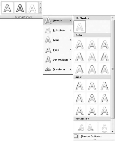
You can also customize the shadow by choosing Shadow Options, which opens the Format Text Effects dialog box. You can then fine-tune the shadow by changing its color, transparency, size, and so on.
Note
Chapter 10 looks at each of the shadow settings in detail.
Warning
The WordArt gallery and its effects are not available when working in Compatibility mode (that is, on a PowerPoint 97-2003 format presentation).
Reflection creates a partial mirror image of the text beneath the original, making it appear as if it were looking into a reflecting pool. figure 6.19 illustrates the effect.
Choose a reflection preset from the Reflection submenu of the Text Effects menu, as shown in figure 6.19. There are no custom options that you can set for text reflection; you're limited to the presets that are provided. To remove the reflection effect, choose No Reflection from the top of the gallery menu.

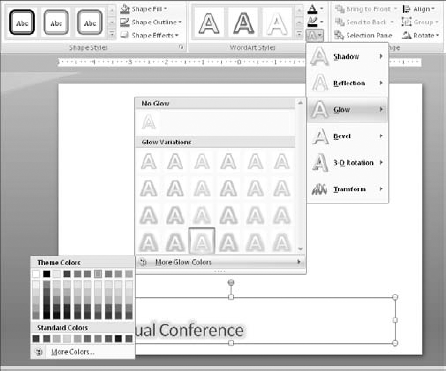
Glow appears as a soft halo effect around the text. You can choose from four levels of thickness for the glow, as well as any glow color. figure 6.20 shows a glow effect. Notice that when you apply a glow to text that has a reflection, the glow also applies to the reflection.

You can choose a glow preset from the Glow submenu of the Text Effects menu. You must first select the level that you want by clicking one of the presets in the gallery. Then, if you cannot find the desired color, you can reopen the submenu and choose More Glow Colors. You can then click the color that you want from the color picker, as shown in figure 6.21. To remove the glow, choose No Glow from the top of the gallery menu.
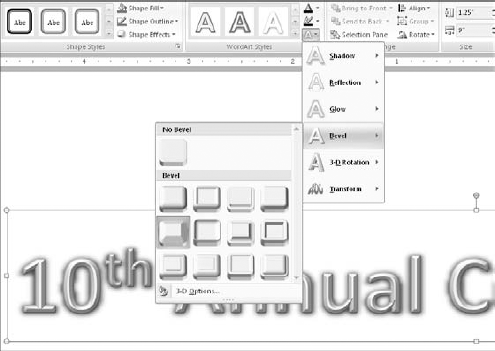
A bevel is a slanting, curving, or rounding off of the edges of an object. It is not a very obvious effect when applied to most text, and so it's mostly for larger, drawn objects and pieces of charts and diagrams. However, on large, thick letters in light colors, beveling is sometimes useful to create a raised or textured effect. For example, in figure 6.22, a bevel effect adds a raised appearance to the letters.
Note
Bevel effects are not easily visible at the default zoom in Normal view. To really see the bevel effect, zoom in on the letters to at least 300 percent.
Choose a bevel preset from the Bevel submenu of the Text Effects menu, as shown in figure 6.22.
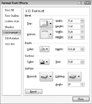
Beveling is a subset of a larger category of formatting known as 3-D Format. With 3-D Format, you can apply not only bevels to the edges, but also depth, contours, and surface effects. 3-D Format effects are not as effective with text as with other types of objects because text is relatively small and thin, and the effects are not readily visible.
Note
For more on depth, contours, and surface effects, see Chapter 10.
To access the advanced options, choose More 3-D Settings from the gallery menu. The Format WordArt dialog box opens with the 3-D Format settings displayed, as shown in figure 6.23. From here you can adjust the width and height of the top and bottom bevel effect (in points), and you can also experiment with the colors and sizes of the depth and contour settings, as well as the 3-D lighting and surface effects.
Tip
The Contour section governs the outline that appears around the text when you apply beveling. If you do not want the beveled text to have an outline, set the Size to 0 points in the Contours section, as shown in figure 6.23.
The Depth setting in the Format WordArt dialog box controls the length of the 3-D effect that is applied to the text. It doesn't do anything until you apply a Rotation setting, which is covered in the next section. However, when you rotate the text, it shows "sides" according to its depth setting. For example, in figure 6.24, the text has a five-degree X rotation and a depth of 60 points.

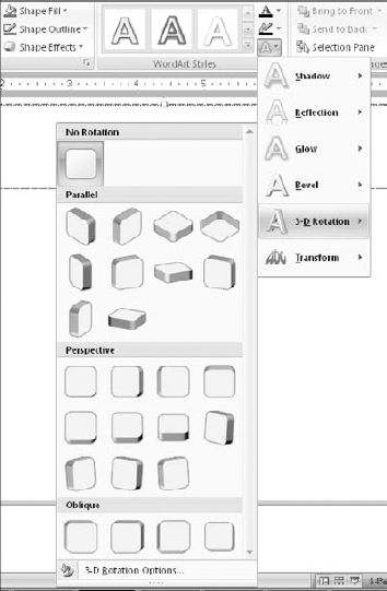
The 3-D Rotation effect slants, tilts, or otherwise manipulates the text so that it looks as if it is being viewed at an angle. Earlier versions of PowerPoint had a very basic 3-D effect that kept the faces of the characters forward but added some perspective slant to the "sides" of the text. However, in PowerPoint 2007, you can actually slant and tilt the letters themselves, as shown in figure 6.25.

There are four factors that make up a 3-D rotation setting:
X: left-to-right rotation
Y: Top-to-bottom rotation
Z: Rotation around a center point
Perspective: The height at which you are viewing (above or below)
The 3-D rotation presets combine these factors to create commonly used effects. Select a rotation preset from the 3-D Rotation submenu of the Text Effects menu, as shown in figure 6.26.
To adjust each of the four factors separately, choose More 3-D Settings from the bottom of the submenu and set the angles for each factor in the Format WordArt dialog box. By combining them with the 3-D Format settings in the Format WordArt dialog box, you can create almost any effect that you want.
Note
For more on the various rotation settings, see Chapter 10.
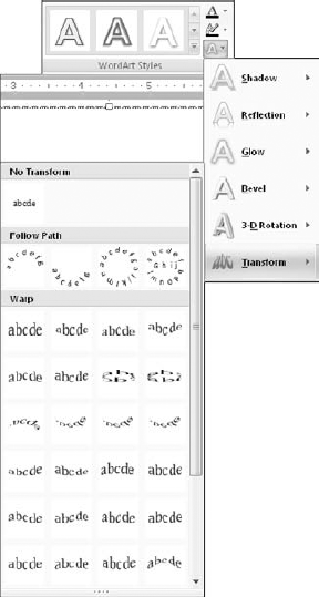
Transform settings are just for text and are not available for graphic objects such as drawn shapes. You can think of transformations — which were called WordArt Shapes in earlier versions of PowerPoint — as "molds" into which you squeeze text in order to change its shape. figure 6.27 shows some examples of various transformations that are not rotated. However, you can combine a transformation with 3-D rotation to create some even more unusual effects.
There are two categories of transformation: Follow Path and Warp. Follow Path is the "traditional" type of WordArt transformation, squeezing the text into various shapes. Follow Path does not reshape the text itself, but makes the characters hug a curved path. The bottom-right example in figure 6.27 is a Follow Path effect; the others are Warp effects.

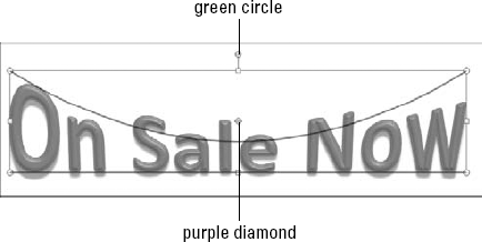
To apply a transformation effect, select it from the Transform submenu of the Text Effects menu, as shown in figure 6.28. To remove a transformation effect, choose No Transform.
After applying a transformation, you might be able to modify its shape somewhat, depending on the transformation that you have chosen. Once you select the WordArt, look for a purple diamond in the WordArt text. You can drag this diamond to reshape the effect, making it more or less dramatic. You can drag the purple diamond in the center of the WordArt to stretch or compress the center. Lines appear as you drag to show the new position.
Note
You can also rotate the WordArt by dragging the green circle at the top. This works just like rotating any other object and is covered in Chapter 10.
The Follow Path transformations are a bit different from the Warp transformations, and so it might not be obvious how to manipulate them. Here are some tips:
If the text seems to follow the path in a lopsided manner (especially common with short text phrases), set the text's horizontal alignment to Center. To do this, use the Center button in the Paragraph group on the Home tab.
Note
For more on text alignment, see Chapter 7.
The third Follow Path transformation (Circle) makes text appear in a circle. Where it starts depends on the horizontal alignment setting for the text. You can set horizontal alignment using the buttons in the Paragraph group on the Home tab. If you set the text to be left-aligned, it starts at the left; if you center the text, the text bends around the right side as a center point. If you use right alignment, the text starts upside-down.
The fourth Follow Path transformation (Button) makes text appear above a center line, on a center line, and then below a center line. To indicate what text should appear where, press Enter to insert paragraph breaks between the text segments.
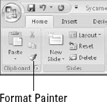
Once you have formatted text exactly the way you want it, you might want to copy it to other blocks of text. To do this, you can use the Format Painter tool. Format Painter picks up the formatting of any object (including text) and "paints" it onto other objects.
To use Format Painter, follow these steps:
Select the text or other object whose formatting you want to copy.
On the Home tab, click the Format Painter icon in the Clipboard group, as shown in figure 6.30. The mouse pointer changes to a paintbrush. If you want to copy the formatting onto more than one object or section of text, double-click the Format Painter icon instead of just clicking it.
Click the object, or drag across the text, to which you want to apply the formatting.
(Optional) If you double-clicked the Format Painter icon in step 2, Format Painter is still enabled; click additional objects to apply the formatting. Press Esc to cancel the Format Painter when you are finished.
Note
To clear the formatting from a block of text, click the Clear All Formatting button in the Font group on the Home tab.
In this chapter, you learned many techniques for formatting text. You learned how to apply different fonts, sizes, colors, and attributes, and how to bend and shape text with 3-D effects and WordArt transformations. In the next chapter, we'll continue to look at text formatting, focusing on paragraph-wide effects such as bulleted and numbered lists, indentation, and alignment.