Wow! What a great presentation! That's what you want your audience to come away thinking, right?
Most people won't be nit-picky enough to pinpoint exactly what they loved about the experience. Nobody is likely to say "Weren't the colors in that pie chart on slide 43 artfully chosen?" or "Did you see his tie? I wonder where I can buy one just like it." Instead, you'll leave your audience with an overall impression that they gather from a host of little details, from the color scheme on your slides to the anecdotes and jokes you tell.
You can turn off your computer for this chapter, because you won't need it to follow along. In this chapter, I'll present some strategies for planning the best presentation ever. I'll provide an 11-point action plan for building your presentation file, and address some of the "soft" topics that can make or break a show, such as how to arrange a room, what to wear, where to stand, and more.
What separates an effective presentation from an ineffective one? No, it's not just a gut feeling; there are proven attributes for which you can strive. The rest of this chapter elaborates on these points, but here's a quick overview of what to work on.
Is designed and formatted appropriately for the audience and the medium.
Is tightly focused on its subject, with extraneous facts trimmed away or hidden for backup use.
Uses the right PowerPoint theme, with colors and fonts chosen to reinforce the message of the presentation.
Includes the right amount of text on each slide, without overcrowding.
Uses artwork purposefully to convey information and create an overall visual impression
Uses charts rather than raw columns of numbers to present financial or numeric information.
Employs sound and video to create interest where needed, but does not allow the effects to dominate the show.
Uses animations and transitions if appropriate for the audience and message, but does not allow them to dominate.
Offers the audience handouts that contain the information they will want to take with them.
Leaves time at the end for a question-and-answer session so the audience members can clarify any points they were confused about.
Now that you know what the goal is, how do you get there? The following section outlines a precise, step-by-step action plan for developing a presentation that has these qualities.
Can you guess what the single biggest problem is when most people use PowerPoint? Here's a hint: It's not a problem with the software at all. It's that they don't think things through carefully before they create their presentation, and then they have to go back and make major modifications later. You've probably heard the saying, "If you don't have time to do it right, how are you going to find time to do it over?" This sentiment is certainly applicable to creating presentations.
In the following sections, I outline a strategy for creating the appropriate PowerPoint presentation right from the start. By considering the issues addressed here, you can avoid making false assumptions about your audience and their needs, and so avoid creating a beautiful presentation with some horrible flaw that makes it unusable. By spending a half-hour or so in this chapter, you can save yourself literally days in rework later.
Before you can think about the presentation you need to create, you must first think of your audience. As you probably already know from real-life experience, different audiences respond to different presentation types. For example, a sales pitch to a client requires a very different approach than an informational briefing to your coworkers. Ask yourself these questions:
How many people will be attending the presentation? The attendance makes a difference because the larger the group, the larger your screen needs to be so that everyone can see. If you don't have access to a large screen, you have to make the lettering and charts big and chunky so that everyone can read your presentation.
What is the average age of the attendees? Although it's difficult to generalize about people, it's especially important to keep your presentation light and entertaining when you're presenting to a very young audience (teens and children). Generally speaking, the older the audience, the more authoritative you need to be.
What role will the audience take in relation to the topic? If you are rolling out a new product or system, the managerial staff will likely want a general overview of it, but the line workers who will actually be operating the product need a lot of details. Generally speaking, the higher the level of managers, the more removed they will be from the action, and the fewer details of operation they need.
How well does the audience already know the topic? If you are presenting to a group that knows nothing about your topic, you want to keep things basic and make sure that you define all of the unfamiliar terms. In contrast, with a group of experts, you are likely to have many follow-up questions after the main presentation, and so you should plan on having some hidden backup slides ready in anticipation of those questions. See Chapter 20 for more on hiding slides for backup use.
Does the audience care about the topic? If the topic is personally important to the attendees (such as information on their insurance benefits or vacation schedule), they will likely pay attention even if your presentation is plain and straightforward. However, if you must win them over, you need to spend more time on the bells and whistles.
Are the attendees prejudiced either positively or negatively toward the topic? Keeping in mind the audience's preconceived ideas can make the difference between success and failure in some presentations. For example, knowing that a client hates sales pitches can help you to tailor your own presentation to be out of the ordinary.
Are the attendees in a hurry? Do your attendees have all afternoon to listen to you, or do they need to get back to their regular jobs? Nothing is more frustrating than sitting through a leisurely presentation when you're watching precious minutes tick away. Know your audience's schedule and their preference for quick versus thorough coverage.
Next, think about what you want the outcome of the presentation to be. Although you might want more than one outcome, you should try to identify the primary one as your main goal. Some outcomes to consider include the following:
Audience feels good about the topic. Some presentations are strictly cheerleading sessions, designed to sway the audience's opinion. Don't discount this objective — it's a perfectly legitimate reason to make a presentation! For example, suppose a new management staff has taken over a factory. The new management team might want to reassure the workers that everything is going to be okay A feel-good, Welcome to the Team presentation, complete with gimmicks such as company T-shirts or hats, can go a long way in this regard.
Audience is informed. Sometimes you need to convey information to a group of people, and no decision is involved on their part. For example, suppose your company has switched insurance carriers and you want to let all of the employees know about their new benefits. An informational presentation can cover most of the common questions and save your human resources people a lot of time in answering the same questions over and over.
Audience members make individual decisions. This presentation is a kind of sales pitch in which you are pitching an idea or product to a group, but each person says yes or no individually. For example, suppose you are selling timeshare vacation condos. You may give a presentation to a group of 100 people in an attempt to sell your package to at least a few members of the group.
This presentation type can also have an informational flavor; you are informing people about their choices without pushing one choice or the other. For example, if your employees have a choice of health plans, you might present the pros and cons of each plan and then leave it to each employee to make a selection.
Audience makes a group decision. This is the kind of presentation that scares a lot of people. You face a group of people who will confer and make a single decision, based on the information you present. Most sales pitches fall into this category. For example, you might be explaining your product to a group of managers to try to get their company to buy it.
Think about these factors carefully and try to come up with a single statement that summarizes your audience and purpose. Here are some examples:
I am presenting to 100 factory workers to explain their new health insurance choices and teach them how to fill out the necessary forms.
I am presenting to a group of six to ten mid-level managers, trying to get them to decide as a group to buy my product.
I am presenting to a group of 20 professors to convince at least some of them to use my company's textbooks in their classes.
I am presenting to individual Internet users to explain how my company's service works.
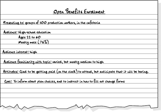
Let's take that first example. figure 2.1 shows some notes that a presenter might make when preparing to explain information about employee benefits enrollment to a group of factory workers. Jot down your own notes before moving to step 2.
You essentially have three ways to present your presentation to your audience, and you need to pick the way that you're going to use up front. These methods include speaker-led, self-running, and user-interactive. Within each of those three broad categories, you have some additional choices. Before you start creating the presentation in PowerPoint, you should know which method you are going to use because it makes a big difference in the text and other objects that you put on the slides.
The speaker-led presentation is the traditional type of presentation: you stand up in front of a live audience (or one connected through teleconferencing) and give a speech. The slides that you create in PowerPoint become your support materials. The primary message comes from you, and the slides and handouts are just helpers.
With this kind of presentation, your slides don't have to tell the whole story. Each slide can contain just a few main points, and you can flesh out each point in your discussion. In fact, this kind of presentation works best when your slides don't contain a lot of information, because people pay more attention to you, the speaker, if they're not trying to read at the same time. For example, instead of listing the top five reasons to switch to your service, you might have a slide that just reads: Why Switch? Five Reasons. The audience has to listen to you to find out what the reasons are.
This kind of presentation also requires some special planning. For example, do you want to send each audience member home with handouts? If so, you need to prepare them. They may or may not be identical to your PowerPoint slides; that's up to you. You also need to learn how to handle PowerPoint's presentation controls. It can be really embarrassing to be fiddling with the computer controls in the middle of a speech, and so you should practice, practice, practice ahead of time.
Note
Handouts and other support materials (such as cards for speaker notes) are covered in Chapter 19. For more on PowerPoint presentation controls, see Chapter 20.
With a self-running presentation, all of the rules change. Instead of using the slides as teasers or support materials, you must make the slides carry the entire show. All of the information must be right there, because you won't be looking over the audience's shoulders with helpful narration.
In general, self-running presentations are presented to individuals or very small groups. For example, you might set up a kiosk in a busy lobby or a booth at a trade show and have a brief but constantly running presentation of perhaps five slides that explains your product or service.
Because there is no dynamic human being keeping the audience's attention, self-running presentations must include attention-getting features. Sounds, video clips, interesting transitions, and prerecorded narratives are all good ways to attract viewers.
You must also consider the timing in a self-running presentation. Because there is no way for a viewer to tell the presentation, "Okay, I'm done reading this slide; bring on the next one," you must carefully plan how long each slide will remain on-screen. This kind of timing requires some practice!
Note
Part III explains how to use sounds, videos, and other moving objects in a presentation to add interest. Chapter 21 deals with timing issues that are associated with a self-running presentation, as well as how to record voice-over narration.
A user-interactive presentation is like a self-running presentation, except that the viewer has some input. Rather than standing passively by, the viewer can tell PowerPoint when to advance a slide. Depending on the presentation's setup, viewers may also be able to move around in the presentation (perhaps to skip over topics that do not interest them) and request more information. This type of presentation is typically addressed to a single user at a time, rather than a group, and is usually distributed over the Internet, a company intranet, or via CD.
The user runs the presentation using either PowerPoint or a free program called PowerPoint Viewer that you can provide for download. You can also translate a PowerPoint presentation to HTML format (the native format for World Wide Web pages), so that anyone with a Web browser can view it. However, presentations usually lose some of their features when you save them in Web format, so consider the decision carefully.
Note
Chapter 21 explains how to place action buttons on slides so that the viewer can control the action. Chapter 22 covers some of the issues involved in preparing a presentation for mass distribution.
Whereas the presentation method is the general conceptual way that the audience interacts with the information, the delivery method is the way that you deliver that interaction. It's a subtle but important difference. For example, suppose that you have decided to use a speaker-led presentation method. That's the big picture, but how will you deliver it? Will you present from a computer, or use 35mm slides, or overhead transparencies, or just plain old handouts? All of these methods fall under the big umbrella of "speaker-led."
PowerPoint gives you a lot of options for your delivery method. Some of these options are more appropriate for speaker-led shows, while others can be used for any presentation method. Here are some of the choices:
Computer show through PowerPoint. You can use PowerPoint's Slide Show view to play the slides on a computer screen. If necessary, you can also hook up a large, external monitor to the PC so that the audience can see it better. This setup requires that PowerPoint (or the PowerPoint Viewer utility) be installed on the computer at the presentation site. This method works for speaker-led, self-running, or user-interactive shows.
Computer show through a Web site. You can save your presentation in Web format and then publish it to a Web site. You can use this method for speaker-led, self-running, or user-interactive shows, and no special software is required—just a Web browser. However, you lose some of the cool graphical effects, including some transitions and animation effects. Web delivery is used mostly for self-running or user-interactive shows.
Computer show on CD. You can create a CD that contains both the presentation and the PowerPoint Viewer utility. The presentation starts automatically when the viewer inserts the CD into a PC. This method is most useful for self-running or user-interactive shows.
Overhead transparencies. You can create overhead transparencies, which are just clear sheets, on most printers. During your presentation, you place them on an overhead projector one at a time.
Warning
Be careful that the transparencies that you buy are designed for your printer! For example, inkjet transparencies will melt in a laser printer.
35mm slides. These are more expensive to create than transparencies, but the resolution is a bit higher and the image quality is better. Slides transport well in carousels, and you don't have to fumble with placing them manually on the projector. Of course, you lose all of the special effects, such as animations and sounds, just as you do with overheads.
Paper. If there is no projection media available, then your last resort is to distribute your slides to the audience on paper. If you give them handouts, these handouts should be a supplement to an on-screen show, and not the main show themselves.
Note
Chapter 19 covers printing, both on paper and on transparencies. See Chapter 21 for more on self-running presentations.
PowerPoint comes with so many themes and templates that you're sure to find one that is appropriate for your situation. A theme is a set of design settings: background, fonts, colors, and graphic effects. PowerPoint 2007 has many built-in themes that are available in every presentation, and you can also create your own themes and use themes that others have created and stored in theme files. A template is a full-fledged PowerPoint file that has been designated as a sample from which you can create new presentations. It contains everything that a presentation requires, including sample slides. A template can also contain multiple themes that are piggybacked onto slide masters within the template. When you start a new presentation, you do so from a template, and you inherit any themes and sample slides in that template, in addition to having the built-in themes available.
Tip
You aren't stuck with the color scheme or design that comes with a particular theme or template. As you learn in Chapter 5, you can apply different color, font, and effects themes separately from the overall theme.
What's the best theme to use? What are the best colors? It all depends on the situation, and on your presentation medium. Here are some tips.
Using an overhead projector is never anyone's first choice, but sometimes it may be all that is available. An overhead projector image is medium-sized (probably about 36"x36"), but often of poor quality. You will probably be fighting with room lighting, and so your slides may appear washed out. Here are some tips for preparing slides that you will be showing with overhead projectors:
Fonts: For headings, choose chunky block fonts, such as Arial Black, that can stand up to a certain amount of image distortion. For small type, choose clear, easy-to-read fonts such as Arial or Times New Roman.
Text color: Black letters on a light background stand out well. Avoid semi-dark lettering, such as medium-blue, because it easily washes out under an overhead projector's powerful light.
Background color: Avoid dark backgrounds. You probably will not position each slide perfectly on the overhead projector, and the white space around the edges is distracting if your transparencies have a dark background. Consider using a simple white background when you know that you're going to be using transparencies, and especially when you want to write on the transparencies.
Content: Keep it simple. Overheads are best when they are text-heavy, without a lot of fancy extras or clipart. The overhead projector is an old technology, and slides that are too dressy seem pretentious.
Here are some guidelines for formatting slides that are destined to be 35mm slides:
Fonts: You can use almost any readable font. If your audience will sit far away from the screen, stick with plain fonts such as Arial and Times New Roman for the body text.
Text color: Go for contrast. Try light text on a dark background. My personal favorite for 35mm slides is bright yellow text on a navy blue background.
Background color: Keep it dark — but not black. Light colors make the screen too bright. Dark blues, greens, and purples are all good choices. Stick with solid backgrounds to compensate for any image distortion that occurs on-screen. You should avoid patterned, shaded, or clip art backgrounds.
Content: You can use any combination of text and graphics with success, but it has to be static. Animations and transitions don't work with 35mm slides. For example, if you have a bulleted list, don't build the bulleted list one bullet at a time from slide to slide. It looks awkward.
If you are lucky enough to have access to a computer-based presentation system, you can show your slides on a PC monitor or TV screen. Some large meeting facilities even have projection TVs that let you project the image onto very large screens.
Here are some guidelines for formatting for this medium:
Fonts: The image on a computer screen is usually nice and sharp, and so you can use any font. However, you should first test your presentation on the computer from which you'll be presenting, as some fonts may look more jagged than others. If you are presenting to a large group on a small screen, make sure that you keep all of the lettering rather large. Also make sure that the font is available on the presentation computer; if it's not there, your text and bullets may not look the way you anticipated.
Text color: As with 35mm slides, go for contrast. Both dark text on a light background and light text on a dark background work well.
Background color: Dark backgrounds such as dark blue, green, or purple are a good choice if the room is not too dark. Light backgrounds can add ambient light to the room, which can sometimes be helpful. You are also free to use gradients, shading, patterns, pictures, and other special backgrounds because all of these elements display nicely on most monitors.
Content: You can go all out with your content. Not only can you include both text and graphics, but also animations, transitions, sounds, and videos.
Your slides should say to the audience, "I had you in mind when I created this," and, "Relax; I'm a professional, and I know what I'm doing." Good-looking, appropriate slides can give the audience a sense of security, and can lend authority to your message. On the other hand, poorly done or inconsistent slides can tell the audience, "I just slapped this thing together at the last minute," or, "I don't really know what I'm doing."
Only after you have made all of the decisions in steps 1 through 4 can you start developing your content in a real PowerPoint presentation. Now comes the work of writing the text for each slide, which most people prefer to do in Normal view. Type the text on the outline or on the text placeholder on the slide itself, and you're ready to roll.
Developing your content may include more than just typing text. For example, your content may include charts that you created in PowerPoint or imported from another program such as Excel, pictures, and other elements.
The term visual image refers to the overall impression that the audience gets from watching the presentation. You can create a polished, professional impression by making small tweaks to your presentation after you have decided on the content.
You can enhance the visual image by making minor adjustments to the slides design. For example, you can give a dark slide a warmer feel by using bright yellow instead of white for lettering. Repositioning a company logo and making it larger may make the headings look less lonely. You can use WordArt effects to dress up some text and make it look more graphical. A product picture is more attractive in a larger size or with a different-colored mat around it. All of these little touches take practice and experience.
Audiences like consistency. They like visual elements that they can rely on, such as a repeated company logo on every slide, accurate page numbering on handouts, and the title appearing in exactly the same spot on every slide. You can create a consistent visual image by enforcing these rules in your presentation development. It's easier than you might think, because PowerPoint provides a slide master specifically for images and text that should appear on each slide.
Note
You'll work with slide masters and learn more about the benefits of consistency in Chapter 5.
If you're creating a self-running presentation, multimedia effects are extremely important for developing audience interest. Flashy videos and soundtracks can make even the most boring topic fun to hear about, especially for young audiences. How about a trumpet announcing the arrival of your new product on the market, or a video of your CEO explaining the reasoning behind the recent merger?
Warning
Even if you are going to be speaking live, you still might want to incorporate some multimedia elements into your show. However, be careful not to let them outshine you or to appear gratuitous. Be aware of your audience (see step 1), and remember that older and higher-level managers want less flash and more substance.
All kinds of presentations can benefit from slide animations and transitions. Animations are simple movements of the objects on a slide. For example, you can make the bullet points on a list fly onto the page one at a time, and discuss each one on its own. When the next bullet flies in, the previous ones can turn a different color so that the current one stands out. You might also animate a picture of a car so that it appears to "drive onto" the slide, accompanied by the sound of an engine revving. You can also animate charts by making data series appear one at a time, so that it looks like the chart is building. Transitions are animated effects for moving from slide to slide. The most basic and boring transition is to simply remove one slide from the screen and replace it with another. However, you can also use many alternative effects such as zooming the new slide in, sliding it from the top, bottom, left, or right, or creating a fade-in transition effect.
Note
Chapters 16 and 17 deal with the mechanics of placing sound and video clips into a presentation and controlling when and how they play. You learn about animations and transitions in Chapter 18.
This step is applicable only to speaker-led presentations. With a live audience, you may want to provide handouts so that they can follow along. You can make handouts verbatim copies of your slides, or abbreviated versions with only the most basic information included as a memory-jogger. Handouts can be either black and white or in color, and PowerPoint provides several handout formats. For example, you can print from one to nine slides per printout, with or without lines for the audience to write additional notes.
Tip
A continual debate rages in the professional speakers' community over when to give out handouts. Some people feel that if you distribute handouts beforehand, people will read them and then not listen to the presentation. Others feel that if you distribute handouts after the presentation, people will frantically try to take their own notes during the presentation or will not follow the ideas as easily. There's no real right or wrong answer, it seems, and so you should distribute them whenever it makes the most sense for your situation.
As the speaker, you may need your own special set of handouts with your own notes that the audience should not see. PowerPoint calls these Notes Pages, and there is a special view for creating them. (You can also enter notes directly into the Notes pane in Normal view.)
Note
Notes are covered, along with handouts, in Chapter 19, which also guides you through selecting the appropriate size and format, as well as working with your printer to get he best results for your handouts.
No matter which type of presentation you are creating (speaker-led, self-running, or user-interactive), you need to rehearse it. However, the goals for rehearsing are different for each type.
When you rehearse a live presentation, you check the presentation slides to ensure that they are complete, accurate, and in the right order. You may need to rearrange them and hide some of them for backup-only use.
You should also rehearse using PowerPoint's presentation controls, which display each slide on a monitor and let you move from slide to slide, take notes, assign action items, and even draw directly on a slide. Make sure that you know how to back up, how to jump to the beginning or end, and how to display one of your backup slides.
Note
You can learn about navigation skills in Chapter 20.
With a speaker-led presentation, the presenter can fix any glitches that pop up, or explain away any errors. With a self-running presentation, you don't have that luxury The presentation itself is your emissary Therefore, you must go over it repeatedly, checking it many times to make sure that it is perfect before distributing it. Nothing is worse than a self-running presentation that doesn't run, or one that contains an embarrassing error.
The most important feature in a self-running presentation is timing. You must make the presentation pause for the correct amount of time so that the audience can read the text on each slide. The pause must be long enough so that even slow readers can catch it all, but short enough so that fast readers do not become bored. You can now see how difficult this can be to make perfect.
PowerPoint has a Rehearse Timings feature that is designed to help you with this task. It lets you show the slides and advance them manually after the correct amount of time has passed. The Rehearse Timings feature records how much time you spend on each slide, and gives you a report so that you can modify the timing if necessary. For example, you may be working on a presentation that is supposed to last ten minutes, but with your timings, it comes out to only nine minutes. You can add additional time for each slide to stretch it out to last the full ten minutes. You may also want to record voice-over narration for your presentation. You can also rehearse this, to make sure that the voice matches the slide that it is supposed to describe (which is absolutely crucial, as you can imagine!).
Note
Chapter 16 covers timing as well as voice-overs.
In a user-interactive presentation, you provide the readers with on-screen buttons that they can click to move through the presentation, so that timing is not an issue. The crucial factor with a user-interactive presentation is link accuracy. Each button on each slide is a link. When your readers click a button for the next slide, it must take them to the next slide and not to somewhere else. And if you include a hyperlink to a Web address on the Internet, when the readers click it, the Web browser should open and that page should appear. If the hyperlink contains a typo and the readers see File Not Found instead of the Web page, the error reflects poorly on you. Chapter 21 covers creating and inserting these links.
If you are planning to distribute your presentation through the Internet, you have a big decision to make. You can distribute the presentation in its native PowerPoint format and preserve all of its more exciting features, such as animations and videos. However, not everyone on the Internet owns a copy of PowerPoint, and so you are limiting your audience. Although PowerPoint supplies a free program, called the PowerPoint Viewer that you can post for downloading on your Web page, not everyone will take the time to download and install it, and so you may turn off potential viewers before you start.
The other option is to save the presentation in HTML (Web) format. When you save in HTML format, you convert each of the slides to a Web page, and you add links (if you didn't already have them) that move the viewer from slide to slide. You lose many of the animations, transitions, sounds, videos, animated graphics, and other extras, but you retain your text and most static elements of the presentation. The advantage is that everyone with a Web browser can view your presentation with no special downloads or setup.
Note
You learn more about preparing a presentation for the Internet, using either method, in Chapter 21.
For a user-interactive or self-running presentation, giving the presentation is somewhat anticlimactic. You just make it available and the users watch it. Yawn.
However, for a speaker-led presentation, giving the speech is the highlight, the pinnacle, of the process. If you've done a good job rehearsing, you are already familiar with PowerPoint's presentation controls. You should be prepared to back up, to skip ahead, to answer questions by displaying hidden slides, or to pause the whole thing (and black out the screen) so that you can hold a tangential discussion.
Note
Chapter 20 covers all of these situations in case you need to review them.
What remains now? Nothing, except for setting up the room and overcoming your stage fright. Later in this chapter, you'll get some tips about using a meeting room most effectively and being a dynamic speaker. Check them out — and then go get 'em!
If giving a presentation is a one-time thing for you — great. It's over, and you never have to think about it again. However, it is more likely that you will have to give another presentation someday, somewhere, and so you shouldn't drive the experience out of your mind just yet. Perhaps you learned something that might be useful to you later. Immediately after the presentation, while it is still fresh in your mind, jot down your responses to the following questions. Then keep them on file to refer to later, the next time you have to do a presentation!
Did the colors and design of the slides seem appropriate?
Could everyone in the audience read the slides easily?
Did the audience look mostly at you, at the screen, or at the handouts? Was that what you intended?
Did the audience take notes as you were speaking? If so, did you give them handouts with note-taking lines to write on?
Was the length of the presentation appropriate? Did the audience become bored or restless at any point?
Were there any slides that you wished you had prepared but didn't?
Were there any slides that you would omit if you were doing it over?
Did your speaker notes give you enough help that you could speak with authority?
Did the transitions and animations add to the entertainment value, or were they distracting or corny?
Did the sound and video clips play with adequate quality? Were they appropriate and useful?
Are you giving a live presentation? The choice of room — and its arrangement — can make a big difference in your success. If you have any say in it, make sure that you get an appropriate size of room for the presentation. For example, a room that is too small makes people feel uncomfortable and seems crowded, whereas a room that is too large can create a false formality and distance that can cause people to lose focus. You also don't want to have to shout to be heard.
Warning
To avoid having to shout during your presentation, make sure that there is a working sound system, with a microphone and amplifier available, if necessary. If possible, check this detail a few days ahead of time, to avoid scrambling for one at the last minute.
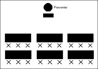
Next, make sure that tables and chairs are set up appropriately. figures 2.2 through 2.5 illustrate several setups, each of which is appropriate for a certain kind of presentation:
For a classroom setting where the audience will take a lot of notes, give them something to write on, as in figure 2.2. This arrangement works well when the audience will be listening to and interacting with you, but not with one another.
If the audience is not expected to take notes while you are giving the speech, consider an auditorium setup, as in figure 2.3. This arrangement is also good for fitting a lot of people into a small room. (This is also known as theater-style seating.)
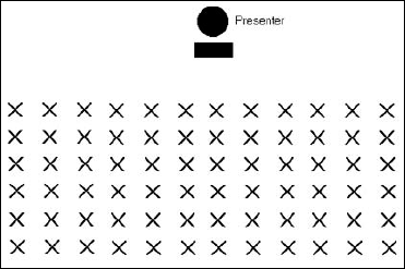
Figure 2.3. An auditorium setup (or theater-style seating) fits a lot of people into a small space; it's great for large company meetings.
If you want the audience to interact in small groups, you should set up groups where people can see each other and still see you. figure 2.4 shows a small-group arrangement.

Figure 2.4. Having small groups clustered around tables encourages discussion and works well for presentations that incorporate hands-on activities.
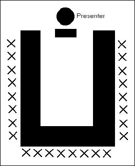
To make it easier for the entire group to interact with one another as a whole, use a U-shape, as in figure 2.5.
The outfit that you choose for the presentation should depend on the expectations of the audience and the message that you want to send to them. Before you decide what to wear, ask yourself, "What will the audience be wearing?" Choose one of these classifications:
Very informal: Jeans, shorts, T-shirts
Informal: Nice jeans, polo shirts
Business casual: Dress slacks and oxfords, with or without a tie, for men; dress slacks or a skirt and a dressy, casual shirt (sweater, silk blouse, vest) for women
Business: Dress slacks and a shirt and tie, with or without a jacket, for men; dress or skirt (blazer optional) for women
Business formal: Suit and tie for men; suit or conservative dress for women
Now, shape your own choice of attire, depending on the impression that you want to convey. To convey authority, dress one level above your audience. Use this attire any time your audience does not know who you are and when you need to establish yourself as the leader or the expert. (Most teachers fall into this category.) For example, if your audience is dressed informally you should wear a dress shirt and tie (for men) or a skirt and sweater (for women). (If you're female and will be seated on a stage, you might want pants or a very long skirt.) However, you should not dress more than two levels above your audience because it makes them feel intimidated. For example, if you are presenting to factory workers who are dressed in very informal clothing, you should not wear a business suit.
To convey teamwork and approachability dress at the same level as the audience, or slightly (no more than one level) above. For example, if you are a CEO visiting a factory that you manage, the workers already recognize your authority — you don't have to prove it. Instead, you want to appear approachable, and so if they are wearing informal clothing, you might wear dress slacks and a dress shirt (but no tie) for a man, or slacks and a sweater for a woman.
Avoid dressing below the audience's level. This is almost never a good idea. If you do not know what the audience will be wearing, err on the side of formality. It is better to look a little stiff than it is to look less professional than your audience.
There are no miracle cures here — some people are naturally better, more interesting speakers than others. However, there are definite steps that all speakers can take to stack the odds in their favor when it comes to giving a successful live presentation.
Here are some strategies for improving your speaking style:
Plant your feet firmly; don't pace. Pacing makes you appear nervous, and people have to constantly follow you with their eyes. However, you should keep your upper body mobile, and should not be afraid to use arm gestures.
Use gestures to support your voice. If you are talking about three different points, then hold up fingers to illustrate one, two, and three points. If you are talking about bringing things together, bring your hands together in front of you to illustrate. Don't freeze your hands at your sides.
Don't memorize your speech. If someone asks a question, it will throw you off and you'll forget where you were.
Conversely, don't read the speech word for word from your notes. Notes should contain keywords and facts, but not the actual words that you will say.
Don't talk with your face in your notes. Make eye contact with an audience member before you begin speaking.
Pick a few people in the audience, in different places in the room, and make direct eye contact with each of them, in turn, as you speak. Talk directly to a single person for the duration of the point that you are making and then move on. Also, don't forget to smile!
Don't be afraid to pause. Speaking slowly, with pauses to look at your notes, is much more preferable than rushing through the presentation. Keep in mind that pauses that might seem very long to you really aren't.
Don't stare at or read your slides. Focus your attention on your audience, and pay as little attention to the support materials as possible while you speak. You want to engage directly with your audience to deliver your message in your own words.
Emphasize verbs and action words in your presentation. Remember that the verb is the most powerful element in the sentence.
Consider these content techniques:
If the audience is not in a hurry and you are not rushed for time in your presentation, start with some kind of icebreaker, like an anecdote or joke.
Warning
Be careful with humor. Analyze the joke that you plan to tell from all angles, making very sure that it does not offend any race, ethnic group, gender, sexual orientation, or class of workers. It is much worse to tell a joke that hurts someone's feelings — even one person — than it is to tell squf at all.
Include the audience in interactive exercises that help to firm up their understanding of the topic.
Ask questions to see whether the audience understood you, and give out small prizes to the people who give correct answers. Nothing energizes an audience into participation more than prizes, even if they are cheap giveaways like key chains and bandannas.
If possible, split the presentation into two or more sessions, with a short break and question-and-answer period between each session.
During the Q&A portion, turn off the slide projector, overhead, or computer screen so that people focus on you and on the question, not on the previous slide. If turning off the equipment isn't practical, consider inserting a simple Q&A Session title slide or a blank slide that displays during the Q&A.
Even if you're comfortable with the PowerPoint slides that you've created, you still might be a little nervous about the actual speech that you're going to give. This is normal. In fact, a study from a few years ago showed that public speaking is the number-one fear among businesspeople. Fear of death came in second. That should tell you something.
It's okay to be a little bit nervous because it gives you extra energy and an edge that can actually make your presentation better. However, if you're too nervous, it can make you seem less credible.
One way to overcome stage fright is to stop focusing on yourself, and instead focus on your audience. Ask yourself what the audience needs and how you are going to supply that need. Become their caretaker. Dedicate yourself to making the audience understand you. The more you think of others, the less you think of yourself.
Although this chapter had little to do with PowerPoint per se, it focused on making successful presentations using your PowerPoint slides as a tool. The information that you learned here can help a beginning presenter look more experienced, or help a more experienced presenter polish his or her skills to perfection.