Many times when you include a chart in PowerPoint, this chart already exists in some other application. For example, you might have an Excel workbook that contains some charts that you want to use in PowerPoint. If this is the case, you can simply copy-and-paste them into PowerPoint, or link or embed them, as you will learn in Chapter 15.
However, when you need to create a quick chart that has no external source, PowerPoint's charting tool is perfect for this purpose. The new PowerPoint 2007 charting interface is based upon the one in Excel, and so you don't have to leave PowerPoint to create, modify, and format professional-looking charts.
Note
What's the difference between a chart and a graph? Some purists will tell you that a chart is either a table or a pie chart, whereas a graph isa chart that plots data points on two axes, such as a bar chart. However, Microsoft doesnot make this distinction, and neither do I in this book. I use the term "chart" in this book for either kind
PowerPoint 2007's charting feature is based upon the same Escher 2.0 graphics engine as is used for drawn objects. Consequently, most of what you have learned about formatting objects in earlier chapters (especially Chapter 10) also applies to charts. For example, you can apply shape styles to the individual elements of a chart, and apply WordArt styles to chart text. However, there are also many chart-specific formatting and layout options, as you will see throughout this chapter.
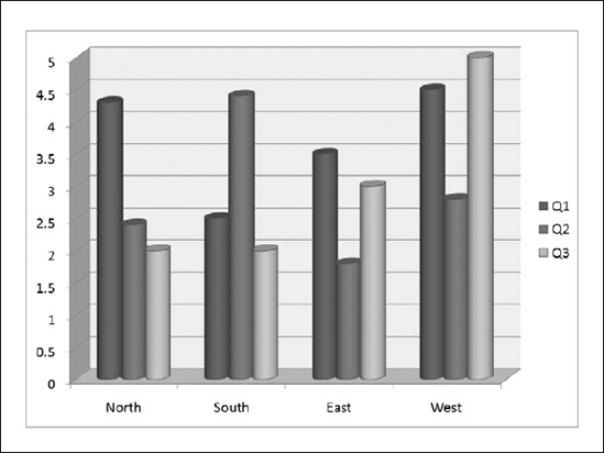
The sample chart shown in figure 14.1 contains these elements:
Data series: Each different bar color represents a different series: Q1, Q2, and Q3.
Legend: Colored squares in the Legend box describe the correlation of each color to a data series.
Categories: The North, South, East, and West labels along the bottom of the chart are the categories.
Category axis: The horizontal line running across the bottom of the chart is the category axis, also called the horizontal axis.
Value axis: The vertical line running up the left side of the chart, with the numbers on it, is the value axis, also called the vertical axis.
Data points: Each individual bar is a data point. The numeric value for that data point corresponds to the height of the bar, measured against the value axis.
Walls: The walls are the areas behind the data points. On a 3D chart, as shown in figure 14.1, there are both back and side walls. On a 2D chart, there is only a back wall.
Floor: The floor is the area on which the data points sit. A floor appears only in a 3D chart.

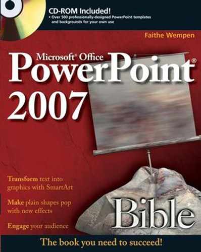
When you are working with a chart in PowerPoint 2007 format, you have access to three Chart Tools tabs — Design, Layout, and Format — and also to a separate Excel window for entering and editing your data. Because the PowerPoint 2007 charting engine uses Excel as its basis, there is no longer a big advantage to creating charts in Excel and then copying them over to PowerPoint. figure 14.2 shows the PowerPoint 2007 charting interface, along with the Layout tab.
If you later save the file as a PowerPoint 97-2003 presentation, it does not take away your ability to access the PowerPoint 2007 charting interface when working in PowerPoint 2007. The chart is still saved as a PowerPoint 2007 object in the 2003 file, but it also contains a 2003 version of itself, for backward compatibility. When you open the presentation in PowerPoint 2003, it initially looks like a PowerPoint 2007 style chart, but if you double-click it to edit it (or enter editing mode for it in some other way), it switches to a 97-to-2003-style chart and loses its 2007-style appearance.
If you want to make sure that the chart appears exactly as you created it in PowerPoint 2003, even if it is edited there, then you should insert the chart initially using Microsoft Graph, rather than the PowerPoint 2007 charting tools. To do this, insert a Microsoft Graph object by following these steps:
On the Insert tab, click Object. The Object dialog box opens.
Click Create New.
On the Object Type list, click Microsoft Graph Chart.
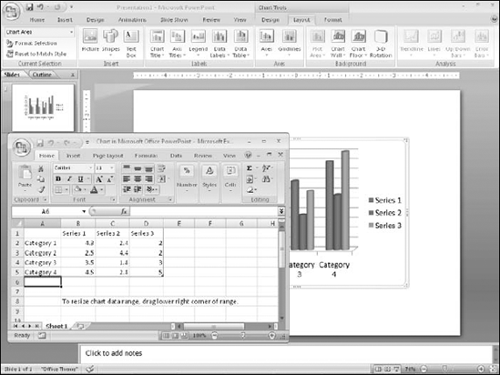
Click OK. The Microsoft Graph window opens within PowerPoint, complete with a 2003-style menu bar from which you can access all of the same controls that were available in PowerPoint 2003s charting interface. The Microsoft Graph window is shown in figure 14.3.

Tip
When you double-click to edit a Microsoft Graph chart within a PowerPoint 2007 presentation file, a message appears asking whether you want to Convert, Convert All, or Edit Existing. If you choose to convert (this chart or all charts) to 2007 format, you can use the new charting tools. If you choose Edit Exiting, MS Graph opens.
The main difficulty with creating a chart in a non-spreadsheet application such as PowerPoint is that there is no data table from which to pull the numbers. Therefore, PowerPoint creates charts using data that you have entered in an Excel window. By default, itcontains sample data, which you can replace with your own data.
You can place a new chart on a slide in two ways: you can either use a chart placeholder from a layout, or you can place one manually.
If you are using a placeholder, click the Insert Chart icon. If you are placing a chart manually follow these steps:
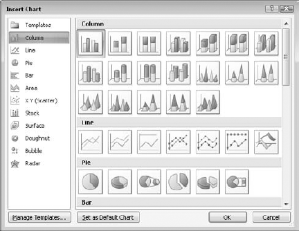
On the Insert tab, click Chart. The Insert Chart dialog box opens, as shown in figure 14.4.
Click the desired chart type. See Table 14.1 for an explanation of the chart types. figures 14.5 and 14.6 show examples of some of the chart types.
Click OK. The chart appears on the slide, and an Excel datasheet opens with sample data.
Modify the sample data as needed. To change the range of cells that appear in the chart, see the section "Redefining the Data Range," later in this chapter. If you want, you can then close the Excel window to move it out of the way.
Note
After you have closed the Excel window, you can open it again by clicking Edit Data on the Chart Tools Design tab.
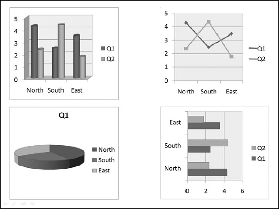

Table 14.1. Chart Types in PowerPoint 2007's Charting Tool
Type | Description |
|---|---|
Column | Vertical bars, optionally with multiple data series. Bars can be clustered, stacked, or based on a percentage, and either 2-D or 3-D. |
Line | Shows values as points, and connects the points with a line. Different series use different colors and/or line styles. |
Pie | A circle broken into wedges to show how parts contribute to a whole. This de-emphasizes the actual numeric values. In most cases, this type is a single-series only. |
Bar | Just like a column chart, but horizontal. |
Area | Just like a column chart, but with the spaces filled in between the bars. |
Shows values as points on both axes, but does not connect them with a line. However, you can add trend lines. | |
Stock | A special type of chart that is used to show stock prices. |
Surface | A 3-D sheet that is used to illustrate the highest and lowest points of the data set. |
Doughnut | Similar to a pie chart, but with multiple concentric rings, so that multiple series can be illustrated. |
Bubble | Similar to a scatter chart, but instead of fixed-size data points, bubbles of varying sizes are used to represent a third data variable. |
Radar | Shows changes of data frequency in relation to a center point. |
Note
At any point, you can return to your PowerPoint presentation by clicking anywhere outside of the chart on the slide. To edit the chart again, you can click the chart to redisplay the chart-specific tabs.
Tip
If you delete a column or row by selecting individual cells and pressing Delete to clear them, the empty space that these cells occupied remains in the chart. To completely remove a row or column from the data range, select the row or column by clicking its header (letter for column; number for row) and click Delete on the Home tab in Excel.
After you create a chart, you might want to change the data range on which it is based, or how this data is plotted. The following sections explain how you can do this.
By default, the columns of the datasheet form the data series. However, if you want, you can switch the data around so that the rows form the series. figures 14.7 and 14.8 show the same chart plotted both ways so that you can see the difference.
Note
What does the term data series mean? Take a look at figures 14.7 and 14.8. Notice that there is a legend next to each chart that shows what each color (or shade of gray) represents. Each of these colors, and the label associated with it, is a series. The other variable (the one that is not the series) is plotted on the chart's horizontal axis.
To switch back and forth between plotting by rows and by columns, click the Switch Row/Column button on the Chart Tools Design tab.
Tip
A chart can carry a very different message when you arrange it by rows versus by columns. For example, in figure 14.7, the chart compares the quarters. The message here is about improvement — or lack thereof—over time. Contrast this to figure 14.8, where the series are the regions. Here, you can compare one region to another. The overriding message here is about competition—which division performed the best in each quarter? It's easy to see how the same data can convey very different messages; make sure that you pick the arrangement that tells the story that you want to tell in your presentation.

After you have created your chart, you may decide that you need to use more or less data. Perhaps you want to exclude a month or quarter of data, or to add another region or salesperson. To add or remove a data series, you can simply edit the datasheet. To do so, follow these steps:
On the Chart Tools Design tab, click Edit Data. The Excel datasheet appears. A blue outline appears around the range that is to be plotted.
(Optional) To change the data range to be plotted, drag the bottom-right corner of the blue outline. For example, in figure 14.9, the West division is being excluded.
You can also enlarge the data range by expanding the blue outline. For example, you could enter another series in column E in figure 14.9 and then extend the outline to encompass column E.

Figure 14.9. You can redefine the range for the chart by dragging the blue outline on the datasheet.
The preceding steps work well if the range that you want to include is contiguous, but what if you wanted to exclude a row or column that is in the middle of the range? To define the range more precisely follow these steps:
On the Chart Tools Design tab, click Select Data. The Select Data Source dialog box opens, along with the Excel datasheet, as shown in figure 14.10.
Do any of the following:
To remove a series, select it from the Legend Entries (Series) list and click Remove.
To add a series, click Add, and then drag across the range on the datasheet to enter it into the Edit Series dialog box; then click OK to accept it.
To edit a series, select it in the Legend Entries (Series) list and click Edit. Then drag across the range or make a change in the Edit Series dialog box, and click OK.
(Optional) To redefine the range from which to pull the horizontal axis labels, click the Edit button in the Horizontal (Category) Axis Labels section. A dotted outline appears around the current range; drag to redefine that range and click OK.
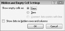
(Optional) To redefine how empty or hidden cells should be treated, click the Hidden and Empty Cells button. In the Hidden and Empty Cell Settings dialog box that appears, choose whether to show data in hidden rows and columns, and whether to define empty cells as gaps in the chart or as zero values. Then click OK. The Hidden and Empty Cells Settings dialog box is shown in figure 14.11.
When you are finished editing the settings for the data ranges, click OK to close the Select Data Source dialog box.
(Optional) Close the Excel datasheet window, or leave it open for later reference.

The default chart is a column chart. However, there are a lot of alternative chart types to choose from. Not all of them will be appropriate for your data, of course, but you may be surprised at the different spin on the message that a different chart type presents.
Warning
Many chart types come in both 2-D and 3-D models, and you can choose which chart type looks most appropriate for your presentation. However, try to be consistent. For example, it looks nicer to stay with all 2-D or all 3-D charts rather than mixing the types in a presentation.
You can revisit your choice of chart type at any time by following these steps:
Select the chart, if needed, so that the Chart Tools Design tab becomes available.
On the Design tab, click Change Chart Type.
Select the desired type, just as you did when you originally created the chart. figure 14.4 shows the chart types.
Click OK.
This is the basic procedure for the overall chart type selection, but there are also many options for fine-tuning the layout. The following sections explain these options.
Tip
To change the default chart type, after selecting a chart from the Change Chart Type dialog box, click the Set as Default Chart button.
PowerPoint provides a limited number of preset chart layouts for each chart type. You can choose these presets from the Chart Layouts group in the Chart Tools Design tab. They are good starting points for creating your own layouts, which you will learn about in this chapter.
To choose a layout, click the down arrow in the Chart Layouts group and select one from the gallery, as shown in figure 14.12. Although you cannot add your own layouts to these presets, you can create chart templates, which are basically the same thing with additional formatting settings. This chapter also covers chart template creation.

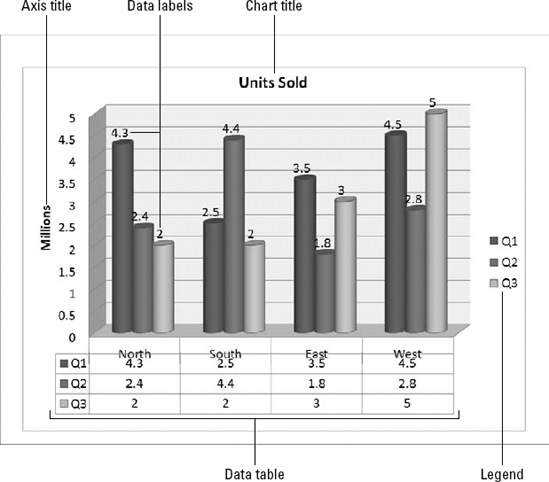
On the Chart Tools Layout tab, the Labels group provides buttons for controlling which labels appear on the chart. figure 14.13 points out the various labels that you can use.
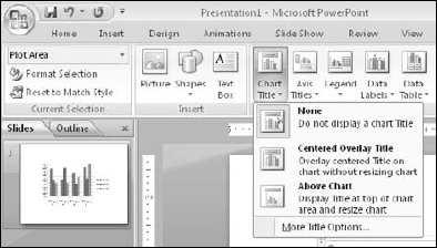
Each of these label types has a button on the Layout tab that opens a drop-down list that contains some presets. The drop-down list also contains a "More" command for opening a dialog box that contains additional options. For example, the drop-down list for the Chart Title button contains a "More Title Options" command, as shown in figure 14.14.
Tip
New in PowerPoint 2007, you can add data labels by right-clicking a series and choosing Add Data Labels. You can also format label text from the mini bar, which may be easier than using the Home tab's controls.
You can format the label text, just as you can format any other text. To do this, select the text and then use the Font group on the Home tab. This allows you to choose a font, size, color, alignment, and so on.
You can also format the label box by right-clicking it and choosing Format name, where name is the type of label that the box contains. In some cases, the dialog box that appears contains only standard formatting controls that you would find for any object, such as Fill, Border Color, Border Styles, Shadow, 3-D Format, and Alignment. These controls should already be very familiar to you from Chapter 9. In other cases, in addition to the standard formatting types, there is also a unique section that contains extra options that are specific to the content type. For example, for the Legend, there is a Legend Options section in which you can set the position of a legend.
The following sections look at each of the label types more closely. These sections will not dwell on the formatting that you can apply to them (fonts, sizes, borders, fills, and so on) because this formatting is the same for all of them, as it is with any other object. Instead, they concentrate on the options that make each label different.
A chart title is text that typically appears above the chart — and sometimes overlapping it — that indicates what the chart represents. Although you would usually want either a chart title or a slide title, but not both, this could vary if you have multiple charts or different content on the same slide.
You can select a basic chart title, either above the chart or overlapping it, from the Chart Title drop-down list, as shown in figure 14.14. You can also drag the chart title around after placing it. For more options, you can choose More Title Options to open the Format Chart Title dialog box.
However, in this dialog box there is nothing that specifically relates to chart titles; the available options are for formatting (Fill, Border Color, and so on), as for any text box.
An axis title is text that defines the category or the unit of measurement on an axis. For example, in figure 14.13, the vertical axis title is Millions.
Axis titles are defined separately for the vertical and the horizontal axes. Click the Axis Titles button on the Layout tab, and then select either Primary Horizontal Axis Title or Primary Vertical Axis Title to display a submenu that is specific to that axis. When you turn on an axis title, a text box appears containing default placeholder text, "Axis Title." Click in this text box and type your own label to replace it, as shown in figure 14.15. If you've plotted any data on a secondary axis, you'll see Secondary Horizontal and Secondary Vertical Axis Title options as well.
Tip
You can easily select all of the placeholder text by clicking in the text box and pressing Ctrl+A.

Figure 14.15. An axis title describes what is being measured on the axis; you can edit the placeholder text in the title.
For the horizontal axis title, the options are simple: either Squf or Title Below Axis, as shown in figure 14.15. You can choose More Primary Horizontal Axis Title Options, but again, as with the regular title options, there are no unique settings in the dialog box—just general formatting controls.
For the vertical axis title, you can choose from among the following options, as shown in figure 14.16.
Rotated Title: The title appears vertically along the vertical axis, with the letters rotated 90 degrees (so that their bases run along the axis).
Vertical Title: The title appears vertically along the vertical axis, but each letter remains unrotated, so that the letters are stacked one on top of the other.
Horizontal Title: The title appears horizontally, like regular text, to the left of the vertical axis.
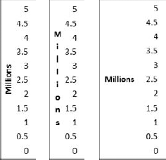
Figure 14.16. You can select these vertical axis titles, from left to right: Rotated Title, Vertical Title, and Horizontal Title.
Each type of vertical axis shrinks the chart somewhat when you activate it, but the Horizontal Title format shrinks the chart more than the others because it requires more space to the left of the chart.
Warning
If you turn off an axis title by setting it to Squf and then turn it back on again, you will need to retype the axis title; it returns to the generic placeholder text.
If the chart does not resize itself automatically when you turn on the vertical axis title, you might need to adjust the chart size manually Click the chart, so that selection handles appear around the inner part of the chart (the plot area), as shown in figure 14.17. Then drag the left side-selection handle inward to decrease the width of the chart to make room for the vertical axis label.

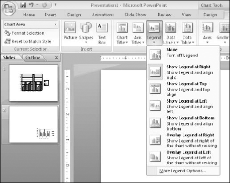
The legend is the little box that appears next to the chart (or sometimes above or below it). It provides the key that describes what the different colors or patterns mean. For some chart types and labels, you may not find the legend to be useful. If it is not useful for the chart that you are working on, you can turn it off by clicking the Legend button on the Layout tab and then clicking Squf. You can also just click it and press Delete. Turning off the legend makes more room for the chart, which grows to fill the available space. To turn the legend back on, click the Legend button again and select the position that you want for it, as shown in figure 14.18.
Warning
Hiding the legend is not a good idea if you have more than one series in your chart, because the legend helps people to distinguish which series is which. However, if you have only one series, a legend might not be useful.
To resize a legend box, you can drag one of its selection handles. The text and keys inside the box do not change in size.
When you right-click the legend and choose Format Legend, or when you choose More Legend Options from the Legend drop-down list on the Layout tab, the Format Legend dialog box opens with the Legend Options displayed, as shown in figure 14.19. From here, you can choose the legend's position in relation to the chart and whether or not it should overlap the chart. If it does not overlap the chart, the plot area will be automatically reduced to accommodate the legend.

Data labels show the numeric values (or other information) that are represented by each bar or other shape on the chart. These labels are useful when the exact numbers are important or where the chart is so small that it is not clear from the axes what the data points represent.
To turn on data labels for the chart, click the Data Labels button on the Layout tab. The options available depend on whether it's a 2-D or 3-D chart. figure 14.20 shows the options for 2-D charting; for a 3-D chart your only choices are Show and Squf.

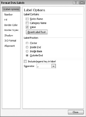
Data labels show the values by default, but you can also set them to display the series name and the category name, or any combination of the three. The data labels can also include the legend key, which is a colored square. To set these options, choose More Data Label Options from the Data Labels drop-down menu, to access the Format Data Labels dialog box, as shown in figure 14.21. For a 3-D chart, the Label Position section does not appear.
Sometimes the chart tells the full story that you want to tell, but other times the audience may benefit from seeing the actual numbers on which you have built the chart. In these cases, it is a good idea to include the data table with the chart. A data table contains the same information that appears on the datasheet.
To display the data table with a chart, click the Data Table button on the Layout tab, as shown in figure 14.22, and choose to include a data table either with or without a legend key.
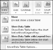
To format the data table, choose More Data Table Options from the Data Table drop-down menu. From the Format Data Table dialog box that appears, you can set data table border options, as shown in figure 14.23. For example, you can display or hide the horizontal, vertical, and outline borders for the table from here.

No, axes are not the tools that chop down trees. Axes is the plural of axis, and an axis is the side of the chart containing the measurements against which your data is plotted.
You can change the various axes in a chart in several ways. For example, you can make an axis run in a different direction (such as from top-to-bottom instead of bottom-to-top for a vertical axis), and you can turn the text on or off for the axis and change the axis scale.
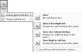
You can select some of the most popular axis presets using the Axes button on the Layout tab. As with the axis titles that you learned about earlier in this chapter, there are separate submenus for horizontal and vertical axes. figure 14.24 shows the options for horizontal axes, and figure 14.25 shows those for vertical axes.

The scale determines which numbers will form the start and endpoints of the axis line. For example, take a look at the chart in figure 14.26. The bars are so close to one another in value that it is difficult to see the difference between them. Compare this chart to one showing the same data in figure 14.27, but with an adjusted scale. Because the scale is smaller, the differences now appear more dramatic.
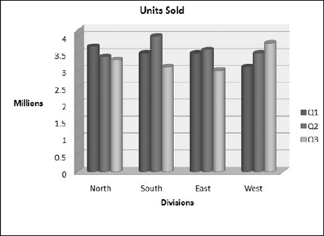

Figure 14.27. A change to the values of the axis scale makes it easier to see the differences between values.
Tip
You will probably never run into a case as dramatic as the difference between figures 14.26 and 14.27 because PowerPoint's charting feature has an automatic setting for the scale that is turned on by default. However, you may sometimes want to override this setting for a different effect, such as to minimize or enhance the difference between data series. This is a good example of "making the data say what you want." For example, if you wanted to make the point that the differences between three months were insignificant, then you would use a larger scale. If you wanted to highlight the importance of the differences, then you would use a smaller scale.
To set the scale for an axis, follow these steps:
On the Layout tab, choose Axes

Drag the Format Axis dialog box to the side so that you can see the results on the chart.
If you do not want the automatic value for one of the measurements, click Fixed and enter a different number in its text box.
Minimum is the starting number. The usual setting is 0, as shown in figure 1.26, although in figure 14.27, it is set to 2.8.
Maximum is the top number. This number is 4 in both figure 14-26 and figure 14.27.
Major unit determines the axis text. It is also the unit by which gridlines stretch out across the back wall of the chart. In figure 14-26, gridlines appear at increments of 0.5 million units; in figure 14.27, they appear by 0.2 million units.
Minor unit is the interval of smaller gridlines between the major ones. Most charts look better without minor units, because these units can make a chart look cluttered. You should leave this setting at Auto. You can also use this feature to place tick marks on the axes between the labels of the major units.
(Optional) If you want to activate any of these special features, select their check boxes. Each of these check boxes recalculates the numbers in the Minimum, Maximum, Major Unit, and Minor Unit text boxes.
Values in reverse order. This check box turns the scale backwards so that the greater values appear at the bottom or left.
Logarithmic scale. Rarely used by ordinary folks, this check box recalculates the Minimum, Maximum, Major Unit, and Minor Unit according to a power of 10 for the value axis, based on the range of data. (If this explanation doesn't make any sense to you, then you're not the target audience for this feature.)
Floor crosses at. When you select this feature, you can enter a value indicating where the axes should cross. You can specify an axis value of a particular number, or use Maximum axis value.
(Optional) You can set a display unit to simplify large numbers. For example, if you set display units to Thousands, then the number 1000 appears as "1" on the chart. If you then select the Show Display Units Label on Chart check box, an axis label will appear as "Thousands."
(Optional) You can set tick-mark types for major and minor marks. These marks appear as little lines on the axis to indicate the units. You can use tick marks either with or without gridlines. (To set gridlines, use the Gridlines button's menu on the Chart Tools Layout tab.)
If you are happy with the results, click Close.
You can apply a number format to axes and data labels that show numeric data. This is similar to the number format that is used for Excel cells; you can choose a category, such as Currency or Percentage, and then fine-tune this format by choosing a number of decimal places, a method of handling negative numbers, and so on.
To set a number format, follow these steps:
Right-click the axis and choose Format Axis.
In the Format Axis dialog box that appears, click Number. A list of number formats appears.
(Optional) You can select the number format in two ways: the first way is to select the Linked to Source check box if you want the number format to be taken from the number format that is applied to the datasheet in Excel. The second way is to click the desired number format in the Category list. Options appear that are specific to the format that you selected. For example, figure 14.29 shows the options for the Number type of format, which is a generic format.
(Optional) You can fine-tune the numbering format by changing the code in the Format Code text box. The number signs (#) represent optional digits, while the zeroes represent required digits.
Click Close to close the dialog box.

Note
To see some examples of custom number formats that you might use in the Format Code text box, choose Custom as the number format.
In the following sections, you learn about chart formatting. There is so much that you can do to a chart that this subject could easily take up its own chapter! For example, just like any other object, you can resize a chart. You can also change the fonts, change the colors and shading of bars, lines, or pie slices, use different background colors, change the 3-D angle, and much more.
Tip
The Format dialog box can remain open while you format various parts of the chart. Just click a different part of the chart behind the open dialog box (drag it off to the side if needed); the controls in the dialog box change to reflect the part that you have selected.
PowerPoint uses Format dialog boxes that are related to the various parts of the chart. These dialog boxes are nonmodal, which means that they can stay open indefinitely, that their changes are applied immediately, and that you don't have to close the dialog box to continue working on the document. Although this is handy, it is all too easy to make an unintended formatting change.
To clear the formatting that is applied to a chart element, select it and then, on the Format tab, click Reset to Match Style. This strips off the manually applied formatting from that element, returning it to whatever appearance is specified by the chart style that you have applied.
Once you add a title or label to your chart, you can change its size, attributes, colors, and font. Just right-click the title that you want to format and choose Format Chart Title (or whatever kind of title it is; for example, an axis label is called Axis Title). The Format Chart Title (or Format Axis Title) dialog box appears.
Note
The formatting covered in this section applies to the text box, not to the text within it. If you need to format the fill, outline, or typeface, use the mini toolbar (right-click to open it) or use the font tools on the Home tab.
The categories in this dialog box vary, depending on the type of text that you are formatting, but the following categories are generally available:
Fill: You can choose No Fill, Solid Fill, Gradient Fill, Picture or Text Fill, or Automatic. When you select Automatic, the color changes to contrast with the background color specified by the theme.
Border Color: You can choose No Line, Solid Line, or Automatic. When you select Automatic, the color changes to contrast with the background color specified by the theme.
Border Styles: You can set a width, a compound type (that is, a line made up of multiple lines), and a dash type.
Shadow: You can apply a preset shadow in any color you want, or you can fine-tune the shadow in terms of transparency size, angle, and so on. You might need to apply a fill to the box in order for the shadow to appear. This shadow is for the text box, not for the text within it; use the Font group on the Home tab to apply the text shadow, or the shadows available for WordArt.
3-D Format: You can define 3-D settings for the text box, such as Bevel, Depth, Contour, and Surface.
Alignment: You can set vertical and horizontal alignment, angle, and text direction, as well as control AutoFit settings for some types of text.
Note
Alignment is usually not relevant in a short label or title text box. The text box is usually exactly the right size to hold the text, and so there is no other way for the text to be aligned. Therefore, no matter what alignment you choose, the text looks very much the same.
From the Home tab or the mini toolbar, you can also choose all of the text effects that you learned about earlier in this book, such as font, size, font style, underline, color, alignment, and so on.
Chart styles are presets that you can apply to charts in order to add colors, backgrounds, and fill styles. The Chart Styles gallery, shown in figure 14.30, is located on the Chart Tools Design tab, which appears when you select a chart.
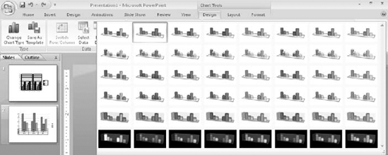
Chart styles are based on the themes and color schemes in the PowerPoint Design tab. When you change the theme or the colors, the chart style choices also change.
Your next task is to format the big picture: the chart area. The chart area is the big frame that contains the chart and all of its elements: the legend, the data series, the data table, the titles, and so on.
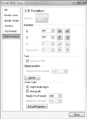
The Format Chart Area dialog box has many of the same categories as for text boxes — such as fill, border color, border styles, shadow, and 3-D format — and it also adds 3-D rotation if you are working with a 3-D chart. You can choose to rotate and tilt the entire chart, just as you did with drawn shapes earlier in this book.
When you use a multi-series chart, the value of the legend is obvious — it tells you which colors represent which series. Without the legend, your audience will not know what the various bars or lines mean. You can do all of the same formatting for a legend that you can for other chart elements. Just right-click the legend, choose Format Legend from the shortcut menu, and then use the tabs in the Format Legend dialog box to make your modifications. The available categories are Fill, Border Color, Border Styles, and Shadow, as well as the Legend options mentioned earlier in this chapter.
Tip
If you select one of the individual keys in the legend and change its color, the color on the data series in the chart changes to match. This is especially useful with stacked charts, where it is sometimes difficult to select the data series that you want.
Gridlines help the readers eyes move across the chart. Gridlines are related to the axes, which you learned about earlier in this chapter. Although both vertical and horizontal gridlines are available, most people use only horizontal ones. Walls are nothing more than the space between the gridlines, formatted in a different color than the plot area. You can set the Walls fill to Squf to hide them. (Don't you wish tearing down walls was always that easy?) You can also use the Chart Wall and Chart Floor buttons on the Layout tab.
Note
You can only format walls on 3-D charts; 2-D charts do not have them. To change the background behind a 2-D chart, you must format the plot area.
In most cases, the default gridlines that PowerPoint adds work well. However, you may want to make the lines thicker or a different color, or turn them off altogether.
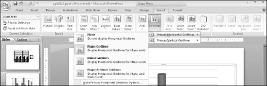
Gridline presets are available from the Gridlines drop-down menu on the Layout tab. There are separate submenus for vertical and horizontal gridlines, as shown in Figure 14.31. You can also choose the More command for either of the gridlines submenus for additional options.
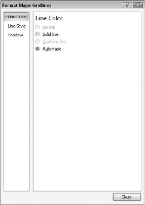
To change the gridline formatting, right-click a gridline and choose Format Major Gridlines. You can then adjust the line color, line style, and shadow from the Format Major Gridlines dialog box, as shown in figure 14.32.
To format a data series, just right-click the bar, slice, or chart element, and choose Format Data Series from the shortcut menu. Then, depending on your chart type, different tabs appear that you can use to modify the series appearance. Here are the ones for bar and column charts, for example:
Series Options: This tab contains options that are specific to the selected chart type. For example, when working with a 3-D bar or column chart, the series options include Gap Depth and Gap Width, which determine the thickness and depth of the bars. For a pie chart, you can set the rotation angle for the first slice, as well as whether a slice is "exploded" or not.
Shape: For charts involving bars and columns, you can choose a shape option such as Box, Full Pyramid, Partial Pyramid, Cylinder, Full Cone, or Partial Cone. The partial options truncate the top part of the shape when it is less than the largest value in the chart.
Fill: You can choose a fill, including solid, gradient, or picture/texture.
Border Color: The border is the line around the shape. You can set it to a solid line, no line, or Automatic (that is, based on the theme).
Border Styles: The only option available on this tab for most chart types is Width, which controls the thickness of the border. For line charts, you can set arrow options and other line attributes.
Shadow: You can add shadows to the data series bars or other shapes, just as you would add shadows to anything else.
3-D Format: These settings control the contours, surfaces, and beveling for 3D data series.
Other chart types have very different categories available. For example, a line chart has Marker Options, Marker Fill, Line Color, Line Style, Marker Line Color, and Marker Line Style, in addition to the generic Series Options, Shadow, and 3-D Format categories.
Three-dimensional charts have a 3-D Rotation option in the Format Chart Area dialog box. This feature works just the same as with other 3-D objects, where you can rotate the chart on the X-, Y-, and Z-axis. In addition, there are some extra chart-specific options, as shown in figure 14.33. For example, you can set the chart to AutoScale, control its depth, and reset it to the default rotation.
After you have formatted a chart the way you want it, you can save it as a template. You can then apply these same formatting options to other charts at a later time.
To create a chart template, follow these steps:
Select a chart that is formatted exactly the way you want t he template to be. If you want the template to use theme colors, use them in the chart; if you want the template to use fixed colors, apply them instead.
On the Chart Tools Design tab, click Save As Template. The Chart Template dialog box opens.
Type a name for the template.
Note
By default, under Windows Vista, templates are stored in UsersusernameAppData RoamingMicrosoftTemplateCharts, with a .crtx (Chart Template) extension. In Windows XP, it's Documents and SettingsusernameApplication DataMicrosoftTemplatesCharts. You can copy templates from another PC and store them in that location and they will show up on your list of chart templates on the current PC.
Click Save.
To apply a chart template to an existing chart, follow these steps:
Select the chart, and on the Chart Tools Design tab, click Change Chart Type. You can also right-click the chart and choose Change Chart Type.
At the top of the list of categories, click Templates. PowerPoint displays all of the custom templates that you have created.
Click the template that you want to use.
Click OK.
To apply a chart template to a new chart as you are creating it, after choosing Insert
Chart template files remain on your hard disk until you delete them. If you want to get rid of a chart template, or rename it, you can do so by opening the folder location that contains these templates. Although you can manually browse to the location (UsersusernameAppDataRoamingMicrosoftTemplateCharts), this is an easier way:
On the Insert tab, click Chart.
In the Insert Chart dialog box, click Manage Templates. The folder location opens in an Explorer window. From here, you can rename or delete files.
In this chapter, you learned how to create and format charts using PowerPoint. You learned how to create charts, change their type and their data range, and use optional text elements on them such as titles, data labels, and so on. You also learned how to format charts and how to save formatting in chart templates. In the next chapter, you learn how to incorporate data from other sources, including programs that do not necessarily have anything to do with PowerPoint or Office.