
Chapter 3
Building a Mobile-Friendly Site
In This Chapter
- Choosing the right mobile approach
- Designing for a mobile user
- Optimizing a mobile site for search engines
- Testing for mobile-friendliness
A mobile-friendly website is a site that functions and displays equally well on a mobile device — such as a smartphone or a tablet — and a desktop computer.
In this chapter, you learn how to build mobile-friendly websites that are optimized for search and optimal user experience. If you’re still not convinced of the importance of mobile, consider these 2014 comScore statistics:
- The U.S. alone has 172 million smartphone owners and 93 million tablet owners.
- On average, 34 percent of monthly visitors come to top leading brands like Amazon.com, Google, Facebook, and CBS Interactive exclusively from mobile devices. That means that about 34 percent of all traffic to Amazon.com comes from users who use only a mobile device to access the site.
- As of June 2014, consumers say they spend 60 percent of their time interacting with digital media using mobile devices and 40 percent of the time interacting through desktop computers. These numbers represent a 13 percent decrease in desktop engagement with media over a 15-month period, and a 13 percent increase in media engagement via mobile devices.
- Approximately 60 percent of all Internet traffic comes from mobile devices and 40 percent comes from desktop computers. In other words: To access the Internet, people are using mobile devices — through apps and the mobile browser — 20 percent more than they are using their desktop computers.
The fact of the matter is that mobile use is growing every year, and access to mobile-friendly, user-focused websites is becoming more important to search engines and consumers. In April 2015, Google confirmed that it uses mobile friendliness as a ranking signal when delivering results to users searching on mobile devices. We mention elsewhere in the book that Google doesn’t typically confirm or deny the signals that it looks at when ranking websites, so when Google tells you outright that something matters for search rankings, it’s a big deal.
Not sure how to get started making your site look and function just as well on mobile as it does on desktop? Not to worry; this chapter contains many design, user experience, and optimization tips to get your site on the path to mobile friendliness.
Choosing the Right Mobile Approach
Because a desktop computer monitor and a smartphone are drastically different in size, designing for mobile means that you have to do one of three things:
- Build a responsive web design that dynamically adjusts content from desktop format to mobile format
- Use dynamic serving to make the mobile experience device specific and control how mobile content is delivered page by page
- Create a separate mobile site designed specifically for mobile users
This section explores each of these three approaches to mobile-friendly website development. At the time of publication, responsive design is the mobile-friendly configuration recommended by both Google and Bing. That said, we recommend that you use the configuration that delivers the best user experience for your consumer’s specific needs. Search engines will never penalize you for working extra hard to make your site visitors happy.
 We talk about code and servers in this section. If you’re a code person, you’ll love it. If you’d rather not touch code or servers with a 10-foot pole, don’t be alarmed. The idea here isn’t to teach you how to become an IT guy or gal. The idea is to teach you how it all works so that you can communicate what you need and delegate the task of making it happen to the right person.
Option 1: Responsive design
Explained simply, responsive design is a web design technique that uses CSS and a series of coded rules to dynamically adjust the appearance of your desktop content so that it best fits within the screen-size parameters of different mobile devices. Responsive design uses JavaScript and client-side serving (also known as front-end serving) to alter the way pages appear in mobile or desktop browsers after the server has already loaded the page. See how responsive design works in Figure 3-1.

Figure 3-1: Websites that use responsive design to adjust the display of a website based on device type work in this way.
Websites using responsive design have one single set of URLs for all content regardless of whether that content is being delivered to a desktop computer or a mobile device. See the example in Figure 3-2.

Figure 3-2: BruceClay.com is using a responsive web design, so the desktop content (left) and the mobile content (right) have the exact same URL but appear differently on different devices.
When to use responsive design
Choosing responsive design makes sense in the following five circumstances:
- When you want a coherent desktop and mobile experience.
- When you have a strong desktop website that has built up years of link equity, trust, and industry authority. Responsive mobile sites benefit from shared indexing with desktop sites, which can result in improved mobile ranking. Although you can use special code if you go with other mobile design options for your website to make sure the search engine sees the mobile site as the same as your desktop site, this is a technical issue that can introduce complications. (Learn more about shared indexing in the “Optimizing to rank in mobile search results” section, later in this chapter.)
- When you want your desktop and mobile visitors to convert in the same way.
- When you have limited development resources, which can make maintaining a custom mobile experience with custom content seem out of the question.
- When you want to manage the maintenance and search engine indexing of just one site.
Option 2: Dynamic serving
Dynamic serving is a server-side development approach that detects which type of device your visitor is using to deliver unique content that is optimized specifically for her device. As you can see in Figure 3-3, the user searches with a mobile device and the server responds accordingly.
Like responsive design, dynamic serving uses one single set of URLs for all content regardless of whether that content is being delivered to a desktop computer or a mobile device. But that’s where the similarity ends.
See, responsive web designs dynamically adjust the appearance of content — but the URLs stay the same because the mobile content and desktop content are essentially the same, other than appearance. With dynamic serving, the URLs stay the same, but the content delivered to mobile devices is not always the same as the content delivered to desktop devices.
This difference in content is possible because dynamic serving is a server-side approach that alters content code (HTML, CSS, PHP) based on the device that is asking for it before the content is delivered to the browser (where the user sees it). This code allows the server to alter the content of the page without altering the URL of the page. You can find more on how to set up your server for dynamic serving in Book VII, Chapter 1.

Figure 3-3: What's happening behind the scenes when a website uses a dynamic serving approach to mobile design.
When to use dynamic serving
Using dynamic serving makes particular sense in the following five circumstances:
- When your website needs to include complex mobile-friendly functionality, such as multipage forms or interactive tool dashboards. In this case, dynamic serving can be a great solution that allows you to serve the best experience based on user circumstances.
- When you find that your website needs to serve two different device markets very differently. Some examples are that your iPhone users take a very different path to conversion than your Android users, or you want your pages to render differently for smartphone users than for tablet users.
- When your visitors largely use different keywords to access your website via desktop search and mobile search. Dynamic serving lets you alter the way content is rendered on a page-by-page basis, so it is a great resource if you want to optimize specific pages for high-volume mobile keyword phrases without changing the desktop language.
- When you want your desktop visitors and mobile visitors to convert in different ways.
- When you have strong development resources that are comfortable with manually coding and maintaining complex, clean code.
Option 3: Building a separate mobile site
A mobile site is just what it sounds like: a separate website that has been created specifically for mobile device users. With a separate mobile site, rather than altering content for mobile upon request, when searchers navigate to your website from a mobile device, they are redirected to a mobile-only version of your website that lives on a unique domain, such as m.domain.com (as shown in Figure 3-4) or mobile.domain.com. If you go with this choice, you need to set up your server to detect the device and then send the user to the right site. Read about how to redirect users in Book VII, Chapter 3.

Figure 3-4: Firestone uses an m.domain.com mobile site design.
An important technical implementation of a separate mobile site is the proper use of canonical tags. From your mobile pages, include a canonical tag that points to the correlated desktop page so that the trust, authority, and link equity of your desktop site will be associated with your mobile site as well. Read more about this in the Google Developers documentation (https://developers.google.com/webmasters/mobile-sites/mobile-seo/configurations/separate-urls).
When to build a separate mobile site
Here are a few circumstances in particular when it may make the most sense for your business to build a separate mobile site:
- When you need to prominently include elements on your desktop website that don’t render well on mobile devices — Flash, for instance. Although we don’t recommend using Flash or other high-bandwidth interactive elements on your website, we do recognize that sometimes you have to (say, if you are running a movie website and need to create image-based experiences and show movie trailers). If your boss says you have to to do this, you’ll benefit from building a separate mobile site.
- When you need to build a mobile-specific conversion flow or your visitors use search terms on mobile that are very different from the search terms they use on a desktop.
- When you have a huge website with lots of pages and limited resources. Making a large website multi-device responsive can take a lot of resource time. A mobile site can be a solution that allows you to show your mobile users a smaller, refined, sampling of your website content.
- When your visitors use older — not “smart” — phones to access your website. Mobile sites tend to work better on these types of older, less dynamic phones.
- When you have the resources to build, update, and maintain a separate mobile site.
A note about mobile apps
A mobile app is a self-contained computer program, or application, built specifically to provide users with a tightly controlled way to access content outside the mobile browser. Although mobile apps are great for user experience, they are very different from mobile websites.
Because the scope of this book is limited to techniques that can help your mobile website rank in search engine results pages, we don’t go into depth about when to build a mobile app, or how to optimize mobile apps for iTunes or the App Store. To learn more about that, we recommend that you dig deeper with a book specifically about mobile app marketing.
Designing for a Mobile User
Choosing a mobile development approach is all about directing your content to the user. Mobile design, on the other hand, is all about deciding what the user will see when the content arrives. How does the navigation look? Can users read the text? How do they contact you, or search for items?
To begin designing for mobile, you must wrap your head around what the “mobile experience” is.
First, mobile visitors are mobile. At least part of the time, your searchers use mobile devices to find you on the go from taxi cabs, dentists’ waiting rooms, their backyards, and the aisles of your competitor’s store. So when visitors access your site using a mobile device, their needs are inherently different than when they access your site from a desktop computer.
Second, remember that mobile devices are smaller than desktop computers, and that navigation and scrolling is done using touchscreens and gestures (swiping, tapping, and other physical interactions with the screen). See examples of gestures in Figure 3-5.

Courtesy of Julian Burford
Figure 3-5: Some common mobile device gestures.
Feeling mobile minded? Great! Next you can get started on learning how to design with the needs of mobile users in mind.
Prioritizing mobile content creation
Think of all the things your users see when they visit your website. From words, pictures, and video to your site’s navigation, they see the content of your website.
Now, get in your mobile mindset and think about how your visitors will experience your website content when they are on mobile devices walking the streets of New York.
If you remember only one thing about designing for mobile friendliness, it needs to be this: Mobile-friendly websites need above all else to provide the best user experience possible.
Think of your user’s needs first and you’ll always end up with a better design. Plus, the search engines love a great user experience! So, by designing to make your human user happy, you are automatically designing to make the search engine happy. The following sections describe seven ways to design mobile websites that keep users happy.
Create single-tap calls to action
To make your content mobile friendly, you want to make it as easy as possible for your user to find what they need and take action. In the mobile environment, in which users are working with small screens and finger taps rather than mouse clicks, prominent click-to-call call-to-action buttons are a great way to help users easily accomplish common tasks. And completing a task means a conversion for you!
Click-to-call buttons are a great mobile-specific call to action because mobile users are often already holding a phone. This button helps users get what they need (a chat with you) and for you to get what you need (a conversion).
Figure 3-6 shows an example of a click-to-call button, placed strategically at the top of the Bruce Clay, Inc., mobile experience.

Figure 3-6: Click-to-call buttons let mobile users easily take action and get the assistance they need.
Also consider creating single-tap buttons that help mobile users find your store front or accomplish tasks on the go. You can see an example on the Progressive mobile site, shown in Figure 3-7, which has buttons to help users find local agents and make payments without having to scroll down the page.

Figure 3-7: One-click buttons above the fold help mobile users accomplish tasks.
Design for a small screen size
Mobile devices are smaller than desktop computers, so you have less room to fit content on the page and less room for white space. Some small-screen content optimization tricks include:
- Making your logo serve as a link that redirects back to your mobile home page.
- Minimizing white space and making sure that the majority of the page is filled with actual content.
- Building off-screen elements such as a toggle menu, which is a navigation element that can expand and close. (We discuss toggle menus in the “Designing mobile-friendly navigation” section, later in this chapter.)
- Shorten the text that appears on buttons when possible.
Be particular about what goes above the fold
Because mobile devices are smaller than desktop computers, they have less space to present content above the fold (in the space the user sees before scrolling down the page). Make sure to be thoughtful and user-focused when selecting your above-the-fold content. Also, make sure that the content you place above the fold loads quickly. Site speed and above-the-fold load time are important to user experience, and they’re also important mobile ranking factors.
Choose a legible mobile font
Any time you put words on your website, the first priority needs to be user comprehension. Your user needs to be able to clearly see, and quickly read, your words on a variety of devices. Because no one-size-fits-all standard currently exists for mobile screen size or graphic quality, unfortunately we can’t give you a one-size-fits-all recommendation for font selection. We do recommend that you keep it simple and user focused. Here are some rules of thumb to follow about fonts:
- Whether you go with a Sans Serif or Serif font, consider the height of the characters in your font alphabet and the white space between the letters. Fonts with a moderately high individual character height and a little bit of space between letters can improve readability.
- Know your demographic and remember that older folks may have a harder time reading smaller, more condensed fonts.
- Make sure to provide enough contrast between the font and the background so that users can see your content, even outdoors or in other conditions where screen glare is a factor.
- The safest route is to use a common font that mobile device manufacturers and users approve of, such as Arial, Helvetica, Courier, Georgia, Times New Roman, Trebuchet MS, or Verdana.
Optimize images
Not all images are created equal: Some are created in giant size for billboards, some are in high resolution for print; and some are compressed so that they load quickly on mobile devices. In this chapter, we’re most concerned with the third type of image.
 To make your website mobile-friendly, it’s important to make sure your images are sized and saved in a way that allows them to load quickly on desktop and mobile devices. Optimized images that load quickly keep both the user and the search engine happy.
To optimize images for mobile, make sure to
- Save images in a compact file format, such as JPG, GIF, or PNG.
- Never size images larger than they need to be; remember that big images mean big file sizes, which in turn means slow load times.
- Optimize the size of images even if you’re using responsive design. With responsive design, you can make sure that images are optimized for mobile by using CSS to write in a max-width clause — {max-width:100%} — which will resize your images based on the size of the detected screen.
Design for multiscreen
These days, it is not uncommon for customers to visit your site using multiple devices over a short period of time. For instance, visitors may start shopping your selection of boots using their phone on the train home from work and then, after they’re home, they may continue their search using a desktop computer or tablet.
To optimize your mobile content for multiscreen use, make sure that the colors, fonts, and themes that you use closely imitate your desktop colors, fonts, and themes. Doing so helps your visitors feel confident that they’ve landed in the right place when they navigate to your website using a new device, and it can also help reinforce branding. Progressive Insurance does a good job of this, as shown in Figure 3-8.
Avoid using Flash
In general, designing with Flash is unreliable and not recommended for either desktop or mobile design. This includes relying on Flash to play video content. Some mobile devices, such as iPhones, can’t render Flash at all, so any elements of your website that require Flash will render a poor user experience.
Flash is also bad for SEO because Google has been known to bump SERP rank and insert SERP warnings when mobile sites use Flash.

Figure 3-8: Keep your mobile and desktop designs similar.
Designing mobile-friendly navigation
Your mobile-friendly navigation can take many shapes. The option that is best for you depends on how complex your navigation needs to be, your conversion goals, and your users’ preferences.
Remember that your site’s navigation needs to help visitors — and search spiders — navigate through your website. So your mobile navigation needs to be intuitive, functional, crawlable, and optimized for touch.
Keep these best practices in mind when designing your mobile-friendly navigation:
- Keep it simple, sweetie. Keep top-level navigation as simple as possible, especially if you want your navigation displayed across the top of your mobile page. Remember that you’re designing for a small screen size. (An iPhone 6 is 750 pixels wide in portrait mode, whereas a 13-inch laptop computer is 1,280 pixels wide).
The point of a mobile site let your visitors easily browse your website with a mobile device. Your navigation should give them links to your main category pages and pages that improve usability (such as a “Call Now” option and a link to your shopping cart).
You don’t have to link to every page in your website here. In fact, too many options can result in decision paralysis and confusion, which creates a poor user experience.
Including four to eight items in your top menu is usually a good rule of thumb. See the example of Bruce Clay, Inc.'s top menu in Figure 3-9.
- List your most important pages first. These are usually your conversion calls to action, such as “locate store,” “shop,” “subscribe,” and “products,” as shown in Figure 3-10. If your website is more content oriented than sales oriented, list your most important category first.
- Consider losing the Home button. To save space, you can leave off the Home button in your navigation and instead have your top-of-page logo navigate to the home page when tapped.
- Design for touch and give enough space for a finger. Because both your tablet and smartphone users are navigating your mobile site using touchscreens, it’s very important to make sure that the tap sensitivity of your navigation buttons are large enough to use. The average finger requires a space at least 44 pixels large, left to right and up and down.
- Make your menu intuitive. Your visitors should know exactly where each of your menu items will take them.
- Minimize multilevel navigation. We encourage you to keep it simple, but if your navigation simply must have drop-down levels, never add more than two layers of drop-down functionality.
- Make sure that drop-down menus are activated by touch. Although mouse-hover activation works in the desktop experience, it leaves your user stuck in the mobile experience.
Use visual menu indicators. If you use an off-screen menu, use a three-line menu indicator so that your visitor can access your menu. We talk more about off-screen menus later in this chapter.
If you have a multilevel navigation, use an intuitive symbol, such as a plus sign (+) to indicate that the menu item has further drop-down options. Also consider using a symbol to differentiate buttons that navigate to a new page from buttons that reveal more drop-down options. REI uses a right-pointing arrow (>) to indicate when a navigation item takes you to a new page, as shown in Figure 3-11.
- Add touch feedback. When users tap an item in your navigation, something needs to happen to assure users that they tapped in the right place. This feedback can be a color change, a blink of color, or a font change. Figure 3-12 shows that Local, tapped by a user, is highlighted in blue (although you can’t see the blue in the printed book).
- Avoid horizontal scrolling. In general, search engines aren’t fond of excessive left to right scrolling, and neither are users. If your menu is too long to fit within the parameters of the screen from left to right, consider a vertical navigation.
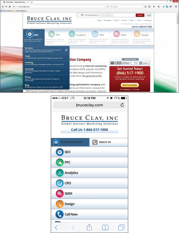
Figure 3-9: Bruce Clay, Inc. simplifies its desktop navigation (top) significantly to improve mobile user experience. To help users with task completion, the mobile site navigation (bottom) also includes a click-to-call button.
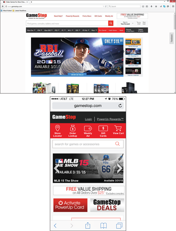
Figure 3-10: GameStop simplifies its desktop navigation (top) by including only user- and conversion-focused calls to action on its mobile home page (bottom).
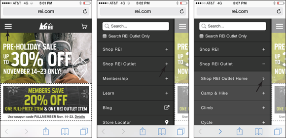
Figure 3-11: REI uses visual menu indicators to guide users through its multitiered navigation.
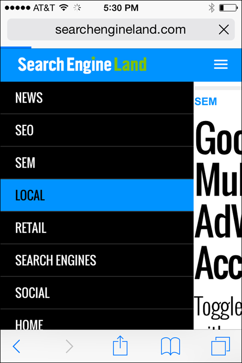
Figure 3-12: Search Engine Land uses color-change touch feedback to let users know where they have tapped within the navigation.
Exploring mobile navigation styles
Because the space you have on a smartphone is so limited, the off-screen toggle menu (a navigation that can be expanded when tapped) is a common mobile navigation. With this option, the user sees three stacked lines in either the left or right corner of the mobile experience. The user must tap the lines to see the navigation. Figure 3-13 shows two examples of off-screen toggle menus.
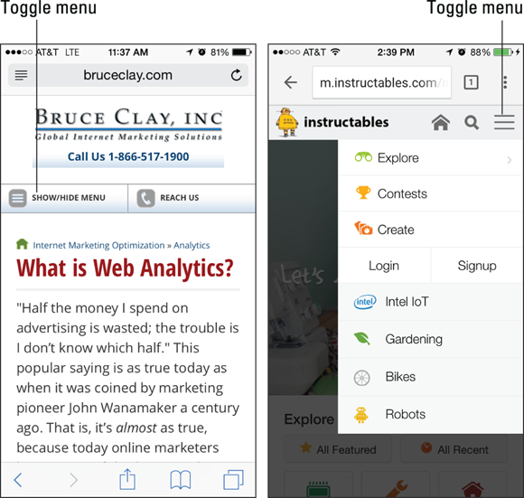
Figure 3-13: Two examples of off-screen toggle menus using three stacked lines as a visual menu indicator.
Another navigation option is to have a minimal static navigation that runs across the top of the mobile browser window. Figure 3-14 shows an example of the static navigation experience. In this example, GameStop has identified these five pages as being the most important to its mobile users' experience, so these navigation items are always present on the top of the mobile web page.

Figure 3-14: An example of static mobile navigation.
A third option is icon navigation. Figure 3-15 shows a mobile site that has created a series of graphic buttons as its home page navigation. Note that this approach is applied in addition to — not instead of — an off-screen toggle menu.

Figure 3-15: A mobile home page that uses a graphic navigation as well as text navigation that can be reached through a toggle menu.
Optimizing forms
Forms are used on websites to collect information from users. Sites use this information to complete transactions and registrations, or to complete other tasks such as submitting an insurance claim online.
When approaching form design for mobile devices, keeping the physical mobile experience in mind is important. If you make your form slow to load or overly complicated, your visitors will likely abandon the form in the middle, or even before they begin.
Keep these best practices in mind when designing your mobile-friendly forms:
Keep forms short and sweet. Make your forms easy to complete by minimizing the number of required fields. Having one field for “Name” rather than two fields for first and last name is a good example of an easy way to make your form one field shorter.
 Ask for too much and you may end up with nothing at all.
- When they can’t be short, create multipage forms. If you must have a long form, break it up into multiple pages, present only a few above-the-fold fields on each page (“above the fold” means before you have to start scrolling down the screen), and include clear Next buttons so that visitors don’t have to scroll excessively. A progress bar can also help keep users committed to multipage mobile forms.
- Make the Submit button and the form fields finger size. Your mobile users are completing forms with their fingertips, so your fields and buttons need to be big enough to make tap interaction easy. No standard size exists that works best for every mobile device, but creating buttons and form fields that are 44 pixels wide by 44 pixels tall is generally a safe rule of thumb.
- Minimize typing by using drop-down menus, radio buttons, and auto-selected answers. Anything you can do to limit the amount of typing required will help speed up the process and improve your customer satisfaction. For example, if your form asks for a state, let users select their state from a drop-down menu so that they don’t have to type it.
- Make what you’re asking for clear. Above each field, clearly specify exactly what you want the user to put in the form field. If you’re asking for a birthday, for instance, clarify whether the form wants the birth year entered as two or four digits. See an example from Progressive in Figure 3-16.
If you’re asking for a piece of information that requires additional explanation, including a button that offers more information when tapped (often called a tooltip) can aid user experience. Figure 3-17 shows a form using a tooltip to explain what CCV means.
- Clearly specify which fields are required. If your form has more than one field, make sure that your users know exactly which fields are mandatory and which they can skip. Placing an asterisk (*) next to required form fields is a common convention. If all your form fields are required, place an asterisk next to all your fields. Don’t assume that your visitors will understand that they are all required.
- Allow log-in using a third-party provider like Google or Amazon.com. Sometimes a registration form can become a barrier to entry for a first-time user. Allowing your customers to sign in using a third-party provider that they are already connected to can speed up the process and eliminate the registration barrier.
- Figure 3-18 shows an example of a third-party integration that allows first-time users to sign in using their Google account information. This is much easier for the user than typing registration information into a form.
Third-party log-in is also a great way to get customers through the purchasing form. By allowing users to log in and pay using a service for which they already have credit card information stored, such as Amazon.com, you allow your customer to skip a multifield credit card authorization form. See an example in Figure 3-19.
Keep the focus on the form and minimize other content on the page. When your visitors have landed on a web page with a form, they are on a conversion page, and you want the content of the page to do everything in its power to keep the conversion momentum going. You want to get your visitor interacting with the form and tapping the Submit button as soon as possible.
Adding a lot of content on top or next to your form can end up being a conversion distraction that can slow down or completely derail the form submission process. To minimize distraction, try to include only explanatory content that helps the user complete the form. If you do want to include content that isn’t explanatory, keep it concise and directly related to the form — just like the example from BruceClay.com in Figure 3-20.
- Visually validate when a form line is completed correctly. Mobile users don’t love filling out forms the first time, and they really don’t love having to go back and fill them out a second time because the form has errors. Using visual cues to let your user know they have completed each line of the form correctly — or incorrectly — can save time and limit frustration (see Figure 3-21). A green check mark next to the field is a great way to clearly indicate that the field has been completed the right way, and a red X works well to communicate when something is wrong. If something is wrong with the line, make sure to clearly explain how the user can correct the error.
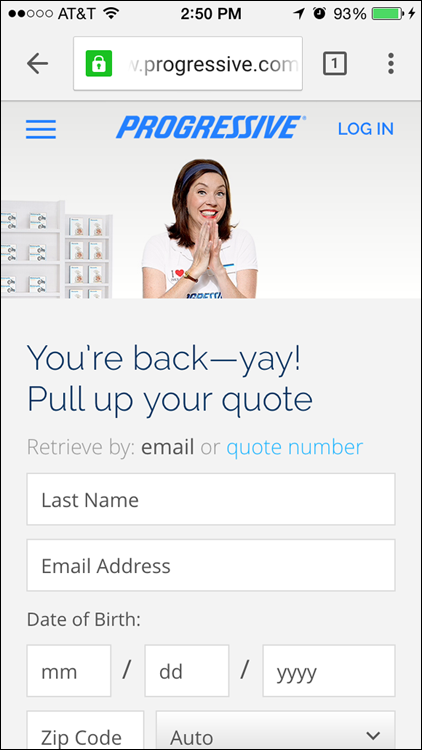
Figure 3-16: Show users how they should enter birth date information.
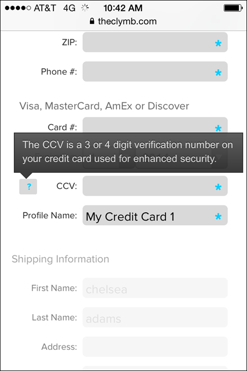
Figure 3-17: A tooltip button explains the form field requirement.

Figure 3-18: Because HubSpot Sidekick has optional third-party authentication, first-time mobile users can skip the form and register with their Google account information.
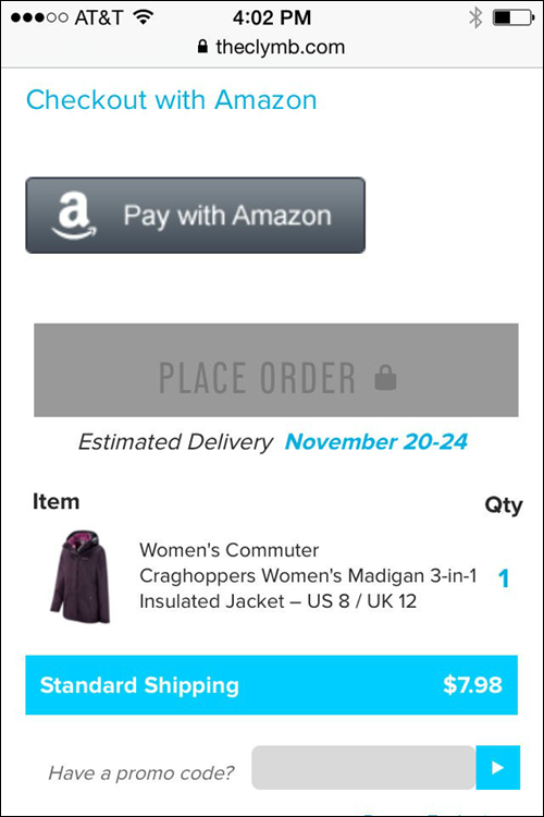
Figure 3-19: An example of third-party integration.

Figure 3-20: Keep language on forms to the point to increase conversion.
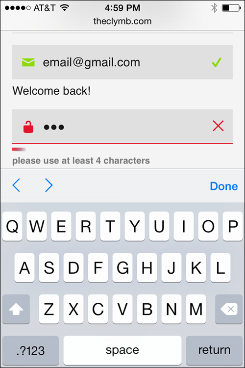
Figure 3-21: Use visual and verbal cues to let users know whether they have completed each line of the form correctly.
Making Mobile a Part of Your SEO Strategy
To understand how mobile SEO and desktop SEO strategies work together, think of a successful SEO strategy as being like a large jigsaw puzzle with many pieces that rely on one another to create the big picture. Mobile optimization is just one piece of the puzzle. Without it, you have a large hole in your SEO big picture. On the other hand, get mobile optimization right and your website big picture becomes less imperfect over all. Get your site less imperfect than your competitors’ sites, and now you’re ranking above the fold on page one of the search engine results page — exactly where you want to be!
Read on to find out
- How mobile search results compare to desktop results
- How to use SEO to improve mobile search rank
- Whether Bing and Google consider mobile a ranking factor
Comparing mobile results to desktop results
Mobile search results are the results that users see when they search the web using mobile devices.
Sometimes mobile and desktop search results can look very similar. This is because Google uses one search algorithm to analyze and rank both desktop and mobile results.
Other times, mobile search results can look very different from desktop results. This is because Google and Bing use a number of independently weighted ranking factors within their algorithms, and because the search engines strongly consider mobile friendliness when determining the order of their mobile search engine results.
Despite the visual differences, the good news is that optimizing for mobile results doesn’t have to feel like reinventing the wheel. In fact, it shouldn’t feel like reinventing the wheel. Although you want to employ some mobile-specific optimization tactics to gain an edge over the search engines’ weighted ranking factors, for the most part, your mobile site and your desktop site should be optimized using the same tactics — from keyword research to competitive analysis and technical SEO (which you learn more about in Book VI).
Optimizing to rank in mobile search results
Up to this point in Book IV, we discuss the principals of mobile-friendly website design. In this section, we tell you about the mobile optimization tactics that can help your mobile-friendly website rank higher in mobile search engine results. Yes; mobile friendliness and mobile optimization are not the same things. Making your site mobile friendly is the act of making sure that your site is designed to deliver an optimal user experience for your mobile searcher. Making your site mobile optimized means thinking about the factors that can help your site rank higher in search engine results pages — such as making sure that you’re using keywords, optimizing for local search, and granting search engine spiders access to your content. To make matters just a tad more confusing, you should also know that making your site mobile friendly is actually a part of the mobile optimization process because the search engines consider user experience when they determine rank.
In addition to the SEO strategies that you learn throughout this book, the following sections describe several mobile-specific tactics that might improve your site’s mobile search engine results rank.
Tag pages to combine mobile and desktop signals
Some optimization tactics, such as adding keyword phrases to your content, can be done in minutes. Others, such as earning industry authority, trust, and link equity, can take months or even years to build.
Regardless of the mobile design format you use (mobile-specific site, mobile-responsive site, or dynamically served pages), you have ways to tell the search engine that the desktop site and the mobile site should be considered the same. You want the search engines to understand your mobile site and your desktop site as one single entity sharing trust signals and link equity.
With proper tagging, a mobile-specific site gets to share the desktop site’s strong link equity and trustworthy reputation, helping it rank.
If you’ve got a separate mobile site, getting tagging right is extremely important and can get pretty technical. We urge you to talk to your developer if you have any confusion or concern about the tags that search engines need to see. You actually have two tags to work with, rel="canonical" and rel="alternate". In short, use rel="canonical" on your mobile page to point to the associated desktop page. From your desktop page, include the tag <link rel="alternate" media="only screen and (max-width:640px)"> where max-width is the width of the mobile browser your mobile page supports. Google’s got more reading for you on this topic in its Developers site at https://developers.google.com/webmasters/mobile-sites/mobile-seo/configurations/separate-urls.
Creating a superior user experience
According to the Google Developers website, “Mobile pages that provide a poor searcher experience can be demoted in rankings or displayed with a warning in mobile search results” (https://developers.google.com/webmasters/mobile-sites/mobile-seo/overview/key-points).In other words, search engines care about user experience, and a poor user experience is likely to cause a ranking drop.
To create an optimal mobile user experience, make sure that you
- Make your website mobile friendly. Check out the mobile design best practices that we discuss earlier in this chapter, in the “Designing for the Mobile User” section. For instance, make sure that your text is large enough to be read without zooming, your content is sized to fit the mobile device, and all your elements are designed for touch. In the section “Testing Mobile Friendliness”, later in this chapter, we show you how to use the mobile-friendly test in Google Search Console.
- Don’t use Flash on your mobile site. Many mobile devices cannot render Flash, which means that device users are out of luck if they run into a piece of content that relies on Flash. Even on devices that do support Flash, it significantly slows down load times, which can mean a major drop in rank. Instead of Flash, we recommend using HTML5 to build interactive elements.
Don’t cross-link between your mobile site and your full desktop site, if possible. Sending a mobile site user away from the mobile site and into your full desktop experience does not provide the best user experience. If at all possible, try to keep the links within your mobile site pointing to other mobile site pages.
If you have only a desktop-version of a page, never redirect your user to a 404 error page or a different mobile-optimized page instead of the page the user is asking for. Google considers this to be a faulty redirect, which creates a bad user experience and is grounds for a SERP rank demotion. Always think: Will my users be happy with this experience? Am I giving them what they expect? If the answer is yes, move forward. If it’s no, think of a better way.
- Don’t include intervening pages that block access to content for any reason. This includes any kind of page that asks for a login, a newsletter opt-in, or an app download. When searchers tap a link from a mobile search results page, both Google and Bing want the searchers to immediately be redirected to the content they are interested in, without any barriers. Pages that block the user from having immediate access to the content she wants creates a bad user experience and — because such pages can make your website less imperfect than your competitor’s — often result in a rank drop.
Improving site speed
According to the PageSpeed Insights portion of the Google Developers help site, Google prefers above-the-fold content (what the user sees first) to render in under a second for a mobile user. Anything longer than a second, Google says, can result in a poor user experience. The search engines care a lot about user experience, so fast load times really matter when Google determines which of the least imperfect websites to rank the highest.
To improve your mobile site speed and ranking potential, try to eliminate redirect chains and loops, make sure that images are compressed and optimized (see the “Designing for a Mobile User” section earlier in this chapter), and always follow the page speed optimization recommendations outlined in the Mobile Analysis portion of the Google Developers PageSpeed Insights (https://developers.google.com/speed/docs/insights/mobile).
Optimizing for proximity
Search engines are always working to return results that give users exactly what they need, when they need it. For mobile users, this means returning local results that take location into consideration.
To learn more about optimizing your website for mobile proximity and local search, follow the best practices outlined in Book I, Chapter 4.
Making mobile content accessible and crawlable
Before your web pages can show up in search results, search engines need to be able to find, access, and index your content. To ensure that your mobile site can be found and crawled by search engines, be sure to grant search spiders access to all your CSS and JavaScript.
Many mobile sites render dynamically (or on the fly) using web development techniques like AJAX. These types of sites often do not alter the URL when displaying new content, and, as a result, are impossible for search engines to properly index.
If you build a separate mobile site, also make sure to have your web developer submit an XML Sitemap for your mobile site to the search engines. To learn more about XML Sitemaps, flip ahead to Book VI, Chapter 2.
Distinguishing mobile content from desktop content
You always want Google to lead searchers to the version of your website that offers the best user experience. This means that you never want Google to return your mobile site to a desktop user, and — unless no mobile alternative exists — you don’t want the desktop version returned to a mobile user.
To help search engines discover, crawl, and index mobile-only web pages, be sure to specify in the HTML of your desktop website when you have an alternative (mobile) version of your web page by using the rel="alternate" HTML attribute, like this:
<link rel="alternate" media="only screen and (max-width: 640px)" href="http://m.example.com/your-mobile-only-web-page">
You also need to include a rel="canonical" tag that points to the desktop version of your website in the HTML of your mobile page. Using this tag is like waving your hands in the air, telling the search engines “Hey! I have two versions of this web page. The canonical is the original. The other one is the alternative. This is not duplicate content!” To add the canonical tag, use code that looks something like this:
<link rel="canonical" href="http://www.example.com/desktop-version-of-your-page">
Optimizing on-page content with mobile keywords
Don’t forget your keyword research and on-page SEO basics when optimizing for mobile! Use your favorite keyword research tool to research the language that your searchers commonly use when they are searching with mobile devices. These are called mobile-specific keyword phrases, and “near me” is a common modifier used by a mobile user. In some situations, you may find that your searchers use similar language to search on both desktop and mobile. Other times, you may find mobile search queries to be quite different from desktop queries. (Learn more about how to perform keyword research in Book II, Chapter 1.)
If you’re using a responsive design, try to work mobile keywords into your content naturally as secondary keywords that support your primary desktop keywords. If you have built a separate mobile site, or are dynamically serving web pages, consider creating content specifically to target high-volume mobile keyword phrases.
Is mobile a ranking factor?
The search engines use hundreds of proprietary ranking factors to decide the order of search engine results pages. We know some of the factors for sure; for others, we have to make our best guesses.
But when it comes to mobile friendliness, we can say with 100 percent certainty that it is a ranking factor for both Bing and Google! In November 2014, Bing announced that it is officially taking into consideration a website’s mobile friendliness to determine mobile search engine results rank. This means that the search engine will boost web pages identified as mobile friendly and demote the unfriendly results. “We know which pages are mobile-friendly so [we] automatically rank them higher with the new update,” says the Bing blog (https://blogs.bing.com/webmaster/2014/11/20/bing-and-mobile-friends/).
In April 2015, Google confirmed the same in its Webmaster Central blog: “We will be expanding our use of mobile-friendliness as a ranking signal. […] Consequently, users will find it easier to get relevant, high quality search results that are optimized for their devices” (http://googlewebmastercentral.blogspot.com/2015/02/finding-more-mobile-friendly-search.html).
It doesn’t get much more straightforward than that. You must make your web pages mobile friendly in order to rank high in mobile search results.
Google has other ways besides higher rankings to show preference to mobile-friendly results:
- Google appends a “Mobile-friendly” label to mobile search results listings that are optimized for mobile user experience. You’re safe to assume that not having the mobile-friendly label makes a site less imperfect — which often means a rank demotion.
- In recent years, Google put a lot of time into the development of mobile-friendly design documentation and tools to help website owners create improved mobile experiences for their users. Most notable among the list, perhaps, is the recent Mobile-Friendly Test tool that analyzes a website’s mobile friendliness and offers feedback to help the site owner make improvements. Clearly, Google considers mobile friendliness very important.
Testing Mobile Friendliness
After you’ve selected a development approach, created mobile-friendly content, and optimized your website for user experience and SEO, you’re done, right? Well, you’ve come a long way, but the truth is that an online marketer’s job is never done. After you’ve built your mobile website to be just how you want it, it’s time to start testing to make sure that everything is working how it should.
Never develop a “set it and forget it” mindset.
To test the mobile friendliness of your website, explore the following elements:
- Does the website look and function correctly on multiple devices? Your customers are using many types of mobile devices to access your content, so you must test to see whether your website works appropriately on all of them. To do this, use a device emulator that mimics the experience of tablets and smartphones, or test manually by using the actual devices if you have access to them.
- Are all the usability features that you built into your web pages actually working for your users? Have real people test your mobile site. This process is called user testing, and it should be a regular part of your website optimization strategy.
Does your site pass the “mobile friendly” test? Navigate to
https://www.google.com/webmasters/tools/mobile-friendly/and plug in your website URL to see whether your site passes the Google Mobile-Friendly Test (see Figure 3-22). This free tool gives you a pass or fail analysis of a specific website page’s mobile friendliness. This is a great tool to determine whether your website is on the path to mobile optimization success. You can also use the Google Mobile-Friendly Test tool to analyze your competitor’s mobile website. Flip back to Book III for a refresher on competitive analysis.- How fast do your pages load? Having a mobile site that loads quickly is important both for user experience and as a ranking factor. To test the site speed of individual pages on your mobile website, use the Google PageSpeed Insights tool, found at
https://developers.google.com/speed/pagespeed/insights(see Figure 3-23). Enter a page URL into the free tool and you'll receive a 1–100 numerical Speed score, suggestions for fixes that could improve speed, and recognition for what you're doing right in the Rules Passed section. Are Google crawlers seeing your site the way they should be seeing it? This step is all about double-checking to see whether the search spider is understanding the elements of your mobile design in the same way your human visitors are. Webmaster Tools — a free Google resource that helps webmasters analyze how users and search spiders are interacting with their websites — is a great resource for performing this type of mobile testing.
With Google Search Console open, find the Crawl portion of the dashboard and then find the Fetch as Google option. We explain more about this tool in the next chapter. But for now, know that using the fetch and render portion of Fetch as Google, you can ask Google to send the mobile crawler through your website (this is the fetch part) and show you exactly how the elements of your site appear to the spider (this is the render part).
The idea is to make sure that the Google mobile crawler recognizes your images and code without any hang-ups.
To get started with Google Search Console and the Fetch as Google tool, visit
https://www.google.com/webmasters/tools.- How does your site look in mobile search results? If your site has any elements that aren’t ideal for the mobile environment, Google recognizes these less-than-friendly spots and warns users in mobile search results. Some warnings include “Uses Flash” and “May open the site’s homepage” (see example in Figure 3-24). These warnings are clearly bad for search rank and bad for user experience. In the testing phase, be sure to look at your website in search results for these warnings.
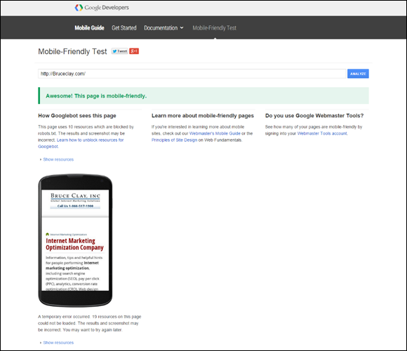
Figure 3-22: The Google Mobile-Friendly Test.

Figure 3-23: The Google PageSpeed Insights tool rates Bing.com 81 on a 100-point Speed scale.
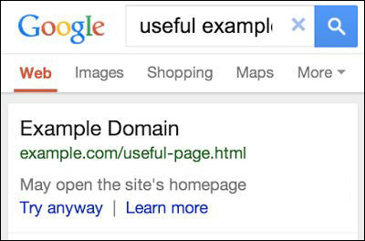
Figure 3-24: A home page redirect warning from Google.