
Images are used on web pages all across the internet. They're used in the form of application icons, corporate logos, and photos of you and your friends. It's been quite a while since I've seen even a regular forms-over-data application that didn't have images in the UI somewhere. Obviously, bitmap-based images have become a mainstay of application design.
Naturally, Silverlight includes mechanisms for displaying this content through the Image element and the MultiScaleImage control.
In addition to displaying images, Silverlight includes the powerful ability to create images from scratch or from other elements using the WriteableBitmap type. You can even use the WriteableBitmap to provide support for formats not natively supported in Silverlight (such as .GIF).
In this chapter, we'll start with the basics of imaging with the Image element. From there, we'll move on to creating images on the fly using the WriteableBitmap. Once we have a handle on the WriteableBitmap, we'll turn to Silverlight's answer to enormous gigapixel-level images or collections of images-Deep Zoom with the MultiScaleImage control. Finally, we'll wrap up the chapter with a discussion of the different ways of stretching content to fit the space allotted.
The Image element enables you to display images from across the internet. In addition to loading images relative to your project, the Image element allows you to retrieve images from another domain. Take a look at how listing 21.1 uses the Source property to get an image from the http://www.silverlightinaction.com web site.
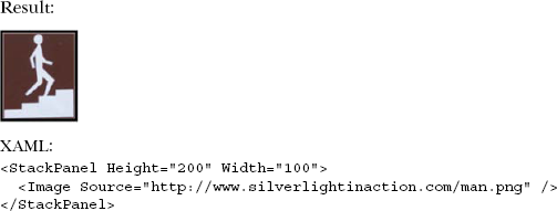
The Image in this markup retrieves an image from the silverlightinaction.com domain. This image is referenced through the Source property, which is set with a Uri through XAML. If this property needs to be set programmatically, you must use an ImageSource instead. Because this abstract class can't be used directly, you use a derivation known as BitmapImage. This class name is a little misleading because only the types listed in table are 21.1 supported.
Table 21.1. Image formats supported by the Bitmap-Image class. These formats are inherently supported formats of the Image element.
Format | Extension(s) |
|---|---|
Joint Photographic Experts Group | .jpg, .jpeg, .jpe, .jfif, .jfi, .jif |
Portable Network Graphics | .png |
This table shows the image formats supported by the BitmapImage class. Because this is the type used by the Source property, these image formats also represent those supported by the Image element in general.
What are you to do if you want to load an image type that's unsupported by Silverlight, such as .gif or .bmp? In the previous chapter, we saw how you can use the MediaStream-Source API to provide a hook to use when a video or audio format is unsupported. Luckily, Silverlight includes an equivalent for still images, the WriteableBitmap.
The WriteableBitmap (sometimes referred to as The Bitmap API) was introduced in Silverlight 3. It provides the ability to generate new images based on existing images, onscreen UI elements, or from scratch using pixel manipulation.
WriteableBitmap is a class in the System.Windows.Media.Imaging namespace, deriving from the common BitmapSource base class. Deriving from that class allows us to use the WriteableBitmap in almost every place you could normally use any other type of bitmap image class.
The uses for this feature are numerous, and all over the map. I've personally used it to generate Windows 7-style window thumbnails in a large Silverlight business application for a customer. I've seen others use it in games, for destructive 2D UI (think Lemmings where a bomb takes a chunk out of the ground). Still others have built their own paint programs using this feature.
In this section, we'll look at the three main ways to use the WriteableBitmap class: creating editable bitmaps from existing images, creating bitmaps from portions of the visual tree, and creating bitmaps from scratch.
Before we do that, we'll have the usual project setup to do. In this case, create a new Silverlight project and modify the MainPage.xaml markup to look like listing 21.2.
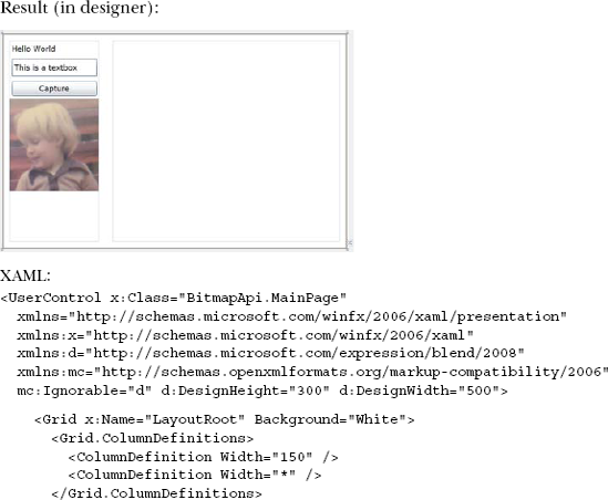
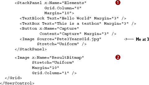
The markup includes a StackPanel  that we'll use for our visual tree rendering example, including an image of me at three years old that we'll use to test creating from existing images, and a result bitmap
  that will display the writeable bitmap we create in the code-behind.
You likely don't have a picture of me at three years old hanging around (if you do, we probably need to chat), so pick any old jpeg you have on your machine and drag it into the Silverlight project as a resource, using it instead.
Our first trial of the WriteableBitmap class is going to be to create a new image from an old one.
If you're creating a photo-manipulation program, you'll likely want to create a WriteableBitmap from an existing image. That new bitmap will enable you to access the pixels to allow for drawing, erasing, recoloring, and pretty much anything else you can write code for.
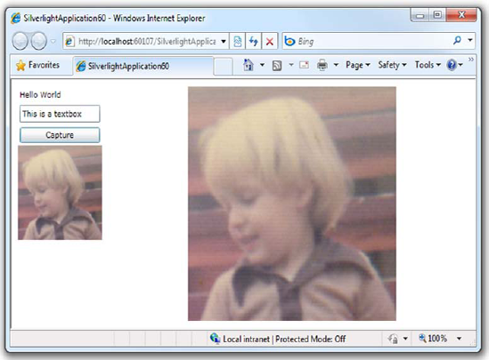
There are some restrictions when creating images from existing images. If you download the image from another server—in other words, a cross-domain call like we discussed in chapter 14—you won't be able to access the individual pixels of the image. In our example, we'll use an image that already exists in our project. The resulting application will look like figure 21.1 once you click the Capture button.
This example shows how to use one bitmap as a source to the writeable bitmap. Once you have the image in a writeable bitmap, you can manipulate it all you'd like (within the cross-domain restrictions I mentioned). Double-click the Capture button to create an event handler, then place this code in the handler:
BitmapSource source = SourceImage.Source as BitmapSource;
WriteableBitmap bmp = new WriteableBitmap(source);
ResultBitmap.Source = bmp;
Of course, you can also load the image from a URL. This code, used in place of the previous example, shows how:
Uri uri =
    new Uri("BitmapApi;component/Pete3YearsOld.jpg",
    UriKind.Relative);
StreamResourceInfo res = Application.GetResourceStream(uri);

BitmapImage image = new BitmapImage();
image.SetSource(res.Stream);
WriteableBitmap bmp = new WriteableBitmap(image);

ResultBitmap.Source = bmp;
This example shows how to create a WriteableBitmap from an existing image that hasn't necessarily been loaded into an Image element onscreen.
The convoluted loading scheme is required only because this file is a resource in the Silverlight project. If it's just a normal file on the server, you could've passed the URI directly to the BitmapImage constructor.
Note
The image is loaded asynchronously; the data isn't available until the BitmapImage.ImageLoaded event has fired. This is especially important when working with images from external servers.
Another way to use the WriteableBitmap class is to create a rendering of a portion of the visual tree.
The WriteableBitmap class can be used to take a snapshot of all or a portion of the visual tree. This allows you to easily create thumbnails of large forms for a Windows 7 taskbar-like effect, or capture still frames from videos playing in a MediaElement. Note that cross-domain pixel-access checks are enforced, so if anything in the tree fails the cross-domain check, everything will.
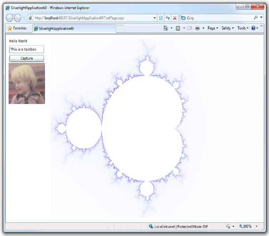
As it turns out, creating a snapshot of a portion of the video tree is extremely simple. You pass the root element of the branch of the tree into the constructor of WriteableBitmap, along with an optional render transform. For example, see figure 21.2 for a direct 1:1 representation.
To create the bitmap version of the UI as shown in figure 21.2, you only need a couple of lines of code. Place these in the click event handler in place of the other code shown so far:
WriteableBitmap bmp = new WriteableBitmap(Elements, null);
ResultBitmap.Source = bmp;
Elements is the name of the StackPanel containing the four elements. The fidelity of the capture is close, but not perfect. For example, you lose ClearType rendering for fonts, so most text will look a little different. Of course, if you pass in a render transform (to rotate, skew, resize), it'll definitely look different.
The final approach is to create an image from scratch. We'll discuss direct pixel access at the same time; it applies to all three approaches.
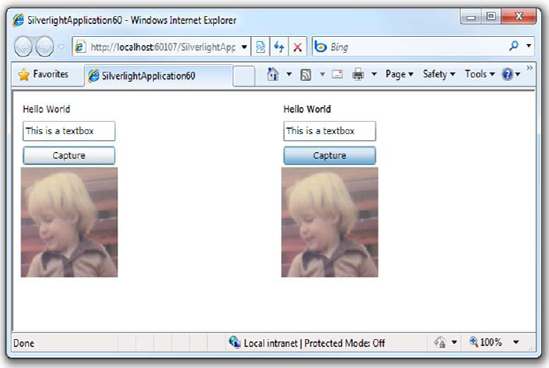
Figure 21.2. The elements to the left are live elements in the visual tree. On the right, you can see the bitmap representation of those elements, captured while the Capture button was clicked.
The third approach to using the WriteableBitmap is to create an image from scratch. This is useful when you want to create an image from code or allow the user to draw on an empty canvas using the mouse.
The direct pixel access techniques shown here also work for any of the previous approaches, once the base image is loaded. Keep in mind that cross-domain images don't allow direct pixel access, and you'll get an exception if you try to do so.
To create an image from scratch, you need only provide dimensions, like this:
WriteableBitmap bmp = new WriteableBitmap(640, 480);
Then you're free to start working with the image. The pixels are manipulated using the Pixels property, which returns an array of integers. Each 32-bit integer represents one pixel in pARGB (premultiplied alpha, red, green, blue) format. This example iterates through the array, setting completely random values for the pixels:
Random random = new Random();
for (int i = 0; i < bmp.Pixels.Length; i++)
    bmp.Pixels[i] = random.Next();

ResultBitmap.Source = bmp;
That's interesting, but not particularly helpful, as it doesn't show how to set a specific color. Setting a single pixel to a specific color is just as easy:
Color c = Colors.Orange;
bitmap.Pixels[i] = c.A << 24 | c.R << 16 | c.G << 8 | c.B;
The shifting combined with the bitwise OR operation packs the four values into their correct position within the integer. To get an existing value, the code is a little more verbose, but still amounts to the reverse of putting the pixel:
int pixel = bitmap.Pixels[i]
Color c = Color.FromArgb((byte)(pixel >> 24),
                         (byte)(pixel >> 16),
                         (byte)(pixel >> 8),
                         (byte)(pixel));
In this example, the variable c will contain the correct color code for the pixel at position i. The bitshift operators and byte masking take care of getting the correct values from the correct positions in the integer.
One interesting use of all this is to create new images using an algorithm. One of the most impressive and best-known algorithms is the Mandelbrot fractal. We'll close the section on the WriteableBitmap by creating our own little Mandelbrot fractal generator.
I love fractals. A number of the desktop wallpapers I created and offer through my personal site were generated using fractal explorer programs such as Ktaza (no longer available). In this section, we'll build a simple visualizer for the Mandelbrot set, a common fractal. The Silverlight application will be able to produce results like figure 21.3. For efficiency, we'll simply modify the same project we've been working with throughout this section. Inside the button click handler, add the code from listing 21.3. This code generates a Mandelbrot fractal, coloring it using the escape time algorithm.
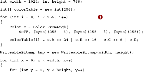
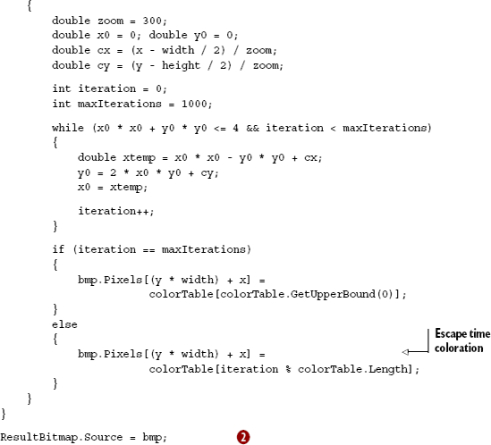
Listing 21.3 shows how to generate a simple Mandelbrot fractal with coloration based on the escape time algorithm. The code to make this work in Silverlight is straightforward. First, I build a color table to be used by the escape time algorithm. The colors simply fade from white to dark blue. I then create the WriteableBitmap instance.
The majority of the remaining code is an implementation of the Mandelbrot fractal algorithm. Should you want to modify the scale of the content, the zoom variable is a good place to begin.
The final step is to set the source of the bitmap onscreen to be the WriteableBitmap . This is consistent with the other examples.
When I run this on my PC, the 1024 × 768 fractal generates and displays in subsecond time. I remember in the '80s I had a CBM-BASIC program that generated a Mandelbrot set, and it ran all night, just to create a 320 × 200 image. Impressive.
WriteableBitmap enables a number of important scenarios. First, you can use it to duplicate an existing image to prepare it for editing. Second, you can take a snapshot of a portion of the visual tree in order to create a thumbnail, or to snap a frame of a video. Third, you can generate images, or modify existing images, entirely from code. The scenarios for WriteableBitmap reach across all types of applications from games, to image manipulation, to forms-over-data business applications. Plus, just about anywhere you can use an Image, you can use a WriteableBitmap.
Tip
WriteableBitmap requires a fair bit of effort to use for generating shapes or lines. For those situations, you have to do the math to plot pixels efficiently. The WriteableBitmapEx library on CodePlex at http://writeablebitmapex.codeplex.com builds upon the WriteableBitmap to add support for these and other functions.
The Image element will support images up to 4 gigapixels (four billion pixels) in size. As you can imagine, using images this large can force your users to endure painful wait times. In addition, with advancements in digital photography and photo-stitching, what are you supposed to do with images larger than 4 gigapixels? To address these types of situations, Silverlight exposes a slick feature called Deep Zoom.
Deep Zoom is a feature of Silverlight that enables users to explore groupings of highresolution images. Traditionally, viewing high-resolution images over the internet is associated with painful wait times because high-resolution images are generally larger in size. Silverlight's Deep Zoom feature removes the usual long wait times. In addition, Deep Zoom natively allows users to drill into an image and see its most intricate details. All this is delivered in a smooth viewing experience that runs with unprecedented performance. This kind of experience is made possible by the MultiScaleImage control.
The MultiScaleImage control, similar to the Image control, has the ability to efficiently show incredibly high-resolution images. These images can be zoomed into, giving the user a close-up view of the content. Alternatively, the user can zoom away from the image to get a bird's-eye view of the image. Either way, these zooming features are constrained to an area known as the viewport. This viewport can be zoomed into, zoomed out of, and moved around the surface of an image, but this image really isn't an image at all—it's a collection of images typically created by Deep Zoom Composer, a free tool from Microsoft.
Showing an image within a MultiScaleImage control is nearly identical to showing an image within an Image control. As with the Image control, the only property you need to set to display an image is Source . This property is a MultiScaleTileSource that can be used to reference a file, but this file isn't a typical image file. Instead, this file is an XML file, known as the Deep Zoom image (DZI) file, that describes a multiscale image. We'll share more about this file type in a moment; for now, look at how a MultiScaleImage is created in XAML:
<MultiScaleImage x:Name="myMultiScaleImage"
  Source="images/dzc_output.xml" />
This shows the XAML to load a relative multiscale image at design time. In the event that you need to load a multiscale image at runtime, you use a DeepZoomImageTileSource instance. This type derives from the abstract base class MultiScaleTileSource, so it can be used at runtime as shown here:
myMultiScaleImage.Source = new DeepZoomImageTileSource(
  new System.Uri("images/dzc_output.xml", UriKind.Relative));
This line of code shows how to load a multiscale image at runtime. If the referenced image can't be found, the MultiScaleImage object's ImageOpenFailed event will be fired. If the image is found, the ImageOpenSucceeded event will be triggered and the image will be shown. Once this happens, you may consider giving your user the ability to zoom in and out of the high-resolution image.
The MultiScaleImage control has the ability to show an extremely high-resolution image. This control helps remove the traditional limitations associated with screen real estate. This is accomplished by enabling your users to zoom in from a view as if they were standing on top of a mountain.
Zooming within a MultiScaleImage is handled by a method called ZoomAboutLogicalPoint. The ZoomAboutLogicalPoint method takes three parameters that describe the zoom attempt. The first parameter determines how much to zoom by. The second and third parameters specify from where in the image the zoom originates. These parameters and the ZoomAboutLogicalPoint method are shown in listing 21.4.
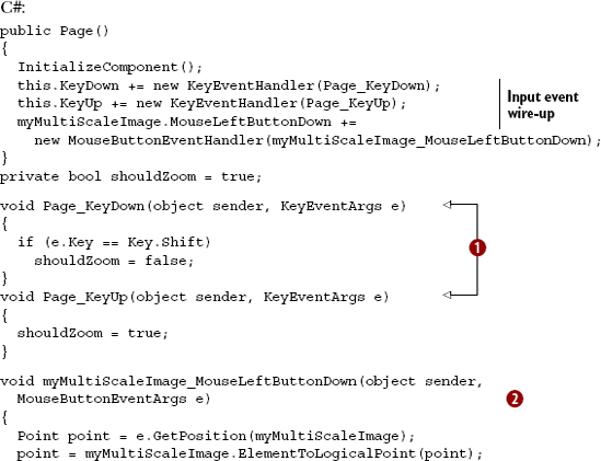
This listing looks like a lot of code. In short, this code enables the user to zoom in or out of the MultiScaleImage defined earlier. To enable this functionality, you first listen for a keypress . If the keypress is made from the Shift key, the user is saying to zoom away from the image. If the Shift key hasn't been pressed, the zooming feature will default to zooming in, so you also need to listen for a user releasing a key through the KeyUp event. This event resets the zoom mode to the default after the Shift key has been pressed. The real meat of this feature is demonstrated when the user clicks the Multi-ScaleImage . This action forces a call to the ZoomAboutLogicalPoint method, which zooms according to the three parameters passed to it.
The first parameter passed to the ZoomAboutLogicalPoint method determines how to zoom on the image. If this double value is less than 1, the method will zoom away from the image. If the value is greater than 1, the method will zoom into the image. Either way, you can play around with this value to also adjust the speed in which the zoom is applied. To determine where the zoom begins, you must rely on the second and third parameters.
The second parameter represents the logical x coordinate to zoom from, the third parameter represents the logical y coordinate to zoom from. Both parameters are double values that fall between 0 and 1. The fact that these values fall between 0 and 1 is what defines them as part of a logical coordinate system, but most items use a standard Cartesian coordinate system. Fortunately, the MultiScaleImage class exposes two methods that enable you to convert Point objects between the two coordinate systems. The methods are:
ElementToLogicalPointLogicalToElementPoint
ElementToLogicalPoint converts a Cartesian Point to a logical Point. This is generally used to convert the position of the mouse cursor before zooming because the ZoomAboutLogicalPoint method expects a logical point. Here's an example, assuming the user clicked the mouse at 125,200:
Point cartesianPoint = new Point(125, 200);
Point logicalPoint = myMultiScaleImage.ElementToLogicalPoint(cartesianPoint);
myMultiScaleImage.ZoomAboutLogicalPoint(1.5,
  logicalPoint.X, logicalPoint.Y);
LogicalToElementPoint converts a logical Point to a Cartesian Point. This allows you to work with a point in a more familiar interface. Here's an example of how to use this method:
Point logicalPoint = new Point(0.25, 0.75);
Point cartesianPoint =
myMultiScaleImage.LogicalToElementPoint(logicalPoint);
Together, these examples show how to convert between the two coordinate systems. The logical coordinate system is necessary because it's used for two important tasks. The first task is zooming in and out of an image—which you just saw. The other major task is selecting what part of a multiscale image to zoom in on. You'll learn how to do this in a moment. Regardless of your task, both require some knowledge of how to manage the viewport.
The viewport is a rectangular region used to view a specific area of an image. This region enables you to zoom in and focus on the details of a specific part of an image, so you may want to think of the viewport as a way to interact with an image three-dimensionally. By default, this region is the size of the entire MultiScaleImage control, but you can change the size of the viewport through the ViewportWidth property.
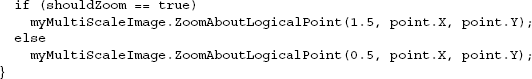
The ViewportWidth property sets the size of a viewport in relation to the logical coordinate space. Anytime you change the ViewportWidth property, it'll be in relation to the hosting MultiScaleImage. For instance, if you set the ViewportWidth property to 1.0, the viewport will be the same size as the hosting MultiScaleImage control. If you change the ViewportWidth property to a double greater than 1.0, you'll make the viewport larger than the MultiScaleImage. This approach would give the user a sense of zooming away from the image. Alternatively, you can focus on a smaller portion of a multiscale image by providing a value less than 1.0. Figure 21.4 illustrates this zooming-away effect.
This figure shows the effects of changing the ViewportWidth property to a double less than 1.0. The figure on the left represents the original multiscale image. As you can see, the Silverlight logo in this image is only a small portion of the area shown to the user. By setting the ViewportWidth property to 0.33, the Silverlight logo becomes the focus of the entire MultiScaleImage. In reality, the ViewportWidth is only part of the story. The other part involves using the ViewportOrigin property.
The ViewportOrigin specifies the position of the upper-left corner of the viewport. This position is a logical Point relative to the upper-left corner of the MultiScaleImage. Each of the coordinates within the Point will be between 0.0 and 1.0. Note that you can still define this value at design time. To do this, you have to set the ViewportOrigin property with the syntax shown here:
<MultiScaleImage x:Name="myMultiScaleImage"
                 Source="images/dzc_output.xml"
                 ViewportOrigin=".33,.33" />
This line of markup shows how to set the ViewportOrigin property value at design time. As you might expect, this value can also be set at runtime by creating an instance of the Point class. This explanation hardly details the real value of the ViewportOrigin property—that it enables you to navigate around the surface of an image once you're zoomed in. By handling a user action (see chapter 8), you can change the viewport position as necessary. The following example shows how to change the position of the viewport on a mouse click:
void myMultiScaleImage_MouseLeftButtonUp(object sender,
  MouseButtonEventArgs e)
{
  Point newOrigin = e.GetPosition(myMultiScaleImage);
  myMultiScaleImage.ViewportOrigin =
    myMultiScaleImage.ElementToLogicalPoint(newOrigin);
}
This example shows how to reposition the ViewportOrigin based on where a user clicked. Once it's clicked, the viewport will move to the new Point. This process begins with a nice smooth animation called a spring animation. This animation will play anytime the viewport changes size or location—anytime you zoom in or out of an image or pan the surface. This animation can be turned off by changing the UseSprings bool property to false, but you won't usually want to do this.
In general, it's recommended that you leave the UseSprings property set to true because the animation creates a rich viewing experience. In addition, it gives the MultiScaleImage control more time to download any necessary data. Once the viewport does change size or location, the MotionFinished event will be triggered, giving you an opportunity to perform any UI updates that you may want to make to the display.
The viewport is an important concept within the MultiScaleImage control. This item gives you the power to scan the surface of a high-resolution image. In addition, the viewport enables you to readily zoom in and out of an image. To enable this zooming functionality, you first load an image into the MultiScaleImage control. This image is loaded through the Source property, and the Source should reference a .xml file, which can be created by a tool. This tool is used when you're ready to deploy a multiscale image.
The MultiScaleImage control has built-in support for handling XML that details a multiscale image. This type of file can be generated programmatically or by a tool called Deep Zoom Composer. We won't cover this tool in detail because of its simplistic nature. Once you download and install the tool from the Microsoft Expression website, you can quickly create XML files that can be used by the MultiScaleImage. These files can be generated within the tool by going through a basic wizard. This wizard goes through the following steps:
Import—Enables you to import your own images.
Compose—Lets you lay out how the images should appear.
Export—Determines where the result will be stored.
These three steps will generate a .xml file and a file/folder structure. These two items must then be added to your web application so that the MultiScaleImage control can access them. Once this has been done, you can use Deep Zoom on your own images.
Deep Zoom is a powerful feature available within Silverlight. Because this technology relies on basic images and an XML file, there are no server-side requirements. In addition, the only client-side requirement is Silverlight itself. This is great news because, as you play with Deep Zoom, you'll see the rich experience it provides. This experience truly makes viewing high-resolution images over the internet enjoyable.
One of the misconceptions about Silverlight is that everything must be a vector shape. Silverlight provides a number of ways to load and display bitmap images, as well as powerful ways to manipulate them. You can load regular .png and .jpeg files from the web or a local resource; you can create images on the fly, or from other visuals; and you can quickly zoom through collections with millions or billions of pixels at play. All of this Silverlight does natively and fluidly, proving both a simple developer experience and an excellent end-user experience.
In the examples shown so far in this chapter, you may have noticed some different values for the Stretch property. This property is shared by video and image elements alike, and helps control how the content will fill (or not fill) the space provided.
Throughout this chapter you've seen a variety of ways to deliver different kinds of media. Often, media is intended to be a secondary part of an application instead of the main attraction. For instance, a user's profile picture is part of an application but not as important as the profile information itself. As you can imagine, there's the possibility that these profile pictures may be of different sizes. This can lead to dead space, or areas that don't include content. Fortunately, there's a way to gracefully deal with these situations. Please look at figure 21.5.
The Image, MediaElement, and Shape (discussed chapter 18) classes expose a property called Stretch. This property determines how the area devoted to an element will be filled. This description will become clearer as you see the examples available in this section. This property must be set to one of the four options available in the System. Windows.Media.Stretch enumerator, which exposes the None, Uniform, Fill, and UniformToFill options.
Most of the time, photos are represented as raster-based graphics. Raster-based graphics often become pixellated and lose their detail when they're enlarged. You can prevent this from happening by using the option None for the Stretch value. This option commands an element to maintain the original size of the requested content—this option doesn't make the content stretch at all. As you probably expected, you can set this property value at design time, as shown in here:
<Image x:Name="myImage"
Source="http://www.silverlightinaction.com/man.png"
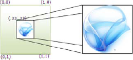
Stretch="None" />The XAML in this example loads an Image and prevents it from stretching. The result from this XAML can be seen in figure 21.5, which shows the results of the None option when there's plenty of space for a piece of content. Consider the scenario where the content is larger than the hosting element. Take a look at Walker's picture (the content) in an Image element (the hosting element) smaller than the picture (see listing 21.5).
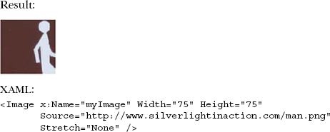
Unfortunately for Walker, his legs got cut off! (One of my slightly twisted tech reviewers suggested he should be named "Sitter" now. Thanks, Tom.) As the result in this listing shows, the original photo remains the same size, so the bottom and right edges of the photo are cropped so that the image fits within the 75px-by-75px dimension of the Image element. This illustration also erases any fears of an exception being thrown in the case of an element being smaller than its content.
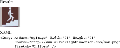
At first glance, the None option may seem like the most obvious default option. It may come as a surprise to find out that another option makes even more sense as the default. When you begin to consider the fact that the Stretch option is applicable to Image, MediaElement, and Shape elements, it makes much more sense to stretch items by default, uniformly.
If you set the Stretch property to Uniform, the content of the element will symmetrically expand or contract to occupy most of the available area. While the content expands or contracts, the native aspect ratio will be preserved. This means that if you revisit Walker's picture, it'll be stretched vertically, making him stand tall and proud (see listing 21.6).
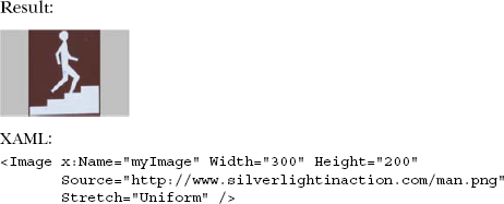
The gray backdrop in this listing represents the area that could be filled by an image. Because the Uniform option stretches content proportionally, it must stop once either a vertical or horizontal boundary is met. But, what happens if the content is larger than the bounding element? Listing 21.7 shows how to maintain aspect ratio.
As this listing illustrates, the content remains intact. Instead of cropping the image, as was the case in listing 21.5, the content scales to a smaller size. As the content scales down, the aspect ratio stays the same. Although maintaining the aspect has its benefits, occasionally you might need to fill the entire area, no matter what. For these situations, you have the Fill option.
The Fill option allows you to expand or contract the content of an element to fully occupy the space allocated to it. You'll most likely use this option in backdrop scenarios where you want an Image to serve as wallpaper. Listing 21.8 shows what the Fill option does to Walker's picture.
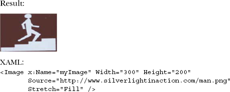
Walker looks a little bloated (it's water weight, trust me) in this listing because, although the Fill option will expand to ensure that every pixel allotted to an element is used, the aspect ratio of the content won't be preserved. Because of the oblong dimensions of the photo, the photo is stretched horizontally—in turn, horizontally stretching Walker.
Sometimes, you may need the flexibility to fill an element while maintaining the aspect ratio. For these circumstances, you have the UniformToFill option.
As the name implies, this option is a hybrid between the Uniform and Fill options. The content within an element will maintain its aspect ratio while filling the entire bounding area. If the content has a different aspect ratio than the housing element, the overflowing content will be clipped. See listing 21.9 for a small sample using our friend Walker.
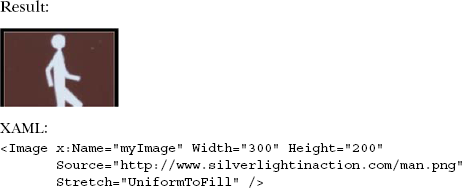
This listing illustrates how a raster-based graphic can become pixellated when inflated. It also shows how the aspect ratio is maintained as the picture is enlarged to fill every allocated pixel. As you've probably noticed, Walker's legs are removed from this picture. This is because the bottom edge has been removed to ensure that the image fits within the allocated boundaries.
Stretching can help you address a wide variety of filling situations. Silverlight allows you to easily address any type of stretching situation through the Stretch property. This property can be used with the Image and MediaElement items discussed earlier in this chapter. Interestingly, the Stretch property isn't supported by the MultiScaleImage control. But, with those powerful deep-zooming capabilities, does it really make sense to stretch? I think not.
Over the course of this chapter, we explored several ways of working with bitmap (also known as raster) images. Silverlight natively supports .jpeg and .png images in the Image element, but provides facilities for you to be able to construct any type of image you'd like using direct pixel access with the WriteableBitmap.
The WriteableBitmap allows you to construct images from existing UI elements, from existing images, or even from individually placed pixels. This supports countless scenarios from screen thumbnails, to video stills, to games and paint programs.
For truly large images, or collections of large images, Silverlight provides the MultiScaleImage control, also known as Deep Zoom. Deep Zoom supports images in the millions to billions of pixels allowing for very fast enlargement of specific areas while minimizing the amount of memory, processing power, and bandwidth used.
All of the image types support various stretch options to allow them to conform to the shape of the container they're placed in. Silverlight smoothly resizes images, preserving aspect ratio if you desire.
Along with media (see chapter 20) and vector graphics (see chapter 18), bitmap images round out the graphical presentation capabilities of Silverlight, helping to put the "rich" in rich internet application. In the next chapter we'll learn how to use animation to move from these static shapes to a more dynamic and interactive user experience.