
When you first created a Silverlight 2 application, you ended up with a project that contained a single white main page, probably sized at 300 × 400, depending on the template you used. There was no guidance for structuring your application or how to move from page to page. Unlike HTML pages or WPF/Windows Forms, the navigation structure wasn't something intuitive, building on a decade or more of knowledge and established patterns. Instead, most new Silverlight developers were left staring that that blank page, wondering what to do next.
Silverlight 3 introduced not only a complete navigation framework, but also an application template built on this framework. The navigation framework takes a modern browser-oriented approach to navigation, supporting concepts such as journal histories, back-and-forward navigation, and uniquely addressable pages. This framework addressed the needs of both application structure and end-user navigation.
Silverlight also supports dialog content. In addition to the standard open and save dialogs provided by the operating system, you can create your own simulated dialogs using controls such as Popup and ChildWindow.
In this chapter, we'll dive deep into Silverlight navigation, followed up with a look at how to handle pop-ups and dialogs. We'll look to history to inform us about how navigation is handled in the browser and how hashtags or URI fragments work. From there, you'll start building an application using the navigation template. The navigation template will then be used to explore navigation to individual pages and customization of navigation.
After we complete the tour of navigation, we'll turn our eye to dialogs and child windows, including the operating system–provided file dialogs and the Silverlight Popup and ChildWindow classes.
Before diving into Silverlight navigation, let's take a look at a well-established navigation paradigm as used by the web browser.
The introduction of GUI web browsers hailed a new approach to navigation. Prior to Mosaic, the typical modes for navigation were either keyboard commands or drop-down menus. Most applications had multiple windows and were wizard-driven or dialog-driven. Browsers introduced two key things:
Navigation to previously visited pages using Back and Forward buttons, with retained history on both
Navigation to new pages using hyperlinks
This may seem pretty unexciting now, but it wasn't a mainstream approach at the time. Applications didn't contain a single frame that was swapped in and out with different bits of content.
With the ubiquity of web browsers came new demands for how applications worked. It was expected that your applications, especially if hosted in a browser, would use a forward/backward and link paradigm. This worked fine for the period of time when browser applications were all server-processed and static client. Think ASP, CGI, and similar application types.
Outlook Web Access (OWA), released in 2000, had bits of functionality that other application developers realized could make the web a better place. OWA was making network calls back to the server to get new content, but did it without any sort of post-back or even an iframe. Developers looked to see how this application (and others such as Gmail in 2004) were written, and began to adopt the approach themselves. Around 2003 (give or take a year or two), Ajax applications based on JavaScript, asynchronous network calls, and client-side HTML DOM manipulation began to rise in popularity. Ajax applications are and were a web approach designed to provide interactive client-side desktop application–like functionality to the web pages.
Unfortunately, as Ajax applications became more and more complex, they made browser back/forward navigation unreliable. Newsgroups at the time were full of "How do we disable the Back button?" questions. Clicking the Back button navigated off the page, completely destroying the application state. Java applets and, later, Flash applications ran into the same problem.
Eventually, both browser makers and the application framework developers were able to work together to provide an approach for interacting with the browser journal, the structure in the browser that keeps track of your navigation history. The rest is, well, history.[1]
In this section, we'll briefly cover how the browser journal works and how it interacts with anchor tags on a typical web page. With that grounding, we'll then be able to look at Silverlight navigation in the subsequent sections.
The browser journal keeps track of your navigation history for a session. It's what allows you to click the Back button to open the previous page and then click the Forward button to return to where you were.
Browsers each implement their history journal and its API in subtly different ways. For example, Internet Explorer 7 required the use of an HTML iframe in order to generate an actual history entry when you navigate to a hashtag. Other browsers didn't update their JavaScript API objects, such as location.hash, to reflect changes to the hashtag. Some other browsers were just plain buggy and didn't consistently keep the correct state. There were other smaller differences in addition to gross API differences.
Note
Ever wonder why you need that iframe in the HTML page in a Silverlight project? It's there for navigation support in older browsers, including IE7. IE7 wouldn't generate a history entry when you navigated to a hashtag unless you also navigated a frame at the same time. Some pretty clever scripting avoids a server round-trip in there, all happily wrapped inside the navigation API. IE8 doesn't require this hack.
Back around 2007-2008, Ajax libraries started to include functionality to wrap all this journal ugliness. Happily, Silverlight, with Silverlight 3 in 2009, was able to build on this body of work to provide the same functionality.
The entire navigation structure for rich, client-side browser applications is built around hash tags.
Hashtags, more properly known as fragments when part of a larger URI, were originally designed to enable navigation within the same page without requiring a round trip to the server. They were for top-level tables of contents on really long pages. Here's an example in HTML:
<ul>
<li><a href="#first">First</a></li>
<li><a href="#second">Second</a></li>
</ul>

<p><a style="height:600px" name="first"/>
This is the first content paragraph</p>

<p><a style="height:600px" name="second"/>
This is the second content paragraph. Put me below the fold.</p>
If you paste this into a file with an .html extension and view it in your browser, you'll see how clicking the links at the top brings the bottom content into view and updates the address at the top of the browser. If the content is already in view, you won't see any on-page changes, but you'll still see the hashtag change in the URL. Figure 15.1 illustrates this.
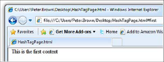
Figure 15.1. I just clicked the First link at the top of the page. The browser scrolled to bring the content into view and updated the URL with the hashtag #first.
You can achieve a similar effect using JavaScript. Rather than having to click a link, you can use this one line of JavaScript code:
window.location.hash = "#first";
As you learned back in chapter 4, Silverlight can manipulate the browser DOM for any page it's on. Silverlight uses this and the plug-in model to handle the journal manipulation for you, saving you the aggravation of coming up with a cross-platform, cross-browser, custom solution or hand-crafting JavaScript.
The hashtag approach provides a way to uniquely address content. It's common to see, for example, blog engines using this to uniquely address comments on a page. In Ajax applications and in-browser RIAs, you can use it the same way: to uniquely identify content that's on the same browser page, but nested within your application.
Assuming you're already on the browser page specified in the URL, all of this is done without a page refresh, which is the key to making it work with your applications.
Browsers have a long history[2] with their current navigation paradigm. When running an application in the browser, and increasingly when running desktop applications, users have come to expect that the approach of Back buttons, Forward buttons, and hyperlinks will be, if not the primary navigation mechanism, at least one form that's available to them. It has even reached a level mainstream enough to be incorporated into the Windows shell, as shown in figure 15.2.
The Back and Forward buttons have their own settled UI convention (left and right arrows). As expected, Back navigates the browser history backward, toward the first page in the navigation chain, and Forward navigates forward as far as you've gone in this chain. Of course, Forward only works if you've used the Back button already. When you click another hyperlink, the forward chain is rebuilt starting at the current point.
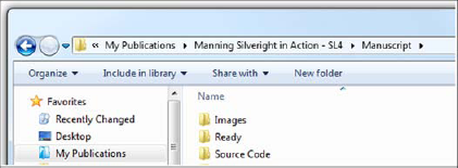
Figure 15.2. The Back and Forward buttons have even made it into the Windows shell, in the file explorer windows.
With the background in browser navigation, journals, and hashtags, we can now look at the Silverlight implementation and make more sense of the design choices made, as well as the knobs provided for tweaking the approach. The easiest and most obvious way to explore the navigation framework is to start with the Silverlight Navigation Application template.
When creating a new Silverlight project, you can choose from several stock templates. For most of the projects in this book, we've used the generic Silverlight Application template. That template is great if you want a blank slate to start with.
The Silverlight Navigation Application template is another good one. This template provides the fundamental structure and plumbing required to allow your application to work using a familiar web page navigation model. In addition, the template provides for easy theming of your application.
The Silverlight Navigation Application template isn't required when you want to incorporate navigation in your application. But you'll find the template provides a good starting point.
In this section, you'll create a new navigation project and use it to explore the Navigation Application template, including modifying the navigation to include an additional page and the link to that page. We'll wrap up with an example showing you how to use the free online themes to customize the UI of the navigation application.
As the name suggests, the Silverlight Navigation Application template structures the application around the navigation API first introduced with Silverlight 3. This API makes it easy to move between pages. The template provides a best-practices structure for using the capabilities provided, as well as a good starting point for your own applications.
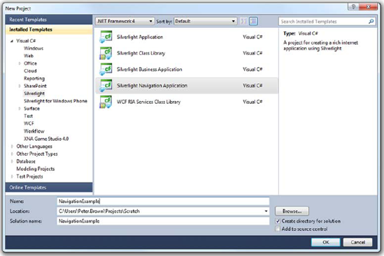
The first step is to create the new project using the navigation template. Figure 15.3 shows the correct template selected in the Visual Studio 2010 New Project dialog. I named the application NavigationExample.
After the project has been created, you end up with a structure that includes an Assets folder with application styles (see chapter 23 for more on styling) and a Views folder that includes two pages and an error window dialog. You'll also see the usual Main-Page.xaml and App.xaml files in the project root.
When you run the unmodified application, using the default application style, you'll end up with something that looks like figure 15.4.
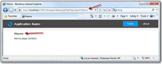
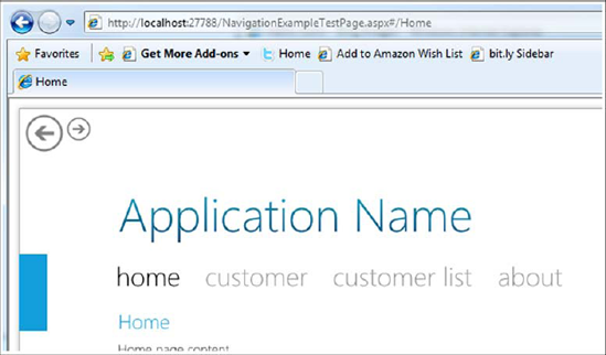
Figure 15.4. The Navigation Application default project. Note how the URL corresponds to the current page visible in the application, and how the navigation menu on the right is synchronized with the two.
The application template includes all the wiring required to synchronize the menu (the Home button at upper right in the screen shot) with the page in view, and synchronizes both with the hashtag in the URL. If you click the About navigation button, you'll see that the URL changes. Even better, you can use the browser's Back button to get back to the home page of the application.
Although this is a great structure, an application with only home and about pages would probably not be particularly engaging. To grow beyond this, you need to add a new page and modify the navigation menu.
Much like regular web pages, the functionality and content for a navigation application are in the pages. Adding a new page to a navigation application involves three steps:
Add the new view to the Views folder.
Add a link to the top menu.
Add functionality to the page.
The first step is as simple as dropping a new file into a folder. The second step involves some modification to MainPage.xaml; and the third step is what you'd normally do in any application, so we'll skip it here.
Views are instances of the Silverlight Navigation Page class defined in the System. Windows.Controls.Navigation namespace. The Silverlight tools include a template for a blank page deriving from the navigation:Page class, a class which is essentially a UserControl that has been beefed up to support navigation.
Right-click the Views folder, and select Add New Item. In the Add New Item dialog, select the Silverlight Page template, and name the file CustomerDetail.xaml. Figure 15.5 shows the Add New Item dialog with the correct selections.
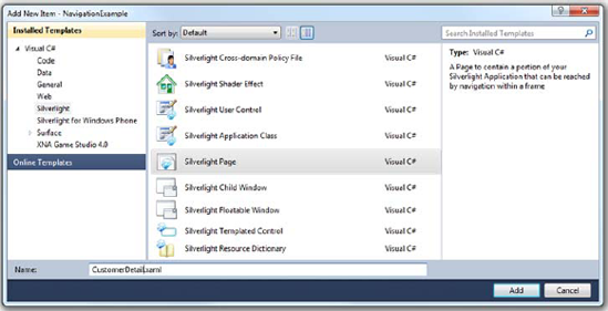
Figure 15.5. The Add New Item dialog with the Silverlight Page template selected. This is the template to be used for views in a Silverlight navigation application. I may have more templates than you; I've installed some add-ins.
After you've added the new page, you need to provide a way for the end user to find it. In a regular desktop application, this may be a menu or toolbar. For this navigation application, you'll use a HyperlinkButton.
In this template, navigation to individual pages is accomplished by HyperlinkButton instances on MainPage.xaml. The pages themselves are loaded in the navigation: Frame element named ContentFrame.
On MainPage.xaml is a Border named LinksBorder. This is the navigation menu that appears at upper right. The default XAML for this area is shown in listing 15.1.
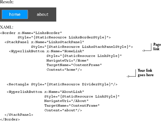
This Border contains the top menu navigation structure for the application. It's a simple StackPanel of elements: HyperlinkButton instances separated by vertical lines (narrow rectangles).
Note that I removed the x:Name from the divider rectangle, because it's not needed. The names in the HyperlinkButton instances also aren't needed, but I gave them meaningful names to help with the discussion here, and in case you decide to do something with them in code. In your own project, you can remove the names if you'd like.
To add your own page to the navigation structure, you need to follow this pattern and add a divider rectangle (optional, but recommended) and a HyperlinkButton pointing to your page. Place this markup in the XAML in the spot indicated in the previous listing:
<Rectangle Style="{StaticResource DividerStyle}" />

<HyperlinkButton x:Name="CustomerDetailLink"
                 Style="{StaticResource LinkStyle}"
                 NavigateUri="/CustomerDetail"
                 TargetName="ContentFrame"
                 Content="customer" />
When copying and pasting from the other links, I left the divider alone but changed a couple properties of the HyperlinkButton. The first is the x:Name property, which is optional because it's not used in any code, binding, or animation in the default template. The second is the Content. This is what will be displayed on the menu bar. You could easily use images rather than text if you'd like. You're also free to change the LinkStyle resource to modify the appearance. The final property is the NavigateUri. That needed to be changed to point to the newly added page.
You may have noticed that the URI for the page is set to /CustomerDetail, when the actual page is stored in /Views/CustomerDetail.xaml. This is handled by the URI mapper, which we'll cover later in this chapter.
Although it isn't unique to the navigation API, one other nice feature of the navigation application is its ability to be easily styled or themed.
When the Silverlight team created the navigation template, they enlisted the help of an in-house designer to both ensure that the template could be themed and to create themes for use with it. Long after the release, the design team has continued to put out new themes, each more impressive than the last.
You can get the set of templates that's current as of this writing by visiting http://bit.ly/sltemplates and clicking the big download link at the top. Be sure to grab the VisualStudio2010 zip file, which contains the .vsix (Visual Studio Install Package) files for the themes. This will install a number of new project templates, one for each theme you install.
Because you've already started your project, you'll need to steal some theme files from another project. In another instance of Visual Studio, create a new Silverlight Navigation Application - Cosmopolitan Theme (or a different theme if you prefer) application. Save that. Then, find the folder where you stored that project, open it in Explorer, and drag all the contents except the SDKStyles.xaml and ToolkitStyles.xaml files from the Assets folder in the temp project into the Assets folder of your chapter project. Be sure to overwrite (or first rename) the old Styles.xaml file so you pick up the new one.
Important
Make sure each of the theme XAML styles is compiled with a build action of Page and a Custom Tool of MSBuild:Compile. You'll find both settings in the property panel for the file. The build action provides compile-time errors. The custom tool tells Visual Studio what to do with the file and how to include it in the assembly.
If you include SDKStyles.xaml or ToolkitStyles.xaml, you'll get compile errors unless you also have the required SDK and Toolkit assembles (respectively) referenced in the application.
Finally, open App.xaml in the project you've been working in, and merge in the new resource dictionaries:
<Application.Resources>
  <ResourceDictionary>
    <ResourceDictionary.MergedDictionaries>
      <ResourceDictionary Source="Assets/Styles.xaml" />
      <ResourceDictionary Source="Assets/CoreStyles.xaml" />
    </ResourceDictionary.MergedDictionaries>
  </ResourceDictionary>
</Application.Resources>
After you have all the DLLs referenced, rebuild your application and run. I picked the Cosmopolitan theme, so my application looks like figure 15.6. I didn't change a single line of page XAML, just the applied styles. Note how the sizes, colors, fonts used, and locations of the elements have all changed-pretty awesome. You'll learn more about styling and resource dictionaries in chapter 23.
Most of the rest of what you'll do inside the pages is straight Silverlight code and design. You'll write code either in the code-behind or using something like the MVVM pattern described in chapter 16.
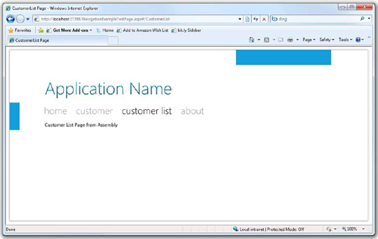
Figure 15.6. The Silverlight navigation application with a new style. The Cosmopolitan style is similar to the Metro theme used by Zune software.
As we continue to explore the navigation framework, you'll use this application in the examples. Now that you've seen how straightforward it is to create a Silverlight navigation-enabled application using the template, it's time to dig into the classes and methods that make the template possible.
In the previous section, you saw what it takes to add a new page into the navigation structure. In a nutshell, all you need to do is add the page to the Views folder and then to the navigation links on the top.
Pages are the most frequently used part of the navigation framework. They're the primarily location for your content. In addition to pages, there are several other important parts. First, the NavigationService class provides the underlying property and event information required to make navigation work. Then you have the Frame element, which loads pages using URIs and supports features such as URI mapping. Both the pages and frames also support forms of caching to minimize the reload time for any given information. Also, much like HTML, frames can be nested and have multiple levels of navigation, or even navigation to pages in other assemblies.
All of these classes collectively fall under the Navigation framework, and all of them are involved in navigating to pages in your Silverlight application.
In this section, we'll dig deeper into what makes navigation possible, looking at the core Page class and its properties. From there, we'll uncover how the Frame class and URI mapping work to load those pages, and how to pass and receive parameters between page instances. Finally, we'll wrap up with caching pages for reuse and navigating to pages contained in other assemblies.
The Page class, in the System.Windows.Controls namespace, provides the behavior expected of content to be loaded into a navigation Frame. The Page itself is analogous to an HTML page or to a regular Silverlight UserControl, but with the addition of navigation events, members, and a navigation service. The page also provides caching capabilities in concert with the Frame class; we'll cover that and other features later in this chapter.
In addition to the standard Title property, which provides a unique friendly title to the page, and some navigation objects that we'll discuss shortly, the Page class includes several virtual functions used to provide information about the current navigation state.
The Page class includes four navigation-related virtual functions. Override these when you want to perform an action on a specific navigation step. Table 15.1 lists the functions of each.
These four events were implemented as virtual functions to eliminate the requirement of hooking up event handlers, potentially keeping pages around longer than intended.
Table 15.1. Page navigation members
Navigation event | Description |
|---|---|
| Called when a fragment inside the Silverlight application is navigated to. For example, /Views/CustomerDetail.xaml#Item1234. This is different from the top-level hash or fragment used to support Silverlight navigation. Equivalent to the |
| Called when this page is no longer the active page in the frame. Use this for any final cleanup code. Equivalent to the |
| Called just before this page is swapped out for another page. The event args allow for canceling the navigation. You can use this to prompt the user to save data, for example. Equivalent to the |
| Called when the page becomes the active page in the frame. In most cases, you'll use this where you'd use the |
You'll use the OnFragmentNavigation when you want to respond to subnavigation within the current page. This is a powerful but seldom-used capability similar in intent to hashtag or fragment navigation on HTML pages.
A good place for page cleanup code, or persisting to a backup cache, is the OnNavigatedFrom method. This is fired when the page is no longer the active page, so it's too late to use to prompt the user for saving. Use the OnNavigatingFrom method when you need to prompt the user.
The OnNavigatingFrom method provides a facility for informing the user that the page is about to be navigated away from. The method signature allows for canceling the navigation, typically in response to a prompt to the user.
Finally, the OnNavigatedTo method is the one most commonly used in navigation pages. This is typically used for any data loading or data-cache retrieval, as well as any page setup. Because pages can themselves be cached, this is the place to check the state of that page cache and perform any operations necessary to make the page available to the user.
The source of the event information is the NavigationService class, which also has several other useful properties and methods.
The navigation Page class exposes a NavigationService class with a property of the same name. This service is useful as a means to hook into the navigation system for the hosting frame from within page code.
The NavigationService class provides five methods used for navigating away from this page, reloading the current page, and stopping asynchronous navigation actions. Table 15.2 provides detail on each function.
Table 15.2. The NavigationService class functions
Member | Description |
|---|---|
| Navigates to the previous entry in the history. Throws an exception if no previous entry exists in the history. |
| Navigates to the next entry in the history. Throws an exception if no next entry exists in the history. |
| Navigates to an arbitrary URI. |
| Reloads the current page. Note that this is useful only when you provide a custom |
| Cancels any asynchronous navigation actions that haven't yet been processed. |
GoBack and GoForward use the currently active journal to move backward and forward through the journal history. These methods are provided both here and at the Frame level to allow you to create your own navigation UI, typically for use when running out-of-browser applications where there's no browser UI. You can certainly use these in-browser, though-something which may be useful for full-screen applications in particular.
The Navigate method takes a URI and starts the process of loading the new content and replacing the current content. We'll cover the Navigate method in more detail when we discuss the Frame class.
In all cases, when using these navigation functions, the events listed in table 15.3 will be fired at their appropriate times.
In addition to the navigation functions, two other methods are available. The first, Refresh, is similar in functionality to the browser's Refresh button. Typically this is used only when you have custom content loaders and are performing some sort of authentication step that must happen before the content appears. This method reloads the page but doesn't force it to be regenerated: if the page is cached, it'll be read from the cache. The second, StopLoading, is similar to the browser's Stop or Cancel button. It stops an asynchronous or long-running page-load process. Given the structure of most navigation applications, with local compiled pages, StopLoading is rarely used.
Highly related to those functions are four properties that provide information on the navigation history as well as the current and planned page. Table 15.3 shows these properties.
These properties are typically used in concert with functions from table 15.1 For example, you'll check the CanGoBack property before calling the GoBack function. Listing 15.2 shows several of these in use in a hypothetical page.
Table 15.3. The NavigationService class properties
Member | Description |
|---|---|
| Returns true if there's at least one previous entry in the history. |
| Returns true if there's at least one next entry in the history. |
| Returns the URI of the currently displayed page. This value changes when navigation has completed. |
| Gets or sets the page to be displayed. If set, when navigation completes, |
These functions and properties are useful for those odd times when you need to perform navigation directly from the page. The more typical approach, shown later in section 15.4, is to call them from the UI that hosts the navigation Frame control.
The final bit of functionality provided by the NavigationService class is surfaced through a set of five events that provide information about the current state of navigation. Table 15.4 shows the events exposed by this class.
Several of the events on the NavigationService class are equivalent to the virtual functions exposed by the page class, discussed earlier. Two of them, the NavigationFailed and NavigationStopped events, have no equivalent and so bear more investigation.
Table 15.4. The NavigationService class events
Member | Description |
|---|---|
| Raised when the system navigates to a hashtag (fragment) on the current page. Equivalent to the |
| Raised when the system has navigated away from the page. Equivalent to the |
| Raised when the system is planning to navigate away from the page. This is a cancellable event. Equivalent to the |
| Raised when the frame is unable to navigate to the requested page. Provides the exception information. |
| Raised when navigation has been stopped. |
The NavigationService class provides much of the core functionality of the navigation system in Silverlight. Although accessing it from within a page is a fine way to use those capabilities, it's more common to access the equivalent properties and methods directly exposed by the Frame class to navigate using URIs or the history journal.
In Silverlight, Pages are loaded into Frames and are uniquely addressable via URIs. These two types-the Frame and the URI-are conceptually similar to their HTML counterparts in that the frame is both a container and a bit of a walled garden, used to host content.
The Frame class is a ContentControl, so it can have only one item as its content. In most cases, that's another XAML page, but that's controllable using the ContentLoader property of the Frame class
The Frame class exposes many of the same properties and methods that the NavigationService exposes. One benefit at the Frame level is that most of these are exposed as dependency properties and can therefore be used to control the IsEnabled state of navigation controls via binding.
You can load content into a frame in a few different ways: using the GoBack and GoForward methods seen in the previous section, or via URI using the Navigate method, which we'll cover here. Frames also support URI mapping to change ugly URLs into more user-friendly versions. This mapping also helps better support page parameters.
Silverlight navigation applications load content pages into frames. In our walkthrough of the Navigation Application template in section 15.2, you saw that the HyperlinkButton in the MainPage.xaml file invokes navigation for you. Although using a HyperlinkButton is an easy way to get content into a frame, it's not the only way. Take for example
ContentFrame.Navigate(new Uri("/CustomerDetail", UriKind.Relative));If the page /CustomerDetail maps to a valid page via the in-force URI mapping, this example will navigate to that page. You could put this type of code in a button or any sort of other handler in the application. The ability to navigate using code means you're not stuck with using HyperlinkControls for your application navigation: you can use traditional menus, ListBoxes, Buttons, or pretty much anything you'd like
When working with navigation pages, you typically don't navigate to pages using a full filename such as CustomerDetail.xaml. Instead, you map friendly URIs to these absolute URIs. This is done through a property on the Frame class.
The Frame class exposes a property named UriMapper of type UriMapperBase. This is responsible for translating real application URIs into something more user-friendly. The default implementation is a class containing a collection of UriMapping objects. Table 15.5 shows the members of the UriMapper class.
Table 15.5. The members of the UriMapper class
Member | Description |
|---|---|
| Collection of |
| Inherited from |
The UriMapper property of the frame class is read/write. Should you desire, you can create your own UriMapper implementation, using your own scheme for mapping URIs. To do so, inherit from UriMapperBase and provide the required functionality in the MapUri function.
In the example at the beginning of this chapter, you saw how the mapper automatically translated /CustomerDetail into /Views/CustomerDetail.xaml. The default UriMapper class exposes the UriMappings collection. Here's the full XAML for the mapping:
<navigation:Frame.UriMapper>
  <uriMapper:UriMapper>
    <uriMapper:UriMapping Uri=""
                          MappedUri="/Views/Home.xaml"/>
    <uriMapper:UriMapping Uri="/{pageName}"
                          MappedUri="/Views/{pageName}.xaml"/>
  </uriMapper:UriMapper>
</navigation:Frame.UriMapper>
Given this mapping, and assuming an application URI of http://myapp.com/app.aspx, when the user visits http://myapp.com/app.aspx#/CustomerDetail, the second mapping will come into play and map to http://myapp.com/app.aspx#/Views/CustomerDetail.xaml. Also note the hashtag in both cases; the mapping only comes into play with that fragment.
This mapping XAML fragment sits inside the navigation:Frame element and provides the two mappings required for the URLs you'd normally use: no page and a specific page. Maps are read top-down and complete when the first match is hit. If you want to pass parameters to your page, you can get more complex and include support for query string values.
A common pattern in web applications is to pass parameters to a page using the query string. The query string is the set of delimited name/value pairs after the question mark in a URL. For example:
http://myapp.com/app.aspx?customer=1234
In this case, the query string would produce two name/value pairs: customer with a value of 27 and invoice with a value of 2506.
That works well for passing parameters to an actual HTML page, but how does it fit in with the hashtag approach used with Silverlight navigation? How do you pass parameters to internal Silverlight pages? In a Silverlight application, much as we've gotten used to elsewhere on the Web, you may want something a little friendlier:
http://myapp.com/app.aspx#/CustomerDetail/1234
In this case, when you have mapping set up, Silverlight will load the CustomerDetail page and pass in a parameter of 1234. How is that parameter passed in? It's entirely up to you and how you do the mapping. For example, let's say you want 1234 to map to a CustomerID query string variable. You provide a map that looks like this:
<uriMapper:UriMapping Uri="/CustomerDetail/{CustomerID}"
        MappedUri="/Views/CustomerDetail.xaml?CustomerID={CustomerID}" />
That map needs to appear near the top, preferably after the Home mapping, in order to be hit. Remember, the maps are evaluated top-down, and the first match is the only one that will be executed.
Retrieving the parameter from within the Page is super simple. The NavigationContext object on the property of the same name in the Page class includes a QueryString property that may be used to retrieve the parameters passed into the page. It's an IDictionary of strings, so no parsing is required; use the name/value pairs as they're provided:
protected override void OnNavigatedTo(NavigationEventArgs e)
{
  if (NavigationContext.QueryString.ContainsKey("CustomerID"))
  {
    string id = NavigationContext.QueryString["CustomerID"];

    if (!string.IsNullOrWhiteSpace(id))
        LoadCustomerDetails(id);
  }
}
This example shows how easy it is to grab the ID from the query string passed into the page. Although I left them out for brevity here, you'll want to have all your query string key names in constants or an enum.
This approach enables you to provide meaningful deep links into data-oriented Silverlight applications, pulling up the appropriate records or other state. Back when I worked primarily with Windows Forms in the .NET 1 and 1.1 days, this was a feature many customers asked for: "How can I email a link to a specific page in the application?" We had all sorts of strange solutions involving custom URI schemes and more. I'm glad to see it's much simpler now.
When you have a data-oriented application, that typically means individual pages cause some sort of database transaction and web service call to run when you load them. The query string parameter may contain a record ID used to load some data. When the user is bouncing back and forth between pages in the application, you don't necessarily want to take a service or database hit on each page; that's where caching comes into play.
There are all sorts of ways to cache information in a Silverlight application: you can cache data at the service level on a web server or using a server-side caching product. You can cache locally on the client using cookies and isolated storage. With elevated trust applications, you can even cache to files in the My Documents folder. Of course, because Silverlight applications are stateful, you could cache everything you need in memory on the Silverlight client. The Page cache is a specialized form of this in-memory approach.
Normally, when you navigate to a page using the navigation framework, you'll get a new instance of that page. This includes times when you click the Back button to get to that page. In order for Silverlight to cache that page, you need to enable caching at the page level using the NavigationCacheMode property. Table 15.6 shows the three possible values for page caching.
Table 15.6. The values for NavigationCacheMode for a Page
Value | Description |
|---|---|
| The default value. The page is never cached. |
| The page is cached, and the cached version is used for every request. Pages marked as required don't count against the |
| The page is cached but is discarded when the |
The cache mode is specific to the URI in use. When using parameters, each unique URI, including the query string, results in a new cached page if caching is turned on. Given the way parameters usually affect the data on the page, this is a desirable effect. If you want to avoid this, you can cancel the navigation using code in the Navigating event or by overriding the OnNavigatingFrom function on the Page.
Typically, you'll set the page's cache mode in the constructor. Cached pages will still receive the navigation events, so you may do any page-loading work inside the OnNavigatedTo override.
The page cache is handled at the Frame level, so it makes sense for that to be the location of the cache settings.
The Frame instance is responsible for any caching of pages it loads. It uses a simple in-memory structure keyed by the URI of the page to be cached. By default, the size of this cache is set to 10 pages, but you can change that by setting the Frame.CacheSize property in either markup or code. Recall that this limit doesn't include pages that require cache, only pages that enable it.
Logically, the cache is a queue: new pages are added to one end, and old pages fall off the other. The cache itself is opaque; you don't have direct access to it and can't manually manipulate the pages contained within. If you need that level of cache control, you can consider creating your own custom INavigationContentLoader and bypassing the built-in cache.
Caching is a powerful way to improve the performance of your application. Using the built-in page cache takes the guesswork out of dealing with individual page instances in a navigation application.
So far, you've seen a number of pages being loaded (and cached) using straightforward URIs. Those pages all existed in the currently executing assembly. It's rare for an application of any complexity to have all of its user interface contained within the main assembly.
For the last topic of this section, we'll cover how to navigate to pages contained in other assemblies.
Nontrivial applications almost always contain multiple assemblies. In many cases, those assemblies may contain user interface pages that must be integrated with the rest of the application. The Silverlight navigation framework supports navigating to pages included in other assemblies.
There are multiple ways to get the assembly down to the local machine. First, it can of course be packaged in the same .xap file with the initial application download. This doesn't help download time, but it does help keep the application modular. The assembly can be a shared assembly sitting on the server, resolved by the Silverlight assembly caching resolver. It can be an assembly dynamically downloaded using the Managed Extensibility Framework (MEF) or via an HttpWebRequest as seen in chapter 14.
Regardless of the download mechanism, the navigation approach remains the same when you have the assembly available to Silverlight. Silverlight uses a specialized form of URI to reference the page. You may have seen this when loading resource files. For example, to get to CustomerList.xaml in a Views folder in the assembly CustomerModule, the URI looks like this:
/CustomerModule;component/Views/CustomerList.xaml
That says to load the CustomerModule component and look in the Views folder for a file named CustomerList.xaml. You could use this syntax as is, but it's much nicer to integrate it with the URI mapper. First, let's modify the project to include a new assembly with the CustomerList page so you can try this out.
To the existing solution, add a new Silverlight Class Library project named Customer-Module. In that project, create a new Views folder. In the Views folder, add a new Silverlight page named CustomerList.xaml. Feel free to remove the default Class1.cs class that came along for the ride.
The XAML for the CustomerList file is short:
<Grid x:Name="LayoutRoot">
    <TextBlock Text="Customer List Page from Assembly" />
</Grid>
The next step is to reference this assembly from the main Silverlight application. First, build the solution. Then, right-click the Silverlight app and choose Add Reference. From the Projects tab, select the newly added CustomerModule assembly.
At this point, you have everything needed for a page in a separate assembly, included in the main .xap file. The next step is to build the URI mapping rule.
Unless you have a specific pattern to the URIs in your external assemblies, you'll need to create individual mapping rules for them. This alone can be a good reason to group pages by a common name prefix (such as Customer) and partition them into assemblies based on those names.
In this case, you'll add a specific URI mapping as the first rule in the URI mapper in MainPage.xaml. The rule looks like this:
<uriMapper:UriMapping Uri="/CustomerList"
        MappedUri="/CustomerModule;component/Views/CustomerList.xaml" />
When the mapping is in place, all you have to do is add some navigation controls on-page.
Still in MainPage.xaml, locate the LinksBorder where you previously added the Customer menu item. Right under the CustomerDetailLink, add the following XAML:
<Rectangle Style="{StaticResource DividerStyle}" />
<HyperlinkButton x:Name="CustomerListLink"
Style="{StaticResource LinkStyle}"
NavigateUri="/CustomerList"
TargetName="ContentFrame"
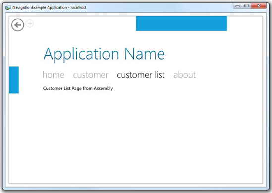
Content="customer list" />When you run the application and click the Customer List menu option, you'll see something like figure 15.7. With the mapped URI, the fact that the page isn't in the main assembly is completely transparent to the user. Not only is this generally a good practice, but it'll make any further refactoring easier, as you can keep the URIs the same regardless of which assembly the pages live in.
Navigation in Silverlight is based primarily around Pages, Frames, and URIs. Individual pages have unique URIs and are loaded by those URIs into frames in the application. Frames provide a location to host pages, as well as a common interface to the navigation facilities offered by the NavigationService class and services such as the URI mapper. Both frames and pages participate in caching to help improve application performance. Finally, pages can be loaded from resources inside the executing assembly, or from external assemblies resolved at compile time or runtime.
So far, everything you've done has been for in-browser applications, where you have the browser's navigation UI and history journal to rely on. Out-of-browser applications obviously can't take advantage of these things. Luckily, the Silverlight navigation framework has taken this scenario into consideration and provided everything you need to have proper out-of-browser navigation.

Out-of-browser applications don't have the benefit of the browser-based navigation UI. From a user experience standpoint, this is excellent, because you'll want to provide your own in-theme navigation controls anyway. Consider the Microsoft Zune software client (see figure 15.8): it uses familiar navigation metaphors but looks different from a web browser.
The Zune client uses some of the traditional controls and navigation concepts (primarily links and the Back button) but provides a custom look and feel. The Zune client also eschews the use, in this case, of a Forward button.
A user interface along the lines of the Zune client is well within the capabilities of a Silverlight out-of-browser application with custom chrome and navigation. In this section, we'll look at what it takes to create custom navigation controls, hook up to an appropriate journal, and support navigation out of the browser.
In the previous sections, you've seen how the Frame class provides various properties, methods, and events you can use to control and respond navigation. You've also created a shell of a navigation application that integrated with the browser to provide standard URI and back and forward navigation.
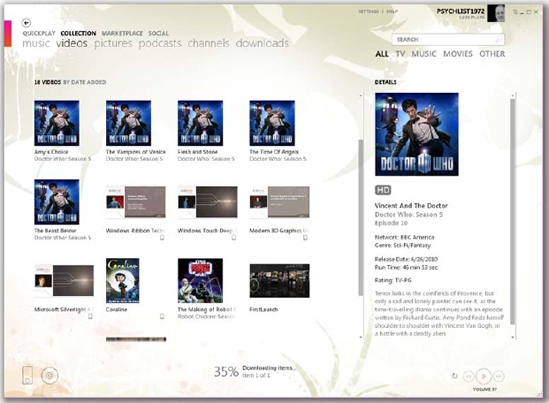
Figure 15.8. The Zune software client. Note the small arrow Back button at upper left. Also note the two-level navigation using links such as Quickplay, Collection, Marketplace, and Social. (I get my Doctor Who fix using Zune. It's cheaper than cable.)
The next step is to take this application out-of-browser and provide your own custom navigation user interface.
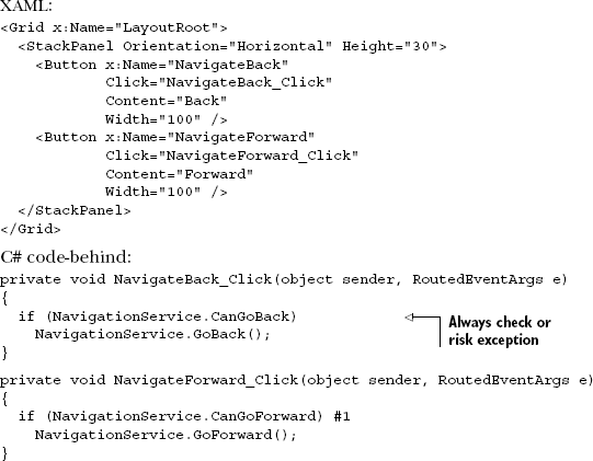
The application needs, at a minimum, a Back button and a Forward button. For this, you'll use the metro theme (Windows Phone 7 and Zune) icons from http://metro.windowswiki.info/. From that set, drag both the back.png and next.png black icons into the project's Assets folder. When they're in place, modify MainPage.xaml to add the XAML in listing 15.3 right before the closing Grid tag at the bottom of the file.
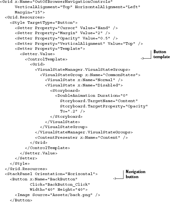
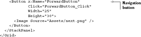
The XAML in listing 15.3 adds two buttons: a Back button and a Forward button. The style resource (resources are covered in chapter 23) creates a button that has no real appearance other than its content. When you run the application, the UI displays the two new buttons at upper left on the main page, as shown in figure 15.9.
The new UI looks pretty good. With the buttons in place, you'll need to wire them up to the content frame to make navigation happen.
In the button-click event handlers for the two new navigation buttons, you'll place some code similar to what you wrote in listing 15.2 earlier in this chapter. This time, though, you'll use the Frame class directly rather than the NavigationService class. Listing 15.4 shows the code-behind for the MainPage.xaml page.
Example 15.4. Navigation code in MainPage.xaml.cs
private void BackButton_Click(object sender, RoutedEventArgs e)
{
  if (ContentFrame.CanGoBack)
ContentFrame.GoBack();
}
private void ForwardButton_Click(object sender, RoutedEventArgs e)
{
if (ContentFrame.CanGoForward)
ContentFrame.GoForward();
}With this code in place, you can use either the browser buttons or the custom navigation buttons to move backward and forward through the journal. There's currently no visual cue indicating whether either navigation option is available, though. You can do this using binding, because the CanGoBack and CanGoForward properties of the Frame class are implemented as dependency properties. As you learned in chapter 11, you can use element binding to get to the properties on ContentFrame, as shown here:
<Button x:Name="BackButton"
        IsEnabled="{Binding CanGoBack, ElementName=ContentFrame}"
...
</Button>
<Button x:Name="ForwardButton"
        IsEnabled="{Binding CanGoForward, ElementName=ContentFrame}"
...
</Button>
With that in place, you'll see the Forward and Back buttons ghost out when the function isn't available. Note how the buttons are in sync with the browser navigation buttons. Now, let's try it without the browser.
The next step is to turn the application into an out-of-browser application. Chapter 5 covered out-of-browser applications in detail; if you haven't yet read that, you may wish to take a brief detour over there now.
Right-click the main application project, select Properties, and select the Enable Running Application Out of the Browser check box on the Silverlight tab. Next, on the Debug tab, select Out-of-browser Application as the start action. Finally, set the NavigationExample project as the startup project by right-clicking the project and selecting Set as Start-up Project.
With those steps complete, run the application. The result will look something like figure 15.10.
One other important option relates to custom navigation: controlling who owns the journal.
The Frame class includes a property named JournalOwnership. This property lets you decide who should own the history journal. In a top-level navigation frame in an in-browser application, the default is to let the browser own the journal. In an out-of-browser application, the default is to let the frame own the journal. Table 15.7 shows the three possible values of the JournalOwnership property.
Given the defaults, leaving journal ownership at the default value will be sufficient for most cases, including your out-of-browser application. For out-of-browser applications, it wouldn't hurt to set the journal ownership to OwnsJournal, but other than a short decision tree, you're not really saving any code.
There was a time when a series of dialogs could be considered the main user interface for a number of applications. Not any more. Pages are the main way you present content to users. But dialogs still have their place for presenting important information to the user, such as error messages or details, or for gathering discrete bits of information such as filenames.
Table 15.7. Values for the JournalOwnership property of the Frame class
Value | Description |
|---|---|
| If the frame control is a top-level frame and is running in-browser, the browser's journal is used. Otherwise, the frame maintains its own journal. |
| The frame maintains its own journal. |
| Uses the browser's journal. This may only be used with a top-level (not nested) frame. |
In addition to the page-navigation approach you've seen so far, Silverlight has support for two discrete types of dialogs: in-application floating windows with simulated modality, and system dialogs.
There are certain times when you need to grab the user's attention and display something that overlays other page content. Maybe you need to display details about a critical error. You could do this with the message box, but that can be limiting. For more intricate dialogs, you may want to consider the other two alternatives available in Silverlight.
Throughout this section, you'll learn about the four types of visual prompts available in Silverlight. We'll briefly cover the Popup control first, followed by the ChildWindow control-a control that provides the capability to display in-Silverlight dialogs. Then, we'll dive into the two system dialogs made available in Silverlight: the OpenFileDialog, which is useful for getting a file from the user's local file system, and the SaveFileDialog, which helps specify a location for saving a file on the local file system.
In Silverlight 2, if you wanted to create a dialog-like experience, you likely used the Popup control from the System.Windows.Controls.Primitives namespace. The Popup control provided a way to guarantee that your content would show up at the top of the z-order, regardless of which control created it. But it wasn't really a dialog substitute.
The Popup control has no visuals of its own. Typically, you'll enclose a UserControl or a number of elements within the Popup to give it the behavior you want. Because sizing and positioning can be tricky otherwise, it's recommended that you apply a fixed size to the content in the Popup and then perform any centering or other position calculations.
Assuming that the XAML namespace xmlns:primitives points to System.Windows.Controls.Primitives, the syntax for the popup is simple:
<primitives:Popup x:Name="MyPopup"> content </primitives:Popup>
To display the pop-up in the example, you'd then use the IsOpen property:
MyPopup.IsOpen = true;
In Silverlight 3 and 4, the use of the Popup control is more for floating nondialog items to the top of the stack, but not really for simulating dialog boxes, so we won't spend much time on it. The Popup control is used by Silverlight to support other elements such as tooltips, the drop-down in the ComboBox, and, of course, the ChildWindow control introduced with Silverlight 3.
Silverlight 3 introduced a new class, ChildWindow, which provides a window-like experience over the base Popup control. Where the Popup control provided only z-order management, the ChildWindow adds window overlays, dialog results, OK/Cancel buttons, and window title functionality.
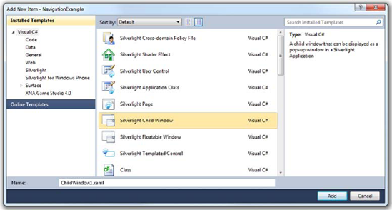
Unlike Popup, ChildWindow is considered a first-class element, like Page and UserControl, and has a template in the project items template list, as shown in figure 15.11.
That said, ChildWindow isn't located in the core Silverlight runtime; it's located in the System.Windows.Controls assembly in the SDK. The primary reason for keeping it out of the runtime is that it's not an essential or enabling technology; you could live with Popup if you absolutely needed to.
After you create a new ChildWindow, you're presented with its default template, as shown in listing 15.5.
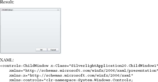
Listing 15.5 shows the default look and feel of the ChildWindow control. Before we get into how to customize that, we'll cover the mechanics of showing and hiding the window.
A ChildWindow is typically displayed from code rather than included as an inline element in XAML. To facilitate this, the control has several members that handle showing, closing, reporting results, and allowing cancellation. Table 15.8 lists those members and their related functions.
Table 15.8. Properties, methods, and events related to showing and closing the ChildWindow
Member | Description |
|---|---|
| A nullable boolean that indicates whether the dialog was accepted or cancelled. This is typically set to |
| Displays the child window and immediately returns. Whereas the behavior of a |
| Closes the window. Typically, this is called from a button on the child window itself. |
| Raised when the child window is closing. The handler for this event has the opportunity to cancel the close operation and force the window to stay open. |
Raised after the child window has been closed. Note that due to animations, the window may still be visible on the screen for a moment longer, but it's be in the process of closing for good. Use this event to inspect the |
The typical way to use a ChildWindow is to call the Open method from code and then to take some action based on the dialog result available during the Closed event. Listing 15.6 shows this process in more detail.
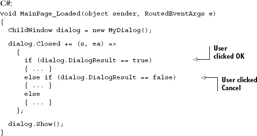
The example shows how to display a ChildWindow and handle the three possible DialogResult values set when the user closes the window. Note that this example also uses a lambda expression to create the event handler. This is a shortcut way to create a delegate inline in your code rather than create a separate event handler function. In this example, s is the variable that contains the sender, and ea is the variable that contains the event arguments. The code to display the window could also have been written like this:
ChildWindow dialog = new MyDialog();
dialog.Closed += new EventHandler(dialog_Closed);
dialog.Show();
Of course, in that instance, you'd need to create a separate function named dialog_Closed that had the event handler logic in it. Either way is valid.
Note also that you do a true/false/else check on the DialogResult value. This is because the DialogResult is a nullable boolean type, and it's not usually sufficient to check for true or false. Nullable booleans also don't allow you to write code like this:
if (dialog.DialogResult) { ... }You'll get a compile-time error unless you cast the value to a regular bool. For that reason, you check explicitly against true, false, and the null (default) value.
When you ran the code in listing 15.6, you probably noticed that the content behind the window was overlaid with a gray rectangle. The color and opacity of the overlay are a couple of the knobs you can tweak to customize the way the ChildWindow looks.
Like almost everything else in Silverlight, you can do some basic customization of a ChildWindow to change things such as background and overlay colors without messing around with the control template. Some of those properties specific to ChildWindow are listed in table 15.9.
Table 15.9. Properties of the ChildWindow control
Property | Description |
|---|---|
| Set this value to determine whether the close button, typically at upper right, is visible or collapsed. If you set this to |
| When the |
| Sets the opacity of the overlay. A higher opacity means less background content shines through. |
| Displays content in the window title bar. Although typically text, this can be any element. |
The ChildWindow provides the capability to create any in-application dialog that you need. Two other types of dialogs are more operating system–specific in their display and use: the OpenFileDialog and the SaveFileDialog.
The OpenFileDialog class enables you to ask users for one or more files from their filesystems. From there, you can load the data from the selected files into memory, giving you the flexibility to do any number of things. For instance, you can send the contents of a file to a server or load the contents into your Silverlight application. The SaveFileDialog performs a similar function but provides a mechanism to save a single file to the filesystem. Either way, before you can do any of these items, you must understand how to interact with the OpenFileDialog and SaveFileDialog classes.
Throughout this section, you'll learn the three steps involved in interacting with an OpenFileDialog. The first step involves launching and configuring an instance of the OpenFileDialog class. Next, you must wait for and retrieve the results of a user's interaction with an OpenFileDialog. Finally, you'll parse the results if a user has selected at least one file.
To give your users the opportunity to select a file or multiple files, you must instantiate an instance of the OpenFileDialog class from procedural code; you can't create an OpenFileDialog from XAML. After it's created, you can use several properties to customize the selection experience. These properties and their descriptions are provided in table 15.10.
Table 15.10. The configuration properties available on the OpenFileDialog and SaveFileDialog
Property | Description |
|---|---|
| Represents the type of files that are displayed in the dialog. |
| Determines which filter is specified by default if the filter specifies multiple file types. |
|
|
|
|
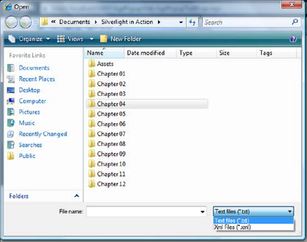
As this table shows, you have flexibility in customizing the selection experience, but you don't have complete control over the dialog box. For instance, you can't dictate the appearance of the dialogs. Instead, the dialogs use the user's OS to determine the general look of the dialog box. By using the values in table 15.10, you can guide the selection experience, as shown in figure 15.12.
The following is the code to achieve this:
OpenFileDialog openFileDialog = new OpenFileDialog();
openFileDialog.Filter =
  "Text files (*.txt)|*.txt|Xml Files (*.xml)|*.xml";
bool? fileWasSelected = openFileDialog.ShowDialog();
This example shows an OpenFileDialog box that enables a user to select a text or XML file. You can accomplish this by appropriately setting the Filter property of the OpenFileDialog object. The dialog is then launched by calling the ShowDialog method. The code for a SaveFileDialog is similar. Unlike the ChildWindow-type dialog shown in the previous section, this method is a blocking call that prevents the execution of any additional code until the user exits the dialog. After the user exits the dialog, the ShowDialog method returns a nullable bool that signals the end of a user's interaction with the dialog. The code then continues executing, giving you the opportunity to retrieve and analyze the results.
When a user exits the dialog, the ShowDialog method returns a nullable bool value. This value will be false if the user chose to close out of or cancel the dialog. If the user clicked the OK button, a true value will be returned. After the value is returned, you can access the file(s) that the user selected.
The file(s) selected within an OpenFileDialog are available through the File and Files properties. The SaveFileDialog, because it only supports a single file, has only the File property. These properties will be null if a user left the OpenFileDialog without clicking the OK button, so you should check the value returned from the ShowDialog method before attempting to retrieve the selected file(s). Here's an example:
bool? fileWasSelected = openFileDialog.ShowDialog();
if (fileWasSelected == true)
{
  FileInfo fileInfo = openFileDialog.File;
  StreamReader reader = fileInfo.OpenText();
}
From this example, you can see that after a user opens the dialog box, you can get the selected file through the File property. If the Multiselect property had been set to true, the Files property would have been more applicable. Either way, if a user hadn't selected a file, both those property values would have been null. If a file or multiple files had been selected, you could have retrieved the details of each file through the FileInfo object.
The SaveFileDialog, because it only supports a single file, has a helper method to use for opening the file. The code for a SaveFileDialog looks like this:
bool? fileWasSelected = saveFileDialog.ShowDialog();
if (fileWasSelected == true)
{
  Stream stream = saveFileDialog.OpenFile();
}
If you wish to retrieve the name of the file entered or selected by the user, use the SaveFieldDialog.SafeFileName string property.
The FileInfo class provides a special bridge from the local filesystem to the security sandbox in which Silverlight runs. This class is specifically designed for use with the OpenFileDialog and SaveFileDialog. This object provides two methods that allow you to read the contents of a file—OpenRead and OpenText-and one method that may be used in the case of the SaveFileDialog to write to the file-OpenWrite.
The OpenRead method is designed to handle binary file scenarios. This method returns a read-only System.IO.Stream object, which is well-suited for handling bytes of information. Similarly, the OpenWrite method returns a write-only stream, but only if called on a FileInfo object returned from the SaveFileDialog. Alternatively, the OpenText method is better suited for reading text-related files. This method returns a basic System.IO.StreamReader, as shown here:
FileInfo fileInfo = openFileDialog.File;
StreamReader reader = fileInfo.OpenText();
myTextBlock.Text = reader.ReadToEnd();
As this example shows, working with a text file in Silverlight is incredibly trivial. It's just as easy to work with a binary file. The key to either approach is to understand working with streams of data. This topic is a general concept in .NET development that's beyond the scope of this book.
The OpenFileDialog provides a way to ask a user for a file to open. The SaveFileDialog provides a way to ask for a filename for saving a file. The Popup element and ChildWindow control provide another way to prompt your users. These options help Silverlight deliver a richer experience than you can easily get with HTML. In addition, other controls that haven't been covered also help provide a rich experience.
In the old days, we had chisels and stone, manual typewriters, and the MDI and dialog application navigation styles. At some point in the late 1990s, developers started taking cues from web browsers and decided that their navigation approach-using Back and Forward buttons and uniquely addressable pages-made sense for many applications. It certainly made more sense than MDI in nondocument applications.
Silverlight builds on this history and application navigation trends to nicely support the back/forward and URI navigation paradigm. Silverlight pages can be uniquely addressed via URIs (including parameters for deep links directly into specific bits of data) using hashtags as pioneered by Ajax. The navigation API even includes support for caching and for customizing the navigation UI.
Setting up a project to use the navigation API can be tricky, so the Silverlight tools include a Navigation Application template that includes all the plumbing necessary to get you well on your way to building the application. The template even includes excellent support for skinning and theming.
Dialogs, of course, are still useful in discrete scenarios. Silverlight provides support for custom dialogs using the ChildWindow and Popup classes, as well as access to system-level file dialogs for opening and saving files.
Navigation is but one of many important pieces when structuring an application. In the next chapter, we'll tackle one of the most important architectural patterns for Silverlight developers: the Model-View-ViewModel pattern.