
The Sprint Burndown chart is a useful graphical representation of whether our team is likely to complete all the User Stories in the Sprint Backlog. The following is an example:
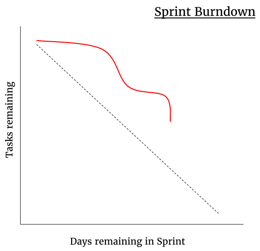
The dotted line represents the average burndown rate necessary if the team is to finish every item. The solid line shows the reality that not all tasks are equal; some take longer than others to complete (the plateaus) and some take less time to complete (the vertical drops).
Sometimes the solid line will go up before it comes down; this shows that once the team started working on a story, they uncovered new information and added tasks.