
In the Enhanced Release Burndown chart, we record data both above and below the horizontal line. Above the horizontal line, we show the Story Points that were forecast at the beginning of the release. Below the horizontal line, we show any new User Stories added, or any increase in the size of existing User Stories.
An Enhanced Release Burndown looks like this:
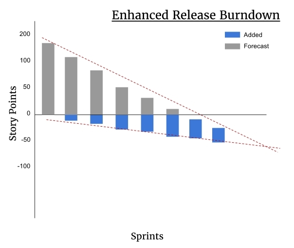
The two dotted lines plot the trajectory of these two groups of Story Points. The top dotted line represents the velocity of our team, and the number of Story Points decreasing as work gets done. The dotted line at the bottom represents the trend of work added to or removed from the backlog. The point at which the dotted lines converge gives the forecast for when the release will be complete.
One thing to note is that User Stories can be removed from the Product Backlog as well as added, and a User Story's size in Story Points can decrease as well as increase. All changes in scope are applied below the baseline.
We can use this approach to forecasting in any situation where we have a bundle of User Stories that represent a milestone when complete. For example, we could also use an Enhanced Burndown chart for tracking when a single feature, or Epic, will complete.