ANALYZING SUCCESSFUL APPS
Before you start refining the usability and/or gameplay details of your app, it will be best to start by seeing what's out there. You should analyze how others have done it within your intended niche, as well as with apps outside of it, but that may share similar feature sets. This section demonstrates how to perform competitive research for your apps.
COMPARING TO “ANGRY BIRDS”
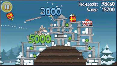
Considering the most popular mobile game thus far is a good place to start. As shown in the following figure, “Angry Birds” is a casual puzzle game where players sling shot birds at pigs that are perched on structures, trying to knock them over.
Released in December 2009, it's been downloaded more than 200 million times on all platforms (including special and theme editions), and has more than 12 million sold just on Apple's App Store.

Almost everyone these days wants to know how to achieve some of the same type of success that “Angry Birds” did (or better) with its record 275 days at Number 1 for the core title, and other lengthy reigns at Number 1 for special editions. When you start seeing the name of an app referenced in television sitcoms that are all about pop culture (such as The Big Bang Theory), or plush pets at major toy retailers, it's probably doing okay.
“Angry Birds” was one of the first games to be shown off in the new HTML 5 (http://chrome.angrybirds.com/), is possibly slated for an upcoming movie, has been ported to countless platforms (including consoles and now PCs), and has generally been a cultural phenomenon.
So, what exactly are the factors of its huge success? What can you take from this (if anything) and apply to apps in general? Conjecture and articles on reasons for its success are plentiful on the Internet. After having read many of the articles and playing the game, the following observations can be offered:
- It's casual — Although this is fairly obvious, of course, this does have a few poignant meanings. “Casual” means easy to learn, no long time commitment for game sessions, appealing usually to women as well as men, and it has a complexity that is delivered in small increments to the user. What this means from a general app standpoint is that if you have a utility app (say, a Twitter client), you want it to be as casual-friendly as possible, presenting a user interface that's simple and clear from the beginning in its core functionality, with hidden or uncovered complexity should users look for it. You'd want users to be able to quickly get in and get to the core functionality, then back out again.
- It has humor — Birds bounce, feathers ruffle, they make sounds, pigs squeal, glass and wood shatters, and the art style is “cartoony.” If you're making a game, don't forget to add a sense of humor to lighten perceptions. If you're making a business app, attempt to make it easy to use and as engaging as possible.
- It has goals and layers of sub-goals — Each level is presented to the player as a clickable icon. When that's cleared, you unlock the next. That's goal 1. Goal 2 is the amount of stars you get on a level depending on performance. This is always shown, and encourages the player to get the maximum three stars for each level. Goal 3 is a high score. This is tied in with number of
- stars, but done in a unique way that rewards breaking more things, which is always random. This is all tied together in the meta-goal of clearing all the levels in one particular section. For a utility, give users reasons to come back to your app (for example, by stat-tracking certain features, or providing useful notifications to make them engaging to the user).
- It has incredibly easy-to-learn and dynamic gameplay — Flick the bird at the structure with pigs and see what happens. The reason that it's dynamic is because of the use of a physics engine where you never truly know what's going to happen, yet maintaining consistency, which allows you to reassess your trajectory after every attempt. Don't force the players/users to use help functionality to learn your app. The basic functionality should always be intuitive.
- Session time is very short — A level can be completed in less than 30 seconds. The casual player must be able to play for short durations at a time.
- It introduces new challenges, just as you might be getting bored or too experienced, completely changing the core mechanic — A general app might do this by providing users with core functionality that's immediately accessible and gratifying to use. Then, allow users to discover just through the main use other useful features. In the Twitter client idea, users may start to type, and then find they can easily now click the name of another user to automatically set up a “retweet.” Intuitive disovery in this way can lead to very positive attachment.
- It's cute — Let's face it. The characters in this game were designed to appeal to both the female and male aesthetic senses — pseudo-angry, but round/fat innocent creatures, and comically cute pigs. That's perfect. No bullets, no blood, just animal versus animal, and stylistic poofs when they explode.
“Angry Birds” did one small thing and did it very well. It nailed its niche.
Let's start by creating a fictitious example — a new Twitter client. That niche happens to already be well saturated, but let's consider that you have new features that none of the other clients have, or perhaps a star programmer who can simply do it better. For whatever reason, you know there's a need, and you plan to fill it.
Although doing research for similar apps from your iPhone, iPad, or iPod Touch is certainly very feasible, don't forget you can easily start to browse from a home computer in iTunes. The first step of competitive research will go much quicker with a big screen and a mouse, with quick access to the Internet, reviews, and easy tabbed browsing.
The iTunes and iPad App Stores even have a couple of secret advantages. Whenever you search for a paid app, you can see that the bottom has the “customers also bought” window, which is where you really start to expand your search. And, at the top, the categories of your searched-for app are listed. This will clue you in to what categories are being targeted. Currently, this does not appear in the App Store on smaller devices such as iPod Touch.
In iTunes (or in the App Store on your device), start by entering the main keyword or words for your niche. In this case, simply enter twitter, as shown in Figure 3-1

FIGURE 3-1: The App Store search bar is where many (or most) users will find your app via your keywords
APP STORE KEYWORDS
In 2009, Apple implemented the capability for developers to create 100 characters worth of keywords (including spaces) so that apps can be better searched for in the Store's search engine. When you're coming up with a keyword list for your app, there are a few rules to follow:
- After you enter keywords, they cannot be changed until you update your app.
- You are required to fill in keywords for an update.
Following are some steps to create both your keywords and app name so that they are more easily searched for:
- Imagine yourself as the user, and consider all of the keywords you would normally use to look up your app.
- Use the Google Keyword Tool (https://adwords.google.com/select/KeywordToolExternal) to search for the most common phrases related to your app, and the list you came up with.
- Refine your search using the lists that come up in Google's Keyword Tool. (Normally this is used for Internet SEO, but it's also very useful for anywhere users can type in keywords or tags.)
- Start typing your keywords into the App Store's search bar and see what comes up (if anything). Use this to refine your keywords even further.
- Use keywords in your app title if possible, and again in your description, but as with any SEO, do not oversaturate, or you may get penalized or rejected.
As shown in Figure 3-2, when you type “twitter” into the App Store search bar, numerous entries come up as suggestions. Click one of these (usually they appear to come up in terms of popularity — which, for your niche at least, would be considered successful), and you'll be taken to a list of potential apps with that keyword or words.
Click any of the apps you see with a decent icon near the top (preferably paid, but okay if not). You'll want to download and install as many of these as you can as well.
Once inside the details for an app, there are three important factors when evaluating whether it's successful:
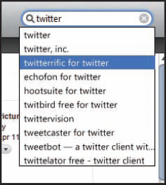
FIGURE 3-2: App Store search term suggestions
- Scroll down slightly and take a look at how many of five stars the current version of the app is rated at, and then also look at the overall rating. (However, it's not uncommon for a successful app to be rated at three to four stars out of five, merely because ratings alone are unreliable.)
- A bigger factor to consider is the number of ratings given. If it's in the thousands or more, this is a fairly popular app. If it's at 10,000 or more, it's an extremely popular app for its niche. Anything with more than 50,000 ratings is likely to be in the top 100 to 200 apps. The free app named “Twitter,” for example, has had as many as 135,612 ratings and 14,000 reviews for all versions.
- You'll definitely want to read the user reviews when you delve into what makes this app successful. Just as with any reviews, there will be many people who don't really respond with constructive criticism, and there are always competitors who (either by themselves, or by paying others) rate a competing app just one star, along with a quick review, to get its value down. This is why you'll often see a disproportionate number of one-star ratings, rather than two, three, or four stars. However, it's here that you'll also find valuable information about what features users would like to see from legitimate customers.
There are four other quick and useful bits of information you can find on any app's page:
- You can find out how the developers have tailored the description, noting particular features and keywords you're interested in.
- You can note when the app was last updated, and specifically note whether the developer appears “done” with it (therefore, a positive for your app).
- As mentioned previously, take special note as to the category in which the app has been placed.
- With paid apps, on the iPad and iTunes versions of the App Store (which support bigger screens), right at the bottom you'll definitely want to go to the other apps people have purchased, and make the same comparisons.
If the app you've looked for is free, give it a try by installing it. If it is not free, determine whether there are features you are competing against or features you don't yet have, but may want, and determine whether it is worth the asking price. Fortunately, you're not dealing with retail console games at $50 a pop, and the most you'll likely spend doing this sort of research is around $100 — and that's being liberal. Note also that a great resource for seeing apps in action is Youtube.com. In most cases, you'll be able to find reviews or other footage, which can usually provide enough information for a quick assessment.
When you try an app, take special note of any interesting features and how they're implemented — both pros and cons. Noting deficiencies will give you a leg up when you develop your app. Always be asking the following questions:
- What combination of features and presentation is making this app successful?
- Is it partly a polished app icon?
- How easy is it to get into and out of the app's core features?
- What is the response time to your actions?
- What sorts of bells and whistles, or built-in social features, are included?
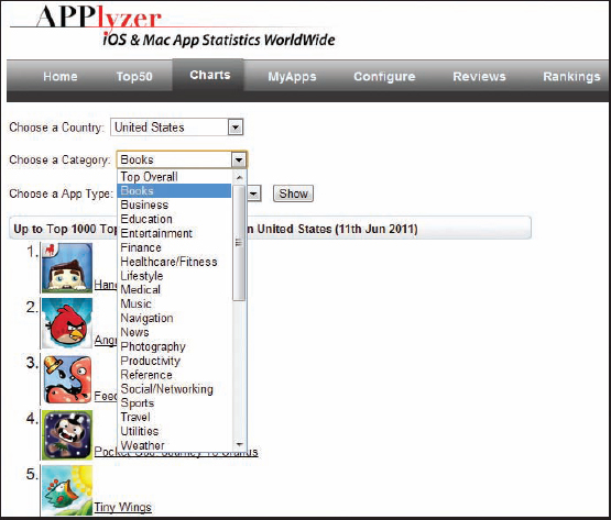
Fantastic (and perhaps even more useful) online tools are available for finding and analyzing top apps. One of the best might be found at Applyzer.com (Figure 3-3). This site features the top 1,000 stats for any app (you must register first), both iPhone/iPod and iPad stores, and currently provides free daily updates for an unlimited number of apps. For a small fee, you can opt in for hourly rankings as well, and register to chart your own apps.
Another web-based free(-mium) tool, equally as intriguing and useful in different ways, is called Appannie at www.appannie.com. As shown in Figure 3-4, one cool feature is a “Top 5 Matrix” that shows icons of all the top five paid, free, and grossing apps in all categories, all on one page, with links. Another is all the filters you can use to search for all apps, as well as ones of your choosing. The total package features a slick interface and good user feedback. Expect this one to rocket up to being at or near the top in ranking tools.
![]() You can find more useful links for tools in Appendix B.
You can find more useful links for tools in Appendix B.
FIGURE 3-3: Applyzer is one of the best App Store ranking tools you can find
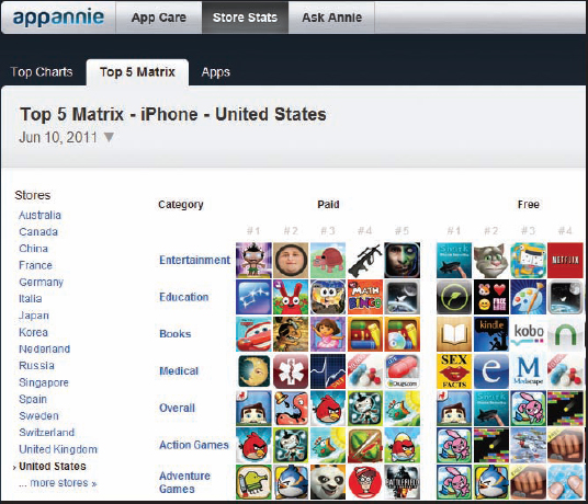
FIGURE 3-4: Appannie is feature-rich with incredible filter properties
Exploring Popular Features
As a rule, apps need to capture a distinctive or unique style (even if that is by being overly simplistic), or its chances of getting noticed are slim. A few still make it by, of course, but they're often forgettable. As far as visual style goes, “The Moron Test” shown in Figure 3-5 is one exception. It spent the second longest time at Number 1 on the charts (38 days). For the most part, the graphics are crude and mish-mashed together, the humor more so, but for that app, that combination worked. It also helped that it went viral because of its crass, in-your-face, no-apologies humor, essentially telling users that they are more stupid than they thought. A point must be scored for novelty.
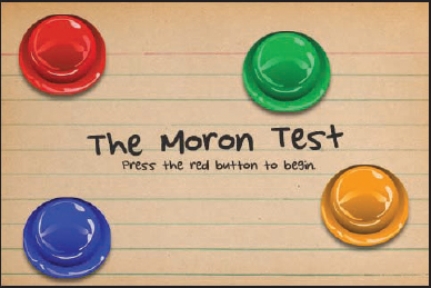
FIGURE 3-5: “The Moron Test” spent 38 days at Number 1, the second longest of any app
![]() It is very useful to note that “The Moron Test” did not compete in the highly popular Games category, but instead was positioned in the Entertainment category, which, in hindsight, was a brilliant move.
It is very useful to note that “The Moron Test” did not compete in the highly popular Games category, but instead was positioned in the Entertainment category, which, in hindsight, was a brilliant move.
Another example, “Doodle Jump,” was mentioned in Chapter 2. Its graphics are hand-drawn in an artsy-sketchy sort of way, ideal for a quick port to the iPhone and oft-duplicated later. But the art style really clicked with its ultra-simplistic controls (tilt and that's it!) and gameplay (go as high as you can). Casual gamers ate it up.
Now, consider once again “Angry Birds.” Though, as shown in Figure 3-6, it has a cartoon style, it certainly has a level of polish most apps fail to achieve, from visual details (such as lingering smoke puffs as you slingshot your bird), to fine-tuned, physics-based gameplay, to every graphic element, sound effect, and thematic music samples fully supporting its brand of humor.
FIGURE 3-6: Cartoon art style from “Angry Birds,”by Rovio
Exploring Visual Styles
If you're creating a game, one of the main considerations is the art style. Because of this, the following visual walkthrough of some of the most popular visual styles to hit the App Store may come in handy for you.
![]() Note that the longer the App Store is around, users and players will naturally expect a progression of higher-quality visuals and functionality, simply based on the natural evolution of apps and saturation of niches, in addition to what's been expected in other mediums such as video or computer games. Back in the early days of the App Store, there weren't all the major companies there are now that are creating apps that cost hundreds of thousands of dollars to create. The bar has been raised. That said, if you can make something novel, it just may be that any style can work.
Note that the longer the App Store is around, users and players will naturally expect a progression of higher-quality visuals and functionality, simply based on the natural evolution of apps and saturation of niches, in addition to what's been expected in other mediums such as video or computer games. Back in the early days of the App Store, there weren't all the major companies there are now that are creating apps that cost hundreds of thousands of dollars to create. The bar has been raised. That said, if you can make something novel, it just may be that any style can work.
As shown in Figure 3-7, “Pocket God” was one of the first App Store apps to feature highly polished and stylized vector-like graphics. Notice that there are no black stroke lines around many of the graphics, helping them have that illustrated render-like quality.
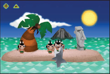
FIGURE 3-7: “Pocket God” spent 26 days at Number 1
As shown in Figure 3-8, “iFart Mobile” is a lot like “The Moron Test” in that it uses photo-realistic-like graphics, but is actually a bit more polished in that respect. Its use of grunge and textures is more professional Photoshop stuff than is found in the other app, and it integrates the default iPhone scroll mechanism beautifully to almost seem like it was made in the same style.
“Fieldrunners” was one of the first iPhone games to really wow people with graphics. As shown in Figure 3-9, its vibrant palette, highly stylized and detailed render-worthy cartoon graphics are still some of the very best seen on the device. What's even better is how fast the graphics are with absolutely zero slowdown. The programming team at Subatomic Studios is a group of miracle workers.
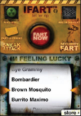
FIGURE 3-8: “iFart Mobile” spent 21 days at Number 1
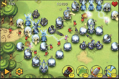
FIGURE 3-9: “Fieldrunners” resides in the App Store Hall of Fame
Exploring Social Integration
When “Fieldrunners” was first released, it had almost no social features built in. However, it now supports Game Center, which is a third-party solution that many apps are now incorporating that allows players/users to connect with friends and earn achievements in the game, using one login across games.
Game Center (and another called Open Feint) is part of a huge push for social features in any app, along with the usual “post to Facebook” or Twitter functionality many apps now come with by default.
The reasoning is straightforward — the more social your app, the better chance it has to spread to more users, and, thus, sustain or even exponentially grow its popularity. If apps lack social integration, then once the initial hype or marketing push is over, over time, people start to forget (usually sooner than later), and the app has little chance of sustaining its momentum for a lengthy time. This was one problem developers had with “Archetype,” even though they built in some social features.
![]() You'll find much more about social integration in Chapter 10.
You'll find much more about social integration in Chapter 10.
Exploring the iPhone Hall of Fame
A good place to go for all-around browsing of the most successful apps of all time is the iPhone Hall of Fame from within the iTunes App Store (Figure 3-10). These aren't just games, but rather all apps that have resided at Number 1, or have been immensely popular for one reason or another. Many are paid, but some are free and worth perusing to get a feel for what's possible using the standard iPhone graphical user interface (GUI) within UIKit, in addition to custom-made graphics. Note also that any time you're looking at apps, pay special attention to how the all-important App Store icon is used.
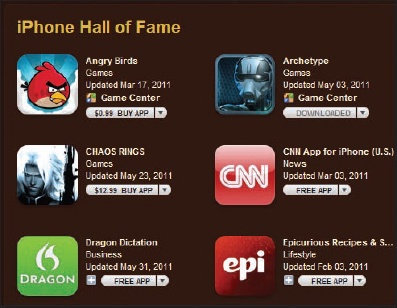
FIGURE 3-10: A great place to call home for any app is the iPhone Hall of Fame
Avoiding Pesky Ego Traps
During your competitive analysis, it will be tempting to keep adding to your list the features others are including as if you also need to include them. Though it can bolster your ego to have an all-powerful app, you really need to focus your feature list. Absolutely compile a list of notes, but before deciding, you will want to trim the fat significantly, and save any extras for possible planned updates in the future. The alternative is spending a lot more time and money with an app that may do everything, but likely nothing exceptionally well.
Another ego trap is that of trying to “keep up with the Joneses.” “Angry Birds” was astonishingly successful and, well, anything sitting in the top 100 is doing pretty well in that particular niche. Copycatting will only get you so far, and there are very few copycat success stories. This is not to say that because Twitter itself has an app that you don't make another one with better features and functionality and call it Twitterrific (already been done, as mentioned in Chapter 2). That would be doing it better.
STICKING TO CORE FEATURES
In the end, with “Archetype,” the development team was able to keep the game focused on a core idea — providing multiplayer, team-based gameplay as smoothly as possible with minimal lag. The original competitive research pitted the team mainly against two apps: ngmoco's “Eliminate Pro” (a “freemium” game where paying real money can help you progress faster) and Gameloft's “N.O.V.A.” (a sublime campaign-based shooter game a la the Halo series for Xbox consoles, only without that series' exquisite multiplayer). Both were highly polished shooters released less than a year prior to when “Archetype” would eventually be released.
“Eliminate Pro” was light on a story, but it did have features such as customization that the “Archetype” team really glommed onto, though they purposefully opted for a different business model. “N.O.V.A.” had a light multiplayer mode, but was really focused on its story presentation and graphics. The niche was there, and, as it happens, remarkably still is.
What was tempting for the “Archetype” team (especially in the beginning) was adding other features that the game did not need. At the top of the feature list were more levels and customization. Second to that was a good story — the team even hashed one out early in development. However, because the goal was to make the app in a manageable amount of time without the budget, personnel, or clout of a development house like Gameloft, the team knew there had to be cuts, and that helped them focus on core features.
Story was something everyone believed in, and thus the “Archetype” team attempted a CGI intro when the opportunity arose. Although customization was also on the list, the team knew it felt more like an add-on than a requirement of the core gameplay. Later in development, it was through gameplay testing and wanting to be mainstream that the team had to “feature creep” and, thus, designed and added a tutorial level with target dummies, calling it “Training,” and providing some assessment and achievements to go along with it.
How many “Farmville” clones are there now on Facebook, as Flash games, as apps, and now on consoles? A zillion — and to make one yourself, you would have to compete with a saturated market. That would be doable if you have the right design and talent, but it would also be risky. “Angry Birds” has now spun off loads of copycats, “Doodle Jump” had its share, and so did “Pocket God.” Any time you have a Number 1 app, chances are that people will take note, and then try to ride the wave. Perhaps it's feasible, but you will almost never achieve the same success as the first — the novelty will have worn off. A more reasonable chance for success would be to go for something innovative, or utilize your ego on one-upping something that already exists, rather than to turn out a simple re-theme.
The bottom line here is not to be afraid to specialize and focus on core features within your niche, polishing them so that they stand out from the competition. In the end, you will save money, be able to deliver more apps, and likely have key unique selling points others don't.
Game Concepts: Old versus New
Generally, you'll have the potential for more success by being the first with a new innovation, or addressing a need that has yet to be met. That said, plenty of older game concepts have had a new lease on life.
One of the most recent examples is the new app by “Farmville” developer Zynga, and spending time at Number 1 on both the paid and free apps list. It's not surprising, given its absolute foothold on the social gaming scene with uber hits “Farmville,” “Cityville,” “Frontierville,” “Café World,” and so on, that this company would be able to market something to its millions of users and rocket it up to Number 1 on the iPhone. But it actually received good reviews as well.
The premise? Hangman. You try to figure out the word your opponent wrote by guessing one letter at a time. It's as old of a concept as it gets, kind of like Battleship, only with a little more skill and deduction involved, making it the better game overall. And, as is par with Zynga, the developers layered it with all sorts of social features like chat, playing simultaneous games with friends, Facebook connect, and push notifications. An old concept is now a social game that hadn't yet translated particularly well as a computer game. Now it has cute characters, appropriate social features, and simultaneous games to make it a novel, fun experience.
As for whether to take an old concept and make it new, or to seek out a brand new need, the important thing is to always find a need, and see if there's a niche for it, whichever order works. Old concepts can always be seen as new again as technology evolves to open up new ways of experiencing them.
TURNING THE OLD INTO NEW
Try this short exercise to help get you in the creative mindset of thinking up novel ways to make old concepts new. First, think of two or three old applications or game concepts, on any platform, that you remember as being kind of cool, novel, or fun back in the day.
With each concept, come up with at least two ways you could bring that app or game up-to-date with current iPhone/iPod/iPad technology and functionality. This could include controls (tilt, accelerometer, gyroscope), social networking or third-party lobby integration, push notifications, multiplayer, camera use, music integration, and so on.
Here's one spur of the moment, creatively challenging example. Having always been an early adopter of new technology (especially software), the author used to use the original Internet chat client ICQ on a PC. Because he was one of the first million users, this would have been around 1997-ish. The core features of ICQ were its notifications when you got new messages, file sharing (especially fun on a 28.8K-baud modem), and, of course, its instant chat and the logs it could keep.
In short, it was one of the first social apps. It encouraged multiple friends in your list. It notified you when they were online and off. You could add status messages and file share. (MP3 music sharing was common back then, though it took 15 to 20 minutes for one song.)
Because chatting is so prevalent in most everything we do (even more so now, in many cases, than e-mail in the working environment), new apps and services like Skype have risen to the forefront with video conferencing, screen sharing, drag-and-drop files, and so on.
The creatively challenging part is this. What could make ICQ or a similar chat client come back stronger than ever when almost any chat app has the same core features? A couple of things come to mind, and feel free to use them if you don't think they're rubbish and haven't yet been done. One is the idea of socially shared credit (that is, the more friends you have and share, the more credit you get). Skype already has paid credit, but this could be another source of promoting your app.
Another unique feature is that of chat achievements to unlock new features such as user icons, and so on—thus making it a game. Bring friends on, score points, and perhaps “level up.” In other words, use the program, check it often, grow your contact list, and you earn special achievements that can be bragged about and shared on Facebook (for example, stars around your name, name on leader boards, new emoticons, and so on).
Traditional Brand Names Do Well; Traditional Concepts Do Not
As mentioned earlier, gameplay and user experience is evolving. What this means is that if you have an older concept, such as the prior example of Zynga's “Hanging with Friends” (Hangman), unless you update it to match with current standards and technology, it won't fly.
You can't bring “Asteroids” back by keeping the same gameplay and not adding anything new. A case in point is an Xbox 360 Live Arcade game named “Geometry Wars.” It's basically “Asteroids,” but has a few new twists to make it completely fresh:
- Its art style is completely vector in a futuristic and geometrically abstract look, completely filled with onscreen pyrotechnics.
- It introduced the capability to control the ship's cannon direction from the right joystick, and the movement from the left. Though that's not particularly novel, it allowed for responsive and intuitive gameplay.
- It introduced geometric “characters” that had consistent artificial intelligence (AI) “personalities,” and would track you in various ways, unlike the random big and small rocks of the original.
In short, it was an old concept, with new tricks.
If you own or are able to pick up an older, somewhat known brand name, it should, however, be easier to market. A quick look at the top 200 will reveal several brand names and concepts you might already be familiar with — Scrabble, The Game of Life, Tetris, The Price is Right, Frogger, Battleship, The Sims, Risk, Yahtzee, and Trivial Pursuit, to name some.
For yet untapped brands that may hold potential, look to possibly licensing characters with some name recognition (for a reboot — those usually go over well), or even older well-known app names that may be able to be purchased. Generally, name recognition will help your app get a better head start if it is possible, but a concept will not. Old concepts always need to be improved to be up-to-date with current technology and trends.
New and Paid, Old and Free
Free apps get many more downloads than paid apps, but there is one big incentive for starting out paid and eventually going free. You have room to lower your price, provide promotions, and give a legitimate reason for some updates.
It doesn't have to be a mutually exclusive thing, though, because one of the more popular promotion strategies is releasing a free or lite version alongside your paid version, with an upgrade funnel built into the gameplay.
![]() More on this is covered in Chapters 6 through 8.
More on this is covered in Chapters 6 through 8.
