Drawing directly on a layer

Walking around my neighborhood one beautiful late spring day, I came across a large clump of calla lilies blooming in a neighbor’s yard. Fascinated by the shapes of the flowers, I rang the doorbell and asked whether I could have a few to photograph. The kind neighbor gave me six!
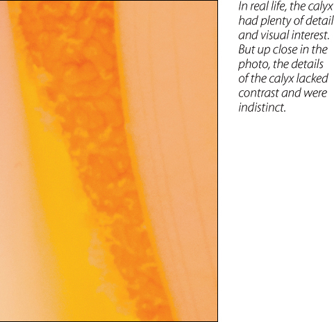
Back at my studio after shooting a series of close-ups, I looked at the photos on my computer and discovered that the spadix peeking out from the lily petal did not have enough contrast. It just looked like an orange shape with some faint lines.
For this photo to work, the spadix needed to contrast in resolution with the softer parts of the flower. To achieve this result, I hand-painted some of the detailed lines into the spadix on a duplicate layer.
300mm, 68mm combined extension tubes, 1/2 of a second at f/36 and ISO 200, tripod mounted.
Do the best you can, because that’s the best you can do.
—Rolie Polie Olie
There’s a special technique that I frequently use that takes advantage of the ability to reduce the opacity of a layer. I use this technique in photos where selected areas just don’t seem to have enough resolution or detail. In essence, I paint in the missing details on a layer at full opacity—and then reduce the Opacity setting to the point where my painting seems entirely natural. That way, someone looking at the final image won’t be able to detect any alterations.
The idea is to duplicate the layer you want to work on. Next, use a fairly hard brush loaded with black to paint in the enhanced detail. Finally, reduce the opacity of the duplicated layer to the point where the enhanced detail looks natural and attractive.
As an example of when it might make sense to paint directly on a layer and then take down the opacity, have a look at the image of a Calla Lily shown on page 66. For this image to work, the details in the calyx, the flower cluster within the lily, needed to contrast with the soft and luxurious feeling of the spathe—the large white bracht that encloses the spadix.
But when I opened the photo of the flower in Photoshop and looked at the area of the calyx up close, it was clear it did not provide as much detail as I would have liked (right).
1. To get started adding contrast to an area in a photo, open the image in Photoshop. (For this example, I’ll be using the calla lily calyx.)

2. Duplicate the layer you want to add contrast to by selecting Layer ![]() Duplicate. In the Duplicate dialog box, name the layer “Contrast.”
Duplicate. In the Duplicate dialog box, name the layer “Contrast.”
In the next step, you’ll paint right on the “Contrast” layer. There’s no layer mask this time. Don’t worry if you aren’t great with the Brush Tool, yet. The painting you will do here will be rather thick and look overdone until the Opacity setting for the “Contrast” layer is lowered.
As you continue to work with the Brush Tool on your photos, you’ll find that you do get a feel for it, though some folks prefer using a mouse to paint, while others prefer a tablet and stylus or digital brush.
3. Select the Brush Tool from the ![]() Tool panel and set black as the Foreground color by pressing D.
Tool panel and set black as the Foreground color by pressing D.
For this type of painting, you’ll want to use a fairly hard, round brush, so open the Brush Tool Picker (page 52) and set the Hardness to 50% and select a small round brush tip. You can use the Master Diameter slider to set the width of the brush tip to be a little wider than the area you want to paint over.
On the Options bar, set both Opacity and Flow to 70% for starters (page 52). You can adjust these settings as you need to while you paint.

4. Use the Zoom Tool to magnify the area of the image you are painting. ![]() Always take the time to zoom in and out while you’re working. That way, you can see what effect you are creating.
Always take the time to zoom in and out while you’re working. That way, you can see what effect you are creating.
5. Paint on the layer where it needs more contrast. This can be meticulous work, so take your time and don’t feel rushed.

6. Once you have finished painting, use the Layers panel to adjust the Opacity setting of the “Contrast” layer. Experiment until you get it just right. For the calla lily, I first tried 50% Opacity, but it was too strong. Then, I tried 20% Opacity—still, too much. Finally, I settled on 10% Opacity—it looked natural but was significant enough to make the calyx really stand out when compared to the soft buttery white spathe. The final image is shown on page 66.