When you have a handle on the possibilities and limitations of the iPhone, your imagination is free to soar to create a compelling user experience. But what is a "compelling user experience," really?
For openers, a compelling user experience has to result from the interaction of several factors:
Interesting, useful, plentiful content
Powerful, fast, versatile functionality
An intuitive, well-designed user interface
The iPhone allows an immediacy and intimacy as it blends mobility and the power of the desktop to create a new kind of freedom. I like to use the term user experience because it implies more than a pretty user interface and nice graphics. A compelling user experience enables users to do what they need to do with a minimum of fuss and bother. But more than that, it forces you as a developer to think past a clean interface and even beyond basic convenience (such as not having to scroll through menus to do something simple). It includes meeting the expectations of the user based on the context — all the stuff going on around a user — in which they're using the app.
A guidebook app may have a great user interface, for example, but it may not give me the most up-to-date information or let me know that a tour of the Houses of Parliament is leaving in five minutes from the main entrance. Without those added touches, I don't consider an app compelling.
This chapter gently urges you to think about what those added touches should be for your app, from the perspective of the content you provide, the app's functionality, and its user interface. But first, you need to envision the totality of what your app's user experience should be.
Pun intended — creating DeepThoughts, the star of Book III, is a fast way to get familiar with iPhone software development. Apple considers DeepThoughts to be a utility app — like the Weather app, but with a single view.
Utility applications can provide real value to the user and are also fun and easy to write — not a bad combination. The way the Weather application flips its view, for example, may seem a total mystery. But Apple goes out of its way to provide samples for many of the neater tricks and features out there, all in hopes of demystifying how they work. With the DeepThoughts application under your belt, you'll have a much easier time understanding and using all the resources Apple provides to help you develop iPhone apps.
What Apple doesn't show you (and where there's a real opportunity to develop a killer app) is how to design and develop more complex applications. Now, "more complex" doesn't necessarily — and shouldn't — mean "more complex to the user." The real challenge and opportunity are in creating complex applications that are as easy to use as simple ones.
Because of its ease of use and convenience, its awareness of your location, and its ability to connect seamlessly to the Internet from most places, the iPhone lets you develop a totally new kind of application — one that integrates seamlessly with what the user is doing when he or she is living in the real world (what a concept). It frees the user to take advantage of technology away from the tether of the desk or coffee shop, and skips the hunt for a place to spread out the hardware. I refer to such applications as here-and-now — apps that take advantage of technology to help you do a specific task with up-to-date information, wherever you are and whenever you'd like.
All these features inherent in iPhone apps enable you to add a depth to the user's experience that you usually don't find in laptop- or desktop-based applications — in effect, a third dimension. Not only does the use of the app on the iPhone become embedded in where the user is and what the user is doing, the reverse is also happening: Where the user is and what the user is doing can be embedded in the app itself. This mutual embedding further blurs the boundaries between technology and user, as well as between user and task. Finally, developers can achieve a goal that's been elusive for years: the seamless integration of technology into everyday life.
The why-bother-since-I-have-my-laptop crowd still has to wrestle with this level of technology, especially those folks who haven't grown up with it. They still look at an iPhone as a poor substitute for a laptop or desktop — well, okay, for certain tasks, that's true. But an iPhone app trumps the laptop or desktop big-time in two ways:
The iPhone's compact portability lets you do stuff not easily done on a laptop or desktop — on site and right now — as with the RoadTrip app you're about to find out how to build.
The iPhone is integrated into the activity itself, creating a transparency that makes it as unobtrusive and un-distracting as possible. This advantage — even more important than portability — is the result of context-driven design.
The key to designing a killer iPhone application is to understand that the iPhone is not a small, more portable version of a laptop computer. It's another animal altogether and is therefore used entirely differently. So don't go out and design (say) the ultimate word-processing program for an iPhone. (Given the device's limitations, most people would rather use a laptop.) But for point-in-time, 30-second tasks that may provide valuable information — and in doing so make someone's life much easier — the iPhone can't be beat.
What most of the really good iPhone apps have in common is focus: They address a well-defined task that can be done within a time span that is appropriate for that task. If you need to look something up, you want it right now! If you're playing a game while waiting in line, you want it to be of short duration or broken up into a series of short and entertaining steps.
The content itself then, especially for here-and-now apps, must be streamlined and focused on the fundamental pieces of the task. Although you can provide a near-infinity of detail just to get a single task done, here's a word to the wise: Don't. You need to extract the essence of each task; focus on the details that really make a difference.
Suppose you want to offer a restaurant-finding app that's better than the apps now available. Imagine that your potential user is standing with some friends inside the lobby of a movie theater, trying to decide where to go to grab some dinner. They all have iPhones, and they're all using their favorite restaurant-finders, but none of them are providing what your user really needs — restaurants ranked by distance and type, with reviews and directions.
One of the apps is particularly frustrating because it lets the user select a restaurant by distance and cuisine. After selecting the distance, it gives back a list of cuisines. So far, so good. But the cuisine list is not context-based; when the user taps Ethiopian, all that comes back is a blank screen. Very annoying! So the user decides to stop using it then and there — nobody wants an app that makes you work only to receive nothing in return.
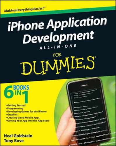
When you're using a good app, every piece of the app is not merely important to the task, but also important to where you are in the task. For example, if you're trying to decide how to get to central London from Heathrow, the app shouldn't offer detailed information about the Tube until you need it. The Maps app is another example — if you start searching by the name of a business or type of business after searching for your own location, as shown in Figure 2-1, Maps is smart enough to assume you mean a business or service nearby and thus locates the closest ones. Multiple pins appear on the map, showing the location of each one, and with a tap you can start getting directions to or from any of the pins.
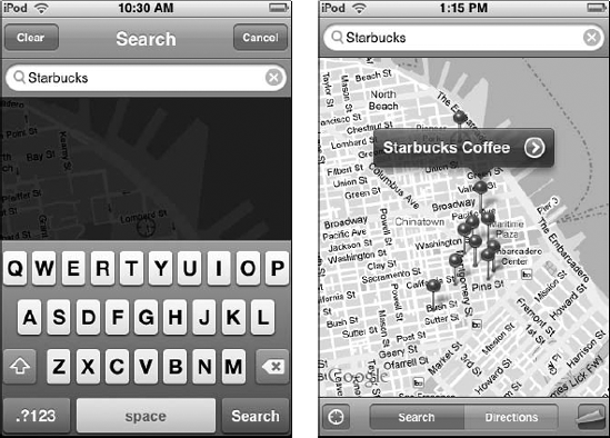
Figure 2-1. From your location in Maps, type the name of a popular business (left) to see its nearest locations (right).
That doesn't mean your app shouldn't make connections that ought to be made. One aspect of a compelling user experience is that all the pieces of an application work together to tell a story. If the tasks in your app are completely unconnected, perhaps they should be separate apps.
Limiting the focus to a single task also enables you to leave behind some iPhone constraints, and the limitations of the iPhone can guide you to a better app design.
Great apps are based on the way people — users — think and work. When you make your app a natural extension of the user's world, it makes the app much easier and more pleasant to use and to learn.
Your users already have a mental model that describes the task your software is enabling. The users also have their own mental models of how the device works. At the levels of both content and user interface, your app must be consistent with these models if you want to create a superb user experience (which in turn creates loyalty to your app).
The user interface in RoadTrip was based on how people divide the experience of traveling by car. Here are some broad categories of the kinds of things folks tend to want to do when on the road:
Use a map that shows your current location and lets you pin other locations on it so you can find them quickly.
List the places you want to visit and browse information about them.
Look up your hotels or campgrounds and read information about each; add new hotels and campgrounds to your list.
Check the current weather and the forecast for where you are and where you're going.
Keep your car's service record, vehicle identification, and other information handy.
This is only a partial list, of course. Chapter 1 of Book V gets into the RoadTrip application design in more detail.
There are other ways to divide up the tasks, but anything much different would be ignoring the user's mental model, which would mean the app would not meet some of the user's expectations. It would be less pleasant to use because it would impose an unfamiliar way of looking at things instead of building on the knowledge and experiences those users already have.
When possible, model your application's objects and actions on objects and actions in the real world. For example, the Settings app displays on-off switches you can slide to turn things on or off. Many e-book readers let you flick the screen to view the next page as if you were turning a paper page.
These examples are based on physical counterparts in the real world, as are the apps shown in Figure 2-2: VoiceMemos and Cleartune. VoiceMemos starts immediately with the microphone image placed exactly where it should be for optimal voice recording, and an obvious red Record button. Cleartune displays what looks like a chromatic tuner for tuning acoustic instruments or vocals — which is what it is. Both are simple and elegant for those who already know something about recording or tuning an instrument.
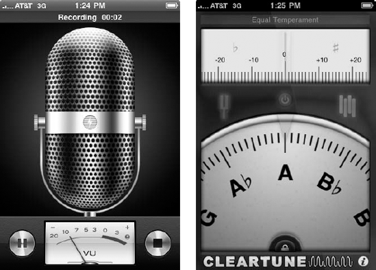
Figure 2-2. Voice-Memos (left) and Cleartune (right) model real-world actions of recording vocals and tuning instruments.
Note
Your application's text should be based on the target user. For example, if your user isn't steeped in technical jargon, avoid it in the user interface.
This doesn't mean that you have to "dumb down" the app. Here are some guidelines:
If you're targeting your app toward people who already use (and expect) a certain kind of specialized language, then sure, use the jargon in your app. Just do your homework first and make sure you use those terms correctly.
For example, if your app is targeted at high-powered foreign-exchange traders, it might use pip (price interest point — the smallest amount that a price can move, as when a stock price advances by one cent). In fact, a foreign-exchange trader expects to see price movement in pips, and not only can you, but you should use that term in your user interface.
If your app requires that the user have a certain amount of specialized knowledge about a task in order to use your application, identify what that knowledge is upfront.
If the user is an ordinary person with generalized knowledge, use ordinary language.
Note
Gear your app to your user's knowledge base. In effect, meet your users where they are; don't expect them to come to you.
Basing your app on how the user interacts and thinks about the world makes designing a great user interface easier.
Don't underestimate the effect of the user interface on the people who are trying to use it. A bad user interface can make even a great app painful to use. If users can't quickly figure out how to use your app or if the user interface is cluttered or obscure, they're likely to move on and probably complain loudly about the app to anyone who will listen.
Simplicity and ease of use are fundamental principles for all types of software, but in iPhone apps, they're critical. Why? One word: multitasking. iPhone users are probably doing other things simultaneously while they use your app.
The iPhone hardware and software are outstanding examples of form following function; the user interfaces of great applications follow that principle as well. In fact, even the iPhone's limitations (except for battery life) are a result of form following from the functional requirements of a mobile device user. Just think about how the iPhone fulfills the following mobile device user wish list:
Small footprint
Thin
Lightweight
Self-contained — no need for an external keyboard or mouse
Task-oriented
It's a pretty safe bet that part of the appeal of the iPhone to many people — especially to non-technical users — is aesthetic: The device is sleek, compact, and fun to use. But the aesthetics of an iPhone app aren't just about how beautiful your app is onscreen. Eye candy is all well and good, but how well does your user interface match its function — that is, do its job?
As with the Macintosh, users have a general sense of how applications work on the iPhone. (The Windows OS has always been a bit less user-friendly, if you ask a typical Mac user.) One of the early appeals of the Macintosh was how similarly all the applications worked. So the folks at Apple (no fools they) carried over this similarity into the iPhone as well. The resulting success story suggests the following word to the wise . . .
Note
A compelling iPhone user experience usually requires familiar iPhone interface components offering standard functionality, such as searching and navigating hierarchical sets of data. Use the iPhone standard behavior, gestures, and metaphors in standard ways. For example, users tap a button to make a selection and flick or drag to scroll a long list. iPhone users understand these gestures because the built-in applications utilize them consistently.
Consistency is also important in functionality. Although you could design a page-reading app to add or delete a bookmark a different way, Safari already does it a certain way (see Figure 2-3), which is why co-author Tony's app, Tony's Tips for iPhone Users, provides the same methods for adding and deleting a bookmark.
Figure 2-3. Safari provides a model for adding or deleting a bookmark (left), so why not follow it, as Tony did with Tony's Tips for iPhone Users (right).
Fortunately, staying consistent is easy to do on the iPhone; the frameworks at your disposal have that behavior built in. This is not to say that you should never extend the interface, especially if you're blazing new trails or creating a new game. For example, if you're creating a roulette wheel for the iPhone, why not use a circular gesture to spin the wheel, even if it isn't a standard gesture?
Although simplicity is a definite design principle, great apps are also easily understandable to the target user. If you're designing a travel app, it has to be simple enough for even an inexperienced traveler to use. But if you're designing an app for foreign exchange trading, you don't have to make it simple enough for someone with no trading experience to understand.
The main function of a good application is immediately apparent and accessible to the users it's intended for.
The standard interface components also give cues to the users. Users know, for example, to touch buttons and select items from table views (as in the Contacts app).
You can't assume that users are so excited about your app that they're willing to invest lots of time in figuring it out.
Early Macintosh developers were aware of these principles. They knew that users expected that they could rip off the shrink-wrap, put a floppy disk in the machine (these were really early Macintosh developers), and do at least something productive immediately. The technology has changed since then; user attitudes, by and large, haven't.
While I'm on the subject of users, here are two more important aspects of a compelling application: direct manipulation and immediate feedback. Here's what's so great about them:
Direct manipulation makes people feel more in control. On the desktop, it meant a keyboard and mouse; on the iPhone, the multi-touch interface serves the same purpose. In fact, using fingers gives a user a more immediate sense of control; there's no intermediary (such as a mouse) between the user and the object onscreen. To make this effect happen in your app, one way is to keep your onscreen objects visible while the user manipulates them.
Immediate feedback keeps the users engaged. Great apps respond to every user action with some visible feedback — such as highlighting list items briefly when users tap them.
Because of the limitations imposed by using fingers, apps need to be very forgiving. For example, although the iPhone doesn't pester the user to confirm every action, it also won't let the user perform potentially destructive, non-recoverable actions (such as deleting all contacts or restarting a game) without asking, "Are you sure?" Your app should also allow the user to easily stop a task that's taking too long to complete.
Notice how the iPhone uses animation to provide feedback. (For example, the flipping transition when you touch the Info button in the Weather app is very cool.) But keep it simple; excessive or pointless animation interferes with the application flow, reduces performance, and can really annoy the user.
It's rare (except with sample apps) for an app's user experience to be simply a combination of some of the iPhone's basic experiences. But DeepThoughts, which you build in Book III, is simplicity itself. It displays whatever text the user enters, and the mechanism for changing the text works like most other iPhone apps — touch the i (information) button, and touch the text field to use the onscreen keyboard. As you build DeepThoughts, you discover how to use the basic building blocks of the iPhone user experience.
The RoadTrip app, starting in Book V, presents a more complex set of problems. To meet the needs of a Kerouac-style On the Road trip, the traveler doesn't need a lot of information at any one time. In fact, the user wants as little info as possible (just the facts ma'am) but also as current as possible. It doesn't help to have last year's train schedule.
To get the design ball of your application rolling, start thinking about what you want from the application; not necessarily the features, but what the experience of using the application should be like.
You can reach the goal of seamlessness and transparency by following some very simple principles when you design the user experience — especially with respect to the user interface.
There are two aspects to this directive:
Search and destroy anything that is not relevant to what the user is doing while he or she is using a particular part of your application.
Include — and make easily accessible — everything a user needs when doing something supported by a particular part of your application.
You want to avoid distracting the user from what he or she is doing. The application should be integrated into the task, a natural part of the flow, and not something that causes a detour. Your goal is to supply the user with only the information that's applicable to the task at hand. If your user just wants to get from an airport into a city, he or she couldn't care less that the city has a world-renowned underground or subway system if it doesn't come out to the airport.
At first, the "seconds count" admonition may appear to fall into the "blinding flash of the obvious" category — of course a user wants to accomplish a task as quickly as possible. If the user has to scroll through lots of menus or figure out how the application works, the app's value drops off exponentially with the amount of time it takes to get to where the user needs to be.
But there are also some subtleties to this issue. If the user can do things as quickly as possible, he or she is a lot less distracted from the task at hand — and both results are desirable. For example, RedLaser, shown in Figure 2-4, uses the iPhone camera to scan a product's barcode so you can check online prices; it's designed to be used right in the store aisle while walking by products. Rather than force the user to hold the iPhone steady and at the same time tap a button to take a picture, RedLaser immediately captures the barcode image as soon as it can recognize it in the viewfinder — so you can quickly scan with one hand while pushing your shopping cart with the other. As with relevance, this goal requires a seamless and transparent application.

Figure 2-4. RedLaser recognizes the barcode and captures it so that you don't haveto touch a button while holding the iPhone steady.
Combine these ideas and you get the principle of simply connect: You want to be able to connect easily whether that connection is to a network, to the information you need, or to the task you want to do. For example, a friend of mine was telling me he uses his iPhone when watching TV so he can look up things in an online dictionary or Wikipedia. (He must watch a lot of Public TV.)
What you get by using the application has to have more value than alternative ways of doing the same thing.
You can find airport transportation in a guidebook, but it's not up-to-date. You can get foreign exchange information from a bureau de change, but unless you know the bank rate, you don't know whether you're being ripped off. You can get restaurant information from a newspaper, but you don't know whether the restaurant has subsequently changed hours or is closed for vacation. If the app can consistently provide better, more up-to-date information, it's the kind of app that's tailor-made for a context-driven design.
By real cost, I don't mean just the amount you actually pay out — you need to include the time and effort of using the app. The real cost includes both the cost of the application and any costs you might incur by using the application. This can be a real issue for an application such as Tony's Tips for iPhone, because international roaming charges can be exorbitant for accessing the Internet for new pages. That's why the app must have the designed-in capability to download the information it provides and then to update the info when you find a wireless connection — Tony's Tips lets you save pages and update them later for that very reason.
With the world growing even flatter (from a communications perspective, anyway) and the iPhone available in more than 80 countries, the potential market for an app is considerably larger than just the folks who happen to speak English. But having to use an app in a language you may not be comfortable with doesn't make for transparency. This means that applications have to be localized — that is, all the information, the content, and even the text in dialogs need to be in the user's language of choice.
Key to creating applications that go beyond the desktop and that take advantage of context-based design are four hardware features of the iPhone: knowing the location of the device, accessing the Internet, recording and playing content, and tracking orientation and motion.
There are others, of course, but you can expect to find one or more of these features in a context-based application.
Knowing the device's location (and hence, the user's) enables you to further refine the context by including the actual physical location and adding that to the relevance filter. If you are in Rome, the application can ask the user whether he or she wants to use Rome as a filter for relevant information (so that when in Rome . . .).
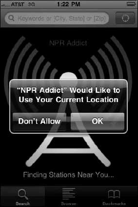
Because the iPhone knows where it is, apps can make use of this information to present content that is closer to them. The feature isn't just for travel — apps that have nothing to do with travel may still use location to improve the user experience. NPR Addict, for example, is not categorized as a travel app, but gives you the standard location button so that you can quickly find NPR stations near you, and you can also listen to NPR stations in other cities from home or work. (See Figure 2-5.)
Accessing the Internet allows you to provide real-time, up-to-date information. In addition, it enables you to transcend the CPU and memory limitations of the iPhone by offloading processing and data storage out to a server in the clouds.
For example, Tony's Tips for iPhone uses the Internet for all its pages so that the pages can be updated at any time without affecting the app, thereby reducing the app's size and speeding up search (which takes place on the site across all pages), while also offering consistently updated info.
The iPhone evolved from the iPod, in which content is king. Not only can your app play music and videos, but it can also record voice-quality (actually telephone-quality) sound with its built-in microphone, or higher quality through external microphones. A number of audio-mixing apps have already made their debut in the App Store. And don't forget the iPhone's camera, which can take photos (and which RedLaser and others use to scan barcodes), and the iPhone 3GS video camera. All iPhones can send and receive images and video clips by e-mail and share multimedia content through the MobileMe service.
When you rotate the iPhone from a vertical view (portrait) to a horizontal view (landscape), the accelerometer detects the movement and changes the display accordingly. In Safari and Mail, your display changes to show the text better.
The iPhone can also sense motion using its built-in accelerometer. Even in its simplest form, motion is useful: When entering text or using the copy and paste functions, you can just shake the iPhone to undo the action.
Motion detection happens so quickly that you can control a game with these movements. Pass the Pigs, for example, is a dice game in which you shake three times to roll your pigs to gain points. In Labyrinth, you tilt your iPhone to roll a ball through a wooden maze without falling through the holes. And you can shake, rattle, and roll your way around the world in Yahtzee Adventures as you rack up high scores, or tilt your iPhone to fly around tanks and bazooka-wielding madmen in Chopper. Even infants can join the fun: Silver Rattle shows a screen that changes color and rattles with every shake. (Big Joe Turner would be proud.)
Although the accelerometer is used extensively in games, it has other uses, such as enabling a user to erase a picture or make a random song selection by shaking the device (not to mention undoing the recent action).
Not only do you have to take into account the user context, but you also need to take into account the device context.
After all, the device is also a context for the user. He or she, based on individual experience, expects applications to behave in a certain way. As I explain in Chapter 1, this expectation provides another perspective on why staying consistent with the user interface guidelines is so important.
In addition to the device being a context from a user perspective, it's also one from the developer's perspective. If you want to maximize the user experience, you have to take the following into account:
Limited screen real estate: Although scrolling is built into an iPhone and is relatively easy to do, you should require as little scrolling as possible, especially on navigation pages, and especially on the main page.
Limitations of a touch-based interface: Although the multitouch interface is an iPhone feature, it comes with limitations as well. Fingers aren't as precise as a mouse pointer, and user interface elements need to be large enough and spaced far enough apart so that the user's fingers can find their way around the interface comfortably. You also can do only so much with fingers. There are fewer options when using fingers than when using the combination of multibutton mouse and keyboard.
Limited computer power, memory, and battery life: As an application designer for the iPhone, you have to keep these issues in mind. The iPhone OS is particularly unforgiving when it comes to memory usage. If you run out of memory, the iPhone OS will simply shut down your app.
Connection limitations: There's always a possibility that the user may be out of range, or on a plane, or has decided not to pay exorbitant roaming fees, or is using an iPod touch, which offers only Wi-Fi capabilities for connecting to the Internet. You need to account for that possibility in your application and preserve as much functionality as possible. This usually means allowing the user to download and use the current real-time information, where applicable.
Some of these goals overlap, of course, and that's where the real challenges are.
Apple exerts control over the app-development and App Store ecosystem, and if you want to play ball in Apple's ballpark, you have to, well, play ball. No matter how many developers complain about Apple's rejection policies, there will always be more developers willing to follow the guidelines. All you need to do is read the documentation, steer away from the Apple trademarks and images, and stay away from content that's questionable in any legal sense. By keeping those things in mind, you can make design decisions about your app now, before developing the app, that can save you time and money later.
Some people believe Apple has not only a right, but also an obligation, to police the App Store and reject questionable apps, if only to build trust with consumers. Anacharsis, one of Greek mythology's Seven Wise Men, warned people that the market is "the place set apart where men may deceive each other." Given the way the iPhone can be integrated into your everyday life and communications, a malicious app could do considerably more damage than a similar one on a desktop computer.
But Apple also wants the user experience to be a rewarding one, as well as one that's consistent with the way Apple designed its own apps and OS. And that makes perfect sense for a company that wants to expand its ecosystem and users so that it can continue to invest in research and keep innovation on the front burner.
So what kinds of things will get your app bounced before it ever has a chance to shine in the App Store? Here are just a few:
Playing good vibrations: You can't use continuous vibration in your apps — short bursts, as warnings, are all that are allowed. Don't bother trying to set up a timer to keep the vibration going. (They know that trick.)
Linking to private frameworks: Apple rejects apps that call external frameworks or libraries that contain non-Apple code. In addition, you can't download interpreted code to use in an app except for code that is interpreted and run by Apple's published APIs and built-in interpreters. Private frameworks and interpreted code may hide functions that Apple would want to know about. Some private frameworks have been found to mine personal information from iPhone users without their knowledge. Apple already knows about most of the private frameworks, so don't bother with them.
Straying too far from Apple's guidelines: When co-author Tony submitted his app (Tony's Tips for iPhone Users), it was initially rejected because the app used highlighting in a menu in a way that did not conform to Apple's guidelines. If you let a user highlight a row in order to select something or initiate an action, you'd better make darn sure that the row is deselected by the time it's displayed again — not still selected (as if you're reminding the user what was last selected). Tony resubmitted the app after fixing this problem, and the app was approved.
Improper handling of editing in table view cells: If you enable table cell editing, you have to manually specify which cells should respond to editing controls and which should not. I describe working with table views in Book V.
Copying existing functionality: Although you should use the functionality provided for developers, you should not simply copy something that Apple already does. Mini Web browsers — apps that essentially show Web pages and do little else — are particularly vulnerable. For example, a simple app that duplicated the functionality of Safari's bookmark button was rejected.
Using an inappropriate keyboard type: If your app needs a phone number or other numeral-only input, and it presents a keyboard that also includes the possibility of entering standard alphanumeric input, it will most likely be rejected.
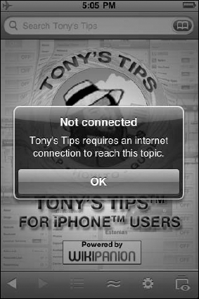
Being oblivious about whether your user lost connection: The iPhone is all about using the Internet. If your app uses a network connection, it is your app's responsibility to tell the user if and when his or her iPhone loses its network connection while using your app. For example, Tony's app (Tony's Tips for iPhone Users) didn't warn the user if the user switched to Airplane mode or otherwise lost the connection, so Tony had to add that warning, as shown in Figure 2-6.
Now that you have some idea what Apple expects of you — in terms of designing and developing your app — it's time for you to find out what to expect of Apple in terms of supporting your development efforts. The Apple Developer Program is rich with informative content, useful downloads, and no-nonsense guidelines. You simply have to become a registered developer to create apps for the App Store. So, onward to the next chapter, where you become a registered Apple software developer.