Perhaps the greatest challenge to design professionals is getting color on printed output to look like the color displayed on computer monitors. Artists can easily overcome common design dilemmas such as working around font problems, learning functional aspects of applications software, avoiding pitfalls related to image handling, and a host of other nuisances that hinder progress. But when it comes to color matching, the problems are more complicated and the solutions are often misunderstood and obscure.
Fortunately, Adobe has been working for several years on creating a common color engine that can be shared among imaging applications. The result of Adobe's efforts is exemplified in the CS4 applications. All the CS4 programs share the same Adobe Color Engine (ACE) that takes you one step closer to reliable color-matching among application documents, your computer monitor, and the output devices you use. In addition, once you set up your color-viewing workspace and color profiles you can use Adobe Bridge to synchronize the same color settings among most of the CS4 applications. In this chapter, we cover some fundamental information related to color management among the Adobe CS4 applications.
Color management is a complex topic. An accurate description for identifying all the variables related to rendering reliable color is well beyond the scope of this chapter. For more sophisticated descriptions, look for books written specifically to help you understand and manage color on computers and output devices.
Note
For more information on managing color, see Color Management For Digital Photographers Only (Padova/Mason, Wiley Publishing) or Color Correction for Digital Photographers For Dummies (Padova/Mason, Wiley Publishing).
Color profiles provide the necessary information for the acquisition, display, and output of your images/documents. A color profile might be one you create through the use of calibration devices or ones you acquire from various equipment manufacturers. Color profiles interpret your images and documents in terms of display and output. Often, using a color profile can mean the difference between a printed image using the colors you expect on output and a rendered image with incorrect colors.
Tip
Color management is a complex issue. Fully comprehending the managing of color on computer systems and how color is reproduced on printing devices takes a lot of research and study. To learn more about color management, open Acrobat, click on the Search tool in the Acrobat toolbar, and type color management as your search criteria. Click on Search PDFs on the Internet in the Search pane, and the Yahoo.com search engine reports all PDF documents on the Internet where color management is found. You can download many PDF documents that offer you definitions of terms and thoroughly explain color management.
The design of production pieces can make use of several different color profiles. You may have one profile developed for your scanner when acquiring an image through the scanning process. A calibrated profile converts the reflective artwork on your scanner platen to digital form, which captures and translates color the best it can, that is a close rendition of the print you scanned. When you open your scanned image in a program like Photoshop, you use a color workspace. The scanned image color space is converted to the monitor working space. This conversion is a temporary preview condition and does not change the data in your image. When you finish your editing session, you convert the workspace color to the output color using yet another profile for your output device. The converted color ideally translates the color space from what you see on your monitor to the color space of your printer; the color range you see on your monitor fits as close as possible to within the color space of your output device. Throughout the color-management workflow, you're converting color from one space to another using color profiles.
Software applications provide you with basic tools for calibrating color. You have tools such as Adobe Gamma installed on Windows to calibrate your monitor for white balance, gamma, black point, and so on. On Mac OS X, the operating system provides you with tools to calibrate your monitor. On a more sophisticated level, you can purchase calibration systems that create monitor color profiles and output profiles for you printing devices. Using hardware devices for calibrating color is much more sophisticated than relying on the software tools that Adobe and Apple provide.
In some circumstances, you can use profiles that come with the installation of the CS4 applications. Profiles designed for four-color process printing on coated stock are generic and often do a reasonable job matching color from screen to press. As the lowest cost option, you can use simple software monitor-calibration tools and get fairly close to the kind of output you want on four-color process printing. However, if you're particular about color, and if your output varies to a range of devices including composite color printers, then you may want to invest in calibration equipment suited to create monitor and printer profiles for your workflow.
Color calibration systems can be purchased as low as $69 US, and the more sophisticated devices start at around $239 and go up to over $3,000 US. At the very least, a creative professional should look at those beginning a little over $200 US. This kind of investment goes a long way in helping you calibrate your color monitor and starts you off in a well-managed color workflow.
If the thought of spending thousands of dollars to calibrate your system doesn't sit well with you, you have some alternatives. In large production centers, you can use a single calibration system to calibrate all the hardware in your environment. With this method, you need only a single calibration tool to create profiles for all the monitors and in-house output devices. Calibration tools are not like software, which you need to license for each user.
Independent graphic designers can solicit assistance from their service centers. Most print shops and service bureaus have calibration devices on hand. You can ask technicians to visit you to calibrate your monitor and provide you with the profiles they created for their equipment.
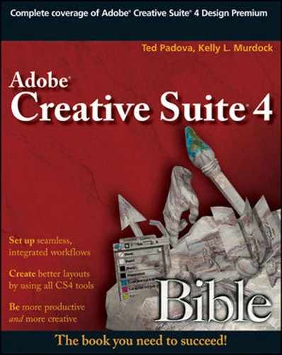
When you acquire profiles for output devices, you must install the profiles in the proper location on your hard drive. For Mac users, copy the profiles to Hard Drive//Library/Application Support/Adobe/Color/Profiles/. On Windows Vista and XP, copy acquired profiles or profiles you create as a result of your calibration system to C:WindowsSystem32SpoolDriversColor. When you install profiles in these locations, the profiles are accessible from the applicable CS4 programs. In Figure 5.1, you can see a profile accessed in the Photoshop CS4 Print dialog box.
Note
Color management is available only within the print-oriented CS4 applications including Photoshop, Illustrator, InDesign, and Acrobat. The Web applications do not have these features.
You can embed color profiles in your images or documents. As a general rule, you should opt for profile embedding whenever possible. As a document prints, it assumes the profile of the printing device. When you embed a color profile in your documents, a color conversion takes place, translating the color within the embedded profile to the color within the output profile. In effect, this translation is a best effort to render all the color contained in your document with the closest matching color values in the output profile. If you elect not to embed a profile in your document, theoretically, the color workspace on the system outputting your file converts to the output profile. If there is great disparity between your monitor workspace and the service center's monitor workspace, the color conversion could result in color shifts.
In Photoshop, profiles are embedded at the time you save your Photoshop document. A little bit of code is added to the Photoshop file containing the profile data. For RGB images, the amount of data added to the original file is minimal. With CMYK images, the file sizes can grow as much as a few megabytes. Be aware that profile embedding is only available for certain file formats. Photoshop native files are supported, as are TIFF, EPS, JPEG, Large Document Format, Photoshop PDF, PICT (Mac), PICT Resource (Mac), and DCS (1 and 2) files. If the check box is grayed out in the Save or Save As dialog box, you need to change the file format to one of the supported formats.
Choose File
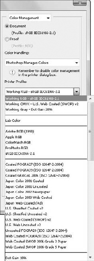
In Illustrator, Photoshop, and InDesign, you assign profiles from a menu command. In these programs, choose Edit

Figure 5.2. Check the box to embed a profile for all image formats supporting color profile embedding.
In InDesign, you have more options for assigning profiles, as well as a preview check box where you can preview the results of profile assignment. Use the same Edit

Note
There's a critical difference between InDesign and both Photoshop and Illustrator files. This difference is explicit in the InDesign Assign Profiles dialog box (hence the plural form of Profiles). Both PSD and AI files by nature can only have one color mode while an ID file must support both color modes simultaneously.
InDesign enables you to assign a working profile (RGB Profile) and an output Profile (CMYK Profile). In addition, you also can make choices for the rendering intent. Finally, check the Preview check box (which also is available in Photoshop), and the document pages behind the dialog box dynamically reflect the color profile you select in the Assign Profiles dialog box.
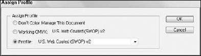
When you embed or assign a color profile to a document and your document is opened on a computer using another profile, there is a profile mismatch. When such mismatches occur, Illustrator, InDesign, and Photoshop all open dialog boxes to offer you some options on how to handle the mismatches. In Figure 5.5, you can see a file opening in Photoshop where a profile mismatch occurs.
The Embedded Profile Mismatch dialog box opens only when your color preferences are set to display profile mismatches. You can choose to convert color automatically in the Color Settings or open a dialog box where you can make decisions for converting color on an image-by-image basis.

The options available in the Embedded Profile Mismatch dialog box include the following:
Use the embedded profile (instead of the working space): Selecting this option leaves the image alone without converting color.
Convert document's colors to the working space: This option assigns the current RGB workspace you've identified in your color settings. At the top of the dialog box, you can see the current RGB workspace (Working) listed. In Figure 5.5, the workspace is sRGB IEC61966-2.1.
Discard the embedded profile (don't color manage): This option deletes the current embedded profile and does not convert color to the current workspace.
What to do when the Embedded Profile Mismatch dialog box opens confuses most people. As a general rule, the best option in a color-managed workflow is to convert color to calibrated systems. Therefore, when you know your RGB workspace is calibrated or you use the generic Adobe RGB (1998) profile, choose the Convert document's colors to the working space option. This choice converts the color embedded in the Photoshop image to the working space you use. In essence, all the color potentially assigned in the original image converts to the best representation that your current monitor space can assume.
In Illustrator, a similar dialog box used for color-profile assignment opens as a warning dialog box, informing you of the color mismatch. InDesign shows a warning dialog box that reports mismatches in both the embedded color policy and the color profile, as shown in Figure 5.6. The options choices are self-explanatory.
When you want to manage color among the CS4 applications, you can benefit greatly from Adobe's Common Color Architecture. The profile management and assignment is similar among all the Adobe CS4 programs, and when you understand how to manage color in one program, you can easily apply the same settings across all the programs. Each of the applications begins by addressing the color settings via menu commands.
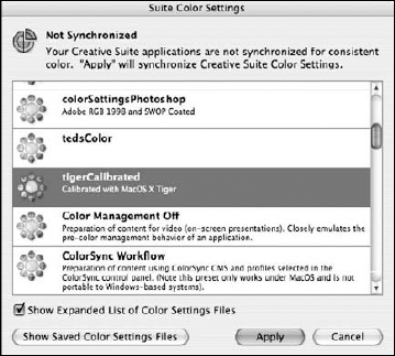
With the CS4 applications, you need only set up the color settings in one program, then use the Bridge to synchronize color among the remaining programs. Typically, Photoshop is the tool you most often use for adjusting color settings, but because of the consistency among programs, you can use any one of the CS4 programs to adjust the settings. Color settings are identical in Photoshop, Illustrator, and InDesign. A few variances occur among these programs. To adjust color settings in the CS4 applications, choose Edit
Note
More on using Bridge to synchronize color settings is covered in Chapter 6.
You can address Photoshop color settings by choosing Edit
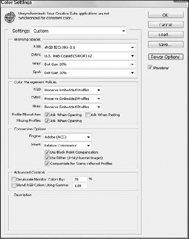
Figure 5.7. With the exceptions for Gray and Spot color handling in Photoshop, the Color Settings dialog box has the same appearance in Photoshop, Illustrator, and InDesign.
The first group is the Working Spaces where you select a color working space for your monitor. Ideally, you want your monitor color to be as close to the color produced on a printing device. The four adjustments to make for your working space include:
RGB: The RGB space defines what you see on your computer monitor. This space is commonly referred to as your working space. Because you perform most of your image editing on RGB images, you work in this color space before eventually converting to CMYK color for commercial printing. In some cases, you may leave images in RGB mode or not convert them to CMYK if the output device is an RGB device. Certain large-format inkjet printers, photo printers such as Fuji Frontier, and film recorders are best imaged from RGB files. If you have a calibrated monitor, use the profile created by your calibration equipment. If you plan on designing files for commercial output to imagesetters, platesetters, or press, use the Adobe RGB (1998) profile if your monitor is not calibrated. If your output is designed for screen and Web viewing, use sRGB IEC61966-2.1 as your monitor space.
CMYK: This profile is used for the output device—typically a CMYK printing device for composite printing and press. If you are designing artwork for press, use the U.S. Web Coated (SWOP) v2 for printing in the U.S. If printing outside the U.S., use the model common to the area where you print your files. For example, use the Japan Color 2001 Coated when printing on coated stock in Japan. The settings you choose in this pull-down menu affect your color conversion when you convert color in Photoshop. If you prepare CMYK files for direct output or importing in other applications via the Image

Gray: The pull-down menu choices affect grayscale images only in terms of dot gain and gamma adjustments. The actual result of making changes among the available settings affects the dot gain on press. In simple terms, you can target grayscale images to print darker or lighter. Decreasing the dot gain value leaves larger dots causing a darker image. You can also darken the image by increasing the gamma value. Increasing the dot gain creates smaller dots that spread out to become larger dots. The end result is dependent on the paper/ink combination that is being used.
Spot: The choices here are similar to the choices available for Gray, because the spot color separations are printed like gray plates. Making adjustments to the dot gain also results in darker and lighter images.
The next section in the Color Settings dialog box is Color-management policies. The choices here affect the profile management and mismatching behavior. You can instruct Photoshop to react to profile mismatches or ignore them according to the settings made from the pull-down menus:
RGB: You have three options from the pull-down menu. This first item deals with the RGB workspace. If your workspace is the one we suggested earlier in this section in "the RGB section—Adobe RGB (1998)—then a file saved with embedded profiles using any other profile from the RGB workspace is a mismatch. Accordingly, you can instruct Photoshop to turn off color management for working spaces by selecting Off, choose Preserve Embedded Profiles to not affect a color conversion, or select Convert to Working RGB where the saved profile is converted to the current RGB working profile. Turning off color management ignores all color profiling. Preserving Embedded Profiles keeps the color the same as assigned in the profile. Convert to Working RGB converts the color to the current RGB working space.
CMYK: The same options are available from pull-down menus as those found in the RGB pull-down menus.
Gray: The same options are available from the same kinds of pull-down menus.
Profile Mismatches: Ask When Opening: When you select this check box, a dialog box prompts you when a mismatch occurs. For workflow environments, it's a good idea to check the box so you know when a color conversion is about to take place.
Profile Mismatches: Ask When Pasting: If you copy data from one file and paste it into another file, you can copy an image with one embedded profile and paste the data into a document with another identified profile. Checking this box opens a dialog box alerting you to the color conversion.
Missing Profiles: If you open legacy files or files that were not color-managed or have no profile assignment, you can instruct Photoshop to offer you an option for managing color in the opened files. A dialog box opens where you can assign profiles as the documents open in the Photoshop window.
Conversion Options: You have choices for using the Adobe Color Engine (ACE) or color engines that your operating system supplies. For handling color among the CS4 applications and across platforms, use the Adobe Color Engine.
Intent: There are four standard options related to color intent. Intent refers to what happens when color is converted, specifically in terms of white points and color equivalents. The options choices for intent include the following:
Perceptual: Perceptual preserves the overall color appearance through the process of changing colors in the source color space so they fit inside the destination color space. This option is a particularly good choice when you have a number of colors that reside outside the destination color space. The color equivalents are matched as close as possible.
Saturation: As the name implies, Saturation tries to preserve the most vivid colors from the source space to the destination space. You might select this option when you want to convert PowerPoint slides, Excel graphs and charts, and other documents where vivid colors are apparent.
Relative Colormetric: This option tries to closely match the white point in the destination space with the same whites in the source space. After converting white, the other colors are matched as closely as possible. If you're pondering which space to use between Perceptual and Relative, use this option, because the whites are more likely to be reproduced accurately.
Absolute Colormetric: This option is an effort to simulate the color including white point for one output device to a second device. If a white in the source document is a bluish white and the destination is a yellowish white, the conversion adds more cyan to simulate the cooler white, thus rendering a closer approximation of the original image.
Use Black Point Compensation: As the intents take care of the whites in converting color from source images to destination images, the separate option for black point compensation takes care of black ink conversion. Without compensating for black when converting colors, you can end up with muddy non-rich blacks. As a matter of default, keep this check box checked.
Use Dither (8-bit/channel images): 8-bit channel images are 24-bit color images (8-bits per channel for 3 channels). If color transitions are stepped or crude, you may need to smooth them out. This check box does just that. Keep the check box enabled for all color conversion.
Compensate for Scene-referred Profiles: If you're dealing with video, then the color profile you want to use is much different from that used for print media. This option converts the profile for use in AfterEffects or another video editing package.
Desaturate Monitor Colors By: By default, some bright colors tend to appear somewhat flat on your computer monitor when using the Adobe RGB workspace. To render the images more true to appearance and prevent any misleading representations, keep this check box enabled.
Blend RGB Colors Using Gamma: When colors are blended in Photoshop like image data appearing on one layer over another layer, the blending of the colors can show visible problems in shadows and on the edges of the layers. If you see visible problems like this, check this box.
After you make your settings adjustments, click Save. The Save dialog box opens and the proper folder on your hard drive are targeted for the saved file. Type a name for the color-management setting and click Save. This color-management setting is then recognized by all the other Design Suite CS4 applications and Adobe Bridge.
After adjusting settings in Photoshop, Illustrator, or InDesign, open the Bridge. Regardless of which program you use to make settings adjustments, choose File
In Adobe Bridge, choose Edit
Note
For more information on working with Adobe Bridge, see Chapter 6.
If you create a settings file and click Save, the file is accessible to all the CS4 applications and to other users when you provide them with the profile. You can post a color-management setting on your network server, e-mail the file, or copy it to a media disk. Other users in your workflow can copy the file to the folder on their computers where all other color settings are saved. See the section "Acquiring Profiles" for the precise location where profiles are saved on the Macintosh and Windows. Once added to the proper folder, other users need only open Adobe Bridge and synchronize the color as explained in the section "Synchronizing Settings."
All the information related to profiling and managing color is fine in a theoretical environment, but when it comes to the real world, you must implement all the work you do in setting up your environment and observe the results. Ideally, you would have a color-calibration device and calibrate your computer monitor and the output device for precise results.
When you use a color-calibration system, you calibrate your monitor and the output device and measure colors as they lay down on the substrate you use for your prints. You develop the profile for a given printer and a given paper. Once you develop the profiles, you edit your images according to the monitor working space so the color values on your monitor come within a predictable range on your output. In essence, the monitor and output device are in parity in terms of color.
To print an image from a program like Photoshop, you would follow these steps after calibrating your system.
STEPS: Printing Composite Color Using Calibrated Profiles
Adjust the color settings. Set up your color settings according to the calibrations you performed. Be certain to choose the monitor working space you used to calibrate your monitor.
Print the Document. With your document open in Photoshop, choose File
Target the print for color management. From the Printer Profile pull-down menu select Color Management from the menu options. Refer to Figure 5.1 to see the Print dialog box.
Select the color profile created for the printer and paper. In the Profile pull-down menu, select the profile created for the paper.
Select the Rendering Intent. Select the intent from the menu options for Intent.
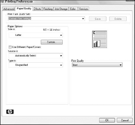
Select print options for the target printer. If you're printing to composite color devices, you have options for your printer via the print driver, as shown in Figure 5.9. Various color settings, paper types, speed for printing, and so on are options choices in the Print dialog box. Choose the options from the Print Settings (Mac) or Properties (Windows).
If you don't have a calibration system, you can run experiments using software tools to calibrate your monitor and test the output results. If you use this method, be ready to run tests many times before settling on a profile that works consistently for your printer.
Note
For more information on printing from Photoshop and the other CS4 applications, see Chapters 37 and 38.
You can use color profiles to consistently reproduce color in your workflow among input devices, your viewing space, and your output equipment.
Color calibration is optimum when using special tools to calibrate your computer monitor and output devices.
You can acquire output profiles from service providers and install them on your computer.
When profiles don't match, it's best to convert color to your calibrated workspace.
The print-oriented Creative Suite applications use a common color engine developed by Adobe Systems.
You apply color synchronization in Adobe Bridge.
You can share color profiles and color settings that you developed in one CS4 application with other users in your workflow.