Acrobat PDF forms and HTML forms are the most popular types of electronic forms in existence today. We're all familiar with HTML forms and most of us have filled out these kinds of forms when making online purchases. PDF forms are standardized in many industries such as government, education, and large business organizations. And most of us are also familiar with PDF forms like those used by the U.S. Internal Revenue Service for income tax preparation.
As a designer, you may be called upon to create PDF forms where your clients want to host the forms on Web sites, distribute forms on CD-ROMs, or use forms for electronic file exchanges.
With the marvelous design tools you have available in the Creative Suite and the use of Adobe Acrobat (Pro, Pro Extended, or Acrobat Standard edition), you have great opportunities to create attractive and powerful dynamic PDF forms.
Forms in Acrobat are PDF files with data fields that appear as placeholders for user-supplied data. In Acrobat, you can use text string fields, numeric fields, check boxes, radio buttons, data fields, calculation fields, signature fields, and a variety of custom fields created with JavaScripts. The advantage of using forms in Acrobat is that doing so enables you to maintain design integrity for the appearance of a form while providing powerful control over data management. Rather than using a database manager, which may limit your ability to control fonts and graphics, Acrobat PDFs preserve all the design attributes of a document while behaving like a data manager.
Forms are created in Acrobat or Adobe LiveCycle Designer. Adobe LiveCycle Designer is a separate executable application available to Windows users and installed on your hard drive with your Acrobat Pro installation. Unfortunately, this program is not available to Macintosh users.
As we discuss in Chapter 36, you can add certain usage rights to PDF files for Adobe Reader users. With Acrobat 8 or 9, forms can be completed and saved with Acrobat and Adobe Reader. When opening PDFs in Adobe Reader that have not been enabled with Reader Extensions, you cannot save, import, or export data. In developing PDF workflows for a company or organization, all users expected to design forms in Acrobat can use any one of the Acrobat commercial products.
Note
Creating Acrobat PDF forms is relatively easy when using auto field detection and working with some simple office forms. However, PDF forms can be quite complex, and your opportunities for assigning field properties, adding scripts, performing calculations, adding dynamic features, and doing more are almost limitless. We can only hope to offer a brief introduction to creating Acrobat PDF forms in this book. For a comprehensive view for working with Acrobat PDF forms and Adobe LiveCycle Designer forms, see PDF Forms Using Acrobat and LiveCycle Designer Bible (Wiley Publishing, Padova/Okamoto, 2009).
The one thing to keep in mind regarding Acrobat and forms is that a form in the context of PDF is not a paper form scanned as an image and saved as PDF. Tons of these so-called forms are around offices and on the Internet. These documents may have originated as forms, but by the time you understand all of Acrobat's available features, you'll see that these scanned documents can hardly be called forms. Simply put, they're scanned images saved to PDF. The power of Acrobat gives you the tools to create smart forms. These forms can be dynamic, intuitive, and interactive, and they can save both you and the end user much time in providing and gathering information.
PDF forms created in Acrobat usually start out as a document converted to PDF from an authoring program. Programs like Microsoft Office, Adobe InDesign, and Adobe Illustrator create the layout and background for a PDF form. After the design is created in an authoring program and converted to PDF, you use tools in Acrobat to add form fields and form attributes.
You also can scan paper forms and convert them to fillable PDF forms. Scanning paper forms, of course, doesn't require you to use any of the other CS applications. The forms are scanned directly in Acrobat where form fields are added.
Whereas many PDF forms in businesses are first created in Microsoft Word, you have many more design tools available to you for creating attractive forms using Adobe InDesign or Adobe Illustrator. These two Creative Suite tools together with Acrobat offer you all that you need to create impressive dynamic PDF forms.
Tip
If you create a design and then add form fields in Acrobat, and then later decide to change your design, you can edit the design back in your original authoring application. Simply save the design, and open the form you created in Acrobat. Select Document
As we mentioned at the beginning of this chapter, you use a design application to create a form layout, convert to PDF, and then add the form fields and form features in Acrobat.
Acrobat 9 has a new forms editing environment called Form Editing Mode that adds form fields to your PDF forms. When you first open a form design, you are in Preview mode. To enter Form Editing Mode, choose Forms

If you've created forms in Acrobat 8 or earlier, you'll immediately notice that Acrobat 9 contains no Forms toolbar in the normal Viewer mode. All form tools are now accessible only in Form Editing Mode. Additionally, the Fields panel you see on the left side of the Form Editing Mode interface appears only when in this mode. If you open the Advanced Editing toolbar in Viewer mode, you'll find the Button tool. This is the only form tool accessible in Viewer mode.
Editing field properties can be accomplished in either mode. By default, the Select Object tool is active when you are in Form Editing Mode and remains the selected tool until you click a Form tool. You cannot access the Hand tool while in Form Editing Mode unless you click the Preview button or use a key modifier. Press the Spacebar to access the Hand tool. While in Viewer mode, you can double-click a field object with the Select Object tool and open the Properties window.
For the occasional user of Acrobat, and well suited for the Creative Suite users, you'll find that creating forms in Acrobat is much easier in Acrobat 9 than in earlier versions. A few menu commands help you create forms in Acrobat without having to be a sophisticated forms designer. Acrobat provides all the tools necessary for creating sophisticated PDF forms, but you can choose simplicity if your forms authoring demands don't require scripting or adding dynamic elements.
One of the marvelous tools in Acrobat is the ability to use an auto field detection feature, in which Acrobat searches through a form and automatically adds fields on a new form design. A simple menu command can save you much time in creating a PDF form. The auto creation of form fields isn't perfect, and sometimes you may need to spend quite a bit of editing time perfecting your form. However, if you design forms knowing how to optimize auto recognition of form fields, you can save yourself much time.
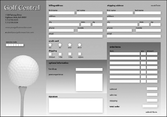
To illustrate, see Figure 30.2. This document is a simple form that originated in Adobe InDesign.
To populate this form using the auto field creation feature in Acrobat 9, open the Forms menu and select Add or Edit Fields. This command takes you into Form Editing Mode. An Acrobat dialog box asks if you want Acrobat to detect form fields. Click Yes, and Acrobat automatically recognizes form fields..
In an instant, Acrobat adds form fields to the document. Notice that the field positions in Figure 30.2 appear with underlines. This type of design works best. If you use rectangular boxes or other graphic elements, auto field detection has a harder time populating the form.
After detecting fields, the form appears as shown in Figure 30.3. The Welcome to Form Editing Mode dialog box opens where information is displayed related to creating form fields in Acrobat.
Another menu command available in Acrobat for creating forms is the Forms

These options are available in the Create or Edit Form wizard:
An existing electronic document (Windows)/Start with a PDF document (Macintosh). In Windows, you can start with a document that can be converted to PDF on the fly using the same options you have with File
A paper form. Choose this option on either platform, and a paper form can be scanned directly in Acrobat. The scan is recognized for text, opens in Form Editing Mode, and has fields automatically detected.
No existing form (Windows only). Choose this option and click Next, and Adobe LiveCycle Designer launches using either Acrobat Pro or Acrobat Pro Extended.


What kinds of authoring application files can be used with auto field detection? Look at this brief list of many different original document formats converted to PDF that work well with this command:
Microsoft Office: All Microsoft Office files work well with auto field detection. Use the PDFMaker from the Office applications (Windows) or use the Print command on the Macintosh to print to a PDF file to convert to PDF. (For more on PDFMaker and Microsoft Office applications, see Chapter 22.)
Adobe Creative Suite: Files created in Adobe InDesign and Adobe Illustrator work well with auto field detection. Native Adobe Illustrator and Illustrator PDFs are both supported.
Adobe Photoshop and scanned forms: Adobe Photoshop files and scanned forms are also supported. After conversion to PDF, you need to run OCR Text Recognition in Acrobat. Select Document
RTF: From a text editor, save files as RTF (Rich Text Format). Use the Create PDF
Web Pages and Adobe Dreamweaver: There's no need to use auto field detection with HTML documents and Web pages. When you use Create PDF
If you have other application program files such as Lotus Notes, Corel Draw, WordPerfect, e-mail messages, and so on, most of these file types also can be used with auto field detection as long as clearly defined form field locations appear on the document.
Using auto field detection does a very good job of recognizing form fields on simple forms. However, when forms become more complex and when you create forms with graphics, gradients, and complex design elements, auto field detection falls apart and won't create fields on most graphically intense form designs. As an example, look at Figure 30.5. When we chose Forms
If you use programs like Adobe Illustrator or Adobe InDesign to create forms with complex graphic elements, you can prepare your files for using auto field detection by adding an extra layer that you use just for the auto field detection command. Using programs like Illustrator or InDesign provide you the benefit for using layers in your design. You can easily create a background with all the graphic elements, a text layer containing all the text in the form, a layer for fields used in the final design, and a separate layer for temporary fields designed for auto field detection in Acrobat. An example of such a form we created in Adobe Illustrator is shown in Figure 30.6. Notice that the Temp Fields and Text layers are the only visible layers in Figure 30.6.
If you create a similar form in a program like Adobe Illustrator or Adobe InDesign, save your file to PDF as a PDF version 1.5 or greater document (Acrobat 6 and above compatibility) and check options for creating Adobe PDF Layers. You must save the file as a layered file that appears with Layers in Acrobat. In Acrobat, you can view just the Text and Temp Fields layers (while in Viewer mode only), all layers, or any combination of layers. Acrobat won't complain, and auto field detection creates form fields from the Temp Fields layer whether or not it is visible. After using auto field detection, our file appeared with the form fields as you see in Figure 30.7.

Figure 30.6. Creating a temporary layer designed for use with auto field detection is used to auto populate the form.
A little polish is needed on the form for sizing some field boxes and adding the radio button and check box fields, but the little time it took to create the temporary layer in the authoring application was a fraction of the time you would need to spend in Acrobat to manually create all the text fields. By using an authoring application supporting layers, you can easily create a PDF file that is auto field detection friendly. Planning ahead when designing forms in authoring programs can save you much time when using auto field detection.
Tip
When designing forms in authoring programs, use geometric shapes such as squares or rectangles for check boxes. Don't use text characters such as those you find in fonts like Carta and Wingdings. auto field detection can detect box shapes and convert them to check box fields, but it cannot detect text characters.
To finish up our form design in Acrobat, we flatten the layers. Be certain to turn off all layers you want discarded; when you select Flatten Layers from the Layers panel Options menu, the hidden layers are discarded and the PDF is flattened. All field objects remain undisturbed regardless of what layer views you have on or off.

Forms contain different types of data fields that hold data, act as buttons that invoke actions, and execute scripts to produce a series of actions. Form fields can assume different appearances and possess the capability to include graphic icons and images to represent hot links that invoke actions. Acrobat forms are more than a static data filing system—they can be as vivid and dynamic as your imagination.
Form data fields are created with the form tools in Form Editing Mode in Acrobat 9. In order to use the form tools, you first need to Form Editing Modechoose Forms

Figure 30.8. To display the form tools in Form Editing Mode across the top of the toolbar, choose Show Tools on Toolbar from the Add New Field pull-down menu.
After you make this choice, the tools appear neatly in a horizontal row across the Form Edit toolbar, as shown in Figure 30.9. The eight form field types available in Acrobat are drawn with the tools shown in Figure 30.9. From left to right following the Selection Arrow, they are the Text Field tool, Check Box tool, Radio Button tool, List Box tool, Combo Box tool, Button tool, Digital Signature tool, and Barcode tool.
Here's an overview of the field types:
Text field: Text fields are boxes in which text is typed by the end user to fill out the form. Text fields can contain alphabetical characters, numbers, or a combination of both.
Check box: Check boxes typically appear in groups to offer the user a selection of choices. Yes and no items or a group of check boxes might be created for multiple-choice selections.
Radio button: Radio buttons perform the same function in PDF forms as radio buttons in dialog boxes. Usually you have two or more choices for a category. Forms are usually designed so that when one radio button in a group is turned on, the other buttons in the group are turned off.
Combo box: When you view an Acrobat form, you may see a down-pointing arrow similar to the arrows appearing in panel menus. Such an arrow in a PDF form indicates the presence of a combo box. When you click the arrow, a pull-down menu opens with a list of choices. Users are limited to selecting a single choice from combo boxes. Additionally, if designed as such, users can input their own choices.
List box: A list box displays a box with scroll bars, much like windows you see in application software documents. As you scroll through a list box, you make a choice of one or more of the alternatives available by selecting items in the list.
Button: A button is usually used to invoke an action or hyperlink. A button face can be text or a graphic element created in another program that you could apply as an appearance to the button. You also can use different appearance settings in the button properties for adding stroke and fill colors. Buttons also are used to import images.
Digital signature: Digital signatures can be applied to fields, PDF pages, and PDF documents. A digital signature can be used to lock out fields on a form.
Barcode: The Barcode tool was not a completely new feature in Acrobat 7. Acrobat 7 supported a plug-in to create 2D and 3D barcodes; the plug-in was shipped long after the initial release of Acrobat 7.0. Later with Acrobat 8.0 and 9.0, the Barcode tool appears in the Forms toolbar in Form Editing Mode. This tool provides options for adding barcodes to a PDF form.
Although not form fields per se, these additional tools also appear in the Forms toolbar in Form Editing Mode:
Preview/Edit Layout: When you open the Form Editing Mode, your default view is the Edit Layout view where fields are added to a form. Click the Preview button, and you remain in Form Editing Mode, but you can edit text fields by filling them in. The button name changes to Edit Layout. Click Edit Layout, and you return to the Edit Layout mode.
Distribute Form: This tool is used to start an ad hoc data collection workflow. You can send the form by e-mail or post the form on
Acrobat.comor a Web page.Close Form Editing: Click the button, and you return to Viewer mode.
Tip
To easily toggle views between Form Editing Mode and Viewer mode, press Shift+Ctrl+7 (Windows) or Shift+
All these form field types and tools are available to you in Form Editing Mode when you create or edit a PDF form in Acrobat. On the right of the Keep tool selected check box on the toolbar, the left-pointing arrow collapses the toolbar and makes available the tools from the Add New Field pull-down menu.
The process of adding form fields to a form is the same for all fields. You click a form tool either from the Add New Field pull-down menu or the tool in the expanded toolbar in Form Editing Mode. This action loads the cursor with the selected tool. Move the cursor to a location on a form and click the mouse button to drop the field object on the page. Alternately, you can click and drag the cursor to shape the field object rectangle to a custom size.
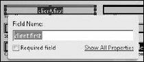
When you click a form tool and then click a page to drop the field object on your form, a mini Properties window opens, as shown in Figure 30.10. In this window, you can name a field and click the blue text (Show All Properties) to open the field object's Properties window. In the Properties window, you specify additional attributes for a field object.
Another choice you have for all field types is the Required field check box. Click this check box if you want to be certain that a form filler completes filling in a field before submitting the form to you.
Other than changing a field name and a few other options you have when creating radio button fields, the mini Properties window is an abbreviated form of assigning properties to field objects. You have a much more elaborate set of options when you open a field object's Properties window.
You can open the Properties window by clicking Show All Properties when you first drop a field object on a page, or when double-clicking a field object with the Select Object tool in either Form Editing Mode or Viewer mode. Additionally, you can open a context menu on a field object with the Select Object tool and choose Properties at the top of the menu. Any of these options opens the Properties window, shown in Figure 30.11, where several tabs offer you options for setting a field's properties.
Note
If you don't click a form tool while in Form Editing Mode, the default active tool is the Select Object tool.

Figure 30.11. Double-click a field object with the Select Object tool in either Form Edit more or Viewer mode to open the field Properties window.
The General properties tab is the default tab where general properties are assigned. These properties are common to all field types. The properties include:
Name: By default, Acrobat adds a name in the Name field. As a matter of practice, you should type a descriptive name in the Name text box. Don't use names with spaces, and try to use parent/child names for fields in common groups. A parent/child name might appear as item.1, item.2, item.3, and so on; or you might have client.first, client.last, client.address, and so on.
Tooltip: Type a name, and when the cursor is placed over the field in Preview mode, the text appears as a tooltip below the Hand tool cursor.
Form field: From the pull-down menu, make choices for visibility and printing. By default, the field is visible and prints when the file is printed.
Orientation: A field and a field's contents can be rotated in 90-degree rotations. By default, fields are at a 0 (zero)-degree rotation. Select from 90, 180, and 270 to rotate fields in fixed rotations.
Read Only: When a field is marked as Read Only, the field is not editable. The user is locked out of the field. A Read Only field might be something you use to show fixed price costs where you don't want users changing a fixed purchase price on an order form. Another example is a value that is pre-populated from a database or with fields that show results of other calculated data.
Required: If a field needs to be filled in before the data is submitted, select the Required box. (Note that you can click the Required field check box when you first create a field object on a form.)
Locked: Locking a field prevents the field from being moved. You can still type data in the field or make a choice from options for other fields. This item is used to fix fields in position as you edit a form.
The Appearance tab relates to form field appearances. The rectangles you draw can be assigned border colors and content fills. The text added to a field box or default text you use for a field can be assigned different fonts, font sizes, and font colors. These options exist in the Appearance properties for all field types except barcode fields. (Barcode fields don't have an Appearance tab.) Figure 30.12 shows the Appearance properties for a selected text field.

Figure 30.12. Click the Appearance tab for any field properties, and make choices for the appearance of fields and text.
The Appearance options include the following:
Border Color: The keyline created for a field is made visible with a rectangular border assigned by clicking the Border Color swatch and choosing a color.
Fill Color: The field box can be assigned a background color. If you want the field box displayed in a color, enable this option, click the color swatch next to it, and choose a color the same way you do for the borders. When the check box is disabled, the background appears transparent.
Line Thickness: Select the pull-down menu, and choose from Thin, Medium, or Thick. The pull-down menu is grayed out unless you first select a Border Color.
Line Style: You can choose from five style types from the pull-down menu. The Solid option shows the border as a keyline at the width specified in the Width setting. Dashed shows a dashed line; Beveled appears as a box with a beveled edge; Inset makes the field look recessed; and Underline eliminates the keyline and shows an underline for the text across the width of the field box.
Font Size: Depending on the size of the form fields you create, you may need to choose a different point size for the text. The default is Auto, which automatically adjusts point sizes according to the height of the field box. Choices are available for manually setting the point size for text ranges between 2 and 300 points.
Text Color: If you identify a color for text by selecting the swatch adjacent to Text Color, the field contents supplied by the end user change to the selected color.
Font: From the pull-down menu, select a font for the field data. All the fonts installed in your system are accessible from the pull-down menu. When designing forms for screen displays, try to use sans serif fonts for better screen views. The first 14 fonts are installed with Acrobat. You can use these fonts to be certain all users have the same fonts.
The Appearance settings are identical for all field types except Digital Signature fields, Radio Button fields, Check Box fields, and Barcode fields. The Radio Button and Check Box fields use fixed fonts for displaying characters in the field box. You choose what characters to use in the Options tab. When creating Radio Button and Check Box fields, you don't have a choice for Font in the Appearance properties. By default, the Adobe Pi font is used.
The Options tab provides selections for specific attributes according to the type of fields you add to a page. Options are available for all fields except the Digital Signatures field. Options tab attributes for the other six field types include options for text, radio buttons, combo and list boxes, and buttons.
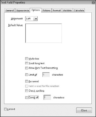
When you use the Text Field tool to create a field and you click on the Options tab, the Properties window appears, as shown in Figure 30.13. Each of the following attribute settings is optional when creating text fields:
Alignment: The Alignment pull-down menu has two functions. First, any text entered in the Default field is aligned according to the option you specify from the pull-down menu choices. Alignment choices include Left, Center, and Right. Second, regardless of whether text is used in the Default field, when the end user fills out the form, the cursor is positioned at the alignment selected from the pull-down menu choices. Therefore, if you select Center from the Alignment options, the text entered when filling out the form is centered within the field box.
Default Value: The Default Value field can be left blank, or you can enter text that appears in the field when viewing the form. The Default item has nothing to do with the name of the field. This option is used to provide helpful information when the user fills out the form data. If no text is entered in the Default field, when you return to the form, the field appears empty. If you enter text in the Default field, the text you enter appears inside the field box and can be deleted, edited, or replaced.
Multi-line: If your text field contains more than one line of text, select the Multi-line option. When you press the Return key after entering a line of text, the cursor jumps to the second line where additional text is added to the same field. Multi-line text fields might be used, for example, as an address field to accommodate a second address line.
Scrolling long text: If Multi-line is selected and text entries exceed the height of the field, you may want to add scroll bars to the field. Enable the check box to permit users to scroll lines of text. If the check box is disabled, users won't be able to scroll, but as text is added, automatic scrolling accommodates the amount of text typed in the field.
Allow Rich Text Formatting: When you check this box, users can style text with bold, italic, and bold italic font styles. You may want to enable the check box if you want users to emphasize a field's contents.
Limit of [ ] characters: The box for this option provides for user character limits for a given field. If you want the user to add a state value of two characters, for example, check the box and type 2 in the field box. If the user attempts to go beyond the limit, a system warning beep alerts the user that no more text can be added to the field.
Password: When this option is enabled, all the text entered in the field appears as a series of asterisks when the user fills in the form. The field is not secure in the sense that you must have a given password to complete the form; it merely protects the data entry from being seen by an onlooker.
Field is used for file selection: This option permits you to specify a file path as part of the field's value. The file is submitted along with the form data. Be certain to enable the Scrolling long text option described earlier in this list to enable this option.
Check spelling: Spell checking is available for comments and form fields. When the check box is enabled, the field is included in a spell check. This can be helpful so the spell checker doesn't get caught up with stopping at proper names, unique identifiers, and abbreviations that may be included in those fields.
Comb of [ ] characters: When you create a text field box and enable this check box, Acrobat automatically creates a text field box with subdivision lines according to the value you supply in the Characters field box. Be certain to disable all other check boxes. You can set the alignment of the characters by making a choice from the alignment pull-down menu, but all other check boxes need to be disabled to access the Comb of check box.
Check boxes and radio buttons have similar Options choices. When you select either field and click the Options tab, the settings common to both field types include the following:
Button/Check Box Style: If a radio button is selected, the title is Button Style. If the field is a check box, the title is listed as Check Box Style, as shown in Figure 30.14. From the pull-down menu, you select the style you want to use for the check mark inside the radio button or check box field.
Export Value: When creating either a check box or radio button, use the same field name for all fields in a common group where you want one check box enabled while all the other check boxes or radio buttons are disabled. To distinguish the fields from each other, add an export value that differs in each field box. You can use export values such as Yes and No or other text, or number values such as 1, 2, 3, 4, and so on.
The creation of radio buttons and check boxes on Acrobat forms has been confusing to many users, and users often inappropriately create workarounds for check boxes and radio buttons to toggle them on and off. To help eliminate confusion, notice that the Options properties in Figure 30.13 includes a help message informing you to name fields the same name but use different export values. (See the nearby sidebar "Creating Mutually Exclusive Fields" for more information.)
Button/Check box is checked by default: If you want a default value to be applied for either field type (for example, Yes), enter the export value and select the box to make the value the default.
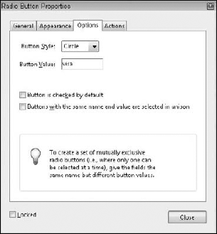
One distinction appears in the Options dialog box between radio buttons and check boxes. The second check box in the radio button properties is unique to radio buttons:
Buttons with the same name and value are selected in unison (applies to radio buttons only): For data export purposes, you'll want to add a different export value for each radio button and check box. If you don't need to export data to a database with unique export values for each radio button, you can add radio buttons to a page with the same export values, and by default, when a user clicks one radio button all other radio buttons are disabled.
The Button/Check Box Style selection from the pull-down menu in both field types provides identical appearances. The styles are shown in Figure 30.15.

Combo boxes enable you to create form fields with a list of selections appearing in a pull-down window. The user completing a form makes a selection from the menu items. If all items are not visible, the menu contains scroll bars made visible after selecting the down-pointing arrow to open the menu. A list box is designed as a scrollable window with an elevator bar and arrows as you see in authoring application documents. When you create a ist box you define the choices in the List Box Properties window as shown in Figure 30.16.
Creating Mutually Exclusive Fields
Creating mutually exclusive fields where one radio button or check box is turned on within a group and all others within the same group are turned off has been a problem for PDF form authors for some time. In Acrobat 9, Adobe made creating mutually exclusive radio button fields easier and more intuitive.
When you add a Radio Button field in Form Editing Mode, the mini Properties window offers you options for creating mutually exclusive fields. The Button Value for each field in the same group must appear different. You can type any text in the Button Value text box. However, the Radio Group Name must be the same name for every field in the same group. When you are ready to add another field to a group, just click Add another button to group in the mini Properties window, and a new radio button field is added to the form using the same Radio Group name.


The two field types differ in several ways. First, combo boxes require less space for the form field. The combo box menu drops down from a narrow field height where the menu options are shown. List boxes require more height to make them functional to the point where at least two or three options are in view before the user attempts to scroll the window. Second, you can select only one menu option from a combo box. List boxes enable users to select multiple items. Finally, combo boxes can be designed for users to add text for a custom choice by editing any of the menu items. List boxes provide no option for users to type text in the field box, and the menu items are not editable.
The data exported with the file include the selected item from the combo boxes and all selected items for list boxes. The item choices and menu designs for the field types are created in the Options tab for the respective field type. Attributes for list boxes also are available for combo boxes. The options include the following:
Item: You enter the name of an entry you want to appear in the scrollable list in this field.
Export Value: When the data are exported, the name you enter in this field box is the exported value. If the field is left blank, the exported value is the name used in the item description typed in the Item field. If you want different export values than the name descriptions, type a value in this field box. As an example, suppose you create a consumer satisfaction survey form. In that form, the user can choose from list items such as Very Satisfied, Satisfied, and Unsatisfied, and you specify the export values for these items to be 1, 2, and 3, respectively. When the data are analyzed, the frequency of the three items is tabulated and defined in a legend as 1=Very Satisfied, 2=Satisfied, and 3=Unsatisfied.
Add: After you enter the Item and Export Values, click the Add button to place the item in the Item List. After adding an item, you can return to the Item field and type a new item in the field box and, in turn, a new export value.
Item List: As you add items, the items appear in a scrollable list window. To edit a name in the list window, delete the item, type a new name in the Item text box, and then click the Add button to add the newly edited item back in the list.
Delete: If an item has been added to the list and you want to delete it, first select the item in the list. Click the Delete button to remove it from the list.
Up/Down: Items are placed in the list according to the order in which they are entered. The order displayed in the list is shown in the combo box or list box when you return to the document page. If you want to reorganize items, select the item in the list and click the Up or Down button to move one level up or down, respectively. To enable the Up and Down buttons, the Sort Items option must be disabled.
Sort items: When checked, the list is alphabetically sorted in ascending order. As new items are added to the list, the new fields are dynamically sorted while the option is enabled.
Multiple selection (List box only): Any number of options can be selected by using modifier keys and clicking the list items. Use Shift-click for contiguous selections and Ctrl/
Commit selected value immediately: The choice made in the field box is saved immediately. If the check box is disabled, the choice is saved after the user exits the field by tabbing out or clicking the mouse cursor on another field or outside the field.
With the exception of the multiple selection item, the preceding options also are available for combo boxes. In addition to these options, combo boxes offer two more items:
Allow user to enter custom text: The items listed in the Options tab are fixed in the combo box on the Acrobat form by default. If this check box is enabled, the user can create a custom value. Acrobat makes no provision for some items to be edited and others to be locked out from editing.
Check spelling: Spell checking is performed when a user types in a custom value. As text is typed, the spelling is checked.
Buttons differ from all other fields when it comes to appearance. You can create and use custom icons for button displays from PDF documents or file types compatible with Convert to PDF from File. Rather than entering data or toggling a data field, buttons typically execute an action. You might use a button to clear a form, export data, import data from a data file, or use buttons as navigation links. When you add a button to a page, the Options tab attributes change to those shown in Figure 30.17.

Figure 30.17. The Options tab for the Button field properties includes options for button face displays and several different mouse behaviors.
When you create a button, you make choices from the Options tab for the highlight view of the button, the behavior of the mouse cursor, and the text and icon views. The Options attributes for buttons are as follows:
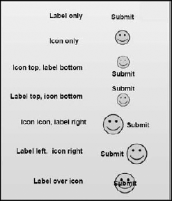
Layout: Several views are available for displaying a button with or without a label, which you add in the Label field described later in this list. The choices from the pull-down menu for Layout offer options for displaying a button icon with text appearing at the top, bottom, left, or right side of the icon, or over the icon. Figure 30.18 shows the different Layout options.
Behavior: The Behavior options affect the appearance of the button when the button is clicked. The None option specifies no highlight when the button is clicked. Invert momentarily inverts the colors of the button when clicked. Outline displays a keyline border around the button, and Push makes the button appear to move in on Mouse Down and out on Mouse Up.
Icon and Label State: Three choices are available in the list when you select Push in the Behavior pull-down menu. Up is the appearance of the button before the mouse enters the button area and triggers the rollover appearance. Down displays the highlight action when the mouse button is pressed. Rollover changes the icon when a second icon has been added to the rollover option. When the user moves the mouse cursor over the button without clicking, the image changes to the second icon you choose—much like a rollover effect you see on Web pages.
Label: If you've selected a layout type that includes a label, type text in the field box for the label you want to use. Labels are shown when one of the options for the layout includes a label view with or without the icon.
Choose Icon: When you use an icon for a button display, click Choose Icon to open the Select Icon dialog box. In the Select Icon dialog box, use a Browse button to open a navigation dialog box where you locate a file to select for the button face. The file can be a PDF document or a file compatible with converting to PDF from within Acrobat. The size of the file can be as small as the actual icon size or a letter-size page or larger. Acrobat automatically scales the image to fit within the form field rectangle drawn with the Button tool. When you select an icon, it is displayed as a thumbnail in the Select Icon dialog box.
Tip
An icon library can be created easily from drawings using a font such as Zapf Dingbats or Wingdings or patterns and drawings from Adobe Illustrator. Create or place images on several pages in a layout application. Distill the file to save as a multiple-page PDF document. When you select an icon to use for a button face, the Select Icon dialog box enables you to scroll pages in the document. You view each icon in the Sample window as a thumbnail of the currently selected page. When the desired icon is in view, click OK. The respective page is used as the icon.
Clear: You can eliminate a selected icon by clicking the Clear button. Clear eliminates the icon without affecting any text you added in the Layout field box.
Advanced: Notice the Advanced button at the top of the Options tab. Clicking the Advanced button opens the Icon Placement dialog box where you select attributes related to scaling an icon. You can choose from icon scaling for Always, Never, Icon is Too Big, and Icon is Too Small to fit in the form field. The Scale option offers choices between Proportional and Non-proportional scaling. Click Fit to bounds to ensure the icon placement fits to the bounds of the field rectangle. Sliders provide a visual scaling reference for positioning the icon within a field rectangle.
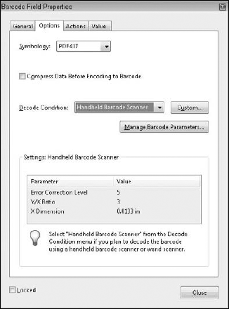
Barcode fields have unique options designed to work with barcode scanners. You have options from pull-down menus and pop-up dialog boxes opened from buttons, as shown in Figure 30.19. In order to make choices for the items in the Options pane in the Barcode Field Properties dialog box, you need to know what parameters are used by your barcode scanner, fax server, or document scanner. Setting the options requires reviewing the documentation supplied by the hardware used to scan barcodes.
The Actions tab enables you to set an action for any one of the eight field types; the attribute choices are identical for all fields. The same action items available for links, Bookmarks, and page actions also are available to form fields. Click the Actions tab, and the pane changes, as shown in Figure 30.20.

From the Select Trigger pull-down menu, you make choices for different mouse behaviors that are assigned to invoke the action. From the menu options, you have choices for the following:
Mouse Up: When the user releases the mouse button, the action is invoked.
Mouse Down: When the user presses the mouse button, the action is invoked.
Mouse Enter: When the user moves the mouse cursor over the field, the action is invoked.
Mouse Exit: When the user moves the mouse cursor away from the field, the action is invoked.
On Focus: This option specifies moving into the field boundaries through mouse movement or by tabbing to the field. As the cursor enters the field, the action is invoked.
On Blur: This option specifies moving away from the field boundaries through mouse movement or by tabbing to the field. As the cursor exits the field, the action is invoked.
Actions assigned to the cursor movements are similar to those in the context of creating links. You first select the trigger, and then select an action type from the Select Action pull-down menu. Click the Add button to add the action to the Actions list.
The action is assigned to the mouse cursor option when you click Add. The default is Mouse Up. When Mouse Up is selected, the action is invoked when the mouse button is released.
Warning
Trigger choices other than Mouse Up may sometimes complicate filling in form fields for end users. Just about any program dealing with link buttons has adopted the Mouse Up response to invoke an action. Many users often click down, think about what they are doing, and then move the mouse away without releasing the button. This behavior enables the user to change his/her mind at the last minute. Deviating from the adopted standard might be annoying for a user.
When you click the Add button, a dialog box specific to the action type you are adding opens. The actions listed in this dialog box are the same as those in the Link Properties dialog box and can be viewed by opening the pull-down menu. A few of the more important action types used with form fields include importing form data, resetting a form, submitting a form, and showing and hiding a field.
You can export the raw data from a PDF file as a Form Data File (FDF) or XML file that can later be imported into other PDF forms. To import data, you use a menu command from the list of action types (Import Form Data) or create a JavaScript. Rather than retyping the data in each form, you can import the same field data into new forms where the field names match exactly. Therefore, if a form contains field names such as First, Last, Address, City, State, and so on, all common field names from the exported data can be imported into the current form. Those field names without exact matches are ignored by Acrobat.
Note
In earlier versions of Acrobat, you also had an option to Execute a menu item that appears in the Select Action pull-down menu. From the menu items, you could select Import (or Export) Data. In Acrobat 8 and 9, the Execute a menu item options have been greatly reduced, and you can no longer manage data using this action type.
The Import Data to Form command enables you to develop forms for an office environment or Web server where the same data can be included easily in several documents. When designing forms, using the same field names for all common data is essential. If you import data and some fields remain blank, recheck your field names. You can edit any part of a form design or action to correct errors.
This action is handy for forms that need to be cleared of data and resubmitted. When the Reset a form action is invoked, data fields specified for clearing data when the field was added are cleared. When you select Reset a form and click the Add button, the Reset a Form dialog box opens. You make choices in this dialog box for what fields you want to clear. Click the Select All button, and all data fields are cleared when a user clicks on the button you assign with a Reset a form action. When you use this action, you should associate it with Mouse Up to prevent accidental cursor movements that might clear the data and require the user to begin over again. Reset a form also can be used with a Page Action command. If you want a form to be reset every time the file is opened, the latter may be a better choice than creating a button.
Tip
When you design a form and view the form in either Form Edit Preview mode or Viewer mode, you can select Forms
The General, Appearance, and Actions tabs are available for all field types. Option attributes are available for all field types except digital signatures. The options vary significantly depending on which field type is used. Table 30.1 gives you a quick glance at the tab differences according to field type.
As shown in Table 30.1, the Format, Validate, and Calculate tab options are available only for Combo Box and Text field types. To access the Format tab, select either of these field types. The Format options are the same for both field types.
When you click the Format tab, you'll find a pull-down menu for selecting a format category. To define a format, open the Select format category and choose from the menu choices the format you want to assign to the Text or Combo Box field. As each item is selected, various options pertaining to the selected category appear directly below the pull-down menu. When you select Number from the menu choices, the Number Options appear as shown in Figure 30.21.
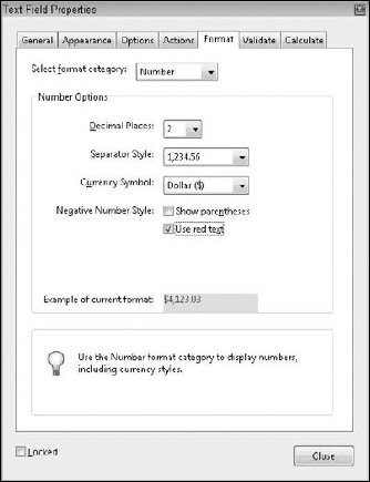
Figure 30.21. When you choose either Combo Box or Text as the field type, you can select data format options from the Format tab.
Table 30.1. Tab Options for Field Types in the Field Properties Window
Field Type | Appearance | Options | Actions | Format | Validate | Calculate | Selection Change | Signed | Value |
|---|---|---|---|---|---|---|---|---|---|
Button | X | X | X | ||||||
Check Box | X | X | X | ||||||
Combo Box | X | X | X | X | X | X | |||
List Box | X | X | X | X | |||||
Radio Button | X | X | X | ||||||
Text | X | X | X | X | X | X | |||
Signature | X | X | X | ||||||
Barcode | X | X | X | X |
The Select format category menu options include the following:
None: No options are available when None is selected. Select this item if no formatting is needed for the field. An example of where None applies would be a text field where you want text data such as name, address, and so on.
Number: When you select Number, the Number Options choices appear below the Select format category pull-down menu. The options for displaying numeric fields include defining the number of decimal places, indicating how the digits are separated (for example, by commas or by decimal points), and specifying any currency symbols. The Negative Number Style check boxes enable you to display negative numbers with parentheses and/or red text.
Percentage: The number of decimal places you want to display for percentages is available when you select Percentage from the pull-down menu. The options are listed for number of decimal places and the separator style.
Date: The date choices offer different selections for month, day, year, and time formats.
Time: If you want to eliminate the date and identify only time, the Time category enables you to do so, offering choices to express time in standard and 24-hour units and a custom setting where custom formats are user-prescribed in a field box.
Special: The Special category offers formatting selections for Social Security number, Zip code, extended Zip code, phone number, and an arbitrary mask. When you select Arbitrary Mask, a field box is added where you define the mask. The acceptable values for setting up an arbitrary mask include these:
A: Add A to the arbitrary mask field box, and only the alphabetical characters A – Z and a – z are acceptable for user input.
X: When you add X to the arbitrary mask field box, most printable characters from an alphanumeric character set are acceptable. ANSI values between 32 – 166 and 128 – 255 are permitted. (To learn more about what ANSI character values 32 – 166 and 128 – 255 are translated to, search the Internet for ANSI character tables. You can capture Web pages and use the tables as reference guides.)
O: The letter O accepts all alphanumeric characters (A – Z, a – z, and 0 – 9).
9: If you want the user to be limited to filling in numbers only, enter 9 in the Arbitrary Mask field box.
Custom: Custom formatting is available by using a JavaScript. To edit the JavaScript code, click the Edit button and create a custom format script. The JavaScript Editor dialog box opens where you type the code. As an example of using a custom JavaScript, assume that you want to add leading zeros to field numbers. You might create a JavaScript with the following code:
event.value = "000" + event.value;
The preceding code adds three leading zeros to all values supplied by the end user who completes the form field. If you want to add different characters as a suffix or prefix, enter the values you want within the quotation marks. To add a suffix, use this:
event.value = event.value + "000";
Validate helps ensure that proper information is added on the form. If a value must be within a certain minimum and maximum range, select the radio button for validating the data within the accepted values, as shown in Figure 30.22. The field boxes are used to enter the minimum and maximum values. If the user attempts to enter a value outside the specified range, a warning dialog box opens, informing the user that the values entered on the form are unacceptable.

Figure 30.22. Validate is used with Combo Box and Text field types to ensure acceptable responses from user-supplied values.
Selecting the Run custom validation script radio button and clicking the Edit button enables you to add a JavaScript. Scripts that you may want to include in this window would be those for validating comparative data fields. A password, for example, may need to be validated. If the response does not meet the condition, the user is denied access to supplying information in the field.
The Calculate tab (supported in Text and Combo Box fields) in the Field Properties window enables you to calculate two or more data fields. You can choose from preset calculation formulas or add a custom JavaScript for calculating fields, as shown in Figure 30.23.
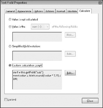
Figure 30.23. The Calculate tab offers options for calculating fields for summing data, multiplying data, and finding the average, minimum, and maximum values for selected fields. In addition, you can add custom calculations by writing JavaScripts.
The preset calculation formulas are limited to addition, multiplication, averaging, assessing the minimum in a range of fields, and assessing the maximum in a range of fields. For all other calculations, you need to select the Simplified field notation or Custom calculation script radio button and click the Edit button. In the JavaScript Editor, you write JavaScripts to perform other calculations not available from the preset formulas. Simplified field notation is written in the JavaScript editor and follows syntax similar to writing formulas in spreadsheets. JavaScripts, also written in the JavaScript Editor, require you to know JavaScript as it is supported in Acrobat.
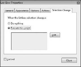
The Selection Change tab, shown in Figure 30.24, is available for List Box fields only. If a list box item is selected and then a new item from the list is selected, JavaScript code can be programmed to execute an action when the change is made. As with the other dialog boxes, clicking the Edit button opens the JavaScript Editor dialog box where you create the JavaScript code.
Many uses exist for the Selection Change option. You might want to create a form for consumer responses for a given product—something such as an automobile. Depending on information preceding the list box selection, some options may not be available. For example, a user specifies "four-door automobile" as one of the form choices, and then from a list, that user selects "convertible." If the manufacturer does not offer a convertible for four-door automobiles, then using a JavaScript in the Selection Change tab, the user is informed that this selection cannot be made based on previous information supplied in the form. The displayed warning could include information on alternative selections that the user could make.
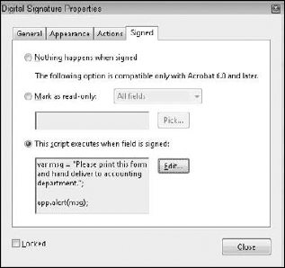
The Digital Signature tool enables you to create a field used for electronically signing a document with a digital signature. The Signed tab offers options for behavior with digital signatures as follows:
Nothing happens when signed: As the item description suggests, the field is signed but no action takes place upon signing.
Mark as read-only: When signed, the selected fields are changed to read-only fields, locking them against further edits. You can mark all fields by selecting the radio button and choosing All fields from the pull-down menu. Choose All fields except these to isolate a few fields not marked for read-only, or select Just these fields to mark a few fields for read-only.
This script executes when the field is signed: Select the radio button, and click the Edit button to open the JavaScript Editor. Write a script in the JavaScript Editor that executes when the field is signed.
Digital signatures can be used to lock data fields. You also can use them to indicate approval from users or PDF authors, or you may want to display a message after a user signs a form. In Figure 30.25, a JavaScript was added to the Digital Signature Signed Properties.
The script in this example instructs a user to print the form and hand-deliver it to the accounting department. A dialog box opens after the user signs the form.
The unique property settings in the Barcode field are located in the Value tab. Options in this tab are available only with Barcode fields, as shown in Figure 30.26. You have options for Encoding from a pull-down menu offering a choice between XML and Tab Delimited data.

Note
When creating barcodes, always add all the fields to a page and populate the fields with data then create the barcode as the last step. A barcode needs to calculate sizes to accommodate the field data.
Click the Pick button and the Field Selection dialog box opens as shown in Figure 30.27. You use this dialog box to determine what field data are added to the barcode. Uncheck those items you don't want added, such as buttons that invoke actions, temporary calculation fields, and so on. The Include field names text box offers an option to include field names along with the data in the barcode.

An additional box appears for adding a Custom calculation script. Click the radio button, and click Edit to open the JavaScript Editor.
For purposes of explanation, we use the term managing fields to mean dealing with field duplication, deleting fields, and modifying field attributes. After you create a field on a PDF page, you may want to alter its size, position, or attributes. Editing form fields in Acrobat is made possible by using one of several menu commands or returning to the respective Field Properties window.
To edit a form field's properties, use the Select Object tool in either Form Edit Mode or Viewer mode and double-click the field rectangle. The Properties window opens after you double-click with the tool. You also can use a context-sensitive menu opened from using either tool and clicking the form field to be edited. At the top of the context-sensitive menu, select the Properties command. Also, you can select Forms
To select multiple fields of different types, you must use the Select Object tool. Ctrl/Shift-click each field you want to select. You can drag through fields to select them, but you can do so only with the Select Object tool.
When you select multiple fields and choose Properties from the context-sensitive menu, options in the General tab, the Appearance tab, and the Actions tab are available for editing. Specific options for each different field type require that you select only common field types. For example, you can edit the appearance settings for a group of fields where the field types are different. However, to edit something like radio button field options for check mark style, you need to select only radio button fields in order to gain access to the Options tab.
Tip
If the fields you want to select are located next to each other or you want to select many fields, use the Select Object tool and drag a marquee through the fields to be selected. When you release the mouse button, the fields inside the marquee and any fields intersected by the marquee are selected. The marquee does not need to completely surround fields for selection—it must just include a part of the field box within the marquee.
You can duplicate a field by selecting it and holding down the Ctrl/Option key while clicking and dragging the field box. Fields also can be copied and pasted on a PDF page, between PDF pages, and between PDF documents in both Form Editing Mode and Viewer mode. Select a field or multiple fields, and then choose Edit
Tip
To ensure that field names are an exact match between forms, create one form with all the fields used on other forms. Copy the fields from the original form, and paste the fields in other forms requiring the same fields. By pasting the fields, you ensure that all field names are identical between forms and can easily swap data between them. If you have JavaScripts at the document level, then use the Document
You can relocate fields on the PDF page by selecting the Select Object tool in the Advanced Editing toolbar, and then clicking and dragging the field to a new location. To constrain the angle of movement, select a field with the Select Object tool, press the Shift key, and drag the field to a new location. For precise movement, use the arrow keys to move a field box left, right, up, or down.
You delete fields from PDF documents in three ways. You can select the field and press the Backspace key (Windows) or Delete key (Macintosh). You also can select the field and choose Edit
Even when you view the grids on the PDF page (View
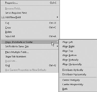
Figure 30.28. Open a context menu using the Select Object tool on one field in a group of selected fields, and choose Align from the menu.
Acrobat aligns fields according to the first field selected (the anchor field appearing with handles around the field object). In other words, the first field's vertical position is used to align all subsequently selected fields to the same vertical position. The same holds true for left, right, and top alignment positions. When you use the horizontal and vertical alignments, the first field selected determines the center alignment position for all subsequently selected fields. All fields are center aligned either vertically or horizontally to the anchor field.
Tip
Fields are aligned to an anchor field when multiple fields are selected and you use the align center, distribute, and size commands. The anchor field appears with handles on the corners and the midpoint on each side while the remaining selected field highlights are blue. If you want to change the anchor (the field to be used for alignment, sizing, and so on), select all fields, press the Shift key and click the field you want to be the anchor. The selected field appears with handles.
You can distribute fields on a PDF page by selecting multiple fields and choosing Distribute from a context-sensitive menu. Select either Horizontally or Vertically for the distribution type. The first and last fields in the group determine the beginning and ending of the field distribution. All fields within the two extremes are distributed equidistant between the first and last fields.
Center alignment is another menu command available from a context menu. When you choose Center
Field rectangles can be sized to a common physical size. Once again, the anchor field determines the size attributes for the remaining fields selected. To size fields, select multiple field boxes, and then open a context menu and choose Set Fields to Same Size
To create a table array, select fields either in a single row or single column and open a context menu. From the menu options, select Place Multiple Fields. The Create Multiple Copies of Fields dialog box opens, as shown in Figure 30.29. In the Create Multiple Copies of Fields dialog box, enter a value in the field box for Copy selected fields down (for creating rows of fields) or Copy selected fields across (to create columns of fields). In Figure 30.29, we created three fields and wanted our duplicated fields to be added below the top row. Notice that when you make selections in the Create Multiple Copies of Fields dialog box with the Preview check box enabled, you see a dynamic preview in the document for how the fields appear when duplicated.
Note
You also can create a table array by first creating a single field and selecting options for both Copy Selected Fields down and Copy Selected Fields across.
If you want to add both rows and columns, you can supply values in both field boxes for the desired number of columns and rows. The Change Width and Change Height field boxes enable you to adjust the field distance respective to each other—editing the values does not change the physical sizes of the fields. Click the Up/Down buttons for moving all fields vertically or the Left/Right buttons to move fields horizontally. When the preview box is enabled, you see a preview of the duplicated rows and columns before you accept the attribute choices by clicking OK.
If, after you click OK, you need to polish the position of the new fields, you can move the top and bottom fields (for aligning single columns), and then open a context menu and choose Distribute
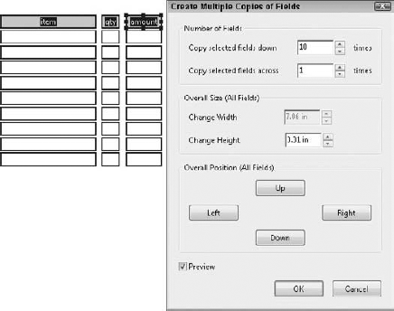
Figure 30.29. To create a table array, select a row or column of fields and open a context menu. Select Place Multiple Fields, and make selections in the Create Multiple Copies of Fields dialog box for the number of rows or columns to be duplicated.
When using the Distribute command, you can distribute only single rows or columns. If you attempt to select all fields in a table and distribute several rows or columns at once, the results render an offset distribution that most likely creates an unusable alignment.
Using the Place Multiple Fields menu command from a context menu enables you to create table arrays or individual columns or rows only on a single page. If you want to duplicate fields either on a page or through a number of pages, another menu command exists for field duplication.
You can use the Duplicate command to duplicate fields; however, the duplicate command is used to duplicate fields across multiple pages such as duplicating a navigation button. To duplicate a field on a page, use the copy/paste commands or press the Option/Control key while dragging a field.
If you spend time formatting attributes for field appearances, options, and actions, you may want to assign a default attribute set for all subsequent fields created with the same form tool. After creating a field with the attributes you want, open a context menu and select Use Current Properties as New Defaults. When you choose the menu command, the properties options used for the field selected become a new default for that field type. As you change form tools and create different fields, you can assign different defaults to different field types.
You have two options for setting the tab order on a form. This is one item you should address before saving your final edited form. You should be able to press the Tab key to enter the first field on a page and tab through the remaining fields in a logical order to make it easy for the end user to fill in your form. Before deploying your form, be sure to check the tab order.
The first option you have for setting Tab order is in the Pages panel. Enter Viewer mode, and open the Pages panel. Open a context menu on the page where you want to set tab order. Select Page Properties from the menu options, and the Page Properties dialog box opens, as shown in Figure 30.30. By default, the Tab Order pane opens with options for setting tab order by making radio button selections.

Figure 30.30. To set tab order, open the Pages panel and open a context menu on the page where you want to edit the tab order. Select Page Properties from the menu choices, and click Tab Order in the Pages Properties dialog box.
You have these options for setting tab order:
Use Row Order: This option tabs through rows from left to right. If you want to change the direction for tabbing through fields, choose File
Use Column Order: This option tabs through columns from left to right, or right to left if you change the binding as described in the preceding bullet.
Use Document Structure: When selecting this option, you first need to use a PDF document with structure and tags. The tab order is determined by the structure tree created by the original authoring application when the file was exported to PDF.
Unspecified: All documents you created in earlier versions of Acrobat that you open in Acrobat 6 through 9 have the Unspecified option selected. Unless you physically change the tab order to one of the preceding options, the tab order remains true to the order set in Acrobat 5 or earlier.
The order in which you create fields and add them to a page is recorded. If you happen to create a row of fields, and then change your mind and want to add a new field in the middle of the row, Acrobat tabs to the last field in the row from the last field created. Changing the tab orders in the Page Properties won't help you fix the problem when the fields need to be reordered.
Fortunately, you do have more options for setting tab orders. The second method, and perhaps your best choice for arranging fields in proper tab order, is in Form Editing Mode.
In Acrobat 9, you can drag and drop fields in the Fields panel to change the tab order. Click a field in the Fields panel in Form Editing Mode, and drag the field up or down in the Fields panel to change the tab order.
If you want to see a visual order of your fields on a form, open a context menu on any field and choose Show Tab Numbers. Each field displays the tab order number in the top-left corner of the field box as shown in Figure 30.31.
Independent graphic designers and small ad agencies have had a problem distributing forms to servers with previous versions of Acrobat. Unless you had an IT department and people capable of programming servers, you were left out of the data collection phase of working with PDF forms using servers and had to rely on e-mail exchanges.
Along with the introduction of Acrobat 9 and later with the Creative Suite 4, Adobe introduces a service called Acrobat.com. Along with Acrobat 9 and Acrobat.com, anyone can distribute forms to the Adobe server to collect form data without having to worry about any programming issues.
Using the services of Acrobat.com, you can use the service to e-mail forms, or submit forms to the server.
Note
For more information on using Acrobat.com, see Chapter 33.
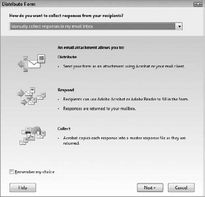
Choose Forms
Tip
Note that when you choose a distribution host such as e-mail, the Distribute Form wizard displays information on what will occur when you proceed to distribute the form according to the selection made in the pull-down menu. As you change distribution methods, the wizard window updates information informing you of the distribution process details for each choice made from the pull-down menu.
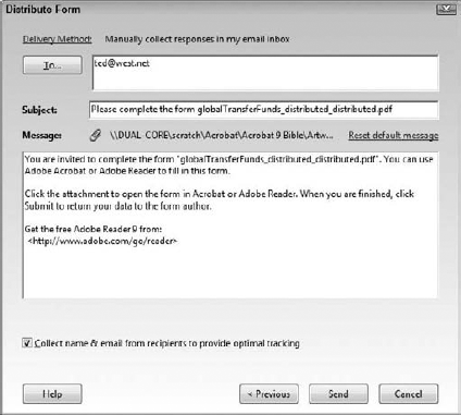
Choosing to manually distribute forms on Acrobat.com sends your form as an e-mail attachment using Acrobat for your mail client. Your e-mail client is not used when you make this choice, and responses are returned to your mailbox. Acrobat copies each response to a dataset file in the form of a PDF Portfolio hosted on Acrobat.com.
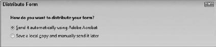
The next pane in the Distribute Form window provides you with two choices, as shown in Figure 30.33. You can choose to Send it automatically using Acrobat or Save a local copy and manually send it later. If you choose to send the file using Acrobat, Acrobat serves as your email client.
If you elect to use Acrobat.com and click the next button, the Acrobat log-on pane opens for you to log in with your Adobe ID and password, as shown in Figure 30.34. Supply the necessary information and click Sign-in. You file is then uploaded to Acrobat.com.
Note
For more information on creating an Adobe ID and signing into Acrobat.com, see Chapter 33.
After you log in, an automated e-mail message opens in the Distribute Form wizard, as shown in Figure 30.35. Here you add recipient names and either send an automated message or edit the Subject and/or Message text boxes. Click Send, and your file is uploaded to your Acrobat.com workspace and a URL link is placed in the e-mail message that is sent to your recipient list. This e-mail uses Acrobat as your mail client.
Note
Don't open your e-mail client and look for a file attachment on a new e-mail message. Using the steps outlined here, Acrobat is serving as your mail client and no intervention is made from your local e-mail client.

Figure 30.34. Choose to have Acrobat.com manage your e-mail responses, and you need to log into your Acrobat.com workspace.
Several things happen when you use Acrobat.com to manage e-mail responses. First, a Submit button is added to the Document Message bar when the form filler opens your form in an Acrobat viewer. Form fillers can click this button to submit responses to you. Second, the file is enabled with Adobe Reader usage rights without warning or notification. Your forms can be filled in by Adobe Reader users. Last, a dataset file is created in your Acrobat.com workspace. As form fillers submit forms, the data are collected on Acrobat.com in a master response file.
When the upload is completed, the Forms Tracker opens immediately in Acrobat with a current status report on your uploaded form, as shown in Figure 30.36. Using the Forms Tracker, you can view responses, open the original form stored locally on your hard drive, add new recipients for completing the form, stop form data collection to terminate the form distribution, send e-mail reminders, and generally keep updated information about the form distribution process.
At any time during your form distribution process, you can monitor the updates for responses by choosing Forms
Because the dataset file is hosted on Acrobat.com, you can organize, view, export, and manage data through your Acrobat.com environment.

We need to roll back momentarily to the Forms
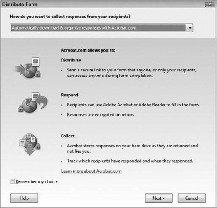
Figure 30.37. The Distribute Form wizard as it appears after choosing Automatically download & organize responses with Acrobat.com
These are some of the differences between Acrobat.com and e-mailing forms:
Distribute: The message you send to recipients contains a secure link to your form that recipients can access. You can allow anyone who visits your
Acrobat.comLibrary to download the form, or you can restrict access to only those whom you've invited to complete the form.Respond: In addition to enabling the form with Adobe Reader usage rights, responses are encrypted when returned to you.
Collect: Acrobat stores responses on your hard drive as the forms are returned to you. All the forms processing actions can be monitored in the Forms Tracker.
When you click the Next button, Acrobat verifies your login ID and brings you to the mail message pane in the Distribute Form wizard. In Figure 30.38, you see a screen very similar to Figure 30.32. However, notice at the bottom of the window that you have the additional choice for determining the level of access. The Access level pull-down menu is not available when you e-mail forms and let Acrobat.com manage the data.
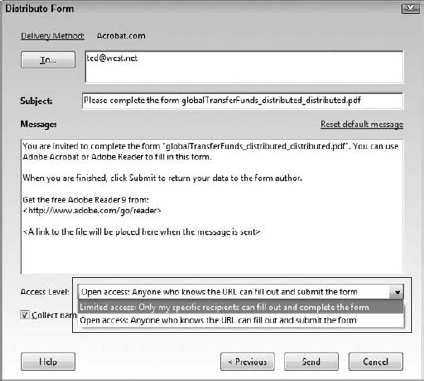
Figure 30.38. When submitting forms to Acrobat.com, you can limit access to only the participants you've invited to fill in the form.
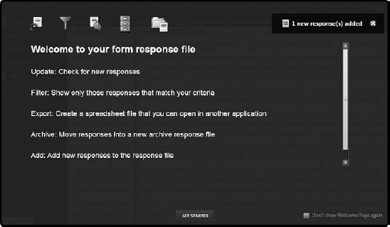
After you distribute a form, you can view and analyze returned form data on Acrobat.com in a number of ways. You can filter fields, sort data, and perform a number of analysis functions. When new responses are received from e-mail distributions or distributing via Acrobat.com, a pop-up window opens when you log into Acrobat.com, as shown in Figure 30.39. Click Get Started, and you can perform a number of viewing and analysis tasks.
Acrobat forms are not scanned documents converted to PDF. They are dynamic and can include interactive elements, data fields, buttons, and JavaScripts.
Data fields are created from many different field types including text, buttons, combo boxes, list boxes, signatures, check boxes, radio buttons, and barcodes.
You set all data field attributes in the Field Properties window. Properties can be described for fields by selecting the tabs labeled Appearance, Options, Actions, Calculations, or other tabs associated with specific field types.
Acrobat 9 has a new interface called Form Editing Mode where filed objects are added to forms.
In Acrobat 9, you edit forms in Form Editing Mode and fill in or check form functionality in Preview or Viewer mode.
You can edit fields with a context-sensitive menu. Acrobat has several editing commands used for aligning fields, distributing fields, and centering fields on a PDF page.
Field duplication is handled in a context menu. You can duplicate fields on a page to create tables with the Place Multiple Fields command, or you can duplicate fields across multiple pages with the Duplicate command.
Button fields can be created to submit form data from any Acrobat viewer. For Adobe Reader users to submit a PDF with data back to the PDF author, the form must be enabled with Adobe Reader usage rights.
Forms can be deployed via e-mail and hosted on
Acrobat.com.