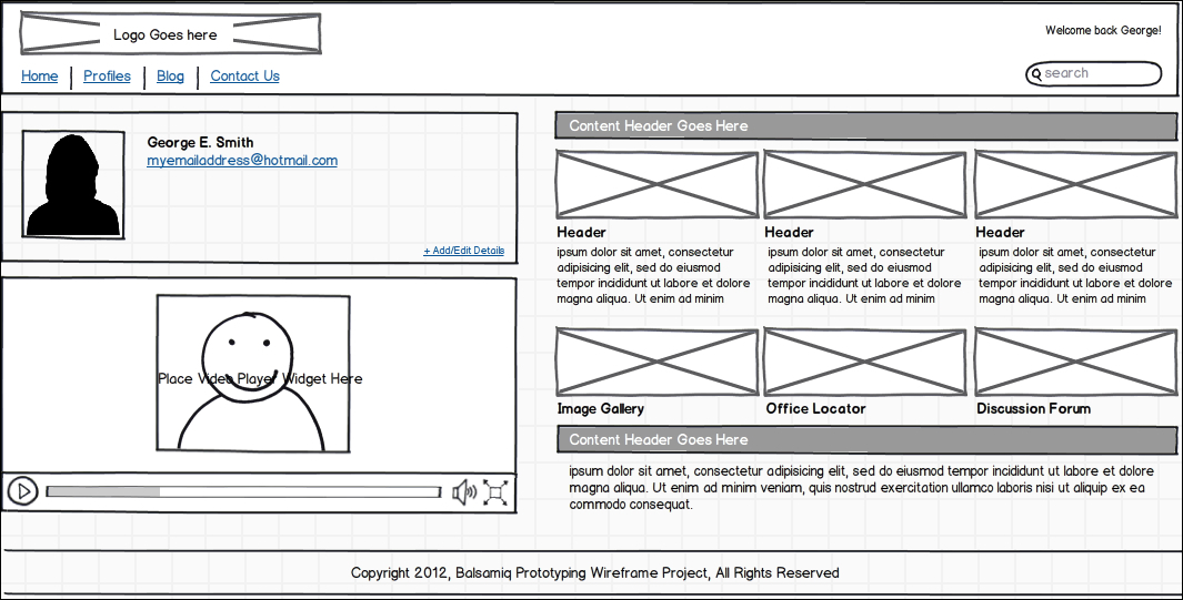
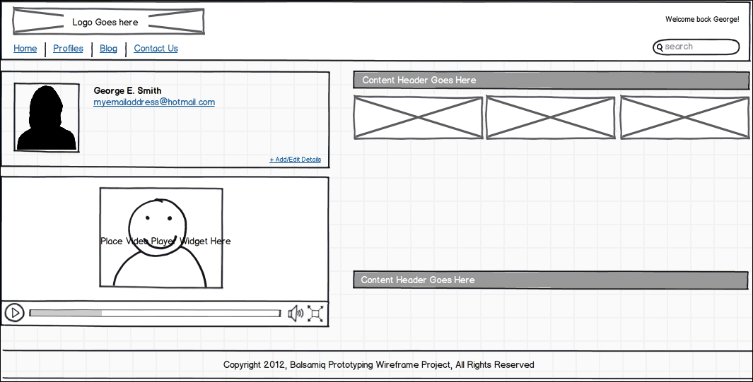
Now it's time to review what you have learned. We will do this by adding a new section to your wireframe, indicated with an arrow in the following screenshot:
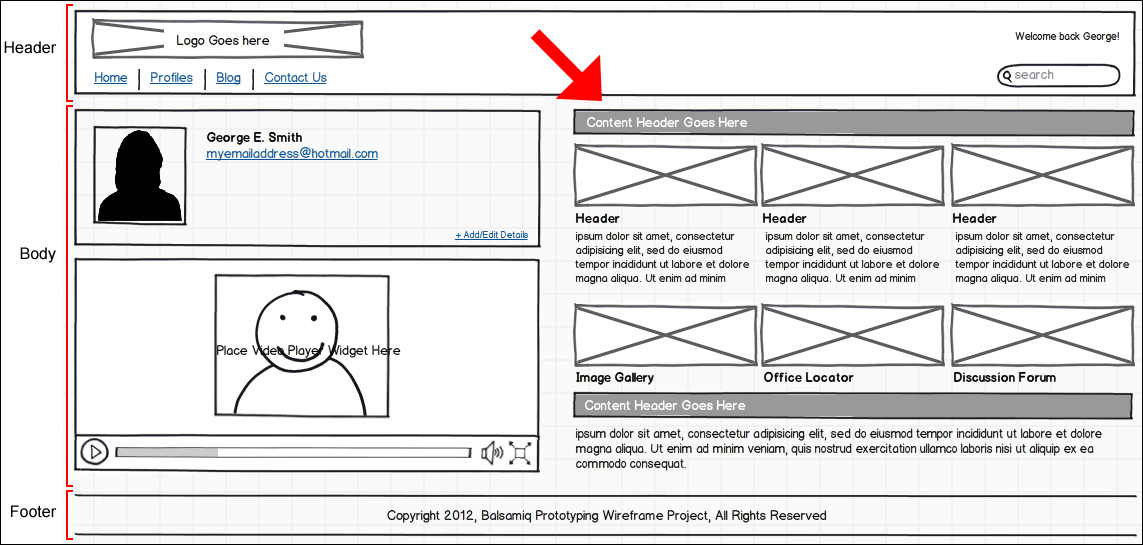
You will notice that the completed wireframe in the previous screenshot consists of essentially three main areas. There is the Header for logo and navigation, the Body for personal info, video, and a section for content and images. Lastly, there is the Footer showing the copyright information.
Taken separately, these are all very important pieces of your design. Taken together, they can make or break the experience of your users if not laid out correctly. Remember, good design and proper balance should never be taken for granted.
As you walk through this chapter, and as you build your wireframe, take note of the symmetry and flow of the designs presented. The alignment of elements to each other, their exact positioning and the way information flows from top-down and left to right are key factors to consider and follow for good design. When you send your work off for coding or to the design team to turn into hi-fidelity screens, you will often find that your work is taken very literally. If you take the time to design with attention to detail you can lead your design team towards a professional, high quality product that your end users will greatly appreciate and that you can be proud of.
While this book does not cover these very important topics, I do offer some great resources in Chapter 7, Parting Thoughts: Resources and Recommendations, that will help you to become more attuned to these factors and how to use them to your advantage.
Knowing how to wireframe is essential. Knowing how to design great user experiences is equally important. Learn them and you will be well on your way to great results.
Let's begin by creating what we will call the section headers. These will be used to divide the sections of text and images, as shown in the example.
The following is what the completed section header will look like:
To build it, perform the following steps:
- Find the widget named Rectangle/Canvas/Panel in the UI Library. You can also search for it using Quick Search or by clicking on the Common button atop the UI Library.
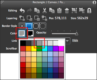
- Place the widget onto the canvas and position it: Pos:
578,111. - Size it as well: Size:
562x29.
Next, we will change the color of the section header:
- Click on the Rectangle/Canvas/Panel so it is selected.
- With the Property Inspector visible, click on the left most color square to open the color palette.
- In the palette, locate the fourth color square from the left, in the top row. Click on it to change the color of the panel, as shown in the following screenshot:
The area header should now be shaded using the color you chose. You can also control the opacity of the color using the slider to the right. Opacity is the level of transparency given to your colors. For this exercise, we are keeping the opacity at its default of 100 percent.
While we do not discuss text until Chapter 5, Icons, Images, and Text, I thought I would give you a preview to help complete this exercise. Perform the following steps:
- Locate the widget in the UI Library called Label/String of Text and drop it onto your newly created section header.
- With the text widget selected, press Return/Enter on your keyboard, or double-click on it to make it editable. Type in
Content Header Goes Here. - Click outside the box to close it.
- Position the textbox: Pos:
589,115. - Save your work.
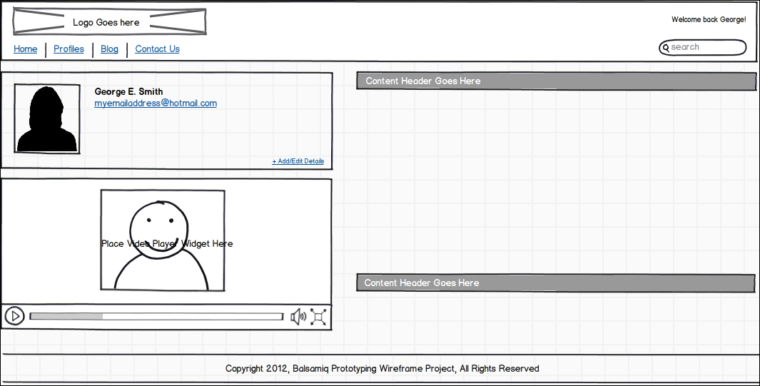
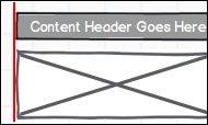
Your section header should now look like the following screenshot:
To change the text color, perform the following steps:
- Click on the color box once again in the Property Inspector and select the white square (It is the furthest square in the top row).
- Select the text box and the section header rectangle and group them.
- Position the group: Pos:
578,111. - Make a duplicate (Copy/Paste).
- Position the duplicate group: Pos:
578,394.
Your screen should now look like the following screenshot:
Now, we are going to place some image widgets on the canvas:
- Locate the Image widget in the UI Library and place it on the canvas.
- Size it: Size:
185x64. - Now, drag two more Image widgets onto the canvas and position them horizontally near the first one.
Don't worry about exact positioning just yet. First, we are going to do some aligning.
In addition to positioning, the Property Inspector also offers useful tools for aligning widgets and groups to each other on the canvas.
Now let's try that by performing the following steps:
- Select the left-most Image widget and the section header above it.
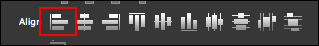
- In the Property Inspector, select the first tool in the Align row called Align Left, as shown in the following screenshot:
Once clicked, the two elements will become left aligned to each other, as shown in the following screenshot:
For this example to work correctly, the section header should be the left-most object. Since you already positioned the section header earlier, use it as your guide and align the Image widget to it.
Now let's align this Image widget to the other two by performing the following steps:
- Select all three Image widgets.
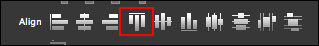
- Click the AlignTop tool (fourth from the left) to top-align all three widgets to each other, as shown in the following screenshot:
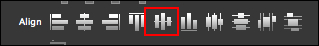
- Finally, space them evenly using the Align Middle tool, as shown in the following screenshot:
As stated previously, be sure that the left-most Image widget remains left aligned to the section header.
Your screen should now look something like the following screenshot:
Once that's completed, do the following:
- Grab all three Image widgets and group them.
- Copy and paste to make a duplicate group.
- Position the duplicate group: Pos:
578,306.
Fool around with positioning and alignment and get comfortable with using them. This may take some practice, but then that's why we're here, right?
By now, you may have noticed some copy on the right-hand side of the canvas. This was provided for you to use as part of this exercise. In reality, it is just some random dummy copy I created to save you the time of typing it yourself. But don't worry. You will have plenty of time to create your own text in Chapter 5, Icons, Images, and Text.
For now, click anywhere on or near the text to select it. To save you some time, it is already grouped. You just need to position it: Pos:
578,211
.
If you prefer, you can also ungroup the text and play around with it. For example, you could move stuff around using the positioning tools, play with the alignment tools, add some text of your own or play with the layer tools in the Property Inspector. When you are done, group it again and reposition the text so it looks like the finished wireframe in the example. You can also click Command + Z/Ctrl + Z as many times as needed to get it back to its original state.
Your final screen should look like the following screenshot: