
The next step is to add some icons to the component by placing three Icon widgets to the right of the name in the first row. Once placed, open the Icon Library.
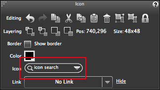
If you recall, in the previous chapter, you can open the Icon Library by double-clicking on an Icon widget. There is, however, an alternate way to open it via the Property Inspector.
Select one of the Icon widgets you just placed and click on the down arrow to the right of the icon search text field in the Property Inspector, as shown in the following screenshot:
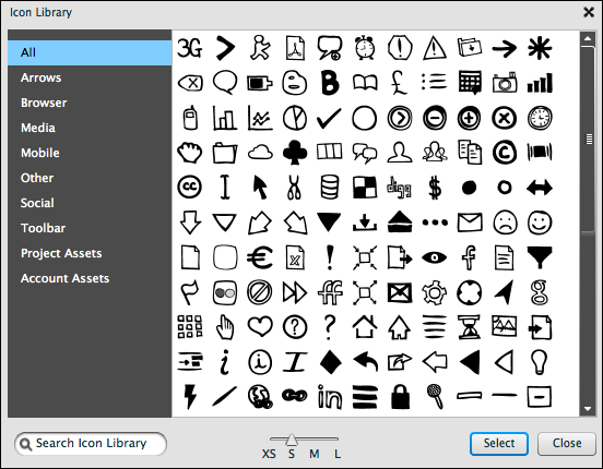
Once clicked, the Icon Library dialogue window will appear.
The Icon Library is a large collection of Balsamiq provided icons, along with links to sort them on the left-hand side of the window. Use these links to narrow down your search or just select All to view every icon available, as shown in the following screenshot:
Similar to Quick Add, you can also search for icons using the Search Icon Library search field located at the lower left of the window and/or the icon search text field in the Property Inspector. When you do, notice that both will autocomplete and show a visual representation of what Balsamiq thinks you are searching for. Give it a try.
When you have found what you are looking for; in this example it's the icons for e-mail, instant messaging (IM), and Facebook; place them on the canvas by either double-clicking on each image or by clicking on the Select button located at the bottom right of the dialogue window, as shown in the following screenshot:

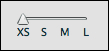
Be sure that the icon size slider at the bottom of the Icon Library window is set to XS for extra small, as shown in the following screenshot:
After you have placed all three icons, perform the following steps:
- Space them evenly using the Align Middle and Top Align tools in the Property Inspector.
- Group them.
- Set Pos:
1045,390. - Copy and paste the group into the remaining rows.
- Select them all and left-align them to each other using the Align Left tool in the Property Inspector.
Finally, finish the George's Friends component as follows:
- Place a Label/String of Text widget in the header bar.
- Type
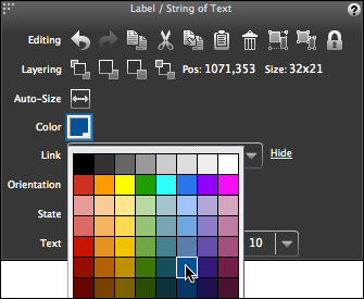
Add+. - Set Font size:
10. - Set Pos:
1071,353.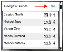
In the real world Add + would function as a link control that allows editing of the component. We will put this functionality to work in Chapter 6, Presenting your Work.
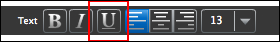
- Use the Underline tool in the Property Inspector to underline the text, as shown in the following screenshot:
- Change its color to dark blue using the Color changer in the Property Inspector, as shown in the following screenshot:
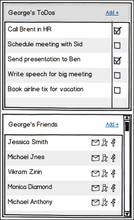
- Now copy the Add + text and place it in the header of George's ToDos component above it.
- Once placed, left align them to each other, as shown in the following screenshot:
How did you do? Does your work match the example? If not, keep at it. Practice makes perfect, as they say.