
Chapter 2
Building an SEO-Friendly Site
In This Chapter
- Designing your website to be SEO-friendly
- Creating a style that attracts your targeted audience
- Planning your site navigation
- Implementing a search within your website
- Incorporating interactive media to enhance your search engine rankings
- Creating pages that convert
In this chapter, you find out how to design websites with search engine marketing in mind. For many sites, search engine ranking is viewed as a part of the launch, but not as a part of the design. If you are fortunate enough to be newly building your website, you can construct it with search engine friendliness from the ground up. It’s more likely, however, that your site already resides on the web. Search engine optimization (SEO) is a new phase of your site’s development, but it’s better late than never. This chapter contains many rules of thumb that can help you design — or retrofit — a site to be SEO-friendly.
Preplanning and Organizing Your Site
Start your SEO planning by inventorying your assets (which we cover in Chapter 1 of this minibook). What do you have that can possibly enhance your website? List all your potential assets, not just those that are already online. Be creative and very open-minded at this point. Take stock of all the following:
- Written materials you or your company has produced — such as brochures, catalogs, articles, user manuals, tutorials, online help, and customer correspondence
- Videos of interviews, television spots, commercials, award acceptances, speeches, and company events
- Audio recordings of radio interviews, and original music
- Photos of products, people, events, and buildings, properties
- Images that go along with your products and services, such as logos, statistical charts, diagrams, and illustrations
The items you gather may become site assets, but for now they’re just ingredients waiting to be used. Looking to the materials your business produces outside your current website, you can probably find a lot of original content that, with a small amount of reformatting or updating, could enrich your online site.
To help you decide which elements to put on which pages, you need a combination of research and planning. The research half involves keyword research (covered in Book II) and competitor research (covered in Book III) — activities that give you lots of guidelines for your SEO work. The types of guidelines you may come up with through research include
- Your site’s main purpose (research, e-commerce, or a mix of both)
- Your site’s main keywords
- How much content you need to be competitive
- What kinds of content you need
- Which existing pages already rank well (you don’t want to change them)
- How your site should be organized to best compete in your Internet market
Armed with this research, you are ready to enter the planning stage. Based on the guidelines you developed, you can determine what areas of your website need work. Or if you’re building your site from scratch, you can lay out a big-picture site plan like a storyboard or a flow chart. Put your ideas for each page on paper. This organized approach lets you pair up items from your inventory of available content with your site’s needs and move through the planning stage.
Designing Spider-Friendly Code
Whether you’re writing your own HTML or hiring a webmaster to do it for you, you want to keep your site’s underlying code spider-friendly. Basically, you need to streamline your site’s code so that the search engine spiders have an easy time crawling your pages and figuring out what the pages are about. You do this by keeping the code as clean as possible. We cover cleaning your code in Chapter 1 of this minibook, but just as a reminder, for search engine optimization (SEO), here are some coding best practices:
- Use an external Cascading Style Sheet (CSS) file to define the look of your website.
- Use an external JS file to hold any JavaScript code you plan to use.
- Use as little inline markup (formatting and other types of on-the-fly HTML codes, such as Font tags to define the font style, and so on) as possible.
Creating a CSS file gives you a source from which to control the look of your entire website. In your CSS file, you can define, for instance, that all H1 headings should be Arial font, size 3, bold, navy blue, and centered. Next week, if you change your mind and decide to make your headings purple instead, you can simply edit the definitions for your H1 style in your CSS file and voilà — every H1 heading throughout your entire site is now purple. That’s a lot more efficient than going page by page through your site, manually updating every instance of an H1 tag, and it eliminates the risk that you’ll miss one.
Not only is an external CSS file efficient, but it also provides a few other big advantages. Having a CSS file allows you to remove inline formatting such as Font tags from your page content and instead insert a CSS tag identifying what style to apply. The result is much less HTML code cluttering your pages and significantly less page complexity. Less code means smaller file sizes. Smaller file sizes means your pages load faster for your site visitors and the search engine spiders have less junk to wade through as they read your text. It’s a win/win/win for all involved!
If your site incorporates JavaScript, you want to externalize it as well, for similar reasons. Move the JavaScript off your individual web pages and into a separate JS file. Then your pages can include a single line of code that calls (that is, instructs the browser and spiders that the information in the file should be used in reference to the content on the page) the JavaScript file, rather than having tons of code on the page. Because JavaScript code can get really long and cumbersome, this decision alone may cut the size of a web page in half. Less code makes for spider-friendly pages with uncluttered text and clear themes.
One online business implemented just these two best practices on its website, creating external files for its JavaScript and using CSS, and the business reduced 20,000 lines of code to just 1,500. The keyword-rich content rose to the top of the page, and along with it the site's rankings rose for the keyword terms in search engine results.
Creating a Theme and Style
When it comes to design styles, people tend to have certain expectations about what's appropriate. Elegant restaurants don’t seat people at tables with plastic chairs and red, yellow, and blue toy blocks for decoration. Neither do preschools decorate their rooms with Persian rugs and neutral colors. A typical business designs for its intended audience, so assessing who makes up its target audience is one of the first things the business has to do. Online businesses should be no different, but many websites overlook this step in their creators’ zeal to just “attract visitors, lots of visitors!”
Knowing what kind of visitor you want to attract influences many style decisions. It helps you make these types of design decisions:
- A color palette for the site
- The kinds of photos and graphics to include
- An appropriate reading level for your audience, including the complexity of the words and sentence structures
- The best tone to use when writing
- Font and layout choices that appeal to your target audience
- The complexity (or simplicity) of information to include
- The number of fun or interactive elements your site needs
- How “flashy” your site needs to be to attract and hold your audience
If you know the type of visitor you want, you can design your website to attract and hold those people’s interest once they arrive. When we say design, we don’t just mean the cosmetic look and feel, we also mean the site’s voice and themes. Your site’s main theme should be a focused idea of what your site is all about, using terms and keywords that match how your audience searches. For instance, if you have a business that customizes classic cars, your main site theme is classic car customization. We cover assigning keywords and themes more in Book II, Chapter 4, but basically, after you determine your main site theme, you can organize your content into categories and subcategories (that is, topics and sub-topics under the main site theme) and choose a specific primary keyword for each one. Every category-plus-keyword pair should have its own landing page within your website so that people searching for those keywords can click your listing and arrive at a page that’s specifically relevant to their search query. (A landing page is the particular web page a user comes to when clicking a link.)
So far in this section, we’ve talked about theme in reference to the keywords and information your website provides. The site’s theme is what the whole site is about; each page’s theme is a subtopic and has content and keywords focused on that subtopic. Frequently, the word theme also applies to the design theme, or the look and feel of a website. Keep in mind that the design theme a web designer creates must integrate with the site’s main content theme and be right for the target audience. They’re all interrelated.
 A design theme for a website needs to support the site’s main theme. For example, if you have a website that offers dog kennel franchises, the design theme needs to include dog-related graphics in the same way the text talks about dogs. Similarly, the overall look needs to appeal to your target audience, just as the text should be tailored to dog-loving entrepreneurial adults. If you do market research to further narrow your target audience, you can make the site even better. Look at your current customers to determine what type of person tends to convert from a window-shopper to a customer. For instance, if it’s usually women who become dog kennel franchisees, you can modify your site theme to appeal more to women. If it’s usually married couples who go into the dog kennel business, by all means, include text references to marriage, as well as images of happy couples watching over lots of tail-wagging pooches.
Writing Rich Text Content
People do read, especially online. “Content is king” is a frequently stated maxim of Internet marketing experts because it’s true. To have a successful website, you need lots and lots of content on your pages. How much content do you need? The answer depends somewhat on what is normal for your industry. When you research the sites that rank well for your keywords, some of the things you want to find out are how many indexed pages they have, as well as the quantity, quality, and structure of the keyword content on the high-ranking pages competing with yours. (Note that Book III explains how to do competitive research in detail.) When you know what level of content is currently succeeding in the search results pages for your keywords as an average, you get an idea of how many pages and words you need in order to play in their league.
We recommend that you have a minimum of 450 words of text content per page. That’s a general rule, based on all our experience helping companies do SEO. If that sounds like a lot to write per page, think about it this way: The page that you’re reading right now has about 450 words on it. Having fewer than 450 words on a page makes it hard to convince the engines that you’re a subject-matter expert. In fact, depending on the industry and keyword, 450 words might still be too few. The SEO industry averages around 1,000 words per page, and this is true of other industries as well. Still, 450 is a good initial target number before you do competitive research.
Writing that much text for every page might sound like a daunting task, but keep in mind how it can help you:
- Expertise goes up. Search engines look for a site’s expertise about a subject, and having a greater amount of relevant text signals that your web page is a subject-matter expert.
- Trust factor goes up. Users coming to your landing pages stay longer and trust it as more of an expert source if there’s more content for them to read that matches their query.
- Keyword relevancy goes up. Long pages give you more opportunities to use your keywords without overusing them and creating spam.
- Depth of content. Multiple pages built around the same theme allow you to capitalize on niche and long-tail keywords that support your main keywords. For more on long-tail keywords, see Book I, Chapter 5.
The second main principle you should know about text content is this: In addition to needing lots of text on your site, you also want that text to be focused. Search engines (and users, for that matter) come to a web page seeking something specific. You want the content of each page to be focused on its keyword theme. This makes the page relevant to the user’s search query.
Making each page’s content relevant and focused helps the page rise in the search engine rankings. This concept ties into siloing, which is the process of organizing your site themes and content into categories and subcategories, each with its own main keyword. (You can read a full explanation of siloing in Book VI, Chapters 1 and 2.) For example, in your dog kennel franchise website, you might have a page focused on how much expected revenue a franchise can generate. In your more than 450 words of content, you wouldn’t want to include a discussion of different dog food brands or grooming techniques. Including non-keyword-focused content like that would only dilute the information about your page’s theme. Instead, you want to have lots of information about kennel rates, expected monthly revenues, and revenue-related content.
For many more in-depth recommendations, tips, and guidelines on writing good content, see Book V.
Planning Your Navigation Elements
Navigation elements make up the roads and highways of your website. They’re the transportation system that can help people move smoothly from place to place, following clear signposts through well-marked paths. On the other hand, a website’s navigation can make people frustrated and hopelessly lost, causing them to press the first Back button and get out of town.
If you create a good navigation plan right from the start, it’s easy for site visitors and search engine spiders alike to move around your site. In fact, if your site doesn't have a good navigation system, it’s unlikely that the search engines can thoroughly index your site. Sites with a clear directory structure, siloed content, and easy-to-follow navigation are at an advantage over sites without these foundational elements.
 For maximum readability to the search engines, you want to format your navigation elements as text links. That said, there are ways to help the search engines read non-text navigation elements (such as Flash or image mapping), which we get into in Chapter 5 of this minibook. Nevertheless, you’re going to get the cleanest, best read from simple text link navigation.
Figure 2-1 shows a sketch of a typical web page's navigation plan: It has three basic areas for navigation links: top, bottom, and side (either right or left, with left being more common than right). We explain what the differences are at an initial design level, so you can evaluate what you’re currently doing for site navigation if your site is already in public use. If your site is still in the design phase, you can start planning how you’ll build your navigation. (Note that we go into depth on navigation in Chapter 5 of this minibook.)
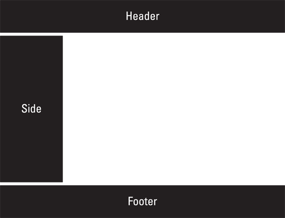
Figure 2-1: The three basic areas for navigation links on a web page.
 Use frames only to create your navigation, unless you don’t want the spiders following those links. When you put content inside a frame, spiders see it as its own separate page, so it can’t be indexed as part of the current page’s content. For search engines, frames split up a page and remove all the associations of your navigation and the rest of your content.
Top navigation
Top navigation simply refers to the links at the top of the page. Usually these are the “pretty” ones and the ones you want people to notice and use to get to the main sections of your site. Also called global navigation, top links often display site-wide, showing up conveniently on every page. A link to your home page is commonly found in your top navigation, as are links that give quick access to your main site categories. As appropriate for your user experience, you may also consider including usability links (sparingly, though), such as Check Out or Contact Us, in your top navigation.
Although the preceding list tells you common elements in the top navigation, they’re not necessarily items that you want to have dominate your top navigation — it depends on your business strategy. For example, the About Us page and the Contact Us page don't necessarily do anything to enhance your overall site theme, so you may choose to include these elements in your bottom (footer) navigation.
Good labels are critical. Because your global navigation appears throughout your site, the anchor text of every link (which is the text label of the link, or what people click) carries a lot of weight.
Why shouldn’t your home page simply be called Home? Because the search engines use the words in your anchor text to better understand what your website is about, using the word Home is a missed opportunity; the word does nothing to reinforce your site theme. (Learn more about theming and siloing in Book VI, Chapter 2.) We know of a window blinds company that radically improved its search engine ranking simply by changing its global navigation link from Home to Window Blinds. Within days, its web page jumped from the third to the first page of the search results for the keyword [window blinds] after this one simple change.
Footer navigation
Footer navigation refers to the navigational links at the bottom of a web page. Because search engines crawl all the way through a page, you can take advantage of another prime chance to show your keywords and increase your site's navigation and usability. Sites that have top navigation elements in Flash, Ajax, JavaScript, or images should see the footer navigation as a chance to restate all those links in search engine–friendly text at the bottom of the page. Footer navigation usually appears in a less conspicuous font, not trying to attract attention and simply offering a service to anyone who goes looking for more links to global topics. The footer is not the place for a link to every single page on your site, nor is it the place to excessively link to pages outside your site. The footer should include links to the pages linked in your top navigation as well as any additional user-friendly pages that weren't important enough to be in your main navigation, such as your privacy policy, your Contact Us page, your About Us page, and industry affiliations like the Better Business Bureau.
Your footer navigation generally should include:
- Top navigation links (again): You want to repeat all the links that are in your top, global navigation if your top navigation is in Flash or JavaScript which can prevent search engine spiders from reading it. Consider using anchor text that is more descriptive.
- Contact Us: You definitely want a link here to your contact information (especially if you left it out of your top navigation). This is good business practice so that people can contact you, but it also makes tons of sense for SEO. Local businesses that let spiders freely crawl all over their physical business address could wind up in local search results, too.
- Physical address: Include your physical address and local telephone number in your footer, especially if you're targeting local business. Both search engines and visitors use street addresses as a way to verify that you're a real business and not merely a scammer.
- Legal stuff: We recommend you include a privacy policy, copyright, and terms of use (if appropriate). These can be separate links in your footer even if they all go to the same legal-content page. You definitely want a privacy policy and copyright for your site — search engines look for these links because they help confirm that you are a legitimate company with accountability. Your trust factor increases, both with the public and the search engines, and because they can simply be inconspicuously placed at the bottom of each page, there’s no reason not to do it.
- Sitemap: Include a link to your HTML sitemap to help the search engines and your users find their way to every bit of your content.
- Link magnets: If you have any piece of content that you're particularly known for or that people often come looking for on your site, providing a link to that content on every page of your site will satisfy users and ensure that search engines consider it a significant page.
Side navigation
Side navigation elements typically include category-specific links and are most commonly seen on e-commerce sites. Side navigation is context sensitive: The links vary from page to page. This helps with siloing because you can reinforce the landing page’s theme by including links to supporting pages that help the user refine and dig deeper into the main category. For example, see in Figure 2-2 how the L.L.Bean website uses a side navigation with deeper, category-specific links to support its main top-navigation category?
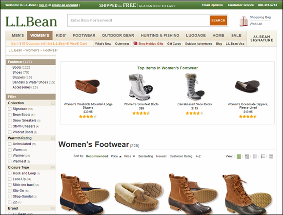
Figure 2-2: A side navigation with category-specific links that support the top navigation main category.
Implementing a Site Search
Many sites offer a Search text box right on their web pages that lets users search for information within the website (see the example below in Figure 2-3).
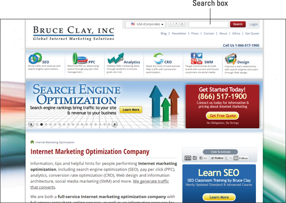
Figure 2-3: A site search text box offers a way to search within the site.
Site searches are essential if your website has tons of pages, such as for a magazine with years of archived issues, a large store with thousands of products, or a business with other extensive amounts of content. Smaller sites might also want a site search, but this decision should be made carefully. If you’re thinking of adding a site search, consider the benefits and the potential drawbacks, and be sure to implement a site search that’s effectively customized for your site.
The two major benefits of implementing a site search are:
- Improving usability: Ideally, a site search should improve usability and user retention. If your site search helps people find what they’re looking for after coming to your site, it’s doing good. For example, a site search is essential for a shopping site such as the Target website (
www.target.com), which tries to keep users within the store after they arrive. Say a user comes to the Target site after running a Google search for [snow shovels]. If the user next wants to find [tire chains], Target’s handy search function offers a quick way to find more products, add them to the same cart, and check out one time. The user gets better convenience, and the website keeps a customer and increases its revenue. - Providing direct user feedback: A site search provides you with a cache of valuable information. Your visitors leave a trail that tells you what they want in their own words. It’s perfect as a feedback tool — users come to you and type in exactly what they’re looking for. By tracking all these searches and the user experience following each one, you can identify weaknesses in your site processes, keywords you may have overlooked, pages of content you need to add, and also what’s working successfully or not working at all.
The main drawback of a site search occurs when it does not improve usability. Many site searches fail to provide what the user is looking for and become a side door where many visitors exit. You don’t want to confuse and lose your site visitors by giving them a technical tool that doesn’t perform as expected. So examine your website carefully in order to determine whether the risk is worth it. If you have clear navigation and well-organized content, you might be better off letting users find their way around rather than giving them a shortcut to nowhere.
If you do decide to implement a site search, be sure to do it right. You want your site search to control the selection and presentation of results to make sure you’ve maximized the opportunity to give users what they need. When done well, an effective site search can prevent site abandonment and eliminate the multitude of brief, one-time visitors. It can guide users along the conversion path, getting them hooked along the way and encouraging them to explore. To make sure, watch your site analytics closely after you deploy a site search to see whether it’s routing people well or causing them to take the nearest exit.
To be effective, your site search must be paired with good navigation and a well-siloed site. This combination is key to giving the user a good experience and developing the relationship between your brand and the customer. Here are some tips for maximizing your site search on an e-commerce site:
- List all major product categories and subcategories on your home page for easy navigation.
- Put a free-form site-search text box on every page with content that can lead to further searches. Like the Google search text box, this is a box where anything can be typed to get a potential answer.
- Implement guided search queries, where a user selects from a rigid pre-determined list to help narrow their search:
- Provide site search for items by brand, price, color, sale, and so on.
- Provide site search for featured products in every category.
- Include every brand in every category in your site search database.
- Include bestsellers in every category.
In some cases, your site may require separate search capabilities, or you may have to choose which kind of search to offer. The same underlying principles apply to non–e-commerce sites. Allow the site search to find your information in a variety of ways, broken down by lots of different categories, subcategories, and cross-categories. You want to give users many ways to get results, and you want to avoid search failure.
There are many free or inexpensive site-search kits you can use to incorporate a vertical search into your website. One reliable resource is the Google site-search option available at www.google.com/sitesearch. Paired with the free Google Analytics tool, any site search offers a good way to track user queries. Check out Book VIII for more on analytics in general. Book VIII, Chapter 3 covers Google Analytics in more detail.
Incorporating Engagement Objects into Your Site
It’s a good practice to include Engagement Objects on your website. By Engagement Objects, we mean any type of interactive media object that gets users excited and offers them a way to connect to the content. The following sections specifically cover video and audio files. Including these types of rich media makes your website appear technically advanced to both users and search engines and engages your visitors.
Incorporating Engagement Objects into your website can also improve your search engine rankings. The reason is because of a concept called blended search, which is the mixing of different types of content in the search results. For instance, if you search on Google for [classic Ford Mustang], Google may include more than just web page links in your results. You might see photographs of restored Ford Mustangs at the top of your results page. Also mingled into the listings you might find a video link to a recent classic car show featuring Ford Mustangs. You might find a news article about a classic Ford Mustang that was the getaway car in a recent heist. Or you might find listings of classic car shops and other local businesses in your city that specialize in Ford Mustangs. Mixed in with these you would also see the top-ranked web pages for the keyword phrase that you entered. Now that there’s blended search, the search engines show whatever types of files they determine to be the most relevant results. (As a side note, Google calls its blended search product Universal Search, and many in the search engine marketing community use that name to refer to all engines' blended search offerings.)
The concept of blending different types of files within a single search results set has raised the value of putting media on your website. In fact, some ranking factors have to do with what interactive media you have on your site. You want your site to get in on this action! You may find that just by adding some Engagement Objects to your website, your rank increases, especially if your competitors aren’t currently using any on their sites. At the very least, you have an opportunity to satisfy your visitors better than your competition can.
Some sites offer video or audio files by displaying them in a separate pop-up window with no text. This has some value for visitors, but because search engines can’t do much to understand the contents of a video or audio file, and because the pop-up window doesn't provide the spiders with any context that would help them understand the media's contents, the site has missed a valuable opportunity to enhance its keyword relevance with this great content.
A better way to handle video and audio files is to embed them right into your web pages. Let the video play right on the web page that also includes descriptive text about the video. Give users a hyperlink to let them hear an audio clip of a Ford Mustang engine on your Ford Mustang landing page, and let the anchor text and the sentences in the code surrounding the image help to support your page’s keyword relevance. Some files, like a video transcript or an MP3 that contains clean narrative, can be indexed by the searches, but this process isn’t perfect. The key to including video and audio files effectively is to place them in proximity to on-topic text that the search engines can read.
Video
You can include videos on your web pages if they’re relevant to your topic. Basically, anything that can be shown in a short video that is relevant to your web page could be used: Just make sure it’s ethical and within acceptable standards for your industry. If you can, you should always be hosting your videos on your site. You can upload them to YouTube as well, but it's your content and you should have it on your site. The possibilities are endless, but here are some examples of videos you might include, just to give you some ideas:
- Product demo: Include a small video demonstrating your product’s or service’s features and benefits. You can do this in a straightforward way or comically. For example, the Blendtec blender company uses video extremely effectively by showing videos of its product pulverizing things you’d never think to put in a blender (a shoe, an iPhone, and so on). The engaging videos alone have attracted thousands of interested buyers to the site (
www.willitblend.com) and have become a viral Internet phenomenon in their own right. - Speech: If you or someone notable from your company speaks in public, you could capture a digital video of an appropriate speech. Just a snippet might be enough.
- Tour: A video can be a tremendously effective tour guide. Show off your company building, impressive equipment, state-of-the-art facilities, or beautiful location — just pick something that can be well shown through a short video.
- Interview: You could interview one of your own personnel to give site visitors a “face-to-face” greeting, introduce one of your executives, or just give a video update of something newsworthy for your business. Alternatively, you could do a brief customer interview and post a live testimonial about your product or service.
Compression rates on the Internet mean that, to keep file sizes down, you often have to sacrifice video quality for speed. Put your money into making sure that the audio is crisp and clean. When it comes to quality, studies have shown that as long as the audio is decent, users will watch a video even if the picture quality is lacking. For more tips on the technical aspects of uploading videos to your site, see Book V, Chapter 2.
Audio
We confess that websites that greet their visitors with audio blaring really annoy us! From a usability perspective, making every person who comes to your site scramble to find their volume control buttons and do damage control with whomever may have heard their computer erupting in sound is a bad idea. You definitely want to avoid that. With that disclaimer made, we want to explain the appropriate use of sound files. Because in the world of SEO, embedding an audio file or offering a podcast carries weight with the search engines — not to mention users.
Consider what types of audio files you might offer on your site. Some ideas include:
- Sounds: If your site has anything to do with nature, consider offering nature sounds (a waterfall, mockingbird calls, hyenas whooping, and so on). You could demonstrate how quiet your product is by recording its noise compared to, say, a roomful of football fans after a touchdown play. Or, you could use on-topic recordings of bells ringing, trains whistling, tires screeching … . This list is going downhill fast, but you get the idea.
- Music: We suggest that you include music on your site only if your site is about music. (Background music for the sake of ambiance alone can be annoying, but as long as you default it to off and offer a volume control, it could be effective.)
- Speaking: You could include a recording of a presentation, speech, sermon, training event, poetry reading, or other public speaking event that’s relevant to your page topic and keywords. Audio bits make for excellent SEO-friendly content.
- Interviews: A Q&A session with one of your own staff or a notable person in your industry could be recorded and offered on your website. If you hire a new executive, consider interviewing her talk-show format as an introduction that you can post on your website.
- Podcasts: To make your site even more advanced, host a podcast that site visitors can subscribe to. With a podcast, users can download digital audio recordings of a radio show or other type of regular program and listen to it on an iPod or other device. These are great for lessons, weekly recaps, radio shows, or even mixes of your favorite music with some commentary sprinkled in.
From an SEO perspective, there’s a right way and a wrong way to add video and audio files to your website. You can read our specific recommendations for keeping your audio and video files SEO-compliant and user-friendly in Book V, Chapter 2.
Allowing for Expansion
When you’re building your website, remember to allow for future expansion. A website is never “finished” any more than a business can ever set itself in stone. To be successful, especially in online marketing, you must stay flexible and allow room for growth — including on your website.
Database engineers have to think about future growth when they create a new database structure. They do not want to be in a position where the entire database needs to be torn apart and rebuilt simply because it cannot accommodate adding another layer of storage. Similarly, you don’t want to box yourself in when it comes to your site design. To some extent, you can foresee future needs and plan ahead logically. Think about:
- New products or services: Try to predict what types of add-on product lines or services may come down the pike and need to be added to your site.
- Expanded content: You’ve read how important it is to have lots of content supporting your keyword themes, so try to identify where you have content holes that need to be filled with new pages of supporting information.
- Enhanced features: If you’d like to someday enrich your site by starting a blog or other interactive community feature, envision how this might fit into your site.
Despite your best efforts, however, you probably cannot predict all the changes coming in the future. For this reason, you want to keep your website design, navigation, structure, and even name somewhat open. For example, a business called George’s Ford-Only Customization Shop has prevented itself right away from ever being able to expand to Chevrolets. Similarly, you wouldn’t want your website’s domain name to be restrictively specific. Today, your business might be all about repairing truck fenders, but if you choose the domain name www.truckfenderwork.com, you’d be stuck having to create a new URL if you want to expand your business to work on all-body work or on cars as well as trucks.
Because constant growth is the rule, you want to make your website structure modular. We cover the concept of siloing in Book VI, Chapters 1 and 2, which involves breaking your website content into categories based on a keyword theme. A proper silo structure allows you to add new silos without breaking your site’s current linking architecture or navigation system. You can simply snap on another silo adjacent to the existing ones at the same structural level.
Developing an Update Procedure
You may be a one-person shop now or the only person in your company’s web development department, like the Lone Ranger working to save the day. Or you might be part of a large team developing a voluminous website. Whatever your situation is today, the fact is that it will change. People may leave the company, you could be transferred, and new people could be hired. To survive the personnel changes that inevitably happen, your website must have a documented update procedure.
In Chapter 1 of this minibook, we cover creating a design procedure that functions as a style guide for your website. In this section, we want to help you expand that document to cover an update procedure, as well. You’ve done the research to know what your site needs in terms of SEO. If you don’t write down guidelines related to search engine optimization and include them in a style guide that new webmasters, IT staff, marketing directors, and others can refer to, all your SEO progress could be lost. After all, without an education in SEO best practices, and without knowing how to do site analysis and competitive research (as you find out how to do in this book), people can make decisions about websites that drop the site right out of the search engine rankings. We’ve seen it happen.
Write down your update procedures, including your SEO do’s and don’ts, to lay out the blueprint for others to follow. Make your list as exhaustive as possible. To get you started, here are some items to cover in your style guide and site update procedure:
- File naming: Specify how you name new pages, images, videos, audio files, and so on. You probably have developed syntax for these things, so you want to write down those standards. (We cover good file naming in Chapter 1 of this minibook.)
- Directory structure: How you name and structure your file folders should also be documented so that when someone creates a new silo or wants to add a new picture, he or she knows how to do it.
- Redirects: Document what your procedure is for redirecting traffic away from a no-longer-needed page. Because there are several types of HTML redirect codes, but only a 301 Redirect is good practice for SEO, instructions could help prevent a costly mistake. (For more information on redirects, see Book VII, Chapter 3.)
- Linking: You want to be sure to cover your procedure for adding new links. Explain why anchor text must contain relevant keywords (never just Click Here), and give guidelines for linking within silos, not between them, as a general rule. You may want to cover linking very thoroughly because it’s so important to SEO — you can find lots more information on good linking strategies in Chapter 5 of this minibook, as well as in Book VI.
- New pages: Your procedure for adding a new page to your site should ask some critical questions, such as: What goal does this page meet? Does it fit into the silo? What are its main keywords? Whoever sets up the new page should be able to write down answers to these questions. In addition, because there are a number of things that must be carefully reviewed before a new page goes live, a checklist is helpful. Your new-page checklist should contain all the steps needed to make sure that the page is SEO-friendly and ready for the public. We suggest you start with the sample list we include in Book I, Chapter 1, and adapt it for your site.
Balancing Usability and Conversion
This chapter is all about building an SEO-friendly site. However, we aren’t recommending that you design a website just for the search engines. Your SEO goal must be balanced with the need to create a user-friendly site. Unless you balance SEO-friendliness (to help people find your site) with user-friendliness (to make people want to stay there), you won’t be able to achieve your true objective, which is conversion.
Conversion refers to whatever action you want your site visitors to take. That may be buying something, joining a group, signing up for a newsletter, registering for a seminar, filling out a survey, or just visiting more pages. Whatever your definition is for conversion, your real goal involves more than just generating traffic to your site’s front door. When those people arrive, you want them to do something: That “something” is your point of conversion.
Usability and SEO working together
Usability refers to the way a person uses, or experiences, your website. Every now and then a familiar discussion resurfaces in the SEO community’s forums, blogs, and newsgroups: When you are designing a website, whom should you be targeting, the search engines or the humans? Which should take precedence in your site design, and how do you serve both? Luckily, balancing these complementary needs is not as complicated as it seems. Search engine optimization and usability can work hand in hand. In fact, many of the things that are good for search engines benefit human visitors as well.
Some marketers are adamant that usability take priority over SEO, arguing that an unusable website can be at the top of the search engine results pages and still never make money. The reverse is pointed out as well — search engine optimization has to come first because the most perfectly usable site in the world still has to have visitors who use it before it is worth anything.
The confusion arises because people commonly mistake what the goal of each approach really is. This misconception leads them to make the assumption that the two are incompatible. In many people’s minds, SEO advocates a complicated set of rules to follow, games to play, pages to write, links to attract, and hoops to jump through. Usability has also grown to complex proportions, incorporating the use of personas, conversion funnels (the path that a visitor takes to get to a conversion, most commonly a purchase), and psychology degrees in human factors.
But if you strip away all the methods used in both approaches, their goals are remarkably similar. Search engine optimization is the process of designing a web strategy that gives search engine spiders and human visitors the best picture of the website possible. Usability is the process of designing a web strategy that gives visitors the most satisfactory experience possible.
You need to focus first on the things that SEO and usability have in common and then put the rest into balance. SEO is about more than simply ranking well in the search engines. The key is to rank well in the search engines for the keywords that are most relevant. If your site is the most expert and the best choice for your human visitors, your SEO campaign should be working to demonstrate that fact to the search engines. Table 2-1 lists a few examples of how improving the usability of your site often benefits your SEO campaign, as well.
Table 2-1 Usability Improvements That Go Hand-in-Hand with SEO
Usability Improvement |
SEO Benefit |
Do research to find out where your target users are looking for you. |
Combines with keyword research. |
Develop each landing page so that it’s well suited to help particular users based on their search queries. |
Optimizes pages around specific keywords. |
Build a larger network of links coming from external web pages so that more people can find your site. |
Increases the perception to the search engines that your site is an expert and raises your link equity. |
Discern where your target audience “lives” online when they aren’t on your site. |
Identifies where you need to be getting links because chances are, those sites are relevant. |
Make your site navigation clear and easy to travel for users. |
Allows search engine spiders to get around your site more easily. |
Write clean copy that states exactly what you offer visitors. |
Helps search engines determine what each page is about. |
Use clarifying words so that your terms make sense in context. |
Helps search engines understand what queries are relevant to your pages. |
Put your site on a fast, stable server to provide good site performance to users. |
Speeds the search engine spiders along their way and helps improve SERP rank. |
Create user-friendly error screens that explain the problem and give users links to other options when a page can't be displayed. |
Optimizes the 404 Page Cannot Be Displayed error page and redirected pages so that search engines can move through them easily to functioning pages on your site. |
So when you consider your visitors’ needs in order to boost your site’s usability, the nice part is that you’re also supporting your SEO efforts. But what if there are conflicts? If the best way to serve your visitors seems to go against SEO best practices, there probably is a way to compensate.
We’ve found that there is nearly always a technical solution for achieving SEO, no matter what the site owner is trying to accomplish. Here are two scenarios where the site’s usability objectives needed a technical solution for SEO:
- Basic example: A web designer wants to use a single image as the entire home page of a site. Knowing that search engines need to find content in order for that page to rank, you (as the SEO consultant) can use HTML to put content into the page, remove any words from the graphic and reset them as text, and use a CSS file to position the elements and give style to the page. The site’s usability expert likes this solution because it offers accessible options for low-sighted visitors and provides flexibility for the layout.
- A more complicated example: To provide the kind of content its users need, a site uses query strings to dynamically build the page from a database rather than the page being static. To help optimize that site for search engines, a technical solution could involve renaming directories so that the URL of each page contains meaningful keywords and a link structure is implemented to assure crawlability; as a result, the human visitor sees the right content, and search engine spiders can see what the site is about based on its well-labeled physical directory structure. Everyone wins.
So between usability and SEO, which is more important to your website’s success? The answer is that they’re both equally necessary and, thankfully, can work hand in hand. Build your site for all your visitors, human and spider alike. Instead of taking the approach that one or the other is sufficient, realize that by doing them in tandem, your website can be stronger, easier to navigate, more accessible to your target audience, and more likely to generate conversions.
Go for conversions as your main target.
Here’s why this tip makes sense. As you monitor your site traffic and conversions, you may notice a strange phenomenon: Sometimes being number three or four or five on the search results page is better than being number one. Sure, you get far more traffic in position one, but consider a typical scenario. Say a woman wants to buy a pair of designer shoes. She searches for the designer name and [shoes], and then begins clicking through the results. At the first website, she looks around and finds a pair she likes, but she doesn’t purchase them because she isn’t sure she’s found the best style or the best price. She clicks the second, third, and fourth sites to continue her shopping and price comparisons. At the fourth site, she’s done with price comparisons and has discovered that every site sells the shoes for the same price. She’s now ready to buy and clicks Add to Cart on site number four: Because she’s already on the site, it’s the most convenient place for her to make her purchase. So site number four wins the conversion.
You have two choices in this particular situation: Be site number four, or be one of the first three sites that didn't secure the conversion and figure out why not. In this case, ranking number one might not get you the sale unless your site was a lean, mean, converting machine.
Creating pages that convert
Most people come to a web page and decide whether to stay there within the first couple seconds. That means that you have only three seconds to convince someone that your page offers what they’re looking for. For each of your landing pages, ask yourself questions such as:
- Curb appeal: Is the site able to satisfy the intent of the query, and is it appropriate to the visitor?
- Impressions: At first glance, what does my page seem to be about?
- Focus: Is it clear that this page is about the keyword?
- Ease of use: How easy is it to achieve the desired task?
- More details: Can a visitor easily access more detailed information if desired?
- Conversion: Can a visitor easily navigate to where a conversion can take place?
You also want to consider your goal for each page and see if you’re achieving it. This differs from deciding what the keyword is for each page. For instance, you may have a landing page on your classic car customization website centered on the keyword phrase [Chevrolet Camaros]; your text may be all about restoring classic Chevy Camaros; and your images might depict classic Chevy Camaros. So far, that’s all good. But your goal for this page is a different issue. Your goal may be to get the user to click through to more pages on your website. Your goal may be to have the user download a coupon for a free tire rotation. Your goal may be to entice the user to set an appointment, make a phone call, order a service, make a purchase, or do something else. In short, the page’s goal can be measured in terms of what you want visitors to do while on this page.
To help determine each page’s conversion goal, ask yourself three questions about every page on your website that requires action (such as landing pages):
- What: What action is required?
- Who: Who must take that action?
- How: What information does the visitor need in order to know how to take the required action?
After you have each page’s goal firmly in mind, usability really comes into play. Think of yourself as a professional usability expert for your website. You want to design your pages in a way that helps your site visitors successfully reach the goal. Don’t just assume that you know what’s best. Someone who knows the site and industry has a completely different opinion than a prospective user of the site. All the different needs and viewpoints of your potential audience should be explored. This is why if you have the budget for it, a professional usability expert can be worth her weight in gold.
For example, professional usability experts can help brick-and-mortar stores decide how to lay out their shelves for highest potential revenue. They can advise a bookstore owner that people tend to turn to the right when entering a store more often than they turn to the left, and the bookstore can apply this information by positioning a bestseller table to the right of the entry. Grocery stores are a great example of user psychology in action as well: You have to pass right through all the really tempting packaged goods, like doughnuts and chips, to get to the staple items, like milk and eggs, that are usually on your shopping list.
On your website, make each of your landing pages meet a particular goal. Often, you want the landing page to work as a funnel, collecting visitors and sending them through to some other page on your site. For instance, an Add to Cart link near the product information is a fairly standard way to turn a window-shopper into a customer, and if your site then displays a clear Proceed to Checkout or similar link, you can funnel the person to a page where she can make a purchase. If your site isn’t about e-commerce, you still want to have clear signposts that lead visitors from each landing page to a conversion page. (Note: We cover conversion funnels in Book VIII, Chapter 2.)
 Engineering a website for human interaction does not always follow common sense. There’s a whole usability science about how to design web pages for maximum return, but that’s outside the scope of this book. If you want to research it, we recommend starting with the website Usability Effect (
www.usabilityeffect.com). The site owner, Kim Krause Berg, began in the field of SEO and then moved to a career in usability consulting, so she understands both sides. You can discover a lot from the articles and other resources on her site.
Keep in mind that all usability theories remain just that — theories — until proven through user testing. You might add a button that says Free Tire Rotation Coupon on your website’s home page, but until you analyze how many times people click the button to download the coupon, you don’t really know if it’s an effective conversion device. You would also want to know whether adding the coupon link draws more traffic to your site or alters your search engine ranking. To go a step further with your user testing, you might also try a few different versions of the button, varying its look or placement, and gather comparison data. However you approach it, you’re going to want to prove your usability theories with some real-world testing.
Creating a strong call to action
Do your web pages have a clear “call to action,” enticing people to do whatever action the web page requires? If not, this absence could explain a less-than-satisfactory conversion rate.
You need an effective call to action on any page where you want the user to do something. This goes back to knowing what your goal is for each page, whether it’s to click through to another page, add an item to a shopping cart, or to take some other action. Because websites typically lose a percentage of people at every step along the way to conversion (known as conversion drop-off), you want your users' journey to be as direct and clear as possible. Don’t confuse your users by offering them too many choices. Often, you end up paralyzing them with indecision or distracting them from their original goal. Either way, you lose your conversion.
The most effective calls to action make use of an imperative verb (like Add or Sign Up or Create) and a compelling benefit. Some of the very best calls to action are actually graphics or buttons that catch the visitor's eye but don't dilute your content with needless commercial language that could bias the search engines. If your site is research-oriented, you might want to obscure the words Buy Now by placing them in an image so that the search engines don’t think that you’re a retail site. This example could be from a business-to-business site. It’s very motivating for an engineer seeking this type of solution:
Attend our Web cast "Process Excellence for Supply Chain Management" and learn how to reduce costs with our process-driven approach to align business practices within your organization.
Your call to action must tell visitors exactly what you want them to do. If you want them to buy your product, you could scatter multiple calls to action in strategic places within your copy, such as Buy Brand X now). If you want them to contact you by phone, list your phone number and provide instructions (Call us Monday–Friday from 8–5 PST at 1-866-517-1900). Repeat the number in bold text throughout your copy and again at the end. But be wary of spamming the page. Repeating your call to action works only if you don’t annoy the visitor. For more on spam, see Book I, Chapter 6.
You should use meaningful words in the anchor text of any call to action in order to reinforce why the user would want to do it. The anchor text can incorporate keywords to clarify why a user would take an action. For example, if you have links in your web content that lead to a page where the user can sign up for your newsletter, include a brief description in every link like “Car Restoration Newsletter” rather than just “Sign up for our newsletter.” Descriptive anchor text on your calls to action adds value for users and also helps search engines better understand what your web pages are about.
You want to make sure that you’re not inadvertently thwarting anyone from getting to the point of conversion with confusing messages, broken links, or other weaknesses in your site. This is where micro-management is appropriate — gather lots of site analytics from your IT department and closely examine how effective your conversion path is every step of the way. You need this information to help you identify problems and then test and improve, test and improve again, and then again — it’s an ongoing process.
A strong call to action is critical, but it’s just one factor that helps you achieve conversions. In the end, your conversion rate reflects your ability to persuade visitors to complete their intended actions from A to Z. It is a measure of your effectiveness and of customer satisfaction overall.