 Creating donut charts
by Krishna Choppella, Dr. Uday Kamath, Boštjan Kaluža, Jennifer L. Reese, Richard M
Machine Learning: End-to-End guide for Java developers
Creating donut charts
by Krishna Choppella, Dr. Uday Kamath, Boštjan Kaluža, Jennifer L. Reese, Richard M
Machine Learning: End-to-End guide for Java developers
- Machine Learning: End-to-End guide for Java developers
- Table of Contents
- Machine Learning: End-to-End guide for Java developers
- Credits
- Preface
- 1. Module 1
- 1. Getting Started with Data Science
- Problems solved using data science
- Understanding the data science problem - solving approach
- Acquiring data for an application
- The importance and process of cleaning data
- Visualizing data to enhance understanding
- The use of statistical methods in data science
- Machine learning applied to data science
- Using neural networks in data science
- Deep learning approaches
- Performing text analysis
- Visual and audio analysis
- Improving application performance using parallel techniques
- Assembling the pieces
- Summary
- 2. Data Acquisition
- 3. Data Cleaning
- 4. Data Visualization
- 5. Statistical Data Analysis Techniques
- 6. Machine Learning
- 7. Neural Networks
- 8. Deep Learning
- 9. Text Analysis
- 10. Visual and Audio Analysis
- 11. Mathematical and Parallel Techniques for Data Analysis
- 12. Bringing It All Together
- 1. Getting Started with Data Science
- 2. Module 2
- 1. Applied Machine Learning Quick Start
- 2. Java Libraries and Platforms for Machine Learning
- 3. Basic Algorithms – Classification, Regression, and Clustering
- 4. Customer Relationship Prediction with Ensembles
- 5. Affinity Analysis
- 6. Recommendation Engine with Apache Mahout
- 7. Fraud and Anomaly Detection
- 8. Image Recognition with Deeplearning4j
- 9. Activity Recognition with Mobile Phone Sensors
- 10. Text Mining with Mallet – Topic Modeling and Spam Detection
- 11. What is Next?
- A. References
- 3. Module 3
- 1. Machine Learning Review
- Machine learning – history and definition
- What is not machine learning?
- Machine learning – concepts and terminology
- Machine learning – types and subtypes
- Datasets used in machine learning
- Machine learning applications
- Practical issues in machine learning
- Machine learning – roles and process
- Machine learning – tools and datasets
- Summary
- 2. Practical Approach to Real-World Supervised Learning
- Formal description and notation
- Data transformation and preprocessing
- Feature relevance analysis and dimensionality reduction
- Model building
- Model assessment, evaluation, and comparisons
- Case Study – Horse Colic Classification
- Summary
- References
- 3. Unsupervised Machine Learning Techniques
- Issues in common with supervised learning
- Issues specific to unsupervised learning
- Feature analysis and dimensionality reduction
- Clustering
- Outlier or anomaly detection
- Real-world case study
- Summary
- References
- 4. Semi-Supervised and Active Learning
- Semi-supervised learning
- Active learning
- Case study in active learning
- Summary
- References
- 5. Real-Time Stream Machine Learning
- Assumptions and mathematical notations
- Basic stream processing and computational techniques
- Concept drift and drift detection
- Incremental supervised learning
- Incremental unsupervised learning using clustering
- Modeling techniques
- Partition based
- Hierarchical based and micro clustering
- Density based
- Grid based
- Validation and evaluation techniques
- Key issues in stream cluster evaluation
- Evaluation measures
- Cluster Mapping Measures (CMM)
- V-Measure
- Other external measures
- Unsupervised learning using outlier detection
- Case study in stream learning
- Summary
- References
- 6. Probabilistic Graph Modeling
- Probability revisited
- Graph concepts
- Bayesian networks
- Representation
- Inference
- Learning
- Learning parameters
- Learning structures
- Measures to evaluate structures
- Methods for learning structures
- Constraint-based techniques
- Search and score-based techniques
- 7. Deep Learning
- Multi-layer feed-forward neural network
- Inputs, neurons, activation function, and mathematical notation
- Multi-layered neural network
- Structure and mathematical notations
- Activation functions in NN
- Training neural network
- Empirical risk minimization
- Parameter initialization
- Loss function
- Gradients
- Feed forward and backpropagation
- How does it work?
- Regularization
- L2 regularization
- L1 regularization
- Limitations of neural networks
- Deep learning
- Building blocks for deep learning
- Rectified linear activation function
- Restricted Boltzmann Machines
- Autoencoders
- Unsupervised pre-training and supervised fine-tuning
- Deep feed-forward NN
- Deep Autoencoders
- Deep Belief Networks
- Deep learning with dropouts
- Sparse coding
- Convolutional Neural Network
- CNN Layers
- Recurrent Neural Networks
- Building blocks for deep learning
- Case study
- Summary
- References
- 8. Text Mining and Natural Language Processing
- NLP, subfields, and tasks
- Text categorization
- Part-of-speech tagging (POS tagging)
- Text clustering
- Information extraction and named entity recognition
- Sentiment analysis and opinion mining
- Coreference resolution
- Word sense disambiguation
- Machine translation
- Semantic reasoning and inferencing
- Text summarization
- Automating question and answers
- Issues with mining unstructured data
- Text processing components and transformations
- Topics in text mining
- Tools and usage
- Summary
- References
- NLP, subfields, and tasks
- 9. Big Data Machine Learning – The Final Frontier
- What are the characteristics of Big Data?
- Big Data Machine Learning
- Batch Big Data Machine Learning
- Case study
- Business problem
- Machine Learning mapping
- Data collection
- Data sampling and transformation
- Spark MLlib as Big Data Machine Learning platform
- A. Linear Algebra
- B. Probability
- D. Bibliography
- Index
- Empirical risk minimization
- Multi-layer feed-forward neural network
- Modeling techniques
- 1. Machine Learning Review
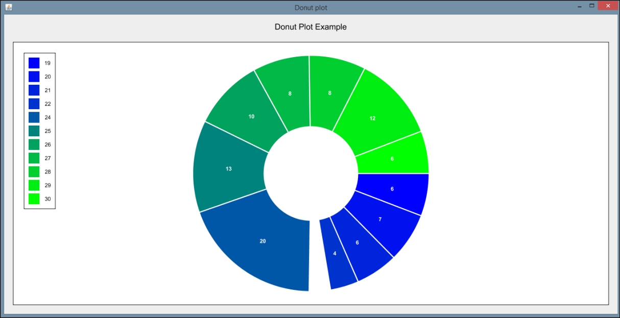
Donut charts are similar to pie charts, but they are missing the middle section (hence the name donut). Some analysts prefer donut charts to pie charts because they do not emphasize the size of each piece within the chart and are easier to compare to other donut charts. They also provide the added advantage of taking up less space, allowing for more formatting options in the display.
In this example, we will assume our data is already populated in a two-dimensional array called ageCount. The first row of the array contains the possible age values, ranging again from 19 to 30 (inclusive). The second row contains the number of data values equal to each age. For example, in our dataset, there are six data values equal to 19, so ageCount[0][1] contains the number six.
We create a DataTable and use the add method to add our values from the array. Notice we are testing to see if the value of a particular age is zero. In our test case, there will be zero data values equal to 23. We are opting to add a blank space in our donut chart if there are no data values for that point. This is accomplished by using a negative number as the first parameter in the add method. This will set an empty space of size 3:
DataTable donutData = new DataTable(Integer.class, Integer.class);
for(int Y = 0; Y < ageCount[0].length; y++){
    if(ageCount[1][y] == 0){
        donutData.add(-3, ageCount[0][y]);
    }else{
        donutData.add(ageCount[1][y], ageCount[0][y]);
    }
}
Next, we create our donut plot using the PiePlot class. We set basic properties of the plot, including specifying the values for the legend. In this case, we want our legend to reflect our age possibilities, so we use the setLabelColumn method to change the default labels. We also set our insets as we did in the previous example:
PiePlot testPlot = new PiePlot(donutData);
((ValueLegend) testPlot.getLegend()).setLabelColumn(1);
testPlot.getTitle().setText("Donut Plot Example");
testPlot.setRadius(0.9);
testPlot.setLegendVisible(true);
testPlot.setInsets(new Insets2D.Double(20.0, 20.0, 20.0, 20.0));
Next, we create a PieSliceRenderer object to set more advanced properties. Because a donut plot is basically a pie plot in essence, we will render a donut plot by calling the setInnerRadius method. We also specify the gap between the pie slices, the colors used, and the style of the labels:
PieSliceRenderer renderPie = (PieSliceRenderer)
testPlot.getPointRenderer(donutData);
renderPie.setInnerRadius(0.4);
renderPie.setGap(0.2);
LinearGradient colors = new LinearGradient(
    Color.blue, Color.green);
renderPie.setColor(colors);
renderPie.setValueVisible(true);
renderPie.setValueColor(Color.WHITE);
renderPie.setValueFont(Font.decode(null).deriveFont(Font.BOLD));
Finally, we create our panel and set its size:
add(new InteractivePanel(testPlot), BorderLayout.CENTER);
setSize(1500, 700);
setVisible(true);
When the application is executed, the following graph is displayed:
-
No Comment